
CSS Magic: Elegant One Liners

Frontend development often involves navigating through a labyrinth of code, striving to achieve the perfect balance between functionality and aesthetics. In this quest for excellence, CSS one-liners emerge as invaluable tools, offering a shortcut to elegance and efficiency. These succinct code snippets pack multiple styling properties into a single line, simplifying the process. This article delves into the world of CSS one-liners, examining their benefits and how they enhance front-end design effortlessly.

Discover how at OpenReplay.com.
CSS one-liners are powerful techniques that condense multiple CSS properties into a single line of code. While they might seem like a shortcut, they offer a range of benefits that can elevate your front-end development workflow and the resulting user experience. Through practical examples, we’ll demonstrate how these concise tools can streamline your CSS workflow and help create captivating user interfaces.
- Simplicity: CSS one-liners encapsulate complex styling techniques into concise snippets, reducing the need for verbose code. You can achieve impressive visual effects with just a single line, saving time and streamlining your workflow.
- Readability: One-liners enhance code readability by eliminating unnecessary clutter. Instead of sifting through lengthy CSS files, developers can easily identify and understand styling rules at a glance, fostering collaboration and maintainability.
- Performance Optimization: By minimizing the size of CSS files, one-liners contribute to faster page loading times and improved performance. Trimmed-down stylesheets reduce bandwidth consumption and alleviate server strain, enhancing the user experience.
- Flexibility: CSS one-liners offer unparalleled flexibility, allowing developers to experiment with various design elements and effects effortlessly. Whether creating smooth animations, customizing typography, or adding subtle shadows, one-liners provide a versatile toolkit for achieving diverse aesthetic goals.
- Ease of Maintenance: With fewer lines of code to manage, maintaining CSS one-liners is a breeze. Updates and modifications can be implemented swiftly, ensuring consistency across your website without sacrificing quality or introducing errors.
By harnessing the power of concise code snippets, developers can elevate their front-end design with effortless elegance, delivering exceptional user experiences across the digital landscape.
Smooth Scroll Behavior
Smooth scrolling is a delightful user experience enhancement that adds a touch of elegance to your website. Instead of abrupt jumps between sections, smooth scrolling provides a seamless transition as users navigate your content. Thanks to the’ scroll-behavior’ property, achieving this effect in CSS is remarkably simple.
html {
  scroll-behavior: smooth;
}
To illustrate its effectiveness, consider a long-scrolling webpage with multiple sections. Without smooth scrolling, abrupt jumps between sections can disrupt the flow of content and disorient users. However, incorporating the scroll-behavior: smooth; one-liner transforms the scrolling experience into a seamless journey, enhancing engagement and satisfaction.
<body>
  <nav>
    <a href="#page-1">1</a>
    <a href="#page-2">2</a>
    <a href="#page-3">3</a>
  </nav>
  <div class="scroll-container">
    <div class="scroll" class="page-1">1</div>
    <div class="scroll" class="page-2">2</div>
    <div class="scroll" class="page-3">3</div>
</body>
With smooth scrolling enabled, users can effortlessly navigate between sections, enjoying a fluid and pleasant scrolling experience.
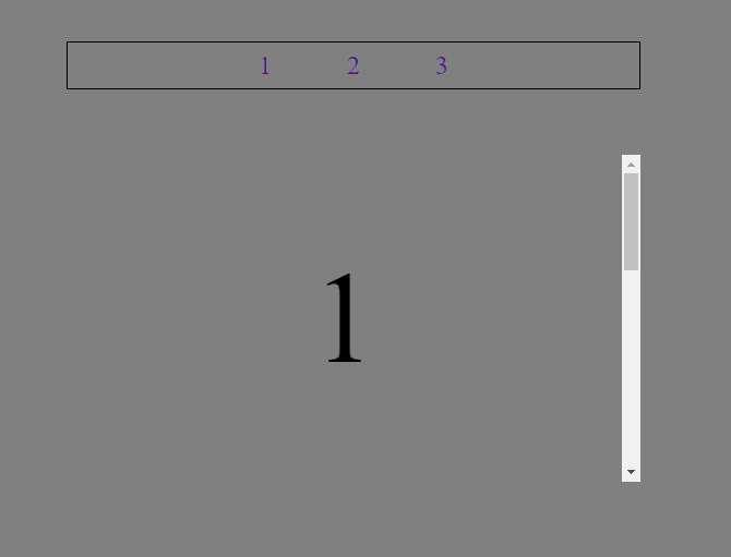
Smooth scroll behavior is particularly beneficial for websites with lengthy content, such as portfolios, blogs, and single-page applications. It elevates the overall user experience, making navigation intuitive and enjoyable.
Perfect Circles with clip-path Property
Creating perfect circles in CSS traditionally involved complex calculations or using images. However, with the clip-path property, you can effortlessly generate perfect circles with just a single line of code. This powerful CSS one-liner leverages the circle() function within the clip-path property to define circular clipping paths.
<div class="circle"></div>Let’s define a <div> element to represent our circle and give it the class circle for styling purposes.
.circle {
  clip-path: circle(50%);
}
Let’s break down this one-liner. The clip-path: circle(50%``) is the magic behind creating a perfect circle. The circle() function within the clip-path property specifies the shape of the clipping path. In this case, the value 50% indicates that the clipping path will be a circle with a radius equal to 50% of the width and height of the element, effectively creating a perfect circle.
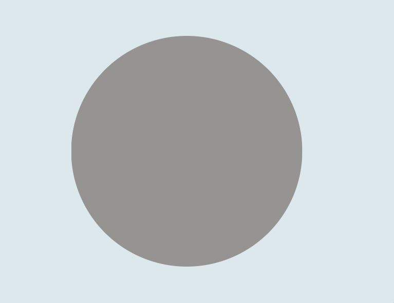
By applying this one-liner to any HTML element, such as a <div> or <span>, you can easily transform it into a visually appealing perfect circle. Whether you’re designing buttons, avatars, or decorative elements, the clip-path property offers a straightforward solution for achieving circular shapes without complex calculations or additional resources.
Change Cursor Display
Customizing the cursor display is a subtle yet effective way to improve user interaction and provide visual cues on your website. With CSS, you can easily change the cursor’s appearance when hovering over specific elements.
For a simple example, we will create a simple button with a class="btn".
<button class="btn">Submit</button>Now, let’s add the CSS one-liner style to the button tag.
.btn {
  cursor: pointer;
}
In this example, the CSS rule .btn targets elements with the class “btn” and changes the cursor to a pointer when users hover over them. This mimics the behavior of clickable elements, making it clear to users that they can interact with those elements.
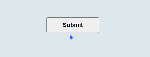
Depending on the context and desired effect, you can customize the cursor style further by using other values such as default, text, crosshair, help, and more.
Prevent Text Selection
Preventing text selection is a handy technique for enhancing the user experience on your website, especially in cases where you want to maintain the integrity of certain content or prevent accidental selections that might disrupt the layout.
Below is an example of how you can implement the user-select property in a web page to demonstrate its effect:
<body>
  <h1>Text Selection Example</h1>
  <p>This is a paragraph where text selection is enabled by default.</p>
  <p class="no-select">
    This paragraph has the user-select property set to none, preventing text
    selection.
  </p>
</body>
With CSS, you can easily achieve this by utilizing the user-select property set to none. By applying the following CSS rule to specific elements or classes.
.no-select {
  user-select: none;
}
In this example, the first paragraph will allow text selection by default, while the second paragraph, marked with the no-select class, will have text selection disabled due to the CSS rule applied to it. You can test the behavior by trying to select text within each paragraph. The second paragraph should prevent text selection, demonstrating the effect of the user-select property.
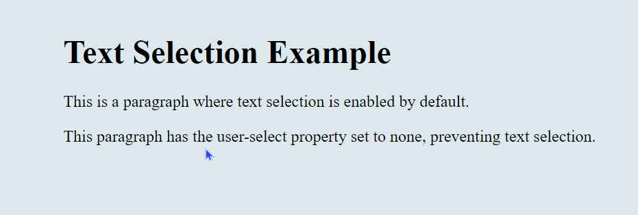
By incorporating this CSS one-liner into your project, you can maintain control over text selection behavior and ensure a consistent user experience across your website. Whether you’re protecting sensitive content or refining the visual presentation of your design, preventing text selection is a handy technique in your CSS toolkit.
Horizontal and Vertical Writing Mode
Switching between vertical and horizontal writing modes in CSS can be a powerful technique for creating unique and visually engaging layouts. Whether you want to experiment with unconventional typography or design elements with non-traditional orientations, CSS offers the flexibility to achieve your desired effect. Here’s how you can implement vertical and horizontal writing modes.
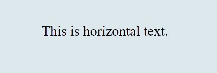
Horizontal Writing Mode
By default, CSS renders text in a horizontal writing mode. You don’t need to specify any additional styles for this mode. Here’s how it looks in HTML:
<p class="horizontal-text">This is horizontal text.</p>While specifying styles for horizontal writing when it’s the default behavior may seem redundant, understanding these principles can deepen your grasp of CSS and prepare you for more complex layout challenges.
.horizontal-text {
  writing-mode: horizontal-tb; /* Horizontal writing mode */
}
It will be rendered as shown below.
Vertical Writing Mode
You can use the writing-mode property in CSS to switch to a vertical writing mode. Setting it to vertical-rl enables a right-to-left vertical writing mode.
Here’s the CSS code:
.vertical-text {
  writing-mode: vertical-rl;  /*Vertical writing mode */
}
And here’s how it looks in HTML:
<p class="vertical-text">This is vertical text.</p>In the example above, the writing-mode property is used to specify the desired writing mode for the text. After applying this, It will be rendered as shown below.

In the example above, the writing-mode property is used to specify the desired writing mode for the text. Setting it to vertical-rl enables a right-to-left vertical writing mode, while horizontal-tb enables the default horizontal writing mode.
You can apply these styles to various HTML elements to achieve the desired layout effect. Experimenting with vertical and horizontal writing modes can add a unique touch to your designs and help you create visually striking user interfaces.
Disable Cursor Interactions
Disabling cursor interactions can be useful in situations where you want to prevent users from clicking or hovering over specific elements, such as during animations or when implementing custom UI components. With CSS, you can easily achieve this by setting the pointer-events property to none. Here’s how you can implement it:
Imagine you’re working on the homepage of an online news magazine. At the top of the page, you have a breaking news ticker implemented using the <marquee> tag. This ticker scrolls horizontally, displaying the latest headlines. However, you want to prevent users from accidentally interrupting the flow of the ticker by clicking or hovering over it while still allowing interaction with other parts of the page.
<body>
  <header>
    <div class="container">
      <h1>News Magazine</h1>
    </div>
  </header>
  <section class="disable-interaction">
    <marquee behavior="scroll" direction="left">
      Breaking News: New discovery on Mars! | Earthquake strikes in the Pacific
      | Stock markets reach all-time high
    </marquee>
  </section>
  <section class="featured-articles">
    <div class="container">
      <h2>Featured Articles</h2>
      <p>
        Lorem ipsum dolor sit amet, consectetur adipiscing elit. Morbi quis
        magna quis est ultricies congue. Pellentesque elit ex, convallis at
        mauris eu, fringilla tincidunt elit.
      </p>
    </div>
  </section>
</body>
By applying this CSS rule to elements with the class disable-interaction, you effectively disable cursor interactions. This ensures that users cannot interact with the specified elements, providing a more controlled browsing experience.
.disable-interaction {
  pointer-events: none;
}
You might use this technique to temporarily disable interactions during animations or transitions, preventing unintended disruptions to the user experience.
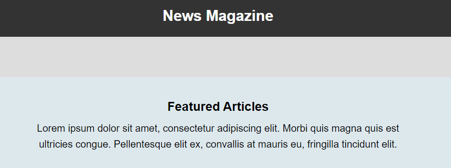
In this scenario, the CSS pointer-events: none; property is applied to the .disable-interaction class, effectively disabling cursor interactions for the <marquee> element. This ensures that users cannot click or perform other cursor interactions, allowing it to scroll smoothly without interruption.
Meanwhile, other sections of the webpage have their cursor interactions enabled. This means that users can interact with these elements by clicking, hovering, or performing other cursor-related actions. This enhances the usability of the webpage by allowing users to navigate through different sections and interact with various interactive elements while still maintaining a smooth scrolling experience for the breaking news section.
Background Gradient
A background gradient can instantly transform the look and feel of your website, adding depth and visual interest to the page. With CSS one-liners, you can easily implement stunning background gradients that capture attention and create a memorable user experience.
One sleek CSS one-liner to achieve this effect is:
.gradient-bg {
  background: linear-gradient(45deg, #FFA500, #FF4500);
}
This minimalist snippet creates a captivating gradient effect for your website’s background. The linear-gradient() function smoothly transitions between two colors, in this case, from #FFA500 (orange) to #FF4500 (red) at a 45-degree angle.
To apply this eye-catching gradient to your website’s background, simply add the .gradient-bg class to the appropriate HTML element:
<body class="gradient-bg">
  <!-- Your website content here -->
</body>
With this simple addition, your website will come to life with a vibrant background gradient that sets the tone and enhances the overall aesthetic.
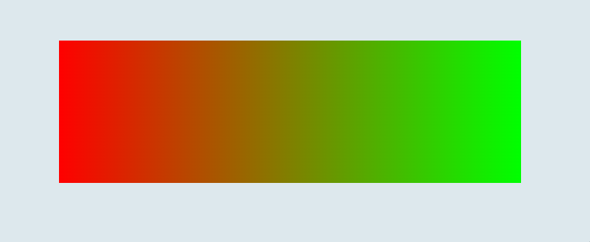
Whether it’s a subtle blend of complementary colors or a bold statement gradient, background gradients offer endless possibilities for creative expression and can elevate your website’s design to new heights.
Overflow property
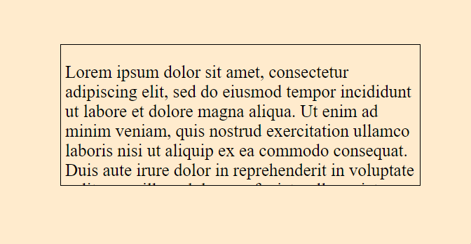
Overflowing content can sometimes disrupt the visual harmony of your design, creating clutter and distractions. However, with a simple CSS one-liner, you can ensure that any excess content within a container remains hidden, maintaining a clean and polished appearance.
Here are two examples—one with the overflow: hidden; property applied to a container and one without—to demonstrate the difference in visual appearance.
With the overflow property:
In this example, the .container div has overflow: hidden; applied to it. As a result, any overflowing content within the container is hidden from view.
<body>
  <div class="container">
    <p>
      Lorem ipsum dolor sit amet, consectetur adipiscing elit. Sed ut
      perspiciatis unde omnis iste natus error sit voluptatem accusantium
      doloremque laudantium, totam rem aperiam, eaque ipsa quae ab illo
      inventore veritatis et quasi architecto beatae vitae dicta sunt explicabo.
      Nemo enim ipsam voluptatem quia voluptas sit aspernatur aut odit aut
      fugit, sed quia consequuntur magni dolores eos qui ratione voluptatem
      sequi nesciunt. Neque porro quisquam est, qui dolorem ipsum quia dolor sit
      amet, consectetur, adipisci velit, sed quia non numquam eius modi tempora
      incidunt ut labore et dolore magnam aliquam quaerat voluptatem.
    </p>
  </div>
</body>
Apply this CSS one-liner to the container to achieve this effect.
.container {
  overflow: hidden; /* Hides any content overflowing the container */
}
This ensures that any excess space beyond the container’s boundaries is effectively concealed.
Without the overflow property:
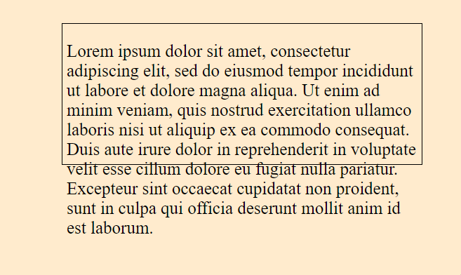
In this example, the .container div does not have overflow: hidden; applied to it. As a result, any overflowing content within the container is visible, protruding beyond the container’s boundaries.
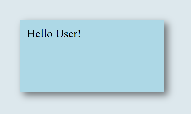
Box Shadow
Box shadows are a versatile tool in the web designer’s toolkit, allowing you to add depth and dimension to elements on your webpage. With a simple CSS one-liner, you can easily apply box shadows to elevate the visual aesthetics of your design.
.box-shadow {
  box-shadow: 5px 5px 10px rgba(0, 0, 0, 0.5);
}
This concise line of CSS code creates a subtle box shadow effect for the specified element. The box-shadow property accepts values for horizontal and vertical offset, blur radius, spread radius, and color. In this example, the shadow is positioned at 5px horizontally and 5px vertically, with a blur radius of 10px, and it uses a semi-transparent black color (rgba(0, 0, 0, 0.5)).
To implement this one-liner, add the .box-shadow class to the HTML element you want to apply the shadow to:
<div class="box-shadow">
  <!-- Your content here -->
</div>
By incorporating box shadows into your design, you can create visual depth and emphasis, making elements appear to lift off the page.
Whether it’s cards, buttons, or other UI elements, box shadows are a simple yet effective way to enhance the overall look and feel of your webpage.
Stacking Order
Controlling the stacking order of elements on a webpage is crucial for achieving the desired visual hierarchy and layout. With CSS one-liners, you can easily manipulate the stacking order of elements to ensure proper layering and presentation. Consider a webpage with multiple overlapping elements.
<div class="container">
  <div class="blue"></div>
  <div class="red"></div>
  <div class="green"></div>
</div>
Apply CSS to style the elements and control their stacking order.
.blue {
  z-index: 3; /* Higher stacking order */
}

.red {
  z-index: 2; /* Medium stacking order */
}

.green {
  z-index: 1; /* Lower stacking order */
}
In this example, the blue box has the highest stacking order (z-index: 3), so it will be displayed on top of the other boxes. The red box has a medium stacking order (z-index: 2), so it will appear between the blue and green boxes. Finally, the green box has the lowest stacking order (z-index: 1), so it will be displayed behind the other boxes.
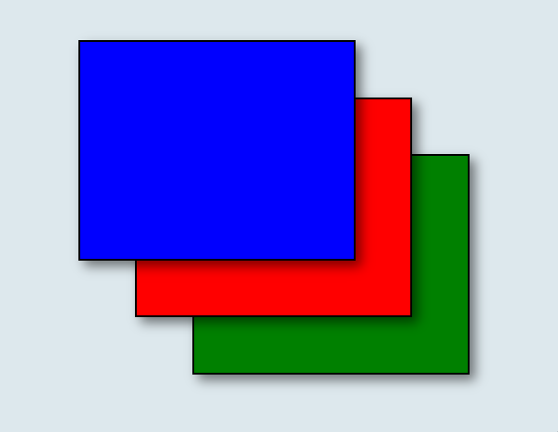
By adjusting the z-index property, you can control the stacking order of elements on your webpage, ensuring they are displayed in the desired arrangement. This is particularly useful when dealing with overlapping elements or creating complex layouts with multiple layers of content.
Conclusion
CSS one-liners offer a powerful and efficient way to enhance your web development workflow and elevate the visual appeal of your website. Throughout this article, we’ve explored a range of one-liners that address common design challenges and provide practical solutions for creating polished and engaging user interfaces.
From smooth scroll behavior and perfect circles to box shadows and stacking order, these one-liners enable you to achieve impressive visual effects with minimal effort. By incorporating these snippets into your projects, you can streamline your development process, reduce code complexity, and deliver a more immersive and user-friendly experience.
Truly understand users experience
See every user interaction, feel every frustration and track all hesitations with OpenReplay — the open-source digital experience platform. It can be self-hosted in minutes, giving you complete control over your customer data. . Check our GitHub repo and join the thousands of developers in our community..
