
CSS Flexbox and CSS Grid are two favored technologies developers use to create responsive and appealing web layouts. These methods have become the go-to solution for building scalable and flexible designs. But, deciding which one to use can be challenging. In this article, we’ll examine the distinctions between CSS Flexbox and CSS Grid. We will also help you decide which technology best suits your layout needs. Regardless of your experience level, this comparison will provide valuable insight into these layout options and how to use them to create stunning web pages.
CSS FlexBox
CSS Flexbox, or Flexible Box Layout, is a model of layout that works in one dimension. It enables developers to create flexible and responsive layouts that are easy to align and distribute within a container. Flexbox also allows you to control elements’ alignment, ordering, and sizing within a container. Once a container is set to use Flexbox, you can manipulate how the items within it are aligned and distributed. This is done along the main axis, determined by the flex-direction property, and the cross-axis perpendicular to the main axis.
FlexBox Properties
Some of the most commonly used Flexbox properties include:
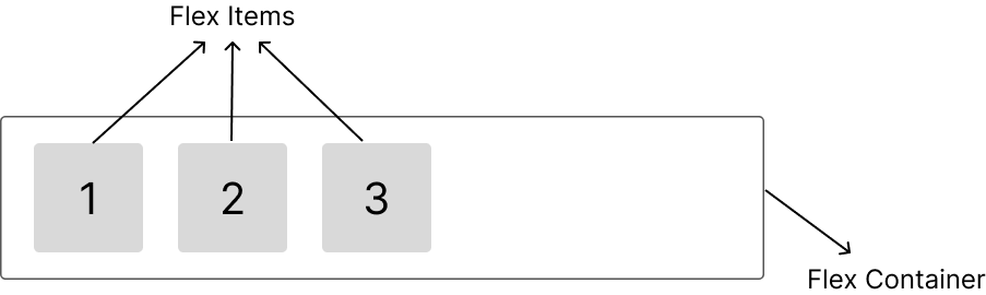
- Display: By setting the display property of a container to
flex, we create a flex container. This aligns all elements in the flex container horizontally and enables us to use all the properties associated with FlexBox. To illustrate, let’s use the code blocks below.
<div class="flex__container">
  <p class="one">1</p>
  <p class="two">2</p>
  <p class="three">3</p>
</div>.flex__container {
display: flex;
}Our flex-items aligned in a flex container:
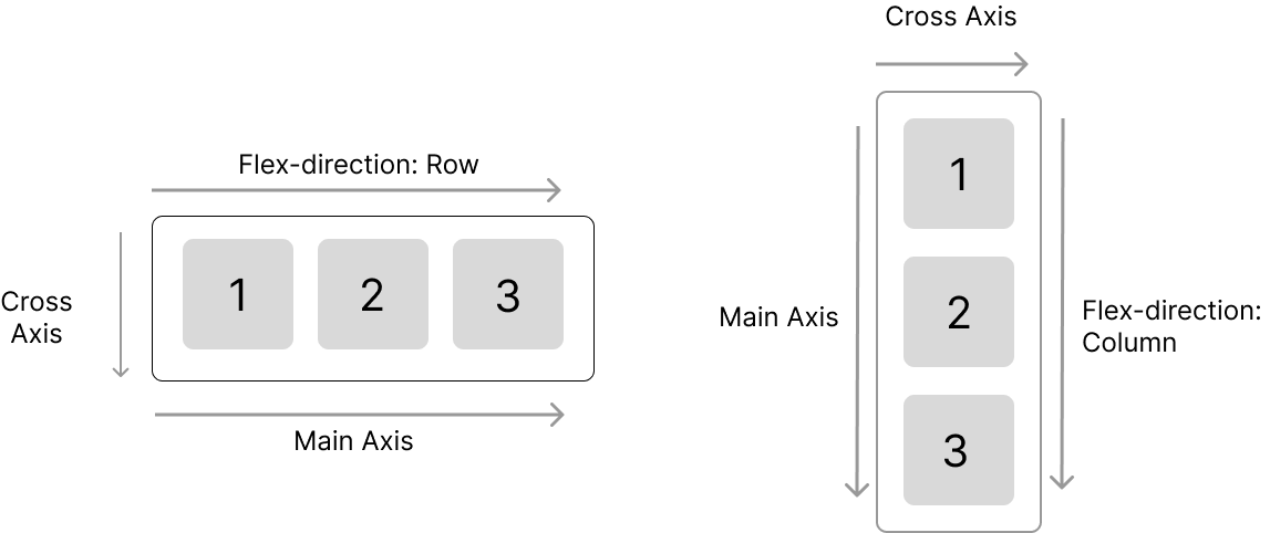
Flex-Direction: This property sets the direction of the main axis. This means it defines whether the items within the flex container should be laid out horizontally (in a row) or vertically (in a column). The most popularflex-directionproperties arerowandcolumn. Illustrating this with CSS gives;
.flex__container {
  flex-direction: row || column;
}
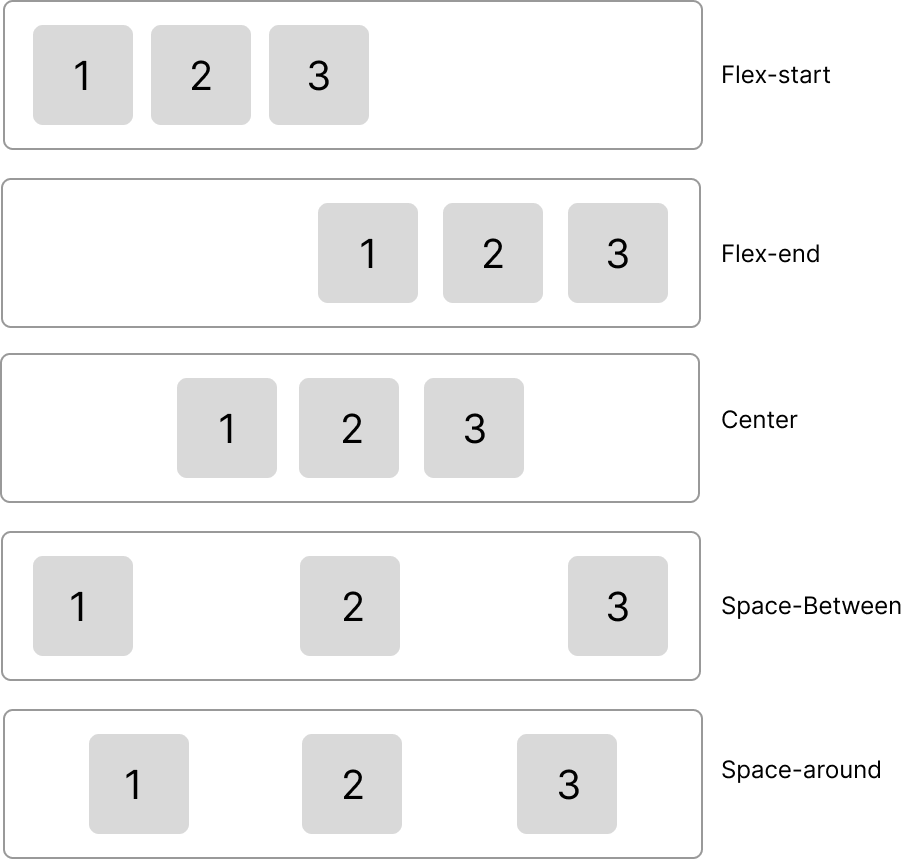
Justify-Content: This property aligns items along the main axis. It controls the space distribution between and around items, allowing you to center them, space them evenly, or align them to one side of the container. To illustrate this property’s various values and behavior, we use the code block and diagram below.
.flex__container {
 justify-content: flex-start || flex-end || center || space-between || space-around;
}
FlexBox Use cases
When building components, there are several useful use cases of FlexBox, such as;
- Navigation menus: Flexbox is great for creating navigation menus with a horizontal or vertical layout, with the menu items evenly spaced and aligned.
- Positioning elements: Flexbox is great for positioning items vertically or horizontally within a container, regardless of the item size.
- Responsive layouts: With Flexbox, you can create layouts that adjust to different screen sizes, with the items in the container shifting and adjusting their size as needed.
CSS Grid
CSS Grid is a layout system based on two dimensions, enabling developers to create more natural and flexible layouts with multiple rows and columns. With this system, we can construct a grid structure that comprises any number of rows and columns and then insert content into each cell of the grid. The grid can have rows and columns that are either fixed or flexible in size.
Grid Properties
Some of the commonly used Grid properties include:
- Display: By setting the display property of a container to
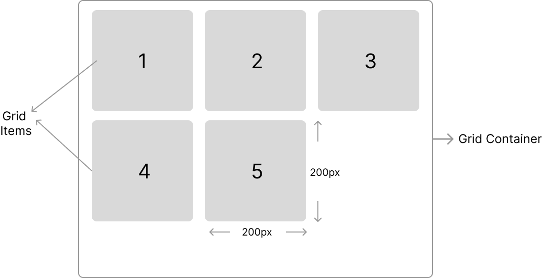
grid, we create a grid container, giving us access to all the properties associated with the grid. Grid-template-columns / Grid-template-rows: These properties are used to set the number and size of columns and rows in a grid container, respectively. To see the behavior of these properties, we use the code blocks and image below.
<div class="grid__container">
  <div class="one">1</div>
  <div class="two">2</div>
  <div class="three">3</div>
  <div class="four">4</div>
  <div class="five">5</div>
</div>.grid__container {
display: grid;
grid-template-columns: 200px 200px 200px;
grid-template-rows: 200px 200px;
}
Grid Use cases
When building layouts, there are several useful use cases of Grids, such as:
- Creating complex, multi-column layouts: With CSS Grid, you can create multi-column layouts by defining the number and size of columns and then placing content in any combination of cells.
- Designing magazine-style layouts: With CSS Grid, you can create magazine-style layouts with content that spans multiple columns and rows. You can even define named
grid areas, allowing you to place content in specific areas of the grid. - Creating masonry-style grids: CSS Grid makes it easy to create masonry-style grids, where items are arranged in a staggered or irregular pattern. This is useful for creating image galleries, portfolios, and other types of content.
- Building a Table Component: Another use case for CSS Grid is building table-like components, which are useful for displaying data in a tabular format on a web page. CSS Grid makes it easier to create these components because it allows for precise control over the layout and sizing of elements on the page.
Session Replay for Developers
Uncover frustrations, understand bugs and fix slowdowns like never before with OpenReplay — an open-source session replay tool for developers. Self-host it in minutes, and have complete control over your customer data. Check our GitHub repo and join the thousands of developers in our community.
Comparison of FlexBox and Grid
Similarities
Both of these CSS properties have some similarities, such as:
- They are both layout systems in CSS used to position and align elements on a web page.
- Both can create complex layouts and designs for web pages.
- Both use CSS properties to adjust the size and positioning of elements.
- Both can create responsive designs that work across a range of devices.
- Both share some properties such as display, justify-content, align-items and gap.
Differences
While Flexbox and Grid share some common properties, they also have some differences in functionality, such as:
| FlexBox | Grid |
|---|---|
| Flexbox is designed to create one-dimensional layouts (single-axis alignment.) | Grid is designed to create two-dimensional layouts (both horizontal and vertical alignment of elements.) |
Flexbox has properties like flex-direction that allows you to specify the direction of the axis | Grid has properties like grid-template-columns and grid-template-rows that allow you to specify the size and position of rows and columns. |
| For complex layouts, Flexbox allows the nesting of child flex containers within parent flex containers. | The nesting of grid containers is not currently supported in all browsers. |
In Flexbox, the order of the flex items can be controlled using the order property. This allows items to be visually re-ordered without having to change the markup. | Grid does not have a similar property, but you can control the order of items by changing their placement in the grid using the grid-column and grid-row properties. |
Browser Support
The browser support of web technology, in this case, Flexbox and Grid, refers to the extent to which the technology is supported by different browsers. This includes how well the browsers can render and interpret these CSS properties and how they adhere to the relevant standards and specifications.
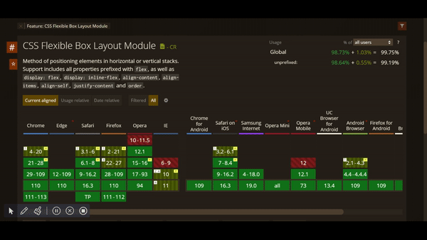
- Flexbox: Due to its longer history, Flexbox has wider browser support than Grid. All modern browsers, including Chrome, Firefox, Safari, Opera, Edge, and Internet Explorer 11 support it. However, some older versions of these browsers may have limited or partial support for Flexbox properties, as shown below.
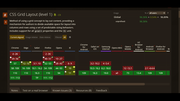
- Grid: Grid is a newer layout system that has been gaining popularity recently. While it has good support in modern browsers, it is not supported by all older browsers. All major browsers, including Chrome, Firefox, Safari, Opera, and Edge support grid. However, it has partial support in Internet Explorer 11, which is still used in some regions, as shown below.
Choosing Between FlexBox and Grid
Although both are powerful in their own right, Flexbox and Grid each have advantages and disadvantages, making them suitable for different layouts. Here is an overview of when to use Flexbox and Grid, coupled with several examples:
| FlexBox | Grid |
|---|---|
| Flexbox is ideal when you have a small layout design to implement with a few rows/columns. | Grid is perfect when you have a complex layout design to implement, with multiple rows and columns. |
| Flexbox is the ideal layout system to create web pages if you don’t know exactly how your content is going to look and just want everything to fit in. | Grid is ideal when you already have your layout design structure, as the two-dimensional layout system helps us use rows and columns together and position the elements the way we want. |
| Flexbox is more suited for building components like nav bars and small menus. | Grid is more suited for building components like image galleries, masonry grids, and magazine layouts. |
Combining Flexbox and Grid
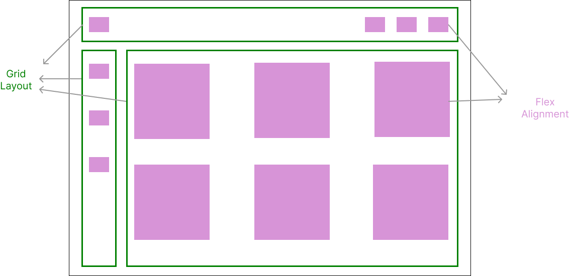
Applying the Flexbox-Alignment and Grid-Layout principles is a good technique when using these technologies. This involves using Flexbox to position elements in containers and provide ample spacing. Then using Grid for the layout (structure) of the entire webpage. Take the illustration below as an example.
Conclusion
In conclusion, CSS Flexbox and CSS Grid have unique strengths and weaknesses, making it important to understand the differences between the two before deciding which to use. Flexbox is most fitting for creating straightforward, one-dimensional layouts, while Grid is optimal for producing intricate, two-dimensional layouts. It is imperative to check the demands of your design, the level of browser support required, and the ease of implementation when deciding which layout system or combination of both to use. Understanding these differences allows you to generate stunning and responsive designs that distinguish your website. So go ahead, experiment with both, and create amazing designs!
Gain Debugging Superpowers
Unleash the power of session replay to reproduce bugs and track user frustrations. Get complete visibility into your frontend with OpenReplay, the most advanced open-source session replay tool for developers.