
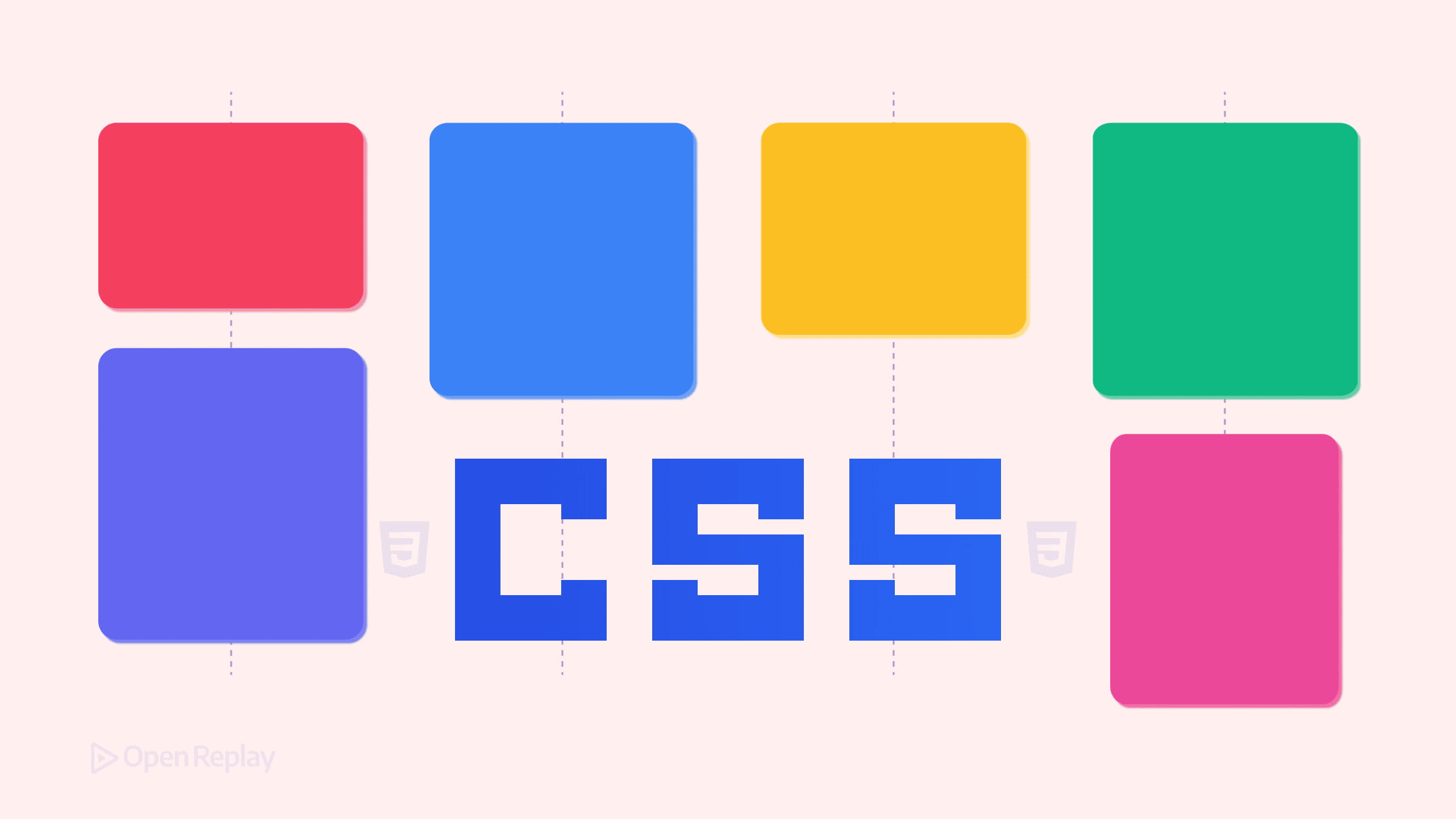
CSS Grid Lanes: The New Native Masonry Layout

You’ve built Pinterest-style layouts before. You’ve used JavaScript libraries, CSS multi-column hacks, or complex Grid workarounds with calculated row spans. Each approach works, but none feels native.
CSS Grid Level 3 is exploring native masonry-style behavior within Grid. One current proposal introduces display: grid-lanes as a possible syntax for this feature—but before you refactor your production code, you need to understand where things actually stand in early 2026.
This article covers the core concept behind CSS Grid Lanes, how it differs from traditional Grid, current browser support realities, and what you should consider before adopting it.
Key Takeaways
- CSS Grid Level 3 is exploring native masonry layout within Grid, including proposals such as
display: grid-lanes. - Masonry-style Grid differs from standard Grid by defining tracks on one axis, allowing items to pack tightly on the other axis.
- As of early 2026, browser support remains experimental and inconsistent across engines.
- A progressive enhancement strategy using
@supportslets you experiment safely while falling back to standard Grid. - Masonry layouts can disrupt keyboard navigation order, so accessibility testing is essential before shipping.
What CSS Grid Lanes Actually Does
Traditional CSS Grid operates on two axes simultaneously. You define both rows and columns, and items occupy explicit cells. This creates predictable, rectangular layouts—but it also leaves gaps when items have varying heights.
The CSS Grid Level 3 draft introduces masonry-style behavior, sometimes referred to as “grid lanes,” where you define tracks on one axis (typically columns) and items pack tightly on the other axis using a masonry-style algorithm. Items flow into whichever lane has the most available space, filling gaps automatically.
The current draft syntax under discussion looks like this:
.container {
  display: grid-lanes;
  grid-template-columns: repeat(auto-fill, minmax(250px, 1fr));
  gap: 16px;
}
However, syntax and behavior are still evolving. Earlier experiments used values like masonry within grid-template-rows or grid-template-columns, and some engines implemented prototype versions of those approaches. The CSS Working Group continues refining how masonry integrates into Grid Level 3. See the latest draft of the CSS Grid Layout Module Level 3.
How Grid Lanes Differs from Standard Grid
With display: grid, items respect both row and column tracks. Shorter items leave empty space below them until the next row begins.
With masonry-style Grid behavior, only one axis has defined tracks. Items on the other axis stack based on available space, not strict row boundaries. This creates the characteristic staggered appearance of masonry layouts.
Most familiar Grid features—such as defining column tracks and explicit placement—remain conceptually available, but implementations may vary while the feature is experimental. Behavior such as spanning and edge-case placement is not yet fully interoperable across engines.
Waterfall vs. Brick Layouts
Define columns with grid-template-columns, and items flow vertically—the classic waterfall layout. Define rows with grid-template-rows (in experimental implementations), and items flow horizontally in a brick-style pattern.
Details such as flow behavior and ordering controls are still under discussion in the spec and may differ between browser previews. Avoid relying on non-standard or draft-only properties unless you verify support in your target browser.
Browser Support: The Realistic Picture
Here’s where production planning gets complicated.
As of early 2026, native masonry behavior in CSS Grid remains experimental across all major browsers:
- Safari Technology Preview has one of the more complete prototype implementations.
- Chromium-based browsers have experimented with masonry-related syntax behind flags, including earlier
masonrytrack values. - Firefox has implemented masonry experiments behind configuration flags.
No major stable browser channel offers fully interoperable, unflagged support at the time of writing. You can track compatibility status via Can I use and browser release notes.
The CSS Working Group continues refining integration details within Grid Level 3.
The practical takeaway: Do not ship masonry-style Grid syntax to production without fallbacks.

Discover how at OpenReplay.com.
Progressive Enhancement Strategy
Feature detection lets you experiment where supported while falling back gracefully:
.container {
  display: grid;
  grid-template-columns: repeat(auto-fill, minmax(250px, 1fr));
  gap: 16px;
}

@supports (display: grid-lanes) {
  .container {
    display: grid-lanes;
  }
}
Browsers without support render a standard Grid layout. Items align to rows instead of packing tightly—an acceptable baseline for many use cases.
Because syntax may change before stabilization, treat this as progressive enhancement rather than a long-term production dependency.
Accessibility and Source Order Concerns
Masonry layouts introduce a DOM-versus-visual-order problem. Items appear in positions determined by the packing algorithm, not their source order. A user tabbing through content may jump unpredictably across the layout.
This is not unique to Grid Lanes—it is inherent to masonry-style layouts. You should test keyboard navigation thoroughly, especially for content where reading sequence matters.
Screen readers follow DOM order regardless of visual placement. Ensure your HTML structure makes sense when read linearly.
Conclusion
For experiments, prototypes, and progressive enhancement layers, masonry-style Grid behavior is worth exploring now. The direction is becoming clearer within Grid Level 3, and hands-on experience today pays off when browser support matures.
For production features requiring consistent cross-browser behavior, hold off. Monitor spec discussions and browser implementation notes before committing.
Native CSS masonry has been a long-standing request. It is finally taking shape—but it is not fully standardized or interoperable yet. Verify browser support matches your requirements before adopting it widely.
FAQs
Not reliably. As of early 2026, masonry-style Grid behavior remains experimental across major browsers and may require preview builds or flags. Use a progressive enhancement strategy with @supports so unsupported browsers fall back to standard CSS Grid.
They represent different proposals and experimental syntaxes for native masonry behavior within CSS Grid. Earlier experiments used masonry track values (such as masonry in grid-template-rows), while more recent drafts explore display: grid-lanes. The syntax is still evolving, and browsers are not yet fully aligned.
It can. The packing algorithm places items based on available space rather than strict row order, so tab order may not match visual order. Always test keyboard navigation and ensure your DOM order reflects a logical reading sequence.
Use @supports to detect grid-lanes and wrap it in a conditional block. Set display: grid as your default layout with the same grid-template-columns and gap values. Browsers that support grid-lanes will override the default. Those that do not will render a standard Grid layout with row-aligned items instead of masonry packing.
Truly understand users experience
See every user interaction, feel every frustration and track all hesitations with OpenReplay — the open-source digital experience platform. It can be self-hosted in minutes, giving you complete control over your customer data. . Check our GitHub repo and join the thousands of developers in our community..
