CSS Image Reflections: A Comprehensive Guide

Adding extra pizzazz to your site usually pays dividends, and this article will show you how to implement image reflections with just CSS.

Discover how at OpenReplay.com.
It’s hard to find any website today that doesn’t use some form of visual representation. Visuals, especially real images, help to tell stories on our sites, so they are pretty important.
CSS image reflection is one eye-catching trick to improve how you display your website images. This technique creates a cool effect on your site by making the image appear at a particular position as though it’s looking at a mirror or a pool of water. It looks something like this:
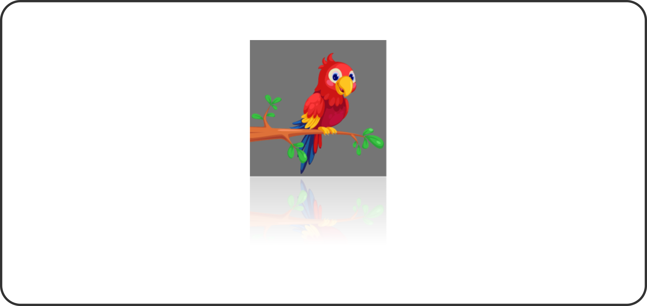
But why should you add this effect to your website? Which images can benefit from this? And, if it suits your website, how can you implement it in your code? These are the questions I will answer in this article. If you are curious, let’s get right into it.
Understanding CSS Image Reflections
In web design, image reflections are duplicates of the original image, appearing in a way that makes them look like they are standing by the side or beneath a mirror surface or water. This unique view makes it appear cool on any image background or product surface, thus improving the overall user experience of such a page.
Use Cases for Image Reflections
Image reflections are very versatile and can be useful in many scenarios; some common places include:
- Product showcases: Apple has used this particular technique for some of their products, and the reason is not far-fetched. The faded part of the image creates an immersive experience for potential customers when they view the product, thus making it more desirable.
- Portfolios: Stop showcasing your work in such a boring way and spice it up with some reflection. This will make it nice to look at and even click on.
- Hero sections: This is usually more beautiful when the hero image is used in the background with its reflection. It just makes your site feel fresh and unique.
- Social media posts: Adding a bit of reflection to your uploaded images can increase engagement and views on your social posts.
Importance in Modern Web Design
Why should you even bother learning this? Let’s look at how image reflection can benefit your website.
- Enhancing Aesthetics: They add a touch of beauty to your website, making it look polished and sleek. When done well, this is always a cool effect to look at.
- Creating Visual Depth: Adding reflections to your key images can make them appear more real and immersive, boosting user engagement on your site.
- Enhancing Visibility: It’s hard to look past an image with a reflection, no matter how soft or subtle it is. That’s why they are often used to grab users’ attention to a particular product image or to communicate more in the hero section.
- Improving User Engagement: Since they draw attention, reflections are used strategically to improve the user experience on your site, leading to higher conversions and sales.
Different CSS Techniques for Image Reflections
Let’s examine some ways to achieve this CSS image reflection on our websites. We will start with the basic methods before moving to the advanced ones.
Using the box-reflect Property
The box-reflect property is the most basic CSS technique to create image reflections. It allows you to specify the position (below, top, right, left), color, and size of the reflection you want on your web image.
Basic syntax:
-webkit-box-reflect: below 2px #fff;The above code creates a reflection directly below the image, with a 2-pixel blur and a white color.
Offset image reflection:
.image-with-offset {
  -webkit-box-reflect:: below 5px inset linear-gradient(to bottom, rgba(0, 0, 0, 0) 0%, rgba(0, 0, 0, 0.2) 100%);
}
The code above applies a reflection to an image with a 5px offset that fades from transparent to 20% black opacity.
Reflections with gradients:
.image-with-gradient {
  -webkit-box-reflect: below 1px linear-gradient(to bottom, rgba(0, 0, 0, 0) 0%, rgba(0, 0, 0, 0.5) 50%, rgba(0, 0, 0, 0) 100%);
}
The code above applies a linear gradient to the reflection of an image below it.
To help you further understand, let’s add all of this into one big example and show you what it looks like. First, let’s set up the HTML structure using the img tag like this:
<img class="reflect" src="./bird.png" alt="Image" />Now, let’s use CSS to reflect our added bird image. Like this:
.reflect {
  width: 300px;
  height: auto;
  -webkit-box-reflect: right 0px linear-gradient(transparent 5%, rgba(255, 255, 255, 0.3));
}
This code creates a reflection on the right side of the original image with a subtle transparent gradient.
When done right, your output should look something like this:
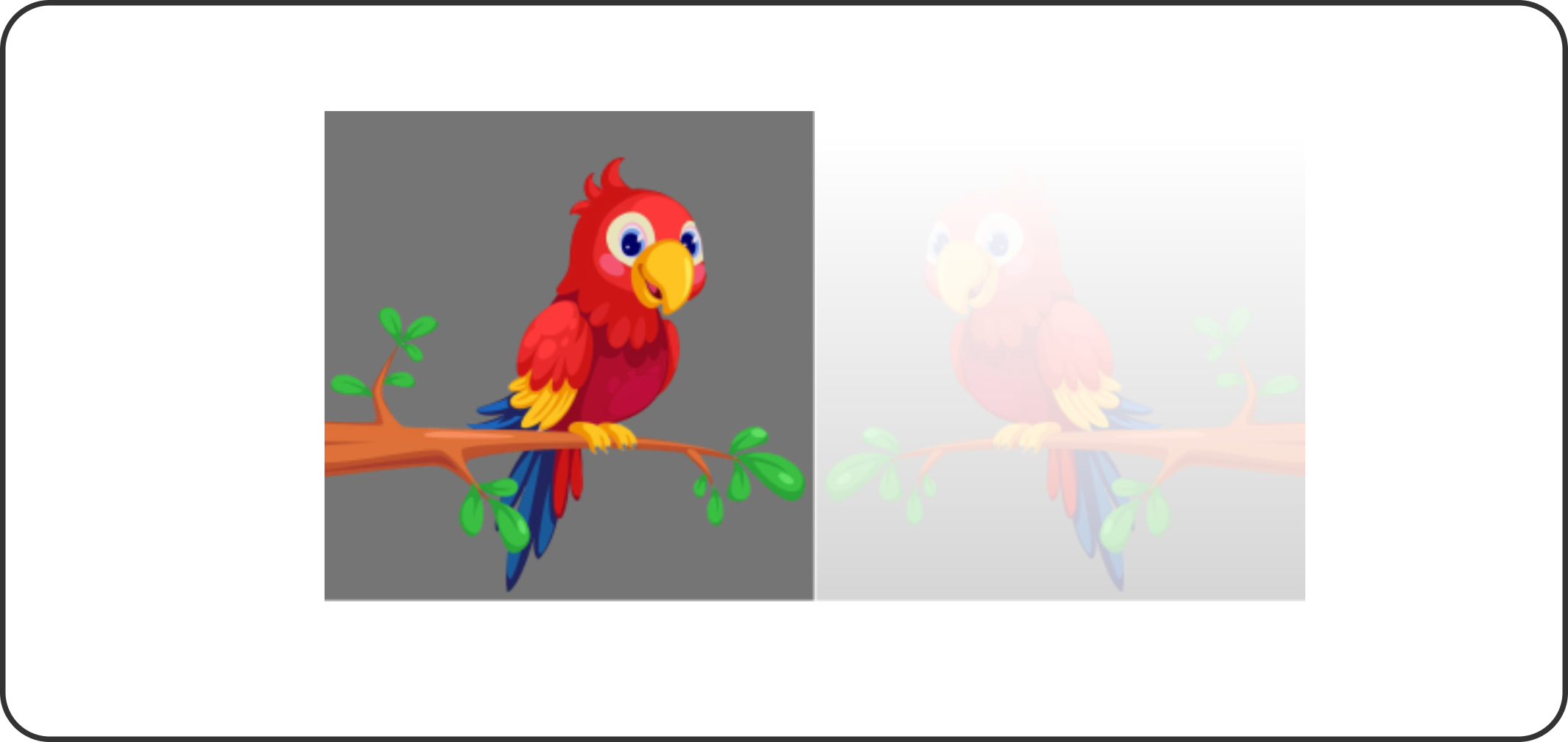
A right side reflected image.
You are free to customize the angle, distance, and other properties of the reflection effect as you like.
The box-reflect technique is great, but it has one downside: it works only on WebKit-based browsers like Safari and Chrome. Let’s move on and see some other advanced techniques we can use to achieve the same thing but in a better way.
Using transform with scaleY and opacity
This particular technique uses CSS transform to flip the image vertically before using the box-shadow and opacity to help create that subtle effect we see on the reflected part. Let’s set it up so that we can better understand it.
<div class="image-container">
  <img src="./bird.png" alt="Image" />
  <img class="reflection" src="./bird.png" alt="Image Reflection" />
  </div>
We uploaded two images with the class image-container in this code. The first will be the original, and the second will be used to create the reflection effect.
.image-container {
  position: relative;
  width: 300px;
  height: auto;
}
.image-container img {
  width: 100%;
}
.reflection {
  position: absolute;
  bottom: -100%;
  display: block;
  left: 0;
  width: 100%;
  transform: scaleY(-1);
  opacity: 0.3;
  filter: blur(2px);
  mask-image: linear-gradient(transparent, black);
}
In the above code, the .transform class helped to apply the reflection effect on the second image below it. The transform: scaleY(-1) did the flipping, and the mask-image property added a subtle fading effect to the image.
Output:
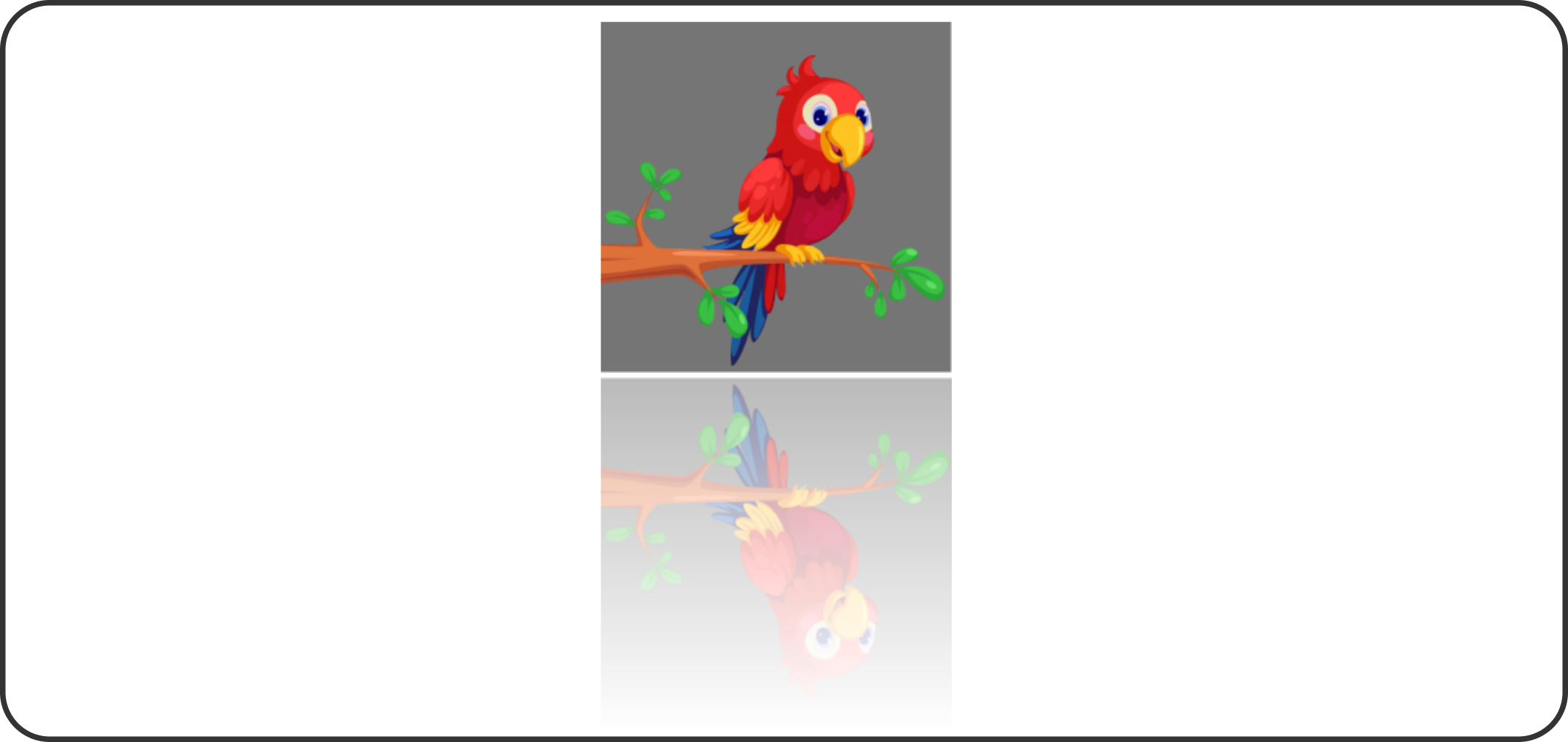
A reflected image with its bottom side faded.
Using a Pseudo-Element and transform
This technique is similar to the ‘transform and opacity’ technique since it still uses two images: one as the original image and the other to create the desired reflection effect.
In this method, though, we will use a pseudo-element (::after) along with the transform property to create the reflection beneath the image.
Code example:
<div class="reflect">
  <img src="./bird.png" alt="Image" />
  </div>
This code has a div class named reflect that houses the first image.
.reflect {
  position: relative;
  width: 300px;
  height: auto;
}

.reflect img{
  width: 100%;
}

.reflect::after {
  content: "";
  position: absolute;
  bottom: -100%;
  left: 0;
  display: block;
  width: 100%;
  height: 100%;
  background: url('./bird.png') no-repeat;
  background-size: cover;
  transform: scaleY(-1);
  opacity: 0.5;
  mask-image: linear-gradient(transparent, black);
}
In the code above, the ::after pseudo-element adds a vertical flip and a semi-transparent reflection to the image below it, while the mask-image ensures the reflection slowly fades away.
Output:
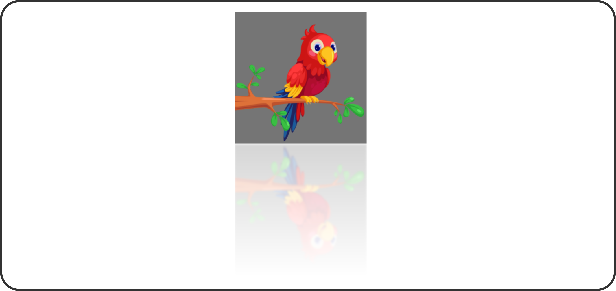
The image above has a reflection that is flipped with a semi-transparent downside of the original image.
Combining Reflections with Other CSS Effects
As we have seen so far, adding reflection to images seems cool, but you can also go overboard by combining it with other CSS effects like animation, shadows, and borders.
Note: These extra features are not necessary, so I strongly warn against using them for actual site development since they do not help your site’s user experience at all. For the sake of practice, let’s see how we can still achieve it.
Shadows
Shadows add depth to your image. When used in image reflection, they make it appear as if it’s floating above the background in a nice and sleek way. When paired with transparency, they give your image a three-dimensional look that works well when creating product showcase websites where you want more users to focus on a particular image.
Code example:
img {
  -webkit-box-reflect: below 5px linear-gradient(transparent, transparent 50%, rgba(0,0,0,0.2));
  box-shadow: 0 10px 20px rgba(0, 0, 0, 0.3);
}
The -webkit-box-reflect property in the code above handles the image reflection, while the box-shadow property creates the shadow beneath it.
Output:

A reflected web image with a shadow makes it look realistic and visually appealing.
Borders
Borders add frame to your image. When used in your image reflection, they appear as if they are sitting on a surface or on the ground, giving them this decoration look and depth.
Code example:
img {
  border: 10px solid #ccc;
  -webkit-box-reflect: below 5px;
}
In the code, the -webkit-box-reflect handles the image reflection while the border property adds the frame weight to the image and its reflected part.
Output:

An image reflected with thick borders on both sides.
Animations
Adding animation to your image reflection can make it lively and interactive. For example, let’s add a hover effect animation to our bird image reflection so that it fades out completely when hovered on top. Something like this:
img {
  -webkit-box-reflect: below 5px linear-gradient(transparent, transparent 50%, rgba(0,0,0,0.2));
  transition: -webkit-box-reflect 0.5s ease-in-out;
}

img:hover {
  -webkit-box-reflect: below 10px;
}
In this code example, we created an image animation that turns the reflected image transparent whenever you hover over it.
Output:
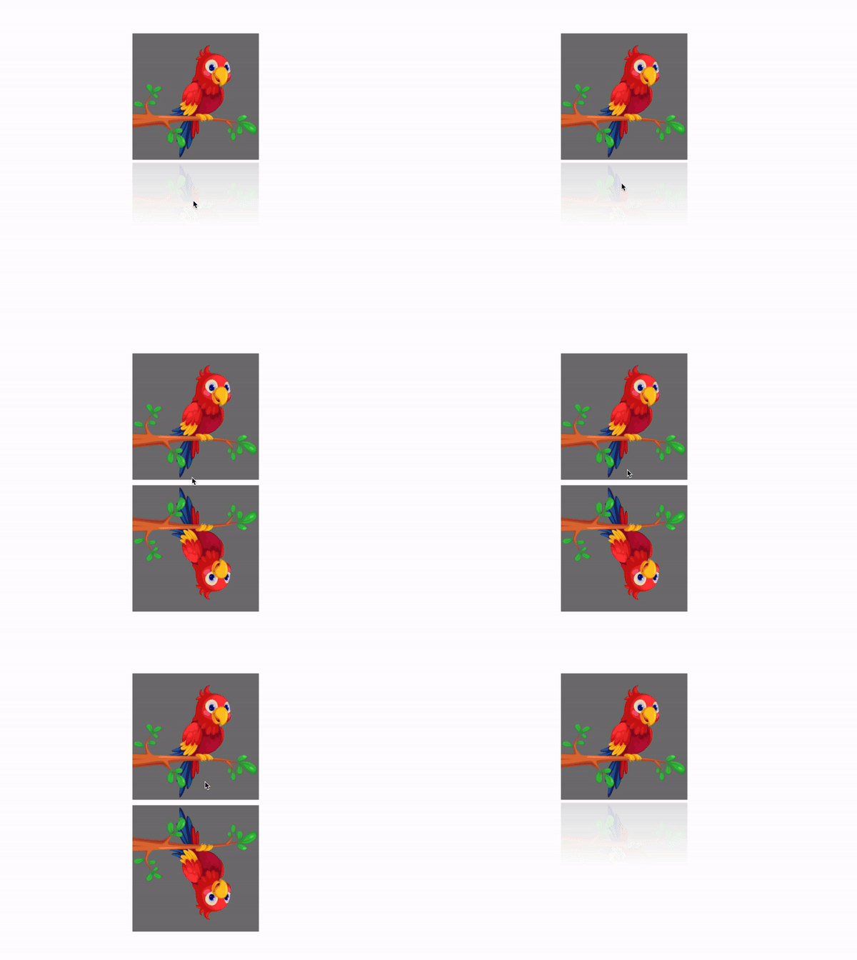
On hover, the reflected image effect is shown without its fades.
Real-World Examples
Let’s look at how some real websites have used image reflection to improve user experience on their own pages.
Apple’s Product Pages
Apple is known for its clean and simple designs. Most often, using a subtle image reflection tool to add a luxurious look to their products when displaying them. For example, the Vision Pro was showcased using a faint reflection beneath it, thus making it look as if it’s floating on a glossy surface like the image below:

Source: alamy
Portfolio Websites for Designers and Photographers
Many designers and photographers use the image reflection technique to showcase their work in their portfolios. For instance, a photographer might use the image reflection feature in their site photo gallery to dynamically display their images for prospective buyers.

Source: Reflected image
Best Practices and Optimization
While it is good to add images to your site, keep in mind that too much can slow down its performance. Here’s how to achieve a smoother user experience when using image reflection techniques.
Optimize Image Sizes
The larger the image, the longer your users have to wait for it to load. Optimize images by slightly compressing their files so that they can still appear nice on your website and load much faster for a good user experience.
Use Reflections Sparingly
Use image reflection strategically. It’s not every single place you can add an image reflection to. Think about where it will make the most impact when adding it to your website, like showcasing your product or any important visuals. Adding it everywhere will make your site feel clustered and slow down performance, too.
Accessibility Considerations
When designing, it’s a good thing to consider every single person in your design. One way you can actually do this is by keeping it purely visual. Don’t link or add any extra functionality to the reflected image background since someone using screen readers won’t be able to read or benefit from it.
Also, keep contrast in mind. Reflected images can sometimes lose their contrast when compared to the original one. This can cause users to be unable to distinguish or even see the reflection, especially if it is on a white background. To prevent this, make sure your website images are well contrasted so that they can easily be seen.
Conclusion
CSS image reflection will always be a great way to elevate your site visuals. You can use the basic method, using the box-reflect property, or spice things up by adding gradients, shadows, transforms, and pseudo-elements.
Whichever approach you choose, always have it in mind that a little reflection can make all the difference, so don’t go too much with it and just keep it subtle.
Now, go ahead and try some of the examples discussed here in your next project and see how small image reflection effects can bring life back into your web designs.
Gain control over your UX
See how users are using your site as if you were sitting next to them, learn and iterate faster with OpenReplay. — the open-source session replay tool for developers. Self-host it in minutes, and have complete control over your customer data. Check our GitHub repo and join the thousands of developers in our community.

