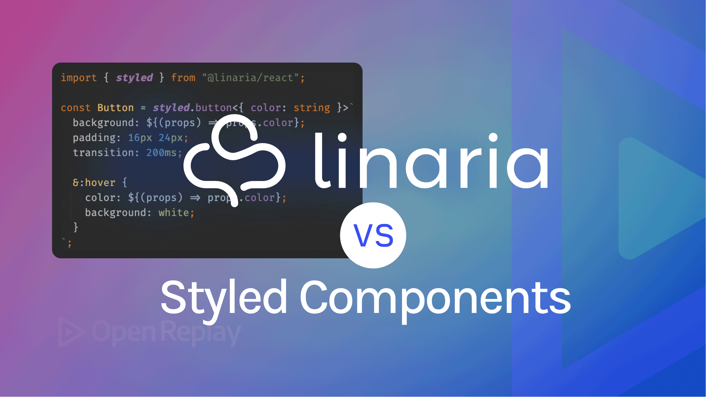
CSS-in-JS for React: Linaria vs. Styled Components
A comparison of two top CSS-in-JS solutions for React

When building a web application with React, one of the challenges apart from implementing the main logic of the application is styling and choosing the appropriate styling solutions for your application. This is because there is a need to consider the maintainability of styles, the fluidity in using them, and the impact of the styles on the application’s performance. These considerations have driven many to choose CSS-in-JS solutions. CSS-in-JS solutions leverage javascript in styling applications. This has benefits as it improves maintainability, brings in modularity in styling, and introduces “Dynamic styling” to applications. There are various CSS-in-JS solutions. However, we will take a look at the two most popularly used solutions, which are Linaria and Styled-components.
In this tutorial, We will be reviewing two(2) popular CSS-in-JS solutions: Linaria and Styled components. we will take a look at their features as well as make comparisons between them based on features, performance, and ecosystem.
CSS-in-JS Solutions
CSS-in-JS solutions provide us with a new method for writing CSS. These solutions do this by using APIs that leverage JavaScript as a language to create and author styles. Some of the advantages of CSS-in-JS solutions include:
- Dynamic Styling: they enable the developer to write dynamic CSS
- Element Scoping: With these solutions, you can scope styles to certain elements of your choice.
- Dead code elimination: they eliminate the availability of redundant CSS codes in your application.
- Support for theming in applications built with them.
- Ease of Installation and setup.
- ES modules and scope.
- Increased ease in writing unit tests.
- Performance improvements.
- SSR (server-side rendering).
- Full CSS support.
Linaria
Linaria is one of the most popular CSS-in-JS solutions. It has over 7.1K GitHub stars and 260 GitHub forks. Linaria is a Zero-Runtime CSS in JS which means that it converts the CSS-in-JS codes into a separate .css file while creating the build for production. This is similar to how most CSS preprocessors, like SASS and LESS, operate.
It offers many Features, which are:
- It offers an API for creating simple CSS classes. The “CSS” API allows us to create styles of choice. It also provides a template literal after the styles where we can add dynamic values associated with the style present in the class.
import { css } from '@linaria/core';

// Write your styles in `css` tag
const header = css`
  text-transform: uppercase;
  .......
`;

// Then use it as a class name
<h1 className={header}>Hello world</h1>;
- It offers an API that enables the creation of elements. The “styled” API allows us to create any element of choice like heading elements, divs, paragraphs, and many more.. it also provides a template literal after the element where we can add dynamic values associated with the element’s styles.
import { styled } from '@linaria/react';

const Container = styled.div`
  ... your styling goes in here
`;- it offers a familiar CSS syntax with Sass.
import { styled } from '@linaria/react';

const Container = styled.div`
  font-size: 35px;
  color: red;
  border: 1px solid red;

  &:hover {
    border-color: blue;
  }

  h1 {
    margin-bottom: 24px;
  }
`;
- It makes arrangements for Dynamic styling using props in React or regular variables. In the code below, we pass a prop from a React component into the element which will be rendered on that element. Also, we pass some styling parameters as regular variables, which will be rendered on the element’s styles.
import { styled } from '@linaria/react';

// Write your styles in `styled` tag
const Title = styled.h1`
  font-family: ${families.serif};
`;
const medium = 30

const Navbar = styled.nav`
  font-size: ${medium}px;
  color: ${props => props.color};
  border: 1px solid red;

  &:hover {
    border-color: blue;
  }

  ${Title} {
    margin-bottom: 24px;
  }
`;

// Then use the resulting component
<Navbar color="#333">
  <Title>Hello world</Title>
</Navbar>;
Other features include:
- Easily find where the style was defined with CSS source maps.
- Enabling Linting of CSS in JS code with
[stylelint](https://github.com/stylelint/stylelint). - Supports atomic styles with
@linaria/atomic.
To investigate the features and API available on Linaria, visit here.
Styled-Components
Styled-Components is one of the most popular CSS-in-JS solutions. It has over 37.2K GitHub stars and 2.3K GitHub forks. Styled-components enables you to write actual CSS code to style your components. It also creates a layer of abstraction between components and styles, thereby eliminating the direct mapping between them.
It offers many features, which include:
- Automatic critical CSS and Code Splitting: Styled-components monitor components and inject styles necessary for the component when the components are rendered on a page. It also enables code splitting, which improves the load time of components.
- Generates Unique classNames for your styles to prevent duplication, misspelling, and redundant styles.
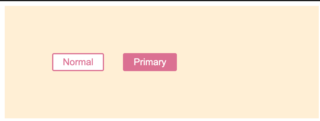
- Dynamic Styling- Styled component provides an API that also enables the creation of elements and styles that can accept dynamic values from props or variables. The “styled” API enables us to create elements of choice. Just like Linaria, it also provides a template literal after the element where we can add dynamic values associated with the styles of the element.
import React from 'react';
import styled from 'styled-components';

const Button = styled.button`
  /* Adapt the colors based on primary prop */
  background: ${props => props.primary ? "palevioletred" : "white"};
  color: ${props => props.primary ? "white" : "palevioletred"};

  font-size: 1em;
  margin: 1em;
  padding: 0.25em 1em;
  border: 2px solid palevioletred;
  border-radius: 3px;
`;

render(
  <div>
    <Button>Normal</Button>
    <Button primary>Primary</Button>
  </div>
);
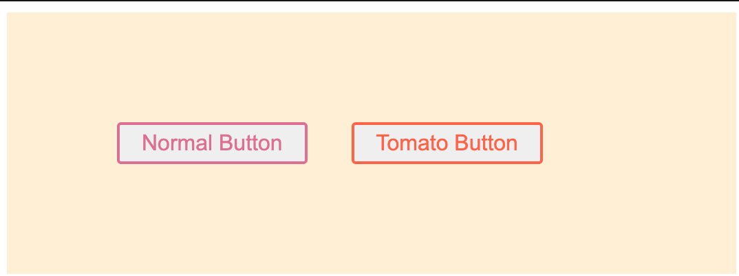
- Style Extension: Styled-components let us extend styles from already existing styles.
import React from 'react';
import styled from 'styled-components';

// The Button from the last section without the interpolations
const Button = styled.button`
  color: palevioletred;
  font-size: 1em;
  margin: 1em;
  padding: 0.25em 1em;
  border: 2px solid palevioletred;
  border-radius: 3px;
`;

// A new component based on Button, but with some override styles
const TomatoButton = styled(Button)`
  color: tomato;
  border-color: tomato;
`;

render(
  <div>
    <Button>Normal Button</Button>
    <TomatoButton>Tomato Button</TomatoButton>
  </div>
);
Other features include:
- Ease of Maintenance.
- Easier deletion of CSS.
- Supports concurrent Server-side Rendering with stylesheet rehydration.
- Supports Theming.
To investigate more about the features and API available on Styled-components, visit here.
Session Replay for Developers
Uncover frustrations, understand bugs and fix slowdowns like never before with OpenReplay — an open-source session replay tool for developers. Self-host it in minutes, and have complete control over your customer data. Check our GitHub repo and join the thousands of developers in our community.
A Comparison of Linaria and Styled-Components
While Linaria and Styled-components are popular CSS-in-JS solutions, there usually arise cases where developers are in a loop in a bid to decide which of these solutions is best suited for their projects. Here we will review these solutions based on three parameters: features, performance, and ecosystem.
Features
- Linaria is a zero runtime CSS-in-JS solution, which implies that its CSS is extracted to CSS files during the build as opposed to Styled-components which utilizes Javascript to inject the CSS during the build.
- Linaria and Styled-components both possess familiar CSS syntax with Sass-like nesting.
- They also use dynamic prop-based styles with the React bindings, and use CSS variables behind the scenes.
- You can easily find where a style was defined with CSS source maps.
- Linting your CSS-in-JS with stylelint is possible with both solutions.
- They both use JavaScript for logic; no CSS preprocessor is needed.
- It is possible to Optionally use any CSS preprocessor such as Sass or PostCSS with both solutions.
Looking at their features and API, we can see that their features and API follow a similar convention. This means one can migrate to either of the CSS-in-JS solutions with little effort.
Performance based on requests
- Since Linaria is a Zero-Runtime CSS in JS, it converts the CSS-in-JS codes into a separate .css file while creating the build for production. This causes an increase in the CSS file size, CSS payload, and CSS requests made.
- For Styled-Components, while there is a decrease in CSS file size, payload, and request, there is a sufficient increase in the Javascript bundle size.
Many argue that the increase in CSS size in Linaria is negligible and is a better trade-off since it doesn’t bloat the Javascript bundle size as compared to Styled-Components while others argue that the increase in CSS size increases the chances of the presence of unused styles in the CSS files which could create redundancy.
To see more on the network benchmark used, visit here.
Performance based on Page load
On Interpolating various page-load benchmarks, it is seen that pages built with Linaria are rendered faster than Styled-Components. One of the reasons could be appropriated to the fact that the increased javascript-bundle size of styled components impacted the page’s performance and that while Linaria loads more CSS resources, they are not intensive and may not affect page performance as much as the increased javascript bundle size present in Styled-Components.
To see more on the network benchmarks used, visit:
- https://pustelto.com/blog/css-vs-css-in-js-perf/#lighthouse-performance-audit
- https://github.com/geeky-biz/css-in-js-benchmark?ref=reactjsexample.com#page-loading-performance
Performance based on Rendering and User interaction
On benchmarks comparing user interaction such as drag and drop activity and re-rendering, results show that Linaria had less scripting, painting, and rendering time compared to Styled-components.
To see more on the rendering and interactions benchmarks, visit:
- https://github.com/geeky-biz/css-in-js-benchmark?ref=reactjsexample.com#re-rendering-performance
- https://pustelto.com/blog/css-vs-css-in-js-perf/#comparing-user-interaction
Ecosystem
With over 37.2K GitHub stars, 2.3K GitHub forks, and over 4 million weekly downloads on NPM, Styled-components is said to have the largest ecosystem on CSS in JS Solutions compared to Linaria’s 7.1K GitHub stars, 260 GitHub forks, and over 16,000 downloads weekly. This implies that there is a larger community around Styled-components which, of course, comes with benefits like a low learning curve, increased availability of resources, solutions to issues encountered on Github and Stack-overflow, and many more.
Conclusion
In this tutorial, we looked at CSS-in-JS solutions and the features and available APIs of our case study solutions - Linaria and Styled-components. We also compared both based on Features, Performance, and Ecosystem.
Resources
- CSS vs CSS-in-JS solutions: https://pustelto.com/blog/css-vs-css-in-js-perf/
- CSS-in-JS benchmarks: https://github.com/geeky-biz/css-in-js-benchmark?ref=reactjsexample.com
- Comparing Linaria CSS extraction approach to Styled-components’s CSS injection: https://github.com/styled-components/styled-components/issues/2377
- Styled-components docs: https://styled-components.com/docs
- Linaria docs: https://github.com/callstack/linaria#installation
- Static CSS Extraction: https://github.com/styled-components/styled-components/issues/1018
A TIP FROM THE EDITOR: For a review of more CSS-in-JS solutions, don’t miss our 5 CSS-In-JS Frameworks To Use article!
Gain Debugging Superpowers
Unleash the power of session replay to reproduce bugs and track user frustrations. Get complete visibility into your frontend with OpenReplay, the most advanced open-source session replay tool for developers.