CSS Scroll Progress Animations: Mastering the Technique
Learn how to add a CSS scroll animation to your website

In the dynamic realm of web design, utilizing innovative elements to enhance the user experience is a pivotal aspect. Among these, CSS scroll progress animations have emerged as a compelling technique, which offers a visually engaging way to track and display a user’s progress while navigating through web content. Web developers integrate these animations to create a seamless and intuitive browsing experience. This article will explore the realm of CSS scroll progress animations, an innovative approach used in web design to enhance the user experience through visually engaging and informative scrolling indicators and animations, showing how to transform static web pages into dynamic and engaging experiences.

Discover how at OpenReplay.com.
CSS scroll progress animations are a new technique for creating dynamic and engaging web experiences. They allow developers to link animations to the scroll progress of a page, creating smooth and efficient effects directly tied to the user’s interaction. By employing various CSS properties and transitions, web developers integrate these animations to create a seamless and intuitive browsing experience. This technique helps to Improve the following in web apps:
- User engagement: Keeps users engaged by providing visual feedback on their progress while scrolling.
- Navigation: Helps users comprehend the length and position of content on a webpage.
- User experience: Enhances overall user experience by clearly indicating the content’s length and position.
- Usability: Makes it easier for users to navigate through lengthy web pages.
- Visibility of scrolling: Provides a visual representation of how much content is left to read, reducing the ambiguity while scrolling.
- Aesthetic enhancement: Adds an attractive and modern visual element to the website.
Here are some websites where css scroll progress animations were used -
Now that we know what a CSS scroll progress web animation is, its benefits, and some real-world examples, let’s create one ourselves.
Let’s first establish our file structure. We will be creating two files. These files are css_scroll_animation.html and css_scroll_animation.css. Our file structure will look this way.
project root

   ├── css_scroll_animation.html
   |
   |── css_scroll_animation.css
   │
   |
HTML structure for scroll progress animation
css_scroll_animation.html file
<!DOCTYPE html>
<html>
<head>
<title>Scroll Progress Animation</title>
<link rel="stylesheet" type="text/css" href="/css_scroll_animation.css" />
</head>
<body>
<div class="wrapper">
<figure>
<img
src="https://img.freepik.com/free-photo/cascade-boat-clean-china-natural-rural_1417-1356.jpg?w=740&t=st=1698915682~exp=1698916282~hmac=4b5284528580dd237ddd95c13dcadef972ce26a5fbe1e6abe4bd221b65985fbd"
alt=""
/>
</figure>
<figure>
<img
src="https://img.freepik.com/free-photo/wide-angle-shot-single-tree-growing-clouded-sky-during-sunset-surrounded-by-grass_181624-22807.jpg?w=740&t=st=1698915748~exp=1698916348~hmac=a9d04389cd2c221e4ac27ee2add0326a80fdce23a71d7885ca48c5f7a46a07b4"
alt=""
/>
</figure>
<figure>
<img
src="https://img.freepik.com/free-photo/painting-mountain-lake-with-mountain-background_188544-9126.jpg?w=826&t=st=1698915788~exp=1698916388~hmac=35c41528412051b4563f4aac14533c68fcbdc2375789f97050941fbc39962093"
alt=""
/>
</figure>
</div>
<section>
<div class="container">
<h1>Section 1</h1>
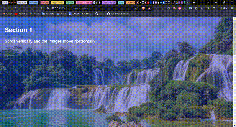
<p>Scroll vertically and the images move horizontally</p>
</div>
</section>
<section>
<div class="container">
<h2>Section 2</h2>
</div>
</section>
<section>
<div class="container">
<h2>Section 3</h2>
</div>
</section>
</body>
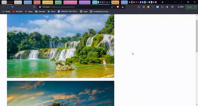
</html>Inside the css_scroll_animation.html file, the body element has four direct children. One of these children is a div element with the class name wrapper. Inside this div element are three figure elements. Each figure element has an img element containing the images to be displayed. Other children are three section elements with the class name container for each. As we can see, inside each section element, we have a part that defines the section we are in, except for the first section element, which also has the instruction “scroll vertically and the images move horizontally.
This is what our website will look like.
Next, we will show how to style these elements using CSS.
CSS styling for scroll progress animation
css_scroll_animation.css file
@layer reset;

body {
 font-family: "Helvetica", sans-serif;
 min-height: 300vh;
 color: white;
}

img {
 height: 100%;
 object-fit: cover;
}

figure {
 flex: 0 0 99.4vw;
}

section {
 min-height: 100vh;
 position: relative;
 z-index: 1;
}

.wrapper {
 display: flex;
 position: fixed;
 top: 0;
 left: 0;
 height: 100vh;
}

.container {
 background: rgba(46, 42, 181, 0.4);
 min-height: 100vh;
 padding: 1em clamp(1rem, 2vw, 4vw);
}

@layer reset {
 *,
 *::before,
 *::after {
   box-sizing: border-box;
 }

 body {
   margin: 0;
   font-size: 1.2rem;
 }

 @media (min-width: 1200px) {
   html {
     font-size: 20px;
   }
 }

 img {
   display: block;
   width: 100%;
 }

 figure {
   margin: 0;
   position: relative;
 }
}
The css_scroll_animation.css file tells the browser how to style the css_scroll_animation.html file. First, it resets some default styling predefined by the browser using the values defined under the @layer reset. Next, we write the style for the body, img, figure, and section elements. We also defined the style for our classes: ’ wrapperandcontainer`.
This is how our website will look after modifying our CSS file.
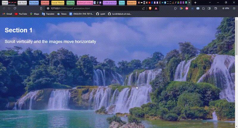
If you observe closely at the gif, you will see that only one image is visible; the rest are hidden and not scrolling, and only the text is moving. To make the image scroll, we will modify our CSS file to add the animation.
CSS animation for scroll progress animation
Let’s add an animation to our css file.
@layer reset;

body {
 font-family: "Helvetica", sans-serif;
 min-height: 300vh;
 color: white;
}

img {
 height: 100%;
 object-fit: cover;
}

figure {
 flex: 0 0 99.4vw;
}

section {
 min-height: 100vh;
 position: relative;
 z-index: 1;
}

.wrapper {
 display: flex;
 position: fixed;
 top: 0;
 left: 0;
 height: 100vh;
 animation: slide auto linear;
 animation-timeline: scroll();
}

.container {
 background: rgba(46, 42, 181, 0.4);
 min-height: 100vh;
 padding: 1em clamp(1rem, 2vw, 4vw);
}

@keyframes slide {
 0% {
   translate: 0;
 }
 100% {
   translate: calc(-100% - 100vw);
 }
}

@layer reset {
 *,
 *::before,
 *::after {
   box-sizing: border-box;
 }

 body {
   margin: 0;
   font-size: 1.2rem;
 }

 @media (min-width: 1200px) {
   html {
     font-size: 20px;
   }
 }

 img {
   display: block;
   width: 100%;
 }

 figure {
   margin: 0;
   position: relative;
 }
}
To add animation in CSS, we use the @keyframes rule with the name of the animation next to it, e.g., @keyframes <name of the animation>. In our code, we added the @keyframes slide line to define our animation. At 0%, the element, which in our case is the image, remains constant, but at 100% using the calc function in CSS, it translates to the opposite side of both it’s own height and width and the width of the viewport by 100% at X-axis.
@keyframes slide {
 0% {
   translate: 0;
 }
 100% {
   translate: calc(-100% - 100vw);
 }
}
To use this defined animation, we need to tell the browser where it should occur and how it should occur using the animation rule. Here, we used the shorthand where the first value stands for the name of the animation, the second value is the duration, and the third value is the timing function of the animation. We specified this in our wrapper style because we want the animation to be applied to the images, and wrapper is the class name for the container of the images.
.wrapper {
 display: flex;
 position: fixed;
 top: 0;
 left: 0;
 height: 100vh;
 animation: slide auto linear;
}
Also, we added the animation-timeline rule, which tells the browser when the animation should be performed, which in our case is on scroll.
.wrapper {
 display: flex;
 position: fixed;
 top: 0;
 left: 0;
 height: 100vh;
 animation: slide auto linear;
 animation-timeline: scroll();
}
Therefore, our code tells the browser on the body scroll to move the images to the opposite direction at 100% in the X-axis linearly, and the browser should automatically define the time it takes to perform the animation.
This means that as we scroll up or down, the section elements move up or down in the Y-axis, and the images move left or right in the X-axis.
This is how the website behaves after adding the animation to our CSS file.

Responsive CSS Design Considerations
Responsively implementing scroll progress animations involves ensuring that these animations adjust appropriately across different screen sizes. When designing scroll progress indicators or animations, it’s crucial to consider how they behave on both small and large screens. In our code, we achieved this by using the media query rule and also by specifying our height and width in percent and viewport, e.g., 100% and 100vw. This way, the element adjusts itself automatically as the screen resizes.
This is how the website looks when we resize our screen.
Conclusion
In wrapping up, this article has journeyed through a myriad of practical CSS techniques focused on scroll progress animations. By dissecting the core benefits and applications, we’ve gained insights into enhancing web design through these dynamic features.
The presented techniques shed light on the power of CSS-based scroll progress animations. As a call to action, I strongly encourage readers to integrate these techniques into their web projects. Embrace this powerful tool, equipped with a clear understanding of its diverse benefits and potential use cases.
Implementing CSS-based scroll progress animations enriches the user experience and elevates the visual dynamics of web interfaces. By adopting these techniques, you can craft engaging and captivating web experiences.
Truly understand users experience
See every user interaction, feel every frustration and track all hesitations with OpenReplay — the open-source digital experience platform. It can be self-hosted in minutes, giving you complete control over your customer data.
Star on GitHub12k