Data Visualization with Google Charts
Creating charts with ease, by using the Google Charts package

Data visualization is an excellent approach to displaying data and involving an audience. The human mind is often better at remembering visuals than memorizing raw data, excel sheets, or lengthy lists of figures. Using Google Charts, developers can create appealing, reusable data visualizations such as bar charts, pie charts, bubble plots, and more.
In this article, we’ll consider this package and some alternatives, and show its usage with React; let’s get on!
What is Google Chart?
Google Charts is a productive and straightforward JavaScript charting utility that is free and regularly maintained by Google. In addition to a large selection of customization choices, Google Charts offers a rich chart library with many alternatives, from straightforward line graphs to more intricate hierarchical tree maps.
Important features of this package are:
- Simple Configurations: They are incredibly simple to understand and use and use JSON to describe different chart configurations.
- Multi-Support:Supports multitouch on touchscreen-based operating systems like Android and iOS. Ideal for Android- and iPhone/iPad-based smartphones and tablets.
- Open Source: Software is available for non-commercial usage and is free to use.
- External Data: Supports dynamic data server loading by giving users access to data control using callback functions.
- Compatibility: Works flawlessly on all popular browsers and mobile operating systems like iOS and Android.
- Light weight: The portable loader and the JS core library are very small libraries.
Alternatives to Google Charts
Additionally, some incredible Google Charts alternatives are available that are robust, user-friendly, and wholly free. The most popular way to utilize Google Charts is to embed basic JavaScript into a web page. However, there are other alternatives that we can as well use for dynamic charts other than Google Charts.
- Chart.Js:- Easy, object-oriented client-side graphics for designers and developers are what Chart.js is described as. Canvas-tagged HTML5 charts that are open source. Chart.js, an app in the development category, makes it simple to incorporate dynamic graphs on your website. For a number of platforms, such as self-hosted solutions, online / web-based, Mac, Windows, and Linux, Chart.js can be implemented.
- FusionChart:- FusionCharts is a sizable JavaScript charting toolkit that includes 1000+ maps and more than 90 charts. It offers some very nice features, including client-side image export, events, themes, and annotations, and works well with all current browsers (including IE 6). Additionally, it provides free open-source plugins and wrappers for popular web development languages, including PHP, ASP.NET, jQuery, and AngularJS.
- D3.Js:- A very adaptable data visualization framework called D3.js uses a data-driven method to manipulate the DOM. It utilizes HTML, SVG, and CSS to help bring data to life. It strongly emphasizes web standards and fully supports all current browsers. The core issue is resolved by D3, which enables effective document alteration based on data. It performs incredibly well, making it simple to support big datasets and dynamic behaviors for animation and interactivity.
- Victory:- Victory is a set of modular React components that can be combined to create dynamic data visualizations. Although it is described as having an opinion, a strong API makes it simple to configure entirely. Even your React Native project can use it.
- ECharts:- An open-source JavaScript visualization tool called Apache EChartsTM can easily function on both PCs and mobile devices. It works with most current web browsers, including IE9/10/11, Chrome, Firefox, Safari, and others. Apache ECharts offers popular chart types such as maps, treemaps, line graphs, and bar charts as a data visualization toolkit.
How To Use Google Charts With React
We’ll begin by putting up a React project with the code below to use Google Charts in our React application:
npx create-react-app react-chartChange the working directory to the folder established by the previous command with the following code:
cd react-chartInstall react-google-charts library. It’s quite simple for developers to utilize React with Google Charts thanks to the react-google-charts package, which is a modern, well-maintained, thin, typed, React wrapper for Google Charts:
npm install --save react-google-chartsWe’ll create a simple chart. First, we create a new component file called charts.js in the src directory, where we’ll build our charts.
N/B: Just for illustration purposes, we’ll be recreating our first chart from the react-google-chart-area-chart example.
Inside the chart.js file, add up the following code. Then import our chart from chart.js in the App.js file:
//Chart.js//

import { Chart } from "react-google-charts";
export const data = [
  ["Year", "Sales", "Expenses"],
  ["2019", 1000, 400],
  ["2020", 1170, 460],
  ["2021", 660, 1120],
  ["2022", 1030, 540],
];
export const options = {
  title: "Company Performance",
  Txis: { title: "Year", titleTextStyle: { color: "#333" } },
  vAxis: { minValue: 0 },
  chartArea: { width: "50%", height: "70%" },
};
export function Charts() {
  return (
    <Chart
      chartType="AreaChart"
      width="100%"
      height="400px"
      data={data}
      options={options}
    />
  );
}
We import react-google-charts first, then retrieve the Chart property. Next, we establish a data property to hold the information shown on the pie chart. You can update the data the chart displays and modify the chart’s appearance and feel by passing props to <Chart />. The type of chart being rendered can be modified using the chartType prop. Hence, if we passed, let’s say, a GeoChart rather than the other option, a geo chart would be shown.
The chart’s data is accepted by data, and an object that can be further customized is accepted by options. For this example, we merely modified the title. Finally, width and height alter the chart’s proportions as their names suggest.
//App.js//
import { Charts } from './Components/Chart';
import './App.css';
function App() {
  return (
    <div className="App">
    <Charts />
    </div>
  );
}
export default App;
Above, inside src/App.js, I import the Charts from the Chart.js component I created. Let’s run our code to see what we have below.
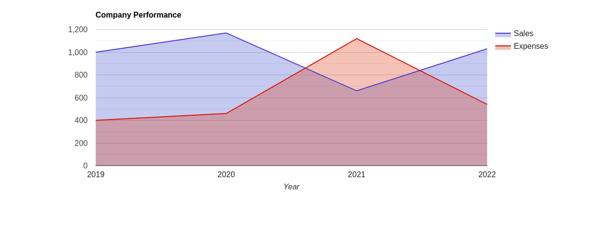
As you can see, the chart was simple to create with only a few lines of code, and it is highly interactive.
Open Source Session Replay
OpenReplay is an open-source, session replay suite that lets you see what users do on your web app, helping you troubleshoot issues faster. OpenReplay is self-hosted for full control over your data.
Start enjoying your debugging experience - start using OpenReplay for free.
Understanding Multiple Charts
Only a simple use case of quickly making and showing a chart was discussed in our previous example. Let’s develop this illustration further and observe how it functions in a more intricate project with more parts and a centralized data source. To accomplish this, we’ll utilize React Hooks to monitor changes and give components data as props.
The data for the charts will be stored in a file called data.json, which will be created first. This data source would originate from an API in a real-world application. A React useState hook then tracks the data that needs to be handed down to components.
Create Data Source
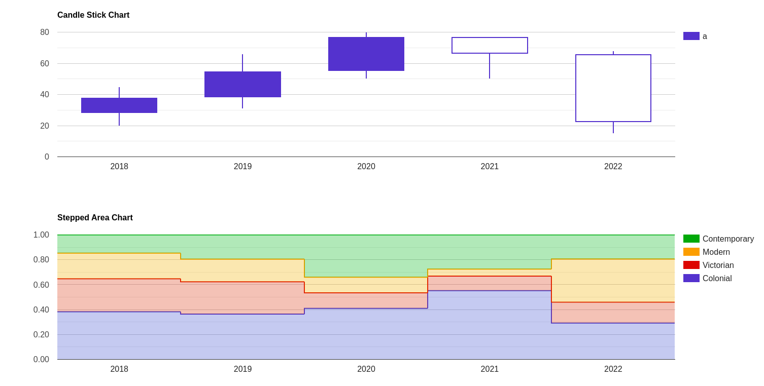
Make a new file called data.json in the project’s root. Add the following content to it:
{
    "charts": [
        {
            "name": "Pie",
            "chartType": "CandlestickChart",
            "data": [
                ["Year", "a", "b", "c", "d"],
                ["2018", 20, 28, 38, 45],
                ["2019", 31, 38, 55, 66],
                ["2020", 50, 55, 77, 80],
                ["2021", 50, 77, 66, 77],
                ["2022", 15, 66, 22, 68]
            ],

            "options":{
                "title": "Candle Stick Chart"
            },
            "width": "100%",
            "height": "400px"
        },
        {
            "name": "Bar",
            "chartType": "SteppedAreaChart",
            "data": [
                ["Style", "Colonial", "Victorian", "Modern", "Contemporary"],
                ["2018", 5.2, 3.6, 2.8, 2],
                ["2019", 5.6, 4.0, 2.8, 3],
                ["2020", 7.2, 2.2, 2.2, 6.0],
                ["2021", 8.0, 1.7, 0.8, 4.0],
                ["2022", 7.5, 4.3, 8.9, 5.0]
            ],
            "options":{
                "title": "Stepped Area Chart",
                "isStacked": "relative"
            },
            "width": "100%",
            "height": "400px"
        }
    ]
}
As previously said, our data source will be the code above. The App.js file will then be updated to incorporate our Hook component. We’ll eventually establish a state to store the information for the charts.
import React, { useState, useEffect } from 'react';
import './App.css';
import response from "./data.json"
import Chart from './Components/Chart'
import { Container } from 'react-bootstrap';
function App() {

  const [data, setData] = useState(null);
  useEffect(() => {
    if(setData){
      setData(response)
    }
  }, [setData]);
  return (
    <Container className='mt-3'>
    <div className="App">

      <span>
      <h2>Available charts</h2>
      { data && data.charts.map((chartData, i) => (
        <Chart chart={chartData} key={i}/>
      ))}
      </span>
    </div>
    </Container>

  );
}
export default App;
The response from the data.json file will be represented by the data variable in the code above. We’ll use a map function to loop across each data, pass each chart item as a prop, and display the resulting chart. We’ll import and pass the data as props in the charts component.
Finally, we gave a chart prop to the charts component in the App.js section. We need to edit the charts component to enable us to have access to the props:
import { Chart } from "react-google-charts";
const charts = (prop) => {
  return (
    <Chart
      chartType={prop.chart.chartType}
      data={prop.chart.data}
      options={prop.chart.options}
      width={prop.chart.width}
      height={prop.chart.height}
    />
  )
}
export default charts
Let’s have a look at our chart. Run the server once again if you shut it off. You should be able to notice that we’ve successfully implemented the multi-chart feature when you visit it in the browser.
For more examples, you can click on the link to their official site; there, you will see how you can implement different charts/graphs.
Conclusion
We learned how to use React with Google Charts for a graphical interface. We furthered our understanding by observing numerous methods for developing complicated applications using React Hooks and the react-google-charts package. For more in-depth information, visit the Google Chart documentation page. Also, for the codebase on Github as well as the live app on Netlify.
Resources
A TIP FROM THE EDITOR: For some ways of producing charts in React, don’t miss our Building and Rendering charts with Nivo in React and Low-Level Charts in React articles.