Design Auditing: A Key Step in Development

Recently, design auditing has gained popularity, and for a good reason. One thing that holds for every good product designer is that design consistency greatly influences the customer experience. It is always the priority of designers to ensure that the clientele will get the same message at any touchpoint, which leads to design auditing — and this article will show you how to do it.

Discover how at OpenReplay.com.
Design auditing, or design audit, analyzes the design elements used across an organization, which ensures consistent branding across all outlets and channels. This means taking stock of not only the visual design elements but also the written and verbal portions of the user experience.
A design audit is a checkup to ensure that the company consistently expresses itself across all channels. Analyzing the visual elements and the core messages enables a brand to compare what users see throughout their journey, as well as remedy inconsistencies.
Design auditing, at its core, requires the gathering and assessment of all kinds of verbal, written, and visual communication. This includes social media to ads, including any workshops or webinars hosted to the product itself. Users go through dozens and even hundreds of touchpoints to and through a product. Designers want to determine if their experience is trustworthy and consistent, or unpredictable and erratic.
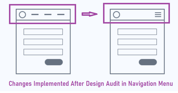
Importance of Design Audit
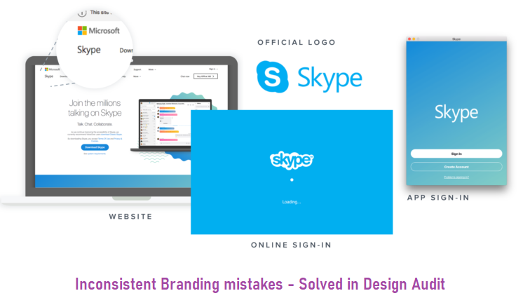
Keep in mind that the visual elements of a product and the company are the ‘wardrobe’ of your brand. Thus, the visual public look of a brand plays an important part in how the public perceives it and, therefore, forms a huge part of the company’s identity. The user experience should be consistent if you want to build trust.
As the business grows, more elements and features will be added, making it harder to handle, so the design audit comes along. Design audits are essential to stay ahead of the competition these days. This is particularly true when a business expands and grows since it must effectively deliver to a wide audience.
The internet is constantly evolving, meaning that elements and techniques also change. There may have been very successful websites before, but they could plummet with the evolving landscape. Design auditing helps discover no longer effective or relevant areas and enables designers to resolve these issues.
Design Audit Benefits
Fixing several small performance inconsistencies and drainers will dramatically improve the user experience. This is something that also impacts the bottom line. Let’s check out the five benefits of design auditing.
Boosts the Usability
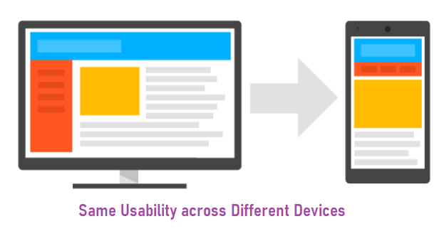
You should always consider the user research and target person when performing a design audit. This could boost communication and the brand image based on solid data instead of assumptions. Accessibility and usability standards are continuously evolving, and a design audit could ensure that the website is usable for all users.
A brand should resonate with its users so they can find what they’re looking for easily. Moreover, a brand that resonates with the users will always do better than one that does not.
Better Positioning
Businesses all aim for a strong market position and identity. Boosting and revisiting the elements that impact positioning ensures that the company will not lose its position because of an identity crisis. Design auditing not only strengthens the brand’s position but could also help improve the website’s positioning on search engines.
This means that each time people search for terms that are related to the website, it’s likely that they’ll find it near the top of the search results page, which drives more traffic and ultimately leads to higher profits.
Refreshes Branding
Often, organizations iterate on their identity. Design auditing could help refresh outdated branding and strengthen its identity across the board. Aside from an eye-catching, fresh new look, refreshing a brand is a surefire way to gain a competitive edge.
A product will be redesigned based on solid data. In design auditing, all data available is gathered from the start and will advise on what tools to use to gather useful information. All businesses attempt to reach new customers or want to inject a little vitality into the existing brand to make it feel brand new. Design auditing is a perfect and low-risk way to formulate growth and business repositioning.
Increase Profits
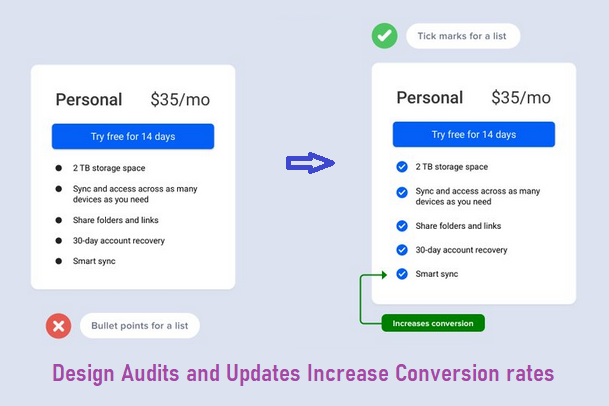
Revenue is the end goal for organizations. Is design auditing worth it? Users will understand a product significantly faster by improving communication and proposition. Eliminating flaws and improving design elements helps boost conversion rate.
Furthermore, by simplifying onboarding, making the visual language slicker, and creating intuitive and easier user flows, users will be more satisfied with a product. This will, in turn, result in a higher score, a lesser churn rate, and an increase in referrals. A design audit could indeed boost profits considerably.
Steps to Design Auditing
Your brand may opt for a website audit before a major rebranding or redesigning or when you notice a gradual plunge in performance and conversions.
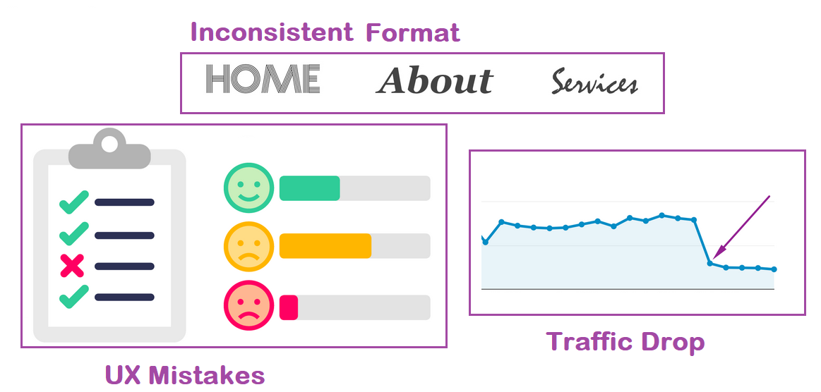
There is no official way to perform a design audit, whether functioning as part of a big design team in a major tech company or auditing your website. Nevertheless, here are several steps to take when conducting one.
Define the Goal
First things first, you should have a clear definition of what you want to achieve. Furthermore, having particular goals helps track the progress and measure success after it’s been implemented. The goal could include boosting the user experience, strengthening the brand identity, and boosting conversions.
The goals for the design audit should be clear. There should be a clear idea of the objectives and the aims, and they all should be realistic. The best way to do this is to think of specific, measurable, achievable, realistic, and time-based goals, or SMART. Clarification makes an effective design audit and boosts collaboration among designers as well.
UI Analysis
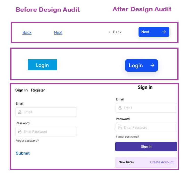
This step is all about visual branding elements to look for design flaws or inconsistencies. Of course, design is subjective in many ways, but this does not mean that the style of the website could not be improved. The logo, content, and images in the brand should share the same style and be consistent. For example, CTAs without labels or action menus without labels are not good for UX. To show an exact example, the below image is taken from Smashingmagazine.
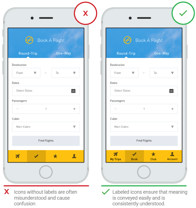
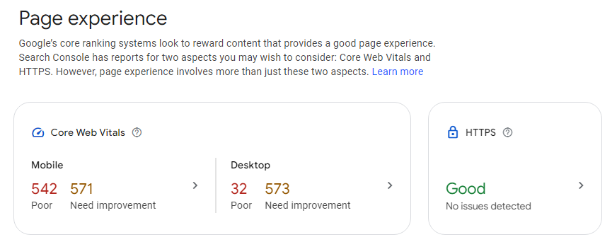
If the logo is not consistent, then you should replace it. Furthermore, ensure that the images share the same style so the transition between the pages and sections is smooth. Also, the design elements should also cover the overall visual audit from different tools, such as Google Search Console and Google Analytics 4.
Identifying the Pain Points
Naturally, categorizing UI elements would lead to determining missing or duplicate content. When you have gathered all design elements in one shared space, designers will find it easy to see those that appear more than once or are not there. There could be, for instance, some unique scenarios where contact forms aren’t included in the design. They could be rectified once they’re identified.
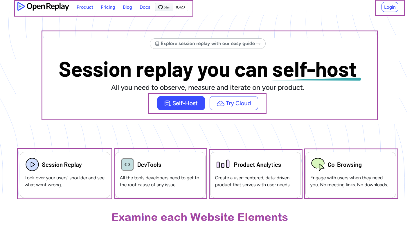
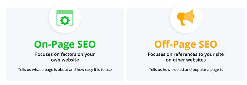
Moreover, it’s important to determine on and off-page issues as well. Design auditing is a great opportunity to boost the website’s SEO. It’s best to closely examine the search engine optimization strategy to ensure maximum results.
Document Research
When you have researched new recommendations and insights, you would want to share them with the team and present them to the organization. Sharing the findings vary. You could, for instance, create a UX framework guideline, Keynote presentation, or something that you find helpful.
Everything you have researched should be documented, even if you don’t share them immediately. Research documentation should be performed immediately. It will be invaluable if you want to refer to it later or pass it on to other designers, saving significant work.
Finalize the Design Standards
Things will be a lot easier in the future when you have accomplished the design audit. Create a compilation of rules for changes to the design in the future, known as the design standards manual. The manual keeps everyone on the same page, making the goals crystal clear.
Finalizing the design standards could include updated color palettes, revised typography guidelines, enhanced navigation structure, and anything that will boost or replace what is presently on the site for a better UX. Depending on how detailed or complex the standards may be, they may need to create style guides or even an entirely new design system.
Implementation
The final step is to implement changes and improvements necessary for the design. Test the updated elements with real users or perform A/B testing to iterate the design. This validates the effectiveness of the change or modifications.
Moreover, you should gather data and feedback to inform more refinements. Design audit implementation usually takes the longest and could involve the most cross-team collaboration as well.
Conclusion
Eventually, most websites will require touch-ups when it comes to the design. This is because some elements of the design may no longer vibe with each other visually, but it would be hard to determine this without having a full design audit regularly. Furthermore, design auditing ensures that visitors will continue to have a great user experience on the website at present and in the future.
Truly understand users experience
See every user interaction, feel every frustration and track all hesitations with OpenReplay — the open-source digital experience platform. It can be self-hosted in minutes, giving you complete control over your customer data. . Check our GitHub repo and join the thousands of developers in our community..


