
Designing Interactive Beautiful Tables with CSS


Have you ever thought data tables could be more than just plain and boring? Well, you’re in for a treat! This guide is about using CSS to turn dull tables into interactive and eye-catching gems, going on an adventure from the basics to the fancy stuff, and making your tables useful and super cool.

Discover how at OpenReplay.com.
This article is meant to be a comprehensive guide for anyone seeking to transform mundane data tables into interactive, beautiful, and functionally efficient website components. It will cater to a broad audience, from beginners eager to grasp the fundamentals to seasoned developers looking to refine their skills and stay ahead in the ever-evolving web development landscape.
Data tables are a fundamental component in web development, a powerful tool for organizing and presenting structured information. They are an essential building block of the web and provide a clear and concise way to show large amounts of information. They are crucial in presenting information on websites, and their appearance can significantly impact user experience. Their importance lies in several vital aspects, contributing to an enhanced user experience and effective data communication. Let’s delve into these aspects:
-
Data Organization: Data tables systematically organize large sets of information into rows and columns. This structured format allows users to quickly scan and locate specific data points without getting overwhelmed.
-
Information Presentation: Tables present data clearly and concisely. They help display various types of information, such as numerical data, text, or a combination of both, making it easier for users to interpret and understand complex datasets.
-
Enhance data communication: Visual cues like color, borders, and formatting can highlight significant trends and relationships within the data.
-
Comparative Analysis: Tables facilitate data comparison across different rows and columns. Users can quickly identify patterns, trends, and variations in the data, enabling them to make informed decisions based on the presented information.
-
Improve user experience: By making data accessible to scan and understand, users can find the information they need quickly and efficiently. Well-designed data tables contribute to web accessibility by providing a structured, navigable layout using assistive technologies. This ensures that disabled individuals can access and comprehend the displayed data.
-
Search and Filter Capabilities: Data tables can have search and filter functionalities, which allow users to narrow down information based on specific criteria, streamlining the process of finding relevant data within a large dataset.
-
Interactivity: Data tables can become interactive, allowing users to sort, filter, and dynamically manipulate data without requiring a page refresh. This interactivity enhances user engagement and efficiency.
-
Integration with Other Technologies: Data tables can seamlessly integrate with other web technologies, such as databases and server-side scripting languages. This integration ensures real-time updates and synchronization with the underlying data source.
-
Boost brand identity: Tables can be styled to reinforce website branding using consistent fonts, colors, and design elements. This approach creates a cohesive and professional look. Consistent and stylish data tables can strengthen your brand image and create a more professional feel for your website.
Importance of Structured Data Presentation
Structured data presentation refers to the organized and systematic arrangement of information, typically in tables or other formats, to facilitate better comprehension and analysis. Structured data presentation isn’t just about making things look neat; it’s about maximizing information clarity, understanding, and impact. Data presentation is fundamental to effective information communication, supports decision-making processes, and contributes to a positive and efficient user experience. Whether in tables, charts, or other formats, the organization of data is a crucial factor in maximizing the value and impact of information.
Understanding data tables is crucial for effective data presentation and website user comprehension. They provide a grid-like structure with rows and columns, allowing users to interpret and analyze data quickly. Creating a data table involves using HTML to define the structure of the tables. Let’s look at how we can structure data tables:
HTML Structure for Creating Data Tables
HTML structure provides a foundation for creating a data table. Let’s break down the process of creating an HTML structure for a data table.
- Create the table structure: While the
<body>section doesn’t directly create the table structure itself, it plays a crucial role in organizing and presenting the table alongside other content elements on the page. This structure sets the foundation for organizing your data into a table format. Here you create the structure of the data table using the<table>,<thead>,<tbody>, and<tfoot>elements. Example:
<table>
  <thead>
    <!-- Table header row will go here -->
  </thead>
  <tbody>
    <!-- Table data rows will go here -->
  </tbody>
  <tfoot>
    <!-- Table footer row will go here -->
  </tfoot>
</table>
The <table> element is the container for the entire data table.
The <thead> element represents the header section of the table. It’s where you will define the column headers.
The <tbody> element represents the body section of the table. It’s where you will add the actual data rows.
The <tfoot> element represents the footer section of the table.
- Add table header: This step involves adding the header row and individual header cells (
<th>) inside the<thead>section. Example:
<thead>
  <tr>
    <th>ID</th>
    <th>Name</th>
    <th>Category</th>
    <th>Price</th>
    <th>Quantity</th>
    <th>Supplier</th>
    <th>Date Added</th>
    <th>Status</th>
  </tr>
</thead>
The <tr> element represents a table row. Inside the <thead>, this row will serve as the header row.
The <th> element represents a header cell within a row. Each <th> contains the title for a column. In this example, we have eight columns: “ID,” “Name,” “Category,” “Price,” “Quantity,” “Supplier,” “Date Added,” and “Status.”
You can customize the content inside the <th> tags based on your specific data.
- Add table data: Now that we’ve defined our header row, let’s add some data rows inside the
<tbody>section. This step involves adding rows and individual data cells (<td>) inside the<tbody>section. Example:
<tbody>
  <tr>
    <td>1</td>
    <td>Product A</td>
    <td>Electronics</td>
    <td>500</td>
    <td>50</td>
    <td>Supplier X</td>
    <td>2024-01-15</td>
    <td>In Stock</td>
  </tr>
  <tr>
    <td>2</td>
    <td>Product B</td>
    <td>Clothing</td>
    <td>200</td>
    <td>100</td>
    <td>Supplier Y</td>
    <td>2024-01-15</td>
    <td>Out of Stock</td>
  </tr>
  <!-- Add more rows as needed -->
</tbody>
The <tr> element represents a table row. Inside the <tbody>, each row contains data related to a specific product.
The <td> element represents a data cell within a row. Each <td> contains the actual data for a specific column. For example, the first row contains “Product A” data with ID, name, category, price, quantity, supplier, date added, and status.
You can continue adding more rows as needed; each row will represent a different entry in your data table. Customize the <td> tags’ content based on your specific data.
- Table footer: The
<tfoot>(table footer) element is used to group the footer content. Typically, it is placed after the<tbody>(table body) element and before the closing</table>tag. The<tfoot>helps organize summary or footer information related to the data in the table.
You can add rows and cells to contain the footer content inside the <tfoot> element. This might include summary information, totals, or any other details related to the table data.
Here’s how you can use the <tfoot> element:
<tfoot>
    <tr>
        <td colspan="3">Total:</td>
        <td>$1,200</td>
        <!-- Add more cells as needed -->
    </tr>
</tfoot>
In this example, a row contains cells containing the word “Total” and a placeholder total value. The colspan attribute indicates that the “Total:” cell should span across four columns.
- Review: Now that we’ve added the table headers and some sample data, let’s review the complete HTML document for a product information table:
<!doctype html>
<html lang="en">
<head>
<title>HTML Structure for a Data Table</title>
</head>
<body>
<h1>Product Information Table</h1>
<table>
<thead>
<tr>
<th>ID</th>
<th>Name</th>
<th>Category</th>
<th>Price($)</th>
<th>Quantity</th>
<th>Supplier</th>
<th>Date Added</th>
<th>Status</th>
</tr>
</thead>
<tbody>
<tr>
<td>1</td>
<td>Product A</td>
<td>Electronics</td>
<td>500</td>
<td>50</td>
<td>Supplier X</td>
<td>2024-01-15</td>
<td>In Stock</td>
</tr>
<tr>
<td>2</td>
<td>Product B</td>
<td>Clothing</td>
<td>200</td>
<td>100</td>
<td>Supplier Y</td>
<td>2024-01-15</td>
<td>Out of Stock</td>
</tr>
<tr>
<td>3</td>
<td>Product C</td>
<td>Home & Garden</td>
<td>300</td>
<td>30</td>
<td>Supplier Z</td>
<td>2024-01-16</td>
<td>In Stock</td>
</tr>
<tr>
<td>4</td>
<td>Product D</td>
<td>Beauty</td>
<td>150</td>
<td>75</td>
<td>Supplier W</td>
<td>2024-01-16</td>
<td>Out of Stock</td>
</tr>
<tr>
<td>5</td>
<td>Product E</td>
<td>Toys & Games</td>
<td>100</td>
<td>50</td>
<td>Supplier V</td>
<td>2024-01-17</td>
<td>In Stock</td>
</tr>
<tr>
<td>6</td>
<td>Product F</td>
<td>Books</td>
<td>30</td>
<td>20</td>
<td>Supplier U</td>
<td>2024-01-17</td>
<td>Out of Stock</td>
</tr>
<tr>
<td>7</td>
<td>Product G</td>
<td>Sports & Outdoors</td>
<td>80</td>
<td>40</td>
<td>Supplier T</td>
<td>2024-01-18</td>
<td>In Stock</td>
</tr>
</tbody>
<tfoot>
<tr>
<td colspan="3">Total:</td>
<td>$1,200</td>
<!-- Add more cells as needed -->
</tr>
</tfoot>
</table>
</body>
</html>The outcome:
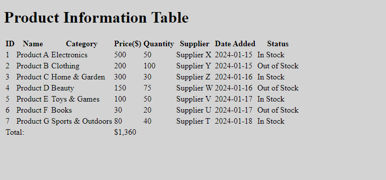
Here, you will see a table with rows and columns, but the visual presentation is plain and lacks a polished and organized appearance. While the table will be functional, it won’t reach its full potential regarding the organization, readability, and user experience without applying CSS styles.
Styling with CSS
While HTML provides the structure for tables, CSS is the magic wand that transforms them from plain grids into visually appealing and user-friendly elements. CSS is a powerful tool for transforming mundane data tables into visually appealing, interactive, and user-friendly components. By leveraging CSS’s capabilities, developers can create tables that effectively present data and contribute to a positive and engaging user experience on the web. Here are some CSS styles that you can use to improve the look of your data table:
- Font and text styles: Use CSS to improve your data table’s font and style. You can apply font and text styles based on your preferences. Adjust the font size for headers and data cells to your taste. Example
table {
  font-family: Arial, sans-serif;
  color: #333;
}

th,
td {
  font-size: 19px;
}

th {
  font-weight: bold;
}
The Arial sans-serif rule sets the font family for the entire table, and color style is applied to the text. The font-size rule is specified for both header and data cells. The font-weight: bold rule in header cells makes the text bold, emphasizing the headers.
- Borders and padding: You can add a subtle border around each cell to separate them. You can also provide padding inside cells for better spacing. Example:
th,
td {
  border: 2px solid #ddd;
  padding: 20px;
}
Here, the th, td selector targets header cells (th) and data cells (td). The border property sets a 1-pixel solid border around each cell with a light gray color (#ddd). The padding property adds 10 pixels inside each cell, providing space between the cell content and the cell border.
- Header background color: You can apply a background color to header cells for distinction. This style ensures that the header row stands out with a distinct background color, providing visual separation between the header and data rows in your data table. Example:
th {
  background-color: #f2f2f2;
}
Here, the th selector targets header cells and sets a light gray background color (#f2f2f2) for header cells.
- Table width and margins: You can set the width and margins of your data table. Add a margin for better spacing and center the table horizontally. Example:
table {
  width: 80%;
  margin: 20px auto;
}
The table selector targets the entire table and sets its width to 80% of its container for responsiveness. The margin property also adds a margin of 20 pixels at the top and bottom and uses auto for left and right margins. This centers the table horizontally within its container.
- Table spacing: The CSS property
border-collapseis used to specify the border model for table elements. When applied to a table, it controls how adjacent borders and cell spacing are handled. This property is applied to the<table>element. The two possible values forborder-collapseare:collapse: Borders are collapsed into a single line, with no space between adjacent cells.separate: Borders are kept separate, and the space specified byborder-spacingis inserted between adjacent cells. Example:
/* Using collapse */
.collapsed-table {
  width: 80%;
  margin: 20px auto;
  border-collapse: collapse;
  font-family: Arial, sans-serif;
  color: #333;

}

/* Using separate */
.separate-table {
  width: 80%;
  margin: 20px auto;
  border-collapse: separate;
  font-family: Arial, sans-serif;
  color: #333;
  border-spacing: 5px; /* Space between cell borders */
}
Here, the .collapsed-table represents a table with border-collapse: collapse, and the .separate-table represents a table with border-collapse: separate. Additionally, border-spacing: 5px is added to set the space between cell borders.
- Let’s combine the styles we’ve discussed and integrate them into the HTML document. Place the following CSS code within the
<style>section in the<head>section of your HTML document:
body {
  background-color: olive;
}

table {
  width: 80%;
  margin: 15px auto;
  border-collapse: collapse;
  font-family: Arial, sans-serif;
  color: #333;
  background-color: lightgray;
}

th,
td {
  border: 2px solid #ddd;
  padding: 21px;
  font-size: 19px;
}

th {
  background-color: #f2f2f2;
  font-weight: bold;
}
The outcome:
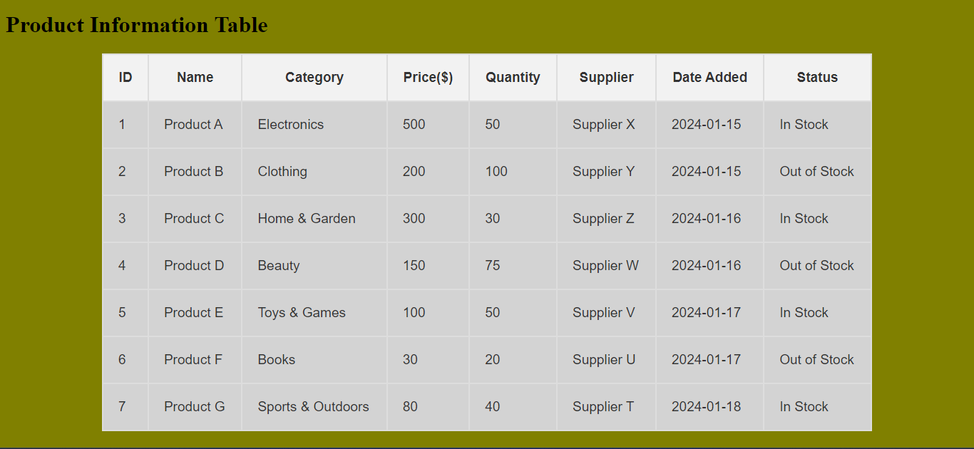
Here, styles are set for the table and its elements. table styles include width, margin, font family, background color, and text color. The border-collapse: collapse This property explicitly sets the border model for the table to collapse, ensuring that adjacent borders and cell spacing are collapsed into a single border line. The th, td styles define common properties for header and data cells, such as border, padding, and font size. The th styles include a background color and bold font weight to distinguish header cells.
Advanced CSS Techniques
Take your skills to the next level by customizing table headers and footers, implementing alternating row colors for improved readability, and adding stylish hover effects and transitions.
Alternate Row Colors
Adding alternate row colors is a styling technique used in tables to improve readability and enhance the visual appeal of the data. Instead of having all rows with the same background color, you alternate between two or more colors for consecutive rows. This helps to distinguish one row from another, making it easier for users to follow information across the table.
Using CSS, achieving alternate row colors is straightforward. The :nth-child selector allows you to target specific rows (even or odd) and apply styling accordingly.
Example:
body {
  background-color: olive;
}

table {
  width: 80%;
  margin: 15px auto;
  border-collapse: collapse;
  font-family: Arial, sans-serif;
  color: #333;
  background-color: lightgray;
}

th,
td {
  border: 2px solid #ddd;
  padding: 21px;
  font-size: 19px;
}

th {
  background-color: #f2f2f2;
  font-weight: bold;
}
/* Alternate row colors */
tr:nth-child(even) {
  background-color: #f9f9f9;
}

tr:nth-child(odd) {
  background-color: #e0e0e0;
}
The outcome:
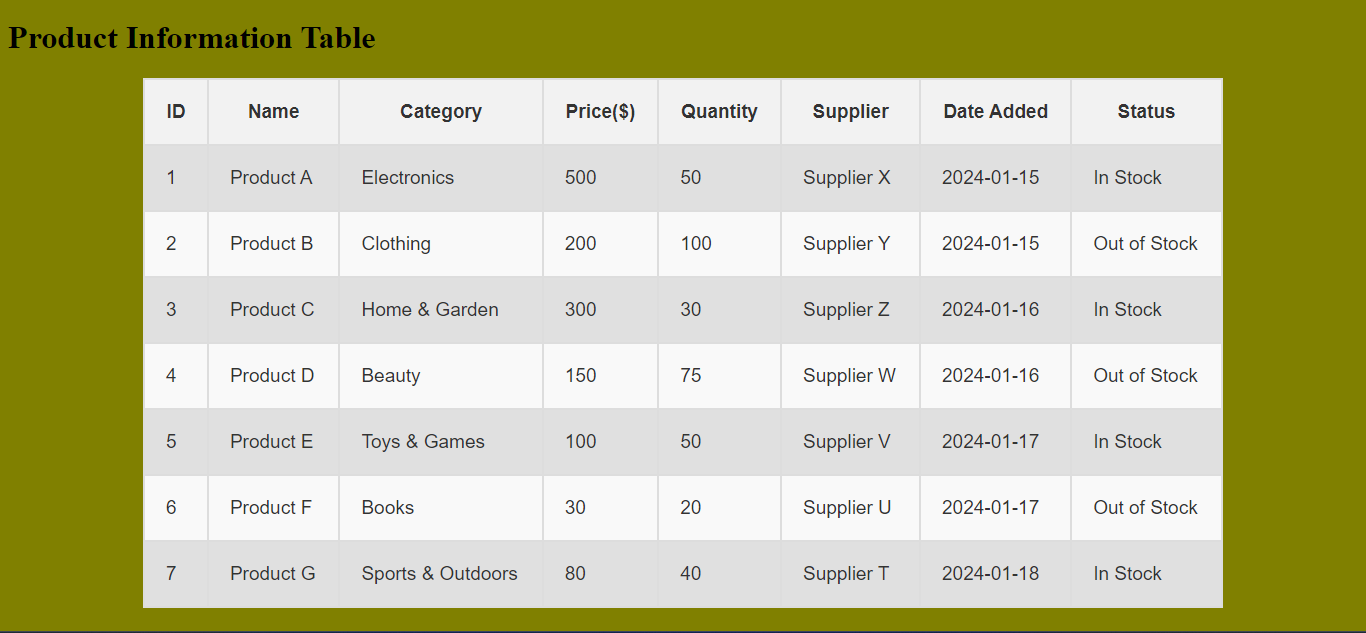
In this example, even rows have a light gray background, and odd rows have a slightly darker gray background. You can customize the colors in line with your design preferences.
Stylish Hover Effects and Transitions
Adding stylish hover effects and transitions can enhance the user experience by giving visual feedback when interacting with the table. Let’s incorporate a subtle hover effect and transition for smoother visible changes:
body {
  background-color: olive;
}

table {
  width: 80%;
  margin: 20px auto;
  border-collapse: collapse;
  font-family: Arial, sans-serif;
  color: #333;
  background-color: lightgray;
}

th,
td {
  border: 2px solid #ddd;
  padding: 21px;
  font-size: 19px;
  transition: background-color 1s; /* Smooth transition on hover */
}

th {
  background-color: #f2f2f2;
  font-weight: bold;
}

tr:nth-child(even) {
  background-color: #f9f9f9;
}

/* Hover effect */
tr:hover {
  background-color: gray; /* Gray on hover */
}
The outcome:
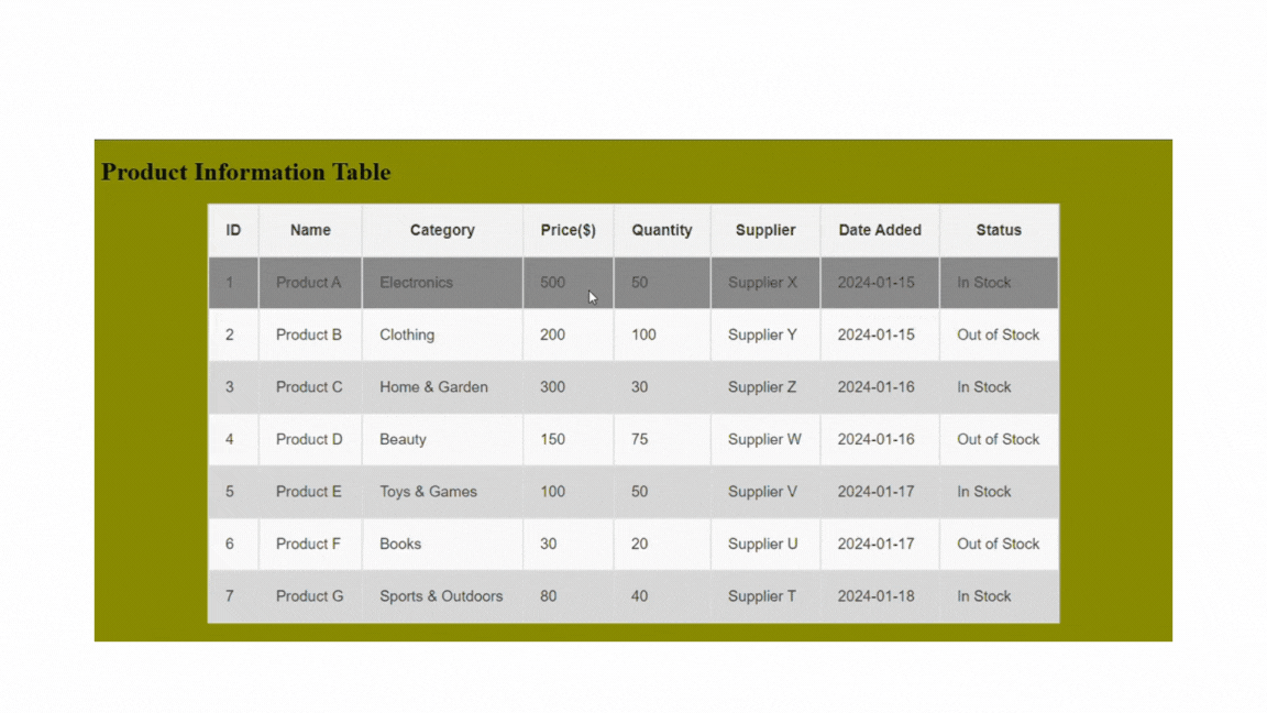
Here, the transition:background-color 1s property adds a smooth transition effect to the background color of th and td elements over 1 second. This creates a gradual change when hovering over the rows. Also, the tr:hover selector targets the entire row (tr) and applies the background color change when the row is hovered. Hovering over a row in the table will smoothly transition to a light gray background color, providing a visually appealing effect.
Adding Interactive Elements
You can add buttons to make the table more interactive. Let’s add a button to each row in the table. This involves combining HTML for structure and CSS for styling to achieve the appearance of buttons in each row of the table. The buttons can have a hover effect for a more interactive user experience. Here is how you can achieve this:
- Inside each table row (
<tr>), a new table cell (<td>) is added to contain the button. For example:
<tr>
  <!--  (other data cells) -->
  <td>
    <button class="action-button">Reviewed</button>
  </td>
</tr>
This code snippet adds a button with the class “action-button” inside a cell of the table.
- You add a table header to give the button a title in the column. Example:
<th>Actions</th>Here, the table header has the title “Actions.”
- Apply styles to the button for a visually appealing appearance. You can style the button using the “.action-button” class, with specific properties for appearance and a hover effect. Here is a simplified way to do this:
.action-button {
  padding: 10px;
  cursor: pointer;
  background-color: #45a049;
  color: #fff;
  font-size: 19px;
  font-weight: bold;
  border: none;
  border-radius: 5px;
  transition: background-color 0.5s;
}

.action-button:hover {
  background-color: green;
}
The outcome:
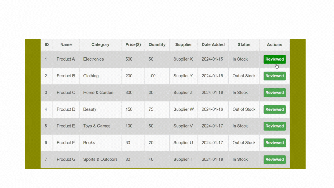
This CSS code styles the button with padding, sets a pointer cursor, defines background and text colors, removes the border, adds a border radius for rounded corners, and includes a smooth background color transition on hover.
Stylish Pagination and Navigation Within Tables
Data table pagination helps break down a large dataset into smaller or more manageable pages. The purpose is to enhance the user experience by presenting information in a structured way, allowing users to navigate through the dataset in bite-sized chunks rather than overwhelming them with massive data at once.
Pagination typically includes navigation controls, such as “Previous” and “Next” buttons and page numbers, to allow users to move between pages. By navigating through the pages, users can decide which part of the dataset to view, providing a more interactive and user-friendly experience.
Here is how to implement pagination in data tables:
- HTML structure for pagination: Inside the table, add a new row at the bottom to contain the pagination controls using the
<tfoot>(table footer) section. A<div>will be included within the table footer, and the pagination controls will involve the<span>elements for each page, and the« and» symbols to represent the previous and next buttons. Example:
<!-- (table content) -->
<tfoot>
<tr>
<td colspan="9">
<div class="pagination">
<span>«</span>
<span class="active">1</span>
<span>2</span>
<span>3</span>
<span>»</span>
</div>
</td>
</tr>
</tfoot>- CSS styling for pagination: Styles can be applied to the pagination container and individual buttons, with a unique style for the active page. Let’s see how this works:
.pagination {
  display: flex;
  justify-content: center;
  margin-top: 20px;
}

.pagination span {
  padding: 8px 10px;
  margin: 0 4px;
  cursor: pointer;
  border-radius: 4px;
}

.pagination span.active {
  background-color: #4caf50;
  color: #fff;
}
The outcome:
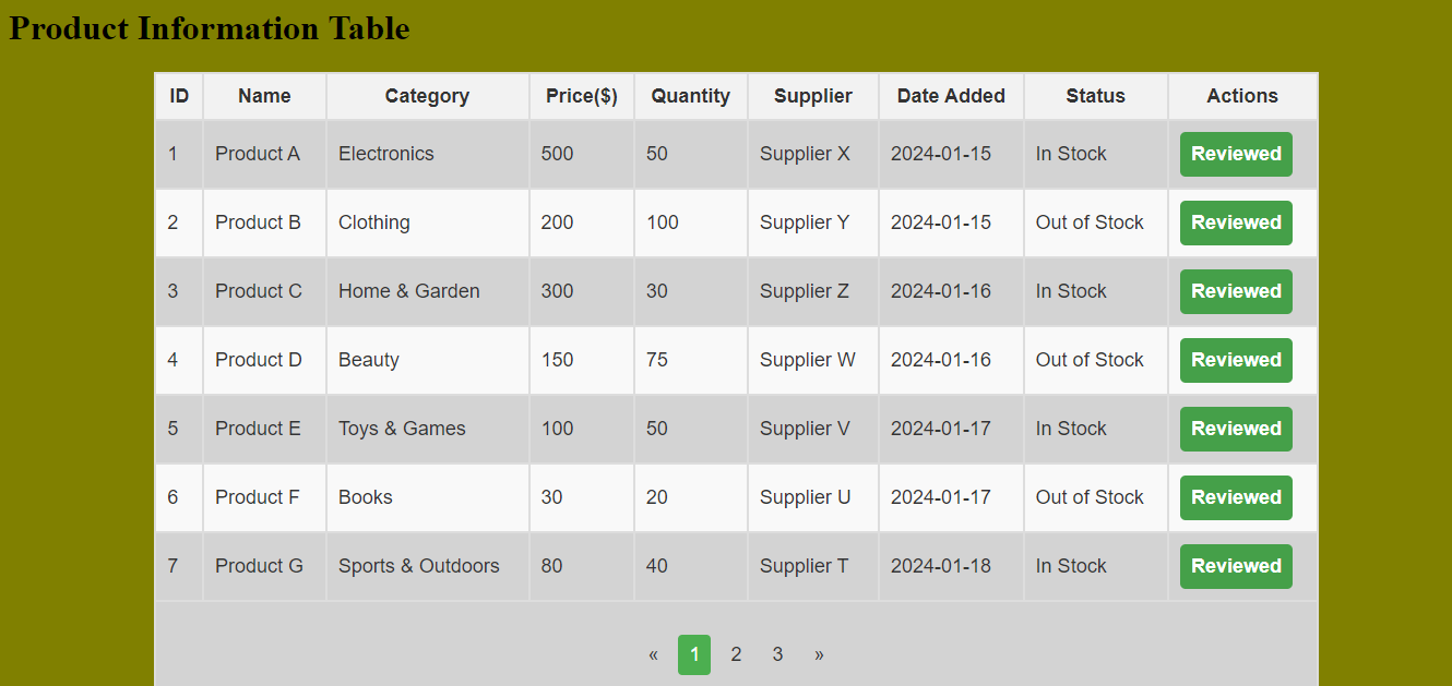
This example creates a <tfoot> section with a row containing a <div> for pagination. The colspan=“9” ensures that the pagination spans across all columns. Styles are applied to the pagination container (<div class="pagination">) to center it. Each pagination button (<span>) is styled with padding, margin, and cursor. The .active class gives the active page a distinct appearance.
Accessibility Considerations for Data Tables
A visually appealing table can enhance a web page’s look and feel. Ensure all users can access your tables and the tables adapt to screen sizes and devices with responsive design techniques.
-
Semantic HTML: Use
<th>for table headers and<td>for data cells. Screen readers and other assistive technologies use semantic HTML to interpret table structures. -
Descriptive Labels: Use the
<caption>element to provide a concise and descriptive summary of the table’s content. Screen readers announce this summary to users. Example:
<caption>Product Information Table</caption>- Scope attributes: Use scope attributes to associate
<th>elements with their corresponding rows or columns. This approach helps provide additional information to assistive technologies, such as screen readers, about the relationship between table headers and data cells. Example:
<th scope="col">ID</th>- ARIA Labels: Use ARIA (Accessible Rich Internet Applications) roles and attributes to provide additional information to screen readers. Example:
<th role="columnheader">Product ID</th>
<td aria-labelledby="productID">1</td>
<td id="productName">Product A</td>-
Table header: The
<thead>element is optional but highly recommended for clarity and accessibility. -
Font: Apply a common font family; this ensures a consistent and readable font for your entire table. You should also set a legible font for the whole table and a dark text color for better contrast and to enhance visibility against the background.
Responsive Design Principles for Data Tables
Responsive design principles can be applied to data tables, making them adapt to different screen sizes and devices. This ensures a user-friendly experience across various platforms, including desktops, tablets, and mobile devices. Here’s how to make your tables responsive:
- Adjust styling: Use CSS media queries to adjust the table’s styling based on the device’s screen size. Example:
@media only screen and (max-width: 600px) {
  /* Responsive styles for small screens */
  table {
    width: 100%;
  }
  th,
  td {
    display: block;
    width: 100%;
  }
}
The @media rule with the query (max-width: 600px) is a CSS media query that targets styles specifically for screens with a maximum width of 600 pixels. The display:block rule changes the default display style of table cells from table-cell to block. This causes each cell to stack on top of each other vertically, creating a one-column layout.
- Scrollable Tables: Enable horizontal scrolling for tables on smaller screens to prevent content overflow. Example:
@media only screen and (max-width: 600px) {
  table {
    overflow-x: auto;
  }
}
The overflow-x: auto rule specifies that if the content inside the table overflows its container horizontally (in the x-axis), a horizontal scrollbar should appear, allowing users to scroll horizontally to see the hidden content.
Conclusion
Data tables are indispensable tools in web development, offering a versatile and efficient way to present and interact with data. This guide has provided a comprehensive journey from the basics to advanced techniques for designing interactive and beautiful data tables using CSS. Following the steps in this guide gives you the tools to transform mundane data tables into visually appealing and interactive components. Keep experimenting, stay creative, and happy coding!
Gain control over your UX
See how users are using your site as if you were sitting next to them, learn and iterate faster with OpenReplay. — the open-source session replay tool for developers. Self-host it in minutes, and have complete control over your customer data. Check our GitHub repo and join the thousands of developers in our community.
