Do's and Don'ts of UI Animation for the Web

In today’s world, digital design is rapidly evolving; UI animation is one of the strong tools for enhancing user experience. From subtle transitions and motions to highly elaborate effects, animations have a critical role apart from aesthetic appeal. They guide the user, give feedback, and increase functionality in an interface. Designers and developers can craft more intuitive, engaging, and enriching interactions by incorporating animations thoughtfully. The following article looks at how UI animations can make user experiences visually appealing and functionally enriching.

Discover how at OpenReplay.com.
UI animation can be described as the integration of motion and transition in a website or app user interface for better usability. This could range from simple animations, such as when the color on a button changes upon hovering over it, as shown below, to more complex interactions, where pages slide smoothly into view, an animation of loading, or elements that fly around because of the user’s action.
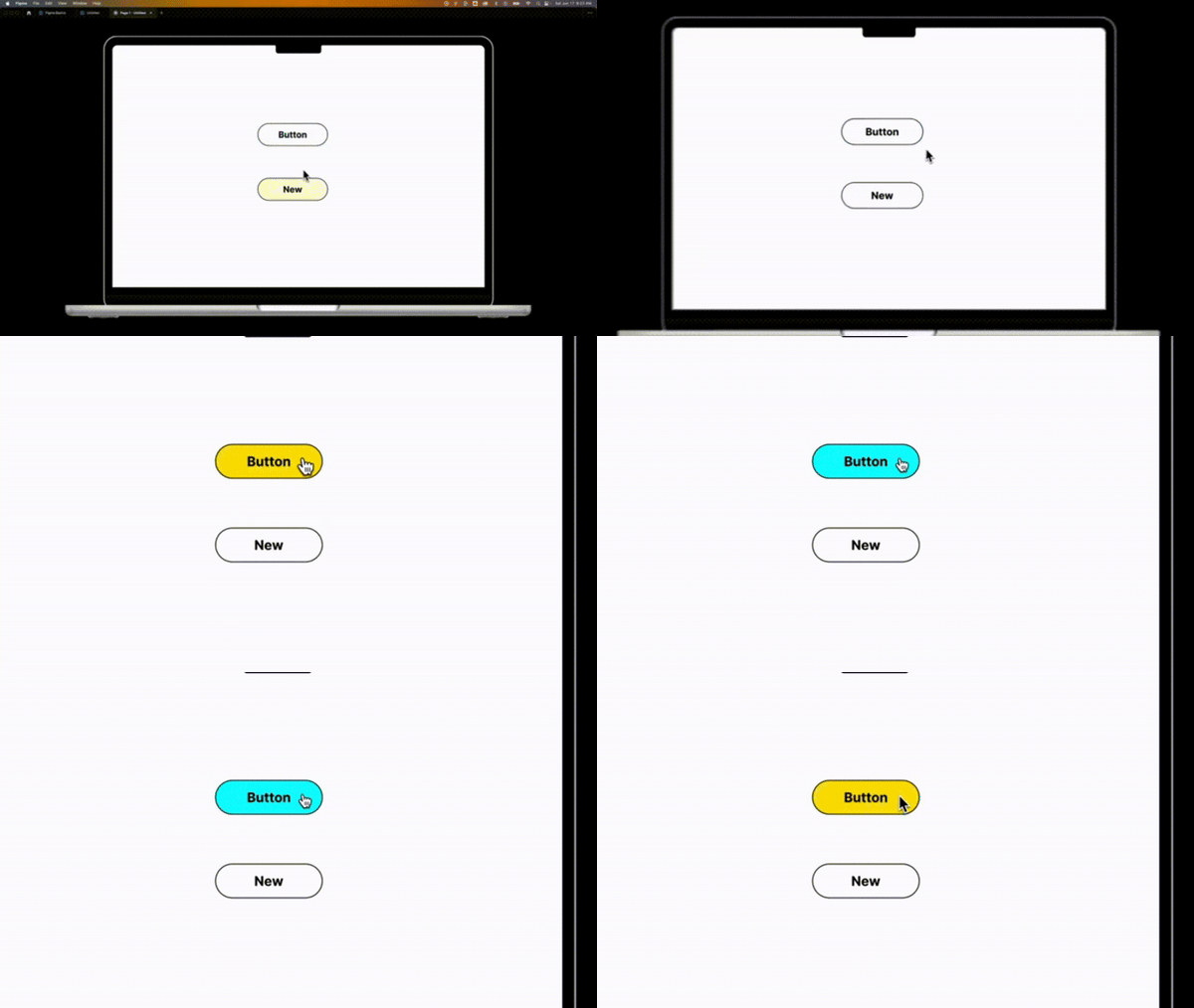 GIF source : How to Add a Button Hover Effect.
UI animation is one of the dynamic elements added to a user interface to enrich the user experience with an application or website. These animations are more than just eye candy; they provide serious functionality that guides navigation, communicates feedback, and improves the overall user experience.
Animations can serve as immediate feedback while users interact with an element in the UI, such as clicking a button or submitting a form. For instance, a button may grow a bit or change color upon being pressed to show that it has been pressed. Such feedback conveys to users that their action has been captured and is under processing.
Objective: How effective animation improves usability
When thoughtfully implemented, animations go a long way in increasing the usability of digital interfaces. Here’s how they help:
-
Guiding User’s Attention, Focus, and Direction: Animation guides users’ attention to what is happening on the screen; for example, it outlines a button or navigates smoothly to another page. Also, subtle animation may help the user’s eye move toward the next step in the form and reduce the possibility of confusion or failure to take action.
-
Feedback through Animations - Immediate Response: Animations offer excellent support for instant responses and visualization of user interactions. For example, a button changes color or animates upon a press to reassure users that there was a response to an action. That sets up an effective feedback loop.
-
Improved perceived performance: Well-timed animation shortens apparent loading times by showing progress indicators or transition amusements. A user feels more engaged and less impatient than just staring at a screen that does nothing, which creates a better user experience.
-
Strengthening the Management of Cognitive Load—Lightening Information Processing: Animations can decompose complex information into easily digestible pieces. For instance, the progressive disclosure technique makes elements sequentially visible to users. Therefore, they can take on information at their own pace and avoid cognitive overload.
The Importance of UI Animation
UI animation has emerged as a key player in today’s design of mobile applications, websites, and software applications. Much more than a cosmetic flourish, well-implemented UI animations have served functional, aesthetic, and strategic ends by expressing a brand’s personality through what is said to the end user and embedding this product in the customer’s memory. This article goes deep into the importance of UI animation from two principal sides: improving user experience and disclosing brand identity.
User Experience: Guiding Users, Providing Feedback, and Enabling Natural Interactions
Smoothening the user’s experience is an important factor in determining the success of a digital product. UI animation performs guidance, feedback, and organic-natural interactions, which are important functions in interfaces.
-
Guiding Users: Animations can be used to draw the user’s attention to certain elements or activities; they also provide users with subconscious visual clues. For example, a slight bounce or change of color upon tapping a button illustrates that an action has been initiated. These types of animations make things clearer and less confusing for customers by showing them what the next step should be in their journey. Animation enhances navigation by leading users through more complex processes in a much more visually understandable way.
-
Providing Feedback: Feedback plays an important role in human-computer interactions. UI animations can be utilized to communicate between the system and the user in real time. Showing loading spinners, progress bars, or animations that depict processing will let the user know that the system is operating. Users might get frustrated or confused without such animations, thinking the program is not responding. Animations giving feedback decrease cognitive strain and ensure recognition and processing of action occur.
-
Creating Natural Interactions: When motion enters an interface, interactions become organic and feel more like they would in the real world. Animations, such as swipe transitions, smooth scrolling, and element fade-in and fade-out, simulate items in real life to become more fluid and less mechanical. These little touches enhance the smoothness of interactions, making them even more engaging and human-centered.
Brand Personality: Reflecting Brand Identity and Enhancing Memorability
Besides pure function, UI animation conveys a lot about brand personality and makes for a memorable user experience. Animation breathes life into your brand by communicating values, tone, and identity with which the users will resonate.
-
Reflecting Brand Identity: Undeniably, the visual identity of a brand would come from its logo, color palette, and typography, but UI animation gives way to its ability to communicate in the digital sphere. While playful brands might make them bright and playful, professional or luxury companies might use motion that’s truly elegant and fluid. These details also reinforce the company’s unique voice by allowing specific emotional characteristics to be tied to the brand. By doing this, along with the animation of logos and transitional interactions, companies can create and establish one solid brand across many media types.
-
Enhancing Memorability: A good animation remains longer in a person’s head, increasing their chances of remembering a certain product or brand. Interactive moments, like delightful micro-interactions—when a user loves something and a heart beats—assist in building an emotional connection with users. These very interactions will set brands apart in today’s competitive market. The better they feel while interacting with their brand, the more likely they are to remember the brand positively, reinforcing brand loyalty over time.
The Dos of UI Animation
When used carefully and intentionally, UI animation can greatly improve the user experience. But not all animation is made equal, and badly done animations can detract from the whole experience. Ensuring that animations enhance usability and offer value requires adhering to specific best practices. The essential UI animation “Dos” are listed below, which can help designers create slick, user-friendly interfaces.
Do Keep It Simple
One of the most important principles of UI animation is simplicity. Too much movement or focus on the details of an animation tends to overshadow the user and reduce the interface’s clarity. Animations shouldn’t overpower the user; they should be subtle and used to enhance the experience.
Examples: Subtle, simple animations—like a button that dims slightly on hover or an element that fades in after loading the page, as depicted below—can draw attention to important events without sensationalism. Such animations easily attract users and are by no means dramatic or loud.
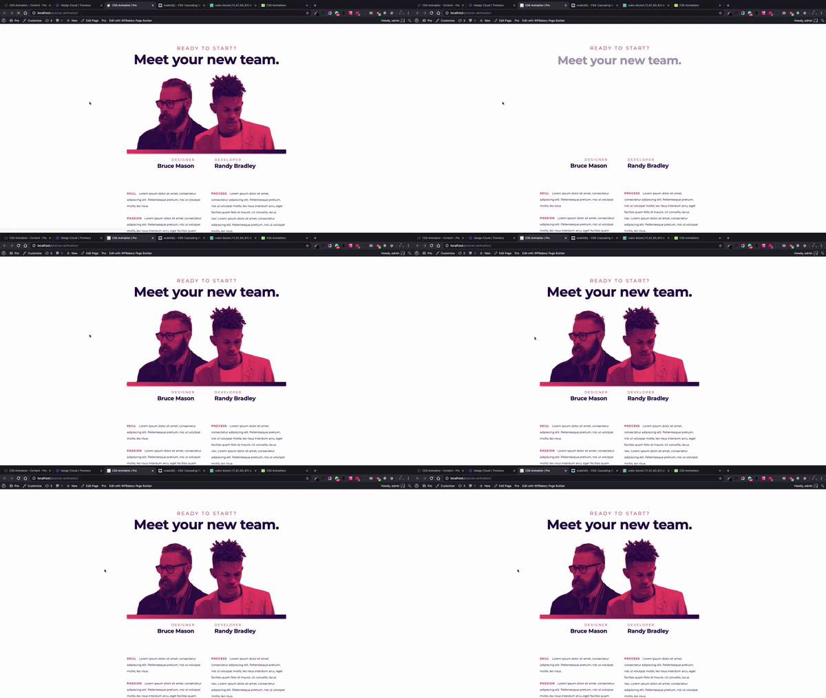 GIF source : Fade-In Effects Using CSS Animations
Do Provide Feedback
It helps users and gives them some feedback animation when the system is acting on an action that was made and recorded. An animation, if well-timed, may reassure a user that a system is working as expected when an action is performed, such as form submission or initiation of a loading process.
Examples: You can tell that the system is processing the user request, for example, by animations such as loading spinners or progress indications. Form submission animations are a good way to verify the successful transmission of data. By removing doubt and irritation, these visual clues enhance the whole interaction. An example of a loading spinner is given below:
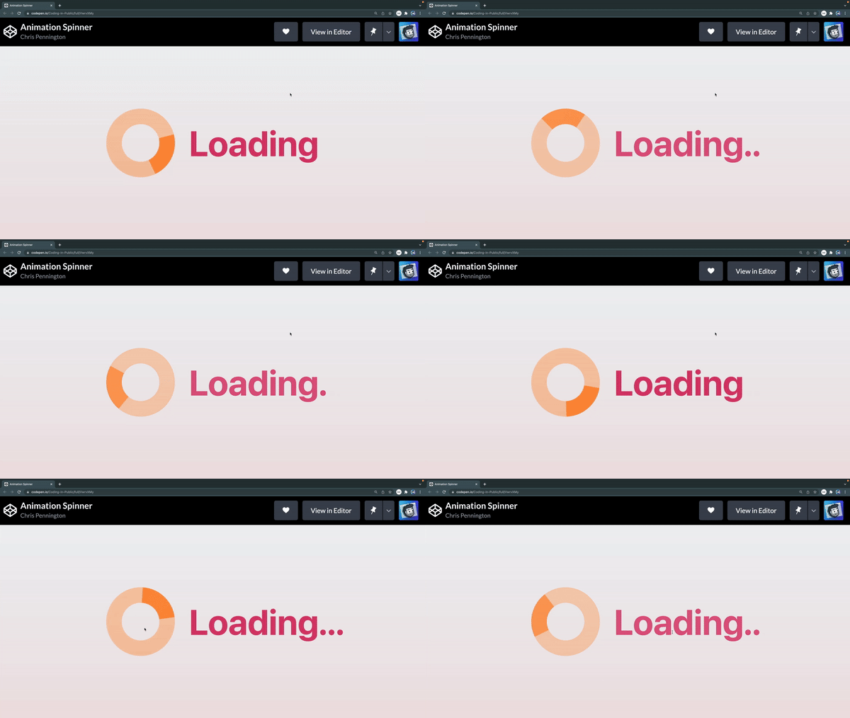 GIF source : Custom Loading Spinner Animation
Do Maintain Consistency
Consistent UI animation is the foundation for a predictable and consistent user experience. If the animations across the various regions of the interface are quite different in appearance or function, users could get lost or alienated. Therefore, making the application stick to one style for the animations is relevant.
Examples: Ensure that each screen uses the same type of transition; for example, seamless transitions among different parts of an app. Also, buttons with a hover effect should be consistently timed and styled throughout the interface to reduce the cognitive load for the user and create familiarity.
Do Make Animations Purposeful
Every animation in the user interface should be purposeful. Animations that are decorative or random might diminish the user experience and make the interface unprofessional. On the other hand, cleverly designed animations afford visual hints, which help users understand how the interface works and what to expect after performing a particular action.
Examples: As shown below, the pop-up notifications and progress bars are part of the animations that notify users about critical activities. A progress bar can be used to make the user aware of the visual completeness of an activity. On the other hand, an animation notification may inform them that something important is going to happen or when they receive some message. Each animation type has its own specific, valuable means of enriching the user experience.
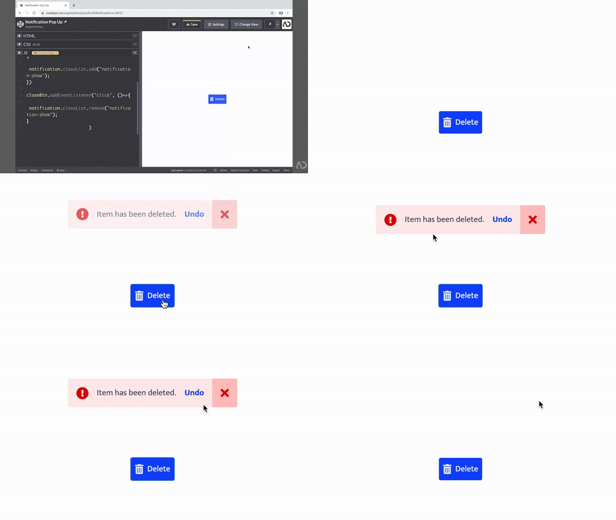 GIF source : Notification Pop Up | Custom Alert
Do Consider Performance
Most importantly, performance consideration is vital when implementing animations on the UI. Poorly optimized animations cause lag, slowdowns, or even crashes on every platform, including mobiles or lower-end systems. Effective techniques should be adopted with reductions of expensive operations so that the animations do not degrade the interface’s performance.
Examples: Where possible, performance can be improved by switching to CSS transitions over JavaScript-based animations, as CSS transitions tend to be lighter and more rendering-optimized. Also, CSS transitions are fast and not complex. An example is given below. To make sure the animations work on all devices, avoid truly complex animations that require lots of processing power, and test the interface on a range of devices.
 GIF source : #31 CSS Transition Tutorial
The Don’ts of UI Animation
When used thoughtfully, UI animation has the potential to enhance usability; if done poorly, it can also harm it. While animations can enhance brand identity, guide the user, and even sometimes provide feedback, there are a few common mistakes one should avoid. The following represents some of the key “don’ts” of UI animation that will help make sure the overall experience is enhanced rather than degraded.
Don’t Overwhelm Users
Animations are good to watch, but too much movement may exhaust the users, hence making such cases a little confusing. When an interface is overburdened with frequent and excessive animations, the user gets distracted from the information and the main tasks. Therefore, having an ideal balance and using the animation only as much amount as required or necessary is very important.
Examples: Too many animated features of a website or application—mostly flashing buttons, many pop-ups, or continuous transitions—drive users without much understanding, thus disabling them from navigating through websites or apps. These overfilled experiences drive frustration and site or app abandonment.
Don’t Use Animation Arbitrarily
Animations shouldn’t be used just to make the interface look alive; they must have a purpose. Too much gratuitous or unexplained animation will make things feel gimmicky, bringing down the overall quality of the user experience. Every single animation should enhance the functionality of the interface.
Examples: Animation side effects may be superfluous to these—for example, floating and bouncing text elements—and can be a waste of the user’s time and take attention away from the user’s main action. Avoid gratuitous effects that don’t enhance usability; also avoid lame decoration animations.
Don’t ignore accessibility
People have varied experiences with animations. Some people find animations confusing or even uncomfortable owing to issues related to motion sensitivity or disorders in vestibular mechanisms. If a site ignores accessibility, the site could be making users uncomfortable and might turn away users who want a plain, static interface.
Examples: It is about time to provide motion-reduction options for users who may want to experience the mobile application as more static. For instance, with the “reduce motion” option added to an app’s preferences, a user can opt out of seeing any animations that may be uncomfortable for him, like parallax scrolling or complicated transitions.
Don’t Slow Down the User
Animations should enhance the user experience, not delay it. Extended and dragged-on animations or transitions of loading just anger users by adding time delays to their activity interactions. Keep your animations swift and light to avoid making the users’ activities slower or making them wait longer than they need to.
Examples: These can make users think that they are wasting time when transitions take several seconds to load. If the progress indicators are slow or transitions between screens lag, it gives off the impression of bad performance, so it’s important to keep the speed of animations for efficiency.
Don’t Forget Mobile Users
Mobile users interact with applications and websites differently than desktop users. They often expect faster loading and smoother user experiences. Poorly optimized mobile animations have a greater chance of reducing performance, resulting in lag, crashes, or poor usability on smaller screens.
Examples: Too much animation, especially those or special effects that work right in a desktop browser, may look too bad on mobile devices. It’s very slow when running, or it could take up too much data. The animations for mobile should be light and responsive; they shouldn’t consume too much of the limited processing power. So, simpler transitions or using simple, less resource-intensive animations would make mobile smooth.
Best Practices and Tools for UI Animation
UI animation, done correctly, elevates the user experience and makes interfaces come alive. However, to do this, best practices must be catered for, with the right tooling in place, so that animations can serve their purpose efficiently. In this article, we shall cover some key best practices that make UI animations effective, the necessary tooling and libraries to create them, and certain case studies of successful animations that give insight into how it’s done.
Best Practices for Effective Animations
UI animations should be intuitive, purposeful, and optimized for performance. The following is a set of a few best practices that one could consider in designing animations:
- Keep Animations Simple: Overly intricate or flash-like animations distract a user and will delay the interaction process. Ensure you remain focused on the subtle, uncomplicated animations that enhance the user experience without cluttering the interface. Simplicity ensures clarity and workability - users are guided through in a natural, unhurried manner.
- Maintain Consistency: In animation, consistency is key. Transitions, hover effects, and micro-interactions have been kept consistent throughout different elements and pages. Consistency helps in building familiarity and reduces confusion; it makes interactions seamless and predictable.
- Optimize for Performance: Performance is key when using the device on mobile or low-powered systems. Too heavy animations create slowdowns, and the results are catastrophic for the user experience. Optimize these by using lightweight tools and avoiding resource-intensive effects in the animations.
- Consider Accessibility: Ensure that your animations are accessible to all users, including people who have sensitivities to motion. Allow reducing or replacing motion for people who get disoriented or otherwise uncomfortable with certain animations.
Tools and Libraries for Creating UI Animations
There are several tools and libraries that may assist a designer in effectively and efficiently creating high-performance animations. Here are some of the most popular ones:
- CSS Animations and Transitions: CSS also inherently includes means for easily making lightweight, smooth animations for everything from simple hover effects to the more complex transitions between states. Animations with CSS are super-efficient, especially in web apps, and are supported quite well across a great variety of browsers and devices.
- GSAP (GreenSock Animation Platform): GSAP is a high-performance library capable of handling more complex, granular animations than CSS alone can offer. This is very useful for creating advanced animations and provides better performance for animations that involve multiple elements or timelines.
- Lottie: Lottie is a popular tool for rendering animations created in Adobe After Effects in real-time, using JSON data. It’s ideal for more detailed, intricate animations and is widely used in mobile apps, web apps, and other digital products to deliver high-quality, scalable animations without significant performance overhead.
Case Studies
Let’s see how some successful examples were taken from well-animated sites and apps and the lessons learned from those case studies for a better understanding of how effectively UI animation can be implemented.
Case Study 1: Mailchimp’s Subtle Micro-Interactions
Mailchimp sprinkles in tiny, often delightful moments when completing certain actions that lead to animations: submitting a form, checking off a to-do, or hovering over a button. These animations provide feedback to confirm that something has happened or is happening and entertain without taking away from the core functionality of the product.
Lesson Learned: Subtle, intentional micro-interactions can do wonders for user experience, providing instant feedback and letting the user better interact with one place or another. The bottom line is that animations feel natural-smooth, enhancing and not breaking the flow.
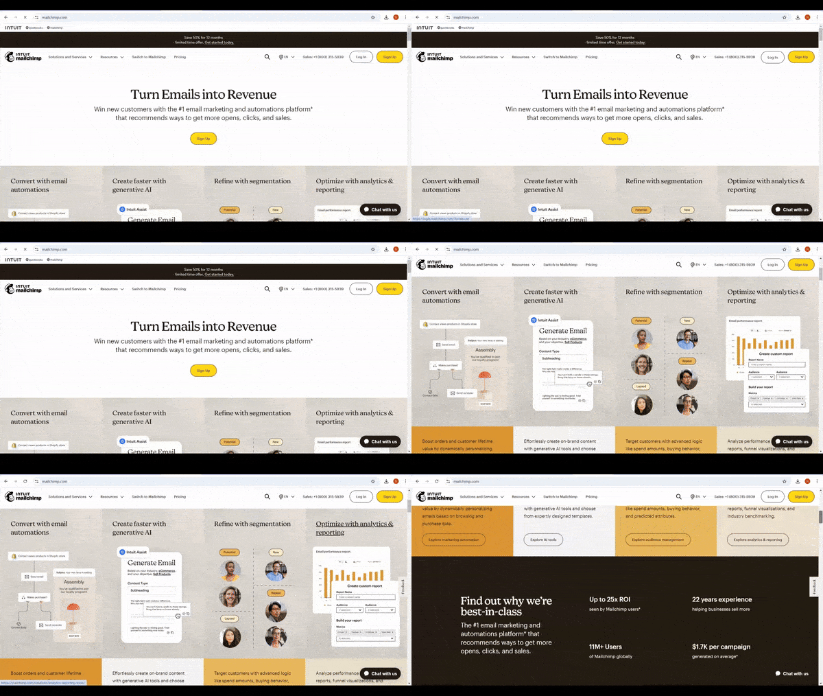 GIF source : Mailchimp landing page
Case Study 2: Airbnb’s Lottie Animations
Airbnb injects its UI with a lot of beautiful, detailed, scalable, and lightweight animations using the Lottie animations. From playful onboarding animations involving transitions to engaging transitions, Airbnb leverages animation in a manner that strengthens brand identity and builds more user engagement.
Lesson Learned: Airbnb uses Lottie Animations to demonstrate how complex and beautiful animations can be seamlessly integrated into an app without hurting performance. What makes these animations successful is that they can amplify brand storytelling without sacrificing fast load times or smooth interactions.
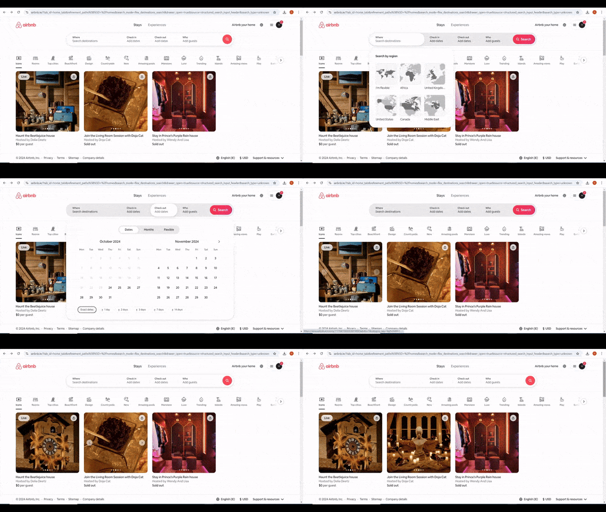 GIF Source : Airbnb landing Page
Case Study 3: Stripe’s Smooth Transitions
Stripe is a payment platform known for its smooth and polished transitions between states when, for instance, a user interacts with form fields or completes transactions. This provides a fluid experience and guides the user in a seamless way through the platform.
Lesson Learned: Animation consistency sends a message of trust and assurance to users regarding the product. Stripe’s smooth transitions and repetition of patterns in animation will ensure reliability and professionalism. It draws on using animations to construct a consistent, intuitive user experience.
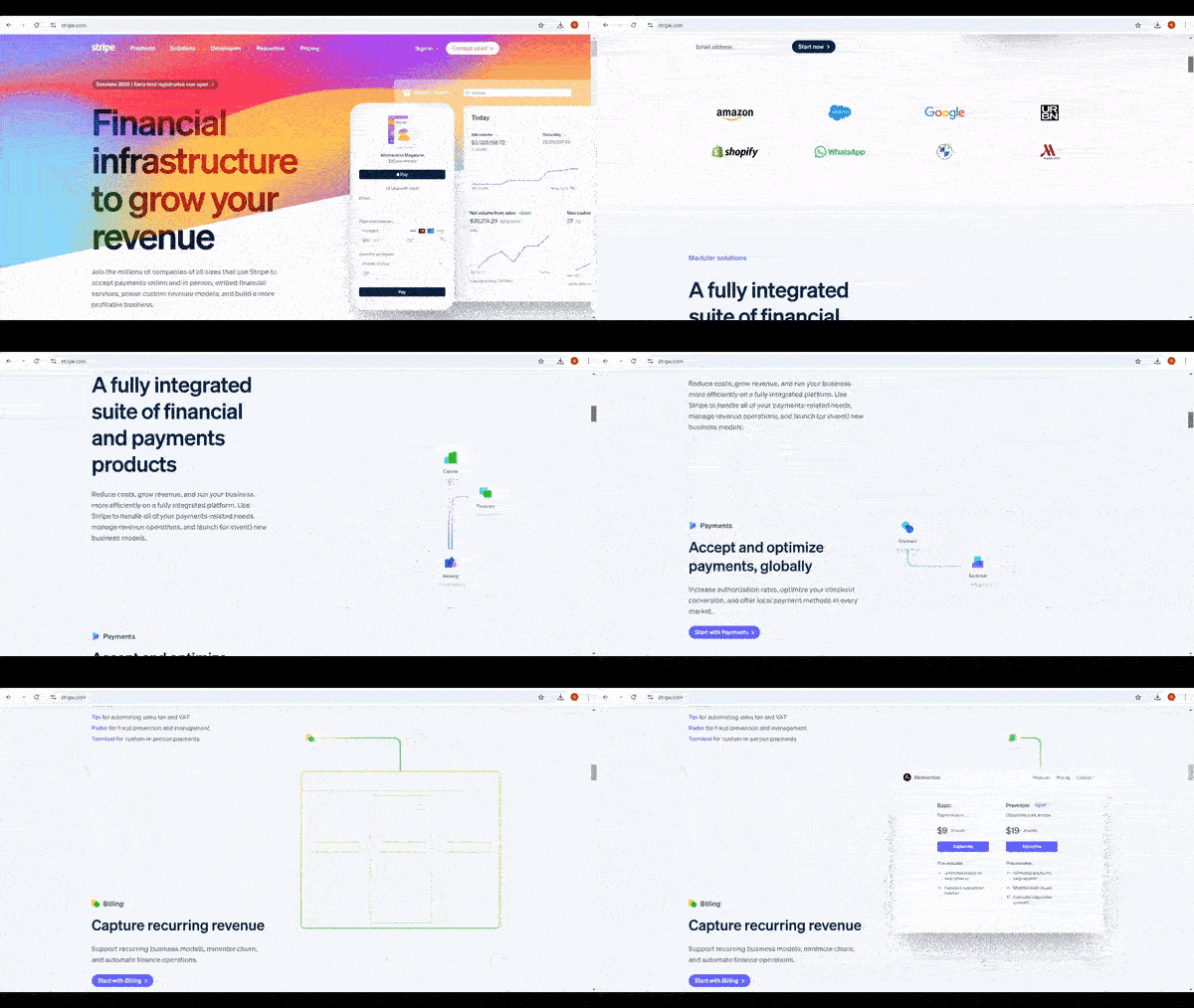 GIF source : Stripe Landing page
Conclusion
UI animation is such a powerful tool that can make interfaces intuitive, engaging, and responsive if applied correctly. Any UI designer or web developer needs to feel the balance between enhancing usability and keeping it simple. If one keeps in mind the key dos like keeping the animation simple, providing feedback, keeping it consistent, making it purposeful, and optimizing it for performance, it’s guaranteed that the animations will add value for sure. By avoiding such common pitfalls as overloading users, using arbitrary animations, neglecting accessibility, crippling interactions, and neglecting performance on mobiles, the interface keeps on being user-friendly and accessible to anyone.
By taking the best practices into account, designers and developers will introduce much more refined, efficient, and delightful digital experiences. Well-thought-out, purpose-driven animation can make the interfaces alive, allowing smoother, more meaningful, and informal interactions that meet the needs of a diverse range of users.
Truly understand users experience
See every user interaction, feel every frustration and track all hesitations with OpenReplay — the open-source digital experience platform. It can be self-hosted in minutes, giving you complete control over your customer data. . Check our GitHub repo and join the thousands of developers in our community..

