

Front-end development plays a crucial role in creating captivating web experiences as the digital world keeps expanding. Yet, the diversity of devices has made it hard to maintain consistent functionality and design across all platforms. To address this, cross-browser testing has become significant. It involves verifying that websites or web applications work and look the same across different web browsers and their versions. This article explores the best practices and strategies for efficient cross-browser testing, ensuring web applications cater to users on all browsers and devices.

Discover how at OpenReplay.com.
Cross-browser testing involves testing a web application to ensure it functions and appears on different browsers and versions. Given plenty of web browsers, such as Google Chrome and Mozilla Firefox, among others, developers need to test their web projects on these different platforms to ensure a smooth user experience for all visitors.
The importance of successful cross-browser testing is very crucial. A website that works on one browser may behave differently or even break on another. Failure to address these inconsistencies leads to poor user experience, decreased user satisfaction, and lost conversion opportunities. In the competitive online space, businesses must ensure their front-end development is robust and reliable across a wide range of browsers to cater to diverse user preferences.
Browser diversity is a fundamental characteristic of the modern internet. With many browsers currently used, developers face the challenge of accommodating their designs and code to work across all these platforms. Differences in rendering engines, CSS support, JavaScript interpretation, and other factors contribute to browser compatibility issues that cross-browser testing aims to address.
Choosing Cross-Browser Testing Tools
This ensures a smooth and efficient software testing process. With many tools available in the market (Selenium, Sauce Labs, BrowserStack, and LambdaTest) offering different features and capabilities, developers must test and select the most suitable tools that align with their project requirements. Here’s an overview of these testing products:
BrowserStack
- Browser Coverage: Supports major browsers & versions (Chrome, Firefox, Edge, Safari, etc.)
- Platform Support: Windows, macOS, Android, iOS
- Ease of Use: User-friendly
- Testing Speed: Fast testing cycles
- Integration Options: Integrated with CI frameworks like Jenkins, Travis CI
- Feature Set: Automated screenshot comparisons, real-time testing for interactive debugging, device emulation for various screen sizes
CrossBrowserTesting
- Browser Coverage: Covers popular browsers & versions (Chrome, Firefox, Edge, Safari, etc.)
- Platform Support: Windows, macOS, Linux, Android, iOS
- Ease of Use: Intuitive interface and navigation
- Testing Speed: Rapid feedback on changes
- Integration Options: Integrated with CI frameworks like Jenkins, Travis CI
- Feature Set: Automated screenshot comparisons, real-time testing for interactive debugging, device emulation for various screen sizes
Sauce Labs
- Browser Coverage: Covers popular browsers & versions (Chrome, Firefox, Edge, Safari, etc.)
- Platform Support: Windows, macOS, Linux, Android
- Ease of Use: Clear documentation and customer support
- Testing Speed: Parallel testing speeds up development
- Integration Options: Integrated with CI frameworks like Jenkins, Travis CI
- Feature Set: Real-time testing for interactive debugging, device emulation for various screen sizes
LambdaTest
- Browser Coverage: Covers popular browsers & versions (Chrome, Firefox, Edge, Safari, etc.)
- Platform Support: Windows, macOS, Linux, Android, iOS
- Ease of Use: Ease to use and intuitive UI
- Testing Speed: Parallel testing, quick feedback on changes
- Integration Options: Integrated with CI frameworks like Jenkins, Travis CI
- Feature Set: Automated screenshot comparisons, real-time testing for interactive debugging, device emulation for various screen sizes
Manual Cross-Browser Testing
Here developers manually test a website or web application on different browsers to identify and resolve any inconsistencies or issues that may arise due to browser rendering and compatibility variations.
Testing on Different Browsers
To ensure that users have a smooth experience on your website, no matter which browser or operating system they use, it’s essential to conduct thorough testing. Different browsers interpret website code differently, which can cause variations in how the site looks and works.
By testing your website on the main browsers, as well as on different devices and systems, you can find and fix any issues. This helps ensure that your website performs well and works for all users, regardless of the platform they’re on.
An example of testing on Firefox
Using Browser Developer Tools for Debugging
Browser developer tools are crucial resources that offer a variety of functions to inspect and fix web pages during manual cross-browser testing. These tools allow developers to:
- Inspect Elements: Developers can check and examine individual elements on the page, which helps understand their structure and style.
- Identify Layout Issues: The tools help spot problems related to the layout of elements on the page, ensuring everything appears correctly.
- Test Responsive Designs: By simulating different screen sizes and orientations, developers can see how their website adapts to various devices.
- Track Network Requests: Developers can track network requests made by the website, which helps identify performance issues.
- Real-time CSS Tweaking: With the ability to tweak CSS in real time, developers can experiment with design adjustments instantly.
- Debug JavaScript Code: The JavaScript console is useful for spotting errors in the code, inspecting variables, and understanding how the code executes, making it easier to fix script-related issues.
Using these developer tools, web developers can debug and fine-tune their websites, ensuring they work smoothly and look great across different browsers and devices.
Automated Cross-Browser Testing
Test automation for websites and web applications across multiple browsers and configurations is efficient. Running tests automatically saves developers time and effort, particularly when dealing with various browsers and platforms. To simplify cross-browser testing, there are essential automated testing frameworks available:
- Selenium: A widely used open-source framework supporting various browsers.
- Puppeteer: A Google-developed Node.js library for controlling headless Chrome or Chromium browsers.
- TestCafe: An open-source framework designed for web applications, supporting many browsers.
- Cypress: A JavaScript-based end-to-end testing framework offering developer-friendly features.
To implement automated cross-browser testing successfully, developers create comprehensive test suites covering critical user flows and essential functionalities.
Integrating these suites into the Continuous Integration (CI) process ensures automatic testing of code changes across different browsers, catching regressions early.
Automated testing ensures consistent and reliable results, eliminates human error, allows easy updates for new browsers or versions, and ensures continuous compatibility across evolving browser landscapes.
Testing Mobile Browsers and Responsive Design
Mobile technology has led to more users accessing the web via smartphones and tablets. This has made mobile browser testing and responsive design compatibility crucial in cross-browser testing. To ensure top-notch user experiences across devices, developers must consider key factors like;
- Testing on popular mobile browsers.
- Accommodating different screen sizes and resolutions
- Accounting for various device orientations.
By addressing issues specific to mobile users, developers ensure an optimized mobile browsing experience.
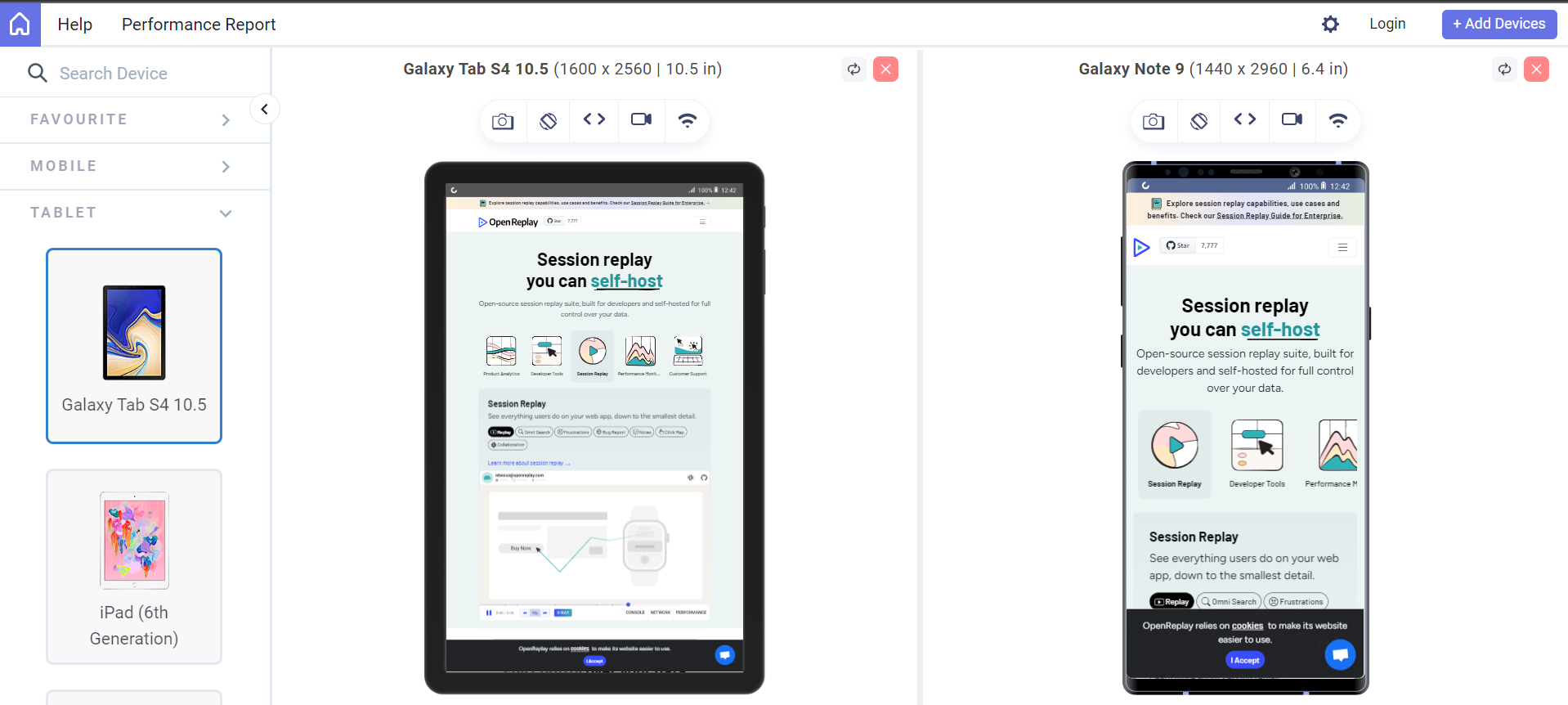
Here’s an example of using LambdaTest to test for responsive design.
Responsive design makes adaptive websites for different screen sizes and devices possible. Developers use the following techniques to test responsive design:
- Media queries are used to apply different styles based on viewport characteristics.
- Browser developer tools are leveraged for viewport simulation.
- Actual devices are tested to discover nuances that simulated environments may overlook.
- Readability and accessibility are ensured on all viewports, including font sizes and line spacing.
- User interaction is enhanced to provide a consistent and engaging experience.
- A well-executed responsive design can lead to improved user satisfaction.
- Overall website performance on mobile devices is measured.
Dealing with Browser-Specific Issues
When creating websites, developers aim to make them work on multiple browsers. However, it’s common for issues to arise due to different interpretations and executions of web code. To solve these problems, it’s important to take a systematic approach to ensure the website functions correctly on all browsers.
The first step in dealing with browser-specific issues is to familiarize oneself with common bugs and known workarounds. Various browsers may have specific quirks or limitations that can lead to inconsistencies in how a website is displayed or functions.
Developers can troubleshoot and apply targeted fixes by being aware of these issues. Some common approaches to dealing with browser-specific bugs include:
- Browser-Specific CSS Hack: When dealing with browser-specific issues, sometimes CSS hacks are used. These are CSS rules that target particular browsers to fix problems unique to them. Although CSS hacks are not the best practice, they can act as temporary solutions until better fixes are implemented. Let’s look at an example where text displays differently in Internet Explorer (IE) compared to other browsers, and a CSS hack is used to address this issue.
/* Styles for all browsers */
p {
 font-size: 16px;
 color: black;
}
/* IE-specific styles using CSS hack */
@media all and (-ms-high-contrast: none), (-ms-high-contrast: active) {
 /* This rule will only apply to Internet Explorer */
 p {
   font-size: 18px; /* Increase font size for IE */
   color: blue;     /* Change text color for IE */
 }
}- Conditional JavaScript Statements: Conditional JavaScript statements are helpful for checking the user’s browser and applying specific code or workarounds based on its identity. This approach allows developers to address browser-specific issues case-by-case, ensuring consistent website performance across browsers.
if (window.fetch) {
 // Use fetch() if supported
 fetch('https://api.example.com/data')
   .then(response => response.json())
   .then(data => console.log(data))
   .catch(error => console.error(error));
} else {
 // Fallback for browsers without fetch support
 var xhr = new XMLHttpRequest();
 xhr.open('GET', 'https://api.example.com/data', true);
 xhr.onreadystatechange = function () {
   if (xhr.readyState === 4 && xhr.status === 200) {
     var data = JSON.parse(xhr.responseText);
     console.log(data);
   } else {
     console.error('Error fetching data');
   }
 };
 xhr.send();
}- Feature Detection: It checks if the user’s browser directly supports a particular feature or functionality. It’s a more reliable approach compared to browser sniffing. This allows developers to provide alternative solutions or graceful degradation for unsupported browsers, resulting in a better user experience.
- Progressive enhancement is a strategy that ensures that all users can access the core functionality of a website, regardless of the browser they are using. This is achieved by first building the website with the most basic features and then adding more advanced features for supported browsers. This ensures that even users with older browsers can still access the main content and functionality of the website.
/* Basic CSS for anchor links */
a {
 color: blue;
}
/* Feature detection with progressive enhancement */
document.addEventListener('DOMContentLoaded', function() {
if ('scrollBehavior' in document.documentElement.style) {
// If scroll-behavior is supported, add smooth scrolling
document.querySelectorAll('a[href^="#"]').forEach(anchor => {
anchor.addEventListener('click', function(e) {
e.preventDefault(); document.querySelector(this.getAttribute('href')).scrollIntoView({
behavior: 'smooth'
});
});
});
} else {
// If scroll-behavior is not supported, use a JavaScript polyfill or fallback
console.log('Smooth scrolling not supported. Consider using a polyfill.');
}
});Ensuring Accessibility Across Browsers
To ensure web accessibility, developers use specialized tools to test how their websites interact with assistive technologies like screen readers, voice recognition software, and keyboard navigation. Key aspects to consider during web accessibility testing include:
- Screen Reader Testing: Ensure all content, including text, images, and multimedia, is conveyed properly through screen readers using semantic HTML elements and ARIA attributes.
- Keyboard Navigation: Verify that interactive elements like buttons, links, and form fields are navigable and operable using only the keyboard, with visible focus indicators.
- Alternative Text for Images: Provide descriptive alternative text (alt text) for images to convey their purpose or content to users with visual impairments or when images fail to load.
- Captions and Transcripts: Include captions for video and audio content to enable users with hearing impairments to access the information. Provide transcripts for multimedia content as well.
To ensure compatibility with assistive technologies, developers should aim for at least AA conformance to Web Content Accessibility Guidelines (WCAG), which define best practices for accessible web content. These guidelines define best practices for accessible web content and include the following principles:
- Perceivable: Present content in a way that all users can perceive.
- Operable: Ensure user interface components and navigation are operable via various means, like keyboard and voice commands.
- Understandable: Make information and user interface operation clear and straightforward.
- Robust: Ensure content works across different browsers and assistive technologies.
By following these principles, developers create accessible websites for a broader audience, improving the user experience and promoting inclusivity.
Best Practices for Efficient Testing
To ensure efficient cross-browser testing, developers should implement the following best practices that promote effectiveness and productivity:
- Optimize Test Coverage
- Focus on critical functionalities and key user flows for initial testing.
- Gradually expand test coverage to less critical areas of the website.
- Prioritize Browsers Based on Usage Statistics
- Target the most widely used browsers to maximize the impact of testing efforts.
- Automate Repetitive Tests
- Use testing frameworks like Selenium or Cypress to automate repetitive test cases.
- Automated tests run across multiple browsers simultaneously, saving time and effort.
- Utilize Browser Stack Testing Services
- Leverage browser stack testing services to run tests on multiple browsers and operating systems concurrently.
- This allows for quick and comprehensive testing across different configurations.
- Effective Issue Management
- To document and manage reported cross-browser issues, use issue-tracking tools such as Jira, GitHub Issues, or Trello.
- Sort and prioritize issues based on their severity and impact on the user experience.
- Maintain Consistent Communication
- To ensure a smooth resolution process for identified issues, regular communication between the testing and development teams is required.
- Provide detailed information about the problem, including how to reproduce it and the expected behavior.
- Work with the QA and UX Teams
- Collaborate with the QA and UX teams to gain insights and perspectives on cross-browser issues.
- A comprehensive approach to problem-solving ensures that all aspects of testing and user experience are considered.
By adopting these best practices, developers can streamline the testing process, promptly address cross-browser issues, and deliver a high-quality product with excellent cross-browser compatibility and user experience.
Conclusion
Cross-browser testing is crucial to front-end development, guaranteeing a smooth and consistent user experience across different browsers. Developers can simplify the testing process, resolve browser-specific issues, and deliver web applications that perform flawlessly on major browsers and devices using the appropriate testing tools, automated frameworks, and best practices.
Prioritizing cross-browser testing in the development workflow leads to higher user satisfaction, enhanced brand reputation, and overall success in the competitive online world.
Gain control over your UX
See how users are using your site as if you were sitting next to them, learn and iterate faster with OpenReplay — the open-source session replay tool for developers. Self-host it in minutes, and have complete control over your customer data.
Star on GitHub12k