Effects you can build with CSS without JavaScript
You don't always need JavaScript to produce nice visual effects

CSS has come a long way from its early days of basic styling to now being a powerful tool for creating eye-catching effects and animations. While JavaScript is still a popular choice for front-end development, CSS is often overlooked as a tool for creating dynamic and interactive effects. In this article, we will explore the many effects that can be achieved purely with CSS without the need for JavaScript. We will cover CSS animations and transitions in-depth, providing code examples and live demos of each effect. By the end of the article, readers will have a comprehensive understanding of the power of CSS and be equipped with the knowledge to build stunning effects without relying on JavaScript.
Introduction to CSS Effects
An effective tool for designing aesthetically appealing effects on a website is CSS. It has a high degree of browser compatibility and is lightweight, quick, simple to learn how to use, and offers. In order to improve the user experience for visitors to their websites, designers, and developers may easily build consistent, SEO-friendly, and scalable effects with CSS.
CSS has always been known as the language used to style and lay out the visual aspects of a web page. However, CSS has developed into a potent tool for producing eye-catching effects and animations over time. While CSS is frequently disregarded as a tool for developing dynamic and interactive effects, JavaScript is still a common choice for front-end development.
In this article, we will examine the various effects that are entirely CSS-based and don’t require JavaScript. How do they differ from JavaScript-based effects?
- Execution: The browser directly applies CSS effects to the style attributes of HTML components. Contrarily, JavaScript effects are implemented through the use of JavaScript code that engages with the Document Object Model of a web page (DOM). This means that JavaScript effects can need more materials, like a JavaScript library.
- Degree of Interactivity: The only interactive elements that can be produced with CSS code are transitions, animations, and pseudo-elements. As a result of JavaScript’s ability to alter the Document Object Model (DOM), which enables more intricate animations and user interactions like drag and drop, however, JavaScript effects can offer a higher level of interactivity.
- The ideal applications of CSS effects are for straightforward animations and transitions, like image sliders, parallax scrolling, and hover effects. They are perfect for increasing a website’s user experience and adding visual appeal. However, complicated interactions like form validation, pop-ups, and interactive games are better suited for JavaScript effects.
- Compatibility: Because CSS effects are executed directly by the browser, they are more likely to be supported by all current browsers, even those on mobile devices. The user experience may be impacted by JavaScript effects that need additional libraries or that aren’t supported by all devices or browsers.
- Performance: Compared to JavaScript effects, CSS effects are typically quicker and lighter. This is due to the fact that although JavaScript effects require additional resources, such as a JavaScript library, which can increase page load times, CSS effects are implemented directly by the browser.
Creating Transitional Effects with CSS
Let’s start with some transition effects.
Hover Effects
One of the most common ways to add transitional effects to an element is to apply different styles to it when the user hovers over it. This CSS effect is one of the basic effects anyone can achieve with CSS. This can be achieved with the :hover pseudo-class in CSS.
For example, let’s say we have a link that we want to change color when the user hovers over it. We can add the following CSS:
nav a {
  float: left;
  display: block;
  color: #914848;
  text-align: center;
  padding: 20px 16px;
  text-decoration: none;
  transition: background-color 0.3s ease;
}
nav a:hover {
  background-color: #a63030;
  color: #fff;
  padding: 15px 16px;
}
In the example above, the nav element has the color #914848, and we’ve added a transition property that specifies that any changes to the color property should be animated over a duration of 0.3 seconds with an easing function. Then, when the user hovers over the link, we change its background color to#a63030.
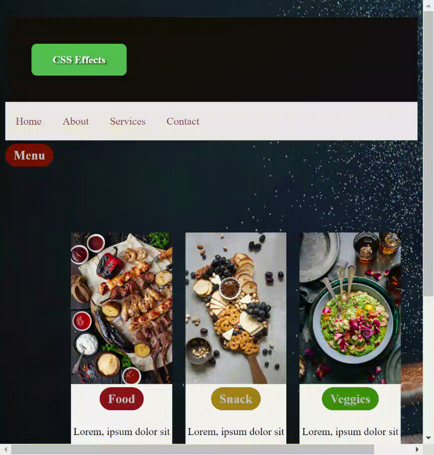
Let’s view another example,
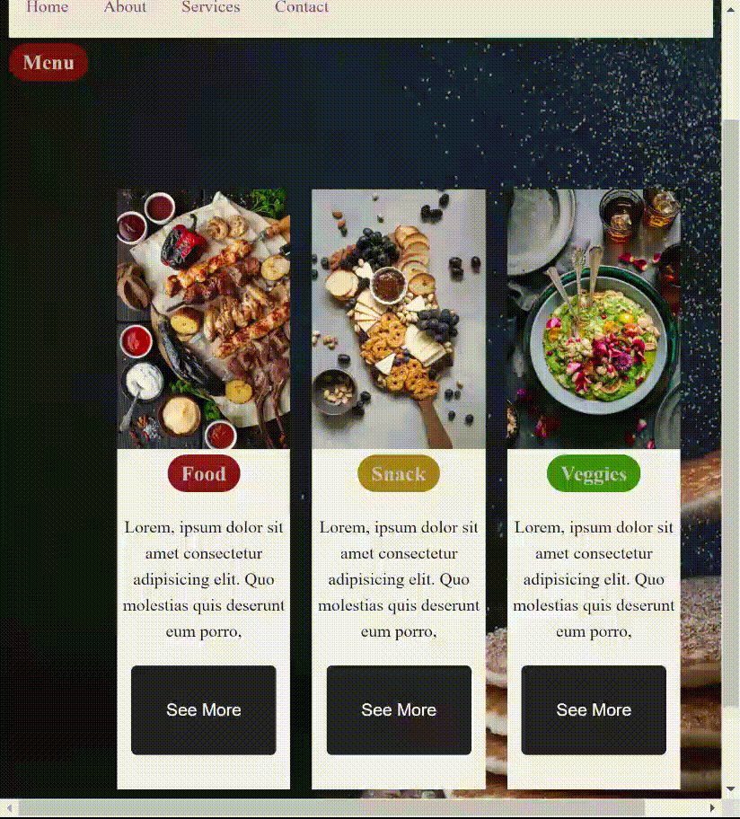 To achieve this with CSS, we define styles for the elements with class using the
 :hover pseudo-class. It applies the styles when the user hovers over it. The transform property applies a 3D transformation that moves the element up. The box-shadow property applies a shadow effect to the element with a horizontal offset of 0, a vertical offset of 3.2rem, a blur radius of 6.4rem, and a color with an opacity of 0.06.
.meal:hover {
  transform: translateY(-1.2rem);
  box-shadow: 0 3.2rem 6.4rem rgba(0, 0, 0, 0.06);
}
For the button,
.container button:hover {
  background-color: #666;
}
The button:hover selector defines styles for the button when the user hovers over it, providing visual feedback to the user that the button is interactive. You can also use hover effects to add transitions to other properties, such as the font size, border, etc.
Text Shadow Effects
The text shadow effect can be used to give elements a three-dimensional appearance and make them stand out.
The text-shadow property takes four values:
offset-x: Horizontal offsetoffset-y: Vertical offsetblur-radius: The amount of blurring applied to the shadow.color: The color of the shadow.
The syntax for the text-shadow property is:
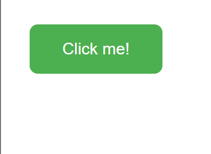
text-shadow: [horizontal offset] [vertical offset] [blur radius] [color];Text shadows can be used to create various effects, such as adding depth to the text, creating an engraved look or highlighting important text creating. First, an HTML code
<button class="example-button">Click me!</button>Basic styling using CSS
background-color: #4CAF50; /* Green */
  border: none;
  color: white;
  padding: 15px 32px;
  text-align: center;
  text-decoration: none;
  display: inline-block;
  font-size: 16px;
  margin: 20px;
  border-radius: 8px;
Result
Now adding the text-shadow property,
background-color: #4caf50; /* Green */
border: none;
color: white;
padding: 15px 32px;
text-align: center;
text-decoration: none;
display: inline-block;
font-size: 16px;
margin: 20px;
border-radius: 8px;
text-shadow: 2px 2px 2px rgba(0, 0, 0, 0.7);
Result
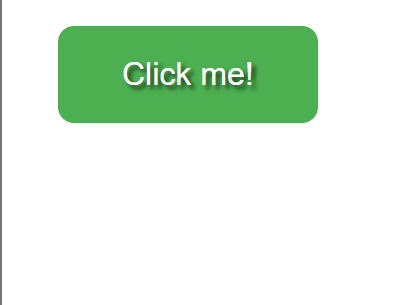
The text-shadow property in CSS is used to create a visual effect where the text appears to have a shadow behind it.
Box Shadow Effects
To create a box shadow, the CSS box-shadow property is used, which allows you to specify the horizontal and vertical offset of the shadow, its blur radius, its spread radius, its color, and whether it should be inset or outset. The syntax for the box-shadow property looks like this:
box-shadow: [h-shadow] [v-shadow] [blur] [spread] [color] [inset];- inset: an optional keyword that makes the shadow appear inside the element instead of outside it
- spread: the amount to expand or contract the size of the shadow
For example, to create a box shadow with a black color, a 10px horizontal offset, a 10px vertical offset, a 5px blur radius, and a 0px spread radius, you could use the following CSS:
box-shadow: 10px 10px 5px 0px black;This would create a shadow that appears to be coming from the bottom right of the element and extending towards the top left, with a sharp edge and a black color.
Now let’s achieve a box shadow effect using CSS First, an HTML code
<div class="container">
  <h1 class="box">Hello</h1>
</div>
and then applying styles using CSS
.box {
  background-color: #5d7892 or #7d9dba;
  width: 4rem;
  height: 4rem;
  padding: 2rem 4rem;
  border-radius: 1rem;
}
There haven’t been any visible effects applied, but that is not the point.
To apply the box shadow effect, do the following:
There haven’t been any visible effects applied, but that is not the point.
To apply the box shadow effect, do the following:
.box {
  margin-right: 4rem;
  box-shadow: 0 4px 4px rgba(0, 0, 0, 0.1), 8px 32px 32px rgba(0, 0, 0, 0.15),
    8px 64px 64px rgba(0, 0, 0, 0.15);
}
Note: the farther a shadow is from the object, the more blurry it appears, giving it an appealing box-shadow effect.
- The first specified effect has no horizontal or vertical offset but creates a 4px blur with a transparency of 0.1. This gives a subtle shadow effect underneath the box.
- The second specified effect has a horizontal offset of 8px, and a vertical offset of 32px, creating a 32px blur with a transparency of 0.15. This creates a larger, more prominent shadow that appears behind and to the right of the box.
- The third specified effect has a horizontal offset of 8px, a vertical offset of 64px, and creates a 64px blur with a transparency of 0.15. This creates an even larger, more diffuse shadow that appears further behind and to the right of the box.
Giving the result
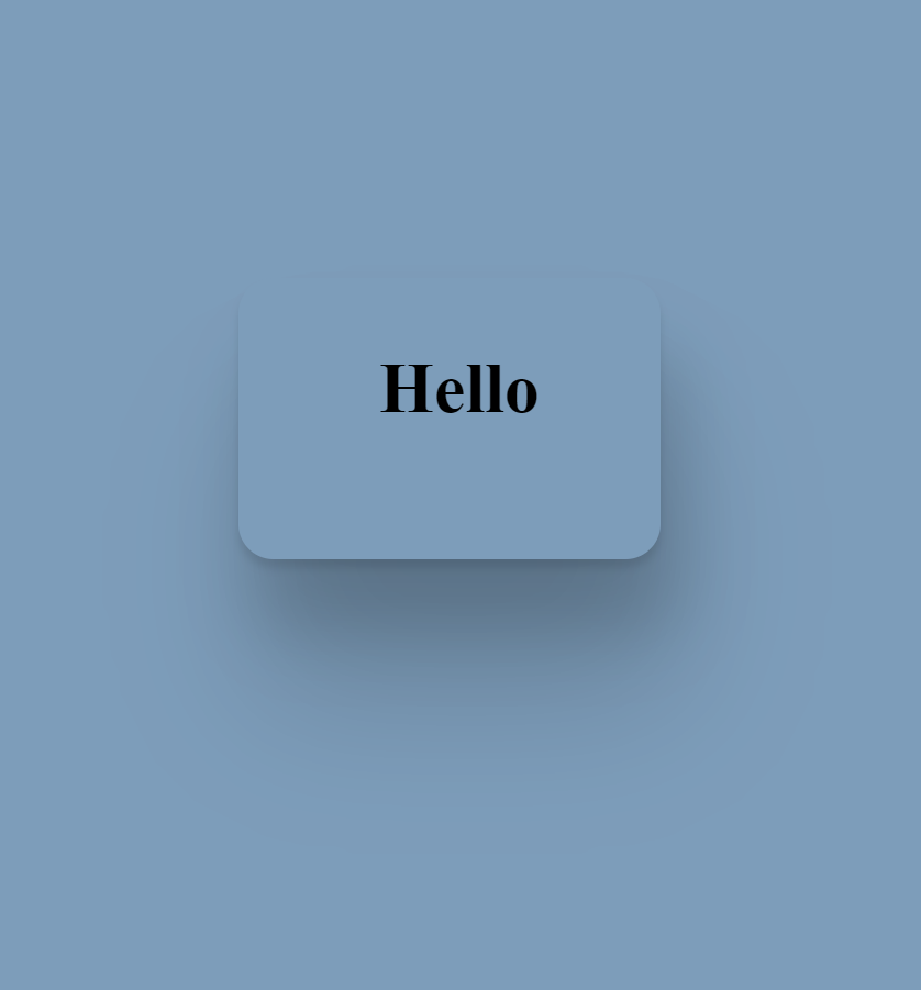 Overall, the box-shadow effect gives the appearance of depth and separation from other elements on the page.
CSS transformations
There are several types of transformations you can apply to an element, including rotating, scaling, skewing, and translating. We’ll explore each of these transformations in more detail.
Rotating Elements
To rotate an element using CSS, you can use the transform property along with the rotate function. The rotate function takes a value in degrees and rotates the element by that amount.
For example, to rotate an element by 45 degrees, you could use the following code:
.element {
  transform: rotate(35deg);
}
For example, to rotate an element around its top left corner, you could use the following code:
.element {
  transform-origin: top left;
  transform: rotate(45deg);
}
The transform-origin property changes the rotation point.
Scaling Elements
Scaling an element allows you to make it larger or smaller. To scale an element using CSS, you can use the transform property along with the scale function.
The syntax is:
.element {
  transform: scale(2, 2);
}
The scale function takes one or two values, which represent the horizontal and vertical scaling factors.
Skewing Elements
Skewing an element allows you to distort it in a non-uniform way. To skew an element using CSS, you can use the transform property along with the skew function.
The syntax is:
.element {
  transform: skewX(30deg);
}
The skew function takes one or two values, which represent the horizontal and vertical skew angles in degrees.
Translating Elements
Translating an element allows you to move it in any direction. To translate an element using CSS, you can use the transform property along with the translate function.
Syntax:
.element {
  transform: translate(100px, 50px);
}
You can also use the translateX and translateY functions to move an element only horizontally or vertically, respectively.
Combining Transformations
You can combine multiple transformations by simply listing them in the transform property.
For example
.element {
  transform: rotate(45deg) scale(2);
}
You can also apply multiple transformations using different transform properties, for example;
.element {
  transform: rotate(45deg);
  transform: translateX(100px);
}
Keep in mind that we utilized two distinct transform properties in the second example, each with a single transformation. This is so that they can be applied in the correct sequence when many transformations are listed in a single transform property. In the first example, the element would be rotated by 45 degrees and scaled by a factor of 2. The second example would involve rotating the element by 45 degrees and then moving it 100 pixels to the right.
Use Case for Skew, Rotate, and transform
<div class="container">
  <div class="box"></div>
</div>
Now a bit of styling with CSS
.container {
  display: flex;
  justify-content: center;
  align-items: center;
  height: 100vh;
}
.box {
  width: 150px;
  height: 150px;
  background-color: #0099ff;
}
Result

Now, adding transformations, starting with skew, we’d have the box appearing in a distorted way
 .box {
  width: 150px;
  height: 150px;
  background-color: #0099ff;
  transform: skew(20deg, 10deg);
}
Result

Adding the rotate and scale function, the box rotates according to the value specified and becomes larger by the scale of 1.2
.box {
  width: 150px;
  height: 150px;
  background-color: #0099ff;
  transform: skew(20deg, 10deg) rotate(30deg) scale(1.2);
}
Result
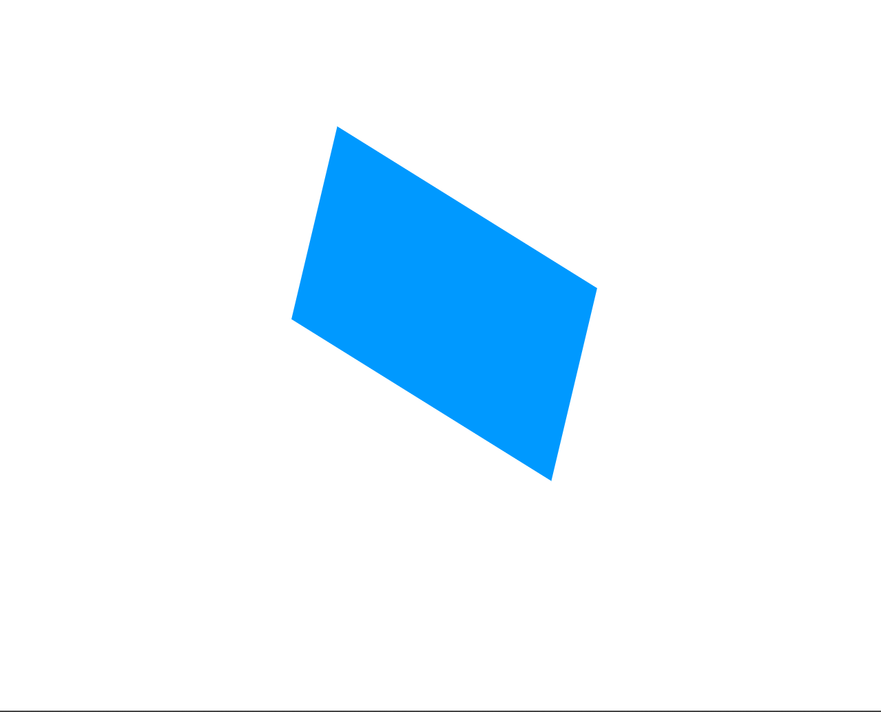
In the example above, we’ve applied three different transformations to the child div.
First, we use the skew function to skew the element horizontally by 20 degrees and vertically by 10 degrees. This creates a parallelogram-like shape. Next, we use the rotate function to rotate the element by 30 degrees clockwise. Finally, we use the scale function to scale the element by a factor of 1.2, making it slightly larger.
Session Replay for Developers
Uncover frustrations, understand bugs and fix slowdowns like never before with OpenReplay — an open-source session replay tool for developers. Self-host it in minutes, and have complete control over your customer data. Check our GitHub repo and join the thousands of developers in our community.
Creating Advanced Effects and Animation with CSS
Let’s see some advanced examples of CSS, still with no JavaScript included!
Parallax scrolling
Parallax scrolling is a visual technique used in web design and video games where background images move slower than foreground images to create an illusion of depth and immersion. Parallax scrolling is frequently utilized in web design to give a webpage a sense of movement and interactivity. The background graphics move more slowly than the foreground photos as the user scrolls down the page, giving the user’s experience a 3D-like feel.
To create a basic parallax effect with CSS, first create at least two layers of content with different depths. This can be achieved by placing an element on the background and another on top of it. Secondly, set the background-attachment property of the background element to “fixed”. This will make the background layer stay in place while the user scrolls, creating a sense of depth. Let’s take a look at this use case;
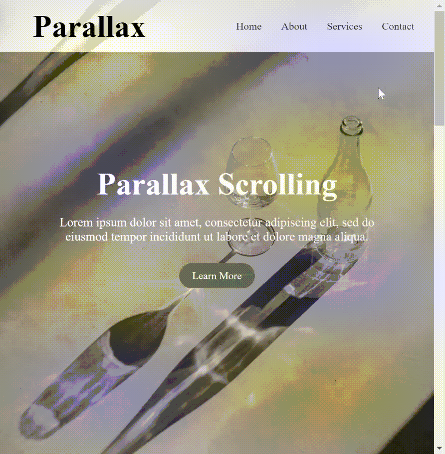 (Parallax-effect-gif)
First, the HTML structure (This is only a part of the HTML code)
<section class="hero">
  <h1>Parallax Scrolling</h1>
  <p>
    Lorem ipsum dolor sit amet, consectetur adipiscing elit, sed do eiusmod
    tempor incididunt ut labore et dolore magna aliqua.
  </p>
  <a href="#" class="btn">Learn More</a>
</section>
<section class="services">
  <h2>Our Services</h2>
  <div class="service-container">
    <div class="service">
      <i class="ser"></i>
      <h3>Order Online</h3>
      <p>
        Lorem ipsum dolor sit amet, consectetur adipiscing elit, sed do eiusmod
        tempor incididunt ut labore et dolore magna aliqua.
      </p>
      <a href="#" class="btn">See More</a>
    </div>
    <div class="service">
      <i class="ser"></i>
      <h3>Make a Reservation</h3>
      <p>
        Lorem ipsum dolor sit amet, consectetur adipiscing elit, sed do eiusmod
        tempor incididunt ut labore et dolore magna aliqua.
      </p>
      <a href="#" class="btn">See More</a>
    </div>
    <div class="service">
      <i class="ser"></i>
      <h3>Gift a Meal</h3>
      <p>
        Lorem ipsum dolor sit amet, consectetur adipiscing elit, sed do eiusmod
        tempor incididunt ut labore et dolore magna aliqua.
      </p>
      <a href="#" class="btn">See More</a>
    </div>
  </div>
</section>
The parallax scrolling effect on this landing page is achieved by simply setting the background-attachment of the section with the background-image to fixed.
.hero {
  background-image: url("https://images.unsplash.com/photo-1677338353822-bd22f9c2abc6?ixlib=rb-4.0.3&ixid=MnwxMjA3fDB8MHxlZGl0b3JpYWwtZmVlZHwyN3x8fGVufDB8fHx8&auto=format&fit=crop&w=1400&q=60");
  background-size: cover;
  background-attachment: fixed;
  height: 100vh;
  display: flex;
  flex-direction: column;
  justify-content: center;
  align-items: center;
  color: #fff;
  text-align: center;
  padding: 0 20px;
}
...
.services {
  padding: 100px 0;
  background-image: url("https://images.unsplash.com/photo-1675096000167-4b8a276b6187?ixlib=rb-4.0.3&ixid=MnwxMjA3fDB8MHx0b3BpYy1mZWVkfDEwNXx4alBSNGhsa0JHQXx8ZW58MHx8fHw%3D&auto=format&fit=crop&w=1400&q=60");
  background-attachment: fixed;
  background-size: cover;
  background-attachment: fixed;
  height: 100vh;
  display: flex;
  flex-direction: column;
  justify-content: center;
  align-items: center;
}
If a background image is fixed or scrolls with the rest of the page, it is determined by the background-attachment property. By setting it to “fixed,” you may create a parallax effect by having the background image stay in position as the rest of the page scrolls. This creates an illusion of depth as different elements of the page move at different speeds relative to each other, giving the impression that some elements are closer or farther away from the viewer.
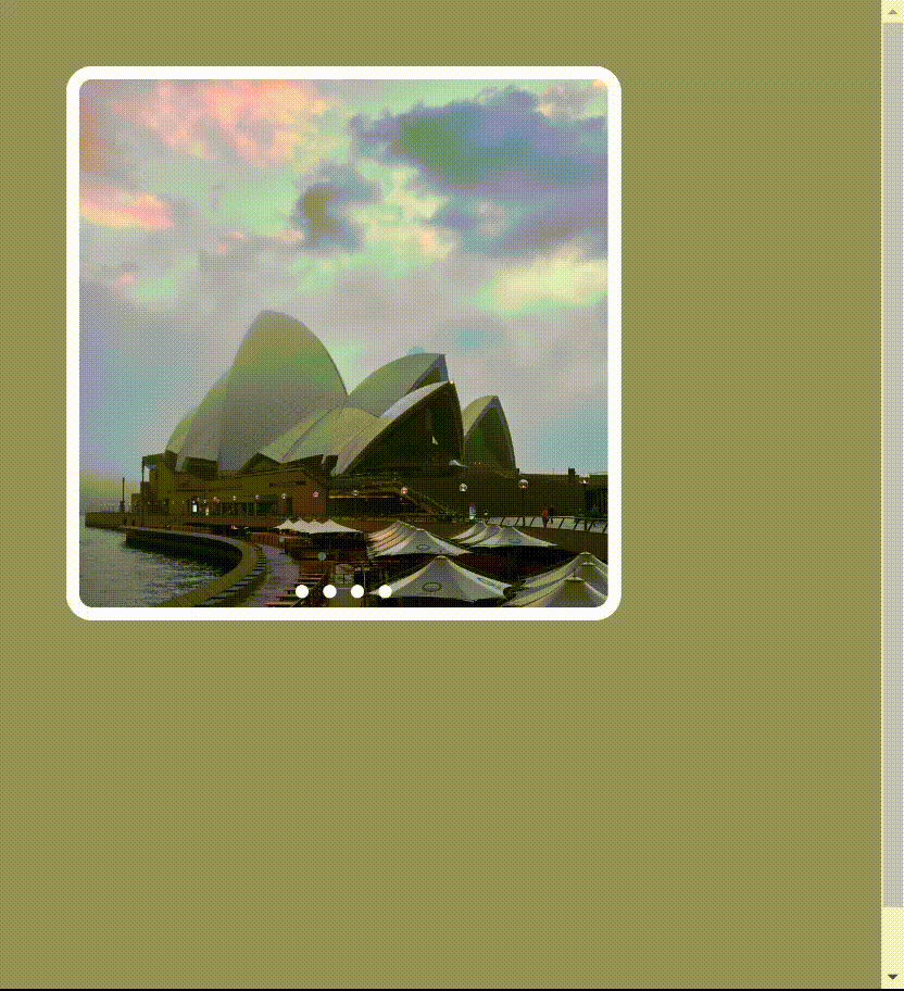
Image sliders
An excellent approach to display numerous images on your website is with an image slider. We will create an image slider using HTML and CSS. First, we will create the HTML structure, which includes a container div, a slider div, and an images div. And then, we will add input elements with type radio and label elements to create the slider buttons.
<div class="container">
  <div class="slider">
    <label for="slide-slider-1"></label>
    <label for="slide-slider-2"></label>
    <label for="slide-slider-3"></label>
    <label for="slide-slider-4"></label>
  </div>
  <div class="images">
    <input id="slide-slider-1" type="radio" name="slides" checked />
    <div class="slide slide-1"></div>
    <input id="slide-slider-2" type="radio" name="slides" />
    <div class="slide slide-2"></div>
    <input id="slide-slider-3" type="radio" name="slides" />
    <div class="slide slide-3"></div>
    <input id="slide-slider-4" type="radio" name="slides" />
    <div class="slide slide-4"></div>
  </div>
</div>
Next, we will add CSS styles to create the layout and functionality of the slider.
html {
  margin: 0;
  padding: 0;
}
img {
  max-width: 100%;
}
Next, we add CSS styles for the container that will hold the slides. First, we set the position to relative so that we can position the slides inside it. Additionally, we’ll set the overflow property to hidden to prevent any overflow from showing.
.container {
  position: relative;
  height: 400px;
  width: 400px;
  overflow: hidden;
  text-align: center;
  overflow: hidden;
}
Next, we add styles to the slider itself. The slider will be a row of circles that represent each slide. We’ll position it at the bottom of the container using absolute positioning. Also, we’ll set the z-index to 1 so that the slider appears above the slides.
.slider {
  position: absolute;
  left: 0;
  z-index: 1;
  width: 100%;
  bottom: 0;
}
Next, we style the labels. We’ll add some basic styles to make the circles visible and clickable. We’ll set the cursor to a pointer so that it looks like a clickable element. We’ll set the display property to inline-block to make sure the circles are aligned horizontally.
.slider label {
  cursor: pointer;
  display: inline-block;
  width: 10px;
  height: 10px;
  background: #fff;
  border-radius: 50%;
  margin: 0.2em;
}
Now we style the slides themselves. We’ll position them absolutely so they stack on top of each other using absolute positioning. We’ll set the top to 0 and the left to 100% to position them offscreen to the right.
.slide {
  position: absolute;
  width: 100%;
  height: 100%;
  top: 0;
  left: 100%;
  background-size: cover;
  transition: left 0s 0.5s;
}
Now, let’s add some more CSS styles for the checked state of the input elements
Now we need to add some styles to show the active slide. We’ll do this by using the :checked pseudo-class on the input elements that we created earlier.
[id^="slide"]:checked + .slide {
  left: 0;
  z-index: -999;
  transition: left 1s ease-out 0.5s;
}
We use the ^ selector to match any input element whose ID starts with “slide”. Additionally, we’ll use the + selector to select the next sibling element, which in this case is the div with a class of “slide”. We’ll set the left property to 0 to move the active slide into view. We’ll set the z-index to -999 to move the inactive slides behind the active ones. Finally, we’ll add a transition to smoothly animate the movement of the slides.
Finally, we can create a separate class for each image slide, .slide-1, .slide-2, .slide-3, and .slide-4. Each class will set the background-image property to the corresponding image URL.
For example;
.slide-1 {
  background-image: url("https://images.unsplash.com/photo-1677208538725-b79e48694eec?ixlib=rb-4.0.3&ixid=MnwxMjA3fDB8MHx0b3BpYy1mZWVkfDh8RnpvM3p1T0hONnd8fGVufDB8fHx8&auto=format&fit=crop&w=1400&q=60");
}
.slide-2 {
  background-image: url("https://images.unsplash.com/photo-1677222153056-c960a6b397e8?ixlib=rb-4.0.3&ixid=MnwxMjA3fDB8MHx0b3BpYy1mZWVkfDd8RnpvM3p1T0hONnd8fGVufDB8fHx8&auto=format&fit=crop&w=1400&q=60");
}
.slide-3 {
  background-image: url("https://images.unsplash.com/photo-1677098320096-6c6630851c07?ixlib=rb-4.0.3&ixid=MnwxMjA3fDB8MHx0b3BpYy1mZWVkfDE1fEZ6bzN6dU9ITjZ3fHxlbnwwfHx8fA%3D%3D&auto=format&fit=crop&w=1400&q=60");
}
.slide-4 {
  background-image: url("https://images.unsplash.com/photo-1636425946927-1a948d0ef0b6?ixlib=rb-4.0.3&ixid=MnwxMjA3fDB8MHx0b3BpYy1mZWVkfDE4fEZ6bzN6dU9ITjZ3fHxlbnwwfHx8fA%3D%3D&auto=format&fit=crop&w=1400&q=60");
}
Here is the result of applying all the steps above
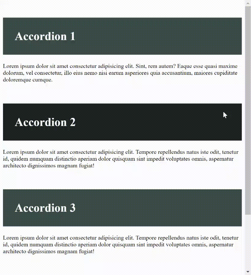
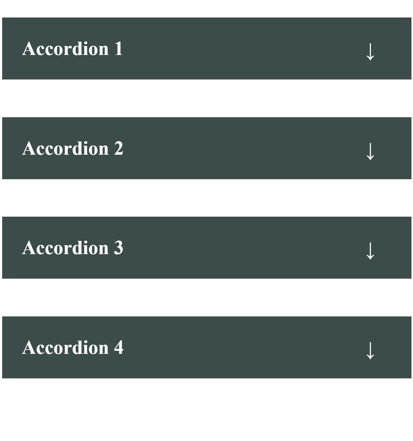
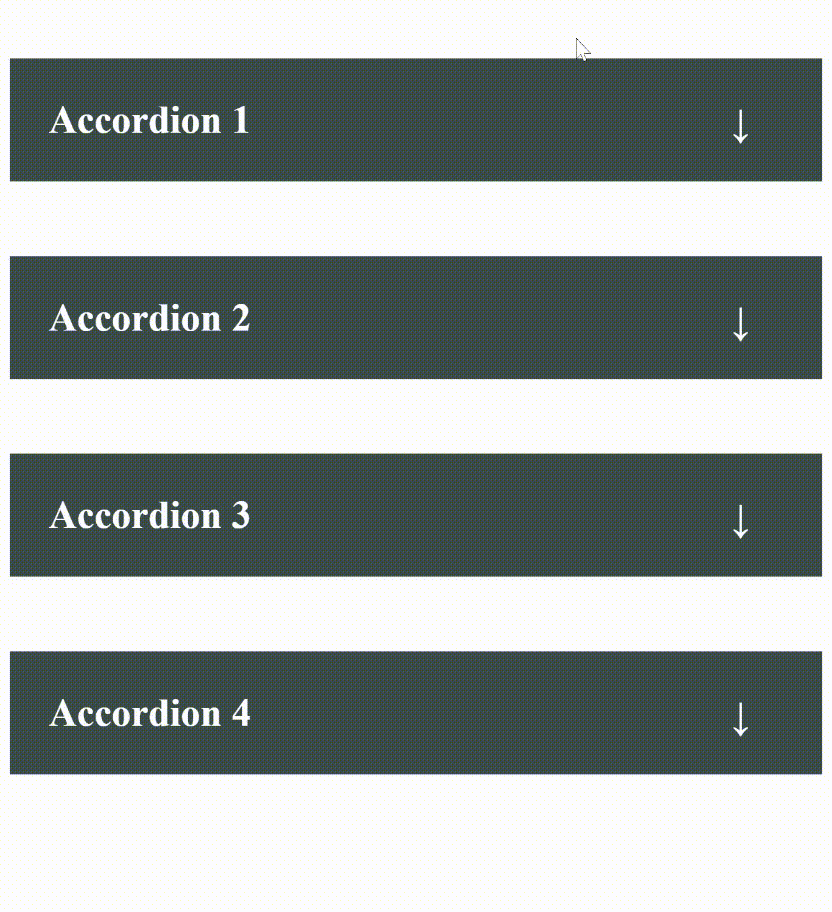
Accordions
An accordion enables users to flip between hiding and exposing a UI content. Typically, it contains a list of headers that can be clicked to reveal the content below. It is a common feature on many websites and is useful for organizing and presenting information in a concise and user-friendly manner.
Creating an accordion with HTML and CSS consists of a container div that holds one or more sections, each with a header and content. The header is typically a clickable element that expands or collapses the content when clicked.
Let’s explore the step by step guide to building an accordion with CSS. First the HTML;
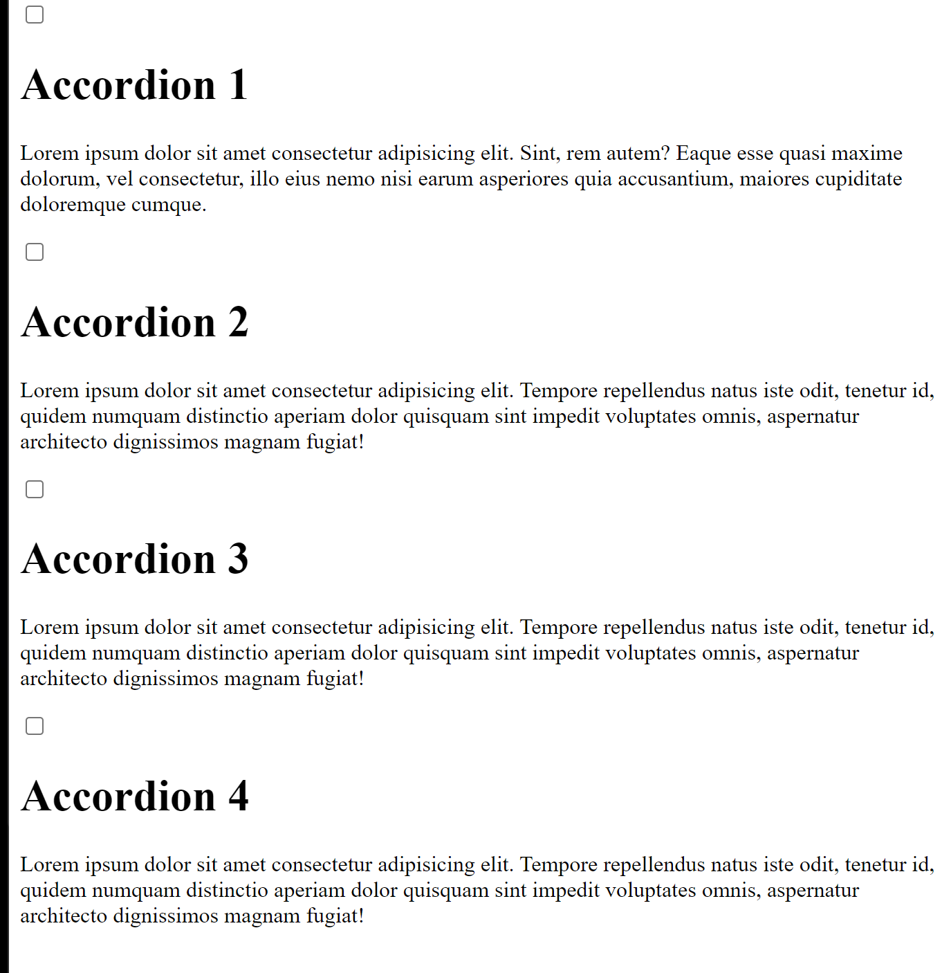
<div class="accordion">
  <input type="checkbox" id="title1" />
  <h1><label for="title1">Accordion 1</label></h1>
  <div class="content">
    <p>
      Lorem ipsum dolor sit amet consectetur adipisicing elit. Sint, rem autem?
      Eaque esse quasi maxime dolorum, vel consectetur, illo eius nemo nisi
      earum asperiores quia accusantium, maiores cupiditate doloremque cumque.
    </p>
  </div>
</div>
<div>...</div>
The <input> creates a checkbox with an ID of “title1”. This checkbox will be used to toggle the accordion panel.
The label is what the user will click to expand and collapse the accordion panel.
Using CSS, let’s style the accordion component.
First, we set the position of the .accordion container to relative, which means that any absolutely positioned elements within it will be positioned relative to this container.
.accordion {
  position: relative;
}
Next, we hide the default checkboxes. This is done by setting the height and width to 0
input {
  height: 0;
  width: 0;
}
Next, we start styling the various elements that make up the accordion. First, the h1;
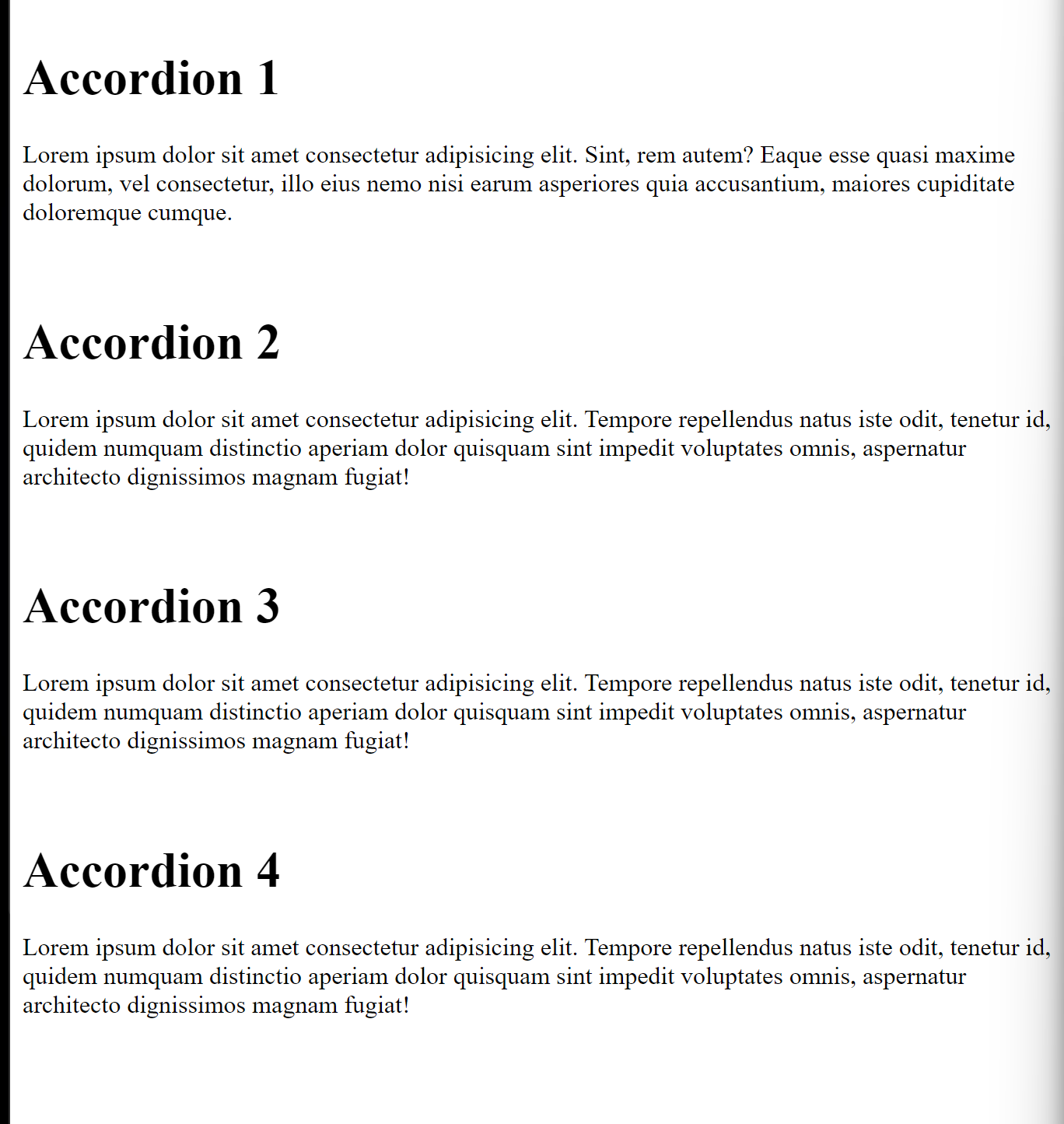
h1 {
  background: #3c4c4a;
  color: #ffffff;
  padding: 1em;
  position: relative;
}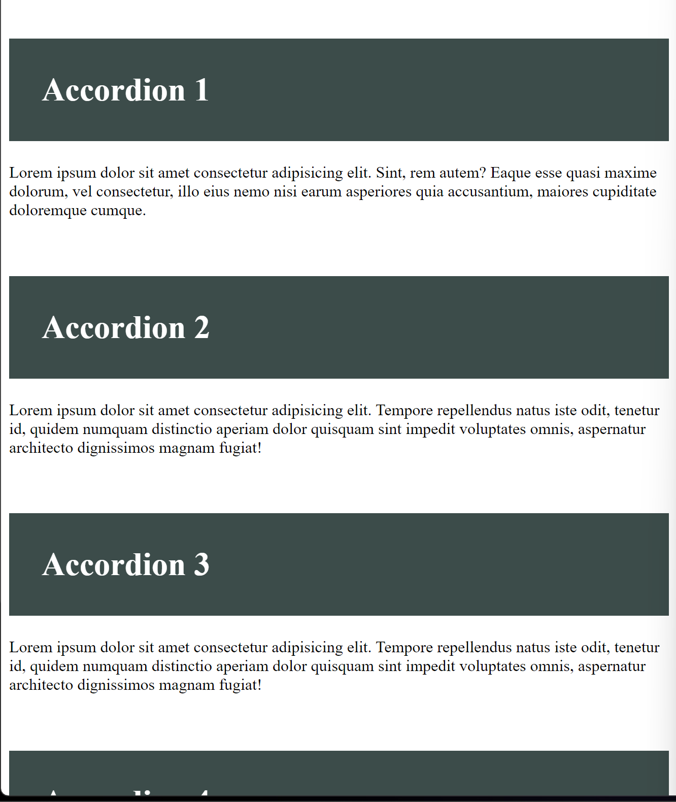
h1:hover {
  background-color: #1e2423;
}
This h1:hover changes the background color of the headers to a darker shade when the user hovers over them.
Styling the label property, we set the cursor to a pointer when the user hovers over the accordion header, indicating it is clickable. Also, set the display to flex, for the label to align its child elements along the vertical axis.
label {
cursor: pointer;
position: relative;
display: flex;
align-items: center;
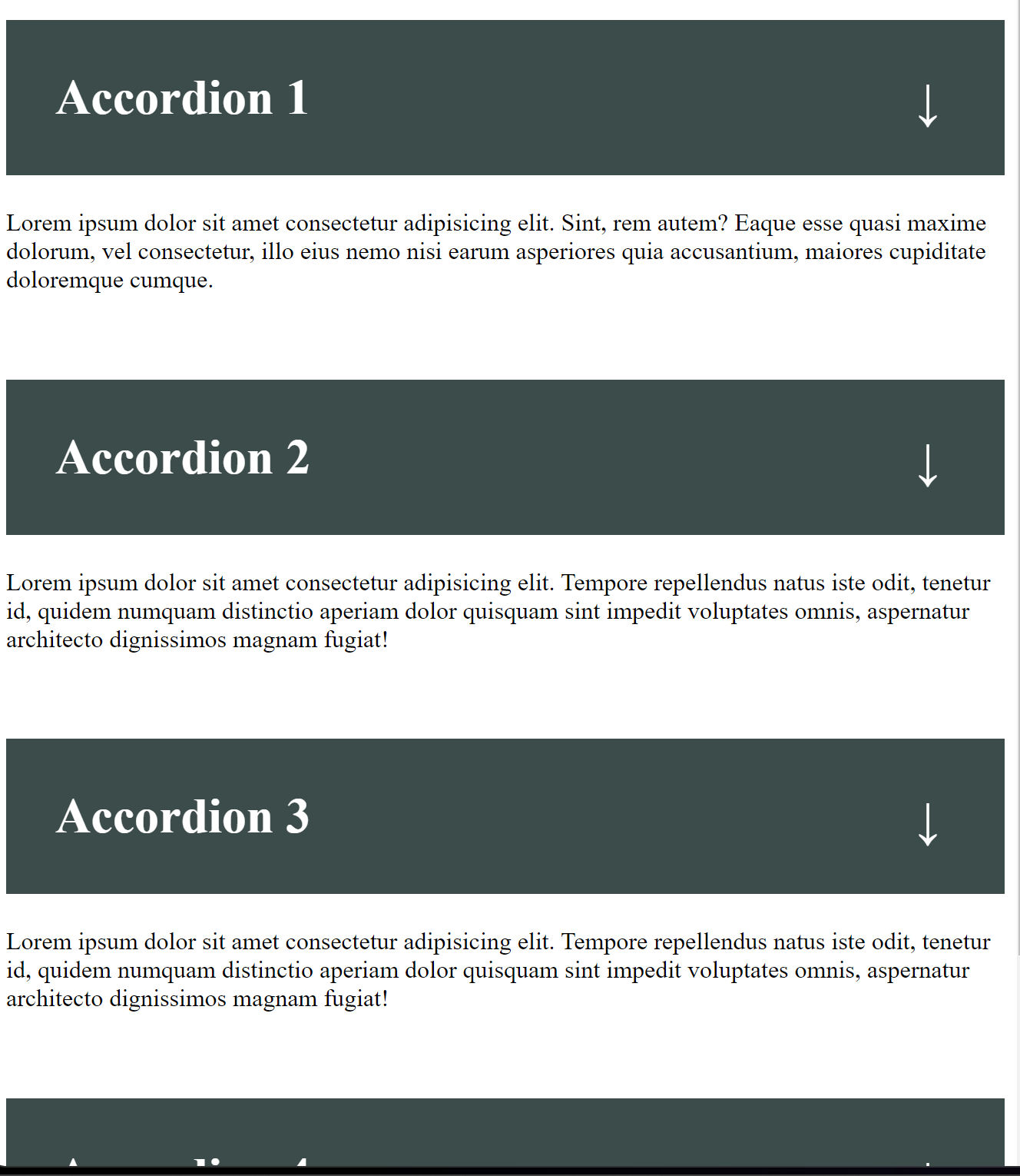
}Now let’s further style the accordion by creating the pseudo-element label::before{}. The ::before pseudo-element is commonly used in CSS to add decorative content to an element without requiring additional markup. In this case, the label element is used as a trigger to show or hide the content of the accordion panel, and the ::before pseudo-element is used to display any styles we add that indicates the current state of the panel.
label::before {
  position: absolute;
  top: 1rem;
  transform: translateY(-50%);
  left: 35rem;
  content: "↓";
  width: 1.75rem;
  height: 1.75rem;
  background-color: #3c4c4a00;
  color: #ffffff;
  position: absolute;
}
The content: ”↓” property sets the content of the pseudo-element to the downward arrow (↓).
By setting the position property of the label::before pseudo-element to absolute, it is positioned relative to the nearest positioned ancestor, which is the accordion container. This allows the arrow icon to be positioned relative to the accordion panel rather than relative to the label element.
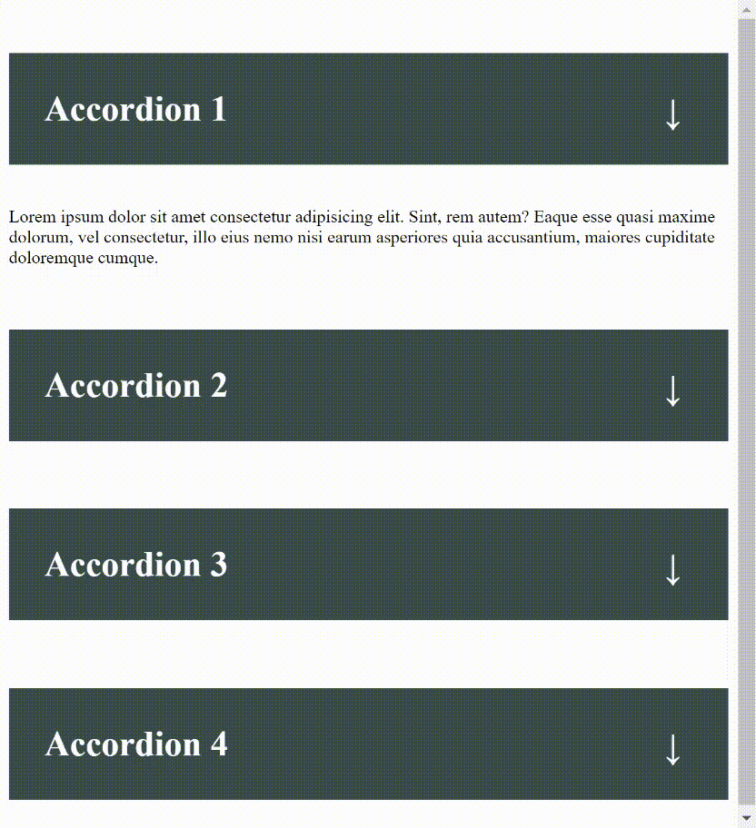
Now styling for the content of the accordion, it is necessary to set the overflow to hidden because when an element’s content overflows its container, it can sometimes create unexpected layout issues or cause the page to scroll unnecessarily. By setting overflow: hidden on the container element, any content that overflows the container will be hidden from view without affecting the layout of other elements on the page.
.content {
  max-height: 0px;
  overflow: hidden;
  transition: max-height 1s;
  background-color: #ffffff;
}
Here, overflow: hidden is applied to the .content element, which contains the content that is hidden or shown when the accordion header is clicked. When the .content element is collapsed, the contents will be hidden from view because they exceed the height of the element.
Additionally, we set the maximum height of the accordion content to 100px so it expands when clicked on and becomes visible to the user.
input:checked ~ h1 ~ div.content {
  max-height: 100px;
}
Finally, we can style the content of the arrow icon to point upwards (↑) when the input checkbox is checked.
input:checked ~ h1 label::before {
  content: "↑";
}
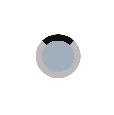
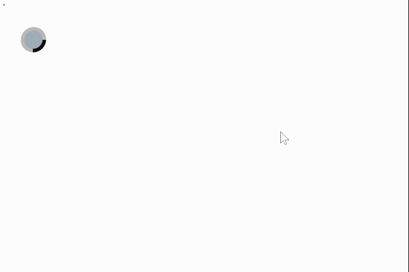
Loaders
CSS is a great tool for creating loaders ar loading animation, and we will explore the step-by-step process of creating a CSS loader animation. Let’s start by creating the HTML file with the basic structure
<div class="css-loader"></div>Next, we style the container with basic CSS, such as height, width, etc.
.css-loader {
  width: 50px;
  height: 50px;
  padding-left: 2px;
  margin: 50px;
  background-color: #a0afbb;
}
This creates a box/square in the browser.

Now let’s style the box to look more like a loader by adding borders and defining the border radius to 50%, which makes the loader circular. Note that: this only works when the height and width have the same length specified.
.css-loader {
  ...
  border: 10px solid #bdbaba;
  border-radius: 50%;
  border-top: 10px solid #0f0f0f;
}
Result
Now, let’s create our loader animation.
To add the animation, we use the @keyframes feature and give it a name which will be useful in the later parts of this tutorial.
@keyframes round {Inside this, we define the animation by specifying how the element should change over time. We start with the from keyword, which specifies the starting state of the element
from {
}
Inside this, we use the rotate property and set it to 0ndegrees
@keyframes round {
  from{
    rotate: 0deg;
  }
The rotate property rotates an element around its center point. Setting it to 0 deg means the element starts with no rotation.
Next, we use the to keyword to specify the end state of the element:
 to {
  rotate: 360deg;
}
This tells the element to rotate all the way around the circle
Finally, to create a rotating effect, we’ll use the “animation” property
.css-loader {
  animation: round 2s linear infinite;
}
We’re applying the “round” animation we defined earlier. We’re also specifying that the animation should last for 2 seconds and that it should repeat infinitely.
Result
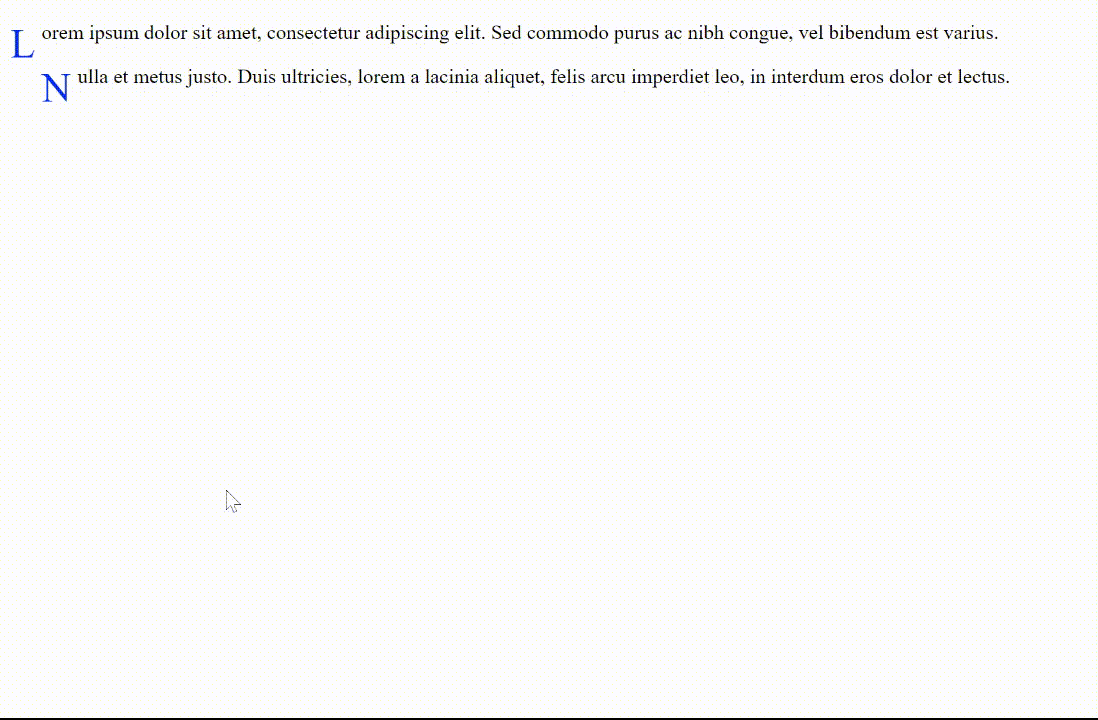
Creating elements using CSS pseudo-elements as an alternative to JavaScript DOM manipulation
With CSS pseudo-elements, you may provide elements with aesthetic effects like making your own bullet points, adding fancy borders, or placing information before or after an element.
Examples of CSS pseudo-elements include ::before, ::after, ::first-line, and ::first-letter.
Now implementing the CSS pseudo-elements,
First,
<p class="example">Lorem...</p>
<p class="example">Nulla...</p>
These are two paragraphs with a class of example that we want to style with CSS.
.example {
  position: relative;
}
Here, we’re setting the position of the example class to relative. This is because we want to use absolute positioning for the ::before and ::after pseudo-elements, and absolute positioning is relative to the nearest positioned ancestor.
Styling with CSS
.example::before {
  content: "";
  position: absolute;
  bottom: -8px;
  left: 0;
  width: 100%;
  height: 4px;
  background-color: #f00;
  transform: scaleX(0);
  transform-origin: left;
  transition: transform 0.3s ease-in-out;
}
This is the ::before pseudo-element selector, which targets the content that appears before the content of the .example element. Here, we’re creating a decorative underline for each paragraph with an absolute position at the bottom of the element.
Now, let’s style the ::after pseudo-element selector, which targets the content that appears after the content of the .example element.
.example::after {
  content: '';
  position: absolute;
  bottom: -8px;
  right: 0;
  width: 100%;
  height: 4px;
  background-color: #f00;
  transform: scaleX(0);
  transform-origin: right;
  transition: transform 0.3s ease-in-out;
}
transform-origin: left; sets the scaling origin to the left side of the element.
transform: scaleX(0); sets the horizontal scaling of the element to 0 so that the underline is initially hidden.
Here, we’ve created a mirrored version of the underline effect with the same styling as ::before.
.example:hover::before {
  transform: scaleX(1);
}
.example:hover::after {
  transform: scaleX(1);
}
These are the :hover pseudo-class selectors, which target an element when the user hovers over it with the mouse. Here, we’re using them to animate the underline effect by scaling it horizontally with transform: scaleX(1); when the user hovers over the paragraph. This scales the underline from 0 to 1 width.
Now using the ::first-letter pseudo-element selector
.example::first-letter {
  font-size: 2em;
  color: #f00;
  float: left;
  margin-right: 5px;
  transform: rotate(-5deg);
}
We target the first letter of the content inside the .example element, highlighting the first letter of each paragraph with a larger font size, red color, and slightly rotated position with transform: rotate(-5deg);.
Result
By combining these different pseudo-classes and pseudo-elements, we can create a wide variety of effects and enhance the visual appeal of our web pages.
Overall, this demonstrates how to use various CSS pseudo-classes to create interesting visual effects on web pages. The ::before and ::after pseudo-elements are particularly useful for creating decorative elements that appear before or after an element’s content. By using absolute positioning, we can place these elements wherever we want within the parent element.
Best Practices for CSS Effects
While CSS is a powerful tool for creating visually appealing effects and animations on a website, it is important to keep in mind some best practices to ensure that the effects perform well and are compatible with different browsers. This section will explore two of these best practices: understanding browser compatibility and performance optimization.
Understanding Browser Compatibility
Making sure that CSS effects function across many browsers is one of the key concerns while developing them. Even though the majority of modern browsers support CSS, there may be subtle variations in how the effects are interpreted and shown. It is crucial to test the effects on various browsers to make sure they function properly. The use of a CSS reset or normalization stylesheet is advised to maintain browser compatibility. This will aid in ensuring that styles are applied consistently across various browsers.
Performance Optimization
Performance optimization is a key factor while developing CSS effects. Despite being less resource-intensive than JavaScript, CSS effects can nevertheless have an adverse influence on a website’s performance if they are not correctly optimized. These are some best practices to adhere to in order to make sure the effects function properly:
- Use animations and transitions sparingly. While they can give a website a more appealing appearance, using too many of them can cause it to load slowly. It is crucial to keep animations and transitions basic and to utilize them only when absolutely necessary.
- Optimize image usage - Images can also impact the website’s performance. It is important to ensure that images are optimized for the web and are not too large. This can be achieved by compressing images, reducing their size, and using the right file format.
- Employ hardware acceleration - It is advised to utilize hardware acceleration to enhance the performance of animations and transitions. This can be done by utilizing CSS attributes like transform and opacity, which in the majority of modern web browsers cause hardware acceleration.
- Avoid using too many nested elements
Conclusion
CSS is a potent tool for developing eye-catching effects and animations for websites. We have looked at a variety of effects that are entirely CSS-based, ranging from simple hover effects to complex animations like accordions, loaders, and parallax scrolling. The advantages of using CSS for effects, such as its speed and lightweight, simplicity, browser compatibility, and scalability, have also been covered. Best practices for CSS effects have also been discussed, including browser compatibility knowledge and performance improvement. With this knowledge, web designers and developers can produce more user-friendly websites that are lightweight, adaptable, SEO-friendly, and aesthetically pleasing by using CSS for effects, thereby making websites that load quicker and is more browser-compatible. All things considered, CSS is a potent tool that shouldn’t be disregarded when it comes to producing beautiful effects and animations on a website. Designers and developers can advance the design of their websites and improve the user experience for their visitors by understanding the many capabilities of CSS and its advantages.
Gain Debugging Superpowers
Unleash the power of session replay to reproduce bugs and track user frustrations. Get complete visibility into your frontend with OpenReplay, the most advanced open-source session replay tool for developers.