Empowering Accessibility: HTML Landmark Roles in the Modern Web Landscape
Important aspects for accessibility


Poorly designed websites often exclude people with disabilities, creating barriers to information and opportunities. HTML landmark roles are a powerful tool to tackle these challenges, empowering accessibility in web development. This article will equip you with the knowledge to leverage HTML landmark roles effectively, enhancing accessibility for users with disabilities and promoting a more inclusive web experience.

Discover how at OpenReplay.com.
Web accessibility is the approach that ensures websites and web applications are made usable and accessible to all users. This inclusivity ensures that people with various impairments or limitations can perceive, navigate, and interact with web content effectively. Web accessibility is essential for inclusive design, expanding audience reach, improving SEO, adapting to technological advancements, and enhancing corporate image and reputation by prioritizing diversity and inclusivity.
Impact of Landmark Roles on Accessibility
The impact on accessibility improvement is substantial. This makes it possible for users with disabilities to navigate, comprehend, and interact with the section effectively through assistive technologies and visual cues. Landmark roles enhance the user experience for people with disabilities, especially screen reader users, in several ways:
-
Navigation Efficiency: It provides a clear and structured hierarchy, enabling screen reader users to navigate a webpage more efficiently by jumping directly to specific sections (e.g., headings, navigation, main content) using shortcut keys.
-
Content Understanding: Using landmark roles, screen readers can convey the structure and purpose of different web page sections, helping users understand the relationships between content elements and the overall layout.
-
Consistent Interaction Patterns: It promotes consistent interaction patterns, allowing screen reader users to anticipate where specific types of content, such as headers, navigation menus, or main content, are located across different pages.
-
Accessible Document Structure: It contributes to a more accessible document structure, ensuring that screen readers interpret and present information logically and meaningfully, fostering a better understanding of the content.
-
Direct Access to Key Information: Screen reader users can use landmark roles to navigate directly to critical sections, like banners or
<main>content, without listening to repetitive content, providing a more streamlined and focused browsing experience. -
Enhanced Page Summary: It assists screen readers in generating a summary of the page structure, allowing users to grasp the layout quickly and decide where to navigate based on their interests or needs.
-
Improved Context Awareness: Using landmark roles, screen readers can convey context changes effectively, such as entering a navigation menu or reaching the footer, helping users maintain a clear sense of their location within the webpage.
-
Facilitated ARIA Live Regions: The ARIA (Accessible Rich Internet Applications) live regions enable dynamic content updates to be announced promptly, informing screen reader users about changes without manual navigation.
-
Simplified Document Skimming: It enables users to skim through the structure of a page quickly, making it easier for screen reader users to decide which sections are relevant and worth exploring in more detail.
-
Semantic markup provides improved accessibility, enhances page structure, aids navigation for users with disabilities, contributes to better search engine ranking, and fosters a more readable, maintainable, and engaging user experience through clear labels and structured content.
-
Landmark roles in web design enhance keyboard navigation by establishing logical tab orders, providing contextual information, offering skip links, ensuring consistent interaction patterns, reducing cognitive load, improving page summaries, and enabling efficient access to critical information, ultimately enhancing overall website usability.
Understanding HTML Landmark Roles
HTML landmark roles provide semantic information about the structure and purpose of different sections within a web page. They are essential for enhancing accessibility and navigation, particularly for users with disabilities who rely on assistive technologies. This provides a transparent and standardized way of organizing content, making it easier for machines and humans to interpret the structure of a web page.
The Landmark Roles in ARIA
Landmark roles in ARIA help define and identify specific regions or elements on a web page, enabling assistive technologies like screen readers to analyze and navigate the content efficiently and effectively. Here are some typical HTML landmark roles:
- Banner: This identifies the header region of a page, often containing the logo, site name, navigation, and primary content heading. Example:
<header role="banner">...</header>- Main: It identifies the main content area of a page, where the primary information resides. Example:
<main role="main">...</main>- Navigation: This identifies major navigation sections like menus, breadcrumbs, or links to other pages. Example:
<nav role="navigation">...</nav>- Complementary: It identifies content that supports the main content but stands alone, such as sidebars, ads, or related articles. Example:
<aside role="complementary">...</aside>- Contentinfo: This identifies the footer region of a page, often containing copyright information, links to terms of use, or contact details. Example:
<footer role="contentinfo">...</footer>- Search: It identifies a search form on the page. Example:
<form role="search">...</form>- Region: This defines a generic region on the page that doesn’t fit the other specific roles. Example:
<div role="region">...</div>Implementing Landmark Roles
Implementing landmark roles using native HTML elements involves using semantic elements to clearly define different web page sections. Here’s a guide on how to implement landmark roles using native HTML elements:
Header (<header>)
The <header> element in HTML landmark represents a webpage’s introductory or topmost section, typically containing essential content such as the site name, logo, navigation links, and the primary heading of the content. It provides a structural and semantic way to define the beginning of a page and is distinct from other sections like <footer> or <main> .The <header> element is fundamental to creating a well-organized and meaningful HTML document structure.
Example:
<!doctype html>
<html lang="en">
  <head>
    <meta charset="UTF-8" />
    <title>My Website</title>
  </head>
  <body style="background-color: lightblue">
    <header>
      <img
        src="https://dynamic.design.com/asset/logo/c5fe9144-a88f-4d3f-87c3-f2a742a0b987/logo-search-grid-1x?logoTemplateVersion=3&v=638197297024270000"
        width="50px"
        alt="Logo"
      />
      <h1>My Website</h1>
      <div class="banner">
        <!-- Banner content -->
      </div>
    </header>
    <main>
      <!-- Site's main content -->
    </main>
  </body>
</html>
Outcome:
 When Inspected:
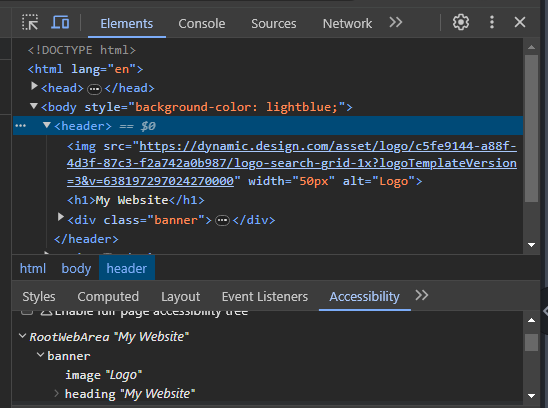
The HTML code defines a webpage with a light blue background, a header featuring a logo, a website title, a banner container, and a main content section. Screen readers will reveal the content of the webpage to users with visual impairments, announcing the presence of a <header> element with an image representing the logo, a heading displaying the website name, and a <div> with the class “banner” providing additional content. If you inspect the element in the developer tools, it will show that it is identified as a <header> element with child elements such as an <img> for the logo, an <h1> for the website heading, and a <div> with the class “banner.”
Navigation (<nav>)
The <nav> element in HTML landmark defines a webpage section that represents the primary navigation menu. This section typically contains links or navigation elements that help users navigate to major sections or pages within the website.
Example:
<!doctype html>
<html>
  <head>
    <title>My Website</title>
    <style>
      body {
        background-color: lightblue;
      }
      nav {
        font-size: 24px;
      }
    </style>
  </head>
  <body>
    <nav aria-label="Main Navigation">
      <ul>
        <li><a href="#">Home</a></li>
        <li><a href="#">About</a></li>
        <li><a href="#">Services</a></li>
        <li><a href="#">Get in Touch</a></li>
      </ul>
    </nav>
  </body>
</html>
Outcome:
 When Inspected:
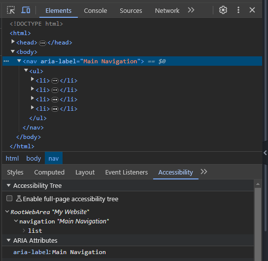
The <nav> element represents a navigation menu with links to major sections of the website, providing a clear semantic structure for navigation, and the aria-label attribute provides a descriptive label for assistive technologies, ensuring screen readers can accurately announce the navigation’s purpose as “Main Navigation.” Also, the <ul> (unordered list) element is used to organize the navigation links within <li> (list item) elements, creating a clear and logical structure, and each <li> contains an <a> (anchor) element to create clickable links, with href attributes specifying the destination of each link.
Screen readers will declare the presence of the navigation landmark and its label, followed by the individual link names, allowing users to navigate the site effectively. The developer tools will identify the <nav> element as a navigation landmark and display the aria-label value, confirming its accessibility features when inspected.
Main Content (<main>)
The <main> element in the HTML landmark is utilized to define the main content area of a document. This section typically contains the primary content unique to the specific page and is not repeated across multiple pages. The <main> element helps structure the document by explicitly indicating where the main content resides.
Example:
<!doctype html>
<html>
<head>
<title>My Website</title>
<style>
body {
background-color: gray;
}
main {
font-size: 24px;
}
</style>
</head>
<body>
<header>
<h1>Welcome to My Website</h1>
</header>
<main>
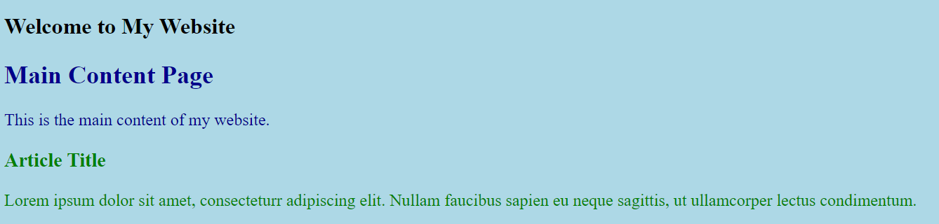
<h2>Main Content Page</h2>
<p>This is the main content of my website.</p>
<article>
<h3>Article Title</h3>
<p>
Lorem ipsum dolor sit amet, consecteturr adipiscing elit. Nullam
faucibus sapien eu neque sagittis, ut ullamcorper lectus condimentum.
</p>
</article>
</main>
</body>
</html>Outcome:
When Inspected:
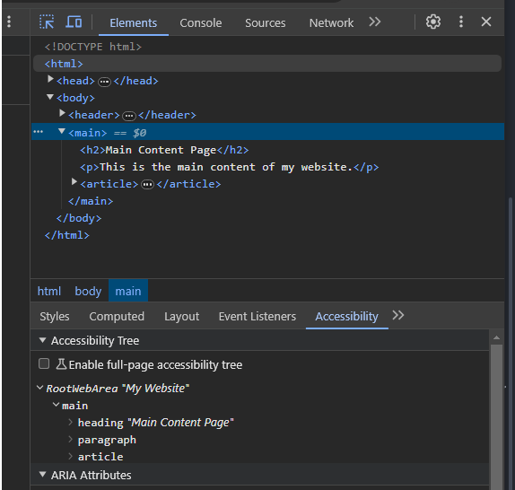
The <main> element specifically designates the primary content area of a web page, providing semantic structure and aiding navigation for both users and assistive technologies. It uses <main> to enclose the main content, including a heading (<h2>) and paragraph (<p>). It also houses an <article> element for independent, self-contained content that can stand independently.
When inspected, the developer tools will identify <main> as a “main” landmark, indicating its significance to screen readers and other assistive technologies. Screen readers will typically announce the presence of the main content area and its heading, allowing users to focus on the essential content quickly.
Footer (<footer>)
The <footer> element in HTML landmark is employed to define the footer region of a webpage. This section typically appears at the bottom of the page and contains information relevant to the entire page or website. The <footer> content often includes copyright notices, links to terms of use, contact details, or other supplementary information.
Example:
<!doctype html>
<html>
<head>
<title>My Webpage</title>
<style>
body {
background-color: lightblue;
}
</style>
</head>
<body>
<footer>
<p>© 2024 My Website</p>
<p>All rights reserved.</p>
</footer>
</body>
</html>Outcome:

The outcome when inspected:
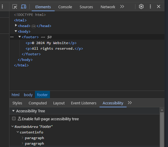
The <footer> element designates the footer section of a web page, typically containing information that complements the main content, such as copyright notices. The entire background color is gray through the CSS in the <style> section. When inspected, the developer tools will identify <footer> as a “footer” landmark, contributing to the overall accessibility of the webpage by providing a semantic structure that aids screen readers and assistive technologies in understanding the organization of content.
Complementary Content
This refers to additional information or features on a webpage that support the main content but can be considered separate. It often provides related or supplementary details without being directly part of the primary content. In web development, the <aside> element is used to define such complementary content, making it distinct from the page’s main content. This can include related articles, sidebars, or additional information enhancing the user experience. Complementary content contributes to a more informative and engaging web layout.
Example:
<!doctype html>
<html lang="en">
<head>
<meta charset="UTF-8" />
<title>Complementary Content Example</title>
<style>
body {
background-color: lightgray;
}
aside {
background-color: lightblue;
padding: 10px;
margin-bottom: 20px;
}
main {
font-size: 24px;
}
</style>
</head>
<body>
<header>
<h1>Website Title</h1>
</header>
<main>
<article>
<h1>The Main Article</h1>
<p>
This is the main content of the article. It discusses the primary
topic in detail.
</p>
<aside>
<h2>Related Articles</h2>
<ul>
<li><a href="#">Article about a related topic</a></li>
<li><a href="#">Another article of interest</a></li>
</ul>
</aside>
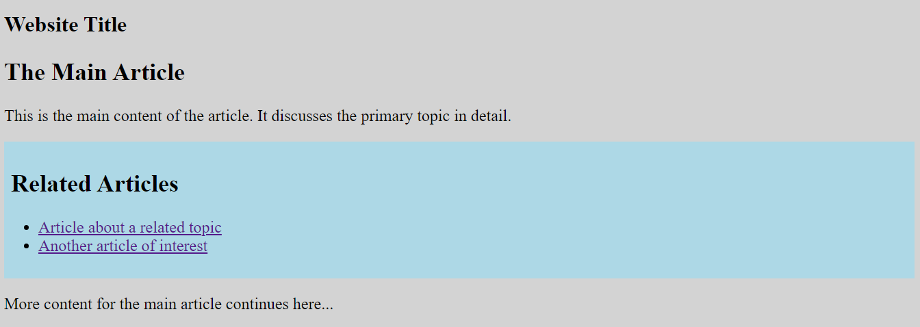
<p>More content for the main article continues here...</p>
</article>
</main>
</body>
</html>Outcome:
When inspected:
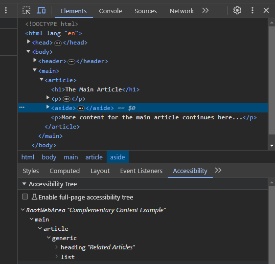
This example demonstrates the use of the <aside> element to define complementary content (related articles) that supports the main content within an article <article> on a webpage. The internal CSS styles give a lightblue background, border, and padding to the aside element for styling. Assistive technologies, like screen readers, will typically announce the <aside> as a “complementary” section when users navigate to it. Inspecting this code with Chrome Developer Tools would reveal the HTML structure and CSS styles, allowing you to analyze the webpage’s layout, elements, and styling properties.
Search
The “search landmark” refers to a specific role or designation assigned to a webpage section representing a search form. This designation is beneficial for assistive technologies, such as screen readers, which can interpret and convey the purpose of different sections on a webpage to users with disabilities. Use the role="search" attribute on a <form> element to identify a search form. This attribute is applied to the <form> element encapsulating search-related content. By adding role=“search,” developers explicitly define the purpose of that particular form, signaling to assistive technologies that it is intended for conducting searches.
Example:
<!doctype html>
<html lang="en">
  <head>
    <meta charset="UTF-8" />
    <meta name="viewport" content="width=device-width, initial-scale=1.0" />
    <title>Search Example</title>
    <style>
      body {
        background-color: gray;
        font-size: 24px;
        margin-top: 25px;
      }
      #blog {
        height: 30px;
      }
      button {
        height: 30px;
      }
    </style>
  </head>
  <body>
    <form name="site-search" action="/search" method="get" role="search">
      <label for="blog">Find the good blog:</label>
      <input
        type="search"
        id="blog"
        name="blog"
        aria-label="Search"
        placeholder="openreplay"
      />
      <button type="submit">Search</button>
    </form>
  </body>
</html>
Outcome:

When Inspected:
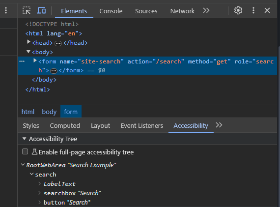
This HTML code creates a webpage with a search form marked by the role=“search” attribute on the <form> element. Users can input the search term “openreplay” in a search field labeled “Find the good blog:” and submit the form using a search button. Screen readers would navigate through this code by announcing the page title. The presence of a search form, reading the label, focusing on the search box and revealing its placeholder text, and finally moving to the search button. When you inspect the form element, you’ll see that it has the Role attribute set to “search,” contributing to the page’s accessibility.
Region
A “region” refers to a designated section or area within a webpage marked for a specific purpose or content grouping. It helps create a structured and accessible layout, providing clarity and organization to users and assistive technologies. Use the role="region" attribute on a generic element like <div> to define a region on the page that doesn’t fit into the other specific roles.
Example:
<!doctype html>
<html lang="en">
  <head>
    <meta charset="UTF-8" />
    <meta name="viewport" content="width=device-width, initial-scale=1.0" />
    <title>Region Example</title>
  </head>
  <body>
    <div
      role="region"
      aria-label="Featured Products"
      style="background-color: gray; font-size: 24px"
    >
      <h2>Featured Products</h2>
      <p>Explore our latest and greatest products:</p>
      <ul>
        <li>Product 1</li>
        <li>Product 2</li>
        <li>Product 3</li>
      </ul>
    </div>
  </body>
</html>
Outcome:

When inspected:
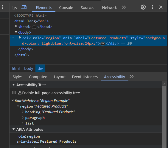
This HTML code defines a webpage with a “Featured Products” section. It utilizes the ARIA landmark role role="region" to signify a specific region on the page and applies visual styling with a gray background. Inspecting the code provides an understanding of the HTML structure, semantic roles, and visual presentation of the “Featured Products” section on the webpage. Screen readers will declare the presence of a region named “Featured Products,” aiding users with visual impairments in understanding the content structure.
When to use the Role Attribute with ARIA Landmarks
Use the role attribute with ARIA (Accessible Rich Internet Applications) landmarks in specific situations where the native HTML semantics alone are insufficient to convey the intended meaning or structure of the content, especially for users that rely on assistive technologies. Here are scenarios when it’s appropriate to use the role attribute:
-
Use
<role>with non-semantic HTML elements (e.g.,<div>,<span>) to define regions on the page. It provides additional information to assistive technologies, helping them understand and convey the structure and purpose of these regions. -
You should use
<role>when implementing custom widgets, interactive components, or dynamic content that lacks inherent accessibility semantics. Assigning appropriate roles ensures assistive technologies interpret and present the custom elements meaningfully, making the user interface more accessible. -
You should use a
<role>when the content on a page changes dynamically based on user interactions or updates. Updating ARIA roles dynamically ensures that assistive technologies are informed about the evolving structure, maintaining a synchronized and accessible user experience. -
You should use
<role>with native semantic elements like<header>,<footer>, or<section>when additional clarification is needed. Combining native semantics with ARIA roles provides more detailed information to assistive technologies, offering a richer understanding of the page structure. -
Use
<role>when developing complex web applications with intricate user interfaces. ARIA roles help convey the structure and relationships between different parts of the UI, aiding users of assistive technologies in comprehending and navigating through complex application interfaces. -
Use
<role>when the layout of a page changes based on different screen sizes or orientations. Dynamically adjusting ARIA roles based on responsive design changes ensures assistive technologies are aware of the altered page structure, supporting a consistent and accessible experience across various devices.
Best Practices for Using Landmark Roles
Here are best practices and tips to follow, along with common pitfalls to avoid:
-
Whenever possible, use native HTML5 elements like
<header>,<nav>,<main>,etc., instead of relying solely on role attributes. Native elements provide semantic meaning by default. -
Use the
<main>element to specify the primary content section of the page unambiguously. This helps assistive technologies and users quickly identify and navigate to the main content. -
Ensure each landmark region has a clear and descriptive label. Users, especially those relying on screen readers, should understand the purpose of each section.
-
Add “skip to content” or “skip to main navigation” links at the top of your page so that users can skip repetitive content and go directly to the main sections.
-
Organize your content so that the tab order follows a logical sequence, allowing keyboard users to navigate through landmark regions in a meaningful order.
-
Combine multiple landmark roles when necessary to represent complex structures accurately. For example, combine
<main>with<article>for more contextually rich content. -
Make your landmark roles responsive by ensuring the layout adapts well to different devices and screen sizes. Test on various devices to ensure a consistent experience.
-
Avoid applying role attributes to every
<div>on the page. Overusing roles can clutter the page structure and confuse users and assistive technologies. -
Use landmark roles for their intended purpose. For example, don’t use a
<nav>element if its content is not genuinely navigation-related. -
Avoid nesting redundant landmark roles. For instance, nesting a
<main>element inside another<main>element is typically unnecessary. -
Ensure all interactive elements within landmark regions are keyboard accessible. Users should be able to navigate and interact with your content using only the keyboard.
Conclusion
HTML landmark roles are crucial in dismantling digital barriers and fostering a more accessible web environment. By delving into the intricacies of these roles, developers and web designers can revolutionize the user experience for individuals with disabilities, making sure everyone, regardless of their abilities, can navigate, engage, and contribute to the digital realm.
Gain control over your UX
See how users are using your site as if you were sitting next to them, learn and iterate faster with OpenReplay — the open-source session replay tool for developers. Self-host it in minutes, and have complete control over your customer data.
Star on GitHub12k