
Lightboxes offer an elegant way to showcase media content without disrupting the user’s browsing experience, making them a popular choice in web development for creating visually engaging and interactive displays. This article will guide you on building custom lightboxes using HTML, CSS, and JavaScript.

Discover how at OpenReplay.com.
A lightbox is a device that displays transparent materials to enhance their visibility by evenly diffusing light behind them. Lightboxes are used in various applications such as advertising, photography, art, medical imaging, etc. They provide a uniform backlighting source, making images or objects placed on their surfaces appear more vibrant and detailed.
Lightboxes are a powerful tool in modern web design, providing an elegant and user-friendly way to showcase content. When used appropriately and with consideration for user experience, lightboxes can significantly enhance engagement and make websites and applications more appealing by drawing attention to specific messages or actions.
Advantages of Using Lightboxes
Using lightboxes over traditional image or video embeds offers several advantages, depending on the context and purpose of the content display. Here are some key benefits of using lightboxes over traditional image or video embeds:
-
Improved User Engagement: Lightboxes create a more appealing and interactive user experience. Also, you can display content in a focused and visually appealing manner with lightboxes, capturing users’ attention and encouraging them to engage with the media content. For example- When a user clicks on an image, the content opens in a larger format with the rest of the page dimmed or blurred, drawing attention to the displayed content.
-
Reduced Page Clutter: Traditional image or video embeds can take up considerable space on a web page, leading to clutter and distracting users from the main content. Conversely, lightboxes overlay content on the current page, maintaining a clean and uncluttered layout.
-
Faster loading times: Lightboxes load content dynamically when triggered, ensuring that the media files are only loaded when users want to view them. This reduces initial page load times, leading to a faster and smoother browsing experience.
-
Seamless Navigation: When users interact with lightboxes, they remain on the same page, retaining their context. This seamless navigation enhances user flow and prevents potential frustrations caused by navigating to a different page and having to find their way back.
-
Mobile-Friendly: You can create responsive lightboxes that work well across various devices and screen sizes. Traditional embeds might not constantly adapt well to different screen resolutions, leading to a suboptimal user experience on mobile devices.
-
Focus on Visuals: Lightboxes focus on the media content being displayed. By darkening or graying out the background, they eliminate distractions, ensuring that users can fully appreciate the images or videos without any visual clutter.
-
Universal usage: You can use lightboxes for various types of content, such as videos, images, forms, and other media. This flexibility makes them a versatile tool for showcasing different types of content in a beautiful and user-friendly way.
-
Customization and branding: Lightboxes often come with customizable designs and transitions, allowing developers to match the lightbox style with the website’s overall theme. This customization enhances the website’s aesthetic appeal and improves brand consistency.
-
Analytics and Tracking: When content is presented in a lightbox, it is easier to track user interactions, clicks, and other relevant metrics. Hence providing helpful insights into user behavior and content performance.
Media Types Supported
The media types supported by lightboxes can vary depending on the specific implementation and the features provided by the lightbox library you are using. However, here are some types of media that can be supported on a website:
-
Images: Lightboxes commonly display images, with static images being the most basic form of media lightboxes use. They are widely used for photographs, icons, backgrounds, logos, and other visual elements. When a user clicks on a thumbnail or a link, the image opens in a larger view within the lightbox, usually with the option to navigate through a gallery of images.
-
Videos: Lightboxes can also play videos, providing a more immersive viewing experience. Videos add a dynamic element to websites and are commonly used for illustrations, tutorials, product demos, marketing campaigns, and entertainment. So, if a user clicks on a video or link, the video can open and play within the lightbox.
-
Galleries: Lightboxes can be used to create image or video galleries, allowing users to view multiple images or videos in a visually appealing layout using navigation buttons. Galleries are famous for showcasing portfolios, event photos, and product galleries.
-
Slideshows: Lightboxes can facilitate automated slide presentations, enabling seamless transitions between images or videos at predefined intervals. This dynamic feature contributes to the creation of engaging and visually appealing presentations.
-
Website pages: Web pages can contain text, images, videos, interactive elements, and more, making them a versatile form of digital content that can be showcased within a lightbox for a more focused and engaging user experience. Lightboxes can go beyond their traditional role and incorporate complete web pages within their framework in certain sophisticated instances. This results in creating a popup window that seamlessly showcases web content.
HTML Setup
You can create a simple lightbox setup that displays HTML content in a button, enhancing the user experience on your webpage.
Here is an example of how to structure the HTML of a lightbox:
<!DOCTYPE html>
<html>
<head>
  <title>HTML Structure for Lightbox</title>
</head>
<body>
  <h1>HTML Structure for Lightbox</h1>
  <div id="lightbox-content" style="display: none;">
    <a href="#img1">
      <img src="https://mobirise.com/bootstrap-gallery/assets1/images/photo-1440658172029-9d9e5cdc127c-1426x863-800x484.jpg" alt="Image 1">
    </a>
  </div>

  <button id="open-lightbox" style="height: 50px; width: 200px;"><strong>Open Lightbox</strong></button>
</body>
</html>
Output:
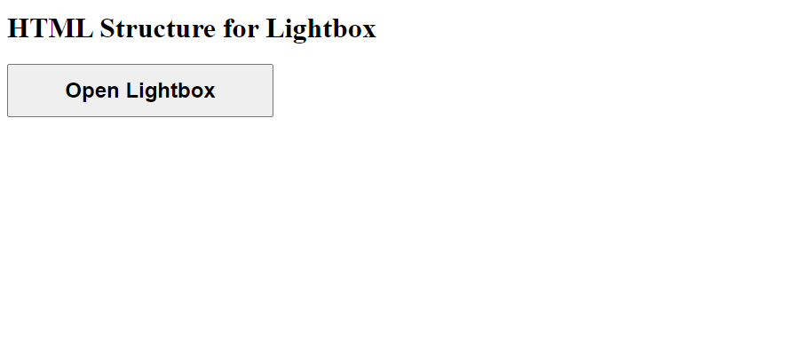
Following this structure above, you can create a simple HTML setup that includes the lightbox content and a button for the lightbox. Note: The lightbox will not function as a modal popup without CSS and JavaScript.
Using HTML to Add Media Types
You can use HTML to add various media types. This will show how you can display different media types in a modal-like fashion.
Here is how you can use HTML to include different types of media on a website:
<!DOCTYPE html>
<html>
  <head>
    <title>Media Types for Lightboxes</title>
  </head>
  <body>
    <h1>Using HTML to Add Media Types for Lightboxes</h1>
    <h2>Image</h2>
    <img
      target="_blank"
      src="https://mobirise.com/bootstrap-gallery/assets1/images/photo-1438159510492-d44b489bd1b6-1350x900-800x533.jpg"
      alt="Scenic Landscape Image"
      width="300"
      height="200"
    />

    <h3>Gallery Images</h3>
    <div>
      <img
        target="_blank"
        src="https://media.istockphoto.com/id/1129482581/photo/white-camargue-horse-galloping-on-the-water.jpg?s=612x612&w=0&k=20&c=WrcnUNOobCB6OZ7upr7BUk2oVV6HTjN7kj2kldKcEXU="
        alt="Image 1"
        height="200"
        width="300"
      />
      <img
        target="_blank"
        src="https://media.istockphoto.com/id/1221305451/photo/pair-of-king-penguins.jpg?s=612x612&w=0&k=20&c=VvwdjfUcOe1DdY46kER3mxlk9zoL6_9h41uUZPOz0Bo="
        alt="Image 2"
        height="200"
        width="300"
      />
      <img
        target="_blank"
        src="https://media.istockphoto.com/id/1408845072/photo/big-male-lion-walking-through-high-grass.jpg?s=612x612&w=0&k=20&c=baX_7KwaTIcFwYHgXLuPakDrT2mETz2pRbaMFLpwIXc="
        alt="Image 3"
        height="200"
        width="200"
      />
      <img
        target="_blank"
        src="https://mobirise.com/bootstrap-gallery/assets1/images/photo-1472345113808-03a78a564cc5-1353x899-800x531.jpg"
        alt="Image 3"
        width="300"
        height="200"
      />
    </div>
  </body>
</html>
Output:
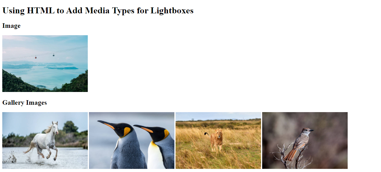
The example above shows a basic lightbox setup for a webpage with the media types (image and gallery). It does not include any lightbox functionality or media types; it’s a static representation of the lightbox media types.
Styling the lightbox with CSS
You can improve the appearance of the lightbox with CSS. To style a lightbox with CSS, you can target the elements that make up the lightbox and apply custom styles to achieve the desired appearance. The lightbox effect allows users to click on thumbnail images in the gallery, with a larger version of the image opening in an overlay with the ability to close it.
Let’s apply CSS styles to create an overlay and position the lightbox container in the center of the screen:
<body>
  <h1>CSS Styling for Lightboxes</h1>
  <div class="gallery">
    <a href="#img1">
      <img
        target="_blank"
        src="https://media.istockphoto.com/id/1129482581/photo/white-camargue-horse-galloping-on-the-water.jpg?s=612x612&w=0&k=20&c=WrcnUNOobCB6OZ7upr7BUk2oVV6HTjN7kj2kldKcEXU="
        alt="Image 1"
      />
    </a>
    <a href="#img2">
      <img
        target="_blank"
        src="https://media.istockphoto.com/id/1221305451/photo/pair-of-king-penguins.jpg?s=612x612&w=0&k=20&c=VvwdjfUcOe1DdY46kER3mxlk9zoL6_9h41uUZPOz0Bo="
        alt="Image 2"
      />
    </a>
    <a href="#img3">
      <img
        target="_blank"
        src="https://media.istockphoto.com/id/1408845072/photo/big-male-lion-walking-through-high-grass.jpg?s=612x612&w=0&k=20&c=baX_7KwaTIcFwYHgXLuPakDrT2mETz2pRbaMFLpwIXc="
        alt="Image 3"
      />
    </a>
  </div>

  <div class="overlay" id="img1">
    <div class="lightbox">
      <a href="#" class="close-button">Close</a>
      <img
        target="_blank"
        src="https://media.istockphoto.com/id/1129482581/photo/white-camargue-horse-galloping-on-the-water.jpg?s=612x612&w=0&k=20&c=WrcnUNOobCB6OZ7upr7BUk2oVV6HTjN7kj2kldKcEXU="
        alt="Image 1"
      />
      <div class="caption">Horse</div>
    </div>
  </div>

  <div class="overlay" id="img2">
    <div class="lightbox">
      <a href="#" class="close-button">Close</a>
      <img
        target="_blank"
        src="https://media.istockphoto.com/id/1221305451/photo/pair-of-king-penguins.jpg?s=612x612&w=0&k=20&c=VvwdjfUcOe1DdY46kER3mxlk9zoL6_9h41uUZPOz0Bo="
        alt="Image 2"
      />
      <div class="caption">Pair of Penguins</div>
    </div>
  </div>

  <div class="overlay" id="img3">
    <div class="lightbox">
      <a href="#" class="close-button">Close</a>
      <img
        target="_blank"
        src="https://media.istockphoto.com/id/1408845072/photo/big-male-lion-walking-through-high-grass.jpg?s=612x612&w=0&k=20&c=baX_7KwaTIcFwYHgXLuPakDrT2mETz2pRbaMFLpwIXc="
        alt="Image 3"
      />
      <div class="caption">Lion</div>
    </div>
  </div>
</body><style>
body {
margin: 0;
padding: 0;
background-color: rgba(0, 0, 0, 0.7);
color: white;
}
.gallery {
display: flex;
flex-wrap: wrap;
justify-content: center;
}
.gallery img {
cursor: pointer;
margin: 5px;
border-radius: 10px;
width: 400px;
height: 300px;
padding-top: 20px;
}
.gallery img:hover {
transform: scale(1.1);
}
.overlay {
display: none;
position: fixed;
top: 0;
left: 0;
width: 100%;
height: 100%;
background-color: rgba(0, 0, 0, 0.8);
z-index: 999;
}
.lightbox {
display: flex;
flex-direction: column;
align-items: center;
justify-content: center;
position: relative;
width: 100%;
height: 100%;
}
.lightbox img {
max-width: 90%;
max-height: 70%;
border-radius: 10px;
margin: 10px;
}
.lightbox .caption {
color: white;
margin-top: 10px;
text-align: center;
font-size: 30px;
}
.close-button {
position: absolute;
top: 20px;
right: 20px;
font-size: 20px;
color: white;
}
.overlay:target {
display: block;
}
</style>Output:
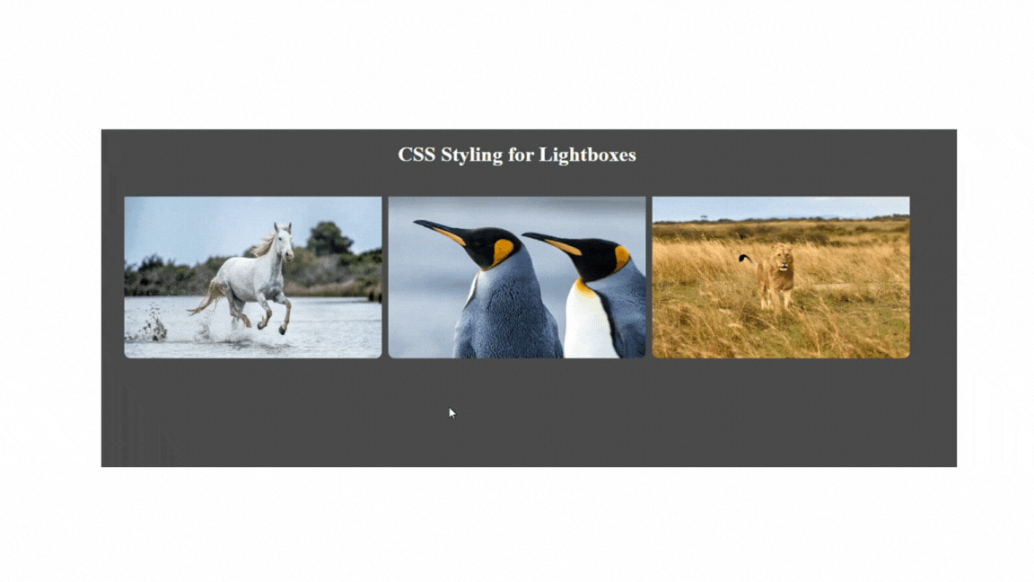
In the above example, we have styled the lightbox using CSS. When you click an image, it opens in a lightbox overlay, and users can close the lightbox using the close button. The styles ensure that images are appropriately sized, have a border radius, and scale up slightly on hover. The background color and positioning of the overlay and lightbox create the desired effect.
JavaScript Functionality
You can add HTML elements for media content, captions, navigation, and close buttons to enhance your lightbox implementation. The implementation of their functionality involves using JavaScript. To achieve the full Lightbox functionality, you must include the appropriate JavaScript files provided by a Lightbox library or develop custom code.
Furthermore, to trigger the lightbox, you will add event listeners to the media items to trigger the lightbox when media items are clicked. When a media item is clicked, the lightbox will open with the clicked media displayed.
Here is how you can implement the functionality of the lightbox using JavaScript:
document.addEventListener('DOMContentLoaded', function () {
  const gallery = document.querySelector('.gallery');
  const overlay = document.getElementById('overlay');
  const lightbox = overlay.querySelector('.lightbox');
  const closeButton = overlay.querySelector('.close-button');
  const prevButton = overlay.querySelector('.prev-button');
  const nextButton = overlay.querySelector('.next-button');
  const lightboxImg = overlay.querySelector('img');
  const lightboxCaption = overlay.querySelector('.lightbox-caption');
  const galleryImages = gallery.querySelectorAll('img');

  let currentIndex = 0;

  const updateLightbox = () => {
    lightboxImg.src = galleryImages[currentIndex].src;
    lightboxImg.alt = galleryImages[currentIndex].alt;
    lightboxCaption.textContent = galleryImages[currentIndex].parentNode.getAttribute('data-caption');

    prevButton.href = `#img${(currentIndex + galleryImages.length - 1) % galleryImages.length + 1}`;
    nextButton.href = `#img${(currentIndex + 1) % galleryImages.length + 1}`;

    if (currentIndex === 0) {
      prevButton.style.pointerEvents = 'none';
    } else {
      prevButton.style.pointerEvents = 'auto';
    }

    if (currentIndex === galleryImages.length - 1) {
      nextButton.style.pointerEvents = 'none';
    } else {
      nextButton.style.pointerEvents = 'auto';
    }
  };

  galleryImages.forEach((img, index) => {
    img.addEventListener('click', () => {
      currentIndex = index;
      updateLightbox();
      overlay.style.display = 'flex';
    });
  });

  closeButton.addEventListener('click', () => {
    overlay.style.display = 'none';
  });

  prevButton.addEventListener('click', () => {
    currentIndex = (currentIndex + galleryImages.length - 1) % galleryImages.length;
    updateLightbox();
  });

  nextButton.addEventListener('click', () => {
    currentIndex = (currentIndex + 1) % galleryImages.length;
    updateLightbox();
  });

  updateLightbox();
});
Output:
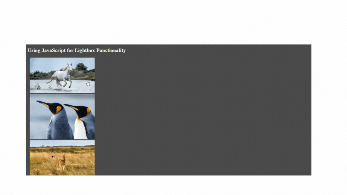
The example above shows a script for creating a lightbox gallery with the next and previous buttons and a close button for navigating between images in the gallery. The code listens for DOMContentLoaded and then adds event listeners to handle the gallery’s functionality.
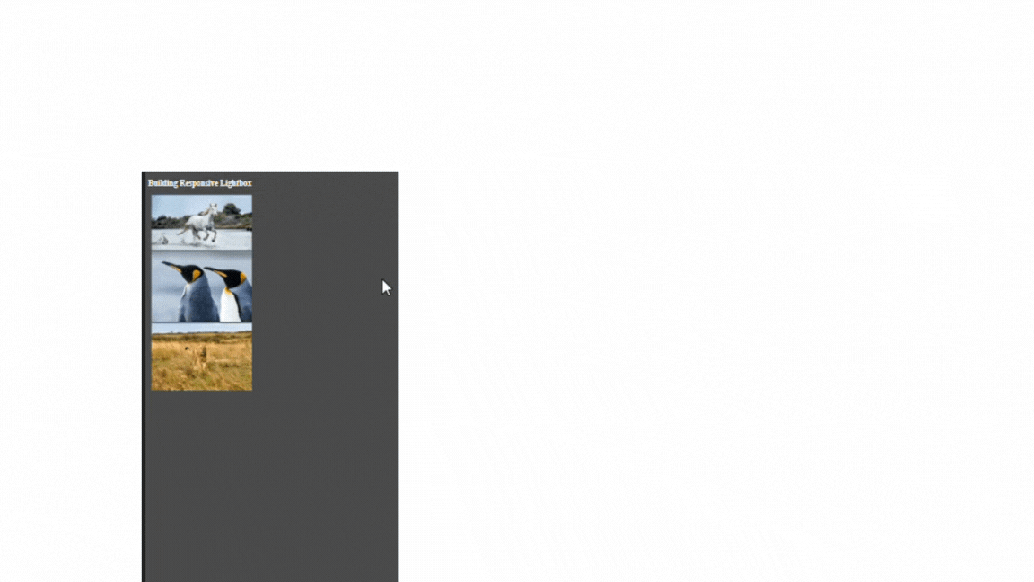
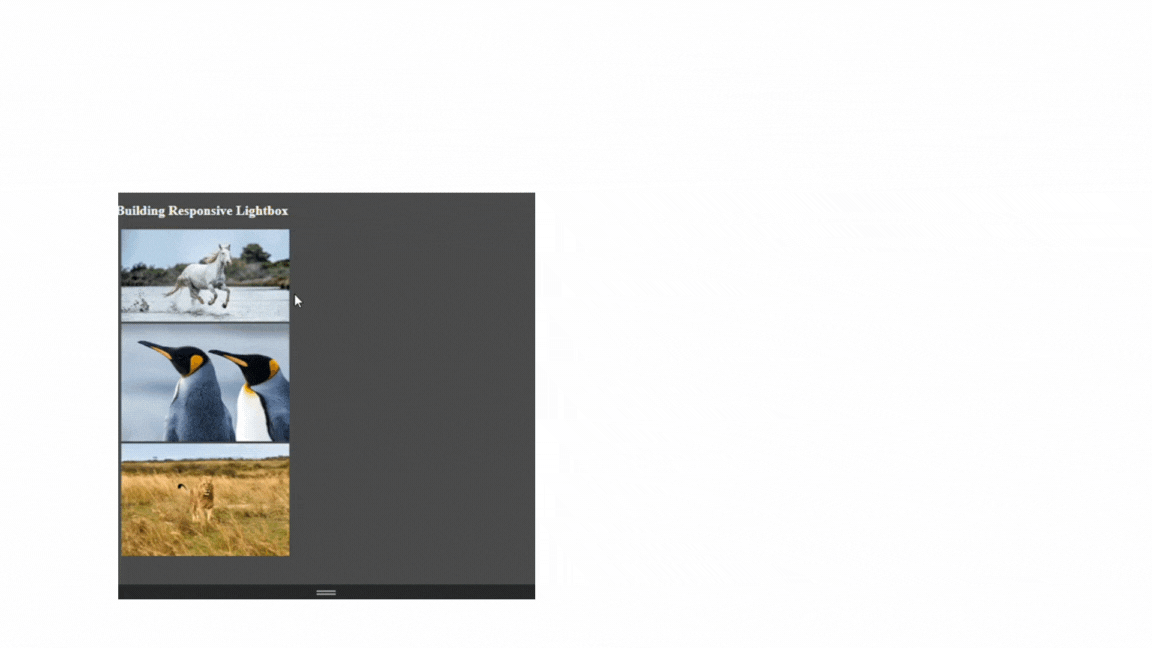
Responsive Lightboxes
You can handle the responsive behavior of lightboxes for different screen sizes and devices. We can use CSS media queries to control responsive behavior for different screen sizes and devices. Here is how you can make the lightbox responsive:
-
Adjust the Lightbox Width and Height: We can set different maximum widths and heights for the lightbox container based on the screen size. This will ensure that the lightbox fits well on various devices.
-
Change Caption Font Size: To ensure the caption remains readable on smaller screens, we can adjust the font size for the caption using media queries.
-
Modify Navigation Buttons Position: For a better user experience on mobile devices, we can adjust the position of the navigation buttons.
Below is an example of how you can use media queries for responsive behavior:
@media (max-width: 768px) {
  .lightbox-caption {
    font-size: 24px;
    margin-top: 8px;
  }
}

@media (max-width: 480px) {
  .lightbox-caption {
    font-size: 20px;
    margin-top: 6px;
  }
  .lightbox {
    width: 90%;
  }
}
Output for mobile device:
Output for larger screen :
In the examples above, the default styles for larger screens keep the caption at a font size of 30px and a margin-top of 10px. A media query with a maximum width of 768px adjusts the font size and margin for a larger screen (font size: 24px, margin top: 8px). A media query with a maximum width of 480px further reduces the font size and margin for smartphones (font size: 20px, margin top: 6px), and it also adjusts the lightbox width to 90% to make it more suitable for smaller screens.
Making the lightbox accessible.
To make the HTML structure more easily accessible and manageable with JavaScript, we can add appropriate attributes and data properties. These attributes will help us reference and manipulate the elements in JavaScript code more efficiently. Here are some ways we can make lightboxes accessible:
- Use IDs and Classes:
IDsandclassesare essential for identifying and styling elements.IDsshould be unique, while you can applyclassto multiple elements.IDsandclassesplay a significant role in ensuring the lightbox is styled correctly and accessible to all users, including those with disabilities. Here is an example of howIDsandclassesrelate to lightbox accessibility:
<div class="overlay" id="overlay">
  <div class="lightbox">
    <a href="#" class="close-button">Close</a>
    <a href="#" class="prev-button">Previous</a>
    <img src="" alt="Image">
    <p class="lightbox-caption"></p>
    <a href="#" class="next-button">Next</a>
  </div>
</div>
The above example uses semantic HTML elements like <div>, <a>, <img>, and <p>, which are a good starting point for lightbox accessibility because they provide a clear structure for assistive technologies to understand the content.
- Event Listeners: Use event listeners to respond to user interactions. You can attach them to elements based on classes, IDs, or data attributes. This is an example of how you can use event listeners for lightbox accessibility:
const button = document.querySelector('.action-button');
button.addEventListener('click', function() {
});
function openLightbox() {
}
In the above example, the button element was selected with the class action-button using document.querySelector(), and the addEventListener() method was used to attach a click event listener to the button. When you click the button, the function inside the event listener will be executed, allowing you to perform actions like opening the lightbox.
You can replace the openLightbox() function with your specific logic for handling the lightbox when clicking the button.
- Traversal: Traversal techniques in JavaScript, such as querySelector and querySelectorAll, are vital for creating accessible lightboxes. They enable you to target and manipulate elements within the lightbox, implement keyboard accessibility, and efficiently manage focus, providing a better user experience for all users, including those with disabilities. Here is an example of how traversal works for lightbox accessibility:
const parentElement = document.querySelector('.content-box');
const childElement = parentElement.querySelector('.child');
In the example, the document.querySelector('.content-box') selects the first element in the document with the class content-box. The parentElement.querySelector('.child') also searches for the first element with the class child; the result is stored in the childElement variable. This approach allows you to efficiently traverse the DOM (Document Object Model) tree to locate specific elements or groups of elements within a larger document. You can then manipulate or interact with these elements as you wish.
Using querySelector and querySelectorAll allows you to efficiently locate elements within the DOM tree, which is crucial for building accessible lightboxes. You can use it to find and manipulate specific buttons within the lightbox for opening, closing, or navigating through items.
Accessibility Considerations for Lightboxes
When implementing lightboxes, it is necessary to consider improved accessibility and interaction for all users, including those with disabilities. Creating an inclusive user experience is essential to ensure that all users, regardless of their capabilities, can access and interact with your website or application.
Here are some guidelines and best practices to follow for lightbox accessibility:
-
Use Semantic HTML: Utilize proper HTML elements to create a clear structure. Use
headings,lists, andsemantic tagsto provide context and help screen readers and assistive technologies comprehend the content. Whenever possible, use native HTML elements (e.g.,<button>,<img>,<video>) to take advantage of built-in accessibility features. -
Keyboard Navigation: Ensure the lightboxes can be accessed via keyboard navigation alone. This will help users who cannot use a mouse or have motor disabilities. You can create them so users can open and close the lightboxes, navigate between media items, and close the lightbox using keyboard controls. Consider using the “Enter” key to open the lightbox and the “Escape” key to close it.
-
ARIA (Accessible Rich Internet Applications) Roles and Labels: Use appropriate ARIA roles and labels to make the lightbox more understandable to screen readers. For example, you can use
role=dialogfor the lightbox container andaria-labelto provide descriptive labels for the lightbox and its content. -
Focus management: When the lightbox is opened, ensure focus is moved to the first interactive element inside the lightbox, such as a navigation button. Thereby helping users who rely on keyboard navigation to know where the focus is and how to interact with the lightbox.
-
Captions and alternative text: Ensure all media items within the lightbox have meaningful
alt textfor images and video captions. This provides context for users who cannot see the media content. -
Consider color contrast: Use good color contrast between text and background to accommodate users with low vision or color blindness. You should provide sufficient contrast between text and background colors for readability.
-
Skip links: A “skip to content” link can be placed at the top of the page to allow screen reader users to avoid navigation and quickly access the lightbox content.
-
Test across Devices: Ensure the lightbox works well on various devices, including desktops, laptops, tablets, and smartphones.
Conclusion
Lightboxes are an appealing way to present media content seamlessly, enhancing user interactions while maintaining a smooth browsing experience. Following the guidance presented in this article, you can efficiently and effectively create personalized lightboxes using HTML, CSS, and JavaScript. With the skills acquired from this guide, you can enhance your web development skills and build outstanding online environments that captivate and delight your audience.
Gain control over your UX
See how users are using your site as if you were sitting next to them, learn and iterate faster with OpenReplay — the open-source session replay tool for developers. Self-host it in minutes, and have complete control over your customer data.
Star on GitHub12k