Exploring SvelteKit in 2022 by Building a Portfolio Website

The team at svelte introduced Sveltekit a few months ago. It’s a newer framework that replaces Sapper. It is the fastest way to build svelte apps with beautiful development experiences and flexible filesystem-based routing. This article will explore how Sveltekit works by building a sample portfolio website with every necessary update in the framework. You will learn all the fundamental concepts on building a web app with Sveltekit, why the switch from Sapper to Sveltekit, and how to consume REST API in Sveltekit by building a demo blog within your app. Additionally, you will learn how to deploy Sveltekit application on Netlify.
What is Sveltekit
For those new to Svelte, according to svelte website:
Svelte is a radical new approach to building user interfaces. Whereas traditional
frameworks like React and Vue do the bulk of their work in the browser, Svelte shifts that
work into a compile step that happens when you build your app.
Instead of using techniques like virtual DOM diffing, Svelte writes code that surgically
updates the DOM when the state of your app changes.
Svelte is a component-based Javascript framework - much like React, Vue, or angular and is
used for building web applications in Javascript.
On the contrary, Sveltekit is a framework for building svelte apps of all sizes; it enables you to build more significant apps with a smaller footprint. It comes with a beautiful development experience, flexible filesystem-based routing, Server-Side Rendering(SSR), client-side hydration, and some other unique features.
Reasons for Switching from Sapper to Sveltekit
Richard Harris, the creator of Svelte, mentions some of the reasons that influenced the switch from Sapper to sveltekit, which are:
- Sapper appeared to be a bit complicated; the distinction between sveltejs/template and sveltejs/sapper-templated seems slightly confusing, particularly for newcomers to Svelte.
- Since the Sapper project started in 2017, the codebase has become a little unkempt over the years. And because the web has changed drastically over the years, there comes a need to rethink a newer approach.
- Also, the idea of having a single recommended way of building apps with svelte will bring significant benefits. It would simplify the onboarding process, reduce the maintenance, and support burden.
Getting Started with Sveltekit
Sveltekit removes all the bottlenecks of building modern web apps; it does all the boring stuff for you while you concentrate on the creative part. It is powered by Snowpack under the hood, a lightning-fast frontend build tool designed for the modern web. It uses Vite with Svelte plugin to provide a lightning-fast and feature-rich development experience with Hot Module Replacement (HMR). Changes to your code are instantly reflected in the browser.
To set up a project with Sveltekit, you must have NodeJS set up on your computer. Please run the following command below to scaffold our sveltekit demo project, then go into the folder to install all necessary dependencies.
npm init svelte@next my_portfolio_website
cd my_portfolio_website
npm install
npm run dev
The first command will scaffold a new project in the ‘my_portfolio_website’ directory asking you if you’d like to set up some basic tooling such as TypeScript. Kindly choose ‘No’ because we won’t use Typescript in this project. The subsequent commands will then install its dependencies and start a server on localhost:3000.
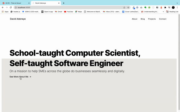
Below is a sample demo of what we are building.
To follow along with this article, you can check out the GitHub repo.
Pages and Component Composition
One of the fantastic features of Sveltekit is its filesystem-based router. It means that the structure of your codebase defines the structure of your application. We have two types of routes which are: pages and endpoints. Pages generally generate HTML, CSS, and JavaScript needed for the page to be displayed to the user, while Endpoints run only on the server(or when you build your site, if prerendering).
Like any other component-based framework, Pages are Svelte components written in .svelte files (or files with an extension listed in config.extension. When users first visit the application, they will be served a server-rendered version of the page in question by default. From there, navigating to other pages is handled entirely by the client.
The filename determines the routes. For example, src/routes/index.svelte is the root of our demo site.
Open the project folder with the code editor of your choice and navigate to src/routes/index.svelte. Insert the following code below:
<!-- src/routes/index.svelte -->
<svelte:head>
 <title>David Adeneye</title>
</svelte:head>

<div class="container">
 <div class="info">
   <div class="animate-background">
     <div class="container info-container">
     <div class="info-text">
       <h1,
       <p class="animate-text-1">School-taught Computer Scientist,</p>
       <p class="text-2">Self-taught Software Engineer</p>
       </h1>
     </div>
     <h2 class="subtitle">
       On a mission to help SMEs across the globe do businesses
       seamlessly and digitally.
     </h2>
     <div style="color:black" class="scroll-button animate-scroll" tabindex="0">
       <a href="/about">Click Here</a><div class="arrow">→</div>
     </div>
     </div>
   </div>
 </div>
</div>

<div class="background-div"></div>
The <svelte:head> tag element in the second line allow you to insert elements inside the <head> of your document. The rest of the code is our Html page structure for the index page. The next section will look into how styling works in Sveltekit.
Styling our app in SvelteKit
The way styling work in Sveltekit is pretty much the same process as our regular HTML&CSS projects. You can reference external CSS files or root styles applied to all pages in the head tag of your app.html and apply the styles by attaching selectors to document tags.
To style our index.svelte files above, add the following style beneath the last code.
<style>
   .info {
       text-align: center;
       position: relative;
   }

   .info-container {
       height: 100%;
       display:flex;
       flex-direction: column;
       justify-content: center;
       text-align: left;
       align-items: start;
   }

   .container {
   max-width: 1400px;
       margin: 190px 0 0 2.5rem;
   }

   .info h1 {
       font-size: 4rem;
       margin: 0;
   }

   .info h1 p {
       position: relative;
       font: inherit;
       margin: 0;
   text-align: left;
       line-height: 130%;
       width: fit-content;
       font-weight: 800;
       letter-spacing: -0.03em;
   }

   .info h2 {
       max-width: 65ch;
       font-weight: 200;
       margin-top: 0.50rem;
   }

 .background-div {
   background-color: var(--background);
     width: 100%;
   height: 56vh;
   margin: -155px auto;
 }


   .info .info-text {
       position: relative;
   }

 .scroll-button {
   display: flex;
   border: none;
   outline: none;
   cursor: pointer;
 }

   .scroll-button .arrow {
     margin-left: 0.50rem;
 }
</style>
Also, to have our global styling work on other pages, open the app.html and insert the following styling beneath the html closing tag.
<style>
   body {
   background-position: left top;
   font-family: "Inter", sans-serif;
   margin: 0;
   background-repeat: no-repeat;
   }

   * {
   box-sizing: border-box;

   }

   a {
   text-decoration: none;
   color: black;
   }

   :root{
       --background: #ecebe8;
   }


   nav {
       position: sticky;
       top: 0;
       left: 0;
       right: 0;
       margin: 0 80px 0 80px;
       padding-top: 2rem;
       padding-bottom: 2rem;
   }

   nav .nav-container {
       display: flex;
       justify-content: space-between;
       align-items: center;
   }

   .nav-links {
       display: flex;
       justify-content: flex-end;
       align-items: center;
       margin: -1em 0;
       flex: 1 0 auto;
   }

   .nav-links .link {
       position: relative;
       margin: 1em;
       font-size: 0.85rem;
       letter-spacing: 1px;
       color: black;
   }

   .nav-logo {
       position: relative;
       line-height: 1;
       font-size: 1.1rem;
       color: black;
   }
</style>
Also, note that each component styling is internally scoped when importing components in Svelte. It means that styling applied to an imported component will only affect the component itself.
Layout and Navigation in Sveltekit
As explained earlier, pages are treated as entirely standalone components. So, upon navigation, the existing component will be destroyed, and a new one will take over. However, elements or components need to be visible on every page in many applications, such as a navigation menu or footer. So instead of repeating them on every page, we can use a layout component.
To create a layout component that applies to every page on our website, create a file called src/routes/__layout.svelte and paste the following code below inside.
<!-- src/routes/__layout.svelte -->
<nav>
   <div class="nav-container">
       <a href="/" class="nav-logo" title="Back to Homepage">David Adeneye</a>
       <div class="nav-links">
           <a href="/about" class="link">About</a>
           <a href="/blog" class="link">Blog</a>
           <a href="/projects" class="link">Projects</a>
           <a href="/contact" class="link">Contact</a>
       </div>
   </div>
</nav>

<div class="container">
 <!-- Pages will be injected below -->
    <slot></slot>
</div>

<style>
    .container {
       max-width: 1400px;
       margin: 50px auto;
   }
</style>
This code above is our navigation menubar that applies to all pages of our portfolio website. The default layout component that Sveltekit uses, if you dont include yours, looks like this:
<slot></slot>In addition, we can use any markup, style, and behavior of our choice; the only requirement is that the component must include a <slot> for the page content like the way we did above in the __layout.svelte file.
Routing in Sveltekit
Like every other popular SSR solution, Sveltekit has a great file-based routing system. Pages in your app are stored by default inside the src/routes folder; this means that the structure of your application is defined by the structure of your codebase, specifically the content of src/routes.
Our portfolio website contain about six pages:
- Home -
index.svelte(already created that above) - About -
about.svelte(we would create that in this section) - Blog -
blog.svelte(we would create that in next section) - Projects -
projects.svelte(copy the code file in the github repo) - Contact -
contact.svelte(copy the code file in the github repo) - [id].svelte - Dynamic routes (copy the code file in the github repo)
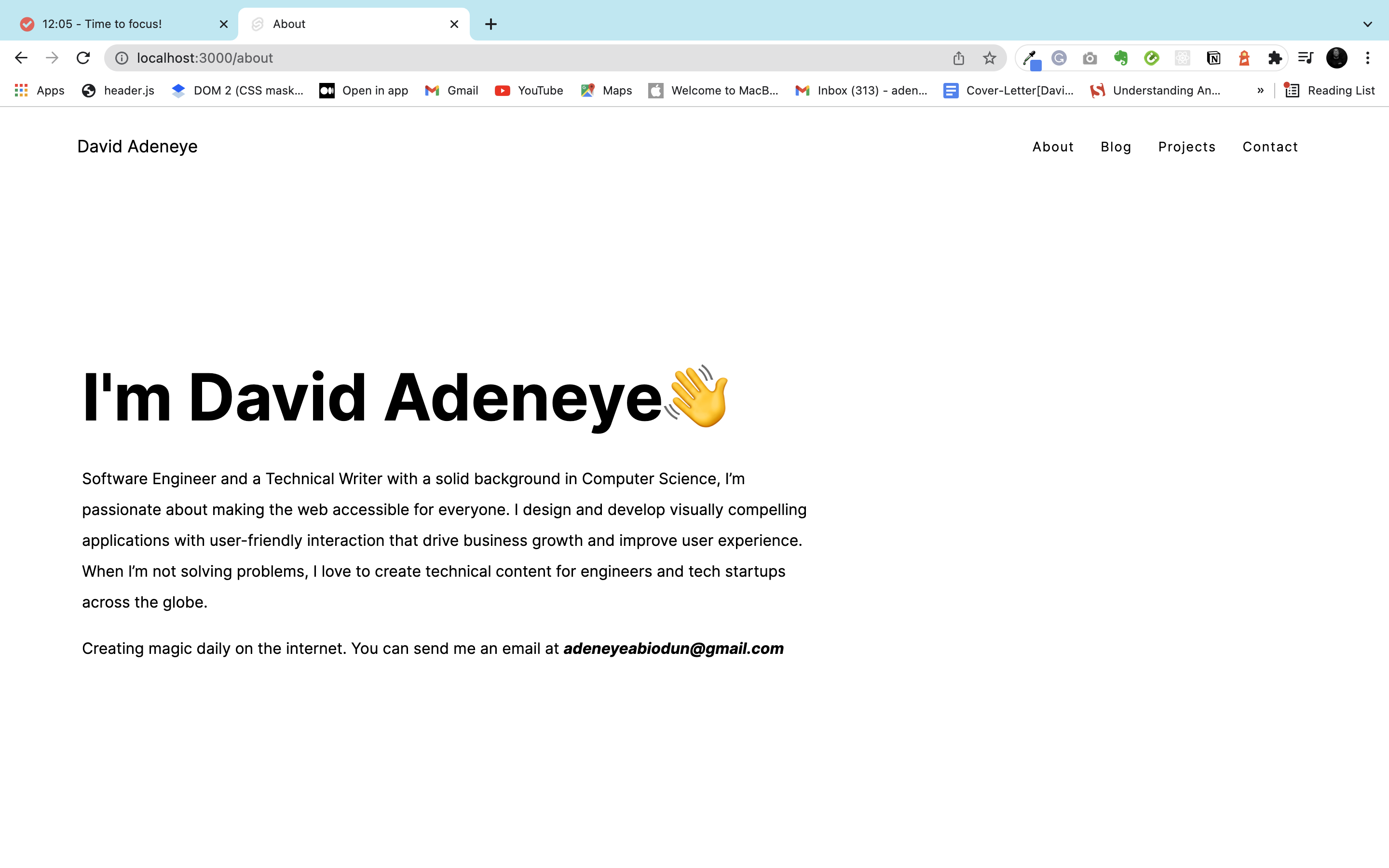
Since we have created our navigation header structure for these pages above in the src/routes/__layout.svelte. Open the about.svelte and insert the following code below:
<!-- src/routes/about.svelte -->
<svelte:head>
   <title>About</title>
</svelte:head>

<div class="main_container">
   <section>
       <div class="inner-container">
         <h2 class="about-title">I'm David Adeneye👋</h2>
         <div class="about-subtitle">
             <p>
               Software Engineer and a Technical Writer with a solid
               background in Computer Science, I'm passionate about making
               the web accessible for everyone. I design and develop visually compell                ing applications with user-friendly interaction that drive business g                owth and improve user experience. When I'm not solving problems,
               I love to create technical content for engineers and tech
               startups across the globe.
             </p>
             <p>
               Creating magic daily on the internet. You can send me
                an email at <span class="info-text">adeneyeabiodun@gmail.com</span>
             </p>
         </div>
       </div>
     </section>
</div>

<style>
   .main_container {
       margin: 0 80px 0 65px;
   }

   .about-title {
       font-size: 4.2rem;
       font-weight: bold;
       margin-top: 11rem;
   }

   .about-subtitle {
       margin-top: -2rem;
   }

   .about-subtitle >p {
       width: 60%;
       font-weight: normal;
       font-size: 1rem;
       line-height: 2rem;
   }

   .info-text {
       font-style: italic;
       font-weight: bold;
   }
</style>
The navigation component will always be visible, and clicking between the pages will always replace page content. Now head over to see our portfolio website in action. Your about page should look like this below.
Open Source Session Replay
OpenReplay is an open-source, session replay suite that lets you see what users do on your web app, helping you troubleshoot issues faster. OpenReplay is self-hosted for full control over your data.

Start enjoying your debugging experience - start using OpenReplay for free.
Consuming REST API in Sveltekit
To learn how to fetch data from a REST API and the concept of loading in Sveltekit, we would build a demo blog post on our website. We will be interacting with a free fake REST API called JSONPlaceholder, it’s a free online REST API for testing and prototyping.
To get started, open src/routes/blog.svelte and paste the following code or read along with the accompanying source code.
<!-- src/routes/blog.svelte -->
<svelte:head>
   <title>Blog</title>
</svelte:head>

<script context="module">
   export const load = async ({ fetch }) => {
       const res = await fetch("https://jsonplaceholder.typicode.com/posts");
       const blogposts = await res.json();
       return {
           props: {
               blogposts,
           }
       }
   }
</script>

<script>
   export let blogposts;
</script>

<div class="container">
   <h1>My Articles</h1>
   <div class="blogposts">
       {#each blogposts as post}
       <div class="post">
           <h2>{post.title.substring(0, 20)}</h2>
           <p>{post.body.substring(0, 80)}</p>
           <p class="readmore">
            <a style=" color: rgb(10, 10, 139);" href={`/blog/${post.id}`}>
              Read More
            </a>
          </p>
       </div>
       {/each}
   </div>
</div>
Let’s analyze the code above. Take note of the <script context="module"> in line 6 - it is necessary because load runs before the component is rendered. The per-component instance code should be in a second <script> tag. We then use the load function to fetch our demo blogposts from the jsonplaceholder fake api to be displayed on our website.
The load function in sveltekit is similar to getStaticProps or getServerSideProps in Next.js, except that it runs on both the client and the server.
In addition, don’t forget to copy the accompanying CSS code within the code block if you’re building along with this tutorial for your page’s styling.
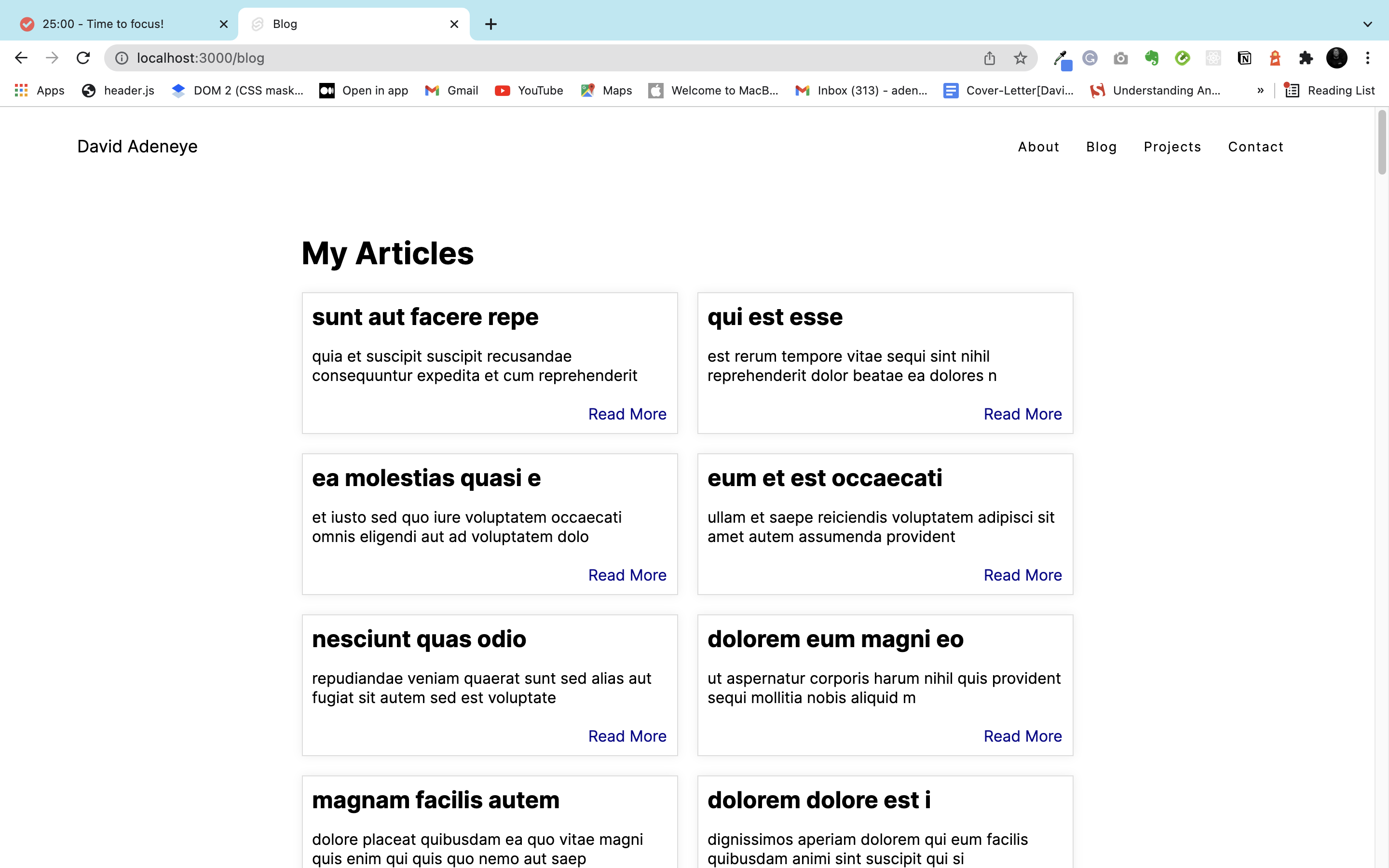
Your blog.svelte should look like this below:
Using Dynamic routes in Sveltekit
Building a blog like this, we would need dynamically generated routes. Sveltekit enables us to implement this easily through dynamic routes.
To implement this, create a new folder called blog. Dynamic parameters in Sveltekit are encoded using [bracket]. For example, create a file called [id].svelte inside your blog folder. Open the file and paste the following code or follow along with the source code.
<script context="module">
   export const load = async ({ page, fetch }) => {
       const id = page.params.id;

       const res = await fetch(`https://jsonplaceholder.typicode.com/posts/${id}`);

       const post = await res.json();

       return {
           props: {
               post,
           }
       }
   }
</script>
From the code, we accessed the parameter within the load function and stored it with the variable id; the parameter was then used to fetch the exact blog post of that id.
Suppose you go back to the blog.svelte you will see how we accessed the dynamically generated pages with a href in line 33 below:
<p class="readmore">
  <a style="color: rgb(10, 10, 139);" href={`/blog/${post.id}`}>
      Read More
  </a>
</p>
You can see how we access the exact blog post with the post.id. So when you click on Read More, it will load a new page to read the entire blog.
Deployment Sveltekit Application
In Sveltekit, before you can deploy your app, you will need to adapt it for your development target. It helps simplify your deployment process by providing several plugins known as adapters. Adapters are small plugins that take the built app as input and generate output for deployment.
Sveltekit provides a few officially-supported adapters:
Adapter Static: This is an adapter for the Sveltekit app that prerenders your site as a collection of static files compatible with hosting services like Github pages and the likes.
Adapter Vercel: An Adapter for Svelte apps that create a Vercel app, using a function for dynamic server rendering. It is used for deploying your app to the Vercel hosting platform.
Adapter Netlify: Adapter for Svelte apps that create a Netlify app, using services functions for dynamically generating pages. It is used for deploying your app on the Netlify platform.
Let’s take a look at how to deploy our demo application to Netlify.
Deploying Sveltekit on Netlify
For you to deploy Sveltekit on Netlify, you need to use the netlify-sveltekit adapter.
Lets install the adpater into our project with the following command below:
npm install -D @sveltejs/adapter-netlify@next
After the intallation is complete, add the adapter into your project’s svelte.config.js file. Insert the following code below into the file.
import adapter from '@sveltejs/adapter-netlify';

export default {
  kit: {
    adapter: adapter(),
    target: '#svelte'
  }
};
Then create a netlify.toml file in your project’s base directory and specify a build command and publish directory. Insert the following code below into the file.
[build]
  command = "npm run build"
  publish = "build"
After all this setting, then deploy your project on Netlify with Git or the Netlify CLI.
This is the link(jolly-franklin-11e50c.netlify.app) to the final deployed website on Netlify
Conclusion
I hope you enjoyed working through this tutorial. We explored the fundamental concept of Sveltekit by building a sample portfolio website and most importantly how to consume REST API with our demo blog within the app and also how to deploy sveltekit application on Netlify. You can try to put what you have learn to practice by building other pages or upgrade this demo to your taste if your looking to build a portfolio website for yourself.
The supporting repo for this article is available on Github.