
Exploring the best React charting libraries for 2023


Almost every day of our lives, we collect, send, analyze and consume data as they are important. Data aren’t appealing and sometimes do not make sense when being looked at, but presenting them in an appealing form, such as charts, helps us understand and appreciate the data.
Digitally, data needs to be represented comprehensively on applications and websites as charts to be of good value. Developers can build these charts from scratch or leverage third-party options such as the React Chart Library in smaller projects. This could save considerable time and effort and deliver great visualization options.
React Chart Libraries are fantastic tools for developers who wish to incorporate meaningful data into their web projects. In this article, we will explore the list of some of the best React Charting libraries while comparing their features, strengths, and weaknesses. By the end of this tutorial, you will be able to choose the library that is best suited for your projects.
They are used to visualize data, manage libraries, and recompose and maintain it. React Chart Libraries are highly beneficial tools for integrating meaningful data into your project. The most awesome feature about this is that these apps are essential in knowing how a particular app works and is meant to work in the future. These apps have eased developers of the worries encountered during the development and design of the app to enable them to focus more on actual data production.
Finding a React Chart Library market can be a lot of work. In this article, we will look at the best React charting libraries. These libraries are flexible and scalable and use frameworks that are reusable for an extended period.
Bizcharts
Bizcharts is an impressive react chart library. Its extensive collection of highly versatile chart templates meets many developers’ requirements. This makes it a superb option for immediate designing and data visualization projects. It gives a massive library with little requirement for coding. With minimal coding, developers can meet their charting needs while focusing on the most crucial section of their project.
The Bizchart library was designed based on the G2 4.X package. It utilizes the benefits of React and G2 and enables users to combine countless charts in the form of components. It also provides 42 base charts with g2Plot built-in. Bizcharts supports multiple coordinate system drawings and integrates many statistical tools, animation customization, interactive customization, graphics customization, etc. It has stable performance and powerful scalability capabilities.
How to install Bizcharts:
You can install Bizcharts by:
- Downloads the latest release version on BizCharts Github here: https://github.com/alibaba/BizCharts.
- Or get Bizcharts through npm:
npm install bizcharts --saveLet’s take a look at a demo example of how to create a basic line chart with Bizcharts:
import React from 'react';
import ReactDOM from 'react-dom';
import { Chart, LineAdvance} from 'bizcharts';

const data = [
 {
   month: "Jan",
   city: "Tokyo",
   temperature: 7
 },
 {
   month: "Jan",
   city: "London",
   temperature: 3.9
 },
 {
   month: "Feb",
   city: "Tokyo",
   temperature: 13
 },
 {
   month: "Feb",
   city: "London",
   temperature: 4.2
 },
 {
   month: "Mar",
   city: "Tokyo",
   temperature: 16.5
 },
 {
   month: "Mar",
   city: "London",
   temperature: 5.7
 },
 {
   month: "Apr",
   city: "Tokyo",
   temperature: 14.5
 },
 {
   month: "Apr",
   city: "London",
   temperature: 8.5
 },
 {
   month: "May",
   city: "Tokyo",
   temperature: 10
 },
 {
   month: "May",
   city: "London",
   temperature: 11.9
 },
 {
   month: "Jun",
   city: "Tokyo",
   temperature: 7.5
 },
 {
   month: "Jun",
   city: "London",
   temperature: 15.2
 },
 {
   month: "Jul",
   city: "Tokyo",
   temperature: 9.2
 },
 {
   month: "Jul",
   city: "London",
   temperature: 17
 },
 {
   month: "Aug",
   city: "Tokyo",
   temperature: 14.5
 },
 {
   month: "Aug",
   city: "London",
   temperature: 16.6
 },
 {
   month: "Sep",
   city: "Tokyo",
   temperature: 9.3
 },
 {
   month: "Sep",
   city: "London",
   temperature: 14.2
 },
 {
   month: "Oct",
   city: "Tokyo",
   temperature: 8.3
 },
 {
   month: "Oct",
   city: "London",
   temperature: 10.3
 },
 {
   month: "Nov",
   city: "Tokyo",
   temperature: 8.9
 },
 {
   month: "Nov",
   city: "London",
   temperature: 5.6
 },
 {
   month: "Dec",
   city: "Tokyo",
   temperature: 5.6
 },
 {
   month: "Dec",
   city: "London",
   temperature: 9.8
 }
];

function Demo() {
 return <Chart padding={[10, 20, 50, 40]} autoFit height={300} data={data} >
   <LineAdvance
     shape="smooth"
     point
     area
     position="month*temperature"
     color="city"
   />
  </Chart>
}

ReactDOM.render(<Demo />, mountNode);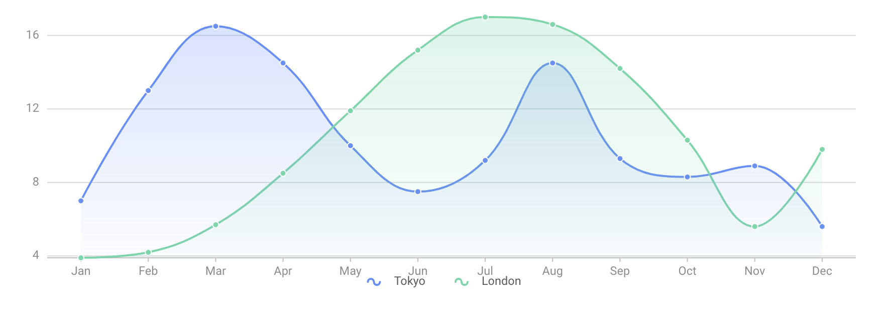
Bizcharts is highly popular among the Asian community because it was developed by the tech giant Alibaba. It has 6k Github stars and 22,343 weekly downloads.
Echarts
Echarts is an open-source front-end js charting library that allows developers to create interactive and highly customizable charts for their react websites. In essence, ECharts is a set of declarative visual design languages that customize different types of built-in charts. More than 20 chart types are available out of the box, and dozens of components can be arbitrarily combined to use. Its underlying streaming architecture enables Echarts’ high performance.
Echarts has a powerful rendering engine that enables progressive rendering and stream loading, which makes it possible to render 10 million data in real time. Echarts are easy to use and also provide multi-rendering solutions and cross-platform support. It offers solutions for a more powerful and beautiful 3D visualization with GL.
How to install Echarts
Echarts offers a variety of installation options, and you can choose using the following options:
Install from npm:
npm install echartsUse from CDN: jsDeliver unpkg cdnjs
You can get the links to each version on the releases page of the apache/echarts projects. Then click on the source code beneath assets at the bottom of the desired release version. After downloading it, unzip the file and locate the echarts.js file in the dist folder to include the full Echarts functionality.
Online Customization:
Perhaps if you want to introduce only some modules to reduce package size, you can use the Echarts online customization function to create a customized download of Echarts.
Let’s look at a demo example of how to create a basic area chart in Echarts.
import * as echarts from 'echarts';

var chartDom = document.getElementById('main');
var myChart = echarts.init(chartDom);
var option;

option = {
  xAxis: {
    type: 'category',
    boundaryGap: false,
    data: ['Mon', 'Tue', 'Wed', 'Thu', 'Fri', 'Sat', 'Sun']
  },
  yAxis: {
    type: 'value'
  },
  series: [
    {
      data: [820, 932, 901, 934, 1290, 1330, 1320],
      type: 'line',
      areaStyle: {}
    }
  ]
};

option && myChart.setOption(option);
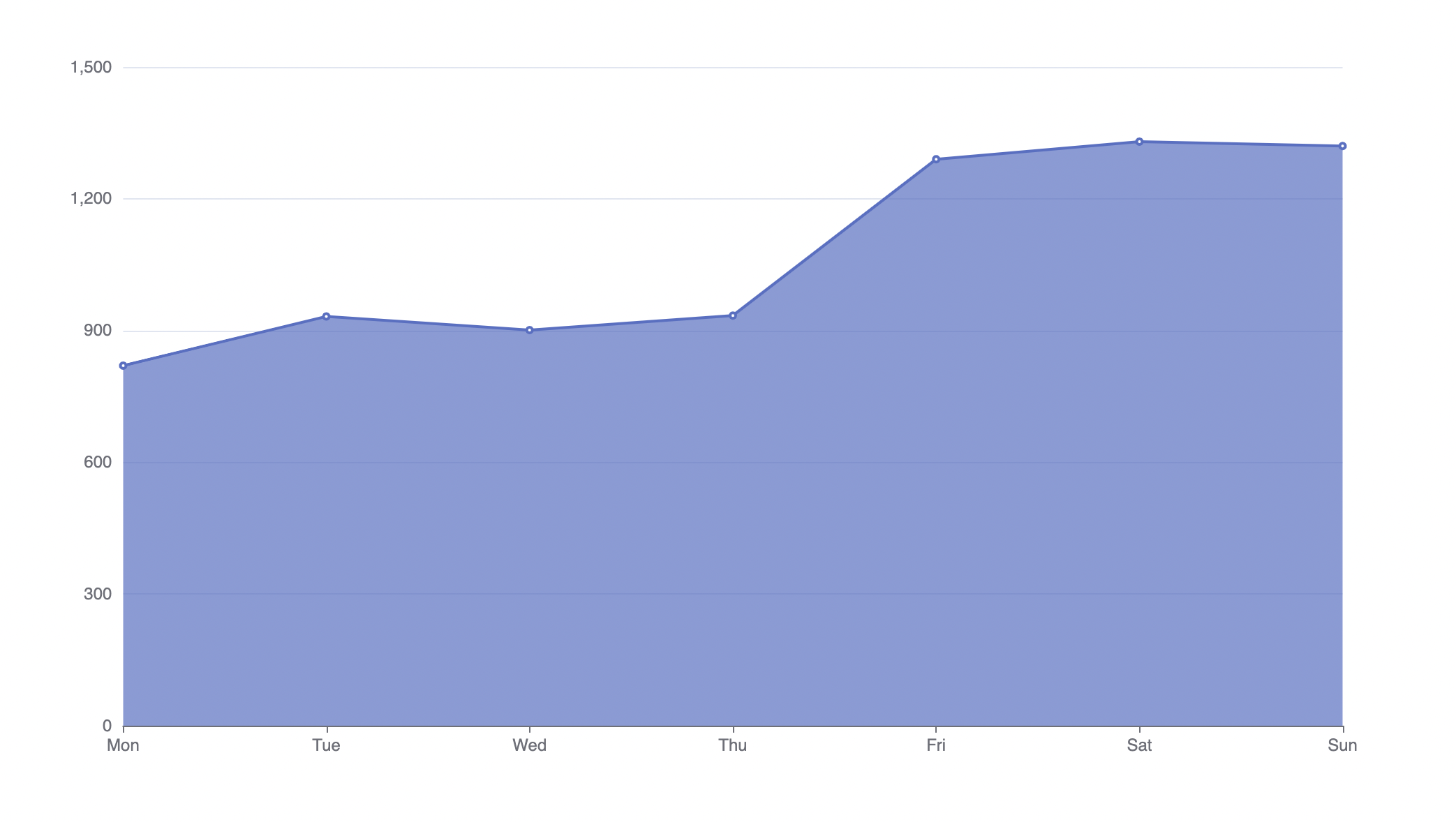
They have a supportive, active open-source community that ensures the healthy development of projects and contributes to a wealth of third-party extensions. It has 3.8k Github stars and 149,964 weekly downloads.
Nivo
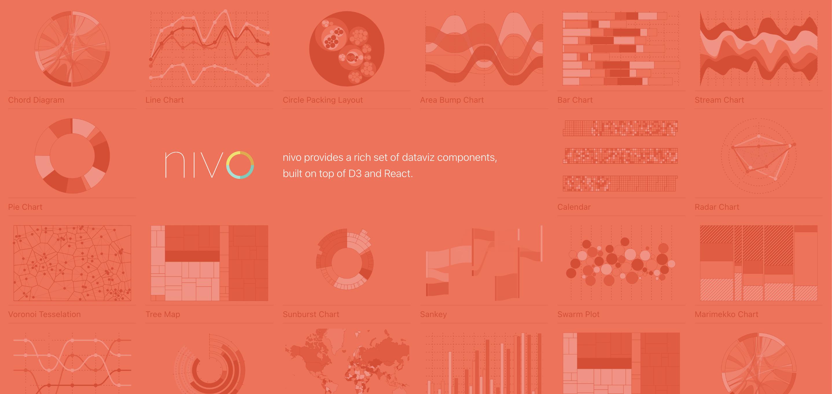
The Nivo data visualization tool can be classified as a special react chart library. It has server-side rendering support, enabling web developers to generate charts and server-side data. Built with React and D3, it provides a variety of chart types and designs that can be created using its templates. It has multiple beautiful charts that you can easily customize. By default, Nivo charts are responsive and respond to changes in screen width.
Let’s take a look at a demo example of how to create a bar chart with Nivo:
// install (please make sure versions match peerDependencies)
// yarn add @nivo/core @nivo/bar
import { ResponsiveBar } from '@nivo/bar'


// make sure parent container have a defined height when using
// responsive component, otherwise height will be 0 and
// no chart will be rendered.
// website examples showcase many properties,
// you'll often use just a few of them.
const MyResponsiveBar = ({ data /* see data tab */ }) => (
   <ResponsiveBar
       data={data}
       keys={['hot dog','burger', 'sandwich', 'kebab','fries','donut']}
       indexBy="country"
       margin={{ top: 50, right: 130, bottom: 50, left: 60 }}
       padding={0.3}
       valueScale={{ type: 'linear' }}
       indexScale={{ type: 'band', round: true }}
       colors={{ scheme: 'nivo' }}
       defs={[
           {
               id: 'dots',
               type: 'patternDots',
               background: 'inherit',
               color: '#38bcb2',
               size: 4,
               padding: 1,
               stagger: true
           },
           {
               id: 'lines',
               type: 'patternLines',
               background: 'inherit',
               color: '#eed312',
               rotation: -45,
               lineWidth: 6,
               spacing: 10
           }
         ]}
       fill={[
           {
               match: {
                   id: 'fries'
               },
               id: 'dots'
           },
           {
               match: {
                   id: 'sandwich'
               },
               id: 'lines'
           }
       ]}
       borderColor={{
           from: 'color',
           modifiers: [
               [
                   'darker',
                   1.6
               ]
           ]
       }}
       axisTop={null}
       axisRight={null}
       axisBottom={{
           tickSize: 5,
           tickPadding: 5,
           tickRotation: 0,
           legend: 'country',
           legendPosition: 'middle',
           legendOffset: 32
       }}
       axisLeft={{
           tickSize: 5,
           tickPadding: 5,
           tickRotation: 0,
           legend: 'food',
           legendPosition: 'middle',
           legendOffset: -40
       }}
       labelSkipWidth={12}
       labelSkipHeight={12}
       labelTextColor={{
           from: 'color',
           modifiers: [
               [
                   'darker',
                   1.6
               ]
           ]
       }}
       legends={[
           {
               dataFrom: 'keys',
               anchor: 'bottom-right',
               direction: 'column',
               justify: false,
               translateX: 120,
               translateY: 0,
               itemsSpacing: 2,
               itemWidth: 100,
               itemHeight: 20,
               itemDirection: 'left-to-right',
               itemOpacity: 0.85,
               symbolSize: 20,
               effects: [
                   {
                       on: 'hover',
                       style: {
                           itemOpacity: 1
                       }
                   }
               ]
           }
       ]}
       role="application"
       ariaLabel="Nivo bar chart demo"
       barAriaLabel={function(e){return e.id+": "+e.formattedValue+" in country: "+e.indexValue}}
   />
)
Code Source: https://nivo.rocks/bar/
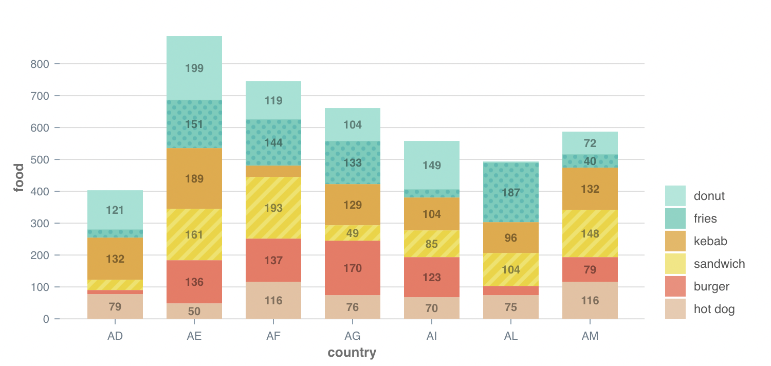
There is support for HTML and SVG, as well as responsiveness charts built in. The documentation is easily understandable. It has 10.5k Github stars with 157,931 weekly downloads.
Recharts
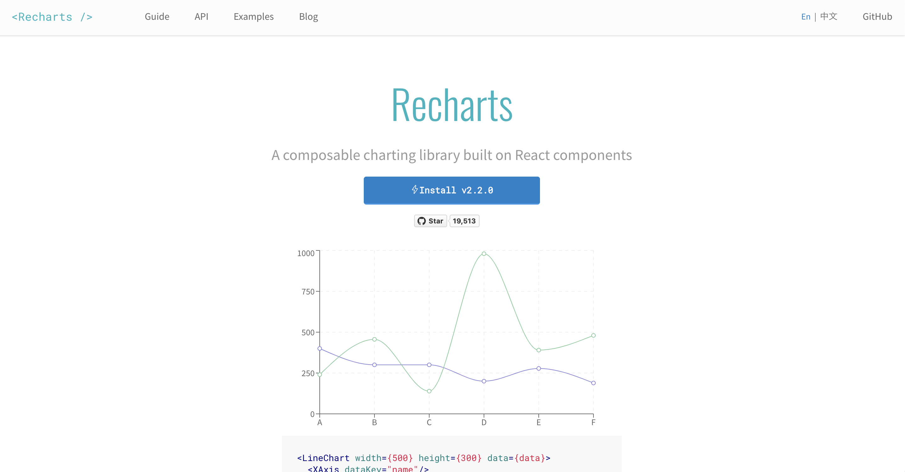
This a fantastic chart library based on React’s chart principle. Rechart is a reliable react chart library that allows developers to build charts with reusable react components.
With Recharts, you can create stunning charts that are easily customizable by tweaking existing components’ props or adding custom ones. In the default configuration, the charts are not responsive but can be made responsive by adding a wrapper component.
As Recharts has been around for a while, it has a large user base and community. Recharts can be easily installed with either npm or yarn using its CDN. Also, it has excellent documentation that makes it easy to get started.
How to install Recharts
According to the documentation, NPM is the easiest and fastest way to install Recharts. It is also the recommended installation method when building single-page applications.
#latest stable
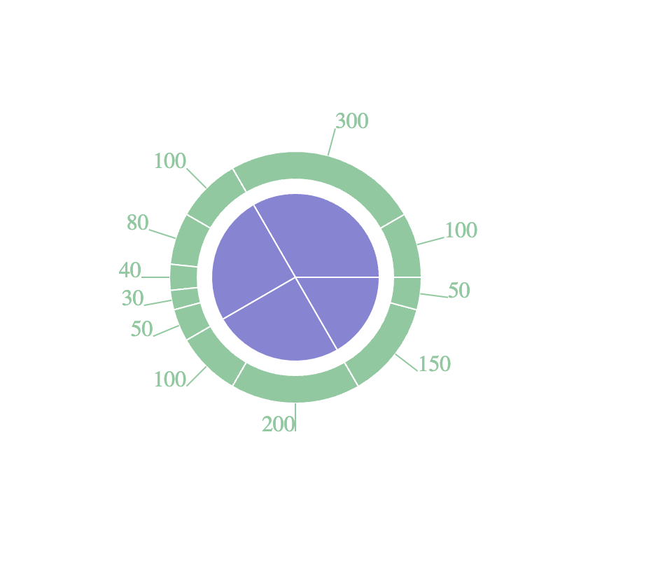
$ npm install rechartsLet’s take a look at a demo on how to create a simple Pie chart with recharts:
import React, { PureComponent } from 'react';
import { PieChart, Pie, Sector, Cell, ResponsiveContainer } from 'recharts';

const data01 = [
  { name: 'Group A', value: 400 },
  { name: 'Group B', value: 300 },
  { name: 'Group C', value: 300 },
  { name: 'Group D', value: 200 },
];
const data02 = [
  { name: 'A1', value: 100 },
  { name: 'A2', value: 300 },
  { name: 'B1', value: 100 },
  { name: 'B2', value: 80 },
  { name: 'B3', value: 40 },
  { name: 'B4', value: 30 },
  { name: 'B5', value: 50 },
  { name: 'C1', value: 100 },
  { name: 'C2', value: 200 },
  { name: 'D1', value: 150 },
  { name: 'D2', value: 50 },
];

export default class Example extends PureComponent {
  static demoUrl = 'https://codesandbox.io/s/pie-chart-of-two-levels-gor24';

  render() {
    return (
      <ResponsiveContainer width="100%" height="100%">
        <PieChart width={400} height={400}>
          <Pie data={data01} dataKey="value" cx="50%" cy="50%" outerRadius={60} fill="#8884d8" />
          <Pie data={data02} dataKey="value" cx="50%" cy="50%" innerRadius={70} outerRadius={90} fill="#82ca9d" label />
        </PieChart>
      </ResponsiveContainer>
    );
  }
}
It has well-structured documentation and a strong community. With over 19k Github stars and 596.527 downloads, it’s arguably one of the most popular charting libraries for React.
Session Replay for Developers
Uncover frustrations, understand bugs and fix slowdowns like never before with OpenReplay — an open-source session replay tool for developers. Self-host it in minutes, and have complete control over your customer data. Check our GitHub repo and join the thousands of developers in our community.
React-chartjs-2
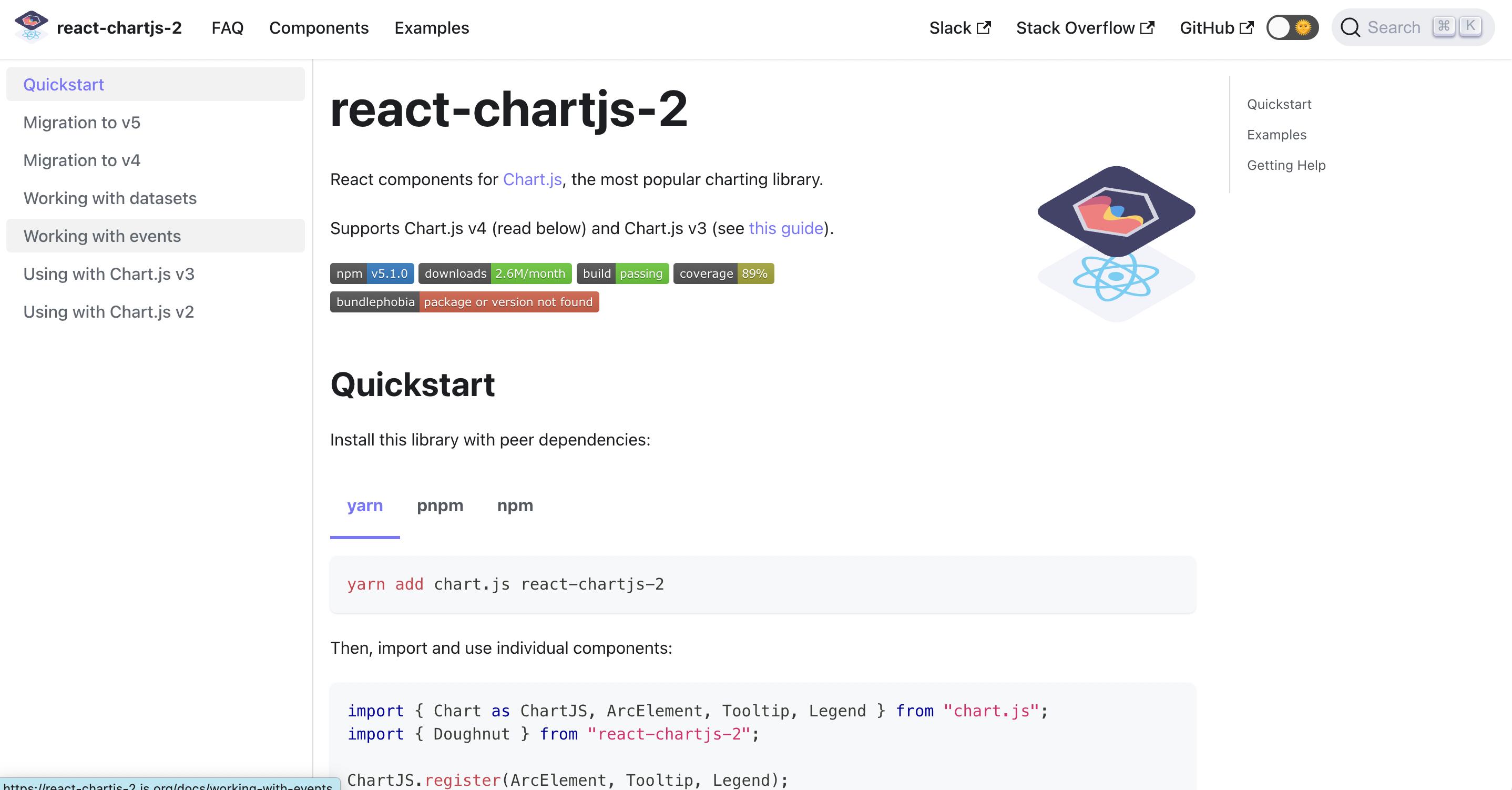
React chart js 2 is not typically a react library but a react wrapper for the Javascript Chartjs library. This means that you can use charts in many react-chartjs-2 projects. This library is excellent if you are working with a simple dataset requiring little customized tweaks.
Chartjs is a little chart toolkit that uses HTML5 Canvas elements to create responsive chart components. Being a react library, you would have to reference Chartjs documentation most of the time.
How to install react-chartjs-2
You can install the library with peer dependencies in any package of your choice:
yarn add chart.js react-chartjs-2npm install --save chart.js react-chartjs-2Let’s take a look at a demo example of how to create a simple Bar Chart with react-chartjs-2:
import React from 'react';
import {
Chart as ChartJS,
CategoryScale,
LinearScale,
BarElement,
Title,
Tooltip,
Legend,
} from 'chart.js';
import { Bar } from 'react-chartjs-2';
import faker from 'faker';

ChartJS.register(
CategoryScale,
LinearScale,
BarElement,
Title,
Tooltip,
Legend
);

export const options = {
responsive: true,
plugins: {
legend: {
position: 'top' as const,
},
title: {
display: true,
text: 'Chart.js Bar Chart',
},
},
};

const labels = ['January', 'February', 'March', 'April', 'May', 'June', 'July'];

export const data = {
labels,
datasets: [
{
label: 'Dataset 1',
data: labels.map(() => faker.datatype.number({ min: 0, max: 1000 })),
backgroundColor: 'rgba(255, 99, 132, 0.5)',
},
{
label: 'Dataset 2',
data: labels.map(() => faker.datatype.number({ min: 0, max: 1000 })),
backgroundColor: 'rgba(53, 162, 235, 0.5)',
},
],
};

export function App() {
return <Bar options={options} data={data} />;
}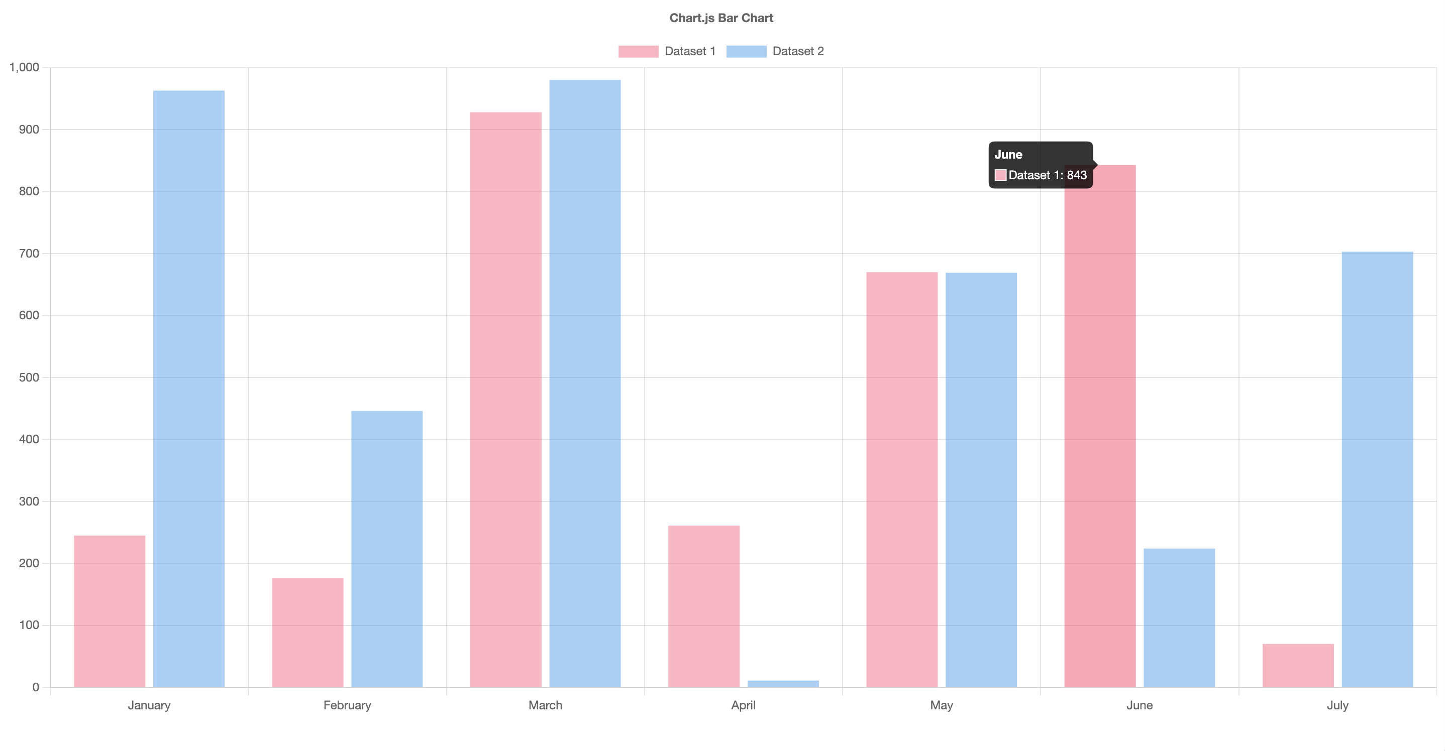
React-chartjs2 is easy to implement with several customization options. Most charts are responsive by default, and support animation. In addition, it comes with some components that allow users to create various types of charts out of the box and customize them. As of the time of writing, it has 5.4k Github stars and over 670,004 weekly downloads.
React Vis
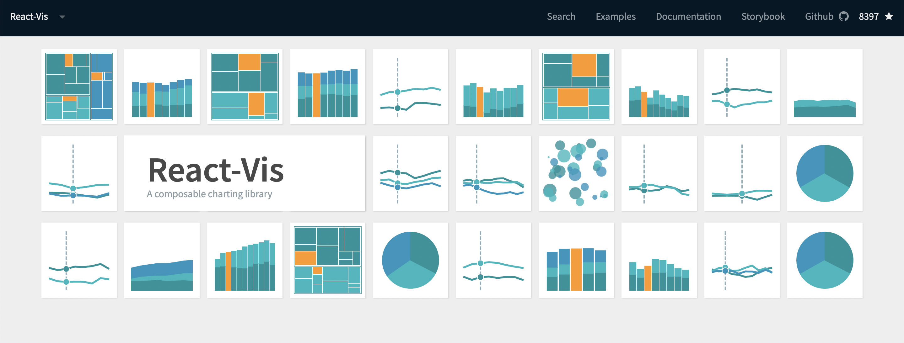
The React vis is a chart library whose makers are Uber open-source web developers. It requires React chart components for illustrating data charts and graphs. React vis can create diverse types of charts like lines, pie charts, and bar charts. It works the same way React components work, so if you have worked with React components, you will find React-vis easy to work with.
How to install React-Vis
You can use react-vis directly on codepen. You can also add react-vis to a project:
npm install react-vis
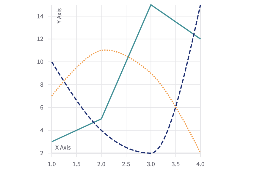
Let’s take a look at a demo example of how to create a line series with React-Vis:
import React from 'react';
import {curveCatmullRom} from 'd3-shape';
import ShowcaseButton from '../showcase-components/showcase-button';

import {
  XYPlot,
  XAxis,
  YAxis,
  ChartLabel,
  HorizontalGridLines,
  VerticalGridLines,
  LineSeries,
  LineSeriesCanvas
} from 'index';

export default class Example extends React.Component {
  state = {
    useCanvas: false
  };
  render() {
    const {useCanvas} = this.state;
    const content = useCanvas ? 'TOGGLE TO SVG' : 'TOGGLE TO CANVAS';
    const Line = useCanvas ? LineSeriesCanvas : LineSeries;

    return (
      <div>
        <ShowcaseButton
          onClick={() => this.setState({useCanvas: !useCanvas})}
          buttonContent={content}
        />
        <XYPlot width={300} height={300}>
          <HorizontalGridLines />
          <VerticalGridLines />
          <XAxis />
          <YAxis />
          <ChartLabel
            text="X Axis"
            className="alt-x-label"
            includeMargin={false}
            xPercent={0.025}
            yPercent={1.01}
            />

          <ChartLabel
            text="Y Axis"
            className="alt-y-label"
            includeMargin={false}
            xPercent={0.06}
            yPercent={0.06}
            style={{
              transform: 'rotate(-90)',
              textAnchor: 'end'
            }}
            />
          <Line
            className="first-series"
            data={[{x: 1, y: 3}, {x: 2, y: 5}, {x: 3, y: 15}, {x: 4, y: 12}]}
          />
          <Line className="second-series" data={null} />
          <Line
            className="third-series"
            curve={'curveMonotoneX'}
            data={[{x: 1, y: 10}, {x: 2, y: 4}, {x: 3, y: 2}, {x: 4, y: 15}]}
            strokeDasharray={useCanvas ? [7, 3] : '7, 3'}
          />
          <Line
            className="fourth-series"
            curve={curveCatmullRom.alpha(0.5)}
            style={{
              // note that this can not be translated to the canvas version
              strokeDasharray: '2 2'
            }}
            data={[{x: 1, y: 7}, {x: 2, y: 11}, {x: 3, y: 9}, {x: 4, y: 2}]}
          />
        </XYPlot>
      </div>
    );
  }
}
React vis is well documented with a wide variety of demo examples. It has over 8.4k Github stars and 107,947 weekly downloads.
Victory
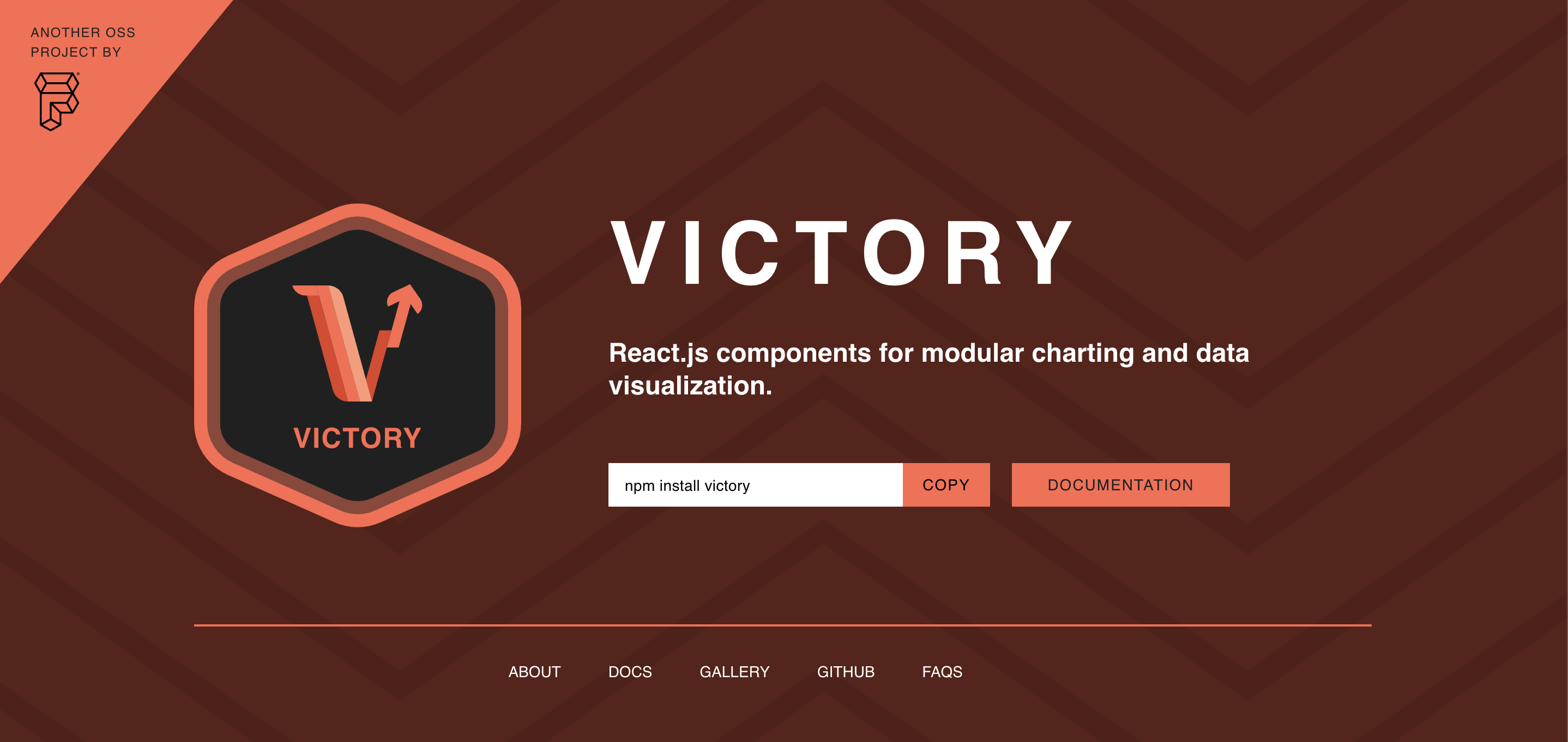
According to the official documentation, Victory is opinionated but a completely overridable ecosystem of React components for modular charting and data visualization. Victory is a set of modular charting components for React and React Native, and it uses the same API for web and Reacts Native applications for easy cross-platform charting.
Let’s take a look at a demo example of how to create a stacked histogram with Victory:
const groupedData = _.groupBy(listeningData, ({ genre }) => genre);

const sharedAxisStyles = {
  tickLabels: {
    fontSize: 13
  },
  axisLabel: {
    padding: 39,
    fontSize: 13,
    fontStyle: "italic"
  }
};

const App = () => {
  return (
    <VictoryChart
      height={450}
      scale={{ x: "time" }}
      containerComponent={
        <VictoryVoronoiContainer
          style={{}}
          labels={({ datum }) =>
            datum.y > 0 ? `${datum.y} ${datum.binnedData[0].genre} songs` : null
          }
        />
      }
    >
      <VictoryLabel
        x={225}
        y={25}
        textAnchor="middle"
        text="Songs listened to in 2020"
      />

      <VictoryStack
        colorScale={[
          "#003f5c",
          "#2f4b7c",
          "#665191",
          "#a05195",
          "#d45087",
          "#f95d6a",
          "#ff7c43",
          "#ffa600"
        ]}
      >
        {Object.entries(groupedData).map(([key, dataGroup]) => {
          return (
            <VictoryHistogram
              data={dataGroup}
              x="day"
              binSpacing={8}
              style={{
                data: { strokeWidth: 0 }
              }}
            />
          );
        })}
      </VictoryStack>

      <VictoryAxis
        tickCount={12}
        tickFormat={date => date.toLocaleString("default", { month: "short" })}
        style={sharedAxisStyles}
      />

      <VictoryAxis
        dependentAxis
        label="Total # of Songs"
        style={sharedAxisStyles}
      />
    </VictoryChart>
  );
};

ReactDOM.render(<App/>, mountNode);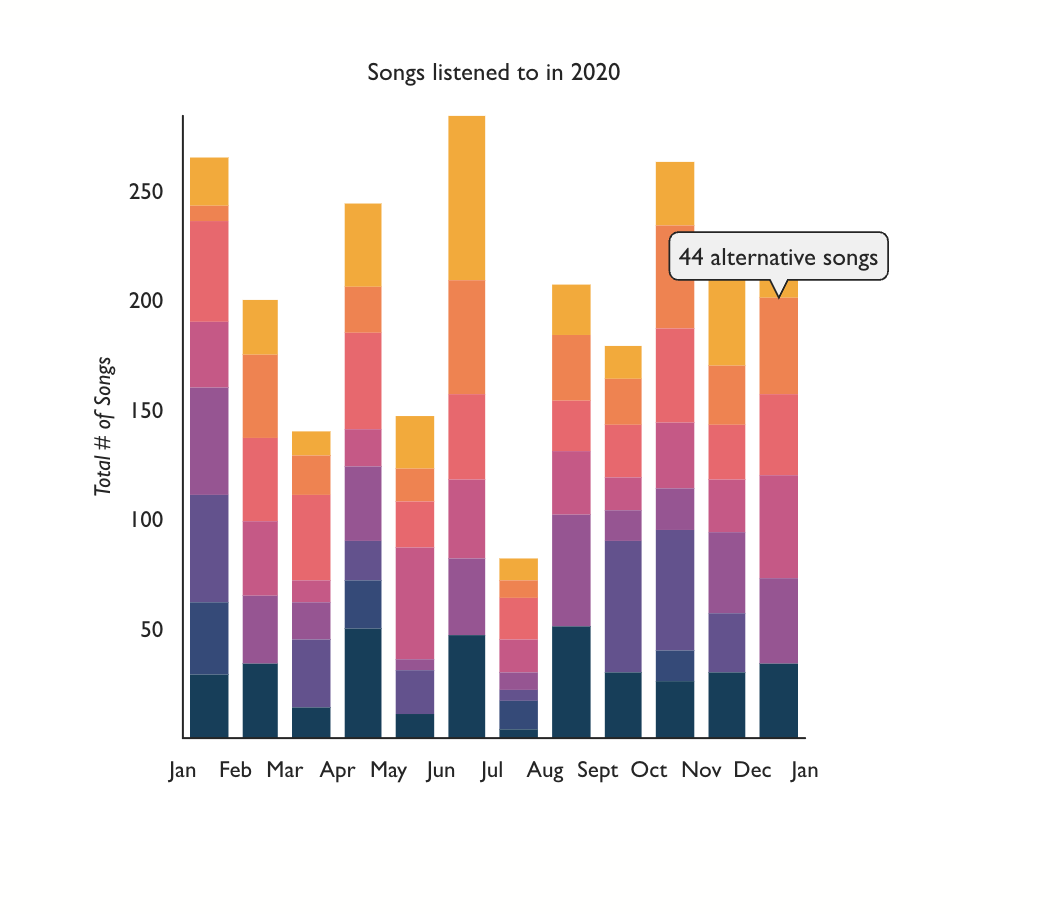
Similarly to many other React chart libraries, Victory was built with React and D3. With it, you can access a wide selection of customizable charts out of the box. The documentation is extensive and easy to comprehend, with many demo examples. It has over 9.9k Github stars with 190,587 weekly downloads.
Visx
The documentation for Visx describes it as a collection of low-level visualization primitives for React. It is an open-source tool developed by Airbnb. It combines React DOM and D3.js to create interactive visualizations. Unlike some react chart libraries, Visx does not claim to be a react chart library. It’s a collection of low-level visualization components that can be reused easily.
Let’s take a look at a demo example of how to create a Bar group chart with Visx:
import React from 'react';
import { BarStack } from '@visx/shape';
import { SeriesPoint } from '@visx/shape/lib/types';
import { Group } from '@visx/group';
import { Grid } from '@visx/grid';
import { AxisBottom } from '@visx/axis';
import cityTemperature, { CityTemperature } from '@visx/mock-data/lib/mocks/cityTemperature';
import { scaleBand, scaleLinear, scaleOrdinal } from '@visx/scale';
import { timeParse, timeFormat } from 'd3-time-format';
import { useTooltip, useTooltipInPortal, defaultStyles } from '@visx/tooltip';
import { LegendOrdinal } from '@visx/legend';
import { localPoint } from '@visx/event';

type CityName = 'New York' | 'San Francisco' | 'Austin';

type TooltipData = {
  bar: SeriesPoint<CityTemperature>;
  key: CityName;
  index: number;
  height: number;
  width: number;
  x: number;
  y: number;
  color: string;
};

export type BarStackProps = {
  width: number;
  height: number;
  margin?: { top: number; right: number; bottom: number; left: number };
  events?: boolean;
};

const purple1 = '#6c5efb';
const purple2 = '#c998ff';
export const purple3 = '#a44afe';
export const background = '#eaedff';
const defaultMargin = { top: 40, right: 0, bottom: 0, left: 0 };
const tooltipStyles = {
  ...defaultStyles,
  minWidth: 60,
  backgroundColor: 'rgba(0,0,0,0.9)',
  color: 'white',
};

const data = cityTemperature.slice(0, 12);
const keys = Object.keys(data[0]).filter((d) => d !== 'date') as CityName[];

const temperatureTotals = data.reduce((allTotals, currentDate) => {
  const totalTemperature = keys.reduce((dailyTotal, k) => {
    dailyTotal += Number(currentDate[k]);
    return dailyTotal;
  }, 0);
  allTotals.push(totalTemperature);
  return allTotals;
}, [] as number[]);

const parseDate = timeParse('%Y-%m-%d');
const format = timeFormat('%b %d');
const formatDate = (date: string) => format(parseDate(date) as Date);

// accessors
const getDate = (d: CityTemperature) => d.date;

// scales
const dateScale = scaleBand<string>({
  domain: data.map(getDate),
  padding: 0.2,
});
const temperatureScale = scaleLinear<number>({
  domain: [0, Math.max(...temperatureTotals)],
  nice: true,
});
const colorScale = scaleOrdinal<CityName, string>({
  domain: keys,
  range: [purple1, purple2, purple3],
});

let tooltipTimeout: number;

export default function Example({
  width,
  height,
  events = false,
  margin = defaultMargin,
}: BarStackProps) {
  const { tooltipOpen, tooltipLeft, tooltipTop, tooltipData, hideTooltip, showTooltip } =
    useTooltip<TooltipData>();

  const { containerRef, TooltipInPortal } = useTooltipInPortal({
    // TooltipInPortal is rendered in a separate child of <body /> and positioned
    // with page coordinates which should be updated on scroll. consider using
    // Tooltip or TooltipWithBounds if you don't need to render inside a Portal
    scroll: true,
  });

  if (width < 10) return null;
  // bounds
  const xMax = width;
  const yMax = height - margin.top - 100;

  dateScale.rangeRound([0, xMax]);
  temperatureScale.range([yMax, 0]);

  return width < 10 ? null : (
    <div style={{ position: 'relative' }}>
      <svg ref={containerRef} width={width} height={height}>
        <rect x={0} y={0} width={width} height={height} fill={background} rx={14} />
        <Grid
          top={margin.top}
          left={margin.left}
          xScale={dateScale}
          yScale={temperatureScale}
          width={xMax}
          height={yMax}
          stroke="black"
          strokeOpacity={0.1}
          xOffset={dateScale.bandwidth() / 2}
        />
        <Group top={margin.top}>
          <BarStack<CityTemperature, CityName>
            data={data}
            keys={keys}
            x={getDate}
            xScale={dateScale}
            yScale={temperatureScale}
            color={colorScale}
          >
            {(barStacks) =>
              barStacks.map((barStack) =>
                barStack.bars.map((bar) => (
                  <rect
                    key={`bar-stack-${barStack.index}-${bar.index}`}
                    x={bar.x}
                    y={bar.y}
                    height={bar.height}
                    width={bar.width}
                    fill={bar.color}
                    onClick={() => {
                      if (events) alert(`clicked: ${JSON.stringify(bar)}`);
                    }}
                    onMouseLeave={() => {
                      tooltipTimeout = window.setTimeout(() => {
                        hideTooltip();
                      }, 300);
                    }}
                    onMouseMove={(event) => {
                      if (tooltipTimeout) clearTimeout(tooltipTimeout);
                      // TooltipInPortal expects coordinates to be relative to containerRef
                      // localPoint returns coordinates relative to the nearest SVG, which
                      // is what containerRef is set to in this example.
                      const eventSvgCoords = localPoint(event);
                      const left = bar.x + bar.width / 2;
                      showTooltip({
                        tooltipData: bar,
                        tooltipTop: eventSvgCoords?.y,
                        tooltipLeft: left,
                      });
                    }}
                  />
                )),
              )
            }
          </BarStack>
        </Group>
        <AxisBottom
          top={yMax + margin.top}
          scale={dateScale}
          tickFormat={formatDate}
          stroke={purple3}
          tickStroke={purple3}
          tickLabelProps={() => ({
            fill: purple3,
            fontSize: 11,
            textAnchor: 'middle',
          })}
        />
      </svg>
      <div
        style={{
          position: 'absolute',
          top: margin.top / 2 - 10,
          width: '100%',
          display: 'flex',
          justifyContent: 'center',
          fontSize: '14px',
        }}
      >
        <LegendOrdinal scale={colorScale} direction="row" labelMargin="0 15px 0 0" />
      </div>

      {tooltipOpen && tooltipData && (
        <TooltipInPortal top={tooltipTop} left={tooltipLeft} style={tooltipStyles}>
          <div style={{ color: colorScale(tooltipData.key) }}>
            <strong>{tooltipData.key}</strong>
          </div>
          <div>{tooltipData.bar.data[tooltipData.key]}℉</div>
          <div>
            <small>{formatDate(getDate(tooltipData.bar.data))}</small>
          </div>
        </TooltipInPortal>
      )}
    </div>
  );
}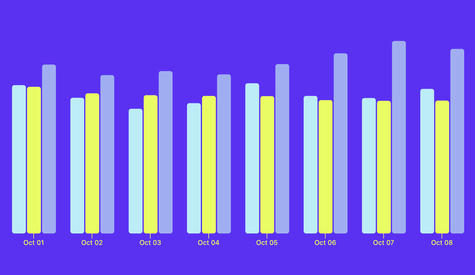
Visx allows you to create complex visualizations and perform mathematical computations with the help of D3. Visx has great documentation with a supporting and booming community. It has over 16k Github stars with over 120,000 weekly downloads.
Summary
In this article, we explored lists of awesome React Charts Libraries that provide a foundational building block that enables developers to effortlessly incorporate meaningful data into their web projects.
Bizchart is a suitable option for creating scalable and performative charts. It helps developers quickly build amazing charts with minimal coding. It is the most suitable choice for quickly integrating charts. Due to its powerful rendering engine, Echarts is the best choice for building charts that render millions of data in real time.
Because of its server-side rendering support, Nivo is best suited for creating charts that render data on the server-side. While Recharts is best suited for developers familiar with React because it was built on react chart principle and enables you to build charts with reusable react components.
React Vis is remarkable for its simplicity, and it is easy to integrate because it works the same way as React components. On the other hand, Victory uses the same API for the web as well as React Native apps, making it a potent cross-platform tool.
Visx is best for creating complex visualization and mathematical computations with the help of D3.
Gain Debugging Superpowers
Unleash the power of session replay to reproduce bugs and track user frustrations. Get complete visibility into your frontend with OpenReplay, the most advanced open-source session replay tool for developers.
