Exploring the Impact of Color Psychology on User Experience
How to select colors for an optimum UX


Color psychology explores how colors can influence our feelings and actions. Understanding the psychological effects of colors is essential in user experience (UX) web design. Colors can arouse emotions and affect how people engage with products and user interfaces. This article explores the significant connection between color psychology and user experience (UX), showing how intelligent color selections can improve digital experiences and create stronger relationships with people.

Discover how at OpenReplay.com.
User experience and color psychology have a significant impact on front-end development. The first point of contact between people and digital products is frontend design, which shapes perceptions and engagement. Frontend developers can make thoughtful color selections that appeal to the target audience and create the desired emotions via understanding color psychology. This approach produces visually appealing and user-friendly interfaces, improving the overall user experience, encouraging positive interactions, and increasing user satisfaction and retention. Digital encounters transform into immersive journeys that have a lasting impression on users through the seamless integration of color psychology and frontend development.
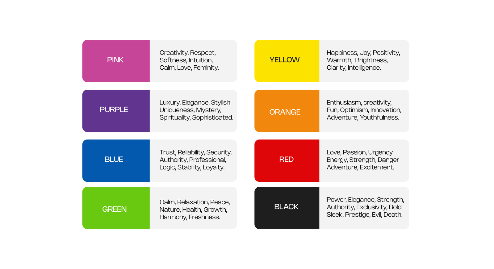
Understanding Color Psychology
Color psychology builds on the foundation of color theory, which explains how colors affect our emotions. Designers can use this knowledge to generate a specific emotion in users by understanding how colors blend and how users perceive them. Designers can better produce visually appealing experiences when they know color contrasts, combinations, and meanings.
Every color triggers a different set of emotions and relationships. A cool color like blue and green evokes a sense of calmness, while warm colors like red and yellow spark passion and energy. To create designs that have a solid emotional connection with their target audience, designers can choose the appropriate colors by breaking down color psychology.
Understanding the Impact of a Color Choice on UI Design
You are in control of user experiences as a front-end developer. Users’ perceptions of digital interfaces are significantly influenced by color. Different colors trigger different feelings. Think about a bold red that shouts “urgent” or “exciting” or a serene blue that brings calmness. As you create interfaces, these color effects are like tools in your toolbox.
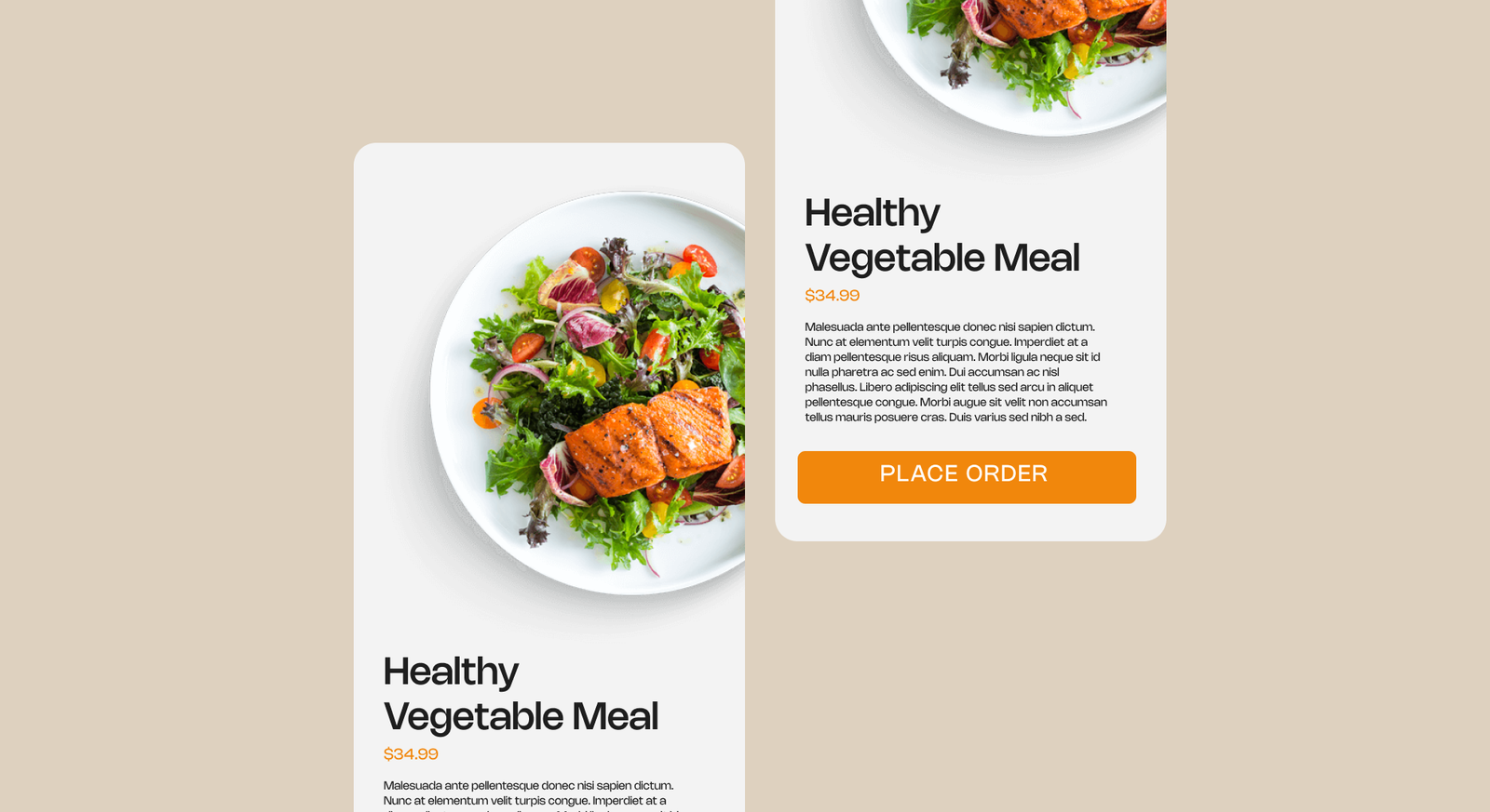
Imagine you’re building a food delivery app. Choosing warm colors like orange and red can make users feel hungry and excited. Similarly, selecting soothing blues and greens for a meditation app can put users at ease. Understanding color psychology allows you to create experiences that add depth and engagement to users by matching their feelings.
Balancing colors for user engagement
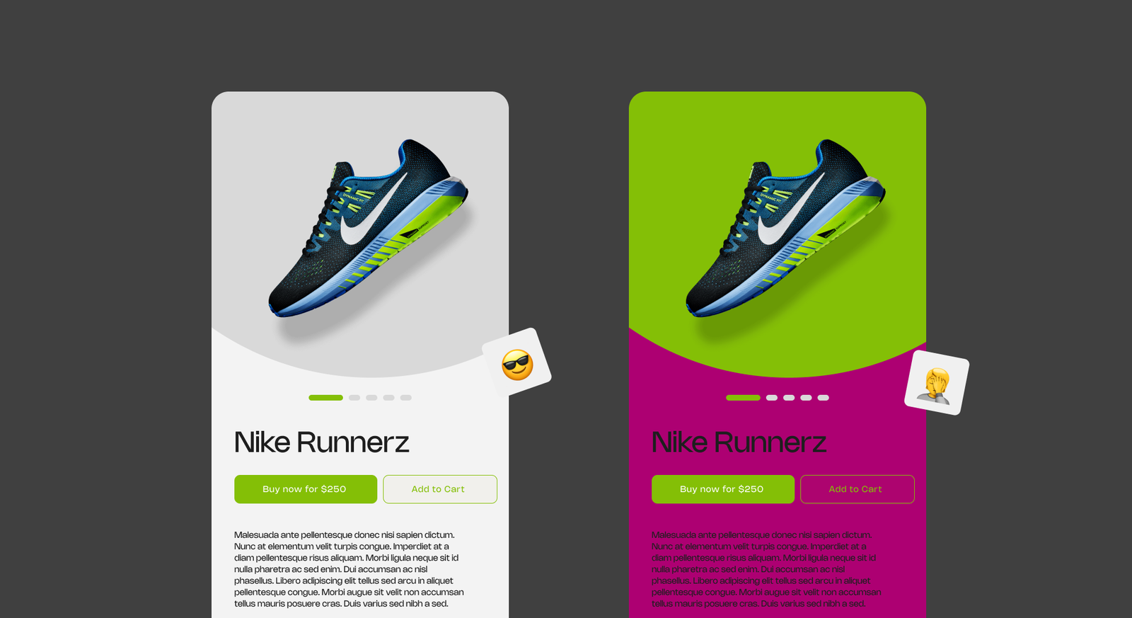
Think of colors as your orchestra, playing a vital role in the symphony of UX design. Balancing colors is like crafting a harmonious melody – too many notes create confusion, while too few can fall flat. Your task is to select colors that stand out, guiding users to essential elements like clickable buttons and crucial messages.
Consider an online store app you’re working on. Imagine the “Buy Now” button in a bright color against a calm background, ensuring it catches attention. Yet, striking the right balance is essential. Overloading with too many bold colors could be overwhelming. Moreover, your challenge is to ensure everyone can enjoy the tune – even those with visual challenges. Achieving this color equilibrium makes the design visually appealing and user-friendly for all.
Color Accessibility and Inclusivity
Color accessibility ensures everyone can use products and services, regardless of their ability to see color. We can achieve color accessibility by using high-contrast colors, avoiding certain color combinations, and providing alternative ways to convey information.
Considering color contrast for users with visual impairments
Designers consider how colors work together to make digital things easy for everyone. The words and the background must have a noticeable color contrast because some people have poor vision. Think about how easy it is to read black lettering on a white page. Designers also do this for apps and websites to ensure easy reading and comprehension for all users. It’s like having a conversation where everybody can participate, regardless of vision.
For example, when booking a flight online, the website will have words that stand out clearly from the background, enabling people who might need help seeing specific colors to read the information and book their flights without confusion. Designers do this to make sure everyone can get things done efficiently.
 In the above picture, users with visual impairments may struggle to see the yellow text on the white background, which is more challenging as the font size reduces. On the other hand, the black text looks more soothing.
Creating color-blind friendly designs
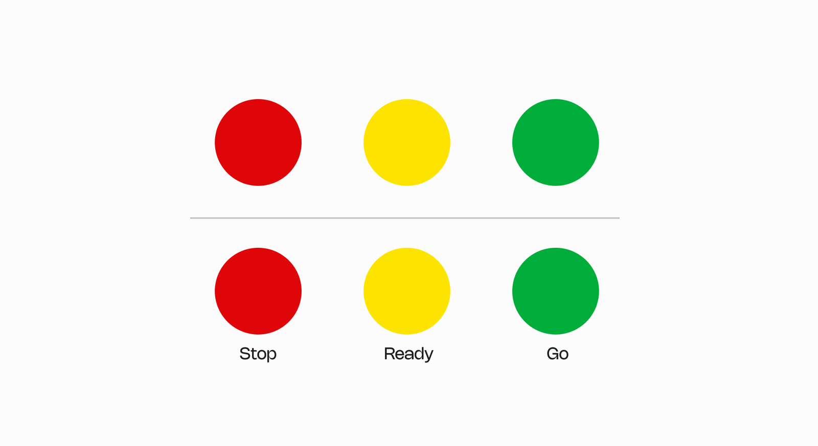
Some people can’t see all colors like you do. For them, specific colors may appear indistinguishable. Designers consider this and select easily distinguishable colors, ensuring that even if someone cannot perceive color, they can still comprehend the information conveyed. Additionally, designers incorporate elements such as patterns, words, or labels alongside the colors to aid in understanding.
Let’s consider a traffic light in a game as an example. Some players might need help determining when to stop or go if it only consisted of green and red lights. To address this issue, designers can include words like “stop” and “go” alongside the corresponding colors so that everyone understands their meaning. By doing all players can fully enjoy the game. Know what actions to take regardless of their ability to perceive different colors.
Creating Harmonious Color Palettes
Harmonious color palettes are essential for creating visually appealing and practical designs. You can create aesthetically pleasing and emotionally engaging designs using colors that work well together.
Exploring Color Harmony and Its Role in UI Design
Color harmony is like mixing the right ingredients for a delicious recipe. Designers use a unique color guide tool to find colors that complement one another. This guide serves as a map, showing which colors complement one another and work well together.
Imagine it as the same as blending colors in a painting. If you mix blue and yellow, you get green – colors that get along. It’s the same in design. Designers might pick soft greens and blues if an app wants to feel calm. These colors are like the peaceful colors of nature and make users feel relaxed. But designers might choose bright reds and oranges if an app wants to feel exciting. These colors are like a celebration and make the app feel energetic.
By using color harmony, designers ensure that the colors in an app or website work together and make people feel the right way. It’s like putting together a beautiful picture with colors that tell a story.
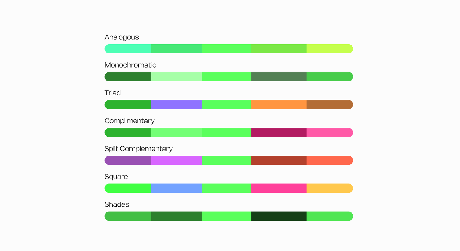
Some websites and apps let designers explore different color combinations and find the ones that match their design goals. Some examples include:
Selecting and refining color palettes
Making the appropriate color choices is similar to putting together a delicious meal. Designers consider the audience they are designing for and the atmosphere they want to convey. They start with a primary color and build around it. Once they have a palette, they test it to see if it looks good and works for everyone. They ensure the colors have enough contrast to clarify everything, especially for those who might have trouble seeing specific colors.
For instance, imagine a travel app. If the primary color is a soothing blue, the designers might add complementary colors like warm orange or yellow to highlight essential buttons. They would also make sure that text is easy to read against these colors. This careful selection and testing ensure the design feels welcoming and works well for everyone.
Conclusion
Our dive into color psychology’s impact on user experience shows how colors shape feelings and designs. Colors are tools that create moods, making apps and websites exciting, calming, or enjoyable. We learned about color basics and making designs that everyone likes. Colors will keep adding magic to designs. As trends change, colors will stay important in making apps and websites look and feel great. By using colors intelligently, designers will keep making digital adventures awesome for all of us.
Truly understand users experience
See every user interaction, feel every frustration and track all hesitations with OpenReplay — the open-source digital experience platform. It can be self-hosted in minutes, giving you complete control over your customer data.
Star on GitHub12k