Illuminate Your Web Design: Five CSS Tricks for Stunning Light Effects
Five inventive CSS effects


There’s light everywhere in the offline world, from the natural light of the sun to the artificial light in our homes. Light affects our ability to see and can be used to create beauty. With CSS, you can create light effects that can improve the visual appeal of your website. There’s no light source online, but we can manipulate several CSS properties and elements to create visual effects mimicking light. This article will show you five ways to create light effects with CSS.

Discover how at OpenReplay.com.
Neon or Glowing Light
In the real world, neon lights are created by passing an electric current through a gas. These lights depend on the gas type and are very bright and colorful. This is why they’re often used for decorative displays.
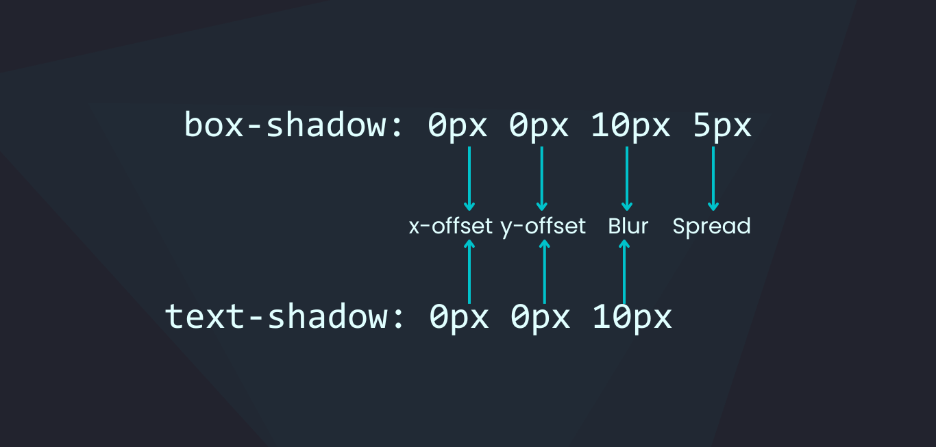
You can create this effect with CSS by adding color to shadows. You can use two properties to create shadows, box-shadow and text-shadow.
The box-shadow property adds a shadow around an element, and the text-shadow adds a shadow around text.
This is the HTML we’re using:
<div class="content">
 <h1>Neon/Glowing Light</h1>
 <h3>Colored shadows create glowing light</h3>
</div>
Here’s how to create the neon effect with box-shadow:
.content {
 box-shadow: 0px 0px 10px 10px #00c2cb;
}
And here’s how to do the same with text-shadow:
.content h1 {
 text-shadow: 0px 0px 10px #00c2cb, 0px 0px 20px #fff;
}
Here’s a screenshot of how it looks:
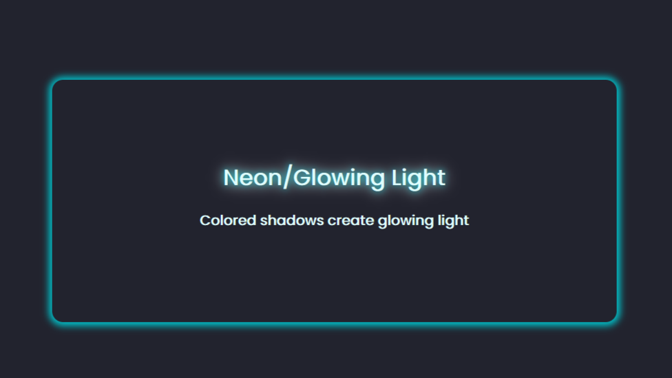
The box-shadow and text-shadow can be styled similarly. The difference is there’s no spread on a text shadow.
You can add multiple shadow layers and use different colors to create this effect.
Here’s a CodePen demo:
Note that there’s a third way to add a shadow to an element, and that’s with the CSS drop-shadow() filter. This filter only works with images, and it’s great for adding shadows to images with transparent backgrounds.
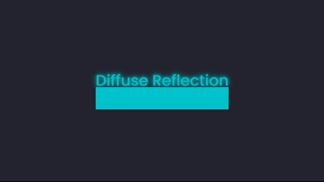
Diffuse Reflection
Diffuse reflection is when light reflects off a rough surface, like a concrete wall, the floor, paper, and clothes.
For this, you’ll use the :before pseudo-element. You can use any HTML element, but we’ll use some text for this example.
<div class="content">
 <h1>Diffuse Reflection</h1>
</div>
Next, create the pseudo-element that has the same background-color and dimensions as the text:
.content h1 {
position: relative;
font-size: 3rem;
font-weight: 600;
color: #00c2cb;
text-shadow: 0px 0px 10px #00c2cb, 0px 0px 20px #00c2cb;
margin: 3px;
}
.content h1::before {
content: "";
position: absolute;
top: 80%;
left: 0;
height: 100%;
width: 100%;
background: #00c2cb;
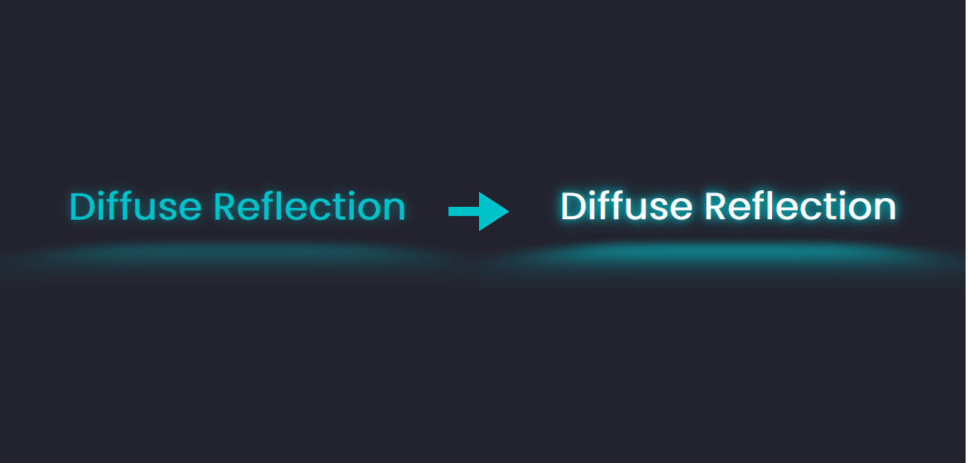
}At this point, all you’ll have is a plain box.
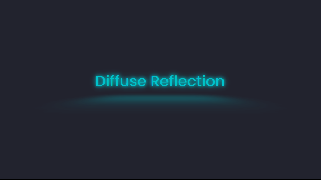
To make it look like a light reflection, we’ll need more properties like transform, blur, and opacity.
.content h1::before {
 content: "";
 position: absolute;
 top: 80%;
 left: 0;
 height: 100%;
 width: 100%;
 background: #00c2cb;
 transform: perspective(10px) rotateX(10deg) scale(1, 0.2);
 filter: blur(1em);
 opacity: 0.5;
}
The perspective() function is the distance on the z-index, creating the illusion of depth; it’s like your viewing point. The rotateX() function rotates the element horizontally. Finally, scale() scales an element on the x and y axis, making it appear bigger or smaller. For this example, we’re reducing the element on the y-axis.
Here’s a screenshot of the reflection:
You can go in and add in more features, like a hover effect.
Here’s a CodePen you can interact with:
Mirror Reflection
Without light, you won’t be able to see yourself in the mirror. You can create a mirror reflection with CSS in two ways: using the box-reflect property or pseudo-elements.
The box-reflect property has limited browser support. It only works with the -webkit- prefix on Chrome, Edge, and Opera. It’s not supported on Firefox.
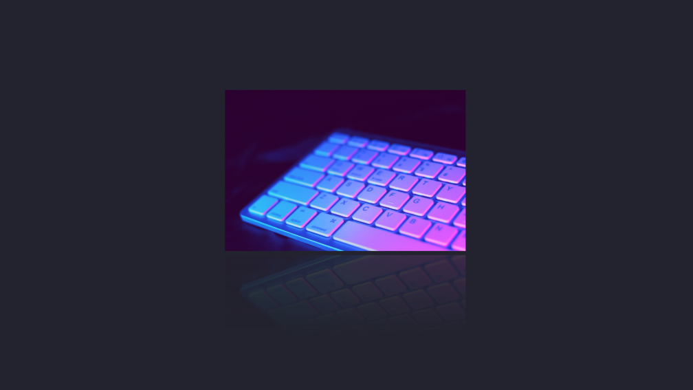
box-reflect: <position> <offset> <mask>;For this example, we’ll use an image.
<div class="content">
 <img src="1.jpg" alt="" />
</div>
Then, you apply the box-reflect property and specify the position of the reflection.
.content img {
 -webkit-box-reflect: below;
}
Here’s a screenshot of what you’ll get at this point:
It’s a replica of the image. You can then add a gap between the image and the reflection. We can use a linear-gradient for the mask that fades into transparency.
.content img {
 -webkit-box-reflect: below 5px linear-gradient(transparent 50%, #22232e20);
}
Here’s a screenshot of the result.
Here’s a CodePen demo:
Again, this effect will be visible only on browsers that support the -webkit- prefix, even when viewing on CodePen.
You can also apply this effect to text. This is what you’ll get using the same code:
There’s a wide gap between the image and the reflection because box-reflect reflects the “box” around the HTML element.

You can adjust the offset to reduce the gap.
-webkit-box-reflect: below -30px linear-gradient(transparent 20%, #22232e20);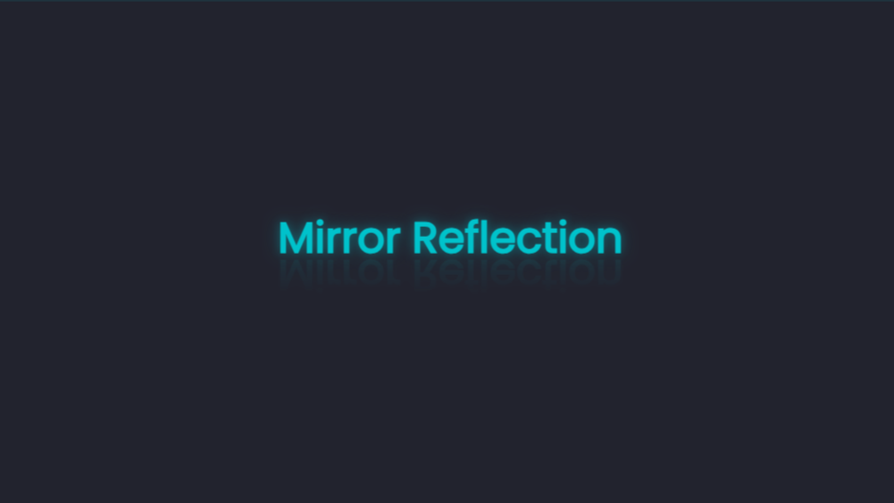
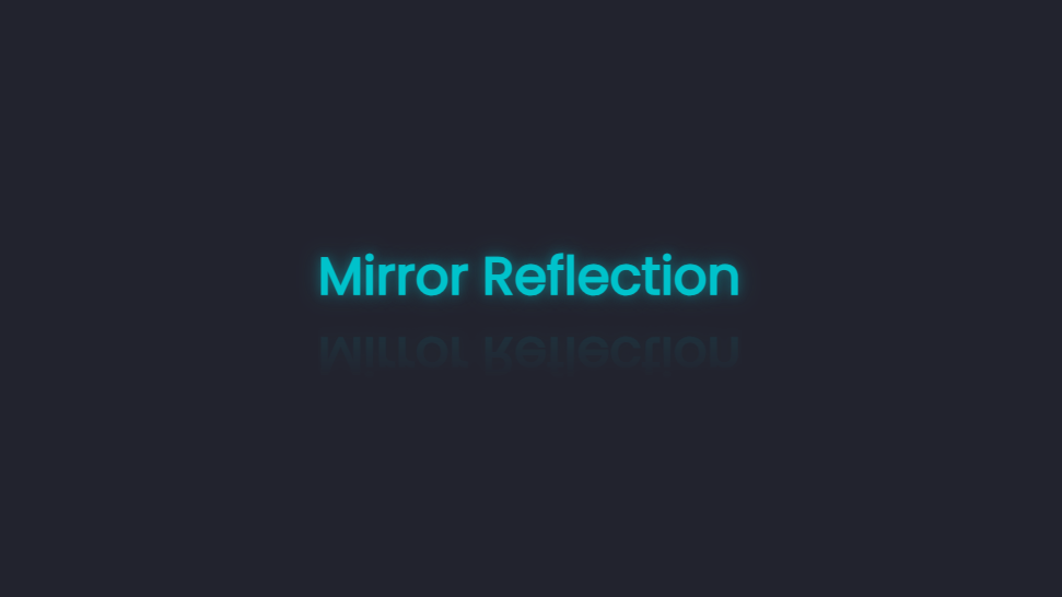
Moving on to pseudo-elements. One way to add a reflection to text with this method is by entering the pseudo-element’s content property.
.content h1::before {
 content: "Mirror Reflection";
 position: absolute;
 top: 60%;
 left: 0;
 height: 100%;
 width: 100%;
 transform: rotate(180deg) scaleX(-1);
 opacity: 0.1;
 filter: blur(2px);
}
To add the fade-out effect, add the :after pseudo-element with the same size as the :before element and give it a gradient background fading from transparency into the same color as the parent element’s background.
.content h1::after {
 content: "";
 position: absolute;
 top: 60%;
 left: 0;
 height: 100%;
 width: 100%;
 background: linear-gradient(transparent, #22232e 80%);
}
Alternatively, you can use the data-text HTML attribute when adding a reflection to text with the pseudo-elements.
<div class="content">
 <h1 data-text="Mirror Reflection">Mirror Reflection</h1>
</div>
You can then style with CSS:
.content h1::before {
 content: attr(data-text);
 position: absolute;
 top: 60%;
 left: 0;
 height: 100%;
 width: 100%;
 transform: rotate(180deg) scaleX(-1);
 opacity: 0.2;
}
And that’s how to add a mirror effect to text. Pseudo-elements are supported on all modern browsers.
Here’s a CodePen demo:
Now, for an image, you’ll need the background-image property and not the image itself.
Here’s the HTML:
<section id="main">
 <div class="image"></div>
</section>
You can then add a background-image to the div with the class name of image.
.image {
 background-image: url(/1.jpg);
 background-size: cover;
 background-position: center;
 background-repeat: no-repeat;
 background-color: red;
 width: 350px;
 height: 200px;
 position: relative;
}
Then, add the pseudo-element, which will have most of the same properties as the main element. The transform property will rotate and invert the reflecting image.
.image::before {
 content: "";
 position: absolute;
 top: 102%;
 left: 0;
 width: 350px;
 height: 200px;
 background-color: red;
 background-image: url(/1.jpg);
 background-size: cover;
 background-position: center;
 background-repeat: no-repeat;
 transform: scaleY(-1);
 opacity: 0.2;
}
Finally, add a second pseudo-element to complete the reflection effect.
.image::after {
 content: "";
 position: absolute;
 top: 102%;
 left: 0;
 width: 350px;
 height: 200px;
 background-image: linear-gradient(transparent, #22232e 50%);
}
To avoid repetition, you can simplify your CSS code.
.image {
 background: url(/1.jpg) center / cover no-repeat;
 width: 350px;
 height: 200px;
 position: relative;
}

.image::before,
.image::after {
 content: "";
 position: absolute;
 top: 102%;
 left: 0;
 width: 350px;
 height: 200px;
}

.image::before {
 transform: scaleY(-1);
 opacity: 0.2;
 background: url(/1.jpg) center / cover no-repeat;
}

.image::after {
 background-image: linear-gradient(transparent, #22232e 50%);
}
Here’s a CodePen showing this effect:
Water Reflection
You’ll follow nearly the same steps as the mirror reflection with the pseudo-elements to get this effect. The difference will be the addition of two SVG filter primitives, feTurbulence and feDisplacementMap, to create the water effect.
You’ll add the SVG in the body of your HTML document. SVG filters work with the HTML <filter> element, which will be referenced through an id by the CSS filter property.
Here’s an example of an SVG syntax:
<svg>
 <filter id="">
   <!--Add filter primitives-->
 </filter>
</svg>
We’ll start with the feTurbulence filter primitive.
<svg>
 <filter id="water">
   <feTurbulence
     id="turbulence"
     type="turbulence"
     numOctaves="1"
     result="WAVES"
   ></feTurbulence>
 </filter>
</svg>
This will create a noise effect when applied to an image. Here’s a screenshot of what it looks like:

This primitive contains two attributes, numOctaves and baseFrequency, which control the level of distortion.
Next, add in the feDisplacementMap primitive. This will apply the texture of one element to another. In this case, it will apply the distortion created by feTurblance, denoted by the result or name WAVES, to a sourceGraphic, the pseudo-element reflection.
<svg>
 <filter id="wavy">
   <feTurbulence
     id="turbulence"
     type="turbulence"
     numOctaves="1"
     result="NOISE"
   ></feTurbulence>
   <feDisplacementMap
     in="SourceGraphic"
     in2="NOISE"
     scale="50"
   ></feDisplacementMap>
   <animate
     xlink:href="#turbulence"
     attributeName="baseFrequency"
     dur="60s"
     keyTimes="0;0.5;1"
     values="0.01 0.02;0.1 0.2;0.01 0.02"
     repeatCount="indefinite"
   ></animate>
 </filter>
</svg>
The <animate> element defines the behavior of the SVG animation. It contains a link pointing to the id of the primitive to which we’re applying the animation. It also contains the name of the attribute we’re animating, baseFrequency. Next, you set the duration of the animation and the keyTimes, which function like @keyframes in CSS animation. Then, you add the values of the animated attribute and the iteration at each stop point.
Here’s a CodePen showing this effect:
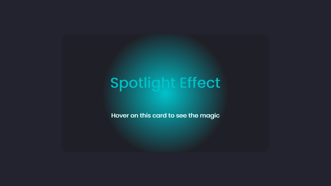
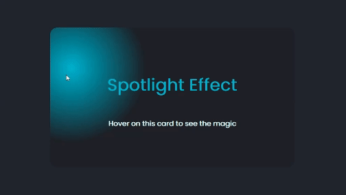
Spotlight Hover effect
You’ll need the JavaScript onmousemove event listener to create this effect.
We’ll start with the HTML, which will be a simple card with some text.
<section>
 <div class="content" style="--light: #00c2cb;">
   <h1>Spotlight Effect</h1>
   <h3>Hover on this card to see the magic</h3>
 </div>
</section>
It contains a CSS custom property --light, which will be the color of the light.
Next, style with CSS.
section {
 display: flex;
 justify-content: center;
 align-items: center;
 gap: 50px;
 flex-wrap: wrap;
}
.content {
 position: relative;
 width: 600px;
 height: 400px;
 border-radius: 20px;
 background: rgba(31,32,39,1);
 overflow: hidden;
 display: flex;
 justify-content: center;
 align-items: center;
 flex-direction: column;
 z-index: 1;
}
.content h1{
 font-size: 3rem;
 color: #00c2cb;
 z-index: 3;
}
.content h3{
 font-size: 20px;
 color: #e0ffff;
 z-index: 3;
}
Now create a :before pseudo-element over the card.
.content::before{
 content: '';
 position: absolute;
 background: radial-gradient(var(--light),transparent,transparent);
 width: 600px;
 height: 600px;
}
The background will serve as the spotlight, and it’s a radial-gradient using the custom color specified in the HTML.
At this point, here’s a screenshot of what you should have:
let content = document.querySelectorAll('.content');
content.forEach(card => {
 card.onmousemove = function (e) {
   let x = e.pageX - card.offsetLeft;
   let y = e.pageY - card.offsetTop;

   card.style.setProperty('--x', x + 'px');
   card.style.setProperty('--y', y + 'px');
 };
});
The onmousemove event listener calculates the X and Y coordinates of the mouse cursor relative to the element and sets the custom properties --x and `—y to those coordinates.
Next, apply this to the :before pseudo-element.
.content::before{
 content: '';
 position: absolute;
 top: var(--y);
 left: var(--x);
 transform: translate(-50%,-50%);
 background: radial-gradient(var(--light),transparent,transparent);
 width: 600px;
 height: 600px;
 opacity: 0;
 transition: 0.5s, top 0s, left 0s;
}
.content:hover::before{
 opacity: 1;
}
We’re also setting the opacity to 0 and making the spotlight visible when you hover on the card.
At this point, you can decide to add the :after pseudo-element.
.content::after{
 content: '';
 position: absolute;
 inset: 2px;
 border-radius: 18px;
 background-color: rgba(31,32,39,0.7);
 z-index: 2;
}
This has a slightly more transparent background than the :before element and an inset, so it’ll appear as though the card has a border.
Here’s a codepen showing the final result you can interact with:
Conclusion
You’ve just learned five different ways to create light effects with CSS. We started by adding colors to the two shadow properties to create neon light. Then, we covered several types of reflection using the :before and :after pseudo-elements and the box-reflect CSS property. Finally, we created the spotlight effect using the onmousemove JavaScript event listener.
Light serves a lot of purpose offline, and it can be a way to increase the visual appeal of your website online.
Truly understand users experience
See every user interaction, feel every frustration and track all hesitations with OpenReplay — the open-source digital experience platform. It can be self-hosted in minutes, giving you complete control over your customer data.
Star on GitHub12k