When 100vh Lies: Fixing Mobile Viewport Issues

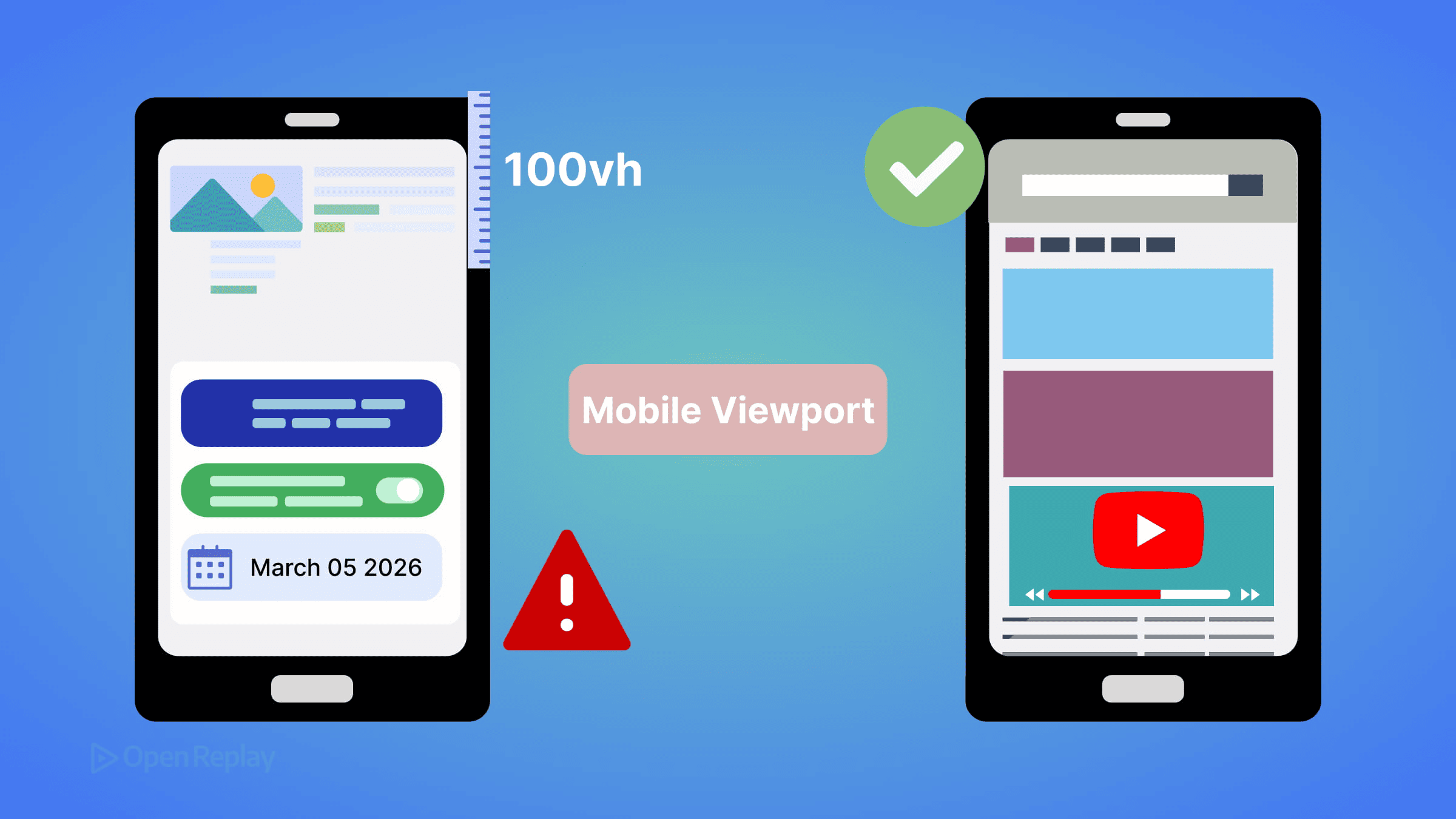
You build a full-height hero section. It looks perfect in Chrome DevTools. You open it on your phone and the bottom content is cut off — the CTA button you spent time positioning is hiding behind the browser’s address bar. Sound familiar?
This isn’t a Safari-only quirk anymore. It’s a consequence of how viewport units are fundamentally defined, and it affects Chrome, Firefox, and Samsung Internet on mobile too.
Key Takeaways
100vhon mobile is calculated against the large viewport (toolbars retracted), which is taller than what users actually see on initial load.- Use
100svhfor stable full-height layouts that fit the visible screen when toolbars are showing. - Reserve
100dvhfor cases where you explicitly want the layout to resize as browser UI changes, and accept the reflow cost. - Combine viewport units with
env(safe-area-inset-bottom)on edge-to-edge displays to prevent content from sitting behind system UI.
Why 100vh Lies on Mobile
The root cause comes down to two different viewport concepts:
- Layout viewport: what the browser uses to calculate CSS lengths, including
vh - Visual viewport: what the user actually sees on screen
Mobile browsers intentionally keep the layout viewport fixed even as the address bar and navigation toolbar retract while scrolling. This means 100vh is calculated against the expanded toolbar state — the large viewport — and that value is larger than the visible screen when the page first loads.
This is not a bug. The CSS spec defines
vhas equivalent tolvh(large viewport height). The browser is behaving correctly. Your layout just doesn’t account for it.
That’s why DevTools mobile emulation looks fine: it doesn’t simulate dynamic browser UI. The address bar never retracts in a simulator.
The Real-World Impact
- Hero sections overflow by 56–80px on initial load
- Fixed footers get obscured by the navigation bar
- Full-screen modals clip content at the bottom
- Layouts jump when toolbars retract mid-scroll (if you’re using
dvh)

Discover how at OpenReplay.com.
Modern Fixes: svh, dvh, and lvh
CSS now gives you three explicit viewport height units that correspond to different toolbar states:
| Unit | Represents | Best For |
|---|---|---|
lvh | Large viewport (toolbars retracted) | Same as current vh behavior |
svh | Small viewport (toolbars visible) | Stable layouts, always-visible content |
dvh | Dynamic viewport (current state) | Adapting layouts, but causes reflow |
For Most Full-Height Sections: Use svh
.hero {
  height: 100vh;     /* Fallback for older browsers */
  height: 100svh;    /* Fits within visible screen on load */
}
100svh sizes the element to the smallest possible viewport — meaning it fits even when toolbars are fully visible. No overflow, no clipping.
When You Want Dynamic Adjustment: Use dvh Carefully
.full-height {
  height: 100vh;     /* Fallback */
  height: 100dvh;    /* Resizes as toolbars retract */
}
Warning: dvh recalculates as the browser UI changes during scroll. This can cause visible layout shifts and repaints. It’s not the right default for most hero sections or modals — use it only when you explicitly want the element to resize with the toolbar state.
Browser Support
svh, dvh, and lvh are supported in Chrome 108+, Safari 15.4+, and Firefox 101+. Combined, that covers over 90% of users globally. For older browsers, the 100vh fallback handles the rest.
Edge Cases Worth Knowing
Safe area insets: On edge-to-edge displays (iPhone notch/Dynamic Island), combine viewport units with env(safe-area-inset-bottom) to avoid content sitting behind system UI:
.hero {
  height: 100svh;
  padding-bottom: env(safe-area-inset-bottom);
}
On-screen keyboard: The virtual keyboard primarily affects the visual viewport, and its interaction with layout viewport sizing can vary across browsers and WebViews. This is separate from toolbar-driven viewport units and may require JavaScript handling or the VirtualKeyboard API as a progressive enhancement.
WebViews and embedded browsers: In-app browsers (Instagram, LinkedIn) often have non-standard viewport behavior. Test on real devices, not just system browsers.
Conclusion
Stop reaching for 100vh as your default for full-height mobile layouts. Use 100svh for stable sections that need to fit the visible screen on load. Reserve 100dvh for cases where dynamic resizing is intentional. The new viewport unit family exists precisely because the old behavior was always a compromise — now you have the tools to be explicit about what you actually want.
FAQs
Not everywhere. 100svh gives you the smallest viewport height, which is shorter than 100vh. For elements that should fill the screen only after toolbars retract, 100lvh or 100dvh may be more appropriate. Use 100svh specifically for content that must be fully visible on initial page load with toolbars showing.
It can. Because dvh recalculates whenever the browser toolbar retracts or expands during scrolling, it triggers layout recalculations and repaints. For static hero sections or modals, this overhead is unnecessary. Reserve dvh for elements where you intentionally want the height to track the current visible viewport in real time.
Behavior varies. In standard iframes, viewport units reference the iframe's own viewport, not the parent page. In WebViews used by in-app browsers like Instagram or Facebook, toolbar behavior is non-standard and viewport unit calculations can be unpredictable. Always test on actual devices in the specific embedded contexts your users encounter.
The svh, dvh, and lvh units are not affected by the virtual keyboard. The keyboard shrinks the visual viewport but not the layout viewport that these units reference. To handle keyboard-related layout shifts, look into the VirtualKeyboard API, which gives you programmatic control over how your layout responds to keyboard visibility changes.
Truly understand users experience
See every user interaction, feel every frustration and track all hesitations with OpenReplay — the open-source digital experience platform. It can be self-hosted in minutes, giving you complete control over your customer data. . Check our GitHub repo and join the thousands of developers in our community..