Focusing on Focus for Web Accessibility


A focus indication is helpful for any digital interface since it highlights the intractable component active on the page. Because it reveals what they’re interacting with, a visible focus indicator is helpful for keyboard and screen reader users.
Since Focus is a crucial element of web accessibility, you should know how it works. This post will define focus, explain why it matters, and show you how to apply focus to an element to make your website more accessible.
What is Focus?
A focus is a pseudo-class used to indicate or highlight an intractable component in a webpage. It helps in selecting and directing keyboard events to an element. When you navigate a website using a mouse or keyboard, the blue outline is called the focus indicator. Here is a diagram example of a focus indicator:
In the above image, when we tab through with our keyboard, we will see the focus indicating the particular element we are currently on.
A focus indicator is essential for accessibility because some people use a mouse or a touch device to access a website, and some rely on using a keyboard to navigate a website. Having a focus indicator will improve the usability of your website and make it accessible. It also tells us the interactive element we are focused on. The primary goal of focus is to provide direction to the user. Consider a user who can only navigate your app via the keyboard.
:focus
We have learned what focus is and why it is important. Let’s check out some elements that require focus. When working with focus, you need to consider the elements that require focus and elements that require tab index, which is why I will be sharing a list of them here. Some of the elements that require focus (if not disabled) are controls like input, text-area, select, and button.
We can apply focus to an element using the syntax below:
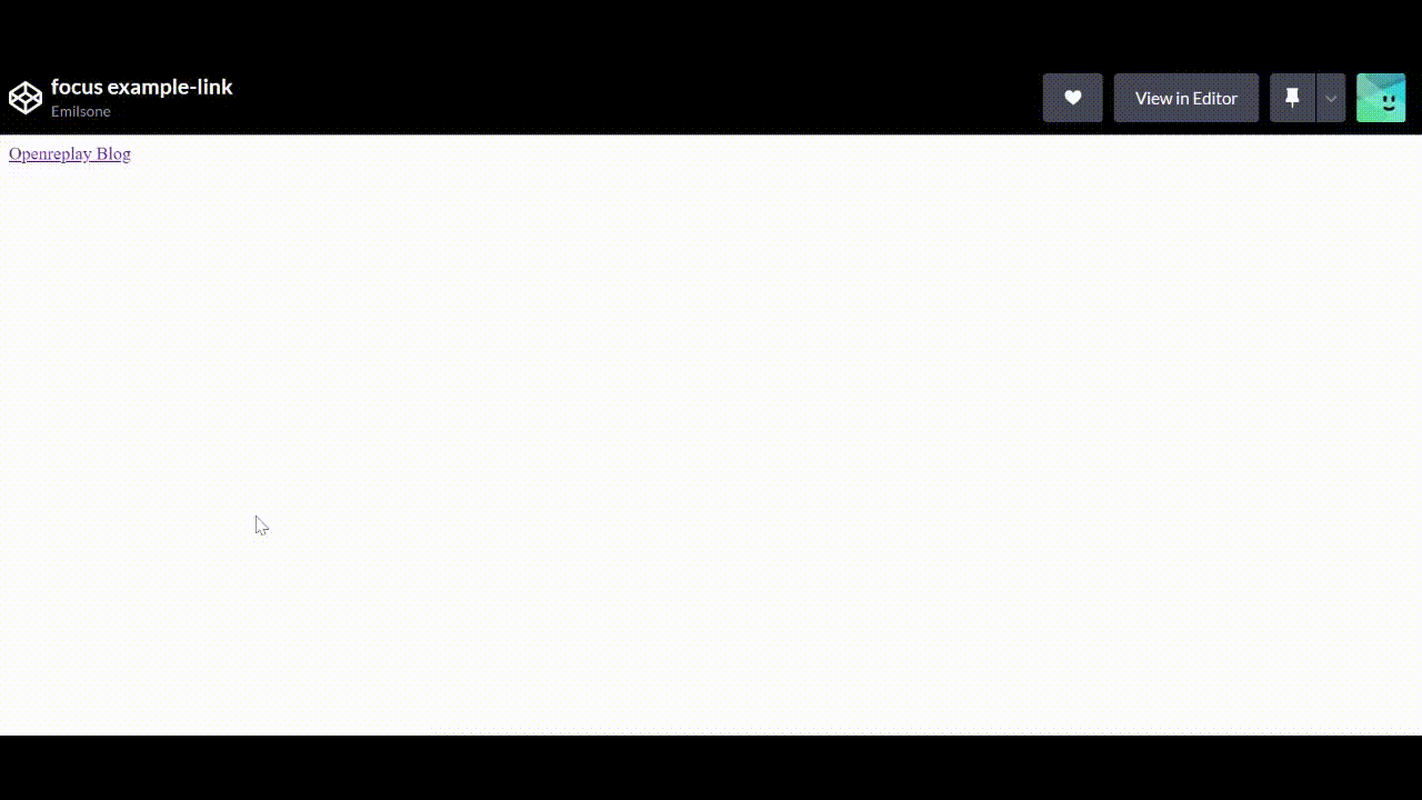
:focusApplying Focus to a Link
The following code example is a link that has a custom style for its focus state:
a:focus {
  outline: 5px solid red;
}
In the above code example, we added focus to our link and gave it an outline of solid red with a value of 5px. Please note the focused style is applied only to the link tag itself. This example is a basic illustration of how the focus elements work. Let’s look at a real-world example. Check out the full code
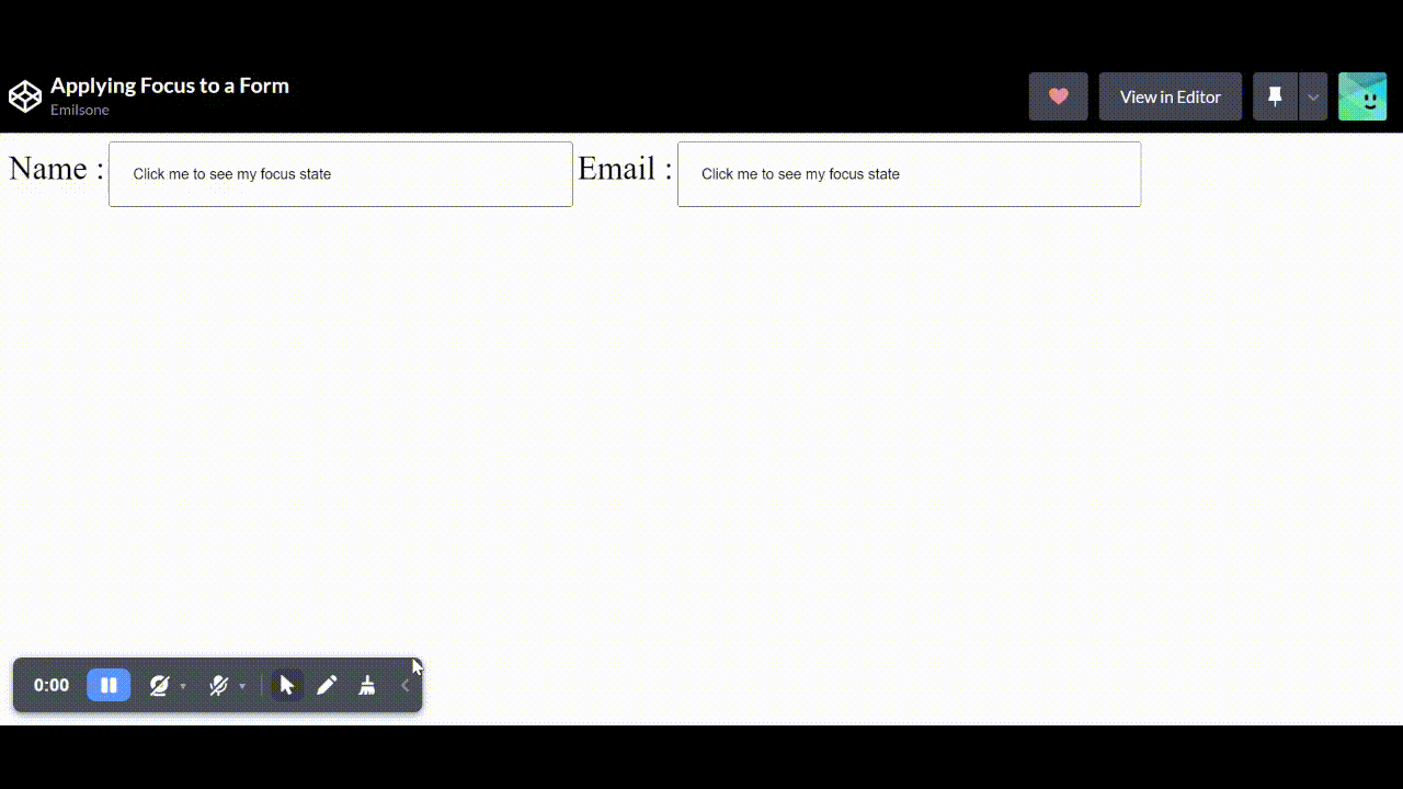
Applying Focus to a Form Input
When creating a form, it is necessary to use the focus element to highlight the fields you want the users to fill. Let’s look at an example below:
<form>
<label for="name" class="label"> Name :</label>
<input class="name-input" value="Click me to see my focus state">
  <label for="email" class="label"> Email :</label>
<input class="email-input" value="Click me to see my focus state">
</form>
.email-input:focus {
 background-color: black;
 color: white;
}
.name-input:focus {
 background-color: green;
 color: white;
}
In this example, we created a form and added a focus element to the input. When we click on the email input, the background color changes from white to black; that is how a focus style works. Check out the full code.
:focus-visible
The focus-visible is a great idea for controlling how users interact with your elements; it is used to provide a focus indicator selectively. When navigating to your website through a keyboard or mouse, the focus-visible element brings attention to the element that is currently focused on. Let’s look at a quick code example:
.email-input:focus-visible {
 color: black;
/* outline: 5px solid yellow; */
  background-color:yellow;
}
.name-input:focus-visible {
 color: black;
/* outline: 5px solid yellow; */
  background-color:yellow;
}
From the example above, people would want to ask why should I use focus-visible? when I can use focus instead to achieve the same thing. There are two reasons we use :focus-visible: styling elements that are in focus and needing a visible indicator to show focus.
Aside from that, many developers, when using focus, make it difficult for people using a mouse to navigate a website. for example, a video page with control buttons such as “Previous” and “Next.” This is an excellent feature for keyboard users as it makes navigation more accessible, but it can be a minus for mouse users.
Here is one of the wrong practices I see developers make with focus. Check out the full code.
video-button:focus {
 outline: none;
 }
Removing the focus from the element is not the best idea as it will affect both mouse and keyboard users. In the example above, when users navigate through the website using the tab keys, they can’t see where they have tabbed or where the focus is currently on, because the outline has been styled as none, and that’s a big problem for the user.
This is what you should do instead:
<video playsinline autoplay muted loop poster="videezy.jpg" id="bgvid">
B-Roll provided by <a href="http://www.videezy.com">Videezy</a>
<source src="https://static.videezy.com/system/resources/previews/000/035/849/original/WL057.mp4" type="video/mp4">
</video>
<header class="hero-text">
<h1>
About
<span>Us</span>
</h1>
</header>
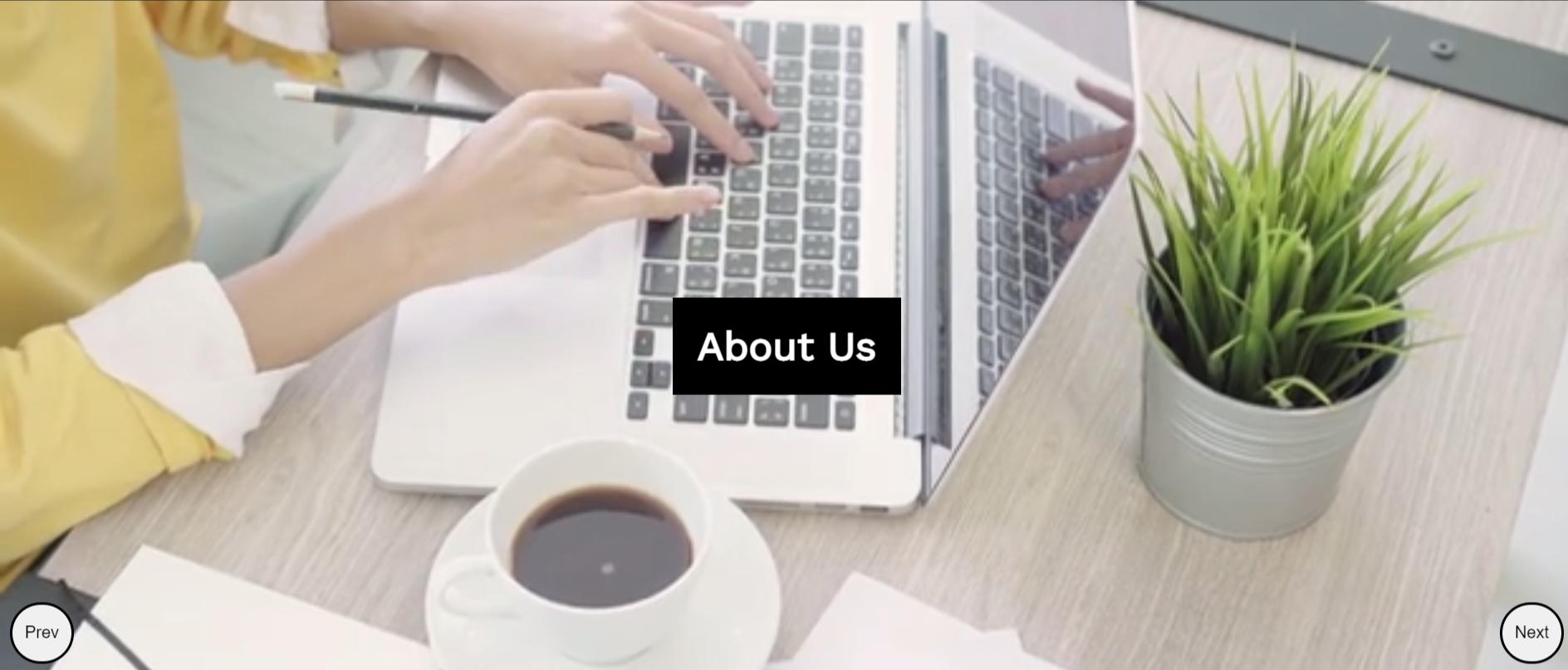
<div class="button">
<button class="video-button">Prev</button>
<button class="video-button">Next</button>
</div>.video-button:focus {
background: lightgrey;
}
@supports selector(:focus-visible) {
.video-button:focus {
outline: none;
background: transparent;
}
}
.video-button:focus-visible {
outline: 3px solid red;
background: transparent;
}With the code example above, the focus indicator will show what element the focus is currently on when the user taps through with the keyboard. In this example, we added a focus-visible with a customized outline of how we want the focus indicator to be on our website when the user tabs through. That is the best practice to follow when using focus-visible elements. You can check out the live code.
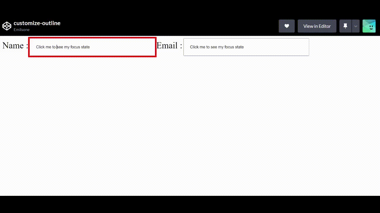
:focus-within
The focus-within is a CSS element used to style the parent element from the children’s element. Traditionally it is challenging to style or make changes to a parent element through the child element, but we can achieve this with focus-within. It is used to highlight the parent container of an element when the child element is being focused on.
Let’s see an example:
<form>
<label for="name" class="label"> Name :</label>
<input class="name-input" value="Click me to see my focus state">
  <label for="email" class="label"> Email :</label>
<input class="email-input" value="Click me to see my focus state">
</form>
.form-container:focus-within {
background-color: #fdc501;
color: #fff;
}In the above example on our codepen, if we click or focus on the input the background color of our parent container changes from white to yellow. Check out the full code.
Open Source Session Replay
OpenReplay is an open-source, session replay suite that lets you see what users do on your web app, helping you troubleshoot issues faster. OpenReplay is self-hosted for full control over your data.

Start enjoying your debugging experience - start using OpenReplay for free.
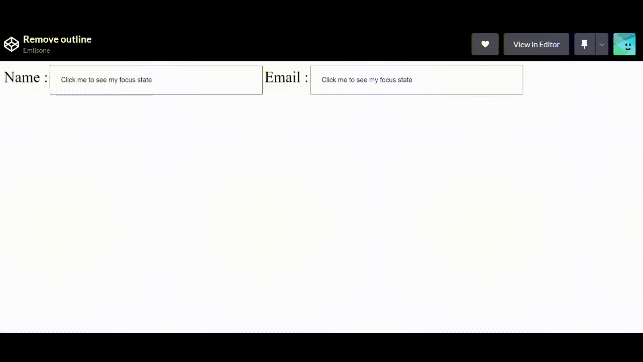
How to Customize your Focus outline
If you followed the course from the beginning, you will see the section where we added a customized outline to our link. A focus outline help users figure out where they are on a page. If they are filling out a form, it helps show the user which form field is currently filled in or which element they are currently focused on. Let’s see an example of how to customize our outline; Check out the complete code.
<form>
<label for="name" class="label"> Name :</label>
<input class="name-input" value="Click me to see my focus state">
  <label for="email" class="label"> Email :</label>
<input class="email-input" value="Click me to see my focus state">
</form>
.email-input:focus {
color: black;
outline: 5px solid red;
}
.name-input:focus {
color: black;
outline: 5px solid red;
}
You can create your custom outline style aside from the browser’s default focus style, as seen in the previous example above. Always ensure the color contrast for your focus indicator is sufficient, especially for people with low vision. This will also benefit those using their screens outside in a bright space.
Conclusion
Users who explore the web with a keyboard (rather than a mouse) can see where they’re tabbing on the screen, thanks to the focus indicator. It also aids people with concentration or short-term memory issues. Including a focus indicator on your website will increase usability and user experience while also making it more accessible to all users. Hopefully, this article has given you a good understanding of what focus is and why it is important.
A TIP FROM THE EDITOR: For more on accessibility, listen to our Accessibility in Web Applications with Graham Ritchie podcast episode.