Fundamentals of Typography for UI design
Important concepts and tips for applying typography well

User Interface designs will not be meaningful without good typography. Therefore, using typography is a critical aspect of User Interface design, especially in a design with texts. In addition, typefaces give a message to users of the design. Therefore, User Interface designers make many decisions about using a typeface, including the kind of font, body text, size, and placement. Furthermore, as you will be using text content for your designs, it is essential to make this text content attractive and easy to read.
In this article, you will grasp typography, its importance, and how to have good typography in our User Interface designs.
What is typography?
Typography is the art of arranging texts in different font combinations, sizes, and spacing combinations, to make them legible and pleasing to the readers. Typography is what gives life to texts.
Why is typography important in UI designs? Typography goes way beyond the ability to choose beautiful fonts; it is an essential element in user interface design. Good typography can do so many beautiful things in your designs, so it is necessary to look at its importance.
- Branding: Typography makes the identity of a product stand out. To create compelling visuals for users, UI designers use typography, which gives recognition to a particular product. In addition, the arrangements of the texts make the product’s design unforgettable, making it easier for the users to link the typeface on your site with your brand.
- Creating content: To modify text in a design, the UI designers use typography. Different typefaces are available, and the designers create beautiful designs that captivate the users.
- Draws attention: Good typography can enable someone to stay longer on your site because you will be able to focus on the right things.
- Attractive designs: A perfect combination of the correct fonts, text size, and colors makes designs catch the eye. This helps in producing good typography for viewers.
Type families
Type families are varieties of related typeface designs with similar design features and functions. There are several families of typefaces, and they are classified based on their style. The two major categories of typefaces are:
- Serif typeface: Just as the name implies, Serif typefaces consist of serifs, which are slight projections or extensions ending off a letter’s stroke in a typeface. These typefaces attract attention due to their appearance. Some commonly used serif typefaces include Garamond, Times New Roman, Bodoni, Georgia, Baskerville, Rockwell, and Courier New.
- Sans-serif: These typefaces do not have the projections that are familiar with Serif typefaces. They take lesser space for the same pixel of Serif types as they do not have extensions. They are much more eligible and smaller in size also. Examples include Helvetica, Gill sans, Roboto, Arial, Calibri, Futura, and Tahoma.
Elements of typography
Several terms designers use to hint at designing needs and requirements are known as typography elements. Eight essential typography elements include typeface, hierarchy, contrast, consistency, hierarchy alignment, white space, and color.
Typefaces: A typeface is not precisely the same as a font, although people use them interchangeably. A typeface is a design feature for characters and letters of different sizes and weights. Simply put, a typeface is a family of related fonts. All typefaces contain different font sizes. Typefaces are classified based on their styles, and some of the common types include Garamond, Bodoni, Times New Roman, Rockwell, Helvetica, Tahoma, Roboto, and Gill sans. On the other hand, a font is a graphical representation of a text character. Fonts are variations in a typeface’s weights, styles, and sizes. The variations include when a typeface is bold, roman, italic, or any other form.
- Hierarchy: Typographical hierarchy seeks to ensure a clear difference in the texts of a design by creating a distinction in the heading, subheadings, and body of texts to make the part the essential part seen clearly.
- Contrast: Similar to hierarchy, contrast emphasizes the message you want to pass on to the readers. In creating contrast in UI designs, designers play around with the design characters’, typefaces, colors, and sizes.
- Alignment: Alignment tends to unify design elements by ensuring they have equal size, space, and distance. For example, this is why UI designers build margins that align their logos, headers, and body of text.
- Color: Colors make texts stand out. A designer must know how to make texts attractive and legible, even for the visually impaired.
- Size: This involves adjustment of the size and spaces of text to fit in with the design.
- Consistency: This element helps organize the design interface, and the readers notice a pattern.
- Whitespace: Whitespace is the space around design elements such as text, margins, or graphics. Proper arrangement of this space helps make the design pleasing and in order.
Rules of Thumb in typography for designs
Some basic rules will quickly and simply make your designs better.
- Ensure that the typography of your design mirrors the personality of the brand you are designing.
- Create a big difference when you want to create contrast when you have two elements, for example, a header and body of text.
- Choose a suitable typeface and font for your designs.
- Use similar font when designing for the same brand.
- It is preferable to stick to the two types of families, the Serif or Sans-serif, to create contrast, except you are intentionally trying to make your design look messy.
- It is better to pair a regular and an italic font to make emphasis.
- Ensure that your header is two times bigger than the body of the text.
- Creating the proper contrast between the typeface and background colors is vital.
- Do not download more character sets of a font when downloading a web font to avoid unnecessary weight.
- To be able to create a big contrast, try pairing fonts that have different weights.
- Endeavor to use the same icon and font when designing to maintain consistency.
- It is better to pair a regular and an italic font to make emphasis.
- Above all, ensure you consider all the elements of typography when designing.
Creating contrast with type
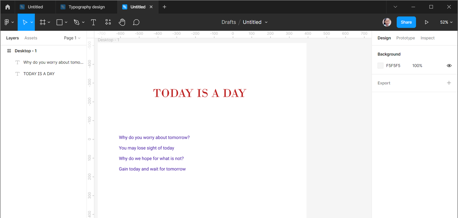
Creating contrast with type is essential in web or app designing. There are several ways one can develop contrasts with type, including changing the font styles of a design. When designing, you can create contrast using several font styles like italic, small caps, or condensed. For example, the design below shows the heading in big caps and italics while the content is in italics. The style you choose depends on the kind of contrast you want to create.
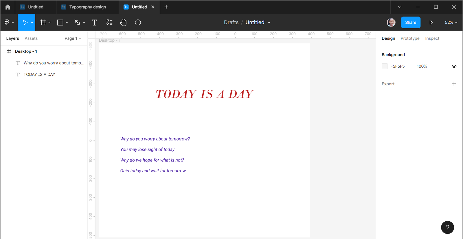
Changing the sizes of types in a design can help create contrast, and viewers tend to focus on the area with contrasting characters. For example, the texts at the top and bottom of the design are 12px and not so clear, but the text at the center is clear to read because the size is 32px.
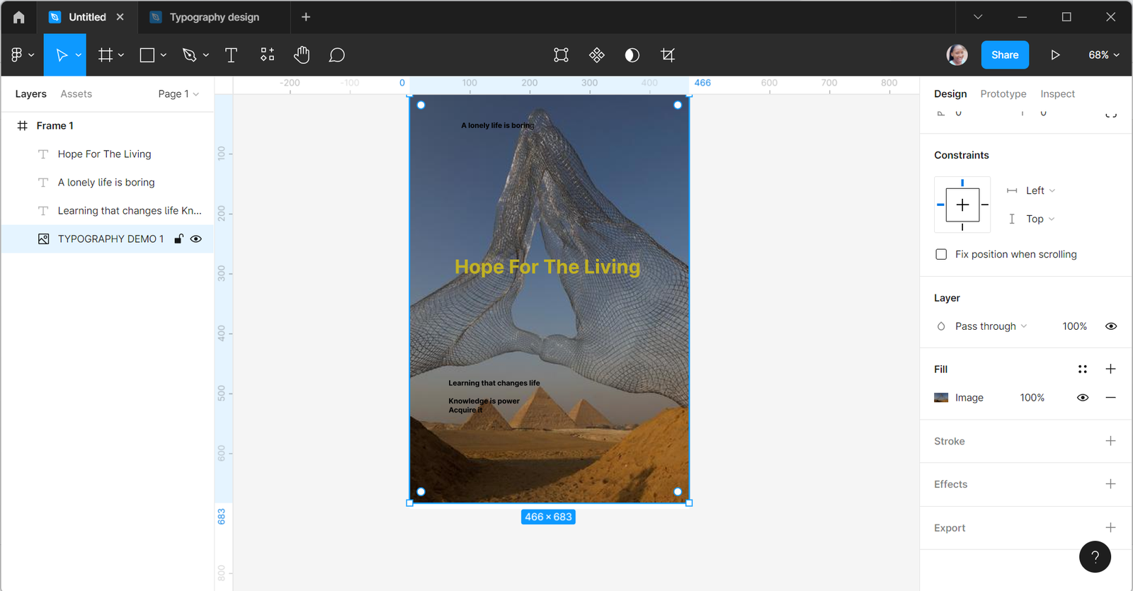
A mixture of the two common types helps create contrast in our designs. Using a Serif and a Sans-serif typeface creates contrast in designs. For example, the below design is a mixture of Bodoni MT, a Serif typeface, and Roboto, a Sans-serif typeface.
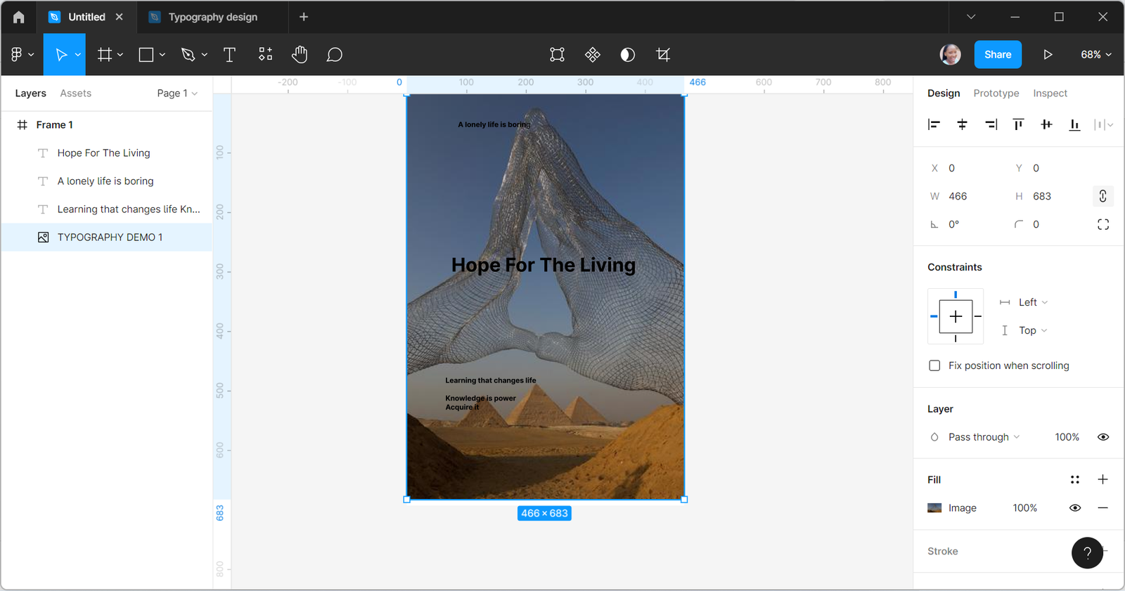
You can use color to create contrast in your designs by making adjustments in the color to ensure they match and viewers see texts. You can do this by fitting dark and light colors. For example, when you have light text on a dark background, you will create a contrast than when both colors are light or dark. The design is a bit dark, so we will need to add a bright color to create contrast. This draws attention to the colored text.
You can create contrast in your designs by adjusting the font weight. You can achieve this by making the characters of your designs bold in a situation you want to create a big contrast. You can also make your characters normal or lightweight, depending on the kind of contrast you need. For example, You can bold the heading of a design and make the body light to create contrast. As the text of this design is bold, it is easier to see it.
Typography relationships
Several relationships in typography can help create a fantastic design, and some that are not good in design which we need to avoid. Let’s delve into these relationships.
- Concordant relationship: A design is said to have a concordant relationship when the page has only one typeface, and the style, weight, and size of other elements on the page do not have much difference. This relationship is for designs that aim at having a simple and clean look, and this relationship will not be a good choice for designs that want so much attention.
- Conflicting relationship: This kind of relationship involves using two similar typefaces. It can be confusing going through a page and noticing a change in the typefaces inside the body of the text. In addition, it is not easy to ascertain whether a text is a header or part of a paragraph, which disturbs the reader. Therefore, it is crucial to avoid conflict in designs.
- Contrasting relationship: Contrasting relationship creates a catchy and appealing design as there are different typeface families and design elements. A combination of Serif and Sans-serif typeface is one of the ways to create contrast in a design. For example, using a large-size Serif font for the title and a small-size Sans-serif font for the body of text in a website helps the user differentiate the title from the body of text.
Building your type library for your designs
As a designer, you can access many fonts you use in designing. However, sticking to what you know through the file font will not be enough, and your designs will start to look the same. Having many fonts in your library will be great, and this is how you can build your library.
- You must know how to develop your eyes in font relationships.
- Get to know several fonts.
- You can start by searching for the 15 best google fonts.
- You can also check for some popular fonts.
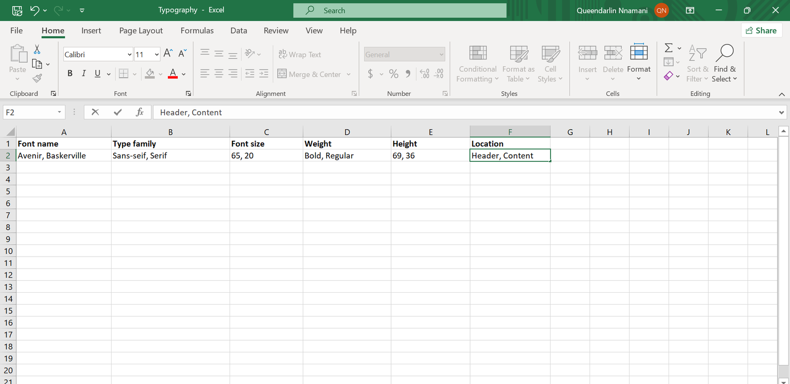
- Have an excel font file where you store your fonts.
- Any font you use for a design, ensure to save it on your excel font file so you can quickly go to it when next you need to make a selection.
You can use this format to build your library and create the excel file of any font you use in your designs.
Open Source Session Replay
OpenReplay is an open-source, session replay suite that lets you see what users do on your web app, helping you troubleshoot issues faster. OpenReplay is self-hosted for full control over your data.

Start enjoying your debugging experience - start using OpenReplay for free.
How to install fonts
Sometimes you will want to use a particular font and realize it is not on your design tool font list. You have to download such font to your computer to use it. You will take these steps to download fonts to your computer and use them in your designs.
- Have the desired font you want to download
- Go to Google fonts.
- Search for the font you want
- Then click the download icon.
- In case you cannot see the fonts you wish to on google fonts, you can also check https://eng.m.fontke.com/ or google the font to download. For example, a font like Avenir and Avenir Next is not on google fonts.
- A zip file of the font downloads to your device
- Create a folder on your local disk (C:)and name it “Fonts.”
- Go to “downloads” on your device and Unzip the file.
- To unzip, right-click the zip file to open, then select “extract all.”
- Choose the destination of the created folder (C:/windows/fonts).
- Open the extracted file and select Install.
- Your font is ready to use.
Accessing the downloaded font on Figma
You will see the font on your font list if you use the desktop application and your device is a Mac or Windows PC. But if you are using the browser version, you will have to install a font service application to use the font already installed. In addition, if your device is a Linux or Chromebook, you will need your team or organization admin to install the font because you cannot use local fonts on the platforms.
Note: Make sure you install the font correctly. Also, ensure you reload or close all Figma tabs and open the application again to see the fonts you install.
Practicing typography
Knowing typography is one thing, and practicing what we know is another. Next, we will go into how we can practice the application of typography in our designs.
You already know several typefaces and fonts and must understand how to choose the right ones for your designs. If you have many fonts but do not know how to combine them in your design, having them will not be helpful.
- Check for fonts on Google Fonts.
- When you see a font you like, you will have to learn how to combine it with another font in your designs.
- Learn how to combine them.
- Go to https://typ.io/
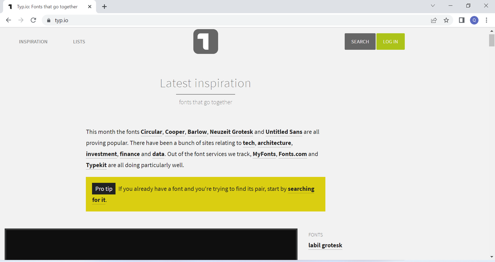
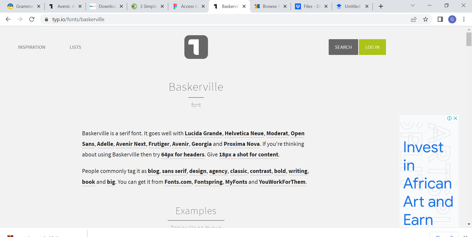
- Search for the font you want. For example, let us search for Baskerville.
- Do a more in-depth search to know the font that blends best with it.
- Click on “search.”
- Then, search for the font.
- Go through to check for a design with the font you like. Then, let’s pick a design to work on.
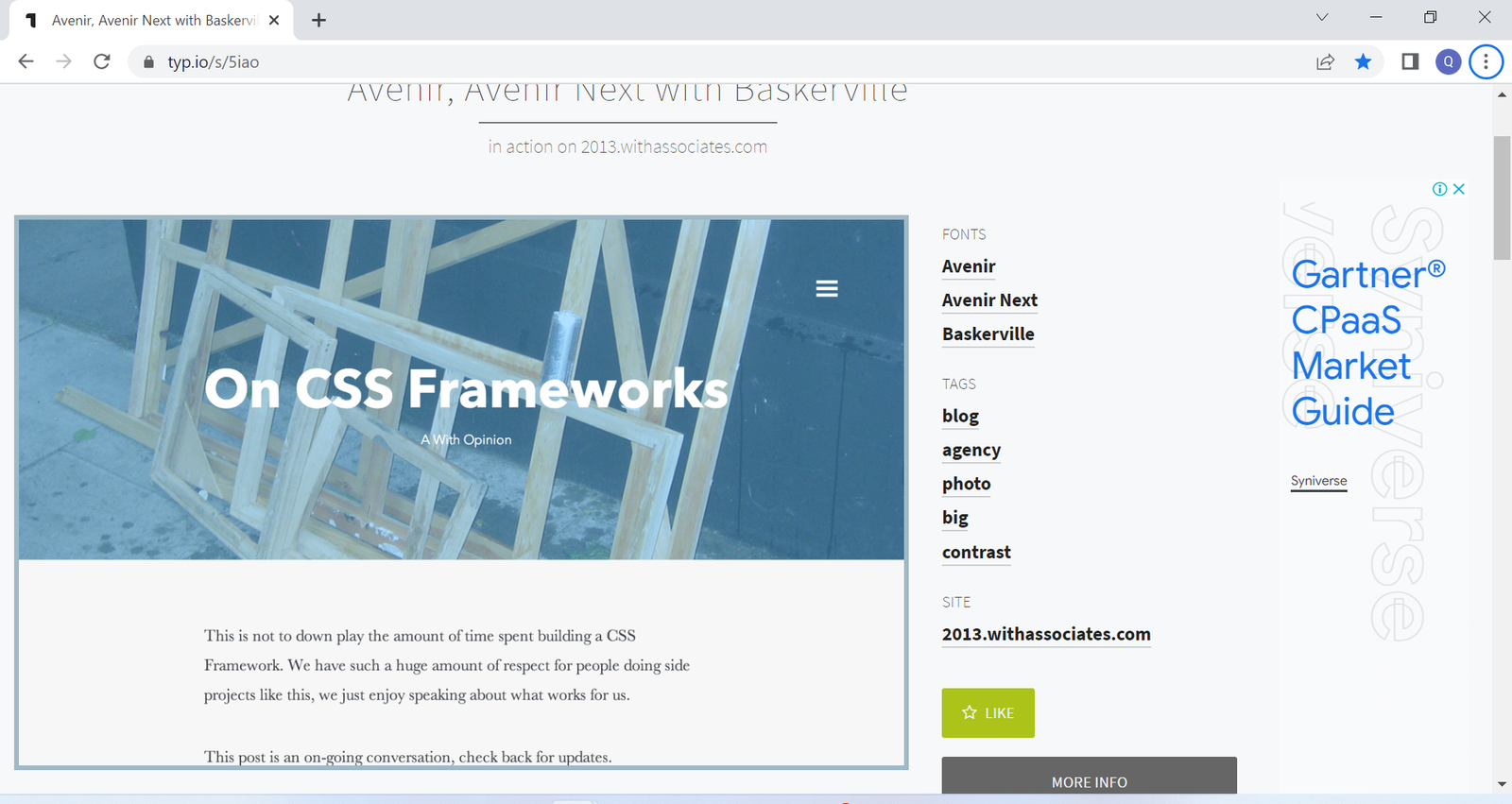
- Move below to the “Under the hood” area to see the typeface details of the headers and content.
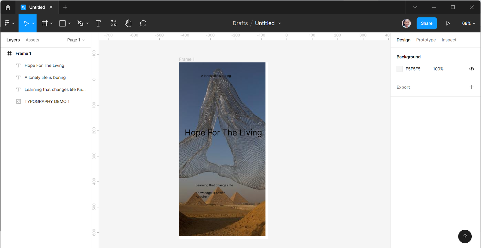
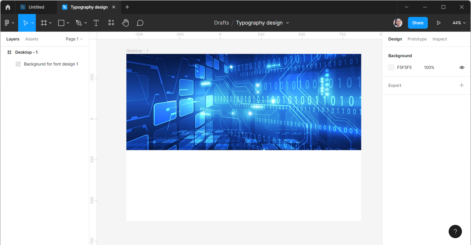
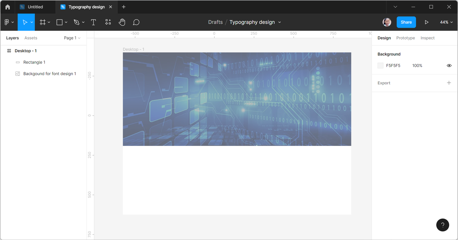
- Let us search for a picture to use for the background.

- Now, let us create a frame on Figma and import the picture into it.
- Notice that the picture is brighter than our sample design, which can make the texts unclear.
- So, we will darken it a little by adding a black square on it and adjusting the appearance to 35%.
- Input the texts and buttons.
- Ensure you use the font size, height, and color in the design in the “Under the hood area.”
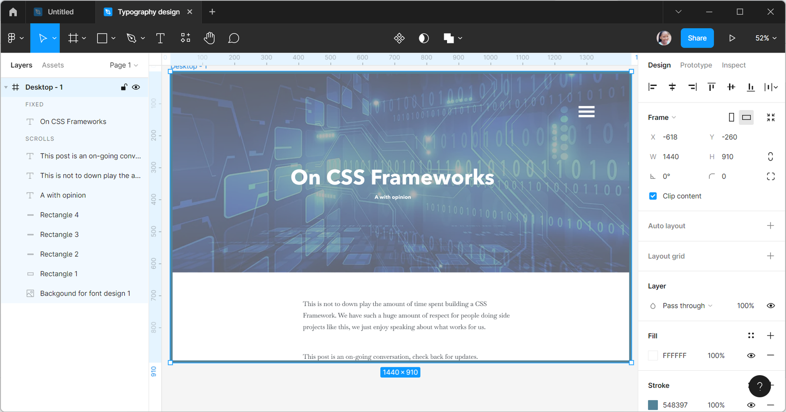
- Considering all the typography elements, the broad header has a font size of 65px and a line height of 69px; The second header has a font size of 20px and line height of 36; The typefaces; The font colors are also white and a shade of black; The color of the background.
- All these are put this way to create contrast and make a fantastic design that viewers can read.
Conclusion
You can never overemphasize the importance of Typography in UI design. Although some designers neglect it, to be a great designer, one must master its use. Pay excellent attention to typography to get your viewer’s attention, give a name to your brand, and harmonize elements of your design. You can see my design here.
A TIP FROM THE EDITOR: The concepts in this article can also be applied to developing your components, as in our Tips for creating a component library article.