Getting started with Angular Material UI
Adding Angular Material UI to your project for an elegant look


Angular Material is a user interface (UI) component library that developers use in their Angular projects in terms of hastening the development process for a stylish and compatible user interface. It offers developers functional and elegant UI components like Inputs, Data Tables, Cards, and much more. Its components help build functional, compatible, and captivating web applications/pages and responsive websites regarding Design Durability, Versatility, and Quality.
Why Angular Material UI?
Let’s examine the significance of Angular Material in our projects to better understand why it is essential to the Angular framework.
- Its components are designed so that a site can adjust to any screen size.
- It integrates easily with Angular Projects because it is built with Angular structure.
- It can be incorporated with new or existing Angular Application despite the version.
- It provides tools for developers to build/customize their components.
- It speeds up the development process of building UI components from scratch.
Below are a few features of Angular Material:
- Angular Material consists of standard CSS.
- It is a cross-platform browser and can be used to create a reusable component.
- It has responsive design built in.
- It includes the latest version of UI components: buttons, checkboxes, and form field, shaped to follow Angular Material Design concepts.
- It provides specialized and advanced features such as a toolbar, swipe, side nav, cards, speed dial, and many more exciting features.
Alternatives to Angular Material UI
When we talk about alternatives, we’re talking about other UI component libraries that we can use in place of Angular Material. The following are possible, viable alternatives.
-
Ignite UI for Angular is a comprehensive collection of Material-based UI widgets, components, UI kits, and accompanying directives for Angular that enables programmers to create the most cutting-edge, high-performing applications for contemporary browsers, mobile experiences, and PWAs.
-
Bootstrap is an open-source library that offers a few native Angular widgets made with Bootstrap 4 CSS. As you probably already know, one of the most well-liked CSS frameworks, Bootstrap, is used to create sleek, contemporary apps. It includes libraries for HTML, CSS, and JavaScript. However, “ng-bootstrap” provides us with the ideal method to use in our Angular apps without any JS file. Previously, to use Bootstrap frameworks in the Angular app, we would have had to employ bootstrap CSS and its JavaScript files.
-
PrimeNG An alternative UI component library created by PrimeFaces. It provides a variety of pre-built themes and UI elements for data presentation, form inputs, menus, charts, overlays, and other uses. PrimeNG offers a wide range of components, including data tables, drop-downs, multi-selects, notification messages, accordions, breadcrumbs, and other input components that would meet the majority of your application’s UI requirements. Therefore, including distinct libraries for various UI requirements would not be necessary.
Start-Up Our Project
For beginners who haven’t used Angular before or it’s their first time trying out the framework before we start creating our project, we need to set up our environment and to do that we need to install the CLI using the npm package manager with the following command.
npm install -g @angular/cliOnce this is done, we move on to creating/building our project. n/b: we only need to run the command once. After that, we can start creating our projects. Run ng new my-app in the command line, replacing my-app with the name of your app.

Select Y for routing.
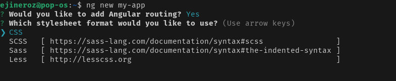
Select CSS for styles.
After all that, run the following command:
cd <your-app-name>
ng add @angular/material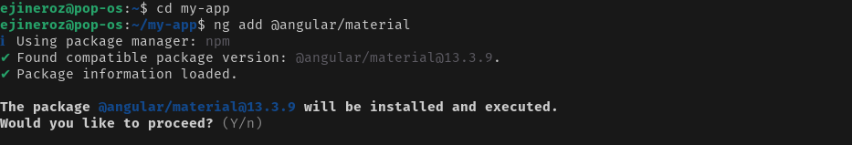
Select Y to Proceed.
The ng add command will install Angular Material, the Component Dev Kit (CDK), and Angular Animations. Also, you are to choose any of the pre-built or custom themes as required.
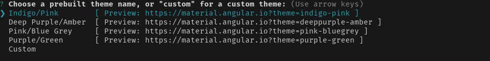
Click Enter to select your theme.

Select Y for Angular Material Typography.

Select Y for Animations.
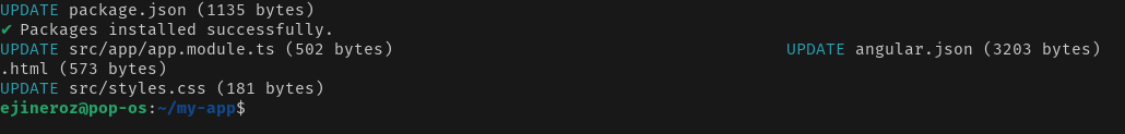
And our Angular Material Package is fully installed. Let’s move on to our project and create some content.
We’ll remove everything in our app.component.html except for <router-outlet></router-outlet> since the material content is auto-generated by Angular, and we will change it.
Open Source Session Replay
OpenReplay is an open-source, session replay suite that lets you see what users do on your web app, helping you troubleshoot issues faster. OpenReplay is self-hosted for full control over your data.

Start enjoying your debugging experience - start using OpenReplay for free.
Create Our Content
To use the Angular Material components in the app, we need to import the individual components in the app.module.ts file. Let’s say we want to display Progress spinner in our app; all we have to do is import the MatProgressSpinnerModule component to our app.module.ts below:
import {MatProgressSpinnerModule} from '@angular/material/progress-spinner';

@NgModule ({
  imports: [
    MatProgressSpinnerModule,
  ]
})
class AppModule {}
For larger applications, you should create a separate file; let us say material.module.ts, and import all the individual components, then import the material module into app.module.ts. This helps our code to be DRY (“Don’t Repeat Yourself”), especially when we need more than one Angular Material component. Add the <mat-spinner> tag to the app.component.html below:
<mat-spinner color='warn'></mat-spinner>Then after that, run your local dev server:
ng serve
Generate Material Component
Let’s create some components.
A Toolbar Component
A Toolbar component is a place where headers, titles, or actions can be placed. Most of the time, a toolbar with just one row and the program title will be added to the top of your application. Let’s create a toolbar header component for our project.
<mat-toolbar color="primary">
    <span>My Angular Material App</span>
</mat-toolbar>
A Card Component
A card is a container for content that mixes text, graphics, and activities around a single theme. The most straightforward card only needs a content-filled <mat-card> element. Our Card Component will have a title and subtitle, an image, a paragraph, and a description.
<mat-card class="card">
  <mat-card-header>
    <div mat-card-avatar class="header-image"></div>
    <mat-card-title>Mercedes-Benz 360c</mat-card-title>
    <mat-card-subtitle>Automobile</mat-card-subtitle>
  </mat-card-header>
  <img mat-card-image src="https://images.theconversation.com/files/274334/original/file-20190514-60570-gfti2h.jpg?ixlib=rb-1.1.0&q=45&auto=format&w=1200&h=900.0&fit=crop" alt="Photo of a Mercedes-Benz">
  <mat-card-content>
    <p>
      The unique 360-degree view feature on CarDekho lets you explore a car from each and every angle on your mobile device.
      Take a detailed tour of a car's exterior and interior without having to visit a showroom! For the best experience,
        download the CarDekho app.
    </p>
  </mat-card-content>
  <mat-card-actions>
    <button mat-button>LIKE</button>
    <button mat-button>SHARE</button>
  </mat-card-actions>
</mat-card>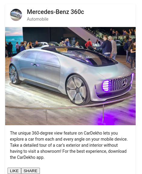
A Button Component
Native “button” or “a” elements supplemented with Material Design styling and ink ripples are what constitute “Angular Material Buttons”. So we’ll be adding varieties of buttons to suit our project.
<section>
  <div class="example-button-row">
    <button mat-button>Basic</button>
    <button mat-raised-button color="primary">Primary</button>
    <button mat-stroked-button color="accent">Accent</button>
    <button mat-flat-button color="warn">Warn</button>
    <button mat-icon-button disabled aria-label="Example icon button with a open in new tab icon">
        <mat-icon>open_in_new</mat-icon>
      </button>
    <div class="example-button-container">
        <button mat-fab disabled aria-label="Example icon button with a heart icon">
          <mat-icon>favorite</mat-icon>
        </button>
      </div>
  </div>
</section>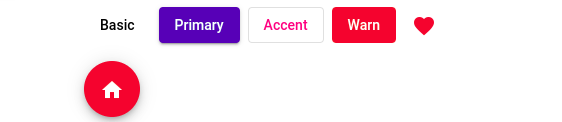
A Progressive Bar Component
Our Progressive Bar Component shows activity and progress as a horizontal progress bar. The progress bar supports four operating modes: determinate, indeterminate, buffer, and inquiry. In this section, we’ll consider using the indeterminate sign whenever the user is needed to wait while something completes, and it is not necessary to specify how long it will take.
<mat-progress-bar mode="indeterminate"></mat-progress-bar>
A Form Field/ Datepicker
The Form Field Component is a component that applies popular Text field styles like the underline, floating label and hint messages to several Angular Material components. At the same time, the Datepicker consists of a text input and a calendar pop-up joined by the text input’s Datepicker property.
<mat-form-field appearance="fill">
  <mat-label>Choose a date</mat-label>
  <input matInput [matDatepicker]="picker">
  <mat-hint>MM/DD/YYYY</mat-hint>
  <mat-datepicker-toggle matSuffix [for]="picker"></mat-datepicker-toggle>
  <mat-datepicker #picker></mat-datepicker>
</mat-form-field>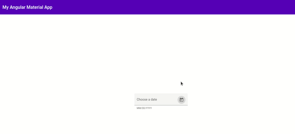
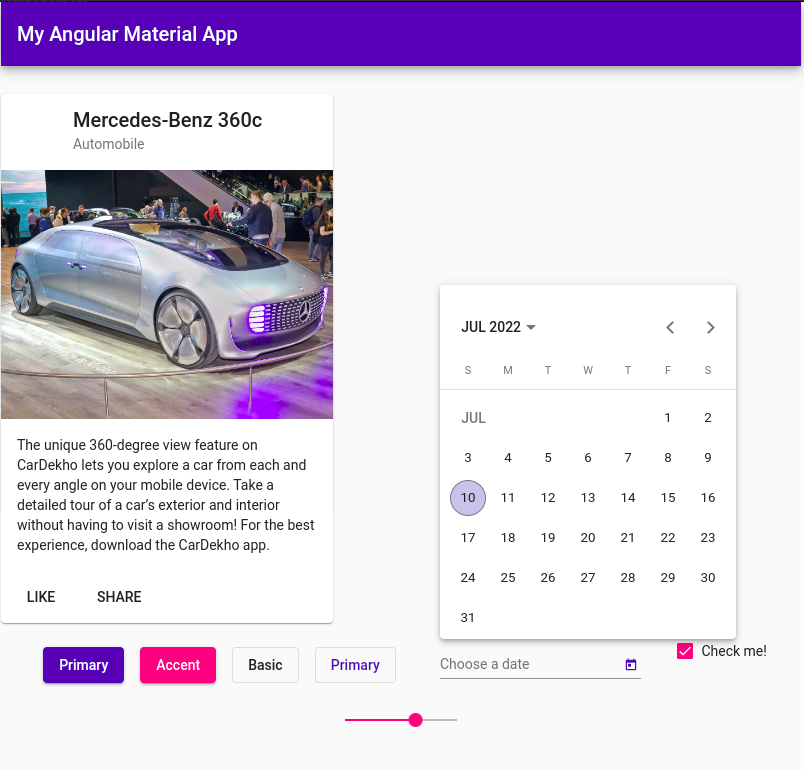
Putting All Together
After much explanation, let’s combine all we’ve discussed in our article to produce something meaningful to the eyes.
Generate a Component
Generate a component using Angular CLI
- Run
ng generate component home - Set up the routes in our home folder; replace the empty routes in
app.routing.module.tswith:
const routes: Routes = [
  { path: '', component: HomeComponent },
  { path: '**', redirectTo: '/', pathMatch: 'full'}
];
These procedures will create a component called Home and set this as the Home page. Run ng serve to compile the app and see the text Home Works!
Add Angular Material components
Add Angular Material Components to home.component.html
<mat-card class="card">
  <mat-card-header>
    <div mat-card-avatar class="header-image"></div>
    <mat-card-title>Mercedes-Benz 360c</mat-card-title>
    <mat-card-subtitle>Automobile</mat-card-subtitle>
  </mat-card-header>
  <img mat-card-image src="https://images.theconversation.com/files/274334/original/file-20190514-60570-gfti2h.jpg?ixlib=rb-1.1.0&q=45&auto=format&w=1200&h=900.0&fit=crop" alt="Photo of a Mercedes-Benz">
  <mat-card-content>
    <p>
      The unique 360-degree view feature on CarDekho lets you explore a car from each and every angle on your mobile device.
      Take a detailed tour of a car's exterior and interior without having to visit a showroom! For the best experience,
        download the CarDekho app.
    </p>
  </mat-card-content>
  <mat-card-actions>
    <button mat-button>LIKE</button>
    <button mat-button>SHARE</button>
  </mat-card-actions>
</mat-card>

<div class="flex-container">
  <div>
      <button mat-raised-button color="primary"> Primary</button>
      <button mat-raised-button color="accent"> Accent</button>
      <button mat-stroked-button>Basic</button>
      <button mat-stroked-button color="primary">Primary</button>
  </div>
  <mat-form-field>
      <mat-label>Choose a date</mat-label>
      <input matInput [matDatepicker]="picker">
      <mat-datepicker-toggle matSuffix [for]="picker"></mat-datepicker-toggle>
      <mat-datepicker #picker></mat-datepicker>
  </mat-form-field>
  <mat-checkbox>Check me!</mat-checkbox>
  <mat-slider></mat-slider>
</div>
Add Basic Styles
We’ll add basic CSS FlexBox styles for creating spacing on our Home page. You can find the code on the Github page.
Conclusion
With the help of Angular Material, we could build an interactive web page, as we can see above. This tells us that developers can build swift projects that are attractive, responsive, and intuitive in users’ eyes across all development spaces. For our source code, click the Github link.