The Art of Styling Text with CSS Orientation
Text orientation helps add a unique touch to how text is displayed on a page. It might not be the flashiest feature, but it holds immense power in shaping a website’s personality and user experience. Whether you want your text to flow traditionally in horizontal lines or take a striking vertical twist, CSS text orientation can turn your vision into reality, and this article will show all the details about it.

Discover how at OpenReplay.com.
We often marvel at the visual wonders of websites, from eye-catching layouts to beautifully designed fonts. Behind these aesthetics lies a silent hero, Cascading Style Sheets (CSS), which serves as the artistic paintbrush of the web. CSS lets web developers and designers weave their magic, fine-tuning every web page element. While we’re familiar with its role in colors and layout, text orientation is a lesser-known but equally intriguing aspect of CSS. In this article, along the way, we’ll provide examples and illustrations. Let’s kick off this exciting exploration into the world of CSS text orientation.
What is Text Orientation
Text orientation defines how text appears on a webpage. It plays a role in shaping the character and readability of a website. Whether creating a classic horizontal layout or experimenting with a striking vertical display, understanding CSS text orientation opens up a world of creative possibilities.
Importance of Text Orientation
The importance of CSS text orientation lies in its ability to enhance readability, maintain design consistency, and accommodate various languages and devices. Here are the key importance:
- Readability: This is text orientation’s first and most important aspect. It ensures the text is easy to read and understand.
- Global accessibility: Modern web applications are built to cater to audiences of different backgrounds. CSS text orientation websites can accommodate languages that read from right to left (RTL), such as Arabic and Hebrew, and languages that use vertical scripts, like Japanese and Chinese.
- Design Flexibility: Text orientation allows web designers to break away from standard horizontal layouts and experiment with creative designs. Vertical text, for example, can be used to create unique and visually appealing web pages.
- Cross-Platform Consistency: CSS text orientation helps maintain design consistency across various devices and screen sizes. It ensures text elements adapt to different layouts while preserving readability and aesthetics.
Use Cases of Text Orientation
Here are some common use cases of text orientation:
- Multilingual Websites: Websites targeting an international audience often need to support multiple languages with different text orientations. CSS text orientation is crucial for presenting content in a readable and culturally appropriate manner.
- Vertical Text: Vertical text orientation is commonly used for titles, headings, and navigation elements, especially in Asian languages. It’s also used for artistic and decorative purposes.
- Right-to-Left (RTL) Languages: Languages that read from right to left, such as Arabic and Hebrew, require specific text orientation adjustments to ensure text is displayed correctly.
- Responsive Design: CSS text orientation is valuable for responsive web design. It enables text to adapt to different screen orientations on mobile devices, such as portrait and landscape modes.
- Typography and Styling: Web designers can use text orientation to add artistic flair to their layouts, creating visually stunning and unique web pages.
- Printable Content: When generating printable content, such as PDFs, controlling text orientation is essential to ensure the printed material looks as intended.
- User Interfaces: In user interface design, proper text orientation is essential for maintaining a clear and intuitive user experience, especially when dealing with icons, labels, and navigation elements.
Introduction to CSS properties for text orientation
Various properties give developers the power to create unique text layouts. These properties allow you to control how text flows and appears, whether you’re aiming for traditional horizontal text or something more unconventional.
Writing-mode
One key CSS property that plays a central role in text orientation is the writing-mode property. This property acts as a switch, altering the direction in which text flows. It’s an essential element in shaping the visual language of your web content.
The writing-mode property is at the heart of controlling text orientation in CSS. It is used to define whether text should be displayed horizontally or vertically, among other options. The primary values associated with the writing-mode property include:
-
horizontal-tb: This value represents the default writing mode; with this value, the text flows from left to right and top to bottom, much like you’d read a book or a newspaper written in English. -
vertical-rlandvertical-lr: These values dictate vertical text orientation.vertical-rldisplays text from top to bottom and right to left, whilevertical-lrmakes the text flow from top to bottom and left to right. -
sideways-rlandsideways-lr: These values create a sideways text orientation, with characters rotated 90 degrees, either clockwise (rl) or counterclockwise (lr).
Here is an example to show some of these property values in action:
<!DOCTYPE html>
<html>
  <head>
    <style>
      body {
        font-family: Arial, sans-serif;
        text-align: center;
        background-color: #f7f7f7;
        margin: 0;
        padding: 0;
      }

      h2 {
        color: #333;
        background-color: #fff;
        padding: 10px;
      }

      .horizontal-text,
      .vertical-text {
        font-size: 18px;
        background-color: #fff;
        padding: 20px;
        margin: 10px auto;
        width: 60%;
        box-shadow: 0 2px 4px rgba(0, 0, 0, 0.2);
      }

      .horizontal-text {
        writing-mode: horizontal-tb;
      }

      .vertical-text {
        height: 700px;
        writing-mode: vertical-rl;
        text-wrap: wrap;
      }
    </style>
  </head>
  <body>
    <h2>Horizontal Text</h2>
    <p class="horizontal-text">
      This is an example of horizontal text orientation. It flows from left to
      right and top to bottom, just like standard text.
    </p>

    <h2>Vertical Text</h2>
    <p class="vertical-text">
      This is an example of vertical text orientation using the `vertical-rl`
      writing mode. The text flows from top to bottom and right to left.
    </p>
  </body>
</html>
Here is the result of our code:
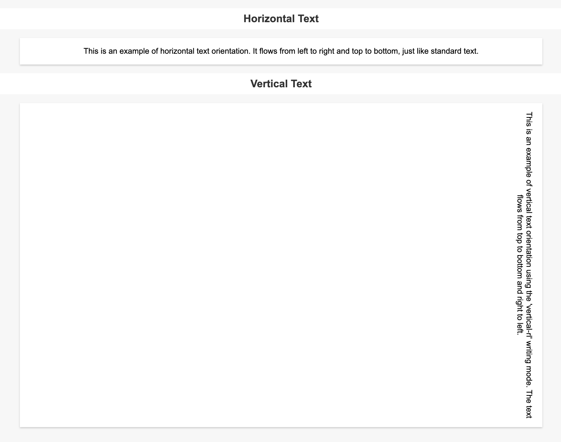 From the image above, you can see that this is a practical example showing how the
 writing-mode property works with two different values: the horizontal-tb value and the vertical-rl value.
Text Orientation
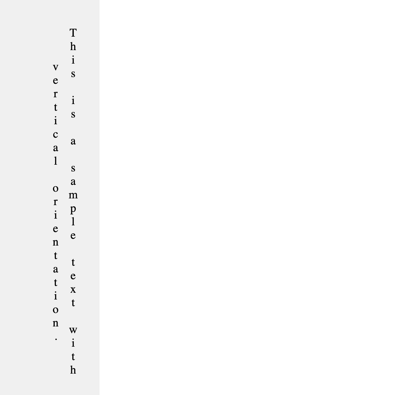
This is a CSS property that can be very useful when it comes to text orientation. It lets you define the individual orientation of an element. This is mainly used to add a typographical effect or for languages that are traditionally written vertically. There are different values that can be used on this property, the most common being upright.
.element {
    text-orientation: upright;
}
This is how our text would look if this property was added to an element:
Horizontal Text Orientation
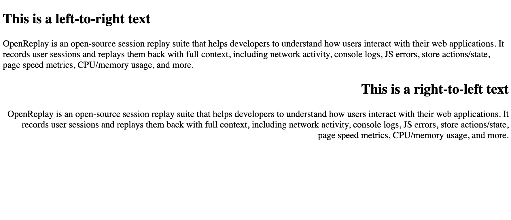
In web development, the default text orientation is horizontal, naturally flowing from left to right, like in English, or from right to left, like in Arabic.
Horizontal text orientation allows for clear and straightforward content consumption, making it suitable for most websites, especially those in languages that read from left to right. However, even within this seemingly standard approach, CSS provides several properties and styles to fine-tune the appearance of horizontal text.
Let’s consider this code to show the two positions of the horizontal text alignment:
<!DOCTYPE html>
<html>
  <head>
    <style>
      .ltr-text {
        text-align: left;
      }
      .rtl-text {
        text-align: right;
      }
    </style>
  </head>
  <body>
    <!-- Left-to-Right (LTR) Text Orientation -->
    <div class="ltr-text">
      <h2>This is a left-to-right text</h2>
      <p>
        OpenReplay is an open-source session replay suite that helps developers
        to understand how users interact with their web applications. It records
        user sessions and replays them back with full context, including network
        activity, console logs, JS errors, store actions/state, page speed
        metrics, CPU/memory usage, and more.
      </p>
    </div>

    <!-- Right-to-Left (RTL) Text Orientation -->
    <div class="rtl-text">
      <h2>This is a right-to-left text</h2>
      <p>
        OpenReplay is an open-source session replay suite that helps developers
        to understand how users interact with their web applications. It records
        user sessions and replays them back with full context, including network
        activity, console logs, JS errors, store actions/state, page speed
        metrics, CPU/memory usage, and more.
      </p>
    </div>
  </body>
</html>
Browser Output:
Vertical Text Orientation
Vertical text Orientation is a very powerful design element. It is most common in languages such as Japanese and Chinese, where vertical text is the traditional reading direction.
Vertical text orientation is not just about turning text 90 degrees; it involves considerations like text flow, alignment, and readability, which we’ll explore in the following examples.
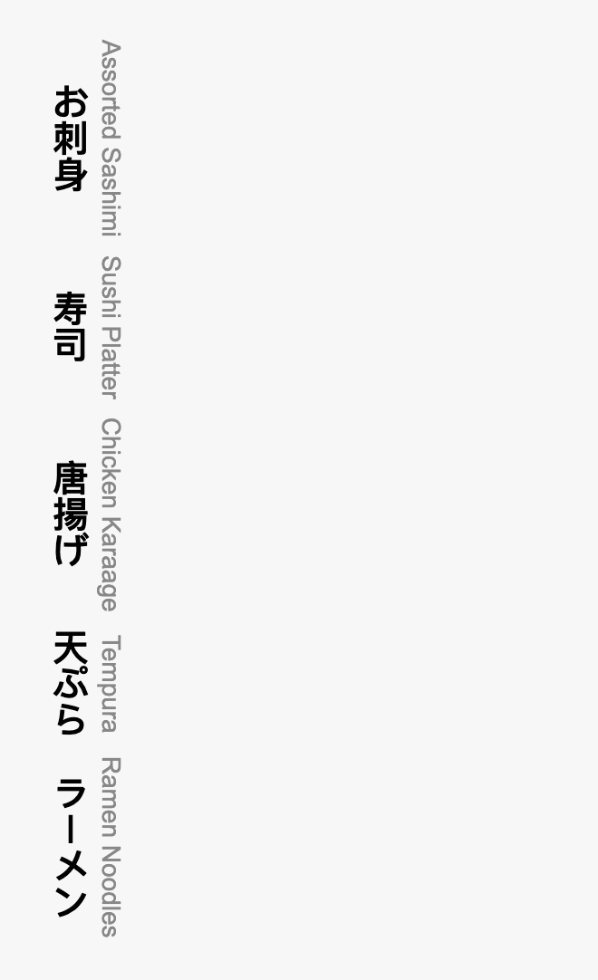
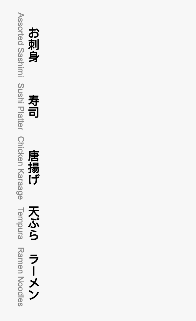
We have previously delved into how to use the writing-mode property; here, we will narrow it down to how it will be used in a vertical orientation. There are several values that you can use with writing-mode to achieve vertical text orientation:
- vertical-rl: Text flows vertically from top to bottom, turning counter-clockwise.
- vertical-lr: Text flows vertically from top to bottom, turning clockwise.
To illustrate this, let’s consider this code:
<!DOCTYPE html>
<html lang="en">
  <head>
    <meta charset="UTF-8" />
    <meta name="viewport" content="width=device-width, initial-scale=1.0" />
    <title>Japanese Restaurant Menu</title>
    <style>
      body {
        font-family: Arial, sans-serif;
      }

      .menu {
        width: 300px;
        background-color: #f7f7f7;
        padding: 20px;
        text-align: center;
      }

      .menu-item {
        /* writing-mode: vertical-lR; */
        margin: 10px;
      }

      .menu-item h3 {
        margin: 0;
        font-size: 20px;
      }

      .menu-item p {
        margin: 0;
        font-size: 14px;
        color: #888;
      }
    </style>
  </head>
  <body>
    <div class="menu">
      <div class="menu-item">
        <h3>お刺身</h3>
        <p>Assorted Sashimi</p>
      </div>

      <div class="menu-item">
        <h3>寿司</h3>
        <p>Sushi Platter</p>
      </div>

      <div class="menu-item">
        <h3>唐揚げ</h3>
        <p>Chicken Karaage</p>
      </div>

      <div class="menu-item">
        <h3>天ぷら</h3>
        <p>Tempura</p>
      </div>

      <div class="menu-item">
        <h3>ラーメン</h3>
        <p>Ramen Noodles</p>
      </div>
    </div>
  </body>
</html>
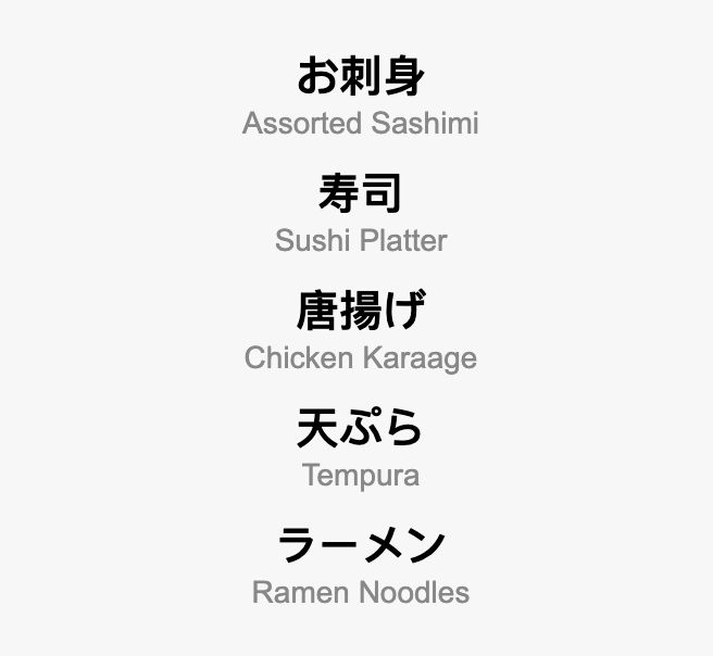
Here is our browser output from the code above:
Here is our browser output with writing-mode:vertical-lr:
 Here is our browser output with writing-mode:vertical-rl;
Common CSS Pitfalls in Text Orientation
Overusing Unfamiliar Text Orientations: While advanced CSS properties like writing-mode can add creativity to your designs, it’s important not to overuse them. Using unfamiliar text orientations excessively can confuse users and hinder readability. It’s best to reserve unconventional text orientations for special cases or artistic designs.
-
Inconsistent Text Orientation: Inconsistent text orientation can lead to a disjointed and unprofessional look. Ensure that text orientations are consistent throughout your design, especially on multilingual websites or when mixing horizontal and vertical text.
-
Neglecting Browser Compatibility: In older browsers, CSS properties for text orientation may not be fully supported. Always check browser compatibility, and be prepared to provide fallback designs or use JavaScript-based solutions for browsers that don’t support these properties.
-
Ignoring Responsive Design: Text orientation issues can arise when transitioning between different screen sizes. Neglecting responsive design considerations can lead to text clipping or unintended layouts. Use media queries to adapt text orientations for various screen sizes.
-
Test on Multiple Browsers: Test your web page on various browsers and browser versions to identify compatibility issues. Use browser prefixes or consider alternative approaches for browsers with limited support.
-
Avoid Overlapping Elements: Overlapping elements can interfere with text orientation. Ensure enough space and padding around vertically oriented text to prevent overlap with other elements.
-
Use CSS Resets and Normalize CSS: CSS resets or Normalize.css can help with best practices for text orientation
Best Practices for Text Orientation
Text orientation is a great tool in web design, and there are some best practices one must consider to make the most use of it. Here are some guidelines to effectively use Text Orientation:
-
Maintain Readability: Readability is the foremost consideration when using non-standard text orientations. The text should always be easily legible for your target audience.
-
Cultural Awareness: Different cultures have different text orientation conventions. Be aware of cultural norms and ensure that your text orientation respects these traditions, especially for multilingual websites.
-
Hierarchy: Use text orientation to establish visual hierarchy. You can emphasize important headings or key elements by rotating the text or using different orientations to draw attention.
-
Balance with Other Design Elements: Text orientation should complement other design elements, such as color, typography, and layout. Ensure that it fits seamlessly within the overall design.
Conclusion
In this article, we’ve explored the fascinating world of text orientation. We began by understanding the basics of CSS text orientation, emphasizing its importance, and highlighting its real-world applications. We looked at the writing-mode property, the cornerstone of controlling text orientation. This property allows us to easily navigate horizontal, vertical, and even multi-line text layouts.
With that knowledge, we discussed Vertical Text Orientation, embracing its potential in web design. We grasped the concept of turning text from a conventional horizontal flow to a vertical one. We discussed different values we could use on the ‘writing-mode’ property, where we explored values like vertical-rl and vertical-lr, each bringing a unique visual appeal to our web designs. Lastly, we looked at some pitfalls of CSS Text orientation and some best practices for CSS text Orientation.
Thank you for joining us on this journey through CSS text orientation, and best of luck in your future design endeavors.
Truly understand users experience
See every user interaction, feel every frustration and track all hesitations with OpenReplay — the open-source digital experience platform. It can be self-hosted in minutes, giving you complete control over your customer data. . Check our GitHub repo and join the thousands of developers in our community..

