

Forms are a vital component of many applications today, which allows users to perform tasks like authentication, payment, feedback, etc. Hence, handling forms and implementing proper validation becomes crucial to delivering a seamless user experience. Angular provides two approaches for working with forms, reactive and template-driven, and this article will show you them, their use cases, and how to implement validation proper data validation.

Discover how at OpenReplay.com.
Forms in Angular
Angular provides two ways of working with forms:
-
Reactive forms are a flexible way to manage and validate forms within your application. They provide direct, explicit access to the underlying form’s object model, which represents a form and its elements as objects within the application’s component code. They are more reusable, scalable, and testable and are a good option if your application heavily relies on forms.
-
Template-driven forms are an approach to handling forms within your application by using the template to define the form structure and behavior. They rely on directives in the template to create and manipulate the form’s object model. Compared to reactive forms, template-driven forms are more straightforward to add and recommended if you’re building a basic form.
Both reactive forms and template-driven forms have similar building blocks. However, they differ in how these building blocks are used and implemented.
Here’s a list of their common building blocks:
-
FormControl: This class represents an individual form control, such as an input field. It allows you to track the value and validation status of the control.
-
FormGroup: This class is used to manage and track the values of a collection of form controls.
-
FormArray: This class Is similar to
FormGroupbut is designed explicitly for dynamically managing an array of controls.
Setting up Angular
Let’s start by creating a new Angular app and the form used in both the template-driven and reactive form sections to demonstrate how they work.
To generate a new Angular app, enter the following commands in your terminal:
ng new angular-formsWhen prompted, pick CSS for styling, and don’t add Angular routing. The above will create an angular app called angular-forms.
After the installation is complete, we can start the app with npm start.
Next, let’s create the form. In the terminal, cd into the created project and enter the following command to create a form component.
ng g c profile-formNavigate to src/form/profile-form.compnent.html and add the following lines of code:
<div class="profile-form">
<h2>Profile Form</h2>
<form name="profile-form">
<div>
<label for="full-name">Full name</label><br />
<input type="text" id="full-name" placeholder="Enter your full name"/>
</div>
<div>
<label for="username">Username</label><br />
<input type="text" id="username" placeholder="Enter your username"/>
</div>
<div>
<label for="birth">Date of Birth</label><br />
<input type="date" id="birth"/>
</div>
<button>Done</button>
</form>
</div>
<style>
.profile-form {
max-width: 400px;
box-shadow: 0 4px 4px rgb(179, 184, 189);
padding: 50px 20px;
margin: 0 auto;
margin-top: 100px;
}
.profile-form h2 {
font-family: monospace;
font-size: 24px;
text-align: center;
}
.profile-form form {
display: flex;
flex-direction: column;
gap: 20px;
}
.profile-form input {
border: 1px solid rgb(179, 184, 189);
height: 50px;
width: 100%;
font-size: 16px;
margin-top: 5px;
padding: 0 10px;
box-sizing: border-box;
}
.profile-form input:focus {
outline: none;
}
.profile-form button {
background-color: rgb(0, 119, 255);
padding: 15px 25px;
width: fit-content;
color: white;
border: none;
border-radius: 4px;
margin-left: auto;
}
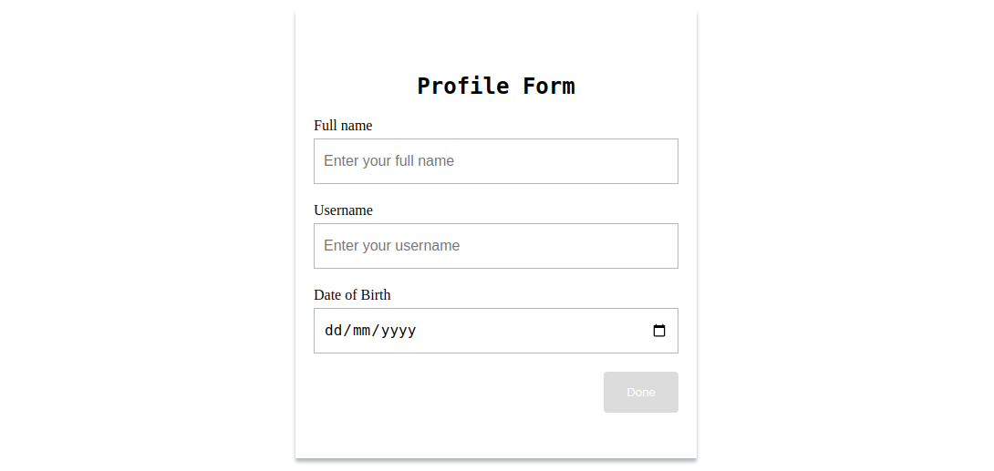
</style>Next, head over src/app.component.html and replace the entire content with the following:
<app-profile-form></app-profile-form>With this, when we open http://localhost:4200/ in the browser, we will see the following:
Handling form and validation in template-driven form
The first step to build a template-driven form is to import the FormsModule into our app, which includes directives to enable us to build a template-driven form. The two most important ones are:
-
NgForm: Creates a top-level FormGroup instance and binds it to a
<form>to keep track of all form control values of a particular form and validation status. This directive is automatically added to all form tags once theFormsModuleis imported. -
NgModel: Creates a
FormControlinstance and binds it to a form control element to track its value, user interaction, and validation status. It can be used for one-way data binding to supply the value of a property in the component to the form control without updating the property when the form control value changes using[ngModel]or two-way data binding, which keeps the properties/data-model in sync with the form control values.
Head over to src/app.module.ts and add the following import:
import { FormsModule } from '@angular/forms';Next, include it in the imports property of @NgModules:
imports: [
  ...
  FormsModule,
]
The NgForm directive will be attached to our profile form. To get access to its properties which show the form status, we can define a template variable that has a reference to the ngForm directive instance like this:
<form #profileForm="ngForm" name="profile-form"> Accessing and working with form control values
To access the form control values, we need to add the ngModel directive to the input tags.
Depending on the use case, ngModel can be added without a binding or one-way or two-way binding.
When using ngModel within a <form> tag, it is often unnecessary to use any binding since the ngForm instance of the form holds the current values of the registered form controls, which can be accessed using a template variable. For submission, the variable can be passed to the submit function.
A use case to use the binding syntax within a <form> tag is when initial values must be passed to the controls. For this, the one-way binding will suffice.
Lastly, for two-way binding, as you might have deduced, it’s most suitable to use when the controls are not with a <form> tag.
Let’s take a look at some examples of the above use cases.
To use ngModel within a <form> tag, add it to each form control along with a name attribute, which will be used to register the control with the parent form’s NgForm instance.
<form #profileForm="ngForm" name="profile-form">
  <div>
    <label for="full-name">Full name</label><br />
    <input
      type="text"
      id="full-name"
      ngModel
      name="fullname"
      placeholder="Enter your full name "
    />
  </div>
  <div>
    <label for="username">Username</label><br />
    <input
      type="text"
      id="username"
      ngModel
      name="username"
      placeholder="Enter your username"
    />
  </div>
  <div>
    <label for="birth">Date of Birth</label><br />
    <input type="date" id="birth" ngModel name="birth" />
  </div>
  <button>Done</button>
</form>
On form submission, the profileForm can be passed to a submit function like this:
<form
  #profileForm="ngForm"
  name="profile-form"
  (ngSubmit)="onSubmit(profileForm)"
></form>
To pass initial values to the controls using one-way binding, first, in the component, you can define a data model that holds the initial values for the controls like this:
model = {
  fullname: 'John doe',
  username: 'john',
  date: '2023-01-11'
}
Component properties can also be used.
Next, in the template, the model’s properties will be assigned to ngModel.
<div>
  <label for="full-name">Full name</label><br />
  <input
    type="text"
    id="full-name"
    #name="ngModel"
    [ngModel]="model.fullname"
    name="fullname"
    placeholder="Enter your full name "
  />
</div>
<div>
  <label for="username">Username</label><br />
  <input
    type="text"
    id="username"
    [ngModel]="model.username"
    name="username"
    placeholder="Enter your username"
  />
</div>
<div>
  <label for="birth">Date of Birth</label><br />
  <input type="date" id="birth" [ngModel]="model.date" name="birth" />
</div>
On submission, rather than using the model’s values, the template variable is passed to the submit function, as done above.
Then, for two-way binding. First, you will define the data model in the component:
model = {
  fullname: '',
  username: '',
  date: ''
}
Next, assign it to ngModel in the template like this:
<div>
  <label for="full-name">Full name</label><br />
  <input
    type="text"
    id="full-name"
    [(ngModel)]="model.fullname"
    name="fullname"
    placeholder="Enter your full name "
  />
</div>
<div>
  <label for="username">Username</label><br />
  <input
    type="text"
    id="username"
    [(ngModel)]="model.username"
    name="username"
    placeholder="Enter your username"
  />
</div>
<div>
  <label for="birth">Date of Birth</label><br />
  <input type="date" id="birth" [(ngModel)]="model.date" name="birth" />
</div>
On submission, the model’s values can be used since it will always be in sync with the view.
Although these use cases determine how best to use ngModel, it is not tied to a particular use case.
For our use case where the controls are within a form, we will use ngModel without a binding.
Validation in template-driven form
Validation in template-driven form is relatively straightforward. To add validation, we can use the HTML form validation attribute, which we are well familiar with. Angular also allows us to create custom validators if the built-in validators don’t suffice for our use case.
Now, let’s add validation to our form and disable the submit button if the form is not valid. Head over to the profile-form.component.html and modify the form to the following:
<form
  #profileForm="ngForm"
  name="profile-form"
  (ngSubmit)="onSubmit(profileForm)"
>
  <div>
    <label for="full-name">Full name</label><br />
    <input
      type="text"
      required
      minlength="5"
      id="full-name"
      ngModel
      name="fullname"
      placeholder="Enter your full name "
    />
  </div>
  <div>
    <label for="username">Username</label><br />
    <input
      type="text"
      id="username"
      required
      ngModel
      name="username"
      placeholder="Enter your username"
    />
  </div>
  <div>
    <label for="birth">Date of Birth</label><br />
    <input type="date" id="birth" required ngModel name="birth" />
  </div>
  <button [disabled]="!profileForm.form.valid">Done</button>
</form>
Above, we have declared all fields as required and specified a minLenght of five(5) for the fullname field. We are disabling the button if the form is not valid using the valid property in the ngForm instance.
We have also specified a submit function, which will be called when the form is submitted. To create this function, in profile-form.component.ts, add the following import:
import { NgForm } from '@angular/forms';Next, add the following lines of code:
onSubmit(profileForm: NgForm) {
  console.log(
    `
      Full Name is ${profileForm.form.controls?.['fullname'].value}
      Username is ${profileForm.form.controls?.['username'].value}
      Date of birth is ${profileForm.form.controls?.['birth'].value}
    `
  )
}
Although the form has validated, there are no visual cues to inform users about the state of the form, which negatively impacts the user experience. For that, we can create template variables that reference ngModel for all controls and use the variables to conditionally add a class name, which will be used for styling, or better still, we can use the class name Angular applies based on the control’s state. Below is a list describing these class names:
.ng-valid: Applied when the control is valid..ng-invalid: Applied when the control is not valid..ng-pristine: Applied when the control’s value has not changed..ng-dirty: Applied when the control’s value has changed..ng-untouched: Applied when the control has been visited..ng-touched: Applied when the control has not been visited..ng-submitted(form element only): Applied when the form is submitted.
We can inspect the <input> elements from the browser developer tools to see how these classes are added and removed.
Now, using these classes, let’s display appropriate errors and change the button’s color when the form is invalid.
In profile-form.component.html, modify the form to the following:
<form
#profileForm="ngForm"
name="profile-form"
(ngSubmit)="onSubmit(profileForm)"
>
<div>
<label for="full-name">Full name</label><br />
<input
type="text"
required
minlength="5"
id="full-name"
#fullname="ngModel"
ngModel
name="fullname"
placeholder="Enter your full name "
/>
<div *ngIf="fullname.invalid && fullname.dirty" class="error">
<p *ngIf="fullname.errors?.['required']">Fullname is required.</p>
<p *ngIf="fullname.errors?.['minlength']">
Fullname must be at least 5 characters long.
</p>
</div>
</div>
<div>
<label for="username">Username</label><br />
<input
type="text"
id="username"
required
#username="ngModel"
ngModel
name="username"
placeholder="Enter your username"
/>
<p *ngIf="username.errors?.['required'] && username.dirty" class="error">
Username is required.
</p>
</div>
<div>
<label for="birth">Date of Birth</label><br />
<input
type="date"
id="birth"
required
#birth="ngModel"
ngModel
name="birth"
placeholder="date of birth"
/>
<p *ngIf="birth.errors?.['required'] && birth.dirty" class="error">
Date of birth is required.
</p>
</div>
<button [disabled]="!profileForm.form.valid">Done</button>
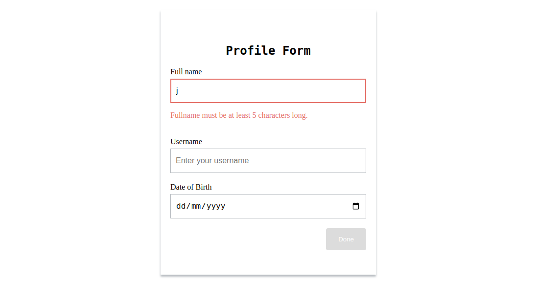
</form>Above, we have created variables that reference the ngModel instance for each control and then use the variables to display the appropriate error messages.
The ngModel instance contains properties that indicate the state of the control. Above, we have used these properties to show errors conditionally.
Next, add the following styling in the <style></style> tag, which uses the defined .error class and applied classes to style the error message, controls, and button.
.profile-form .ng-invalid:not(form).ng-dirty {
  border: 2px solid rgb(235, 104, 104);
}

.ng-invalid button {
  background-color: gainsboro;
}

.error {
  color: rgb(235, 104, 104);
}
With this, when the form or its control (e.g., fullname) is invalid, it will look like the following:
Validation with custom validators in template-driven form
At times, the built-in validators will not suffice for our use case. For that, Angular allows us to define our own validators.
In template-driven forms, custom validators are created using directives that will be added to the controls. The directive must implement the Validator interface, which contains a validate function that will be called when the directive is invoked.
Here is what the Validator interface looks like:
interface Validator {
  validate(control: AbstractControl<any, any>): ValidationErrors | null
  registerOnValidatorChange(fn: () => void)?: void
}
The validate function takes in an Angular control object and returns either null when the control value is valid or an error object when it isn’t.
As an example, let’s create a custom validator that checks if a user is up to 18 years old.
In app/profileForm, create a notOfAge.directive.ts file and add the following.
import { Directive } from "@angular/core";
import { AbstractControl, NG_VALIDATORS, ValidationErrors, Validator } from "@angular/forms";

function notOfAgeValidator (control: AbstractControl): ValidationErrors | null {
  const acceptedMinAge = 18
  const dateOfBirth = new Date(control.value)
  const age = new Date().getFullYear() - dateOfBirth.getFullYear()

  return age < acceptedMinAge ? {notOfAge: true, minAge: 18} : null
}

@Directive({
  selector: '[appNotOfAge]',
  providers: [{provide: NG_VALIDATORS, useExisting: NotOfAgeDirective, multi: true}]
})
export class NotOfAgeDirective implements Validator {

  validate(control: AbstractControl): ValidationErrors | null {
    return notOfAgeValidator(control)
  }
}
Above, the validate method returns the notOfAgeValidator validation function, which does the age check and returns an error object if the age is less than 18 and null if it isn’t.
Angular recognizes this as a validation directive due to the presence of the NG_VALIDATORS provider, which is a predefined provider with an extensible collection of validators. We have registered this provider in the Angular provider metadata and set multi to true since there can be more validation directives.
To use the custom validator, we need first to declare it in the app module and then add its selector appNotOfAge to the date of birth control.
Head over to app/app.module.ts, import the directive, and add it to the declarations array of @NgModule:
import { NotOfAgeDirective } from './profile-form/notOfAge.directive';

declarations: [
  ...
  NotOfAgeDirective,
],
Next, head over to app/profile-form/profile-form.component and add the directive’s selector to the date of birth control:
<input type="date" id="birth" required #birth="ngModel" appNotOfAge ngModel name="birth" />Then we can display an error message as we do with the built-in validators like this:
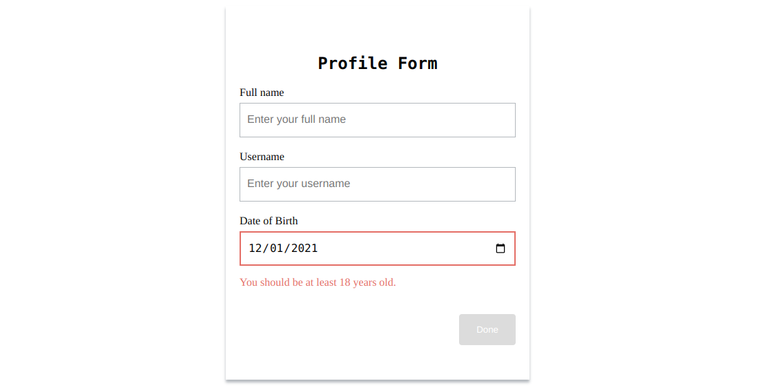
<p *ngIf="birth.errors?.['notOfAge'] && birth.dirty" class="error">
  You are not of age. You must be at least  {{birth.errors?.['minAge']}}  years old.
</p>
With this, when the age is not valid, it will be indicated in the form.
Custom validators are also used for cross-field validation, which involves checking the validity of a control’s value by using other controls. A typical example of this is the password confirmation validation, which we will be implementing.
To implement the password confirmation cross-field validation, first, add two input fields of type=password to our form like this:
<div>
  <label for="password">Password</label><br />
  <input
    type="password"
    id="password"
    required
    #password="ngModel"
    ngModel
    name="password"
    placeholder="Enter your password"
  />
</div>
<div>
  <label for="confirm-password">Confrim password</label><br />
  <input
    type="password"
    id="confirm-password"
    required
    #confirmPassword="ngModel"
    ngModel
    name="confirm-password"
    placeholder="Confirm your password"
  />
</div>
Next, implement the validator directive like this:
import { Directive } from "@angular/core";
import { AbstractControl, NG_VALIDATORS, ValidationErrors, Validator } from "@angular/forms";

function confirmPasswordValidator (control: AbstractControl): ValidationErrors | null {

  const password1 = control.get('password')
  const confirmPassword = control.get('confirm-password');

  return confirmPassword !== password1 ? {passwordNotSame: true} : null
}

@Directive({
  selector: '[appConfirmPassword]',
  providers: [{provide: NG_VALIDATORS, useExisting: ConfirmPasswordDirective, multi: true}]
})
export class ConfirmPasswordDirective implements Validator {
  validate(control: AbstractControl): ValidationErrors | null {
    return confirmPasswordValidator(control)
  }
}
Unlike regular custom validators, the directive must be registered at the highest level in the form, which is the form tag for cross-field validation. This is why, in the confirmPasswordValidator validation function above, we are retrieving the controls using the get() method.
Now that the directive has been created, declare it in the app module next.
import { ConfirmPasswordDirective } from './profile-form/confirmPassword.directive';


declarations: [
  ...
  ConfirmPasswordDirective,
],
Then add it to the form tag like this:
<form
  #profileForm="ngForm"
  name="profile-form"
  (ngSubmit)="onSubmit(profileForm)"
  appConfirmPassword
></form>
Finally, we can display an error message using the following code:
<p
  *ngIf="profileForm.form.errors?.['passwordNotSame'] && confirmPassword.dirty"
  class="error"
>
  Password does not match.
</p>
Although the password confirmation error message will display, there will be no red border around its input field. This is because in our style we are using the ng-invalid class, which is present in each control when it’s invalid to add the red border. Still, for cross-field validation, when the validated control is invalid, the ng-invalid class will only be present form tag.
To fix this, we can conditionally add a class when the password does not match, which will be used to add the red border. To do this, modify the confirm-password control to the following:
<input
  type="password"
  id="confirm-password"
  required
  #confirmPassword="ngModel"
  ngModel
  name="confirm-password"
  placeholder="Confirm your password"
  [ngClass]="{'input-error': profileForm.form.errors?.['passwordNotSame'] && confirmPassword.dirty}"
/>
Next, add the following styling:
.profile-form .input-error {
  border: 2px solid rgb(235, 104, 104);
}
With this, when the passwords do not match, it will be indicated in the form like this:

Multi-step template-driven form with validation
When a form becomes lengthy and complex, it becomes intimidating to users. A well-known UI design technique used to handle this is a multi-step form. In this section, we will learn how to implement a multi-step form with validation when using template-driven forms.
We will break down the profile form into two steps to demonstrate how to implement a multi-step form: NAME and BIRTH. NAME will contain the fullname and username control, and BIRTH will contain the date of birth control. For this tutorial, we will implement a basic multi-step form with no progress headers. If you want a more complex multi-step form, check out the Angular Material Stepper component.
Implementing a multi-step form is quite straightforward. We need to conditionally render the steps of a form based on the value of a numeric variable, which will be decreased or increased by one when the previous or next button is clicked.
To get started, In the profile-form.component.ts file, add the following lines of code before the onSubmit() function in the class:
step = 1;

previousStep () {
  if (this.step !== 1) this.step -= 1
}

nextStep () {
  if(this.step !== 2) this.step += 1
}

stepTitle () {
  switch (this.step){
    case 1: return 'NAME'
    case 2: return 'BIRTH'
    default: return ''
  }
}
In the above code, we have defined a step property that will be used to conditionally render each step in the form, and two methods: previousStep and nextStep to decrease or increase the step by one (1) respectively, and a stepTitle method which returns the title of each step.
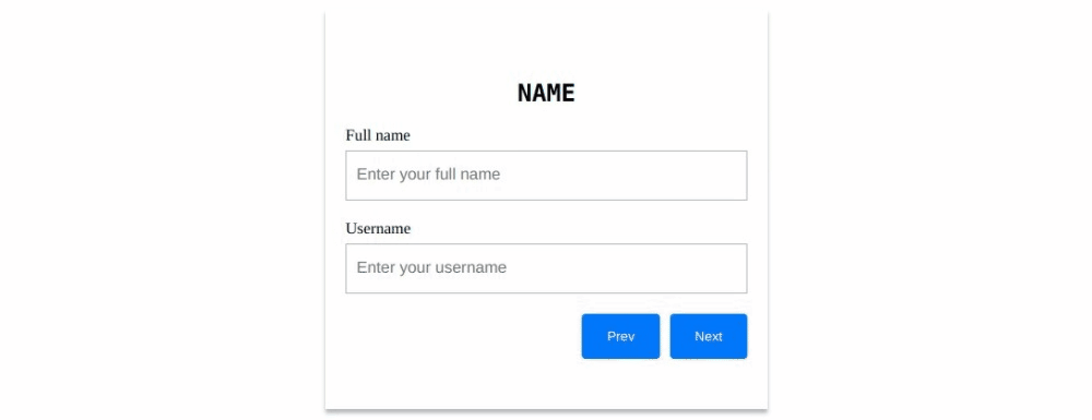
Next, modify the <div> tag with the class name of profile-form in profile-form.component.html to the following:
<div class="profile-form">
  <h2>{{ stepTitles() }}</h2>
  <form
    #profileForm="ngForm"
    name="profile-form"
    (ngSubmit)="onSubmit(profileForm)"
  >
    <div [hidden]="step !== 1">
      <div>
        <label for="full-name">Full name</label><br />
        <input
          type="text"
          required
          minlength="5"
          id="full-name"
          #fullname="ngModel"
          ngModel
          name="fullname"
          placeholder="Enter your full name "
        />
        <div *ngIf="fullname.invalid && fullname.dirty" class="error">
          <p *ngIf="fullname.errors?.['required']">Fullname is required.</p>
          <p *ngIf="fullname.errors?.['minlength']">
            Fullname must be at least 5 characters long.
          </p>
        </div>
      </div>
      <div>
        <label for="username">Username</label><br />
        <input
          type="text"
          id="username"
          required
          #username="ngModel"
          ngModel
          name="username"
          placeholder="Enter your username"
        />
        <p
          *ngIf="username.errors?.['required'] && username.dirty"
          class="error"
        >
          Username is required.
        </p>
      </div>
    </div>
    <div [hidden]="step !== 2">
      <label for="birth">Date of Birth</label><br />
      <input
        type="date"
        id="birth"
        required
        #birth="ngModel"
        ngModel
        name="birth"
        placeholder="date of birth"
      />
      <p *ngIf="birth.errors?.['required'] && birth.dirty" class="error">
        Date of birth is required.
      </p>
    </div>

    <div class="buttons">
      <button type="button" (click)="previousStep()">Prev</button>
      <button type="button" (click)="nextStep()">Next</button>
      <button *ngIf="step === 2" [disabled]="!profileForm.form.valid">
        Done
      </button>
    </div>
  </form>
</div>
In the above code, we called stepTitle() to show the title of the current step, hide or show the controls of each step based on the value of the step property, add a Previous and Next button that calls the corresponding method when clicked, and show the submit button only at the ending of the form.
You might be wondering why we are using the hidden property to conditionally hide the controls rather than *ngIf. We do this so that we are still able to access the control values from the ngForms instance. When *ngIf is used, the controls are not added to the DOM, so its value cannot be accessed, but this is not the same when using [hidden], which includes the controls in the DOM but doesn’t display them.
At the bottom of the page, modify the <style> tag to the following to properly style the form:
<style>
  .profile-form {
    max-width: 400px;
    box-shadow: 0 4px 4px rgb(179, 184, 189);
    padding: 50px 20px;
    margin: 0 auto;
    margin-top: 100px;
  }

  .profile-form h2 {
    font-family: monospace;
    font-size: 24px;
    text-align: center;
  }

  .profile-form form > div:not([hidden]):first-child {
    display: flex;
    flex-direction: column;
    gap: 20px;
  }

  .profile-form input {
    border: 1px solid rgb(179, 184, 189);
    height: 50px;
    width: 100%;
    font-size: 16px;
    margin-top: 5px;
    padding: 0 10px;
    box-sizing: border-box;
  }

  .profile-form input:focus {
    outline: none;
  }

  .profile-form button {
    background-color: rgb(0, 119, 255);
    padding: 15px 25px;
    width: fit-content;
    color: white;
    border: none;
    border-radius: 4px;
  }

  .profile-form .ng-invalid:not(form).ng-dirty {
    border: 2px solid rgb(235, 104, 104);
  }

  .error {
    color:rgb(235, 104, 104)
  }

  .buttons {
    margin-top: 20px;
    display: flex;
    gap: 10px;
    justify-content: right;
  }
</style>
With this, the form will look like the following:
Although we have implemented the multi-form, even when the fields are empty, we can still click the next button, and there are no visual cues to indicate when a button cannot be clicked.
To fix this, we will add a disabled attribute to all the buttons and set it to false or true based on whether a particular step is valid. When the disabled attribute is true, it is added to the element; when it is false, it is not added. So, we will use the presence of the disabled property to change the color of the button to gray to indicate that it can’t be clicked.
First, in profile-form.component.ts, add the following method before the onSubmit method:
stepIsValid (profileForm: NgForm) {
  if(this.step === 1) {
    return (
      !!profileForm.form.controls?.['fullname'].value
      && !!profileForm.form.controls?.['username'].value
      && !profileForm.form.controls?.['fullname'].errors
      && !profileForm.form.controls?.['username'].errors
    )
  }else {
    return (
      !!profileForm.form.controls?.['birth'].value
      && !profileForm.form.controls?.['birth'].errors
    )
  }
}
This method returns true if the controls in a step are not empty and have no errors; if not, it returns false.
Next, in profile-form.component.html, modify the previous and next buttons to the following:
<button type="button" [disabled]="step === 1" (click)="previousStep()">
  Prev
</button>
<button
  type="button"
  [disabled]="!stepIsValid(profileForm)"
  (click)="nextStep()"
>
  Next
</button>
In the above code, we disable the previous button if the form is in the first step and the next button using the stepIsValid() method returns false.
Add the following styling to the <style> tag.
.profile-form button[disabled] {
  background-color: gainsboro;
}
With this, the form will look like the following:

Handling form and validation in reactive form
In this section for the form, we will be using the profile form created in the Setting up Angular section of this article.
To build a reactive form, the first step is to import ReactiveFormsModule, which provides the directives for reactive forms. Then, add it to the NgModules imports property.
Head over to src/app.module.ts and add the following import:
import { ReactiveFormsModule } from '@angular/forms';Next, include it in the imports property of @NgModules:
imports: [
  ...
  ReactiveFormsModule,
]
As mentioned earlier, with reactive forms, the form model is explicitly defined in the component rather than created by a directive like in template-driven form. After the form model is defined, it can be linked to specific form elements in the view.
Here is an example where a FormControl instance is created passed an empty string as the initial values and linked to a form control element in the template.
import { Component } from '@angular/core';
import { FormControl } from '@angular/forms';

@Component({
  selector: 'app-profile-form',
  template: `
    <input type="text"  [formControl]="username">
  `
})
export class ProfileFormComponent {
  username = new FormControl('');
}
The [formControl] directive in the above code is used to link a standalone FormControl instance to a form control element.
It is provided by ReactiveFormsModule.
Each form control instance provides properties and methods to access information about it and modify its state, which is of the underlying AbstractControl class.
Using these properties, to display a form control value, we can use the valueChanges observable to listen for changes using AsyncPipe in the template or using the subscribe method in the component. We can also use the value property. Here are examples.
Using the valueChange observer.
import { Component } from '@angular/core';
import { FormControl } from '@angular/forms';

@Component({
  selector: 'app-profile-form',
  template: `
    <input type="text"  [formControl]="username">
    {{username.valueChanges | async}}
  `
})
export class ProfileFormComponent {
  username = new FormControl('');

  constructor() {
    this.username.valueChanges.subscribe((newValues) => {
      console.log('Username:', newValues);
    });
  }
}
Using the value property:
import { Component } from '@angular/core';
import { FormControl } from '@angular/forms';

@Component({
  selector: 'app-profile-form',
  template: `
    <input type="text" [formControl]="username">
    <button (click)="onClick()">Click</button>
    {{username.value}}

  `
})
export class ProfileFormComponent {
  username = new FormControl('');

  onClick() {
    console.log(this.username.value)
  }
}
In most cases, more than one form control element is wrapped in a <form> or <div> tag. For that, reactive forms provide the FormGroup and FormArray for creating the form model, each with a different use case, which was mentioned earlier.
For our case, which involves converting the profile form to a reactive form, we will be using FormGroup.
Now, let’s learn how to convert the profile form to a reactive form and add a submit function that logs the values of the controls.
First, define the form model, which contains form controls instance corresponding to the input fields in the template, and add the submit function in the profile-form.component.ts file:
import { Component } from '@angular/core';
import { FormControl, FormGroup } from '@angular/forms';

@Component({
  selector: 'app-profile-form',
  templateUrl: './profile-form.component.html',
  styleUrls: ['./profile-form.component.css']
})
export class ProfileFormComponent {

  profileForm = new FormGroup({
    fullname: new FormControl(''),
    username: new FormControl(''),
    dataOfBirth: new FormControl('')
  });


  onSubmit() {
    console.log(
      `
        Full Name is ${this.profileForm.value.fullname}
        Username is ${this.profileForm.value.username}
        Date of birth is ${this.profileForm.value.dataOfBirth}
      `
    )
  }
}
Next, in profile-form.component.html modify the <form> tag to the following:
<form [formGroup]="profileForm" (ngSubmit)="onSubmit()" name="profile-form">
  <div>
    <label for="full-name">Full name</label><br />
    <input
      type="text"
      id="full-name"
      formControlName="fullname"
      placeholder="Enter your full name"
    />
  </div>
  <div>
    <label for="username">Username</label><br />
    <input
      type="text"
      id="username"
      formControlName="username"
      placeholder="Enter your username"
    />
  </div>
  <div>
    <label for="birth">Date of Birth</label><br />
    <input
      type="date"
      id="birth"
      formControlName="dataOfBirth"
      placeholder="date of birth"
    />
  </div>
  <button>Done</button>
</form>
Validation in reactive forms
In Reactive forms, validation is done using validation functions directly added to the form control model in the component class. These functions are called whenever the value of the control changes. To add validation, we can use the built-in validators which are the implementation of the HTML form validation attribute from the Validators class or we can write custom validators if the built-in validators don’t suffice for our use case.
Now, let’s add validation to our profile form and disable the submit button if the form is not valid.
In profile-form.component.ts, import the Validators class and modify the form model to the following:
import { Validators } from '@angular/forms';

profileForm = new FormGroup({
  fullname: new FormControl('', [
    Validators.required,
    Validators.minLength(5)
  ]),
  username: new FormControl('', Validators.required),
  dataOfBirth: new FormControl('', Validators.required)
});
Above using the Validators class, we have made all controls required and added a minimum length of 5 characters for the fullname control.
Next, in profile-form.component.html, modify the form to show errors when a control is invalid using the provided controls state properties and disable the submit button when the form is invalid:
<form [formGroup]="profileForm" (ngSubmit)="onSubmit()" name="profile-form">
  <div>
    <label for="full-name">Full name</label><br />
    <input
      type="text"
      id="full-name"
      formControlName="fullname"
      placeholder="Enter your full name"
    />
    <div
      *ngIf="
        profileForm.controls.fullname.invalid &&
        profileForm.controls.fullname.dirty
      "
      class="error"
    >
      <p *ngIf="profileForm.controls.fullname.errors?.['required']">
        Fullname is required.
      </p>
      <p *ngIf="profileForm.controls.fullname.errors?.['minlength']">
        Fullname must be at least 5 characters long.
      </p>
    </div>
  </div>
  <div>
    <label for="username">Username</label><br />
    <input
      type="text"
      id="username"
      formControlName="username"
      placeholder="Enter your username"
    />
    <p
      *ngIf="
        profileForm.controls.username.errors?.['required'] &&
        profileForm.controls.username.dirty
      "
      class="error"
    >
      Username is required.
    </p>
  </div>
  <div>
    <label for="birth">Date of Birth</label><br />
    <input
      type="date"
      id="birth"
      formControlName="dataOfBirth"
      placeholder="date of birth"
    />
    <p
      *ngIf="
        profileForm.controls.dataOfBirth.errors?.['required'] &&
        profileForm.controls.dataOfBirth.dirty
      "
      class="error"
    >
      Date of birth is required.
    </p>
  </div>
  <button [disabled]="profileForm.invalid">Done</button>
</form>
Now, to add visual cues to inform users about the state of the form, we will be using the class name Angular applies to the form and its controls based on their state, which includes:
.ng-valid: Applied when the control is valid..ng-invalid: Applied when the control is not valid..ng-pristine: Applied when the control’s value has not changed..ng-dirty: Applied when the control’s value has changed..ng-untouched: Applied when the control has been visited..ng-touched: Applied when the control has not been visited..ng-submitted(form element only): Applied when the form is submitted.
You can see how Angular adds and removes these classes from the browser developer tools.
Add the following styling to the <style> tag:
.profile-form .ng-invalid:not(form).ng-dirty {
  border: 2px solid rgb(235, 104, 104);
}

.ng-invalid button {
  background-color: gainsboro;
}

.error {
  color: rgb(235, 104, 104);
}
With this, when the form or its control (e.g., fullname) is invalid, it will look like the following:

Validation with custom validators in reactive form
Creating a custom validator in reactive form is quite straightforward, unlike a template-driven form.
To do this, we need to create a function that implements the ValidatorFn, which is a function that receives a control parameter and synchronously returns either null (if there is no error) or a validation error object.
Here is what the ValidatorFn interface looks like:
interface ValidatorFn {
  (control: AbstractControl<any, any>): ValidationErrors | null
}
As an example, let’s create a custom validator to check if a user is up to 18 years old using the dateOfBirth control of the profile form.
In app/profileForm create a notOfAge.directive.ts file and add the following lines of code:
import { AbstractControl, ValidationErrors, ValidatorFn } from "@angular/forms"

export const notOfAgeValidator: ValidatorFn = (control: AbstractControl): ValidationErrors | null => {
  const acceptedMinAge = 18
  const dateOfBirth = new Date(control.value)
  const age = new Date().getFullYear() - dateOfBirth.getFullYear()

  return age < acceptedMinAge ? {notOfAge: true, minAge: 18} : null
}
Next, in the profile-form.component.ts file, import notOfAgeValidator and add it to the dataOfBirth control like this:
import { notOfAgeValidator } from './notOfAge.directive';
...

profileForm = new FormGroup({
  ...
  dataOfBirth: new FormControl('', [Validators.required, notOfAgeValidator])
});
That’s it. With these few steps, when a date of birth is entered in the form, it will be validated based on the custom validator. Now, to display an error, we can do the following:
<p
  *ngIf="
    profileForm.controls.dataOfBirth.errors?.['notOfAge'] &&
    profileForm.controls.dataOfBirth.dirty
  "
  class="error"
>
  You should be at least
  {{ profileForm.controls.dataOfBirth.errors?.["minAge"] }} years old.
</p>
When the age is not valid, it will be indicated in the form.

Custom validators are also used for cross-field validation, which involves validating a control’s value against another. A typical example of this is the password confirmation validation, which we will be implementing.
To implement the password confirmation cross-field validation, first create the custom validator:
export const confirmPasswordValidator: ValidatorFn = (control: AbstractControl): ValidationErrors | null => {
  const password1 = control.get('password')
  const confirmPassword = control.get('confirmPassword');

  return confirmPassword?.value !== password1?.value ? {passwordNotSame: true} : null
}
In the above code, we are using the FormGroup’s get method to retrieve the controls. This is because for cross-field validations, a common ancestor control FormGroup is used to perform the validation.
Now, update the form model by specifying the custom validator and adding a password and confirmPassword control.
profileForm = new FormGroup({
  ...
  password: new FormControl('', Validators.required),
  confirmPassword: new FormControl('', Validators.required)
}, {validators: confirmPasswordValidator});
Then, in the template, add the two password fields and display the password confirmation error message:
<div>
<label for="password">Password</label><br />
<input
type="password"
id="password"
formControlName="password"
placeholder="Enter your password"
/>
</div>
<div>
<label for="cofimrm-password">Confirm Password</label><br />
<input
type="password"
id="confirm-password"
formControlName="confirmPassword"
placeholder="Confirm your password"
/>
<p
*ngIf="
profileForm.errors?.['passwordNotSame'] &&
profileForm.controls.confirmPassword.dirty
"
class="error"
>
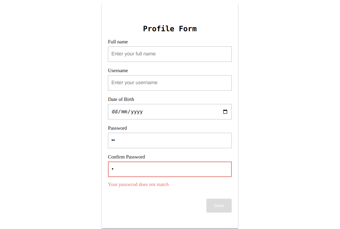
Your passwrod does not match
</p>
</div>Although the password confirmation error message will display, there will be no red border around its input field. This is because in our style we are using the ng-invalid class, which is present in each control when it’s invalid, to add the red border. Still, for cross-field validation, when the validated control is invalid, the ng-invalid class will only be present in the element associated with the FormGroup, the form tag in our case.
To fix this, we can conditionally add a class when the password does not match, which will be used to add the red border. To do this, modify the confirm password field to the following:
<input
  type="password"
  id="confirm-password"
  formControlName="confirmPassword"
  placeholder="Confirm your password"
  [ngClass]="{'input-error': profileForm.errors?.['passwordNotSame'] && profileForm.controls.confirmPassword.dirty}"
/>
Next, add the following styling:
.profile-form .input-error {
  border: 2px solid rgb(235, 104, 104);
}
With this, when the passwords do not match, it will be indicated in the form like this:
Multi-step reactive form with validation
We will break down the profile form into two steps to demonstrate how to implement a multi-step form: NAME and BIRTH. NAME will contain the fullname and username control, and BIRTH will contain the date of birth control. For this tutorial, we will implement a basic multi-step form with no progress headers. If you want a more complex multi-step form, check out the Angular Material Stepper component.
We will use nested groups to break down the form into steps, which involve defining other form group instances within a parent form group. Nested form groups make creating complex models easier to maintain and logically group together. However, this is for demonstration purposes for our use case because the profile form isn’t complex enough to use nesting.
For implementing the multi-step form, we need to conditionally render the steps of a form based on the value of a numeric variable, which will be decreased or increased by one when the previous or next button is clicked.
In the profile-form.component.ts, modify the component to the following:
export class ProfileFormComponent {

  profileForm = new FormGroup({
    name: new FormGroup({
      fullname: new FormControl('', [
        Validators.required,
        Validators.minLength(5)
      ]),
      username: new FormControl('', Validators.required),
    }),
    dataOfBirth: new FormControl('', Validators.required)
  });

  name = this.profileForm.controls.name
  step = 1;

  previousStep () {
    if (this.step !== 1) this.step -= 1
  }

  nextStep () {
    if(this.step !== 2) this.step += 1
  }

  stepTitle () {
    switch (this.step){
      case 1: return 'NAME'
      case 2: return 'BIRTH'
      default: return ''
    }
  }

  onSubmit() {
    console.log(
      `
        Full Name is ${this.name.value.fullname}
        Username is ${this.name.value.username}
        Date of birth is ${this.profileForm.value.dataOfBirth}
      `
    )
  }
}
In the above code, we have nested the fullname and username in a child group called name and created a variable to access the name group easily. After that, we defined a step property which will be used to render each step in the form conditionally, and two methods: previousStep and nextStep to decrease or increase the step by one (1), respectively, and a stepTitle method which returns the title of each step.
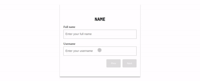
Next, modify the <div> tag with the class name of profile-form in profile-form.component.html to the following:
<div class="profile-form">
  <h2>{{ stepTitle() }}</h2>
  <form [formGroup]="profileForm" (ngSubmit)="onSubmit()" name="profile-form">
    <div *ngIf="step === 1" formGroupName="name">
      <div>
        <label for="full-name">Full name</label><br />
        <input
          type="text"
          id="full-name"
          formControlName="fullname"
          placeholder="Enter your full name"
        />
        <div
          *ngIf="name.controls.fullname.invalid && name.controls.fullname.dirty"
          class="error"
        >
          <p *ngIf="name.controls.fullname.errors?.['required']">
            Fullname is required.
          </p>
          <p *ngIf="name.controls.fullname.errors?.['minlength']">
            Fullname must be at least 5 characters long.
          </p>
        </div>
      </div>
      <div>
        <label for="username">Username</label><br />
        <input
          type="text"
          id="username"
          formControlName="username"
          placeholder="Enter your username"
        />
        <p
          *ngIf="
            name.controls.username.errors?.['required'] &&
            name.controls.username.dirty
          "
          class="error"
        >
          Username is required.
        </p>
      </div>
    </div>
    <div *ngIf="step === 2">
      <label for="birth">Date of Birth</label><br />
      <input
        type="date"
        id="birth"
        formControlName="dataOfBirth"
        placeholder="date of birth"
      />
      <p
        *ngIf="
          profileForm.controls.dataOfBirth.errors?.['required'] &&
          profileForm.controls.dataOfBirth.dirty
        "
        class="error"
      >
        Date of birth is required.
      </p>
    </div>
    <div class="buttons">
      <button type="button" (click)="previousStep()">Prev</button>
      <button type="button" (click)="nextStep()">Next</button>
      <button *ngIf="step === 2" [disabled]="profileForm.invalid">Done</button>
    </div>
  </form>
</div>
In the above code, we called stepTitle() to show the title of the current step, hide or show the controls of each step based on the value of the step property, and add a Previous and Next button which calls,, the corresponding method when clicked, and show the submit button only at the ending of the form.
<style>
  .profile-form {
    max-width: 400px;
    box-shadow: 0 4px 4px rgb(179, 184, 189);
    padding: 50px 20px;
    margin: 0 auto;
    margin-top: 100px;
  }

  .profile-form h2 {
    font-family: monospace;
    font-size: 24px;
    text-align: center;
  }

  .group {
    display: flex;
    flex-direction: column;
    gap: 20px;
  }

  .profile-form input {
    border: 1px solid rgb(179, 184, 189);
    height: 50px;
    width: 100%;
    font-size: 16px;
    margin-top: 5px;
    padding: 0 10px;
    box-sizing: border-box;
  }

  .profile-form input:focus {
    outline: none;
  }

  .profile-form button {
    background-color: rgb(0, 119, 255);
    padding: 15px 25px;
    width: fit-content;
    color: white;
    border: none;
    border-radius: 4px;
  }

  .profile-form input.ng-invalid.ng-dirty {
    border: 2px solid rgb(235, 104, 104);
  }

  .error {
    color:rgb(235, 104, 104)
  }

  .buttons {
    margin-top: 20px;
    display: flex;
    gap: 10px;
    justify-content: right;
  }
</style>
With this, the form will look like the following:

Although we have implemented the multi-form, even when the fields are empty, we can still click the next button, and there are no visual cues to indicate when a button cannot be clicked.
To fix this, we will add a disabled attribute to all the buttons and set it to false or true based on whether a particular step is valid. When the disabled attribute is true, it is added to the element; when it is false, it is not added. So, we will use the presence of the disabled property to change the color of the button to gray to indicate that it can’t be clicked.
First, in profile-form.component.ts, add the following method before the onSubmit method:
stepIsValid () {
  console.log(this.name)
  if(this.step === 1) {
    return (
      !!this.name.value.fullname
      && !!this.name.value.username
      && !this.name.controls.fullname.errors
      && !this.name.controls.username.errors
    )
  }else {
    return (
      false
    )
  }
}
This method returns true if the controls in a step are not empty and have no errors; if not, it returns false.
Next, in profile-form.component.html, modify the previous and next buttons to the following:
<button type="button" [disabled]="step === 1" (click)="previousStep()">
  Prev
</button>
<button
  type="button"
  [disabled]="!stepIsValid(profileForm)"
  (click)="nextStep()"
>
  Next
</button>
In the above code, we disable the previous button if the form is in the first step and the next button using the stepIsValid() method returns false.
Lastly, add the following styling to the <style> tag.
.profile-form button[disabled] {
  background-color: gainsboro;
}
With this, the form will look like the following:
Conclusion
Both template-driven and reactive forms are great options for adding a form to your Angular app, but depending on your use case, you must choose one. So make sure before building your forms, you compare to see which is best for your app. You can learn more about forms in the Angular forms doc.
Gain Debugging Superpowers
Unleash the power of session replay to reproduce bugs, track slowdowns and uncover frustrations in your app. Get complete visibility into your frontend with OpenReplay — the most advanced open-source session replay tool for developers.
Star on GitHub12k