
High Contrast and Simple Layouts: How Neubrutalism Benefits Users with Disabilities


Neubrutalism is a design trend that helps users with visual disabilities because of its emphasis on high contrast and simple layouts, as this article shows.

Discover how at OpenReplay.com.
For far too long, we have neglected individuals with disabilities when designing our websites. Most of the time, nobody really cares to ask, “How is this site we are developing accessible to everyone?” We tend to always have a certain audience in mind when designing or using our use cases. Thankfully, new changes in the design world are bringing about many advancements in design thinking, and the need for a more inclusive design process has never been this high and important.
One effective approach that has been introduced is the use of bold fonts, high contrast, and a combination of bright, colorful palettes. This perfectly aligns with the principles of Neubrutalism, a web design trend that emphasizes high contrast and simple layouts to help those with visual disabilities access web content easily. In this article, we will look at:
- What Neubrutalism is all about and why it concerns you as a developer
- How Neubrutalism aligns with accessibility principles to help those with disabilities
- And finally, a practical example of designing a Hero Page with Neubrutalism
So, first things first. Why should you care about this Neubrutalism thing? Here are the reasons why:
- Easy on the Eyes: Bold fonts and clear contrasts make reading so easy, no matter what your vision is like.
- Brain-Friendly Design: Simple layouts make finding what you need on the website a snap, saving you mental stress.
- The Important Stuff Stands Out: Key information gets the spotlight, so you can grab it and go without getting lost in the weeds.
Plus, making your website accessible isn’t just about following the rules (although there are rules about it in many places). It’s simply good design! When everyone can use your website easily, you reach a wider audience, and that can be pretty good for business, too.
Understanding Neubrutalism in Web Design
What is Neubrutalism?
Think of it as a modern web design style inspired by brutalist architecture, which is all about bold statements. It uses strong colors, basic shapes, and clean layouts to keep things clear and user-friendly.
Brief History of Neubrutalism Design
Brutalism in architecture began in the 1950s. It was all about showing buildings in their most raw and unadorned forms, without fancy decorations. Fast-forward to the late 2010s, and web designers started to adopt this style to break away from the overly polished and uniform look of many websites. They wanted to create something more authentic and striking, and thus, Neubrutalism was born.
Key Characteristics of Neubrutalism
Neubrutalism stands out with its:
- Clear, bold typography
- Use of bold contrasting colors
- Minimalist choice of layouts
- Use of bold outlines
- Use of dark shadows and layers
- Flat design, unstyled shapes
- No animation or movement of elements
- No need for gradient
Examples of Neubrutalist Websites
To see Neubrutalism in action, here are a few websites that use this style effectively:
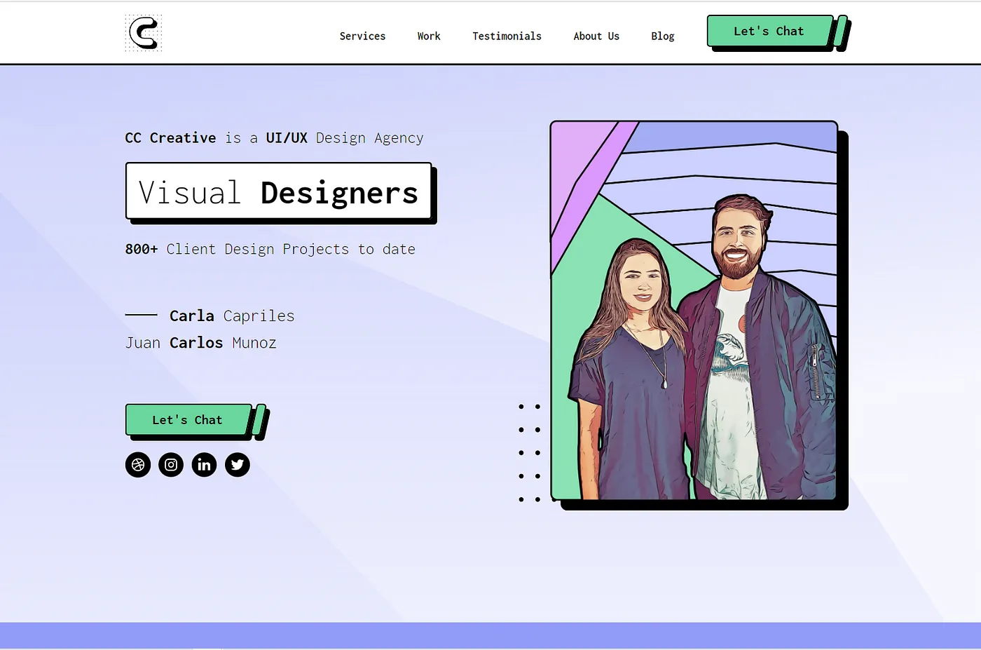
CCCreative’s website is a great example of Neubrutalism in web design. It is clean and simple, focusing on important information without unnecessary clutter. The site uses bold, contrasting colors that make text and elements easy to see, even incorporating a layered effect on the “Let’s chat” button to help people with visual impairments.
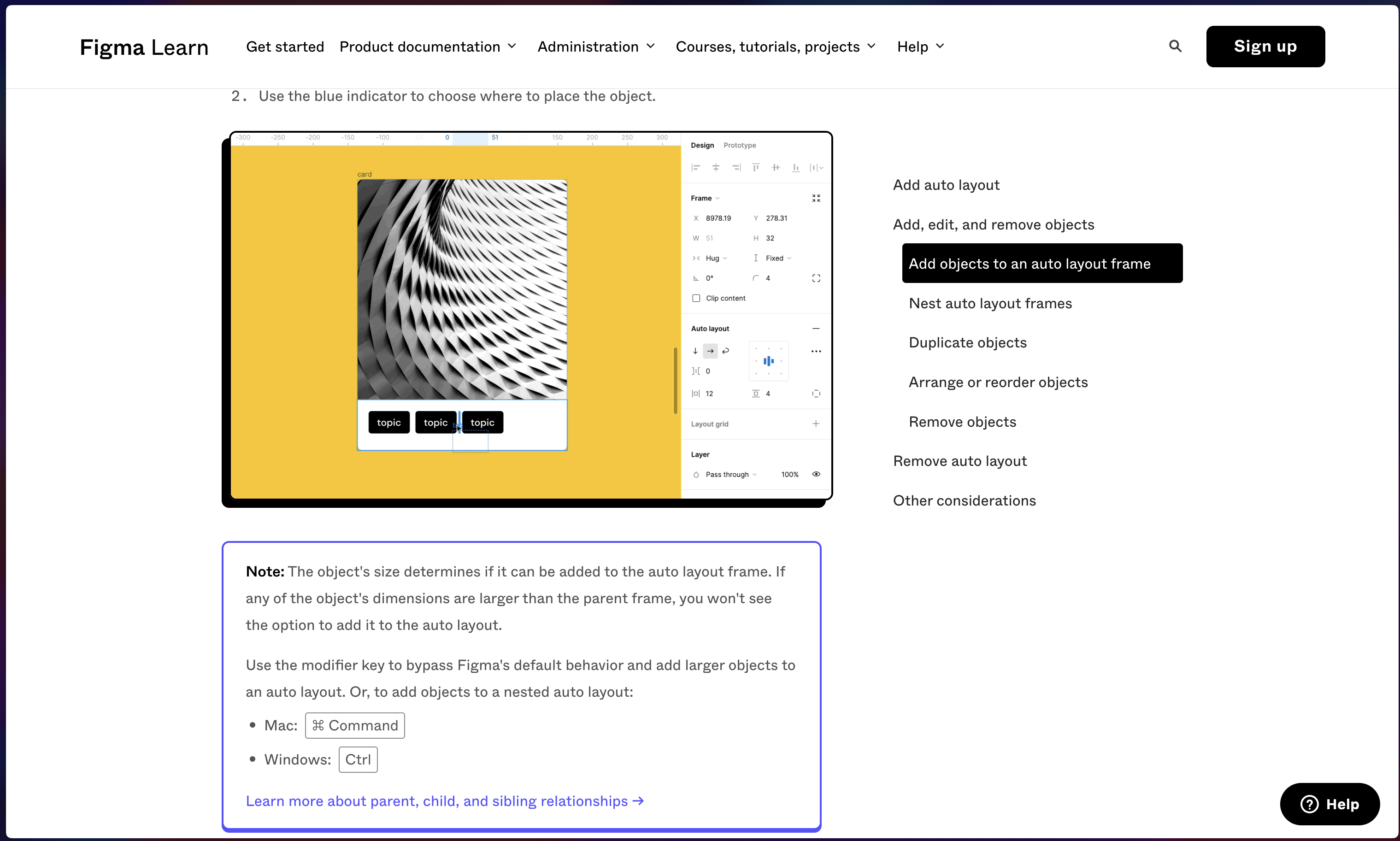
Figma Learn: This website example effectively highlights important tips, notes, and images using bold outlines and shadows. Additionally, the buttons maintain strong contrast for easy visibility.
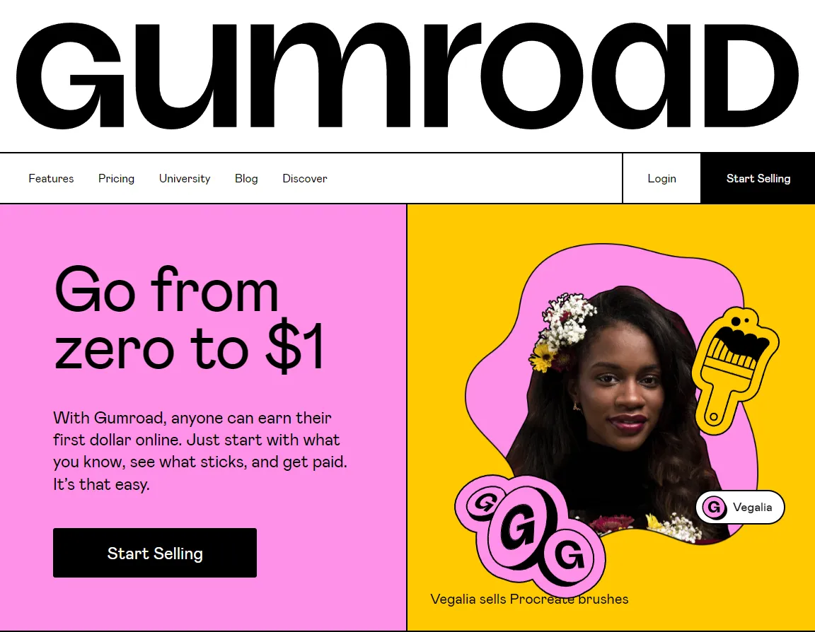
Gumroad’s website is also another great example of Neubrutalism in web design. It uses bold, contrasting colors that make text and buttons easy to see. This makes the site easy to navigate and user-friendly. The clear, straightforward design helps everyone, especially people with visual or cognitive impairments, to read and use the site effectively. Overall, Gumroad combines visual appeal with functional simplicity.
How Neubrutalism Aligns with Accessibility Principles
Is Neubrutalism just a trendy web design style? Are there better approaches out there? While other methods exist, let’s see how Neubrutalism’s core principles help make the web more inclusive.
High Contrast
Neubrutalism’s bold use of contrasting colors ensures clear distinction between text and background elements. This is crucial for users with low vision or color blindness, enhancing readability for users with visual impairments. Imagine a website with bright white text on a deep blue background – a classic high-contrast combination often used in Neubrutalism.
Simple Layouts
Neubrutalism focuses on minimalist layouts with a clear hierarchy. This means the design is clean, with only the essential elements on display. For users with cognitive disabilities, this simplicity reduces cognitive load, aiding users with cognitive disabilities in information processing and task completion.
Focus on Content
A website with less content allows you to prioritize the elements that truly matter, too. Neubrutalism leverages this advantage by focusing on clear typography and clean, minimal layouts. This design approach not only simplifies navigation but also ensures a clear user journey towards the most important action. Additionally, it benefits users with slow internet connections by resulting in faster loading times.
The Significance of High Contrast in Web Accessibility
We’ve discussed how high contrast in Neubrutalism helps people differentiate between elements and easily navigate a website, but let’s zoom in further because, whether we like it or not, it makes a huge difference for people with visual impairments.
Imagine reading a newspaper where the words are almost the same color as the background. Yikes! That’s what low-contrast websites can feel like for some users. High contrast, like bold text on a bright background, makes everything clear and easy to see.
Neubrutalism gets this. It uses bold color palettes to create sharp contrasts between different parts of the website. Text pops off the screen, buttons are easy to find, and important information stands out. It’s like turning on the website’s “bright lights” mode for everyone.
Now, you might be wondering, “Is high contrast really that big of a deal?” Actually, it is! Studies have shown that high-contrast websites can significantly improve reading speed and comprehension for people with visual impairments.
For example, a website with a low-contrast design might have light gray text on a white background. This can be difficult to read, especially for people with low vision. But if they switch to a high-contrast design with black text on a white background, reading becomes much easier and less straining.
So, high contrast on a website is something you should really check for when designing. I think there are even Figma plugins you can use to run some analysis on your design to detect which elements are not contrasting well. The whole essence is to end up with a site that is both visually striking and accessible to all.
Practical Example: Designing an Accessible Hero Page with Neubrutalism
Now that we have understood the core principles of Neubrutalism design, let’s try to put that knowledge into practice by creating a hero page for a charity website. Let’s start!
Here is a step-by-step guide on how to go about using the neubrutalism design style:
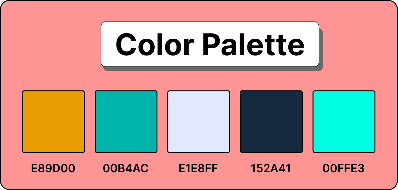
Select Your Perfect Color Schemes
As you have likely noticed in the Neubrutalism website examples shown earlier, choosing colors that stand out against each other is a crucial step in designing with this style. For instance, using dark text on a light background or vice versa. To select a perfect color palette to follow, you can choose any of the options here.
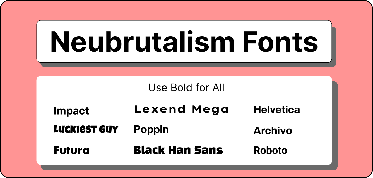
Use Simple Typography
When it comes to typography, go for clear, large fonts without too many decorative elements. Simple, sans-serif fonts improve readability and ensure that your message is easily understood. Neubrutalism often leans towards fonts with clean lines, geometric shapes, and heavy or condensed weight. These characteristics typically align more with sans-serif fonts than serifs. Fonts like Impact, Futura, or Helvetica are all great options. For this example, let’s use Helvetica to practice with.
Prioritize Essential Information
Neubrutalism emphasizes clarity and user experience. On your hero page, focus on the most important information you want visitors to remember by avoiding unnecessary text or images. Highlight key points and a clear call to action (CTA) so users can quickly grasp your message and take action.
Here’s what our charity hero page might include:
- Hero Image: A powerful image that evokes empathy and urgency but avoids relying solely on images depicting suffering. Consider using visuals that showcase hope or the positive impact of donations.
- Compelling Headline: A clear and concise statement that summarizes the charity’s mission or the specific cause you’re addressing.
- Subtext: Briefly expand on the headline or provide context. Keep it short and impactful.
- Strong CTA: A prominent button that clearly tells visitors what you want them to do, such as “Donate Now” or “Sponsor a Child”.
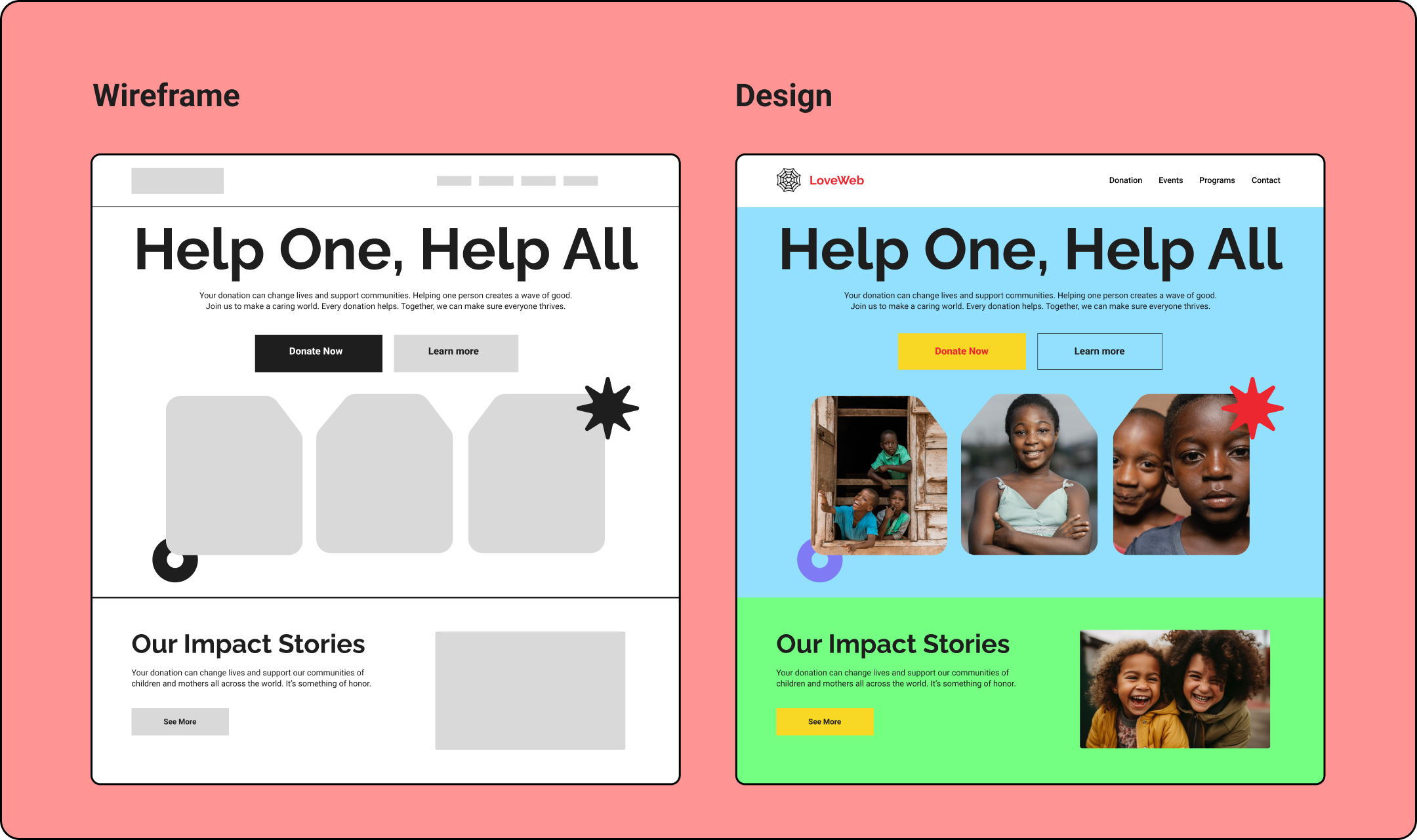
Wireframing and Designing
Now, let’s sketch out our website and start adding our selected colors to it. Remember, Neubrutalism is known for its bright colors and sharp, clear elements. This style helps make websites more accessible to all users. By using bold colors and clean lines, we ensure that everything on the page is easy to see and understand, which is especially important for users with visual impairments. Let’s keep these principles in mind as we design our layout.
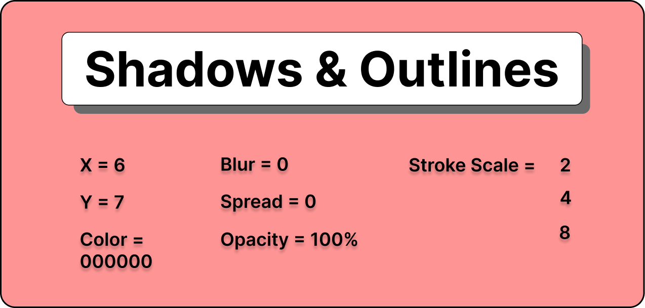
Add Shadows and Outlines
One of the most noticeable aspects of Neubrutalism design is the unapologetic use of shadows and outlines to give depth and emphasis to text and important elements. This helps them stand out more, making the page easier to navigate for users with visual impairments.
You can add shadows to your important elements using this shadow and outline setting:
Final Result
By following these steps, you should have a hero page that looks something like this:
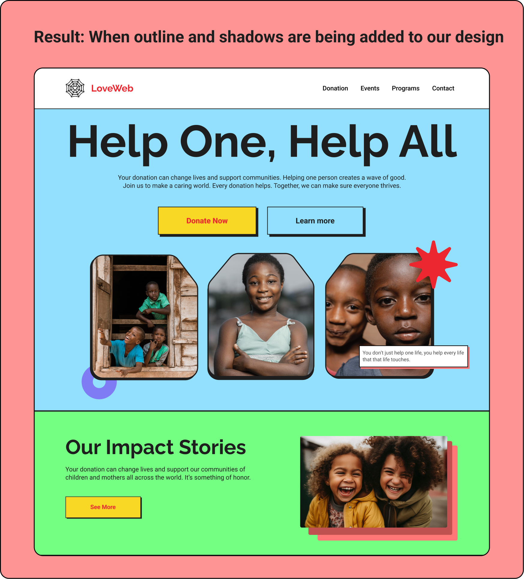
As you can see, adding shadows and outlines gives depth and emphasis to key interactive elements like buttons, making everything easier for everyone to scan and read.
Potential Concerns and Considerations
While Neubrutalism has many benefits, it’s important to note that not all aspects of this design style are inherently accessible. Here are some concerns:
Going Too Dark
High contrast is great, but there can be too much of it. Super dark backgrounds with light gray text might look stylish but can be difficult to read, especially for people with low vision.
Color Blindness Matters
Neubrutalism often uses bold color palettes. However, these choices might not be distinguishable for someone who is colorblind. It’s essential to consider how your color choices might affect different users.
Ensuring Accessibility
So, how can we make sure our Neubrutalist designs are truly accessible?
Testing is Your Best Friend: Just because a design looks good on your screen doesn’t mean it works for everyone. User testing with people who have different abilities is crucial. This helps you identify any accessibility issues and make adjustments before launching your website.
Conclusion
In this guide, we looked at neubrutalism—a modern design style characterized by high contrast, simple layouts, and bright color combinations. We explored how you can use this style on your own website to enhance accessibility, meaning this style helps make websites more readable and easier to navigate for everyone, including users with disabilities.
It is also advisable to test this design style first with a small, diverse group of users to see if they resonate with the new design before proceeding with a major revamp. This can help prevent potential backlash if the design is not well-received.
Truly understand users experience
See every user interaction, feel every frustration and track all hesitations with OpenReplay — the open-source digital experience platform. It can be self-hosted in minutes, giving you complete control over your customer data. . Check our GitHub repo and join the thousands of developers in our community..
