How to build a Micro Frontend with Bit
Use Bit to easily share components among different pages


The term micro frontend has been flying around recently, but what are they, and why should you care? This article will answer those questions. Here’s a quick overview:
What’s a Micro Frontend?
Modern frontend frameworks are big on building web apps using components: self-contained, reusable pieces of code that render a portion of the user interface.
Micro frontends take this concept one step further. A micro frontend is a web application made up of fully independent components. But what makes this different from a regular frontend?
The components that make up a micro frontend are as loosely coupled as possible and can be maintained and improved independently of the rest of the application.
The idea behind Micro Frontends is to think about a website or web app as a composition of features that are owned by independent teams. Each team has a distinct area of business or mission it cares about and specializes in. A cross-functional team develops its features end-to-end, from database to user interface. (Source: What are micro frontends? )
That’s the power of micro frontends.
Why (or why not) should you build micro frontends?
The most apparent advantage of a micro frontend is flexibility. Anyone can build components, and you can include them in your application as you please.
The glaring disadvantage of this method is the complexity. Building a frontend from bits and pieces that are so loosely coupled means that you have to be very careful about the way you organize your code and coordinate all these different components.
If your application is small or medium-sized, you probably don’t need to construct it this way. However, once applications grow to large sizes with many people working on them, the flexibility micro frontends provide can be a valuable asset.
What is Bit?
Bit is software that allows you to create self-contained components and export them so you (and others, if you so choose) can reuse them across projects.
In addition to component reuse, Bit allows you to create documentation and tests for your components, and handles versioning them. Bit is written in and supports TypeScript and is built to be framework agnostic.
How to build a micro frontend in Bit
In this section, you’ll piece together a React web page from Bit components. First, you need to install Bit. The easiest way to do this is with npx:
npx @teambit/bvm installAfter that, you must create a new Bit workspace. A Bit workspace is an environment for creating and managing related Bit components. Create the workspace by running the following in your terminal:
bit new react demo-siteThat command will create a workspace called demo-site using the React workspace template.
Note: You can view the list of default templates by running bit templates in your terminal outside a workspace directory.
Now that your workspace is set up, run the following to start the Bit component development server:
cd demo-site
bit start
You can access the dev server at localhost:3000.
Creating Bit components
Next, you’re going to create your first Bit component: the body component of your web page. This component will be written in React, but Bit components can also be written in Angular, Vue, and even Node.js!
Create the component in your workspace by running the following:
bit create react site/bodyLike the bit new command, the bit create command takes the name of a template as the first argument and the name of your component as the second.
Note: You can find out how to turn an existing component into a bit component here
Running bit new should create a folder in your workspace that looks like the following:
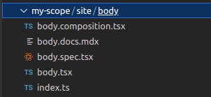
Let’s break this down. The my-scope/site/body folder represents your component. The body.docs.mdx file contains component documentation (if you don’t know what MDX is, you can find out here), and the body.spec.tsx file contains tests. You won’t write any tests in this demo, so delete that file.
The body.composition.tsx file contains small JavaScript functions called compositions that serve as code examples to demonstrate the use of your component under various conditions.
The code that will render the component goes into body.tsx, and the index.ts file is responsible for exporting your components.
Now, paste the following code into body.tsx:
import React, { ReactNode } from 'react';
import './body.css'

export function Body() {
  return (
    <div className="container">
      <div className="image"></div>
      <div className="content">
        <h1>Futuristic shoes</h1>
        <p>Lorem ipsum dolor sit amet, consectetur adipisicing elit.
           Quia, commodi. Molestiae blanditiis quis, laborum necessitatibus
            pariatur quam ipsa accusamus corporis,
           minima labore recusandae earum reprehenderit saepe autem ratione, laudantium natus.
        </p>
      </div>
    </div>
  );
}
Next, styling. Create a body.css file in your component folder and put the following into it:
.container {
    height: 30rem;
    display: flex;
    gap: 2rem;
}

.image {
    background-image: url('https://images.pexels.com/photos/2529148/pexels-photo-2529148.jpeg?auto=compress&cs=tinysrgb&w=1260&h=750&dpr=1');
    height: 100%;
    width: 50%;
    background-size: cover;
    background-position: center;
}

.content {
    width: 50%;
}
Those blocks of code created a React component that renders an image and some text side by side. If you visit your dev server at localhost:3000, you should see a page that looks like this:
If you click on the card, you should see a view of your component that looks like this:
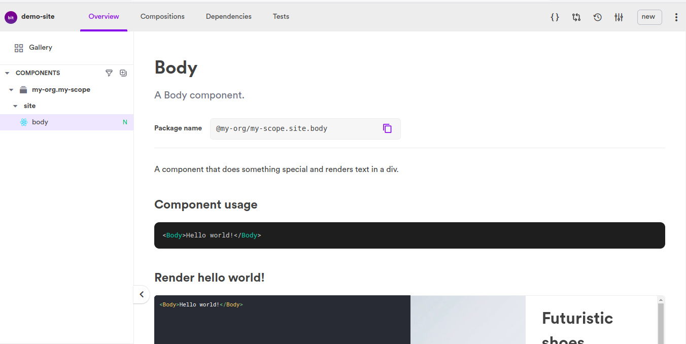
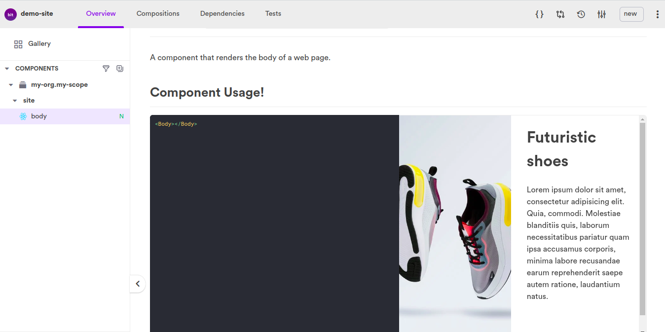
The documentation on the page is rendered from body.docs.mdx and composition.tsx. Let’s edit it to something more accurate. Replace the contents of body.docs.mdx with the following and save:
    ---
    description: A Body component
    ---

    import { Body } from './body';

    A component that renders the body of a web page.

    ## Component Usage!

    ```js live
    <Body></Body>
Then replace the contents of `composition.tsx` with this:

```javascript
import React from 'react';
import { Body } from './body';

export const BasicBody = () => {
  return (
    <Body></Body>
  );
}
The web page should update itself to look like this:
Finally, since Body takes no props, remove this line from index.ts:
export type { BodyProps } from './body';And your component is done!
Exporting your component
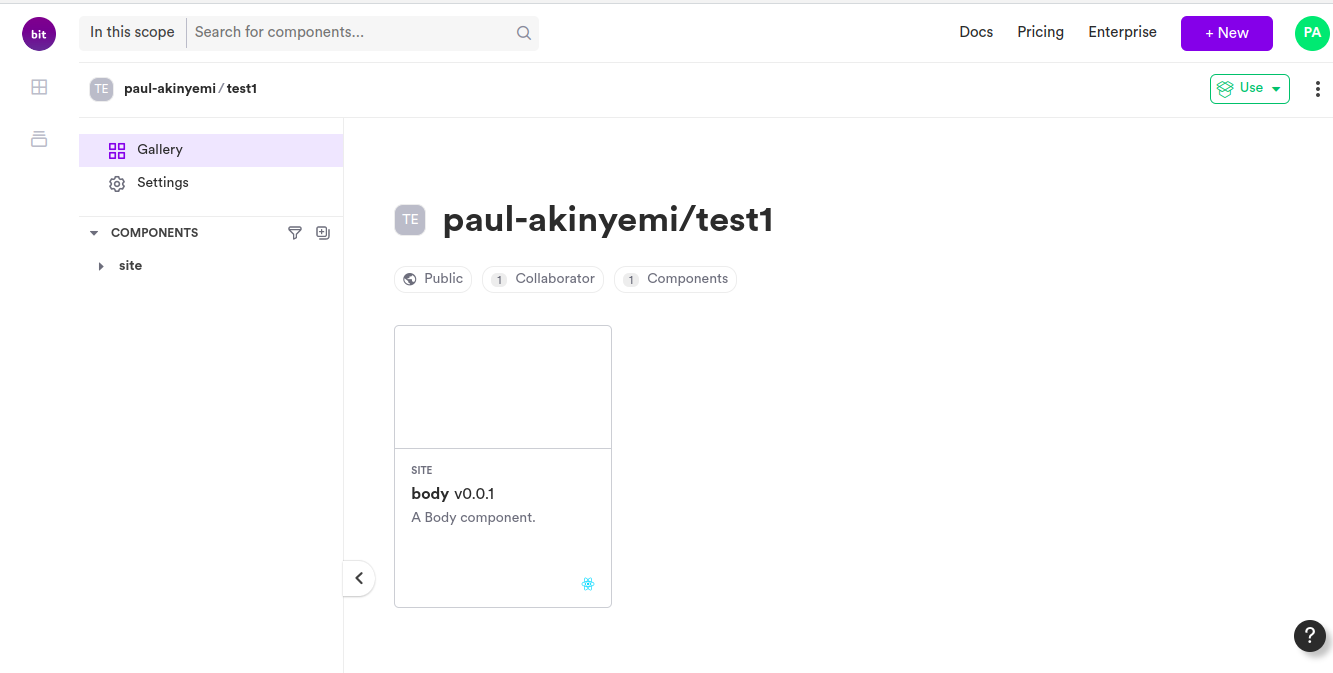
Sign up for a bit.cloud account for free hosting of your component. Next, there’s a file called workspace.jsonc in your workspace. Edit its defaultScope property to this:
"defaultScope": "[your bit.cloud username].[scope name]"Next, run the following in your terminal:
bit loginthen
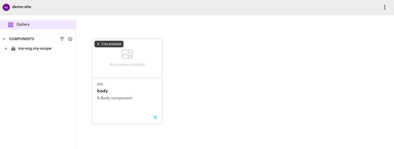
bit exportAnd your component is live! If you refresh the scope page in your bit.cloud, you should see your component there like this:
Open Source Session Replay
OpenReplay is an open-source, session replay suite that lets you see what users do on your web app, helping you troubleshoot issues faster. OpenReplay is self-hosted for full control over your data.

Start enjoying your debugging experience - start using OpenReplay for free.
Composing a frontend with Bit
Now that you’ve built and exported a Bit component, let’s see how to compose an app from components.
Exit your Bit workspace and create a new React app with the following:
npx create-react-app bit-siteNext, you will install a search input component from bit.cloud to use in the header.
Note: When importing a Bit component with npm, you first need to set the name of the Bit organization or user (the part after @) as a scoped registry with npm config set.
Run the following in your terminal:
npm config set '@nitsan770:registry' https://node.bit.cloud

npm i @nitsan770/reuse-components.ui.input sass --legacy-peer-deps
Then import the component you built, like this:
npm config set '@[your-bit-cloud username]:registry' https://node.bit.cloud
npm i @[your-username]/[scope name].site.body
In my case, the code looks like this:
npm config set '@paul-akinyemi:registry' https://node.bit.cloud
npm i @paul-akinyemi/test1.site.body --legacy-peer-deps
Next, put the following code into src/App.js:
import { Input } from '@nitsan770/reuse-components.ui.input'
import { Body } from '@[bit.cloud username]/[scope name].site.body'
import './App.css';


function App() {
  return (
    <div>
      <header>
        <span>Header</span>
        <Input buttonText='search' className='search'></Input>
      </header>

      <Body></Body>

      <footer>
        I'm a footer
      </footer>
    </div>
  );
}

export default App;
Put the following into src/App.css:
header {
  display: flex;
  justify-content: space-between;
  align-items: center;
  padding: 15px;
}

header > span {
  font-size: 2rem;
  font-weight: 600;
}

header .search{
  width: 25%;
  border: 1px purple;
}

footer {
  font-size: 2rem;
  font-weight: 600;
  text-align: center;
  padding: 15px 0;
}
Then in your terminal, run npm start. You should render a frontend that looks like this:
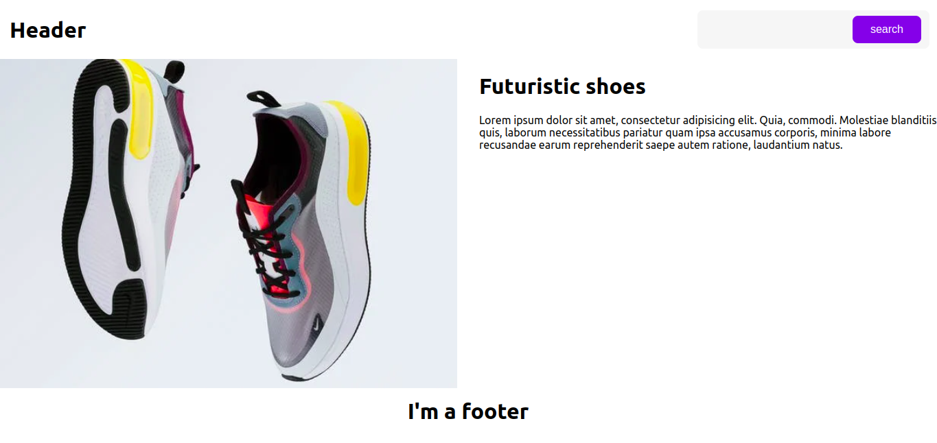
And now you’ve built a micro-frontend with Bit!
Conclusion
In this article, you learned about the concept of a micro frontend and how to assemble a web app from independent components using Bit. If you’d like to learn more about micro frontends, you can check out this YouTube video.
I hope you enjoyed the article, and happy building!
A TIP FROM THE EDITOR: When building your own set of components, take into account the suggestions in our Tips for creating a component library article.