How to build your own React components library
Create your own set of components for React


In the process of developing software, we frequently reuse some code and extract the portions we use in other contexts. React and front-end development are no exceptions. As a result, we occasionally desire to develop React libraries.
Building a component library allows for efficient and consistent development, as well as easy maintenance and updating of your components. This guide will take you through setting up the project, creating the components, building and publishing the library on npm, and using it in other projects. By the end of this guide, you will have a solid understanding of how to build your own React component library.
Getting Started
We will construct a loader component for this example that will be exported from the library.
We need first to prepare our environment. There are only a few ways to build a react library, ranging from tools like Bits, react-starter-library, and GitHub packages, but we will use a starter template called create-react-library, which is straightforward to customize. It supports, among other things, CSS modules, Typescript, Jest, and Babel for transpiling.
Install create-react-library
When you wish to begin the project, you run the command below:
npm install -g create-react-libraryWith npm, the library would be installed globally to build your project folder. Or,
npx create-react-libraryWith npx, the library would be utilized directly (from the source) to construct your project folder rather than being installed worldwide.
Create Project-Folder Library
First of all, we need to figure out the name of our component library. Since we’re creating a loader component, we’ll stick with loader-library as the name of our component library.
Since we’re installing from the source directly, we’d use the npx command:
npx create-react-library spin-loaderThe given command would show a list of prompt questions, including:
- The Name; since we included the name, we’ll just hit enter button.
- Package Description: Describe what the component you’re creating does.
- Author’s Github Handle: your Github handle.
- Gihub repo path: Repository for the library.
- License: Most times, you’d see MIT just hit enter button.
- Package manager: choose between NPM and YARN.
- Custom, typescript, or default templates are all acceptable (which is JavaScript). In this instance, we’ll make use of default.
After completing your replies, the library will build your folder, set up your library’s default files, and install any necessary dependencies. The tree structure is as follows:
    ├── README.md
    ├── dist
    ├── example
    ├── node_modules
    ├── package-lock.json
    ├── package.json
    └── src
Upon installation, the library produces three directories: src, which houses the library’s source code, dist, which houses the production code, and example, which houses programs that use the library we are developing. By doing so, we may alter the library while also seeing how it will look.
Think of the library as being in development in the src directory and in usage in the example directory (which uses the codes in the dist directory).
Run Server
The example directory is the only one that would need a server since that is where we preview the outcome. Since the library is not an application on its own and is only a utility, there is nothing to preview in the src directory.
However, the src/package.json file also contains a start script that monitors the library for changes and automatically generates the library’s production code in dist.
Run the following commands to get going:
cd spin-loader
npm start
// spin-loader
cd example
npm start
N/B: If you’re using Nodejs 17.0.1 and above, you might encounter an error ERR_OSSL_EVP_UNSUPPORTED if you run npm start in the example folder. Credit goes to Yuza, who found the solution on GitHub. There are a few ways to bypass the error; all you have to do is run NODE_OPTIONS=--openssl-legacy-provider before any command:
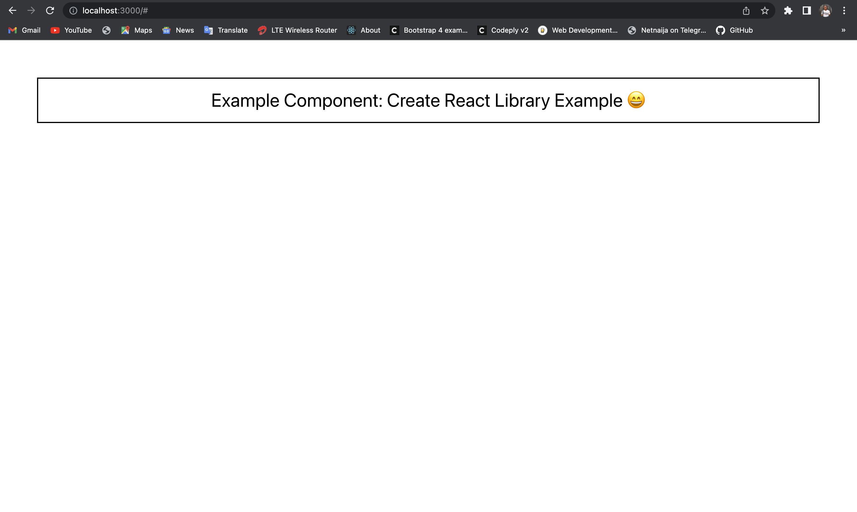
NODE_OPTIONS=--openssl-legacy-provider npm startThere are other methods, but this one seems less stressful. The website is then hosted at localhost:3000:
Create Loader Component
The purpose of our component is to display an animation or a message indicating that content is being loaded. Loaders are commonly used in web and mobile applications to provide feedback to users when data or resources are being fetched from an external source.
There are different loader components, but we will go with the spinner component, which loads when content is fetched.
We’ll start by developing a Spinner.js component.
//Spinner.js
import React from "react";

import styles from "./styles.module.css";

const Spinner = () => <div className={styles.loader}></div>;
export default Spinner;
This code defines a React component named “Spinner.” The component returns a single div element with a class of .loader imported from a styles module. The component is then exported using the export default statement, making it available to be used in other parts of the application. The purpose of this component is to display a spinner animation, typically used to indicate that the application is loading data.
We’ll also create a styles.module.css file to style and animate our spinner component.
//styles.module.css
    /* To center the spinner */
    .pos-center {
      position: fixed;
      top: calc(50% - 40px);
      left: calc(50% - 40px);
    }
    .loader {
      animation: spin 1.5s linear infinite;
      border-radius: 50%;
      width: 75px;
      border: 10px solid #f3f3f3;
      height: 75px;
      border-top: 15px solid #3498db;
    }
    @keyframes spin {
      0% {
        transform: rotate(0deg);
      }
      100% {
        transform: rotate(360deg);
      }
    }
In our index.js, we start by importing the React library and a styles module containing the component’s CSS styles. We then import a component named “Spinner” from a file called “Spinner.js”.
//src/index.js
import React from "react";
import styles from "./styles.module.css";
import Spinner from "./Spinner";

export const Spine = ({}) => {
  return (
    <div className={styles.pos}>
      <Spinner />
    </div>
  );
};
The Spine component serves as a wrapper for the Spinner component, and it applies styles to the div element to position the spinner in a specific way within the application.
Finally, we move to the example folder to test-run our component. We import the Spine component from the loader-library package and the CSS file for the same package. The Spine component is rendered without any prop, meaning that its props’ default values will be used.
//example/src/App.js
import React from "react";
import { Spine } from "spin-loader";
import "spin-loader/dist/index.css";

const App = () => {
  return <Spine />;
};
export default App;
After all that, when we go to the web page, our spinner component seems to work.

Now, we have our component library functioning; what’s next is publishing it on the npm registry to make it public for download.
Session Replay for Developers
Uncover frustrations, understand bugs and fix slowdowns like never before with OpenReplay — an open-source session replay tool for developers. Self-host it in minutes, and have complete control over your customer data. Check our GitHub repo and join the thousands of developers in our community.
Publish Library
We require a method to allow ourselves (or others) to download and install our component library, which is accomplished by publishing it to the NPM registry. Double-check your package before publishing it to NPM after implementing components.
Ensure the name and description fields in the JSON file are configured exactly how you want them. Additionally, confirm that the version is the one you want to start with. Initially, it will be set to 1.0.0, but you might wish to alter it to 0.0.1. You should double-check or, if necessary, fill up the following fields: version, name, description, license, keywords, author, and repository.
Run the following command once more in your terminal:
npm loginYou will be prompted to fill in your NPM username, email, and password, and if you haven’t registered, you’ll be automatically registered.
After completing these procedures, you can publish it via the command line below:
npm publishYou got your component’s name attached to the version after your successful publication.
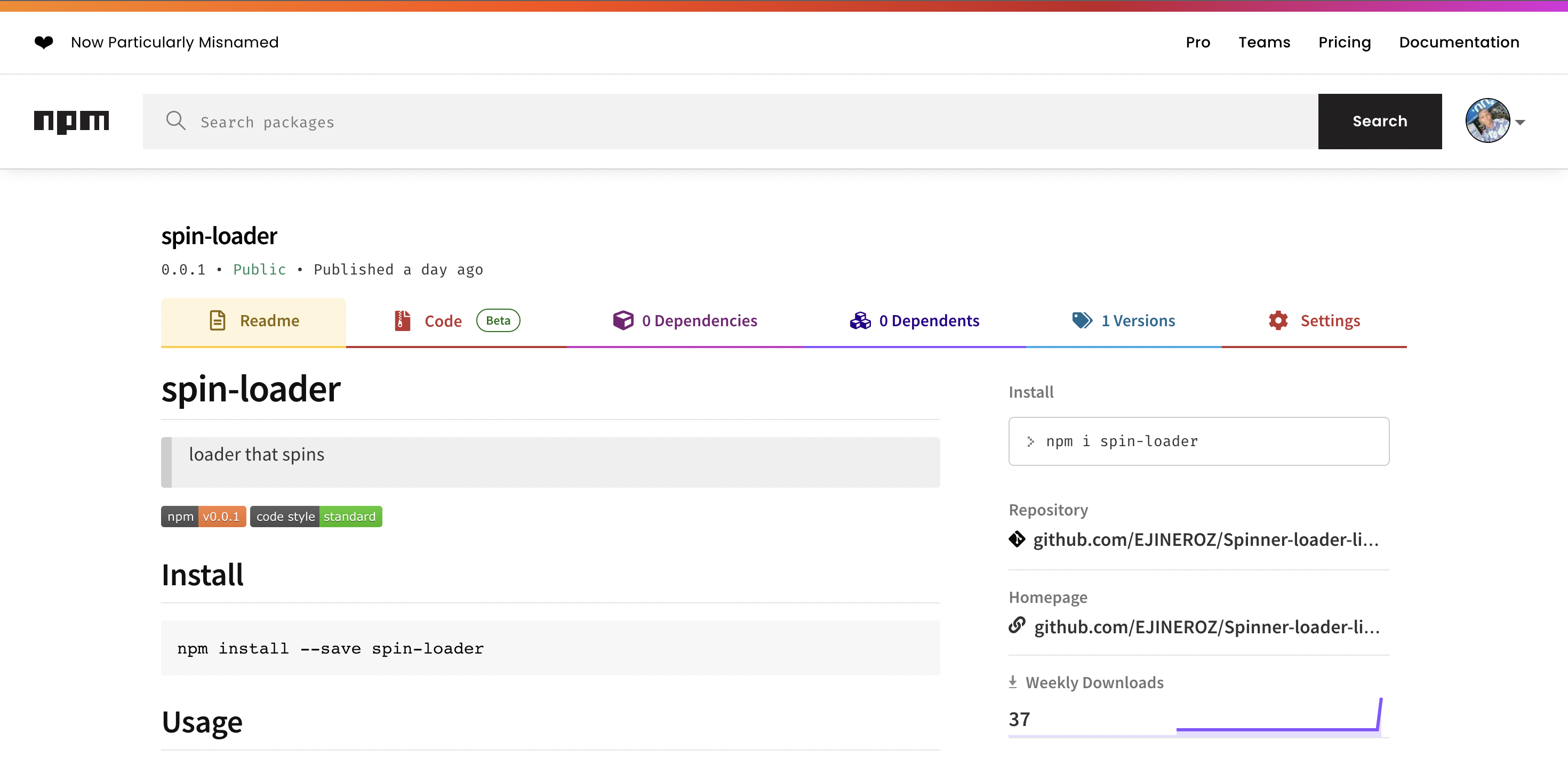
+ spin-loader@0.0.1When we visited the npm website, we could see our library publish live.
Conclusion
Building your own React component library is a valuable investment for any team or individual looking to streamline their development process and maintain consistency in their projects. Following the steps outlined in this article, you can easily create a library of reusable components that can be shared and used across multiple projects. With the power of React and the flexibility of custom components, the sky is the limit for what you can create and accomplish. So why wait? Start building your component library today and see the positive impact it can have on your development workflow!
Resources
Gain Debugging Superpowers
Unleash the power of session replay to reproduce bugs and track user frustrations. Get complete visibility into your frontend with OpenReplay, the most advanced open-source session replay tool for developers.