
How to create a UIKit website: a tutorial for beginners


UIkit is a front-end framework for building quick and effective standard web interfaces for websites, according to the company’s official website. We’ll be using UIKit to create a simple website in this article. But let’s first learn more about UIkit.
It is a group of resources that includes several potent design elements, such as UI components and styles, as well as its elements and attributes. With its robust capabilities, UIkit offers fantastic UI interfaces for websites and online apps. Because of its fantastic features, UIKit is the front-end application framework of choice for developers.
These front-end building blocks are lightweight and easy to configure, making them ideal for creating effective online interfaces. User interface elements display an item’s function and capabilities. Input forms, widgets, and menus are examples of UI components. This article will show how to develop a site using UIKit.
Website creation techniques
With the help of UIKit, developers can quickly and easily create websites using standardized methodologies. Simply put, the ability of an existing project to create complicated logic is one of the key draws of UIKit. The methods used in UIKit now rely on all unique variables that must be added to your HTML element. On our website, UIkit generates properties and variables that are simple to use. We’ll discover the different uses for UIKit characteristics in this article. But before we go into the installation guide, let’s talk about how the color and styling function.
- Color: Choosing the best color scheme for a website might be challenging with UIkit. According to web designers, a website’s style should only contain four colors at most. Too many colors, therefore, detract from the aesthetics and layout of the website. For an appealing look and feel, artists can play with the font to create alluring typos.
- Alignment: A successful website design relies heavily on alignment. The text, layout, buttons, menu bar, banners, header, footer, and other components must be accurately and straightly aligned. With perfect alignment, the website becomes more dynamic and creates a lasting impression.
How do I set up UIKit?
In this section, we’ll be dealing with UIKit Installation. There are several ways of setting up UIKit. And we’ll cover them in this section.
Method 1: Download the UIKit Zipped file Downloading UIKit is very easy all you need to do is click on this link which leads to the official website of UIKit, and it downloads automatically. After downloading the zipped file from UIkit, you must extract it and paste it into your desired workplace folder. You have everything you need to get started in the Zip file, which comprises the compiled CSS and JavaScript files. You might later decide to install and assemble UIkit on your own. The CSS files contain all CSS styles that will be utilized while working with UIKit stiles. At the same time, the JS files contain both the Icon Library JavaScript and the UIkit JavaScript.
Below is the starter template for UIKit.
<!DOCTYPE html>
<html>
    <head>
        <title>UIKit Starter Template</title>
        <meta charset="utf-8">
        <meta name="viewport" content="width=device-width, initial-scale=1">
        <link rel="stylesheet" href="css/uikit.min.css" />
        <script src="js/uikit.min.js"></script>
        <script src="js/uikit-icons.min.js"></script>
    </head>
    <body>
    </body>
</html>
Method 2: Using a CDN You may alternatively initialize UIkit by utilizing a CDN; you have to copy the CDN link and paste it into your HTML file’s topmost head tag. The quickest and easiest approach to using UIKit with a CDN is this:
<!DOCTYPE html>
<html lang="en">

<head>
    <meta charset="UTF-8">
    <meta http-equiv="X-UA-Compatible" content="IE=edge">
    <meta name="viewport" content="width=device-width, initial-scale=1.0">
    <title>CDN Example</title>
    <script src="https://cdnjs.cloudflare.com/ajax/libs/uikit/3.15.11/js/uikit.min.js"
        integrity="sha512-uNdy6/b4kpAKQgC1MqDRW7HzGqmja6jPPfQ0Pv3q4f0r5XpL4cxPlgqgSbFT5pnLFo4BSFZX8Ve/ak0DDN06OA=="
        crossorigin="anonymous" referrerpolicy="no-referrer"></script>
    <link rel="stylesheet" href="https://cdnjs.cloudflare.com/ajax/libs/uikit/3.15.11/css/uikit-core-rtl.min.css"
        integrity="sha512-+6D4TOLdOBhkuufbELpbCiGmD+Y4dzrNbSPGwtgGO2nf7Id3dM0x5R/Cw0bI/13pFUnsRL8pfpmKNWLbAx8fGg=="
        crossorigin="anonymous" referrerpolicy="no-referrer" />
    <link rel="stylesheet" href="https://cdnjs.cloudflare.com/ajax/libs/uikit/3.15.11/css/uikit-core.min.css"
        integrity="sha512-Up68klxaLGLgBXFtu9KAkcM0/b1Vv97wru/VabGokNEwbQN1RBjBtthqDgildf/8YCOKaaLvT5ZfIvVPom5dIw=="
        crossorigin="anonymous" referrerpolicy="no-referrer" />
    <script src="https://cdnjs.cloudflare.com/ajax/libs/uikit/3.15.11/js/uikit-icons.min.js"
        integrity="sha512-Rrh7aqdTz7Q1BPfCdWCK3poag9FNK1HQJMbSdL/eRZwXkbS1EWlY5n2XJ70ZVh1ZLRIJEUoWxATps1cyzpGp/g=="
        crossorigin="anonymous" referrerpolicy="no-referrer"></script>

</head>

</html>
The UIKit CSS, JavaScript, and icon files are all included in the CDN; the same is true of the zipped aspect we discussed. However, we’ll be using the zipped file we mentioned for the sake of this post.
Session Replay for Developers
Uncover frustrations, understand bugs and fix slowdowns like never before with OpenReplay — an open-source session replay tool for developers. Self-host it in minutes, and have complete control over your customer data. Check our GitHub repo and join the thousands of developers in our community.
How do I create a UIKit website?
We’ll be using UIKit to build a website in this section, but it will still be an HTML-compliant website to which you can add your user styles. However, be cautious when handling attributes to prevent too many conflicts in styling. One of the key design elements that developers need to handle carefully is styling conflict. This might result in CSS debugging, which further delays the launch of a website.
Below is the beginning template we’ll use to build our first UIKit website.
<!DOCTYPE html>
<html lang="en">

<head>
    <meta charset="UTF-8">
    <meta http-equiv="X-UA-Compatible" content="IE=edge">
    <meta name="viewport" content="width=device-width, initial-scale=1.0">
    <title>CDN Example</title>
    <script src="https://cdnjs.cloudflare.com/ajax/libs/uikit/3.15.11/js/uikit.min.js"
        integrity="sha512-uNdy6/b4kpAKQgC1MqDRW7HzGqmja6jPPfQ0Pv3q4f0r5XpL4cxPlgqgSbFT5pnLFo4BSFZX8Ve/ak0DDN06OA=="
        crossorigin="anonymous" referrerpolicy="no-referrer"></script>
    <link rel="stylesheet" href="https://cdnjs.cloudflare.com/ajax/libs/uikit/3.15.11/css/uikit-core-rtl.min.css"
        integrity="sha512-+6D4TOLdOBhkuufbELpbCiGmD+Y4dzrNbSPGwtgGO2nf7Id3dM0x5R/Cw0bI/13pFUnsRL8pfpmKNWLbAx8fGg=="
        crossorigin="anonymous" referrerpolicy="no-referrer" />
    <link rel="stylesheet" href="https://cdnjs.cloudflare.com/ajax/libs/uikit/3.15.11/css/uikit-core.min.css"
        integrity="sha512-Up68klxaLGLgBXFtu9KAkcM0/b1Vv97wru/VabGokNEwbQN1RBjBtthqDgildf/8YCOKaaLvT5ZfIvVPom5dIw=="
        crossorigin="anonymous" referrerpolicy="no-referrer" />
    <script src="https://cdnjs.cloudflare.com/ajax/libs/uikit/3.15.11/js/uikit-icons.min.js"
        integrity="sha512-Rrh7aqdTz7Q1BPfCdWCK3poag9FNK1HQJMbSdL/eRZwXkbS1EWlY5n2XJ70ZVh1ZLRIJEUoWxATps1cyzpGp/g=="
        crossorigin="anonymous" referrerpolicy="no-referrer"></script>

</head>

<!-- CoDe here -->

</html>
Let’s style some content with some typical CSS code. Please be aware that UIKit projects can include normal CSS styling. There are no restrictions on doing this, but you must avoid conflicts in styling.
<style>
body {
    max-width: 90%;
    margin: auto;
    background-color: rgb(227, 227, 227);
}
footer {
    padding: 10px;
    background-color: cornflowerblue;
    padding-top: 20px;
}
</style>
Step 1: The Header and Nav
In this section, we’ll include a header and the UIkit navigation. Since it is an existing component that we will be using, adding the UIKit navigation is far too simple. I’ll be going over the UIKit attributes for you after the code snippet for the UIKit navigation is provided below.
To apply this component, use the following classes.
| CLASS | DESCRIPTION |
|---|---|
.uk-nav | For the Nav component to be defined, add this class to an ul> element. Use a> components as list navigation items. |
.uk-active | To apply an active state to a menu item, add this class to a list item. |
<header>
    <nav class="uk-navbar-container" uk-navbar style="background-color: cornflowerblue;">
        <div class="uk-navbar-right">

            <ul class="uk-navbar-nav">
                <li class="uk-active"><a href="#" style="color: white">Home</a></li>
                <li>
                    <a href="#" style="color: white">Account</a>
                    <div class="uk-navbar-dropdown">
                        <ul class="uk-nav uk-navbar-dropdown-nav">
                            <li class="uk-active"><a href="#">Login</a></li>
                            <li><a href="#">Sign Up</a></li>
                            <li><a href="#">Report</a></li>
                        </ul>
                    </div>
                </li>
                <li><a href="#" style="color: white">Item</a></li>
            </ul>

        </div>
    </nav>
</header>
Output:

A UIKit initializer is present in the global nav element with the class name class=” uk-navbar-container” in the code above. The directions of the nav element are set up by the direct div element, which has an attribute of class= “uk-navbar-right”. By altering the class name to class= “uk-navbar-left,” you may also alter it. Simply put, this is positioning, and this is simple to use. A dropdown list that can be utilized in our navigation can be found in the following element, `ul class= “uk-navbar-nav```.
It’s not necessary to be an expert in every aspect of UIKit. You can choose and apply the code that is currently available. This is why developers prefer UIKit, and you should start utilizing UIKit. Click here to find out more about UIKit.
Step2: Adding a slideshow
This part will incorporate a potent slideshow into our demo website. The slideshow has forward and backward arrows on the left and right, respectively. The slideshow we’ll use has a draggable feature that allows users to move the slideshow left or right to access our web page’s previous and subsequent images. This is crucial because our websites’ slideshows demonstrate how responsible a website might be. A slideshow won’t be created from scratch. Constructing a slideshow from scratch can take a long time and a lot of reasoning. An excerpt of the slideshow code from the official UIKit website is provided below.
<div class="uk-position-relative uk-visible-toggle uk-light" tabindex="-1" uk-slideshow style="height: 500px;">
    <ul class="uk-slideshow-items">
        <li style="height: 500px;">
            <img src="slides/slide5.jpg" alt="" uk-cover>
        </li>
        <li style="height: 500px;">
            <img src="/slides/slide2.jpg" alt="" uk-cover>
        </li>
        <li style="height: 500px;">
            <img src="/slides/slide6.jpg" alt="" uk-cover>
        </li>
    </ul>
    <a class="uk-position-center-left uk-position-small uk-hidden-hover" href="#" uk-slidenav-previous
        uk-slideshow-item="previous"></a>
    <a class="uk-position-center-right uk-position-small uk-hidden-hover" href="#" uk-slidenav-next
        uk-slideshow-item="next"></a>
</div>
Output:

The code above was taken from the UIKit website. As you can see, the code above is concise and easy to comprehend without encountering a ton of JavaScript. This is pretty good, and developers almost always use UIKit. Please read up on UIKit slideshows to learn more about how to use them.
Step 3: Centered text with color.
UIkit supports alignment and colors. The code is simple to use and self-explanatory.
<!-- Centered Text -->
<h1 class="uk-text-primary uk-text-center">This is awesome</h1>
Output:

The combined class names in the code above are uk-text-primary and uk-text-center. Sky blue is the primary color offered by UIKit Developers and appears in the UIKit primary. Read more about text formatting and color in UIKit.
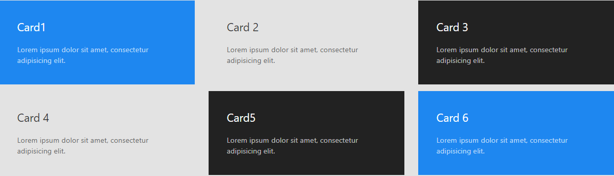
Step 4: Adding Cards
We’ll be adding cards to our website in this section. We won’t need to create Cards from scratch because we can download one from the UIKit website. The card component consists of the card, the card body, and a possible card title. Usually, cards are arranged using the grid columns of the Grid component.
.uk-card | For the Card component to be defined, add this class to a div element. |
|---|---|
.uk-card-body | To add padding between the card and its content, add this class to the card. |
.uk-card-title | To define the title of a card, add this class to a heading. |
Sample Text
<div class="uk-card uk-card-body">
    <h3 class="uk-card-title"></h3>
</div>
The code we’ll be using for our card is listed below. Please be aware that the card is responsive. Because of this, UIKit is among the greatest, and you ought to start utilizing it.
<div class="uk-child-width-1-3@m uk-grid-small uk-grid-match" uk-grid>
    <div>
        <div class="uk-card uk-card-primary uk-card-body">
            <h3 class="uk-card-title">Card1</h3>
            <p>Lorem ipsum dolor sit amet, consectetur adipisicing elit.</p>
        </div>
    </div>
    <div>
        <div class="uk-card uk-card-warning uk-card-body">
            <h3 class="uk-card-title">Card 2</h3>
            <p>Lorem ipsum dolor sit amet, consectetur adipisicing elit.</p>
        </div>
    </div>
    <div>
        <div class="uk-card uk-card-secondary uk-card-body">
            <h3 class="uk-card-title">Card 3</h3>
            <p>Lorem ipsum dolor sit amet, consectetur adipisicing elit.</p>
        </div>
    </div>
</div>

<div class="uk-child-width-1-3@m uk-grid-small uk-grid-match" uk-grid>
    <div>
        <div class="uk-card uk-card-warning uk-card-body">
            <h3 class="uk-card-title">Card 4</h3>
            <p>Lorem ipsum dolor sit amet, consectetur adipisicing elit.</p>
        </div>
    </div>
    <div>
        <div class="uk-card uk-card-secondary uk-card-body">
            <h3 class="uk-card-title">Card5</h3>
            <p>Lorem ipsum dolor sit amet, consectetur adipisicing elit.</p>
        </div>
    </div>
    <div>
        <div class="uk-card uk-card-primary uk-card-body">
            <h3 class="uk-card-title">Card 6</h3>
            <p>Lorem ipsum dolor sit amet, consectetur adipisicing elit.</p>
        </div>
    </div>
</div>
Output:
Utilizing this card is easy; you can learn more about UIKit’s Card by clicking here
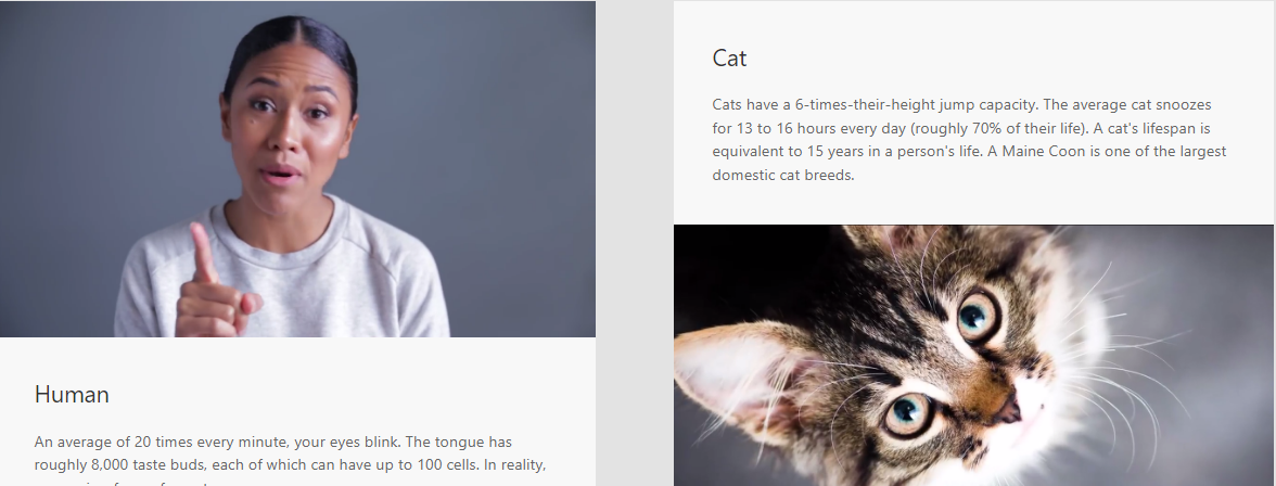
Step 5: Card with Media
Cards with media will be used in this part; this is still a UIKit feature, and we are not implementing it independently. Even though you can still construct this from scratch without UIKit, it can take much longer than usual. We’ll be using UIKit Card with Media to achieve this goal of speed and quick responsiveness.
To display an image inside a card without any gaps, one of the following classes needs to be added to the div> enclosing the img> element. Keep in mind that the source order needs to be adjusted accordingly.
| CLASS | DESCRIPTION |
|---|---|
.uk-card-media-top | The media element is top-aligned, according to this class. |
.uk-card-media-bottom | The media element is bottom-aligned, according to its class. |
.uk-card-media-left | The media element is left-aligned, according to its class. |
.uk-card-media-right | This class indicates that the media element is aligned to the right. |
Sample code.
<div class="uk-card uk-card-default">
    <div class="uk-card-media-top">
        <img src="" width="" height="" alt="">
    </div>
    <div class="uk-card-body"></div>
</div>
Below is a code card with the media we’ll use for our web pages.
<div class="uk-child-width-1-2@m" uk-grid>
    <div>
        <div class="uk-card uk-card-default">
            <div class="uk-card-media-top">
                <img src="/slides/slide3.png" width="1800" height="1200" alt="">
            </div>
            <div class="uk-card-body">
                <h3 class="uk-card-title">Human</h3>
                <p>An average of 20 times every minute, your eyes blink. The tongue has roughly 8,000 taste buds,
                    each of which can have up to 100 cells. In reality, earwax is a form of sweat.</p>
            </div>
        </div>
    </div>
    <div>
        <div class="uk-card uk-card-default">
            <div class="uk-card-body">
                <h3 class="uk-card-title">Cat</h3>
                <p>Cats have a 6-times-their-height jump capacity. The average cat snoozes for 13 to 16 hours every
                    day (roughly 70% of their life). A cat's lifespan is equivalent to 15 years in a person's life.
                    A Maine Coon is one of the largest domestic cat breeds.</p>
            </div>
            <div class="uk-card-media-bottom">
                <img src="/slides//slide4.png" width="1800" height="1200" alt="">
            </div>
        </div>
    </div>
</div>
Output:
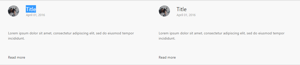
Step 6: Cards with Header and Footer
A card can also be split into a header and a footer, placed around the main body. Assign the class “.uk-card-header” or “.uk-card-footer” to a “div>” element within the card. Sample text
<div class="uk-card">
    <div class="uk-card-header">
        <h3 class="uk-card-title"></h3>
    </div>
    <div class="uk-card-body"></div>
    <div class="uk-card-footer"></div>
</div>
The code for our card with a header and footer may be found below.
<div class="uk-flex">
    <div class="uk-card uk-card-default uk-width-1-2@m">
        <div class="uk-card-header">
            <div class="uk-grid-small uk-flex-middle" uk-grid>
                <div class="uk-width-auto">
                    <img class="uk-border-circle" width="50" style="height: 50px !important;"
                        src="/slides/slide2.jpg" alt="Avatar">
                </div>
                <div class="uk-width-expand">
                    <h3 class="uk-card-title uk-margin-remove-bottom">Title</h3>
                    <p class="uk-text-meta uk-margin-remove-top"><time datetime="2016-04-01T19:00">April 01,
                            2016</time></p>
                </div>
            </div>
        </div>
        <div class="uk-card-body">
            <p>Lorem ipsum dolor sit amet, consectetur adipiscing elit, sed do eiusmod tempor incididunt.</p>
        </div>
        <div class="uk-card-footer">
            <a href="#" class="uk-button uk-button-text">Read more</a>
        </div>
    </div>
</div>
Output:
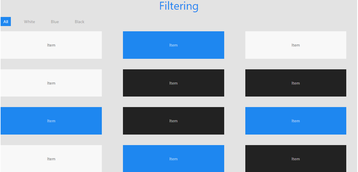
Step 7: Filtering / Sorting
Use the data to sort or filter items in any layout. Although they are usually used together, the Grid and Filter components are not exclusive. The Grid component, in particular the masonry grid, is used frequently. Any layout can be filtered or sorted, regardless of how the components are set up. The objects fade and flow naturally between the many filtering and sorting options. A container element with the property uk-filter=” target: SELECTOR” must have this component applied to it. Make a list of the layout elements and filter controls you wish to apply to this container. By utilizing the target: SELECTOR option, you can select the element that contains the layout elements.
Sample code skeleton:
<div uk-filter="target: .js-filter">
    <!-- Filter controls -->
    <ul>
        <li><a href="#"></a></li>
    </ul>

    <!-- Layout items -->
    <ul class="js-filter">
        <li></li>
    </ul>
</div>
The metadata for each layout item, such as the category to which it belongs, must then be defined. To do this, use any HTML class or attribute.
Add the uk-filter-control attribute to apply a filter control. The filter: SELECTOR option can be used to specify the metadata that needs to be filtered. Any CSS selector, such as an HTML class or an attribute you provide for the layout components, may be used as the selector.
Here is a sample of the code we will use for our website, with the sole aim of filtering colors, from the official UIkit page.
<h1 class="uk-text-primary uk-text-center">Filtering</h1>
<div uk-filter="target: .js-filter">
    <ul class="uk-subnav uk-subnav-pill">
        <li class="uk-active" uk-filter-control><a href="#">All</a></li>
        <li uk-filter-control="[data-color='white']"><a href="#">White</a></li>
        <li uk-filter-control="[data-color='blue']"><a href="#">Blue</a></li>
        <li uk-filter-control="[data-color='black']"><a href="#">Black</a></li>
    </ul>
    <ul class="js-filter uk-child-width-1-2 uk-child-width-1-3@m uk-text-center" uk-grid>
        <li data-color="white">
            <div class="uk-card uk-card-default uk-card-body">Item</div>
        </li>
        <li data-color="blue">
            <div class="uk-card uk-card-primary uk-card-body">Item</div>
        </li>
        <li data-color="white">
            <div class="uk-card uk-card-default uk-card-body">Item</div>
        </li>
        <li data-color="white">
            <div class="uk-card uk-card-default uk-card-body">Item</div>
        </li>
        <li data-color="black">
            <div class="uk-card uk-card-secondary uk-card-body">Item</div>
        </li>
        <li data-color="black">
            <div class="uk-card uk-card-secondary uk-card-body">Item</div>
        </li>
        <li data-color="blue">
            <div class="uk-card uk-card-primary uk-card-body">Item</div>
        </li>
        <li data-color="black">
            <div class="uk-card uk-card-secondary uk-card-body">Item</div>
        </li>
        <li data-color="blue">
            <div class="uk-card uk-card-primary uk-card-body">Item</div>
        </li>
        <li data-color="white">
            <div class="uk-card uk-card-default uk-card-body">Item</div>
        </li>
        <li data-color="blue">
            <div class="uk-card uk-card-primary uk-card-body">Item</div>
        </li>
        <li data-color="black">
            <div class="uk-card uk-card-secondary uk-card-body">Item</div>
        </li>
    </ul>
</div>
Output:
Step 8: Add “Scroll To Top”
We’ll be using the UIkit Scroll To Top in this section. It’s incredibly simple to use this on our website; there’s no complicated code needed.
<!-- Scroll to top -->
<h1 class="uk-text-center">
    Want to scroll to the top?
</h1>
<p class="uk-text-center">
    <a href="#" uk-totop uk-scroll class="uk-text-center">Click here</a>
</p>
Note that the scroll behavior is set to smooth my default
We may scroll to the top using the code above. There is much more to say about the UIKit Scroll; please click here to continue reading.
Step 9: Add Footer and Icons
We’ll be creating a footer for our website in this area. Icons and flex styles will both be present in the footer section. A growing number of elegant outline icons are available in UIkit’s extensive library and distinctive SVG icon system. SVGs are introduced into the website with the help of this component, enabling them to take on color and be CSS-styled.
<footer class="footer uk-flex uk-flex-center">
    <p style="color: white">This site was made with love <a href="" uk-icon="heart"></a> to teach more about UIKit
    </p>
    <span style="color: white" class="uk-margin-small-right" uk-icon="facebook"></span>
    <span style="color: white" class="uk-margin-small-right" uk-icon="twitter"></span>
    <span style="color: white" class="uk-margin-small-right" uk-icon="instagram"></span>
    <span style="color: white" class="uk-margin-small-right" uk-icon="google"></span>
    <span style="color: white" class="uk-margin-small-right" uk-icon="linkedin"></span>
</footer>
Output:

Conclusion
We started by learning about UIKit and the advantages of applying it to our web pages. I hope you had a good time finishing this tutorial. We constructed an example project in this article to examine the fundamental ideas of UIkit, and we discovered how to set it up. You can customize this sample to your liking if you want to create a portfolio website for yourself, or you can try putting what you’ve learned into action by creating other pages.
The completed code is available in our GitHub Repository. To access the source code for the completed project, click here.
A TIP FROM THE EDITOR: Read about Vuikit, a Vue UIKit-based toolkit at our Vue Component Libraries article.
Gain Debugging Superpowers
Unleash the power of session replay to reproduce bugs and track user frustrations. Get complete visibility into your frontend with OpenReplay, the most advanced open-source session replay tool for developers.
