
How to Customize Checkboxes with CSS


Checkboxes are a common element of web design that allows users to select from a list of options. While they may seem simple, much goes into making checkboxes visually appealing and accessible to all users. This article explores the importance of customizing and improving the accessibility of checkboxes, the basics of building custom checkboxes, and advanced techniques for further customization.
Customizing the appearance of checkboxes can significantly improve the user experience of your website or application. It allows you to create a cohesive, visually appealing design that aligns with your brand. However, it is equally important to consider the accessibility of your checkboxes, as all users, regardless of their ability, should be able to use and understand them. You can customize the look of your checkboxes and produce a more aesthetically pleasing and seamless user experience with a basic understanding of CSS. And beyond aesthetics, make it inclusive and accessible for types of web users.
This article will go through the fundamentals of customizing checkboxes and making them more accessible. We first cover the necessary knowledge needed to build a custom checkbox; we’ll discuss styling, the size and shape of the checkboxes, and some pointers for making your checkboxes more web inclusive and accessible. By the end of this tutorial, you’ll have all the skills and knowledge you need to build customized checkboxes with CSS properties and improve their web accessibility to build a more inclusive website. So, let’s get started!
Basics of building a custom checkbox
Before you can customize your checkboxes, it’s important to understand how they’re built. Checkboxes are typically created using the HTML <input> element with a type attribute set to "checkbox". This element can be styled using CSS properties, just like any other HTML element. Some common CSS properties that can be used to customize checkboxes include:
background-color: sets the background color of the checkbox.border: sets the border properties of the checkbox, such as thickness and color.border-radius: sets the rounded corners of the checkbox.box-shadow: adds a shadow to the checkbox.widthandheight: sets the checkbox size.
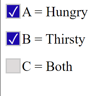
The HTML element for a checkbox is the input element with a type attribute of checkbox. For example,
<label class="checkbox">
  A = Hungry
  <input type="checkbox" checked="checked" />
  <span class="checkmark"></span>
</label>

<label class="checkbox">
  B = Thirsty
  <input type="checkbox" />
  <span class="checkmark"></span>
</label>

<label class="checkbox">
  C = Both
  <input type="checkbox" />
  <span class="checkmark"></span>
</label>
The <label> element with class “checkbox” is used as a container for the checkbox and its text; it also allows users to click on the text to toggle the checkbox.
The <input> element is of type “checkbox,” and it has an attribute checked=“checked,” which means that the checkbox is selected by default when the page loads.
The <span> element with class “checkmark” is used to create the visual of a checkmark on the checkbox, this is a common way to style the checkbox, and it’s the default appearance of a checkbox.
In this way, the checkbox is created with a label, which makes it easy to understand the purpose of the checkbox by the user. The checkmark is added by using a span element, and with the help of CSS, it is displayed when the checkbox is selected. It is possible that the CSS styles the checkmark to be invisible by default and then uses the : checked pseudo-class to make it visible when the checkbox is selected. This will be shown in later parts of this article.
Output
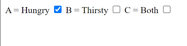 This is what the default checkbox looks like before customizing with CSS.
Styling with CSS
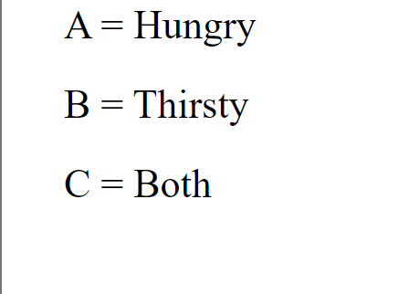
By default, checkboxes are small and square. However, you can change their size and shape using CSS properties. The width and height properties can be used to set the checkbox size. One way to customize the appearance of your checkboxes is to change their size and shape. You can use the width and height properties to set the checkbox size and the border-radius property to round the corners.
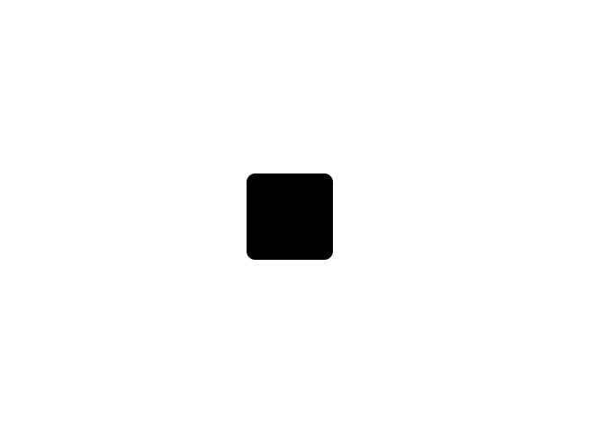
The first step to customizing checkboxes is to hide/get rid of the browser’s default checkbox style, and to do this, Set the values for height and width to zero 0, as this automatically hides the default checkbox.
.checkbox input {
  height: 0;
  width: 0;
}
Now we have the output,
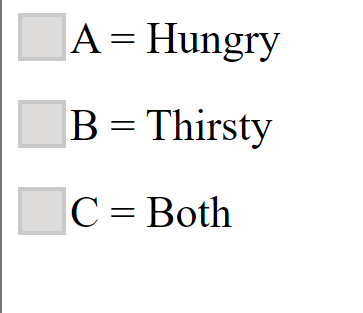
Secondly, style the checkbox container, which is saved under the class .checkbox.
.checkbox {
  display: block;
  position: relative;
  padding-left: 26px;
  margin-bottom: 18px;
  font-size: 22px;
  user-select: none;
}
This sets the checkbox container’s display, position, padding, margin, and font size. It also uses the user-select property to disable text selection on the checkbox.
Now let’s customize the checkbox
.checkmark {
  position: absolute;
  top: 0;
  left: 0;
  height: 20px;
  width: 20px;
  border: 2px solid #c9c9c9;
  background-color: #dedbdb;
}
This sets the position, size, and background color of the checkmark element, sets the position to absolute, and its top and left are set to zero so it aligns with the top left corner of the checkbox.
Output
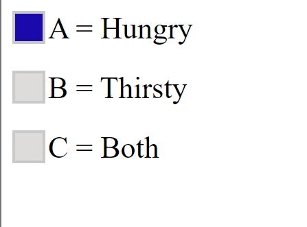
Setting background colors
You can customize the styles of your checkboxes to fit the design of your website, including changing the visual properties. The possibilities are endless!
Below is how to set the background color of a checkbox.
.checkbox:hover input ~ .checkmark {
  background-color: #c095c0;
}
.checkbox input:checked ~ .checkmark {
  background-color: #1c09ac;
}
Output
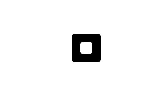
Customizing the Checkmark for the Checkbox
The :after pseudo-class is used to target the added content after the checkmark element.
.checkbox .checkmark:after {
  top: -5px;
  width: 5px;
  height: 10px;
  left: 2px;
  color: white;
}
To make the checkmark visible when checked,
.checkbox input:checked ~ .checkmark:after {
 display: block;
}

//To hide the checkmark when not checked//

.checkmark:after {
 content:'✓';
 position: absolute;
 display: none;
}***content:'✓';: this sets the content of the checkmark to be the Unicode character ”✓” (checkmark symbol)
Output
Making checkboxes more web inclusive and accessible
There are several ways to make checkboxes more accessible, including using semantic HTML and ARIA (Accessible Rich Internet Applications) attributes, providing clear and descriptive labels, and ensuring proper keyboard accessibility. By following these best practices, you can create checkboxes that are visually appealing and usable by all users.
In addition to styling checkboxes, it is important to consider the accessibility of your design. There are several ways to make checkboxes more accessible to all users, including:
- Using semantic HTML and ARIA attributes: Semantic HTML refers to using HTML elements to describe the meaning and structure of the content accurately. This can include using
labelelements to describe checkboxes and ARIA attributes such asaria-labelandaria-describedbyto provide additional context for screen reader users. - Providing clear and descriptive labels: It is essential to provide clear and descriptive labels for checkboxes so all users can understand their purpose. Avoid using abbreviations or jargon; consider providing additional context or instructions if necessary. -
- Ensuring proper keyboard accessibility: It is essential to ensure that checkboxes can be used with a keyboard, as some users may rely on this input method. This includes allowing users to tab to the checkbox and use the space bar to select it and providing a clear visual indication of focus.
Session Replay for Developers
Uncover frustrations, understand bugs and fix slowdowns like never before with OpenReplay — an open-source session replay tool for developers. Self-host it in minutes, and have complete control over your customer data. Check our GitHub repo and join the thousands of developers in our community.
Advanced customization techniques
This section will delve deeper into the techniques for animating checkboxes using CSS transitions and animations. We will cover different methods for creating smooth and seamless animations and explore various properties and values that can be used to achieve the desired effect. By the end of this section, you will have a solid understanding of how to use CSS transitions and animations to create dynamic and engaging checkboxes.
First, Simple HTML
<input type="checkbox" id="checkbox" />
    <label for="checkbox">
      <div id="check_mark"></div>
    </label>
Let’s style a custom checkbox and define its appearance, behavior, and animation when hovered and selected.
First, we hide the default properties of the checkbox element in the browser by setting its display property to none.
* {
  outline: none;
}
The label element is used to create the custom checkbox. The styles define the checkbox’s position, size, background color, border radius, cursor, and transition effects.
#checkbox {
display: none;
}
label {
position: absolute;
top: 20%;
width: 40px;
height: 40px;
right: 0;
left: 0;
margin: 0 auto;
background-color: black;
border-radius: 10%;
border: solid 4px;
transition: 0.3s ease background-color, 0.5s ease transform,
  0.3s ease box-shadow;
overflow: hidden;
z-index: 1;
}
The overflow property is used to control what happens when the contents of the switch overflow their container. z-index: 1 sets the stack order of the label to 1, meaning it will be positioned above other elements with a lower stack order.
Result
Now, let’s style the new default checkbox (i.e., when it is not hovered over), and we do this by linking an element using the pseudo-class before.
label:before {
  content: "";
  position: absolute;
  top: 50%;
  right: 0;
  left: 0;
  width: 35px;
  height: 35px;
  margin: 0 auto;
  background-color: white;
  transform: translateY(-50%);
  border-radius: 20%;
  transition: 0.3s ease width, 0.3s ease height;
}
Result

To define a style that applies to the checkbox when it is hovered over, we simply link the element, using the pseudo-class label:hover:before as shown below
label:hover:before {
  width: 20px;
  height: 20px;
  background-color: white;
}
The styles defined in this block will be applied to the element when the user hovers over it.
Result
Now let’s style the checkmark symbol by specifying two elements, :before and :after, to be used in creating the checkmark.
.checkmark {
  position: absolute;
  top: -1px;
  right: 0;
  left: 0;
  width: 30px;
  height: 30px;
  margin: 0 auto;
  margin-left: 2px;
  transform: rotateZ(-40deg);
}
Using the :before and :after pseudo-elements, combined with the positioning, size, and transformation properties, creates a visually appealing checkmark symbol that can be used on websites or applications.
.checkmark:before,
.checkmark:after {
  content: "";
  position: absolute;
  background-color: #fff;
  border-radius: 2px;
  opacity: 0;
  transition: 0.2s ease transform, 0.2s ease;
  transition-delay: 5s opacity;
}
.checkmark:before {
  left: 0;
  bottom: 0;
  width: 8px;
  height: 20px;
  box-shadow: -2px 0 5px rgba(0, 0, 0.23);
  transform: translateY(-68px);
}
.checkmark:after {
  left: 0;
  bottom: 0;
  width: 100%;
  height: 10px;
  box-shadow: 0 3px 5px rgba(0, 0, 0.23);
  transform: translateX(78px);
}
The transition effect and transition-delay properties add a smooth animation to the appearance of the checkmark, making it more visually appealing.
The transition is used to specify the transition effect applied to an element when its state changes. “transition: 0.2s ease transform, 0.2s ease;” specifies that when a change occurs, the transition effect will take 0.2 seconds to complete, with an easing effect applied to both the transform property and itself.
The transition-delay property, with the value “5s,” sets a 5-second delay before the transition effect begins. So, the transition effect will start 5 seconds after the state change and take 0.2 seconds to complete.
Finally, we add styles for when the checkbox is checked and before it is checked.
#checkbox:checked + label {
  background-color: #0774d4;
  box-shadow: 12px 12px 16px 0 rgba(0, 0, 0.25);
}
#checkbox:checked + label:before {
  width: 0;
  height: 0;
}
#checkbox:checked + label .checkmark:before,
#checkbox:checked + label .checkmark:after {
  transform: translate(0);
  opacity: 1;
}
Result
Conclusion
Customizing checkboxes with CSS properties can significantly improve the user experience of a website or application by creating a cohesive, visually appealing design. However, it’s essential to also consider the accessibility of checkboxes, as all users, regardless of their ability, should be able to use and understand them. This article has covered the basics of building a custom checkbox, including styling, changing the size and shape of checkboxes, and making checkboxes more web inclusive and accessible. Additionally, advanced techniques such as animating checkboxes with CSS transitions and animations have been discussed. By following the key points and resources for further learning in this article, you will have all the skills and knowledge you need to build customized checkboxes with CSS properties and improve their web accessibility, building a more inclusive website.
Gain Debugging Superpowers
Unleash the power of session replay to reproduce bugs and track user frustrations. Get complete visibility into your frontend with OpenReplay, the most advanced open-source session replay tool for developers.
