HTML5 introduced several input types that spice up the user experience and provide an improved validation capability. These input types go beyond the basics that have been present in web forms for years. This version of HTML has several new features, elements, and APIs that greatly boost the capabilities of web applications, and this article will show you a few components you may be missing.

Discover how at OpenReplay.com.
The most significant progress in HTML5 is the emergence of new form input types. Previously, the majority of form fields were limited to simple input types like text, password, email, and checkbox, which often needed substantial JavaScript or server-side scripting to validate or process users’ inputs. However, HTML5 provides handy functionalities and validation for these cases, enabling faster form development and thus enhancing user experience.
These new input types are intended to better handle numerous data formats and user interactions. For example, instead of using plain text input for dates and relying on JavaScript to validate format, browsers can use a date input type with an inbuilt date picker. Similarly, it includes inputs for ranges, colors, or time with built-in validation so that data entered by users conforms to the expected format.
Overview of Commonly Used Input Types
HTML5 has many input types, but several developers restrict themselves to just a few simple ones without realizing that some powerful alternatives could improve user experience and speed up the validation process. But before we look into these unknown input types, let’s go through some of the most widely used ones, which form the foundation of the majority of web forms.
Some Widely Used Input Types
Most developers concentrate on only a few well-known input types in designing web forms. These inputs serve as the primary components of web forms for capturing basic data from users’ end. The following are some of the frequently employed input types:
text: The default input type used for single-line text input. It is versatile and suitable for a wide range of text-based inputs.
<input type="text" name="name">password: Used for password fields, this input type hides the entered text to protect sensitive information.
<input type="password" name="password">email: Designed for email addresses, this input type includes basic validation to ensure the input conforms to the standard email format.
<input type="email" name="email">number: Allows only numeric input, with optional attributes for defining minimum and maximum values.
<input type="number" name="age">checkbox: Provides a single checkbox that can be checked or unchecked.
<input type="checkbox" name="subscribe">radio: Allows the selection of one option from a group of choices.
<label>Gender:</label>
<input type="radio" name="gender" value="male" />
<label for="male">Male</label>
<input type="radio" name="gender" value="female" />
<label for="female">Female</label>submit: A button for submitting the form data to the server.
<input type="submit" value="Submit">These input types form the foundation of most web forms, providing essential functionality for user interaction.
Transition to Lesser-Known Input Types
Although indispensable, HTML5 has introduced newer and lesser-known input types that bring improved functionality to user experience in addition to the commonly used ones. This means that it features other input types and will validate data automatically to enable developers to create forms that are not only stronger but also one that users can interact with easily.
By familiarizing yourself with these lesser-known input types, you can make your website forms more user-friendly and efficient and give users a more personalized experience.
HTML5 Input Types You Might Not Be Using
In the next part of our discussion, we will discuss some of these scarcely used data entry selections, showing what they can do, giving out code samples, and talking about various fields where they are applicable.
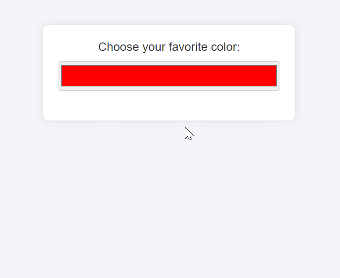
Input Type: color
The color input type enables the selection of a color through a color picker interface. This is important in programs where individuals have to opt for colors, such as design tools or customization options for user interfaces. The color input ensures that people can select their preferred colors more quickly and accurately without necessarily keying in color codes on their own.
Here is a sample demonstrating how to use the color input type within a form.
<body>
  <form>
    <label for="favcolor">Choose your favorite color:</label>
    <input type="color" class="favcolor" name="favcolor" value="#ff0000" />
  </form>
</body>
The input element with type="color" displays a color picker while the value attribute sets a default color (in this case, red).
Use Cases:
- Design Tools: The
colorinput type in web design and graphic design applications enables users to choose colors for text, backgrounds, and borders. This can be quite helpful in creative applications such as web page builders, online image editors, and many more designed for creativity. - Custom Color Selection: Websites and apps that provide customization choices, such as modifying user profiles or themes, can use the
colorinput type so that users can choose colors suitable for their tastes. Allowing for more personalized experiences enhances user engagement and satisfaction.
Once you incorporate the color input type in your Web forms, you offer an easy-to-use and effective method for selecting colors, enabling users to improve not just the user experience but also the performance of your application.
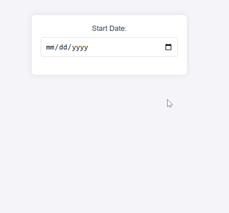
Input Type: date
The date input type in HTML5 allows users to select dates using a calendar-like interface. The date picker displayed in this input type assists users in choosing a date from an organized calendar, which now makes it easier for them to enter dates accurately and monitor their format. They are especially beneficial where precise date entries are required, like booking forms and event scheduling.
Here is a sample demonstrating how to use the date input type within a form.
<body>
  <form>
    <label for="startdate">Start Date:</label>
    <input type="date" id="startdate" name="startdate" />
  </form>
</body>
The input element with type="date" displays a date picker.
Use Cases:
Booking Forms: When a user is booking a flight, reserving a room at a hotel, or scheduling an appointment, they can easily pick out their favorite dates with the date input type. Thus, the date input type lowers errors and increases user-friendliness, especially in hotel bookings, flight reservation systems, and rental services.
- Event Scheduling: Event scheduling is important; therefore, sites must have event management software such as those for planning or other types of meetings. Websites also need to provide visitors with an easy way of inputting dates for scheduling meetings, organizers may use this information for meetings or calendar tools over the Internet.
Using the date input type ensures that users can provide data in the correct format on time, enhancing the look and feel of your application by adding interactivity and good aesthetics.
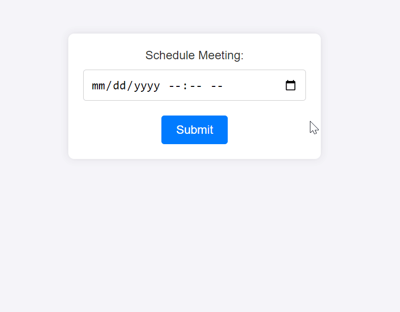
Input Type: datetime-local
The datetime-local input type lets you choose a date and time using one button or dropdown list on the webpage form. This input type ensures that the date and time are captured in a standardized format, making it ideal for applications that require precise scheduling. Additionally, the datetime-local input feature will help you better plan for your appointments, and it becomes even more useful when one has to be specific about when an event is happening.
Here is an example demonstrating how to use the datetime-local input type within a form.
<body>
  <form>
    <label for="meeting">Schedule Meeting:</label>
    <input type="datetime-local" id="meeting" name="meeting" />
  </form>
</body>
The input element with type="datetime-local" displays a combined date and time picker.
Use Cases:
-
Appointment Setting: For applications that handle the scheduling of appointments, the
datetime-localinput type allows users to select the exact date and time for their appointments. This is particularly useful in medical scheduling systems, service bookings, and personal appointment managers. -
Event Planning: Websites that manage events, meetings, or conferences can use the
datetime-localinput type to let users specify both the start date and time of events. This is useful in event management systems, online calendars, and scheduling applications.
Integrating the datetime-local input type into your web forms provides a convenient and accurate way for users to enter date and time information. This enhances the functionality and user experience of your application, making it easier to manage time-sensitive events and appointments.
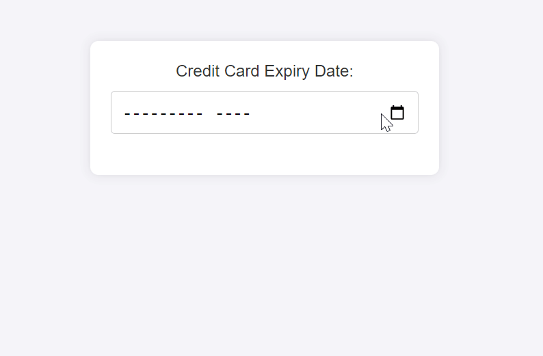
Input Type: month
The month input type allows choosing a month and year only without needing a day. It is supposed to be used in cases where only months and years matter to facilitate users’ entries and guarantee the input’s conformity. The month input type is the best for getting details like credit card expiring days or planning monthly reports.
Here is a sample showing how you could use the month input type within a form.
<body>
  <form>
    <label for="expiry">Credit Card Expiry Date:</label>
    <input type="month" id="expiry" name="expiry" />
  </form>
</body>
Here, the input element with type="month" displays a month and year picker.
Use Cases:
- Credit Card Expiration Dates: The date selector component is perfect for expiring credit cards, it only requires month and year. This simplifies the input process for users and guarantees that the file will be properly formatted for processing.
- Monthly Reports: It is effective when applied in finance-based applications, project management software, or any other system that deals with data every month.
Adding a month input type to your web forms lets you easily capture month and year information, improving data entry accuracy and ease of work, especially in financial and reporting contexts where monthly intervals are significant.
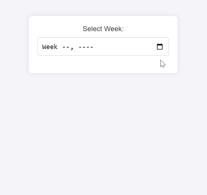
Input Type: week
The week input type in HTML5 allows users to select a specific week within a given year. This input type is particularly useful for applications that involve weekly planning, scheduling, or reporting. The week input type simplifies data entry by providing a standardized way to select weeks, reducing errors and ensuring consistency in date-related data.
Here is a sample showing how to use the week input type within a form.
<body>
  <form>
    <label for="week">Select Week:</label>
    <input type="week" id="week" name="week" />
  </form>
</body>
The input element with type="week" displays a week picker.
Use Cases:
- Weekly Scheduling: Given that the
weekinput type supports the selection of specific weeks, the feature is valuable in generating schedules for project management systems, employee shift planning, and other types of scheduling applications. Planning Tools: Websites and apps built to serve planning purposes can apply the’ week’ input type, allowing users to select their desired week(s) for planning. This can be used in fitness tracking, educational planning, and other tools that organize activities or goals by week.
By integrating the week input type within your web forms, you give users an easy and accurate way of selecting week-based dates, thereby enhancing their experience through simplified selection while maintaining the data format specified.
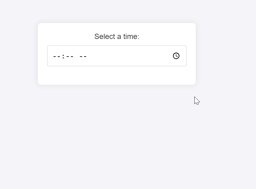
Input Type: time
Users can use the time input type to choose a precise time of day, typically represented in hours and minutes. This input type reduces the chances of incorrect input, thereby enhancing standardization in input format. The time input type is ideal for applications that require precise time inputs, such as booking time slots or setting alarms.
Here is an example showing how to use the time input type within a form.
<body>
  <form>
    <label for="week">Select Week:</label>
    <input type="week" id="week" name="week" />
  </form>
</body>
The input element with type="time" displays a time picker.
Use Cases:
Time Slot Booking: If you are developing applications like appointment systems, reservation platforms, and booking systems where users need to book specific time slots, the time input type will enable them to specify a time for their bookings exactly. It enhances precision in the booking process, thereby enhancing the overall user experience.
- Alarm Settings: Websites or applications that allow users to set alarms or reminders can use the
timeinput type to capture the exact time the alarm should go off.
Using the time input type in your web forms provides a user-friendly and efficient way to capture time-specific information. Whether for booking appointments, setting alarms, or any other time-related tasks, the time input type improves the functionality and usability of your application.
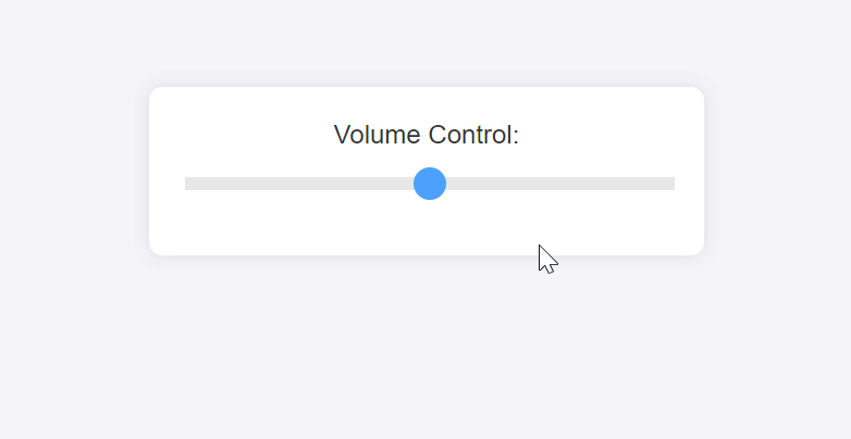
Input Type: range
In HTML5, the range input type enables users to select a value within particular limits by sliding. This method is good when users need to make adjustments within a set of predefined values, giving a higher level of interaction and user-friendliness. The range input type is often used for settings adjustments, such as controlling volume or brightness levels, and other applications where precise numerical input is not critical. Here is a sample showing how to use the range input type within a form.
<body>
  <form>
    <label for="volume">Volume Control:</label>
    <input
      type="range"
      id="volume"
      name="volume"
      min="0"
      max="100"
      value="50"
    />
  </form>
</body>
The input element with type="range" displays a slider that users can adjust. The min and max attributes define the range of values, while the value attribute sets the default position of the slider.
Use Cases:
- Volume Control: Media players, audio applications, or any system requiring volume adjustments allow users to easily control the volume by moving a slider using the range input type. This is more user-friendly than entering numerical values.
- Settings Adjustments: If you need any option that can be changed such as brightness controls, zoom levels, or other customizable stuff, use the range input type. It enables users to adjust their values with precision and in a visually intuitive manner.
Using the range input type in your web forms enhances the interactivity and usability of settings and controls. This input type provides a clear and efficient way for users to make adjustments, improving the overall user experience.
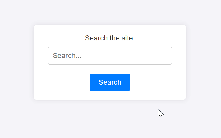
Input Type: search
The search input type is meant for search fields. It has a text input tailored for searching, which includes a clear button meant to clear the text for enhanced user experience. You can use the search input type on search forms when you’re required to enter and send in search queries. Here is an example showing how you could use the search input type within a form.
<body>
  <form>
    <label for="site-search">Search the site:</label>
    <input type="search" id="site-search" name="q" placeholder="Search..." />
    <input type="submit" value="Search" />
  </form>
</body>
The input element with type="search" provides a search-specific text field. While the placeholder attribute gives a hint to the user about what they can search for.
Use Cases:
- Search Forms: The
searchinput type is ideal for search bars on websites, allowing users to enter and submit search queries. This can be used in site-wide search forms, product searches in e-commerce sites, and search functionalities in applications. Enhanced User Input for Search Queries: Thesearchinput type can be used in any context where user input needs to be optimized for search functionality. This includes applications that contain search options within them, such as notetaking apps, document management systems, and content management systems.
When users enter web forms, the search input type enhances the user experience by providing an input field fit for search operations. This input type helps improve accessibility, as screen readers and other assistive technologies can better understand its purpose. Additionally, its benefits include certain built-in capabilities like a clear button that facilitates smoother interplay, thereby achieving more efficiency in the search process.
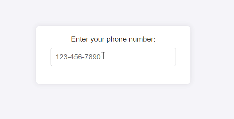
Input Type: tel
In HTML5, the tel input type is meant for entering telephone numbers. However, no fixed format is enforced by this input type, which allows for flexibility with different phone number formats globally. Still, it can be used together with pattern validation to make certain that the number entered meets predefined criteria. Using the tel input type provides a better-suited on-screen keyboard for mobile devices when entering phone numbers, hence making the user experience better. Here is an example showing how to use the tel input type within a form.
<body>
  <form>
    <label for="phone">Enter your phone number:</label>
    <input type="tel" id="phone" name="phone" placeholder="123-456-7890" />
  </form>
</body>
The input element with type="tel" provides a text field specifically for telephone numbers.
Use Cases:
- Contact Forms: The
telinput type is ideal for contact forms where users must provide their phone numbers. This can be used on websites for customer inquiries, support requests, or any other form that collects contact information. - Verification and Security: The
telinput type can be used for sending verification codes to phone numbers to enhance security through two-factor authentication (2FA).
Using the tel input type in your web forms provides a more intuitive and user-friendly way for users to enter their phone numbers. On mobile devices, it triggers a numeric keypad optimized for phone number entry, improving the ease of input. While the tel input type does not enforce formatting by itself, it can be combined with JavaScript validation to ensure that the phone numbers meet specific formatting requirements.
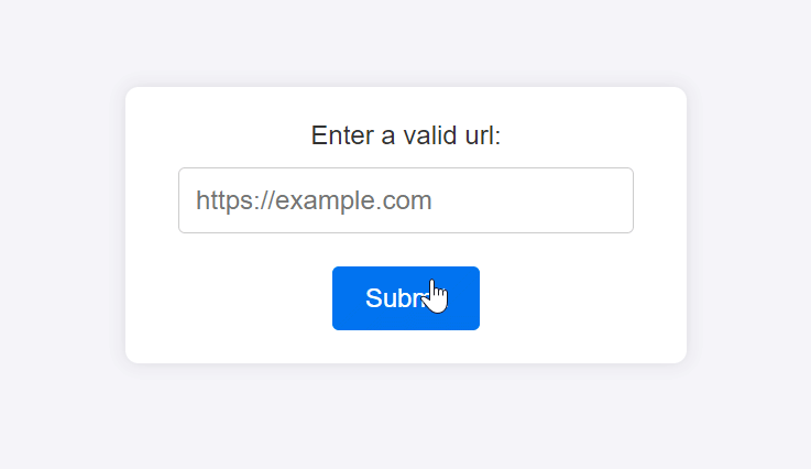
Input Type: url
The url input type is designed to enter web addresses. It confirms the pattern of a typical URL, which should incorporate a protocol such as http or https plus a domain. This variety obligates users to comply with some valid URL format to thwart any wrongly formatted URLs. Here is a sample showing how to use the url input type within a form.
<body>
  <form>
    <label for="website">Enter a valid url:</label>
    <input
      type="url"
      id="website"
      name="website"
      placeholder="https://example.com"
    />
    <input type="submit" value="Submit" />
  </form>
</body>
The input element with type="url" provides a text field specifically for URLs.
Use Cases:
- Website Input Fields: The
urlinput type is ideal for forms that require users to enter a website address. It applies to situations where the user’s URL or blog link is essential, be it an account setup or a contact form. - URL Submission: The
urlinput type is useful in applications that collect URLs for bookmarking, submitting links, or sharing resources. This is particularly useful in content management systems, social media platforms, and link aggregation sites.
Using the URL input type in your web forms enhances the user experience by providing built-in validation for URL structures, reducing data entry errors.
Importance of Using Appropriate Input Types
Specializing your form fields with HTML5 input types unlocks a range of benefits for you and your users. Here’s why this practice is essential:
- Intuitive Data Entry: Users can use specialized input types like
date,color, andrangeformatted to particular data types. For example, the date input type makes choosing dates easier due to a calendar picker and lowers the probability of errors when entering them. Built-in Validation: Built-in validation rules are incorporated into HTML5 input types. For example, theemailinput type automatically checks for the validity of the email format, and the’ URL’ input type ensures proper URL format. This reduces the need for custom JavaScript validation, making your forms simpler and more reliable. - Customizable Constraints: Users can specify the constraints for input types to suit their data requirements. For instance, using the
minandmaxattributes with thenumberinput type ensures that users can only enter values within a specified range. - Enhanced Accessibility and Device Compatibility: Specialized input types often trigger device-specific keyboards or input methods. For instance, the
teltype might bring up a phone number keypad on mobile devices. This caters to users with different input preferences and abilities, making your forms more accessible and user-friendly across various devices.
Using the appropriate HTML5 input types in your web forms is important for enhancing both user experience and data validation.
Browser Support and Fallbacks
HTML5 introduced a wide range of input types to improve the user experience and provide better data validation. However, browser support for these input types can vary.
Browser Compatibility for Various Input Types
All modern browsers, such as Chrome, Firefox, Safari, Edge, and Opera, broadly support the input types text, password, email, number, url, and tel. This makes these input types dependable selections that guarantee compatibility and, hence, are ideal for various programs. The consistent behavior makes it possible for developers to formulate forms confidently across several platforms, for they are assured of a problem-free experience regardless of the browser they are using.
Most major browsers like Chrome, Edge, Opera, and Safari usually support the date, time, datetime-local, month, and week input types. Nevertheless, when it comes to datetime-local, Firefox has limited support for these input types. Furthermore, the range input is another input type where we find broad support from all main browsers guaranteeing that users get a uniform feel each time they choose different values within a specified range. This kind of extensive backing makes the range input type suitable for platform settings.
Providing Fallbacks for Unsupported Browsers
To ensure a consistent user experience across browsers, it’s essential to provide fallbacks for unsupported input types. Here are some strategies to handle this:
- Graceful Degradation: Use a standard
textinput as a fallback. If the specialized input type isn’t supported, the browser will treat it as atextinput by default. In unsupported browsers, the user can still enter the date manually. For example:
<input type="date" id="startdate" placeholder="YYYY-MM-DD">Polyfills and JavaScript Libraries: Use polyfills or JavaScript libraries to enable HTML5 input type support in browsers that do not support them natively. Libraries like Modernizr can help test for HTML5 feature support and then apply polyfills accordingly.
- Custom Validation and UI Enhancements: Custom validation involves creating your validation controls, particularly when you want to mimic unsupported input types using JavaScript. For example, you can write an email format or even add a calendar date picker for date inputs in JavaScript.
For developers aiming to ensure cross-browser compatibility before starting a project, caniuse.com is an invaluable resource. It contains detailed compatibility tables for all browsers, well-known problems, and suggestions for fallbacks, allowing developers to make smart web forms that run on any browser and device. By considering browser compatibility and implementing appropriate fallbacks, you can ensure that your web forms provide a robust and user-friendly experience across all browsers and devices.
Conclusion
Incorporating HTML5’s specialized input types into web forms significantly enhances user experience, data validation, and accessibility. These types—such as color, date, time, range, search, tel, and url—provide intuitive and context-specific interfaces that streamline data entry and reduce errors. They also come with built-in validation and constraints, simplifying development and ensuring data integrity.
Varying browser support tools like caniuse.com help developers check compatibility and implement effective fallbacks. Developers can ensure that web forms are user-friendly and functional across all browsers and devices by employing strategies such as graceful degradation and polyfills.
Complete picture for complete understanding
Capture every clue your frontend is leaving so you can instantly get to the root cause of any issue with OpenReplay — the open-source session replay tool for developers. Self-host it in minutes, and have complete control over your customer data.
Star on GitHub12k