Implementing Claymorphism with CSS
How to achieve claymorphic designs with simple CSS work

Since fluffiness is associated with comfort, our designs that incorporate a taste of it could help transmit the same experience to consumers in a world where there is a little bit of disorder. Claymorphism is based on 3D-like objects made from clay, with inner and outer shadows to create depth. In this post, we want to show the completeness of claymorphic design patterns and how we may use them to improve our front-end design skills. We examine the history, pros, and cons of such designs and examine applications for them.
The Origin Of Claymorphism
It’s 2022, and a design pattern has vastly emerged and become famous in Dribble and Behance; much credit to Mike Malewicz on this. Clay-like user interfaces are the focus of the design idea known as “claymorphism.” Its user-friendliness is becoming more and more well-liked in the realm of UI design, particularly in Web3.
What is it with “morphism” in recent designs? This is one question you could end up pondering, as designs that can be actualized using box-shadow properties always end with the term. Since there isn’t much to distinguish these designs from one another, I view claymorphism, neumorphism, and skeuomorphism as relatives. However, unlike neumorphism, accessibility is not an issue with claymorphic designs.
Neumorphism was popular with basic designs as a complex design wasn’t so friendly to attain; it also owned up to accessibility issues. Despite having these issues, a little tweak here and there will take it off. However, the traditional flat-layered designs of most products were growing increasingly boring for designers. People seemed to want more depth, even if it was artificial, although perhaps not in the sense of a neumorphism attempt.
We have yearned for depth since the early days of neumorphism, something like what skeuomorphism could provide, but this time in 3D. We wanted something fluffy that easily conveys the sensation of reality to elements; Claymorphism is an answered prayer.
Implementation of Claymorphism with CSS
Every living thing on Earth has characteristics that make them unique, and claymorphism is no different. Claymorphism gives the impression of depth, and its properties include:
- Pale, pastel, and vibrant hues.
- Large rounded corners.
- Outer shadow and double inner shadow.
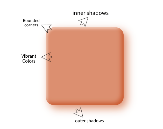
Claymorphism mixes inner and outer shadows to give HTML elements the appearance of depth and shape. Claymorphism seeks to provide a 3D inflated appearance, and simply placing a hazy shadow beneath the piece will practically complete it. Let’s dive into the individual Claymorphism design features and see how we can achieve a similar effect with CSS:
We have gone through the properties above. Let’s see how we can achieve a similar effect with CSS:
- Background: We’ll use the background or background-color property.
- Rounded corners: We deploy the use of border-radius.
- Shadows: We’ll use the box-shadow property, having two inset shadows and one outset shadow.
Let’s kick start with our HTML ready and linking our CSS:
<!DOCTYPE html>
<html lang="en">
<head>
    <meta charset="UTF-8">
    <meta http-equiv="X-UA-Compatible" content="IE=edge">
    <meta name="viewport" content="width=device-width, initial-scale=1.0">
    <title>Claymorphism</title>
    <link rel="stylesheet" href="style.css">
</head>
<body>

</body>
</html>
We need to add a background color and center our yet-to-be-created claymorphic element. Let’s get that done with a very (very!) basic style:
* {
    box-sizing: border-box;
}
body {
    min-height: 100vh;
    margin: 0;
    background: #fff;
    display: flex;
    justify-content: center;
    align-items: center;
}
We are done with the basic starter. We will need a round box too; let’s fix that:
//HTML
<body>
    <div class="clay"></div>
</body>

//CSS
.clay {
    width: 300px;
    height: 300px;
    border-radius: 30px;
    background: rgba(165, 79, 29, 0.6);
}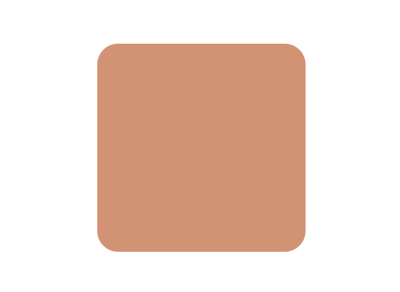
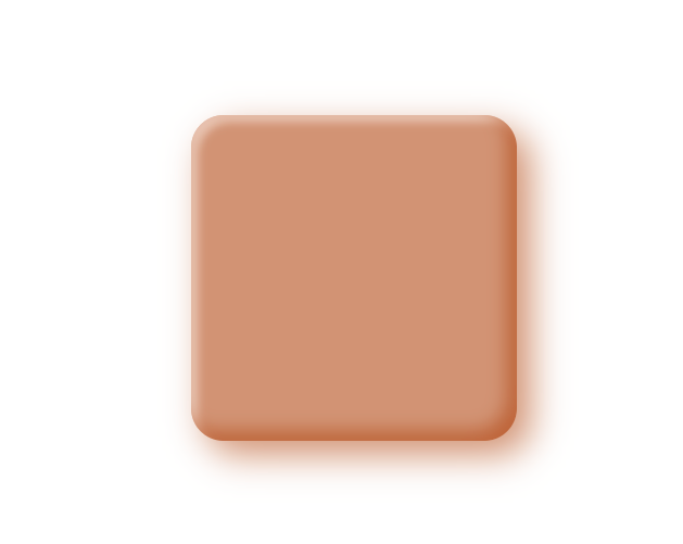
Finally, we will create our own effects by deploying the box-shadow properties. It should look like this:
- box-shadow: One Inset -Horizontal offset -Vertical offset Blur-radius color,
- Two outer shadows Inset Horizontal offset Vertical offset Blur-radius color,
- Horizontal offset Vertical offset Blur-radius color;
.clay {
    width: 300px;
    height: 300px;
    border-radius: 30px;
    background: rgba(165, 79, 29, 0.6);
    box-shadow: inset -0.6em -0.6em 1em rgba(165, 79, 29, 0.6), inset 0.4em 0.4em 0.5em rgba(245, 230, 221, 0.6), 0.8em 0.8em 2em rgba(165, 79, 29, 0.6);
}
The result is:
Session Replay for Developers
Uncover frustrations, understand bugs and fix slowdowns like never before with OpenReplay — an open-source session replay tool for developers. Self-host it in minutes, and have complete control over your customer data. Check our GitHub repo and join the thousands of developers in our community.
Pros and Cons of Claymorphism
While Claymorphism doesn’t come with as many obvious accessibility problems as Neumorphism, it’s still vital to follow the accepted best practices.
- Acceptability: Maintain a logical and clear visual hierarchy. Depending on the use case, the soft 3D effect of Claymorphism makes certain items stand out more; thus, we must be careful not to mess up the visual hierarchy.
- Color Blending In the Claymorphism design aesthetic, color plays a significant role. To offer the greatest user experience to those with low contrast sensitivity, we must be careful with contrast and color pairings.
- Animations Additionally, motion animations and transitions are possible with Claymorphism’s floating effect. Users’ preferences for motion should always be respected to stop overbearing animations from playing.
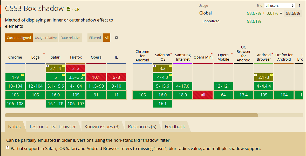
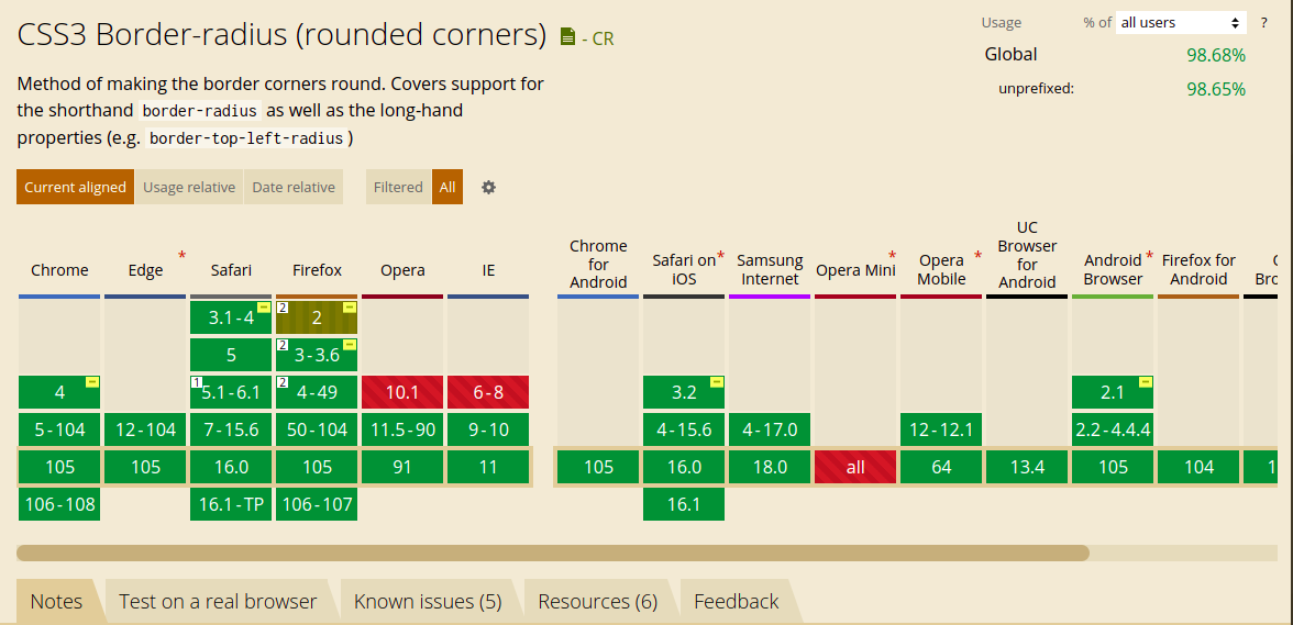
Browser support
All browsers, including the nearly-outdated Internet Explorer 9 and 10, support the box-shadow and border-radius specifications for claymorphism.
Box-shadow:
Border-radius
Conclusion
In this article, we covered the implementation of claymorphism with CSS. Claymorphism employs fluffiness in our applications, making them less severe and more childhood-redeeming. Employing this design in our UI shows how much a simple design can add to a better user experience.
A TIP FROM THE EDITOR: Working with shadows is key to achieve the effects in this article, so please read Shadows in CSS.
Gain Debugging Superpowers
Unleash the power of session replay to reproduce bugs and track user frustrations. Get complete visibility into your frontend with OpenReplay, the most advanced open-source session replay tool for developers.