

Many websites in different top modern browsers have great user interfaces. These user interfaces contain images that help users interact with web pages and add a seamless user experience in these top browsers. Images are essential elements of websites; a website without images will feel static and have no visual impression.
In this article, we will look at the meaning of image rendering and how to render images on the browser. We will look at how to render images in web browsers like Chrome, Edge, and Firefox to achieve faster speeds using the Next.js framework.
Image Rendering
Well, most times, when learning or working on the front-end, we hear the word image rendering. According to Wikipedia, image rendering is a process of generating images from 2D or 3D using a computer program. That means image rendering is simply a process by which we render an image. It could be by using a graphic creator like CorelDraw or Figma or a program like a web browser.
Most times, we want to know why it is necessary as designers or developers. Image rendering is helpful as it helps to visually display a website layout and makes people freely interact with websites. Rendering images can help as follows:
- Improving the load time of web pages.
- Help to generate an image format for web browsers and give a lossless compression to the original image format.
- Help in search engine optimization.
- Improve the layout of pictures on devices.
Image Handling in Next.js
In Next.js, we can optimize images by using the Image component. Next.js provides an easy way to render images. You would wonder what the difference between it and HTML <img> element. It has a lot of properties to improve image rendering that is way better than the HTML <img> tag. To show this, we will try to render a similar JPG image using the <img> element and the <Image/> component in Next.js.
import Image from "next/image"
import image from "../public/scepter.jpg"
function images(){
   return(
         <div>
            <div>
               <Image src={image} alt="man in building"  width="280" height="420"/>
            </div>
         </div>
      )
   }
export default images
<!DOCTYPE html>
<html lang="en">
<head>
<meta charset="UTF-8">
<meta http-equiv="X-UA-Compatible" content="IE=edge">
<meta name="viewport" content="width=device-width, initial-scale=1.0">
<title>Document</title>
</head>
<body>
<img src="scepter.jpg" alt="man in building" width="280" height="420"/>
</body>
</html>When you run the two different codes, you get the following images below:


The two images are the same, but if you inspect each image in the network tab, you will observe that:
- The HTML image takes up to 889 KB and has a load time of over 4.91 seconds, while the Next.js image takes an impressive 31.1 KB and 687 milliseconds on load time.
- You will observe that in the HTML, it uses a JPEG which is a lossy compression, while in the Next.js, it uses a WebP format, having both lossy and lossless compression. But the WebP format works better than the JPEG in terms of memory size and image quality.
- The image name is the same as the image for the Html image, while in Next.js, the name image is a URL due to the loader property.
In HTML images can be rendered, using the HTML <img> tag. But when rendering images on browsers, issues like web performance, image layout, and image priority occur. So by use of the Next.js image component, it will help to make image rendering easier. The Image component is an improvement of the <img> tag in HTML, which enables image optimization, compressed lossless image formats, lazy loading, and cumulative layout shift features.
To render images in Next.js, you have to:
- Copy the picture and put it in the public folder in your Next.js app.
- Import the
Imagecomponent:import Image from 'next/image' - Import the image from the public folder, like this:
import img from '../public/image' - Use the
<Image/>tag to render the image with the source, alternate, width, and height properties:<Image src={img} alt='man in a building' width='340' height='540'/> - Save and run your Next.js app.
Here is a code of how mine is.

And this is the output:

That is an easy way to render images with Next.js. You can render images in different ways in Next.js. In the code, you will notice that I did not use the image’s direct path; instead, I created a name for the picture when importing the image from the public folder.
Open Source Session Replay
OpenReplay is an open-source, session replay suite that lets you see what users do on your web app, helping you troubleshoot issues faster. OpenReplay is self-hosted for full control over your data.

Start enjoying your debugging experience - start using OpenReplay for free.
Things to note when rendering images in Next.js
In the Image tag in the code above, you will observe that there is a source, width, height, and alternate attribute. If the width and height are not specified, it automatically takes up the entire display based on the image size. When you render an image in Next.js, there are properties to note. Those properties are:
- Layout
- Loader
- Quality
- placeholder
- blurDataURL
- etc.
There are other properties of the image component in Next.js though our focus is not on the properties. You can check the documentation on how to use them: https://nextjs.org/docs/api-reference/next/image. When rendering an image, you have to take note of the following:
-
Cumulative Layout shift: Cumulative layout shift is a measurement of layout stability. Imagine having a profile card with an image and text below it, and the page loads. The profile card may distort as each text will take the space of the profile image. But the image component can help solve that problem.
-
Lazy loading: When you have several images in your website’s user interface, the browser automatically loads them all. But when the image component renders images, it makes or tells the browser to load only the images that are currently on the visible area of the screen. That is important because it helps reduce the load time of a page and the memory taken up in the browser.
-
Correct image sizing across different screen sizes: Different devices have different screen sizes, which is another point to note when your images render. The Next.js Image component handles this problem as it takes notice of the device pixels ratio.
-
Generating WebP format: The WebP format is built by Google to display images, and it is a lossless and lossy compressed format for web images. The Next.js image component uses it to render images of smaller sizes and to retain quality.
Rendering images in a different format in Next.js is the same as rendering in HTML. But the slight difference is that when it renders images on the browser, it renders in a WebP format.

If you look at the highlighted path of the image above, you will observe that the image type is in WebP format. Though the image is in JPG format, it renders as WebP, which is not an issue as it helps to improve image load time and size.
Image rendering for browsers
In this section, let us observe how our images are rendered and improved by our Next.js image component in a few top browsers. So let us write the following code.
import Image from "next/image"

function images(){
   return(
         <div>
            {['beautiful_lady','cool_outfit','cool_room', 'onepiece','robo','scepter','skyscraper',].map((path) => {
               return(
                     <div key={path}>
                        <Image src={`/${path}.jpg`} alt='images' width='280' height='420'/>
                     </div>
                  )
               })
            }
         </div>
      )
   }
export default images
The code above renders an array of images as we map through each picture in our public folder.

In the image component, the source is directed to the public folder telling it to pick only files in JPG format. So how does this work in Browsers?
Image rendering in Chrome
In Chrome, each image renders from the first to last in the array.
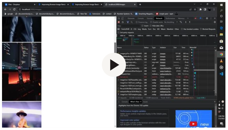
The screencast above shows how each image renders in Chrome. What happens there is that when the app containing the image is loaded, it loads the images on the visible part of the screen first. Each image loads in WebP format and renders less than the actual image size in milliseconds. When you scroll to the bottom of the page, the images below get rendered. This type of rendering is called lazy loading, in the sense that the page does not need to load all images at once when they are not in the viewport.
Image rendering in Edge
In Edge, it technically does the same thing as shown in the screencast below.
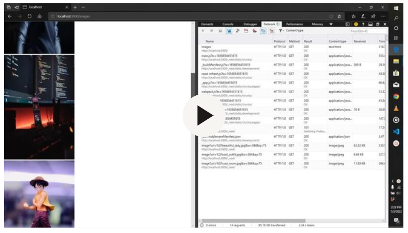
As you can see in the screencast above, it also gets each image and renders them at less the size to reduce load time.
Image rendering in Firefox
Firefox has a great way of rendering images, showing which image loads if you look at the screencasts below.
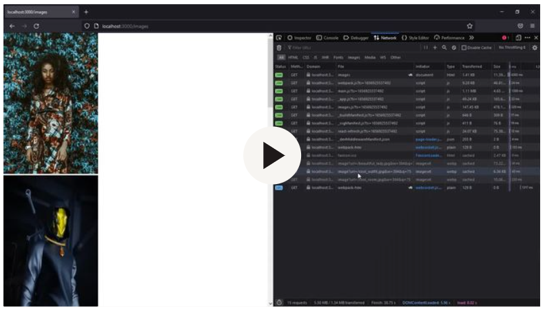
If you observe, it cached the first three images on the screen’s viewport while it loads the rest as each rendered on the screen’s viewport. It has the same Webp format as that of Chrome and has less image size than the original image. In Next.js, when the image renders, the quality is set to 75. That is the default quality of an image in Next.js though it can also increase to 100 if set.
Conclusions
No matter the browser, Next.js can render images with small sizes and good quality, which helps it improve page load time with the help of its image component API. Many properties can help you improve image rendering in your website using Next.js. You can check their documentation for the Image component.