The Phonon CSS framework aims to provide websites with a clean, modern look. With a straightforward, simplistic design that is pleasant on the eyes, it is made to be portable and simple to use. One of Phonon’s key characteristics is its responsive design, which ensures that it will appear great on any platform, including desktop computers, tablets, and smartphones. Additionally, it includes several pre-designed elements and layout choices that may be readily modified to meet the requirements of your website, such as buttons, navigation bars and grid layouts. If you wish to use Phonon, include the CSS file in your HTML text and give your HTML components the appropriate classes. The appearance of your website can then be altered by modifying the values of the various CSS properties. Altogether, Phonon is an excellent solution for anyone looking for a basic, modern design that is easy to use and alter for their website.
Why is it important?
Phonon may be a crucial tool for developers to take into account while creating a website or web application for several reasons. First, Phonon is a compact and adaptable CSS framework that streamlines the process of developing dependable, responsive layouts. It offers a variety of UI components and designs that can help developers build their applications more quickly and efficiently. Furthermore, Phonon is made to be user-friendly, which can make it simpler for developers to create websites and applications that are straightforward for users to use and navigate. This can enhance the overall user experience and increase users’ likelihood of interacting with and visiting the site again.
How does it differ from other CSS frameworks?
Phonon differs from other CSS frameworks in several ways. Among the most significant variations are the following:
- Size and performance: With a minified and gzipped size of about 791 kB, Phonon is a small CSS framework. As a result, it loads more quickly and is simpler to use than some alternative CSS frameworks, which can be more complicated and bulkier.
- Responsive design: Phonon was made with responsiveness and device and screen size compatibility. Developers can construct layouts that look beautiful on any device with the aid of its flexible grid structure and an assortment of responsive UI elements.
- Features and UI elements: Button, form, table, navbar, and other UI elements and features are among the many that Phonon offers. Additionally, it offers compatibility with various media formats, including photos, videos, and audio.
Benefits of Phonon.css
When creating a website or online application, Phonon offers several advantages. Among the main advantages are:
- Lightweight and fast: A minified and gzipped version of Phonon’s CSS framework weighs at just 791 kB. It loads quickly and is simpler to use compared to other CSS frameworks, which can be more sophisticated and larger.
- Responsive design: Phonon was made with responsiveness and device and screen size compatibility in mind. Developers can construct layouts that look beautiful on any device with the aid of its flexible grid structure and an assortment of responsive UI elements.
- User-friendly: The user-friendliness of Phonon can make it simpler for developers to create websites and applications that are simple for users to use and navigate. This can enhance the overall user experience and increase users’ likelihood of interacting with and visiting the site again.
Drawbacks of Phonon.css
When deciding whether Phonon is the best tool for their project, developers should consider its potential downsides, just like any other tool. The following are some possible Phonon drawbacks:
- Limited customization options: Phonon offers various customization and extension options. However, it might not be as flexible as other CSS frameworks, and this could be a problem for developers who want more control over how their website or application looks and feels.
- Limited documentation: Although it gives a solid overview of the framework and its features, the Phonon documentation may not be as thorough as other CSS frameworks. This can make it more challenging for developers to learn about more sophisticated features or find precise solutions to inquiries.
Browser Support for Phonon.css
The most recent versions of the following modern browsers are compatible with Phonon:
- Chrome
- Firefox
- Safari
- Opera
- Edge.
It might also work with some older versions of these browsers, though compatibility with prior versions is not guaranteed. Modern browsers, including Phonon, support contemporary web standards like CSS3 and HTML5. Because some outdated browsers don’t support specific standards, it could not work perfectly with them.
Getting Started
Npm must be set up on your system before you can use it to install Phonon. If npm isn’t already installed on your computer, you can install it by following the directions on the npm website. By typing the following command in your terminal after installing npm, you can install Phonon:
npm install phononThe most recent version of Phonon will then be installed in your project. You must include the Phonon CSS file in the head of your HTML document to use Phonon in your project. You can accomplish this by including the following line in your HTML:
<link rel="stylesheet" href="node_modules/phonon/dist/css/phonon.min.css" />You can also include the Phonon CSS CDN in the head of your HTML document; if you want to use it through a CDN, include the following line in your HTML, and you can accomplish this:
    <link
      rel="stylesheet"
      href="https://unpkg.com/phonon@2.0.0-alpha.1/dist/css/phonon.min.css"
      integrity="sha384-YvRRhxrEwrswiEGUXRvWsOw0trb5T3Mg0OupNZ48rCk6Ri3+q6DSWlYpEyr24vSK"
      crossorigin="anonymous"
    />
This will contain Phonon’s most recent release via the unpkg CDN. By substituting the version number you want to use for “@2.0.0,” you may specify a given Phonon version.
Components
We discussed Phonon’s introduction earlier in this article, and now we know what it is and how important it is. We’ll be using the fundamental elements of Phonon CSS in this part. In this section, we’ll use self-explanatory styles and class names that will result in stunning designs for our project. Let’s get right in and use the fundamental Phonon CSS components.
Alert
An alert is a UI element used to display a message to the user, usually to convey critical information or to alert the user to a problem. Here is an example of how you can create an alert with Phonon:
<div class="alert-primary">...</div>Using one of the following classes, you can alter how the alert looks:
.alert-primary: blue background.alert-secondary: gray background.alert-success: green background.alert-warning: yellow background.alert-danger: red background
To create a warning alert with a light yellow background, you can use the following code:
    <div class="alert alert-warning">
      This is a warning alert message.
    </div>
Output:

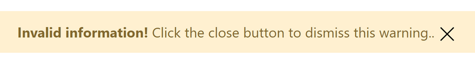
The .alert-dismissible class can be used to add a close button to the alert. The user will then be able to dismiss the alert by clicking the close button.
Code:
    <div
      class="alert alert-warning alert-dismissible"
      id="exampleAlert"
      role="alert"
    >
      <strong>Invalid information!</strong> Click the close button to dismiss this
      warning..
      <button
        type="button"
        class="icon-close"
        data-dismiss="alert"
        aria-label="Close"
      >
        <span class="icon" aria-hidden="true"></span>
      </button>
    </div>
Output:
For more information on how to use alerts with Phonon, you can consult the documentation on the Phonon website.
Button
The buttons on a website are an essential component and allow for user engagement. Using one of the classes below, you can alter the button’s appearance:
.btn-primary: blue background.btn-secondary: gray background.btn-success: green background.btn-warning: yellow background.btn-danger: red background
To create a button with a blue background, you can use the following code:
<button class="btn btn-primary">Primary Button</button>Output:

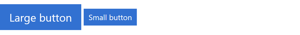
You can customize the button size by using the .btn-sm (small) or .btn-lg (large) classes.
    <button class="btn btn-primary btn-lg">Large button</button>
    <button class="btn btn-primary btn-sm">Small button</button>
Output:
For more information on how to use buttons with Phonon, you can consult the documentation on the Phonon website.
Button group
You can use the .btn-group class to create a button group with Phonon.
Here is an example of how you can create a basic button group with Phonon:
    <div class="btn-group btn-group-lg" role="group" aria-label="Basic example">
      <button type="button" class="btn btn-primary">Home</button>
      <button type="button" class="btn btn-primary">About</button>
      <button type="button" class="btn btn-primary">Contact</button>
    </div>
Output:
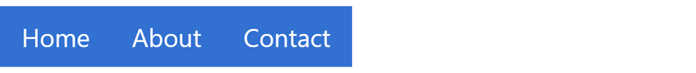
By default, the buttons in the group will be styled with a solid blue background color and white text. You can customize the appearance of the buttons by using one of the following classes:
.btn-primary: blue background.btn-secondary: gray background.btn-success: green background.btn-warning: yellow background.btn-danger: red background
To create a button group with gray buttons, you can use the following code:
    <div class="btn-group" role="group" aria-label="Basic example">
      <button type="button" class="btn btn-secondary">Left</button>
      <button type="button" class="btn btn-secondary">Middle</button>
      <button type="button" class="btn btn-secondary">Right</button>
    </div>
Output:

To learn more about button groups, kindly click here.
Collection
Collections allow you to group list items. The children’s list item will have Phonon styles applied if the parent container has the collection class name applied to it. The item can be anything you want to group as a collection.
Code sample:
    <div class="collection">
      <div class="collection-header">
        <h3 class="collection-title">Title</h3>
      </div>
      <div class="collection-body collection-emphasis">Look at me!</div>
      <div class="collection-body">Body</div>
      <div class="collection-footer">Footer</div>
    </div>
Output:
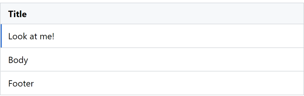
This will provide a simple collection of four. The collection can grow as large as you need it to.
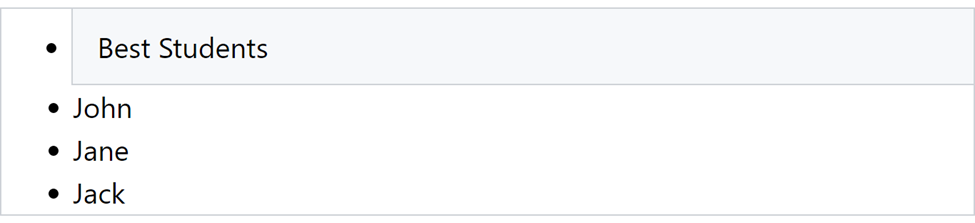
The collection-header class can be used to include a header in a collection:
    <ul class="collection">
      <li class="collection-header">Best Students</li>
      <li class="collection-item">John</li>
      <li class="collection-item">Jane</li>
      <li class="collection-item">Jack</li>
    </ul>
Output:
The Phonon documentation has additional details and examples of using the collection class.
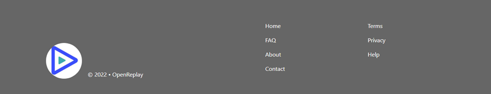
Footer
The footer consists of a container element with the class footer and a series of child elements for the footer’s content.
Here’s an example of the HTML structure for a footer:
    <footer class="footer bg-primary">
      <div class="container">
        <div class="row align-items-end">
          <div class="col-sm-6">
            <div class="d-flex align-items-end mb-3 mb-sm-0">
              <img
                class="rounded-circle"
                src="https://encrypted-tbn0.gstatic.com/images?q=tbn:ANd9GcSHe9oaoqfZGtjciURX7A5d-ZyHKJo5qZTWXALSog96ywzns4wDGfmmQkNdkRVyfRGmqjw&usqp=CAU"
                width="100"
                alt=""
              />
              <span class="text-white ml-3">© 2022 • OpenReplay</span>
            </div>
          </div>
          <div class="col-sm-6">
            <div class="row">
              <div class="col-sm-6">
                <ul class="mb-0">
                  <li><a class="text-white" href="#">Home</a></li>
                  <li><a class="text-white" href="#">FAQ</a></li>
                  <li><a class="text-white" href="#">About</a></li>
                  <li><a class="text-white" href="#">Contact</a></li>
                </ul>
              </div>
              <div class="col-sm-6">
                <ul class="mb-0">
                  <li><a class="text-white" href="#">Terms</a></li>
                  <li><a class="text-white" href="#">Privacy</a></li>
                  <li><a class="text-white" href="#">Help</a></li>
                </ul>
              </div>
            </div>
          </div>
        </div>
      </div>
    </footer>
Output:
Mobile view:
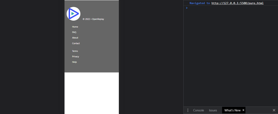
That’s it! You should now have a working footer using the Phonon.css.
Form
To add a form element to your HTML document, you can use the form tag to create a form:
    <form>
      <!-- form fields go here -->
    </form>
Within the form element, add the form fields you want to include in your form. For example, you can add text inputs, textarea, and buttons using the input and button elements, respectively:
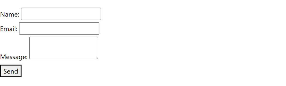
    <form>
      <label for="name">Name:</label>
      <input type="text" id="name" name="name" />
      <br />
      <label for="email">Email:</label>
      <input type="email" id="email" name="email" />
      <br />
      <label for="message">Message:</label>
      <textarea id="message" name="message"></textarea>
      <br />
      <button type="submit">Send</button>
    </form>
Please be aware that this is only a dummy form with no styles added.
Output:
You can customize the appearance of your form using Phonon’s CSS classes. For example, you can use the .form-control class to style form elements and the .form-group class to group form elements together:
    <form>
      <div class="form-group">
        <label for="name" class="form-control">Name:</label>
        <input type="text" id="name" name="name" class="form-control" />
      </div>
      <div class="form-group">
        <label for="email" class="form-control">Email:</label>
        <input type="email" id="email" name="email" class="form-control" />
      </div>
      <div class="form-group">
        <label for="message" class="form-control">Message:</label>
        <textarea id="message" name="message" class="form-control"></textarea>
      </div>
      <button type="submit" class="btn btn-primary">Send</button>
    </form>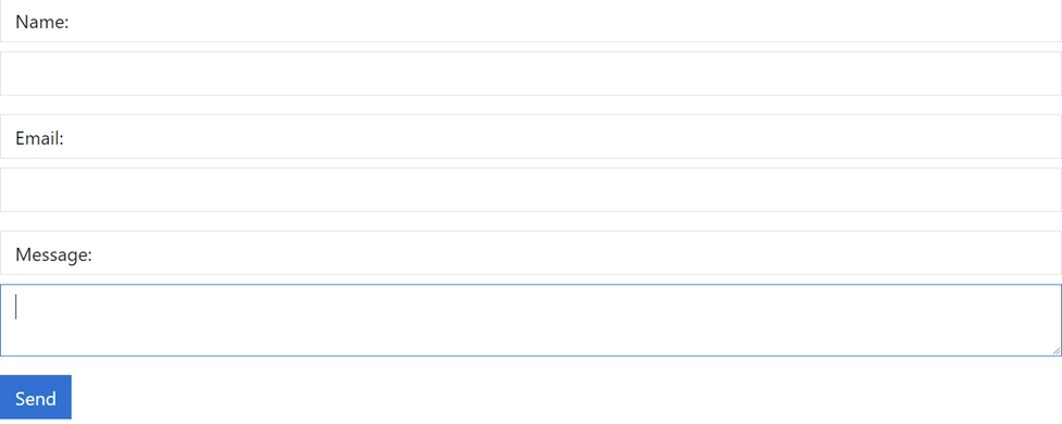
The form’s lovely beauty is now being added, as you can see. To discover more about the form and to get some amazing suggestions and tips, all you have to do is go to the official website of Phonon. To learn more about forms, kindly click here.
Grid
To create a grid layout using Phonon, you can use the div element with the .container class to create a container:
    <div class="container">
      <!-- grid rows and columns go here -->
    </div>
Within the container, add rows using the div element with the .row class. Each row can contain multiple columns:
<div class="container">
<div class="row">
<!-- columns go here -->
</div>
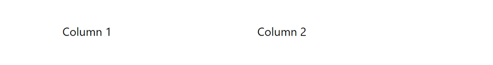
</div>Within each row, add columns using the div element with the .col class. You can specify the width of the column using the .col-* classes, where * is a number from 1 to 12 representing the width of the column as a fraction of the row. For example, .col-6 creates a column that takes up half of the row:
    <div class="container">
      <div class="row">
        <div class="col-6">Column 1</div>
        <div class="col-6">Column 2</div>
      </div>
    </div>
Output:
You can also nest rows and columns to create more complex grid layouts. Please navigate here to learn more.
Line
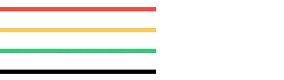
To create a line using Phonon, you can use the hr element with the align attribute:
<hr align="left"/>This will create a horizontal line that spans the width of its parent container. If you want to customize the appearance of the line, you can use the following CSS classes:
.border-danger: Creates a line with a danger color..border-success: Creates a line with a success color..border-warning: Creates a line with a warning color..border-muted: Creates a line with a muted color.
For example:
    <hr align="left" class="emphasis w-lg h-lg border-danger" />
    <hr align="left" class="emphasis w-lg h-lg border-warning" />
    <hr align="left" class="emphasis w-lg h-lg border-success" />
    <hr align="left" class="emphasis w-lg h-lg border-muted" />
Output:
On a website, working with lines is necessary, and the best part is when you apply designs without utilizing the standard gray color. Visit the phonon website to access the official documentation to learn more about line.
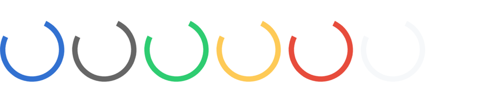
Loader
To create a loader container using Phonon, you can use the div element with the .loader class:
    <div class="loader">
      <!-- loader content goes here -->
    </div>
Doing this will create a container that initializes the loader with a standard loading animation. If you want to customize the appearance of the loader, you can use the following CSS classes:
.loader-primary: Creates a loader with a primary color..loader-secondary: Creates a loader with a secondary color..loader-success: Creates a loader with a success color..loader-warning: Creates a loader with a warning color..loader-danger: Creates a loader with an error color.
For example:
    <div class="loader">
      <div class="loader-spinner loader-primary loader-spinner-animated"></div>
    </div>
    <div class="loader">
      <div class="loader-spinner loader-secondary loader-spinner-animated"></div>
    </div>
    <div class="loader">
      <div class="loader-spinner loader-success loader-spinner-animated"></div>
    </div>
    <div class="loader">
      <div class="loader-spinner loader-warning loader-spinner-animated"></div>
    </div>
    <div class="loader">
      <div class="loader-spinner loader-danger loader-spinner-animated"></div>
    </div>
    <div class="loader">
      <div class="loader-spinner loader-light loader-spinner-animated"></div>
    </div>
Output:
To read more about loaders in the official documentation, please click here.
Navbar
To create a navbar using Phonon, you can use the nav element with the .navbar class:
    <nav class="navbar">
      <!-- navbar content goes here -->
    </nav>
This will create a navbar container that spans the width of its parent element.
To add navigation links to the navbar, you can use the ul element with the .navbar-nav class:
    <nav class="navbar navbar-light navbar-expand-lg">
      <div class="navbar-left">
        <a class="navbar-title" href="#">
          <img
            class="d-inline-block"
            src="https://encrypted-tbn0.gstatic.com/images?q=tbn:ANd9GcSHe9oaoqfZGtjciURX7A5d-ZyHKJo5qZTWXALSog96ywzns4wDGfmmQkNdkRVyfRGmqjw&usqp=CAU"
            width="30"
            height="30"
            alt=""
          />
          Home
        </a>
        <ul class="navbar-nav">
          <li class="nav-item active">
            <a href="#" class="nav-link">Blog</a>
          </li>
          <li class="nav-item">
            <a href="#" class="nav-link">GitHub</a>
          </li>
          <li class="nav-item">
            <a href="#" class="nav-link disabled">Login</a>
          </li>
        </ul>
      </div>
      <div class="navbar-right">
        <button
          class="navbar-toggle icon-hamburger"
          type="button"
          data-toggle="offcanvas"
          data-target="#exampleOffCanvas"
        >
          <span
            class="icon"
            data-toggle="offcanvas"
            data-target="#exampleOffCanvas"
          ></span>
        </button>
      </div>
    </nav>
Output:

Tables
You’ll need to include the Phonon CSS file in your HTML to use Phonon’s table styles. You can either download the CSS file and include it locally or link to the file hosted on a CDN like this:
<link
rel="stylesheet"
href="https://unpkg.com/phonon@2.0.0-alpha.1/dist/css/phonon.min.css"
integrity="sha384-YvRRhxrEwrswiEGUXRvWsOw0trb5T3Mg0OupNZ48rCk6Ri3+q6DSWlYpEyr24vSK"
crossorigin="anonymous"
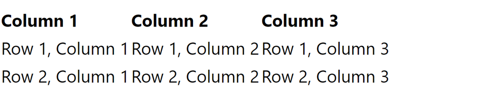
/>Once you’ve included the Phonon CSS file, you can create a table in your HTML using the table element:
    <table>
      <thead>
        <tr>
          <th>Column 1</th>
          <th>Column 2</th>
          <th>Column 3</th>
        </tr>
      </thead>
      <tbody>
        <tr>
          <td>Row 1, Column 1</td>
          <td>Row 1, Column 2</td>
          <td>Row 1, Column 3</td>
        </tr>
        <tr>
          <td>Row 2, Column 1</td>
          <td>Row 2, Column 2</td>
          <td>Row 2, Column 3</td>
        </tr>
      </tbody>
    </table>
Output:
Using the table classes provided by Phonon, you can further alter the appearance of your table. The “table-striped” class, for instance, can be used to add zebra stripes to your table:
    <table class="table table-striped">
      <thead>
        <tr>
          <th>#</th>
          <th>Firstname</th>
          <th>Lastname</th>
          <th>Score</th>
        </tr>
      </thead>
      <tbody>
        <tr>
          <td>1</td>
          <td>Jordan</td>
          <td>Sam</td>
          <td>99%</td>
        </tr>
        <tr>
          <td>2</td>
          <td>Jane</td>
          <td>Mike</td>
          <td>89%</td>
        </tr>
        <tr>
          <td>3</td>
          <td>Andrew</td>
          <td>Jack</td>
          <td>100%</td>
        </tr>
      </tbody>
    </table>
Output:
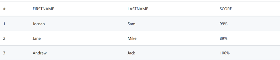
The stunning table we created with PhononCSS styles is shown above. You can still make changes to the table we constructed; visit here to learn more about tables and to obtain some interesting hints and guidelines.
Title
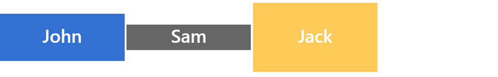
A tile is an item that often has a square or rectangular shape. The Phonon “title” class is used to style headings for various parts of your website. From “p-1” to “p-6,” there are six different sizes of titles available. HTML’s ‘h1’ to ‘h6’ elements allow you to put a title according to the desired heading size; the choice is up to the developer.
Code Sample:
    <div class="tile p-4 tile-primary" style="width: 25%">
      <h1>John</h1>
    </div>
    <div class="tile p-6 tile-secondary" style="width: 25%">
      <h1>Sam</h1>
    </div>
    <div class="tile p-5 tile-warning" style="width: 25%">
      <h1>Jack</h1>
    </div>
Output:
You can find more information and examples of using titles and subtitles in the Phonon documentation.
Session Replay for Developers
Uncover frustrations, understand bugs and fix slowdowns like never before with OpenReplay — an open-source session replay tool for developers. Self-host it in minutes, and have complete control over your customer data. Check our GitHub repo and join the thousands of developers in our community.
Utilities
Now that we have a fundamental grasp of components, we will discuss utility styles in Phonon in this section. These utilities are of the utmost importance to a website because they help make it responsive. Instead of emphasizing too much, let’s begin developing Phonon’s utilities.
Borders
In this section, we’ll discuss borders and how to use them. Please be aware that Phonon supports borders directly and has permission to utilize Bootstrap’s border styles.
To create a border, you can use the .border class on the element you want to add a border to:
    <div class="border">
      <!-- content goes here -->
    </div>
This will create a border around the element with a default color. If you want to customize the appearance of the border, you can use the following CSS classes:
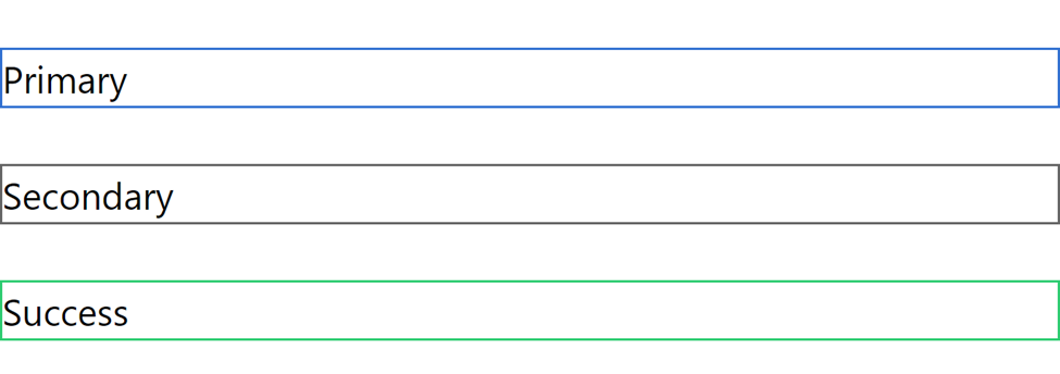
.border-primary: Creates a border with a primary color..border-secondary: Creates a border with a secondary color..border-success: Creates a border with a success color..border-warning: Creates a border with a warning color..border-error: Creates a border with an error color.
For example:
    <div class="border border-primary">Primary</div>
    <br />
    <div class="border border-secondary">Secondary</div>
    <br />
    <div class="border border-success">Success</div>
Output:
The official documentation has further information on borders.
Clearfix
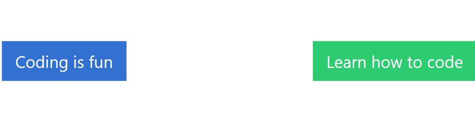
To create a clearfix in Phonon, you can use the .clearfix class on the element that contains the floated elements:
    <div class="bg-info clearfix">
      <button type="button" class="btn btn-primary float-left">
        Coding is fun
      </button>
      <button type="button" class="btn btn-success float-right">
        Learn how to code
      </button>
    </div>
Output:
Alternatively, you can use the .clearfix::after pseudo-element to clear the floats:
    .clearfix::after {
      content: "";
      clear: both;
      display: table;
    }
To understand more about Clearfix, kindly visit here.
Icons
Since Phonon is a CSS framework that provides a set of basic styles and UI components for building web applications.
Here’s an example of how to use an icon in a Phonon project: add the icon class name to an HTML element, such as a <button> element:
    <button type="button" class="icon-close" aria-label="Close">
      <span class="icon" aria-hidden="true"></span>
    </button>
    <button type="button" class="icon-hamburger" aria-label="Toggle">
      <span class="icon" aria-hidden="true"></span>
    </button>
This will display the close and hamburger icons from the Phonon. Any icon class name can be used to display the related icon.
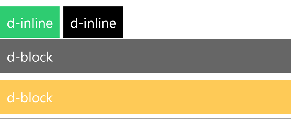
Display
In Phonon, you can use the d-* class name to control how an element is displayed on the page. Kindly note that the * represents the display value. The display property can have a variety of values, each of which determines the type of layout an element should use.
Here are some common values for the display property in Phonon:
d-block: This value causes an element to take up the entire width of its parent container and create a new line after it.d-inline: This value causes an element to be displayed on the same line as its siblings and only take up as much space as necessary.
You can use the d (display) property in your Phonon stylesheets by specifying it as follows:
    <div class="d-inline p-2 bg-success text-white">d-inline</div>
    <div class="d-inline p-2 bg-dark text-white">d-inline</div>
    <span class="d-block mt-2 p-2 bg-secondary text-white">d-block</span>
    <span class="d-block mt-2 p-2 bg-warning text-white">d-block</span>
Output:
Embed
You can utilize the embed utility classes in the Phonon CSS library to quickly and simply apply common styles. The ‘.embed-responsive’ class is one of these utility classes that can be used to insert external styles, such as videos or maps, into your website.
To utilize the “embed-responsive” class, your HTML document must include an “iframe” element that points to the external content you desire to embed. The ‘iframe’ element can then be styled using the '.embed-responsive' class by making the video responsive and setting its width to full its relative parent container:
    <div class="embed-responsive embed-responsive-16by9">
      <iframe
        width="988"
        height="556"
        src="https://www.youtube.com/embed/7ll7vrGHV2s"
        title="Adumu HD 720p"
        frameborder="0"
        allow="accelerometer; autoplay; clipboard-write; encrypted-media; gyroscope; picture-in-picture; web-share"
        allowfullscreen
      ></iframe>
    </div>
Output:
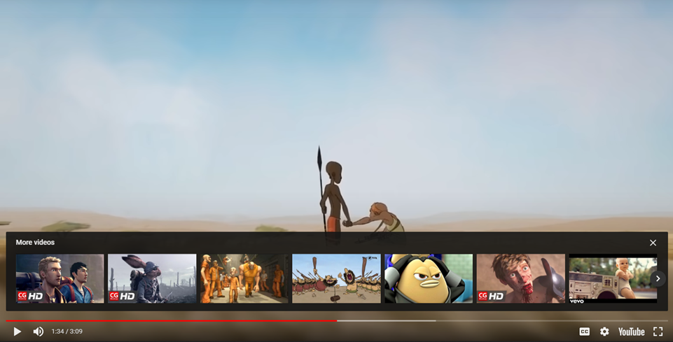
Note that the .embed-responsive class in Phonon is designed to be used with iframe elements and may not work correctly with other types of elements. Additionally, you may need to adjust the src attribute of the iframe element to point to the specific content you want to embed.
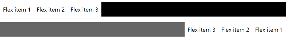
Flex
The Phonon CSS library includes a set of utility classes that you can use to apply common styles quickly and easily. One of these utility classes is the .d-flex class, which can create a flexible layout using the CSS Flexbox layout model.
To use the .d-flex class, you will need to apply it to a container element that contains the elements you want to lay out using Flexbox. For example:
    <div class="d-flex flex-row bg-dark mb-3">
      <div class="p-2 bg-white">Flex item 1</div>
      <div class="p-2 bg-white">Flex item 2</div>
      <div class="p-2 bg-white">Flex item 3</div>
    </div>
    <div class="d-flex flex-row-reverse bg-secondary">
      <div class="p-2 bg-white">Flex item 1</div>
      <div class="p-2 bg-white">Flex item 2</div>
      <div class="p-2 bg-white">Flex item 3</div>
    </div>
    >
Output:
There is much more to learn about utilizing flexbox and its properties, such as flex-direction, flex-wrap, etc. You can just navigate to the official website to do so. The documentation has more details about combining Flexbox and Phonon.
Float
You can utilize the utility classes in the Phonon CSS library to quickly and simply apply common styles. The “.float-[left or right]” class, which may be used to float an element to the left or right of its container, is one of these utility classes. You must add the “.float-[direction]” class to the element you want to float to use it. For instance:
    <div class="float-left">Home</div>
    <div class="float-right">Contact</div>
Output:
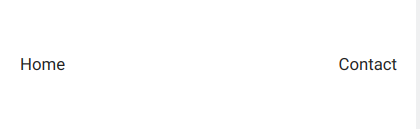
As a result, the second element will float to the right of its container, while the first element will float to the left. It should be noted that Phonon’s “.float” class is intended to be used with block-level elements and might not function well with inline elements or elements whose “display” property is set to “inline-block.” Additionally, to correctly position and arrange items floated within a container, you might need to apply extra styles or layout methods, such as clearing floats or using the “overflow” attribute. Visit the official Phonon website for more information about floats.
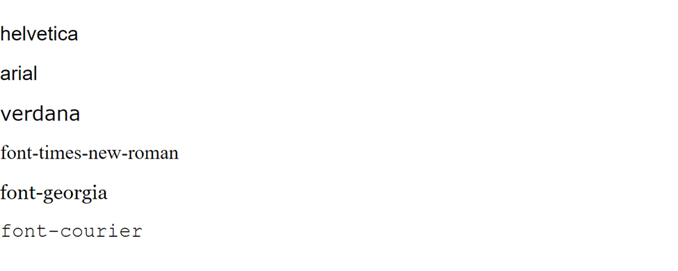
Fonts
You can utilize the utility classes in the Phonon CSS library to quickly and simply apply common styles. The .font-name class is one of these useful classes, and it may be used to modify the font family of an element. You must apply the .font-name class to the element whose font family you want to update to use it. For instance:
    <div class="font-helvetica mb-2">helvetica</div>
    <div class="font-arial mb-2">arial</div>
    <div class="font-verdana mb-2">verdana</div>
    <div class="font-times-new-roman mb-2">font-times-new-roman</div>
    <div class="font-georgia mb-2">font-georgia</div>
    <div class="font-courier mb-2">font-courier</div>
Output:
A developer should really keep the font in mind when working because it contributes to a website’s beautiful appearance. To read more about fonts, you can click here.
Conclusion
I genuinely hope you have enjoyed reading this article. Throughout this tutorial, we learned how to install Phonon.css and produced a few Phonon.css examples to help us understand the syntax’s fundamental concepts. You can modify the examples we discussed to suit your needs if you want to easily and beautifully design a website for yourself or a customer. Alternatively, you can put what you’ve learned into practice by creating more stunning websites.
Gain Debugging Superpowers
Unleash the power of session replay to reproduce bugs and track user frustrations. Get complete visibility into your frontend with OpenReplay, the most advanced open-source session replay tool for developers.