Introduction to Bulma: A Simple and Intuitive CSS Framework
Bulma is a free, open-source framework with ready-to-use front-end components that you can easily combine to build web applications. In this introduction tutorial, you'll learn how to get started with Bulma and why you'll want to use it in your next project.


According to its official website, Bulma is a free, open source framework that provides ready-to-use frontend components that you can easily combine to build responsive web interfaces.
In this article, let’s take a look at the basics of Bulma and how to build a simple To-Do App using this CSS framework.
Why Use Bulma
Bulma adopts a mobile-first approach, which ensures that UI components would be responsive and looks great in small screens.
It is, at its core, a CSS framework similar to Tailwind CSS and Material UI, so it provides many pre-styled components without JavaScript included. Hence, according to its GitHub documentation, Bulma is “environment agnostic”, as it’s just the style layer on top of the logic. With Bulma, you can simply focus on the styles.
Bulma is very easy to install and learn. It has intuitive, readable modifiers, syntax and classes.
Getting Started
The 2 ways I recommend to use Bulma in your projects are:
1. Via npm or yarn
npm install bulmayarn add bulma2. Via CDN
<link rel="stylesheet" href="https://cdn.jsdelivr.net/npm/bulma@0.9.3/css/bulma.min.css">Starter Template
On Bulma’s website, we can also copy the starter HTML template below to our project. As you can see, the starter template imports Bulma via CDN.
<!DOCTYPE html>
<html>
  <head>
    <meta charset="utf-8">
    <meta name="viewport" content="width=device-width, initial-scale=1">
    <title>Hello Bulma!</title>
    <link rel="stylesheet" href="https://cdn.jsdelivr.net/npm/bulma@0.9.3/css/bulma.min.css">
  </head>
  <body>
  <section class="section">
    <div class="container">
      <h1 class="title">
        Hello World
      </h1>
      <p class="subtitle">
        My first website with <strong>Bulma</strong>!
      </p>
    </div>
  </section>
  </body>
</html>
If we open this HTML template, we get the following webpage:

Layout/Spacing
As seen in the starter template, the most common layouts are the .container and .section classes. Using these classes would automatically provide some default margins or padding.
Use the spacing helpers to customize margin and paddings.
Modifier Syntax
Font Sizes Example
In Bulma, the modifier syntax is pretty straightforward. They are often in the is-* or the has-* format. For example, to adjust font sizes, we use is-size-[number] or is-[number].
<p class="title is-1">Title 1</p>
<p class="subtitle is-3">Subtitle 3</p>

<p class="title is-2">Title 2</p>
<p class="subtitle is-4">Subtitle 4</p>

<p class="title is-3">Title 3</p>
<p class="subtitle is-5">Subtitle 5</p>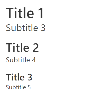
Font Styles Example
For font styles, it is simply is-[style].
<h1 class="title">Hello World</h1>
<h1 class="title is-uppercase">Hello World</h1>
<h1 class="title is-italic">Hello World</h1>
<h1 class="title has-text-weight-bold">Hello World</h1>
<h1 class="title has-text-weight-light">Hello World</h1>
More details can be found in the documentation.
Text Colors Examples
With changing the text colors, Bulma contains the common classes you will find in other CSS libraries such info, primary, success and so on. The modifier syntax will be has-text-[style].
<h1 class="title has-text-primary">Hello World</h1>
<h1 class="title has-text-dark">Hello World</h1>
<h1 class="title has-text-link">Hello World</h1>
<h1 class="title has-text-info">Hello World</h1>
<h1 class="title has-text-success">Hello World</h1>
<h1 class="title has-text-warning">Hello World</h1>
<h1 class="title has-text-danger">Hello World</h1>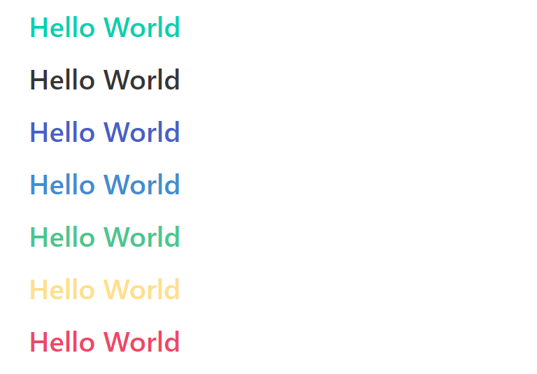
More details can be found in the documentation.
A Simple To-Do App via Bulma
Now that we’ve learned the basics of Bulma, let’s create a simple to-do app. I will be using the Panel component and start from there.
Step 1: Import Bulma
First, let’s import Bulma via CDN into our html file.
<!DOCTYPE html>
<html lang="en">
<head>
    <meta charset="UTF-8">
    <meta http-equiv="X-UA-Compatible" content="IE=edge">
    <meta name="viewport" content="width=device-width, initial-scale=1.0">
    <title>Bulma To-Do App</title>
    <link rel="stylesheet" href="https://cdn.jsdelivr.net/npm/bulma@0.9.3/css/bulma.min.css">
</head>
<body>

</body>
</html>
Step 2: Add the components
Inside body, I will add the following:
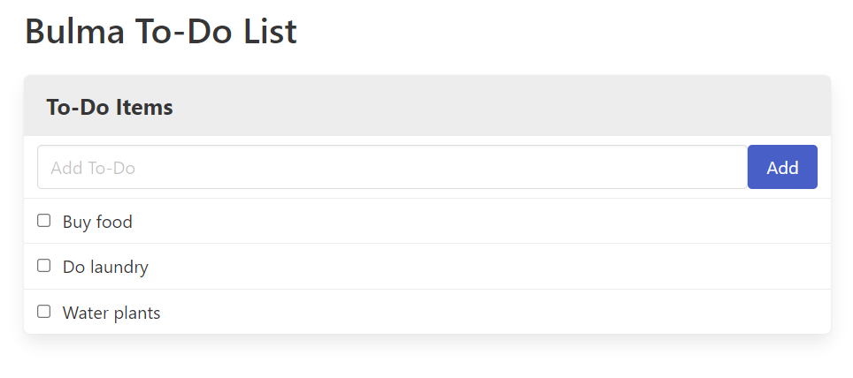
<section class="section">
        <div class="container">
            <h1 class="title">
                Bulma To-Do List
            </h1>
            <nav class="panel">
                <p class="panel-heading">To-Do Items</p>
                <div class="panel-block">
                    <p class="control">
                        <input class="input" type="text" placeholder="Add To-Do">
                    </p>
                    <button class="button is-link">Add</button>
                </div>
                <label class="panel-block">
                    <input type="checkbox">
                    Buy food
                </label>
                <label class="panel-block">
                    <input type="checkbox">
                    Do laundry
                </label>
                <label class="panel-block">
                    <input type="checkbox">
                    Water plants
                </label>
            </nav>
        </div>
    </section>
As seen in the code above, it is pretty intuitive and easy to understand, even if you’re unfamiliar with Bulma. Simply refer to its documentation for the Panel component to understand it. We should now have a nice-looking and simple to-do list.
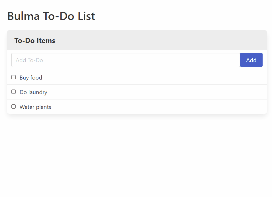
Step 3: Add index.js
Create a file called index.js so we can add items to this list. In this script, we will add a click eventListener to our button and insert a new panel-block component with the value of the user’s input. Finally, we will clear the text input after the component is added.
const btn = document.querySelector(".button");
const input = document.querySelector(".input");
const panel = document.querySelector(".panel");

btn.addEventListener("click", function() {
    //check if input is empty
    if (input.value === "") {
        return alert("Please enter a value");
    }
    //add a new item to the list
    const htmlStr = `<label class="panel-block">
    <input type="checkbox">${input.value}</label>`;
    //insert htmlStr in panel
    panel.insertAdjacentHTML("beforeend", htmlStr);
    //clear input
    input.value = "";
});
Result
And here’s the result of our simple to-do app!
Open Source Session Replay
OpenReplay is an open-source, session replay suite that lets you see what users do on your web app, helping you troubleshoot issues faster. OpenReplay is self-hosted for full control over your data.

Start enjoying your debugging experience - start using OpenReplay for free.
Conclusion
Bulma offers a quick and simple solution for front-end developers. It offers a highly flexible, responsive and intuitive CSS library.
There are also many ways to customize the styles, which are documented in detail here. Thanks for reading the article. I hope it has been helpful in getting you started with Bulma. Cheers!


