
Nowadays, it’s not enough for websites to have all of their capabilities running correctly; it’s more fulfilling when people really enjoy the website’s aesthetics. The smooth and flawless operation of all functionalities is a crucial concern for developers, but recently there has been a need to balance functionality and design.
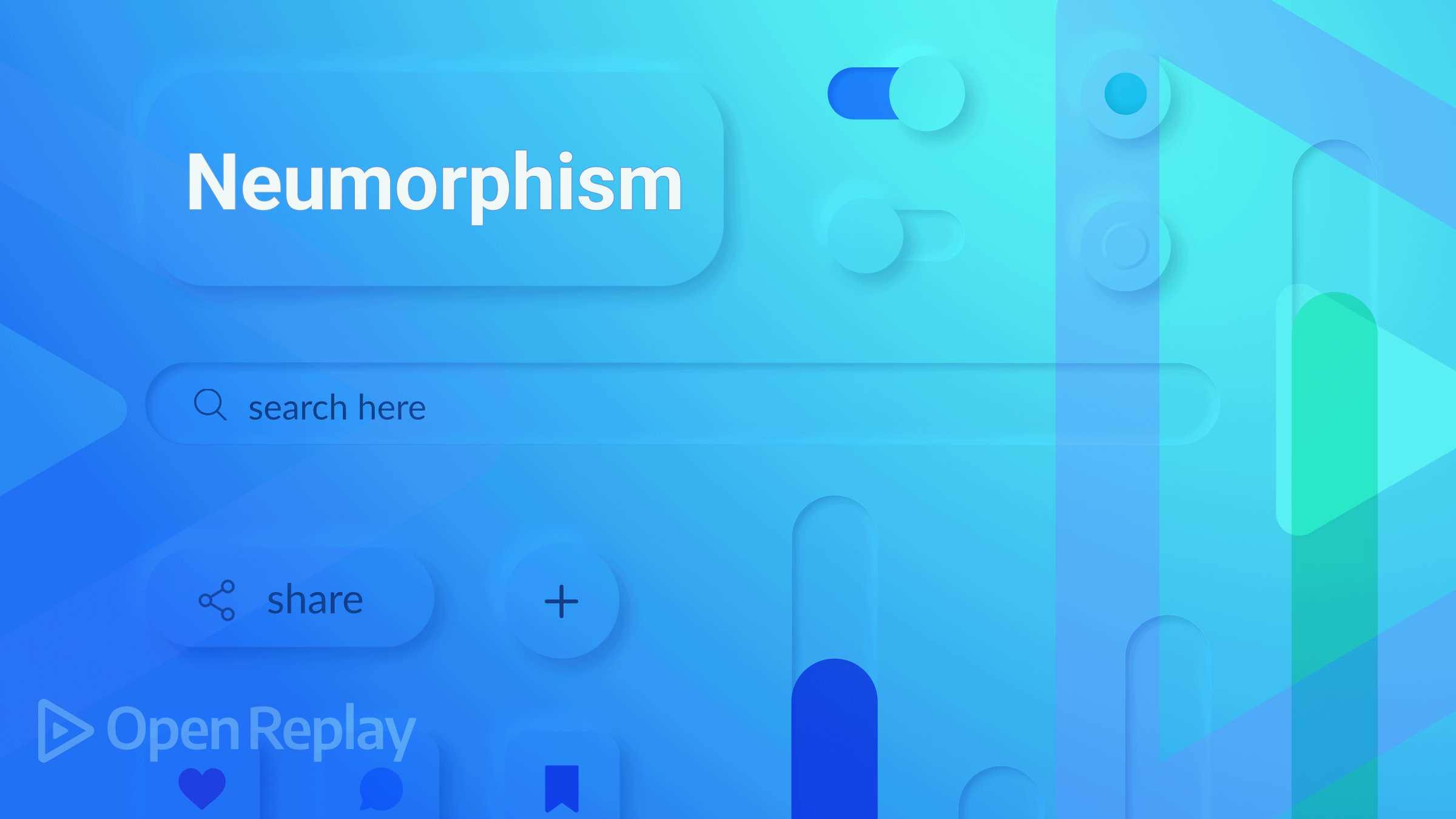
Neumorphism, commonly referred to as soft UI or the advancement of skeuomorphism, employs CSS’s box-shadow and highlights properties to provide the appearance that items are floating above the user interface.
In this article we will implement this type of design on a basic application like this:

What is the Box-shadow property?
A Box shadow is CSS giving an element a shadow; it doesn’t get harder than that. You can throw a shadow from the frame of practically any element with the Box-shadow attribute. An element with a box shadow will have rounded corners if a border-radius is added.
We can apply numerous effects to any element’s frame by separating values with commas. The Box shadow can be specified using blur, spread radius, X and Y offsets, and colors.
The syntax for Box-shadow looks like this box-shadow: h-offset v-offset blur spread color |none|inset|initial
- H-offset: This property is used to control the horizontal position of the shadow. It accepts two values: positive (+) and negative (-). Positive values (+) set the shadow on the right side of the box, while negative values (-) set the shadow on the left.
- V-offset: In this context, V stands for vertical, and it is used to specify the position of the value of the shadow vertically. The shadow above the box is set using the negative value, while the shadow below it is set using the positive value.
- Blur: This characteristic is optional, but it will be required for this article. Its sole purpose is to blur the box.
- Spread: This determines how large the shadow is.
- Color: This choice is entirely up to you. As its name suggests, it’s used to give the shadow more hues if necessary.
- Inset: By utilizing this characteristic, we can create a shadow inside the box even though it is initially displayed outside it.
- Initial: Used to return the box-shadow property to its initial setting.
Neumorphism cannot exist without Box-shadow; therefore, instead of boring you with its attributes as is customary, let’s focus on what Neumorphism is all about. Because the Box-shadow properties are the same as the Neumorphic properties, we are no longer required to discuss Neumorphism’s properties.
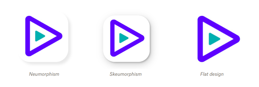
Neumorphism vs Skeuomorphism vs flat design
Many companies, including Apple, have adopted the neumorphic design trend. Although these designs borrow from skeuomorphism and flat design, they also diverge from them:
- Skeuomorphism design: these designs depict incredible three-dimensional features, enabling users to engage with the website or mobile app interfaces more naturally. A fantastic user experience is aided by it, and this was well-liked when iOS first came out.
Three-dimensional effects create the appearance of depth to an interface, which helps users connect certain pieces with distinctive designs and grasp interactive features in sites as we might have:
-
Elements that appear elevated: display a message that can be clicked.
-
Elements that appear unfilled: they look like they could be filled.
These designs are frequently employed as technique signifiers for input elements like the search fields.
- Flat design: a user interface design style that uses simple, two-dimensional elements and bright colors. It is often mistaken for the skeuomorphic style that gives the illusion of three dimensions through copying real-life properties. It’s common with landing pages, logos, and a lot more. Flat designs don’t have any of these; reactionary movement against 3D, skeuomorphic, and realistic design styles.
How to create a Neumorphic Design
In this section, we’ll utilize React and CSS to develop a simple app while implementing the Neumorphic design.
We must develop and import a Neumorphism component into our main “App.js” component because we will need one.
//Neumorphism.Js

import React from 'react';
import "./styles.CSS";

function Neumorphism() {
    return (
        <main className='container'>
            <div className="shapes">
                    <p> Neumorphism effect</p>
                </div>
        </main>
    );
}

export default Neumorphism;


//App.Js
import React from 'react';
import "./styles.css";
import Neumorphism from './Neumorphism';

function App() {
    return (
        <div>
            <main>
                <Neumorphism />
            </main>
        </div>
    )
}
export default App;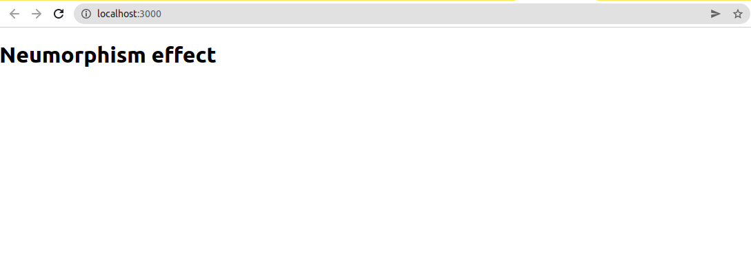
First, we will centralize whatever we are building and add a background color;
.container {
    height: 100Vh;
    display: flex;
    align-items: center;
    justify-content: center;
    background-color: #e2e1e1;
}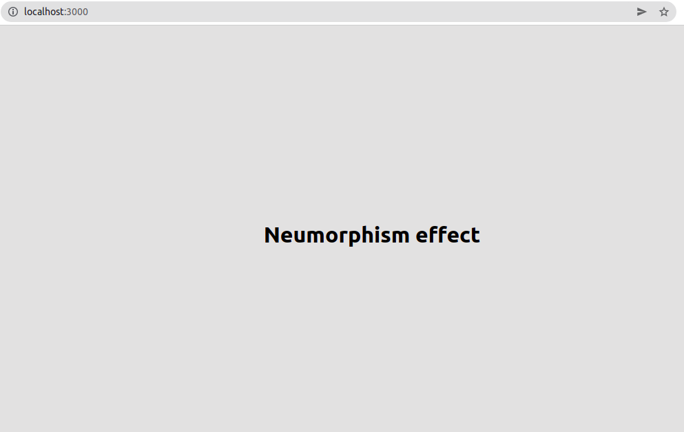
We can take away the “Neumorphism effect” text. Now we will explore our Neumorphic designs in three shapes, rectangle, square, and circle. We need a div from our Neumorphism component as we will only use it for the shapes.
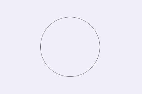
Circle
You need a circle of any dimension; I used 150px for its size.
.circle {
    height: 150px;
    width: 150px;
    border: 1px solid rgba(94, 104, 121, 288);
    border-radius: 50%;
    padding: 2%;
}
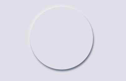
Adding the Box-shadow effect:
.circle {
    height: 150px;
    width: 150px;
    border-radius: 50%;
    padding: 2%;
    box-shadow: -4px -4px 10px #ffffff73, 2px 5px 5px rgba(94, 104, 121, 288);
}
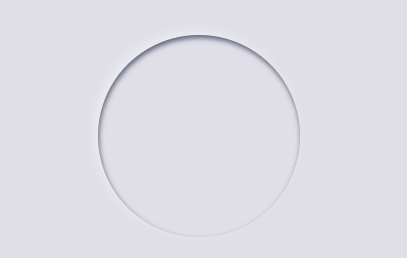
Adding an inset:
.circle {
    height: 150px;
    width: 150px;
    border-radius: 50%;
    padding: 2%;
    box-shadow: -4px -4px 10px #ffffff73, inset 1px 3px 5px rgba(94, 104, 121, 288);
}
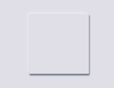
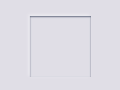
Square
This is easier to make; we just need to take off the border-radius property above, then we have a square:
.square {
    height: 150px;
    width: 150px;
    padding: 2%;
    box-shadow: -4px -4px 10px #ffffff73, 2px 5px 5px rgba(94, 104, 121, 288);
}
Let’s include the inset:
.square {
    height: 150px;
    width: 150px;
    padding: 2%;
    box-shadow: -4px -4px 10px #ffffff73, inset 1px 3px 5px rgba(94, 104, 121, 288);
}
Open Source Session Replay
OpenReplay is an open-source, session replay suite that lets you see what users do on your web app, helping you troubleshoot issues faster. OpenReplay is self-hosted for full control over your data.

Start enjoying your debugging experience - start using OpenReplay for free.
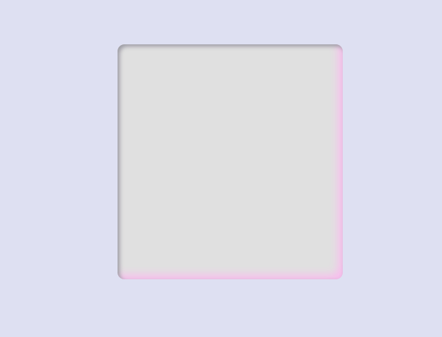
Neumorphic styling with colors
A good mix of Colors adds to the aesthetics of everything, and knowing the right colors to use on a web page guarantees a great UI. You can get a guide on colors to use with the neumorphic effect from Neumorphis.io, and you can also go the extra mile by making the color of your shadows differ from your element’s color.
  .container {
    height: 50Vh;
    display: flex;
    align-items: center;
    justify-content: center;
    border-radius: 10px;
    background-color: #e0e0e0;
    border: none;
    color: #3688db;
    box-shadow: inset 3px 3px 6px #9b9da3, inset -6px -6px 12px #ffaaff73;
    width: 20rem;
    margin-top: 150px;
}
This is what the style above gives us:
Implementing Neumorphic Shadows in an App
We have explored this design in various shapes, colors, and animations; let’s implement it in a simple project.
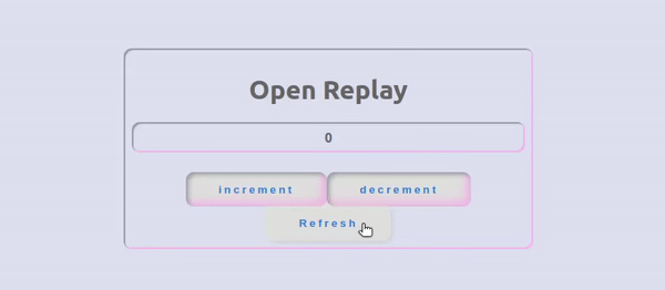
We will have ourselves build an increment app and improve its aesthetics with the Neumorphic shadows we learned already :
//App.Js

import React, { useState } from 'react';
import './App.css';

function App() {
  const [count, setCount] = useState(0);

  function handleClick() {
    window.location.reload(false);
  }

  return (
    <div className="container">
      <div className="display">
        <h1>Open Replay</h1>
        <div className="display">
          {count}
        </div>
        <div>
          <button onClick={() => {
            setCount(count + 1)
          }} className="btn" >
            increment
          </button>
          <button onClick={() => {
            setCount(count - 1)
          }} className="btn" >
            decrement
          </button>
          <button onClick={handleClick} className="btn" >
            Refresh
          </button>
        </div>
      </div>
    </div>
  );
}

export default App;
The code above increments and decrements a number by 1; it’s a straightforward app for this use case. We will add Neumorphic designs to the buttons and the element where the counting takes place.
.container {
    height: 100Vh;
    display: flex;
    align-items: center;
    justify-content: center;
    display: grid;
    background: #dee2f1;
}

.btn {
    padding: 1em 3em;
    border-radius: 10px;
    background-color: #e0e0e0;
    border: none;
    color: #3688db;
    font-weight: 700;
    letter-spacing: .2rem;
    text-align: center;
    outline: none;
    cursor: pointer;
    transition: .1s ease-in-out;
    box-shadow: inset 3px 3px 6px #9b9da3, inset -6px -6px 12px #ffaaff73;
}

button:hover {
    box-shadow: -2px -2px 6px rgba(255, 254, 55, .1), -2px -2px 4px rgba(255, 255, 255, .1), 2px 2px 2px rgba(255, 255, 255, .1), 2px 2px 4px rgba(0, 0, 0, .1);
}

button:active {
    box-shadow: inset -2px -2px 6px rgba(255, 255, 255, .1), inset -2px -2px 4px rgba(255, 255, 255, .1), inset 2px 2px 2px rgba(255, 255, 255, .1), inset 2px 2px 4px rgba(0, 0, 0, .1);
}

.display {
    border-radius: 10px;
    padding: 2%;
    box-shadow: inset 2px 2px 1px #9b9da3, inset -2px -2px 1px #ffaaff73;
    ;
    margin-bottom: 5%;
    color: #666666;
    font-weight: 700;
    text-align: center;
}
This is what it looks like:
Conclusion
We concentrated on Neumorphism in this paper. We observed several forms to determine the distinctions between Neumorphism, Flat designs, and Skeuomorphism. The typical app user is a critic; therefore, this style of design keeps bad reviews at a distance.
A TIP FROM THE EDITOR: You can learn more about shadows (very important in neumorphic designs) in our Shadows in CSS article.