
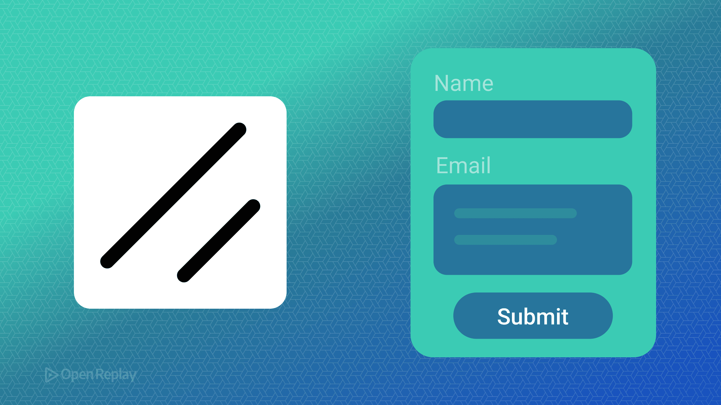
ShadCN UIを使用したアクセシブルフォームの作成方法

機能的でアクセシブルなフォームを構築することは困難な作業です。状態管理、バリデーション処理、適切なARIA属性の確保など、本来であれば簡単であるはずのタスクに開発者は数え切れないほどの時間を費やすことがよくあります。ShadCN UIをReact Hook FormとZodと組み合わせることで、アクセシビリティ標準を維持しながらフォーム作成を簡素化する強力なソリューションを提供できます。
この記事では、ShadCN UIを使用してアクセシブルフォームを構築し、状態管理のためのShadCN UI React Hook Form統合を行い、今後何年にもわたって有効なShadCN UI Zodバリデーションパターンを実装する方法を説明します。
重要なポイント
- ShadCN UIは、コンポーザブルフォームシステムを通じてARIA属性とアクセシビリティパターンを自動的に処理します
- React Hook Form統合により、最小限の再レンダリングで効率的な状態管理を提供します
- Zodスキーマバリデーションにより、明確なエラーメッセージを含む型安全なフォームバリデーションを保証します
- 組み込みコンポーネントは、ラベルの関連付け、エラーのアナウンス、キーボードナビゲーションを処理します
ShadCN UIのフォームアーキテクチャの理解
ShadCN UIは、React Hook FormとRadix UIプリミティブ上に構築されたコンポーザブルフォームシステムを提供します。アーキテクチャは一貫したパターンに従います:
<Form>
  <FormField
    control={form.control}
    name="fieldName"
    render={({ field }) => (
      <FormItem>
        <FormLabel>Field Label</FormLabel>
        <FormControl>
          <Input {...field} />
        </FormControl>
        <FormDescription>Helper text</FormDescription>
        <FormMessage />
      </FormItem>
    )}
  />
</Form>
この構造により以下が自動的に処理されます:
React.useId()を使用した一意ID生成- 適切な
aria-describedbyとaria-invalid属性 - エラーメッセージの関連付け
- ラベル-入力の関係
ShadCN UIを使用したアクセシブルフォームのセットアップ
まず、必要なコンポーネントをインストールします:
npx shadcn@latest add form input textarea checkbox labelこのコマンドは、React Hook FormとZodの依存関係と共にShadCN UIコンポーネントをインストールします。
基本的なフォームスキーマの作成
型安全なバリデーションのためにZodを使用してフォーム構造を定義します:
import { z } from "zod"

const formSchema = z.object({
  name: z.string().min(2, "Name must be at least 2 characters"),
  email: z.string().email("Invalid email address"),
  message: z.string().min(10, "Message must be at least 10 characters"),
  terms: z.boolean().refine((val) => val === true, {
    message: "You must accept the terms"
  })
})

type FormData = z.infer<typeof formSchema>
フォームコンポーネントの実装
ShadCN UI React Hook Form統合を使用してアクセシブルなお問い合わせフォームを構築する方法は以下の通りです:
import { useForm } from "react-hook-form"
import { zodResolver } from "@hookform/resolvers/zod"
import { Form, FormControl, FormField, FormItem, FormLabel, FormMessage, FormDescription } from "@/components/ui/form"
import { Input } from "@/components/ui/input"
import { Textarea } from "@/components/ui/textarea"
import { Checkbox } from "@/components/ui/checkbox"
import { Button } from "@/components/ui/button"

export function ContactForm() {
  const form = useForm<FormData>({
    resolver: zodResolver(formSchema),
    defaultValues: {
      name: "",
      email: "",
      message: "",
      terms: false
    }
  })

  function onSubmit(data: FormData) {
    console.log(data)
  }

  return (
    <Form {...form}>
      <form onSubmit={form.handleSubmit(onSubmit)} className="space-y-6">
        <FormField
          control={form.control}
          name="name"
          render={({ field }) => (
            <FormItem>
              <FormLabel>Name</FormLabel>
              <FormControl>
                <Input placeholder="John Doe" {...field} />
              </FormControl>
              <FormMessage />
            </FormItem>
          )}
        />

        <FormField
          control={form.control}
          name="email"
          render={({ field }) => (
            <FormItem>
              <FormLabel>Email</FormLabel>
              <FormControl>
                <Input type="email" placeholder="john@example.com" {...field} />
              </FormControl>
              <FormMessage />
            </FormItem>
          )}
        />

        <FormField
          control={form.control}
          name="message"
          render={({ field }) => (
            <FormItem>
              <FormLabel>Message</FormLabel>
              <FormControl>
                <Textarea
                  placeholder="Your message here..."
                  className="resize-none"
                  {...field}
                />
              </FormControl>
              <FormMessage />
            </FormItem>
          )}
        />

        <FormField
          control={form.control}
          name="terms"
          render={({ field }) => (
            <FormItem className="flex flex-row items-start space-x-3 space-y-0">
              <FormControl>
                <Checkbox
                  checked={field.value}
                  onCheckedChange={field.onChange}
                />
              </FormControl>
              <div className="space-y-1 leading-none">
                <FormLabel>
                  Accept terms and conditions
                </FormLabel>
              </div>
              <FormMessage />
            </FormItem>
          )}
        />

        <Button type="submit">Submit</Button>
      </form>
    </Form>
  )
}
Discover how at OpenReplay.com.
組み込まれたアクセシビリティ機能
ShadCN UIのフォームコンポーネントは、重要なアクセシビリティパターンを自動的に実装します:
- 適切なラベリング:
FormLabelコンポーネントはhtmlFor属性を使用してフォームコントロールと関連付けます - エラーのアナウンス:
FormMessageコンポーネントはaria-describedbyを介してリンクされます - 無効状態: バリデーションが失敗した場合、フィールドは自動的に
aria-invalid="true"を受け取ります - キーボードナビゲーション: すべてのコンポーネントは標準的なキーボード操作をサポートします
高度なバリデーションパターン
複雑なShadCN UI Zodバリデーションシナリオを実装します:
const advancedSchema = z.object({
  password: z.string()
    .min(8, "Password must be at least 8 characters")
    .regex(/[A-Z]/, "Password must contain at least one uppercase letter")
    .regex(/[a-z]/, "Password must contain at least one lowercase letter")
    .regex(/[0-9]/, "Password must contain at least one number"),
  confirmPassword: z.string()
}).refine((data) => data.password === data.confirmPassword, {
  message: "Passwords don't match",
  path: ["confirmPassword"]
})
アクセシブルフォームのベストプラクティス
- 常にラベルを使用する: すべての入力には、スクリーンリーダーユーザーのために可視のラベルが必要です
- 明確なエラーメッセージを提供する: 何が問題で、どのように修正すればよいかを具体的に示します
- 関連するフィールドをグループ化する: 論理的なグループ化には
fieldsetとlegendを使用します - キーボードでテストする: すべての操作がマウスなしで機能することを確認します
- 送信時にバリデーションする: ユーザーを中断する積極的なインラインバリデーションは避けます
結論
ShadCN UIは、React Hook Formの状態管理の力とZodの型安全なバリデーションを組み合わせることで、アクセシビリティを中核原則として維持しながらフォーム開発を変革します。コンポーネントアーキテクチャにより、手動でARIA属性を管理することなく、構築するすべてのフォームがWCAG標準を満たすことが保証されます。
これらのパターンに従うことで、能力や支援技術に関係なく、すべての人にとって機能するフォームを作成できます。このアプローチの美しさはそのシンプルさにあります:アクセシブルフォームが後付けではなく、デフォルトになるのです。
よくある質問
技術的には可能ですが、ShadCN UIのフォームコンポーネントはReact Hook Formと連携するように設計されています。これなしで使用すると、ライブラリを価値あるものにする自動バリデーション、状態管理、アクセシビリティ機能を失うことになります。
ShadCN UIは自動的に一意IDを生成し、htmlFor属性を通じてラベルを入力と関連付け、aria-describedbyを介してエラーメッセージをリンクし、バリデーションエラー時にaria-invalidを設定します。すべてのコンポーネントはデフォルトでキーボードナビゲーションをサポートします。
Zodバリデーションは必要な時のみ実行され、通常はblurまたはsubmitイベント時に行われます。React Hook Formが不要な再レンダリングを防ぐため、パフォーマンスへの影響は最小限です。数百のフィールドを持つフォームの場合は、スキーマレベルのバリデーションではなくフィールドレベルのバリデーションの使用を検討してください。
Gain Debugging Superpowers
Unleash the power of session replay to reproduce bugs, track slowdowns and uncover frustrations in your app. Get complete visibility into your frontend with OpenReplay — the most advanced open-source session replay tool for developers. Check our GitHub repo and join the thousands of developers in our community.
