Tailwind CSSを使ったフォームスタイリングの実践ガイド
Tailwind CSSのユーティリティクラスで入力欄・ラベル・ドロップダウン・ボタンをスタイリングし、バリデーション状態とダークモードに対応したレスポンシブフォームを構築する。

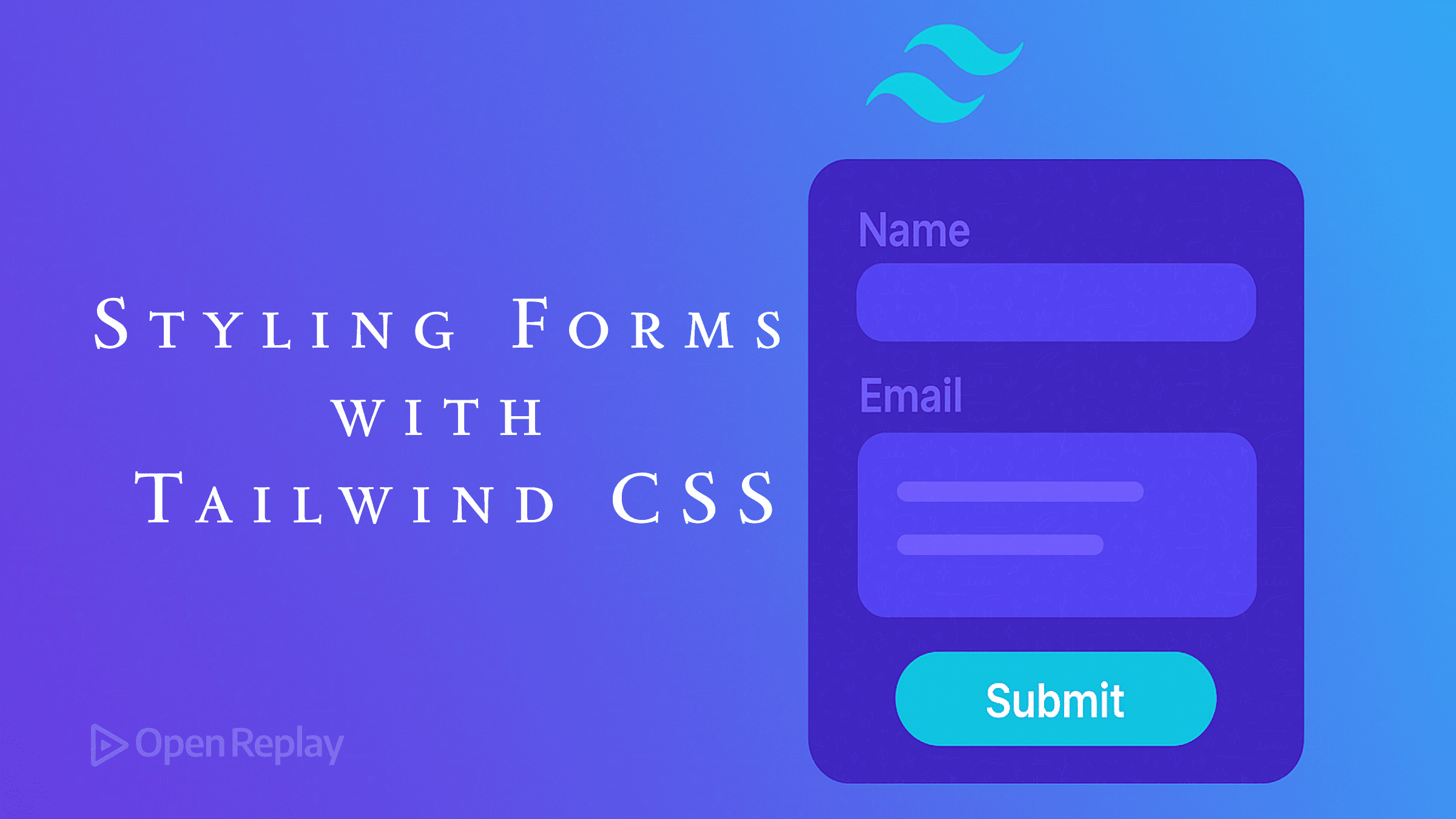
フォームはユーザーインタラクションに不可欠ですが、一貫したスタイリングを行うことは困難な場合があります。Tailwind CSSは、フォームスタイリングをより直感的で効率的にするユーティリティファーストのアプローチを提供します。このガイドでは、基本的な入力フィールドから完全なレスポンシブフォームまで、Tailwindを使用した一般的なフォーム要素のスタイリング方法を説明します。
重要なポイント
- フォーム要素全体で一貫したパディング、ボーダー、フォーカス状態を使用する
- 関連するフォーム要素を適切な間隔でグループ化する
- Tailwindのレスポンシブユーティリティを活用してアダプティブフォームを作成する
- 色分けされたフィードバックでバリデーション状態をスタイリングする
- より良いデフォルトのために@tailwindcss/formsプラグインのインストールを検討する
- ナイトフレンドリーなフォームにダークモードバリアントを使用する
Tailwindフォームスタイリングの開始
具体的なフォーム要素に入る前に、プロジェクトにTailwind CSSがインストールされていることを確認してください:
npm install tailwindcss
npx tailwindcss init必須ではありませんが、公式の@tailwindcss/formsプラグインは、フォーム要素により良いデフォルトスタイリングを提供します:
npm install @tailwindcss/forms次に、tailwind.config.jsに追加します:
module.exports = {
  plugins: [
    require('@tailwindcss/forms'),
  ],
}
基本的なフォーム要素のスタイリング
入力フィールド
テキスト入力は最も一般的なフォーム要素です。Tailwindでのスタイリング方法は以下の通りです:
<input
  type="text"
  class="w-full px-3 py-2 border border-gray-300 rounded-md focus:outline-none focus:ring-2 focus:ring-blue-500 focus:border-blue-500"
  placeholder="Enter your name"
/>
これにより、以下の特徴を持つ入力フィールドが作成されます:
- 全幅(
w-full) - 全方向のパディング(
px-3 py-2) - グレーのボーダー(
border border-gray-300) - 角丸(
rounded-md) - フォーカス時の青いリングとボーダー(
focus:ring-2 focus:ring-blue-500 focus:border-blue-500)
ラベル
適切にスタイリングされたラベルは、フォームの使いやすさとアクセシビリティを向上させます:
<label for="email" class="block text-sm font-medium text-gray-700 mb-1">
  Email Address
</label>
セレクトドロップダウン
ドロップダウンはテキスト入力と同様にスタイリングできます:
<select class="w-full px-3 py-2 border border-gray-300 rounded-md focus:outline-none focus:ring-2 focus:ring-blue-500 focus:border-blue-500">
  <option>Select an option</option>
  <option>Option 1</option>
  <option>Option 2</option>
</select>
チェックボックスとラジオボタン
チェックボックスとラジオボタンのスタイリングには異なるアプローチが必要です:
<div class="flex items-center">
  <input
    type="checkbox"
    id="terms"
    class="h-4 w-4 text-blue-600 border-gray-300 rounded focus:ring-blue-500"
  />
  <label for="terms" class="ml-2 text-sm text-gray-700">
    I agree to the terms and conditions
  </label>
</div>ラジオボタンの場合は、単純にtype="checkbox"をtype="radio"に変更し、roundedクラスを削除します。
テキストエリア
複数行のテキスト入力の場合:
<textarea
  rows="4"
  class="w-full px-3 py-2 border border-gray-300 rounded-md focus:outline-none focus:ring-2 focus:ring-blue-500 focus:border-blue-500"
  placeholder="Enter your message"
></textarea>
ボタン
フォーム送信ボタンは目立つようにする必要があります:
<button
  type="submit"
  class="w-full bg-blue-600 text-white py-2 px-4 rounded-md hover:bg-blue-700 focus:outline-none focus:ring-2 focus:ring-blue-500 focus:ring-offset-2"
>
  Submit
</button>
完全なお問い合わせフォームの構築
すべてを組み合わせて、レスポンシブなお問い合わせフォームを作成しましょう:
<form class="max-w-md mx-auto p-6 bg-white rounded-lg shadow-md">
  <h2 class="text-xl font-bold mb-6 text-gray-800">Contact Us</h2>

  <!-- Name field -->
  <div class="mb-4">
    <label for="name" class="block text-sm font-medium text-gray-700 mb-1">
      Name
    </label>
    <input
      type="text"
      id="name"
      name="name"
      class="w-full px-3 py-2 border border-gray-300 rounded-md focus:outline-none focus:ring-2 focus:ring-blue-500 focus:border-blue-500"
      placeholder="Your name"
      required
    />
  </div>

  <!-- Email field -->
  <div class="mb-4">
    <label for="email" class="block text-sm font-medium text-gray-700 mb-1">
      Email
    </label>
    <input
      type="email"
      id="email"
      name="email"
      class="w-full px-3 py-2 border border-gray-300 rounded-md focus:outline-none focus:ring-2 focus:ring-blue-500 focus:border-blue-500"
      placeholder="your.email@example.com"
      required
    />
  </div>

  <!-- Message field -->
  <div class="mb-6">
    <label for="message" class="block text-sm font-medium text-gray-700 mb-1">
      Message
    </label>
    <textarea
      id="message"
      name="message"
      rows="4"
      class="w-full px-3 py-2 border border-gray-300 rounded-md focus:outline-none focus:ring-2 focus:ring-blue-500 focus:border-blue-500"
      placeholder="Your message"
      required
    ></textarea>
  </div>

  <!-- Submit button -->
  <button
    type="submit"
    class="w-full bg-blue-600 text-white py-2 px-4 rounded-md hover:bg-blue-700 focus:outline-none focus:ring-2 focus:ring-blue-500 focus:ring-offset-2"
  >
    Send Message
  </button>
</form>
フォームレイアウトパターン
インラインフォーム
インラインフォームは、検索バーなどのシンプルな入力に最適です:
<form class="flex items-center space-x-2">
  <input
    type="text"
    class="flex-1 px-3 py-2 border border-gray-300 rounded-md focus:outline-none focus:ring-2 focus:ring-blue-500 focus:border-blue-500"
    placeholder="Search"
  />
  <button
    type="submit"
    class="bg-blue-600 text-white py-2 px-4 rounded-md hover:bg-blue-700 focus:outline-none focus:ring-2 focus:ring-blue-500 focus:ring-offset-2"
  >
    Search
  </button>
</form>
グリッドレイアウトフォーム
複数列のフォームには、Tailwindのgridユーティリティを使用します:
<form class="grid grid-cols-1 md:grid-cols-2 gap-4">
  <div class="mb-4">
    <label for="firstName" class="block text-sm font-medium text-gray-700 mb-1">
      First Name
    </label>
    <input
      type="text"
      id="firstName"
      class="w-full px-3 py-2 border border-gray-300 rounded-md focus:outline-none focus:ring-2 focus:ring-blue-500 focus:border-blue-500"
    />
  </div>

  <div class="mb-4">
    <label for="lastName" class="block text-sm font-medium text-gray-700 mb-1">
      Last Name
    </label>
    <input
      type="text"
      id="lastName"
      class="w-full px-3 py-2 border border-gray-300 rounded-md focus:outline-none focus:ring-2 focus:ring-blue-500 focus:border-blue-500"
    />
  </div>

  <div class="md:col-span-2 mb-4">
    <label for="email" class="block text-sm font-medium text-gray-700 mb-1">
      Email
    </label>
    <input
      type="email"
      id="email"
      class="w-full px-3 py-2 border border-gray-300 rounded-md focus:outline-none focus:ring-2 focus:ring-blue-500 focus:border-blue-500"
    />
  </div>

  <div class="md:col-span-2">
    <button
      type="submit"
      class="w-full bg-blue-600 text-white py-2 px-4 rounded-md hover:bg-blue-700 focus:outline-none focus:ring-2 focus:ring-blue-500 focus:ring-offset-2"
    >
      Submit
    </button>
  </div>
</form>
フォームバリデーションスタイリング
Tailwindはバリデーション状態用の組み込みクラスを提供していませんが、作成することができます:
<div class="mb-4">
  <label for="email" class="block text-sm font-medium text-gray-700 mb-1">
    Email
  </label>
  <input
    type="email"
    id="email"
    class="w-full px-3 py-2 border border-red-500 rounded-md focus:outline-none focus:ring-2 focus:ring-red-500 focus:border-red-500"
    placeholder="your.email@example.com"
  />
  <p class="mt-1 text-sm text-red-600">Please enter a valid email address</p>
</div>
成功状態には、緑のバリアントを使用します:
<input
  type="text"
  class="w-full px-3 py-2 border border-green-500 rounded-md focus:outline-none focus:ring-2 focus:ring-green-500 focus:border-green-500"
/>
<p class="mt-1 text-sm text-green-600">Looks good!</p>
フォームのレスポンシブ化
Tailwindのレスポンシブプレフィックスにより、フォームを異なる画面サイズに簡単に適応させることができます:
<form class="p-4 md:p-6 lg:p-8">
  <div class="grid grid-cols-1 sm:grid-cols-2 gap-4">
    <!-- Form fields -->
  </div>

  <div class="mt-6">
    <button
      type="submit"
      class="w-full sm:w-auto bg-blue-600 text-white py-2 px-4 rounded-md"
    >
      Submit
    </button>
  </div>
</form>
ダークモードサポート
フォーム要素にダークモードバリアントを追加します:
<form class="bg-white dark:bg-gray-800 p-6 rounded-lg shadow-md">
  <label class="block text-gray-700 dark:text-gray-200 mb-1">
    Name
  </label>
  <input
    type="text"
    class="w-full px-3 py-2 border border-gray-300 dark:border-gray-600 bg-white dark:bg-gray-700 text-gray-900 dark:text-gray-100 rounded-md"
  />
</form>
よくある質問
@tailwindcss/formsプラグインは必要ですか?
いいえ、必須ではありませんが、フォーム要素により良いデフォルトスタイリングを提供し、記述する必要のあるユーティリティクラスの量を減らします。
Tailwindでフォームバリデーションを処理するにはどうすればよいですか?
Tailwindはバリデーションロジックを処理せず、スタイリングのみを行います。HTML5バリデーション属性(`required`、`pattern`など)またはJavaScriptバリデーションライブラリを使用し、その後条件付きでTailwindクラスを適用してください。
Tailwindでカスタムフォームコンポーネントを作成できますか?
はい、React、Vue、Angularなどのフレームワークを使用している場合は、繰り返しパターンをコンポーネントに抽出できます。または、CSSでTailwindの`@apply`ディレクティブを使用して再利用可能なフォーム要素スタイルを作成できます。
フォームをアクセシブルにするにはどうすればよいですか?
`for`属性による適切なラベル付け、適切なARIA属性の使用、十分な色のコントラストの維持、キーボードナビゲーションのテストを確実に行ってください。Tailwindのユーティリティクラスは直接的にアクセシビリティに影響しません。
多くのフォームスタイルを使用する際にCSSバンドルサイズを削減するにはどうすればよいですか?
設定でTailwindのpurgeオプションを使用して、本番ビルドで未使用のスタイルを削除してください。これにより、最終的なCSSファイルサイズが大幅に削減されます。
まとめ
Tailwind CSSは、フォームをスタイリングするための強力で柔軟なシステムを提供します。そのユーティリティクラスを一貫して使用することで、異なる画面サイズやユーザーの好みに適応する、視覚的に魅力的で機能的なフォームを作成できます。このガイドの例は、特定のプロジェクト要件に応じて構築できる基盤として機能します。