
Leveraging CSS :invalid for Real-Time Data Validation


The
:invalidpseudo-class allows you to indicate certain real-time clues in terms of design styles or pop-up messages for form fields that do not meet the required validation criteria. In this article, we will see how you can use the:invalidpseudo-class to create and validate forms that offer a better user experience.

Discover how at OpenReplay.com.
You get a level of frustration when you fill out a long form, and just as you hit the submit button, you get so many error messages about what you did wrong. Most times, we just abandon the process. But what if I can show you how to validate your form’s input data in real-time? And the most interesting part is, you just need HTML5 and CSS for it—no need to rely on any lengthy JavaScript code or server-side validation to handle this process.
Understanding the :invalid Pseudo-Class
The :invalid pseudo-class in CSS is used on the web to flag any invalid form element based on a validation rule. Attributes like required or pattern are used to cross-check user input in real-time, and the browser automatically flags it as invalid if it does not meet the required rules laid out by the developer. This is very useful because users don’t have to wait to finish filling a form before being instructed on how to do to accurately complete their task.
Compatibility Across Browsers
Popular browsers like Safari, Chrome, Firefox, and Opera all support the :invalid pseudo-class, so you literally don’t have issues using it in your code. However, there might be slight differences in the styling capabilities of each browser, and it might be wise to test-run your form validation process to ensure a better user experience across browsers.
How It Works in Conjunction with HTML5 Form Attributes
HTML5 form attributes like type, required, and pattern work seamlessly with the :invalid pseudo-class to create rules that guide users on what to do correctly when inputting their information. For example:
- The
typeattribute is used to choose the kind of data that is allowed in a field, such asemail,name,password,url, ornumber. - The
requiredattribute ensures that data must be inserted in the input field before any submission can take place. - The
patternattribute specifies a regular expression that the field’s value must match with. - The
minandmaxattributes act as input range guides, commonly used for numbers and dates. Theminattribute represents the minimum value, while themaxattribute represents the maximum value.
Creating Visual Feedback
Let’s examine some ways to add subtle visual feedback or indicators with the :invalid pseudo-class.
Styling Input Elements
Using the :invalid pseudo-class, you can add a real-time indicator for users when an input fails the defined criteria. Something like changing the border color, background color or adding an icon to indicate an error can be helpful. For example:
input:invalid {
  border-color: red;
  background-color: #fdd;
}
The color red is mostly associated with error, so including that as an indicator will work.
Adding Error Messages
While styling indicators might not work for all scenarios, explicitly providing an error message is another way to tell users what to do right. You can do this by adding the :after pseudo-element to show the message when input is invalid, like this:
input:invalid::after {
  content: "Please fill out this field correctly.";
  color: red;
  font-size: 0.8em;
}
In the code above, the error message “Please fill out this field correctly” is displayed in red once the’ input’ is invalid.
Examples of Effective Visual Feedback
Remember that feedback and indicators are meant to be subtle; they are not our focus. They are only necessary to improve the user experience.
So when we apply changes like changing the border color to red or adding a soft background-color, we should do it without making them too distracting. Also, using concise error messages ensures users quickly understand the message we are trying to pass across and how to fix it.
Practical Demonstration
It’s time to put together everything we have been discussing into practice.
HTML Structure for a Basic Form
Let’s create a simple form field with inputs such as email, tel, text, and number. Something like this:
<h2>OpenReplay ID Form</h2>

<form>
 <div class="form-group">
 <label for="name">Name:</label>
 <input type="text" name="name" />
 </div>

 <div class="form-group">
 <label for="email">Email:</label>
 <input type="email" name="email" />
 <div class="error-message">Invalid gmail - Missing "@"</div>
 </div>

 <div class="form-group">
 <label for="phone">Phone:</label>
 <input
 type="tel"
 name="phone"
 pattern="\d{11}" />
 <div class="error-message">
 Please enter a valid 11-digit phone number.
 </div>
 </div>

 <div class="form-group">
 <label for="age">Age:</label>
 <input
 type="number"
 name="age"
 min="18"
 max="65" />
 <div class="error-message">Age must be between 18 and 65.</div>
 </div>

 <div class="form-group">
 <label for="description"
 >Short Description (max 200 characters):</label
 >
 <textarea
 name="description"
 maxlength="200"
 ></textarea>
 </div>

 <button type="submit">Submit</button>
</form>
The code above is a form with multiple input fields, including those for name, email, age, and a description. Each field has respective types and labels guiding users to the required data. For example, the age input has min and max attributes, specifying that the value must be between 18 and 65.
CSS Styling for Visual Feedback
Now, let’s add some styling to it. One way to just quickly validate your form is by doing this:
body {
  font-family: Arial, sans-serif;
  margin: 20px;
  padding: 20px;
  max-width: 600px;
  margin: auto;
}
.form-group {
  margin-bottom: 15px;
}
label {
  display: block;
  margin-bottom: 5px;
}
input, textarea {
  width: 100%;
  padding: 8px;
  box-sizing: border-box;
}
input:invalid, textarea:invalid {
  border: 2px solid red;
  background-color: #fdd;
}
.error-message {
  font-size: 0.9em;
  display: none;
}
input:invalid ~ .error-message, textarea:invalid ~ .error-message {
  display: block;
}
button {
  background-color: #007bff;
  color: white;
  padding: 10px 15px;
  border: none;
}
In this code, the input:invalid colors the border red if the users does not enter a valid information.
Result
You should have something like this:
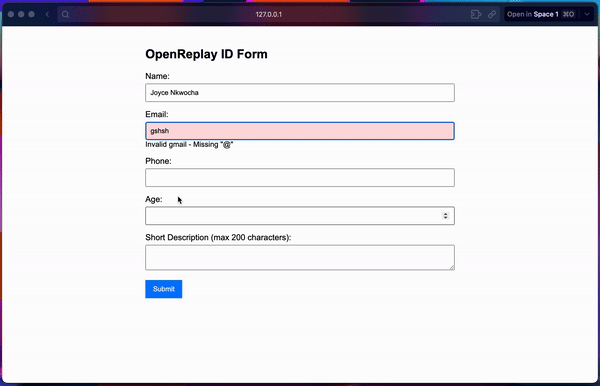
In the result above, you can see how the input field turns red and displays an error message instructing users on what to do correctly in real time.
Best Practices
There is a proper way you can use this :invalid pseudo-class, and that’s what we will learn in this section.
When to Rely on JavaScript
I hate to break it to you, but you can’t rely only on CSS if your project requires more complex validation like verifying email availability or matching passwords. You would need JavaScript for those. You can only use the :invalid for simple, straightforward checks in your forms and then add JavaScript when more advanced needs arise.
Combining with JavaScript for More Complex Validation
You can build more functional and sophisticated forms that can have custom error messages and listen to form submissions in real-time with the combination of this duo.
Accessibility Considerations for Error Messages
Accessibility is another key area most of us ignore. Using ARIA (Accessible Rich Internet Applications) attributes like aria-invalid and aria-describedby can be so helpful for those with visual impairment that rely on screen readers to access web content. For example:
<input type="email" id="email" name="email" required aria-invalid="true" aria-describedby="email-error">
<span id="email-error" class="error">Please enter a valid email address.</span>
Ensuring Clarity and Consistency in Error Messages
When writing your error messages, being concise and consistent will really help your users better complete the required task. For example, instead of writing “invalid input,” something like “Please enter a valid email address” would be more informative and preferable.
Conclusion
We discussed how you can better validate your forms with the :invalid pseudo-class in CSS, which offers a real-time and easy process of improving the user experience with subtle feedback.
While this technique is powerful, we also admitted that more advanced scenarios can be achieved when combined with JavaScript. By following best practices, you can create forms that are very functional and accessible.
As the web advances, using more modern techniques like the :invalid pseudo-class will help you quickly validate your forms without having to write any JavaScript code. Remember to give it a try in your next form validation project.
Gain control over your UX
See how users are using your site as if you were sitting next to them, learn and iterate faster with OpenReplay. — the open-source session replay tool for developers. Self-host it in minutes, and have complete control over your customer data. Check our GitHub repo and join the thousands of developers in our community.
