Imagine borders that do more than define and separate. Envision them as captivating design elements, adding a unique visual flourish to your website. This is the power of border images—a potent CSS technique that opens up a realm of creative possibilities. This article explains the fundamentals of applying them and explores advanced techniques for customization and transforming your web design process.

Discover how at OpenReplay.com.
Border images are a versatile tool in web design that allows for the customization of borders around HTML elements. Rather than relying solely on solid color borders, they enable designers to use images to create visually appealing and unique borders. This means you could have a border made of a repeating pattern, a detailed texture, a decorative frame, or any other visual element you can imagine as an image.
Traditional Border Styles vs. Border Image Styles
Traditional CSS borders, defined by properties like border-width, border-style, and border-color, are commonly represented by solid lines, color gradients, or dotted patterns, as fundamental elements for defining sections and emphasizing visual hierarchy. They provide a simple yet effective way to structure web pages. While these borders excel in functionality, they lack the visual flair offered by their more dynamic counterpart: border images, which leverage image files to create unique and visually compelling borders. This approach unlocks a multitude of design possibilities, allowing for the creation of custom frames, incorporation of brand elements, and crafting attention-grabbing design features.
Compared to the limited modifications available with traditional borders (color, width, and style), they empower designers with extensive control. They can select the image, slice it strategically, define repetition patterns, and tailor it to perfectly complement the element’s border area. This level of control translates to a near-limitless creative potential.
While traditional CSS border styles suffice for straightforward and functional borders, border images emerge as the preferred choice for those seeking to push visual boundaries and create truly distinctive elements. They are a powerful tool for designers aspiring to innovate and captivate audiences with their web design endeavors.
Let’s see an example to highlight the visual difference between them:
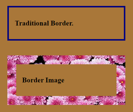
Explanation:
-
The first box demonstrates a classic CSS border: a simple, solid brown line without intricate patterns or designs.
-
The second box replaces the solid border with an image border. The border displays the content of the
image.pngfile around the box, potentially featuring intricate patterns, textures, or designs, depending on the image’s content. This provides a more visually dynamic and customizable border compared to the solid red border of the first box.
Advantages of Utilizing Border Images
Incorporating them into your web design arsenal offers several notable benefits. Their benefits include:
-
Enhanced Visual Appeal: They introduce intricate patterns, textures, gradients, and illustrations to break away from the limitations of traditional borders.
-
Eye-catching designs: They create visually striking elements that capture the web user’s attention and add a unique flair to your website.
-
Increased Customization: They Enable you to choose any image you want, giving you unmatched flexibility to experiment and create bespoke borders.
-
Brand reinforcement: They allow you to incorporate your brand’s colors, logos, or signature patterns into borders to enhance brand consistency.
-
Elevated User Experience: They can enhance the user experience by providing visual cues, demarcating sections of content, or guiding users’ attention. Thoughtfully crafted borders can improve readability, usability, and overall navigation, contributing to a more intuitive and engaging user interface.
Getting Started
To apply border images in CSS, you must understand the syntax for utilizing the border-image property. You can use a shorthand property that combines multiple properties related to them into one declaration. Below is the basic syntax:
border-image: url(image.png) [slice] [width] [outset] [repeat];Explanation:
border-image: url(image.png): This specifies the source of the image you want to use as your border. Replaceimage.pngwith the actual path to your image file.[slice](optional): Controls how the image is sliced into regions. It can be expressed as a single value, a pair of values (horizontal and vertical slices), or four values (top, right, bottom, and left slices).[width](optional): This defines the width, and you can use pixel values, percentages, or even keywords like auto. It can be expressed as a single value, a pair of values (horizontal and vertical widths), or four (top, right, bottom, and left widths).[outset](optional): Determines the spacing between the image and the element’s content[repeat](optional): Controls how the image should repeat to fill the border area.
Note: All the properties except url(image.png) are optional, giving you the flexibility to customize the appearance of your border image.
In the following sections, we’ll explore each of these properties, exploring the different options and showcasing how they affect the final look of your borders.
Let’s illustrate how to apply them to an HTML element using CSS.
For the examples, we will be using this image:
<div class="fancy-box">
  <h2>
    This box demonstrates all border image properties using the shorthand
    property
  </h2>
</div>
body {
background-color: pink;
}
.fancy-box {
border: 25px solid transparent; /* Space for border */
border-image: url("https://tse2.mm.bing.net/th?id=OIP.qV38qxlYzfi5qvSZAisS_QHaEs&pid=Api&P=0&h=220")
50 / 30px / 45px round;
padding: 25px;
width: 500px;
text-align: center;
margin: 50px;
}The outcome:
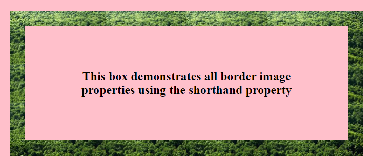
The border-image property, applied to the .fancy-box class, creates a decorative border around the element with the specified image, width, slicing, outset, and repetition method.
Explanation of the properties effect:
50: Sets the width and stretches to fill the border area based on this width./: Separates the next set of values of the properties.30px: Specifies the slicing value for and defines the size of the slices.45px: Sets the outset or spacing between the border image and the element’s content. This value determines how much space there should be between them and the content inside the element.round: Specifies the repetition method and indicates that the image should be stretched or repeated as needed to fill the border area while preserving its aspect ratio.
Notice the border property with a transparent value (border: 25px solid transparent;) used in the example. This inclusion effectively creates a transparent border around the element, providing space for it to be displayed as defined by the border-image property. This is a common technique to ensure that they do not overlap with the element’s content.
Advanced Usage
Advanced usage of border images involves leveraging additional properties to fine-tune their appearance and behavior. They offer precise control over their appearance and behavior, allowing you to create intricate and visually appealing designs for your elements.
Let’s delve into these advanced techniques:
The border-image-source Property
You must understand the border-image-source property to start using border images. This property specifies the location of the image to be used as the border. It acts as the foundation upon which further customization and styling are built. It allows you to specify the location of the image file that will be utilized as the border for an HTML element. Here is the syntax:
border-image-source: url('path/to/image.png');The url('path/to/image.png') value specifies the path to the image file to use as the border. The image resource path can be absolute or relative.
In the initial syntax border-image: url(image.png) [slice] [width] [outset] [repeat];, the url('border-image.png') part specifies the source of the image and can be used with other properties. However, when using only border-image-source, you’re solely defining the location of the image resource without specifying other properties like width or stretching behavior. It’s a more granular approach when you only need to define the source of the image without setting other properties simultaneously.
Slicing Techniques with the border-image-slice Property
The border-image-slice property allows you to define how the image should be sliced into regions. It determines the size of the areas to be sliced in each direction, allowing for precise control over the border’s appearance. Adjusting these slicing values can result in various visual effects, such as emphasizing certain parts of the border or creating intricate patterns.
The syntax:
border-image-slice: [top] [right] [bottom] [left];Here, top, right, bottom, and left represent the sizes of the areas to be sliced in the respective directions. These values can be specified as a length, a percentage, or the keyword fill.
Let’s look at an example demonstrating the border-image-slice property applied to a button:
<button class="fancy-button">Click Me</button>body {
background-color: rgb(209, 174, 180);
}
.fancy-button {
border: 25px solid transparent;
border-image: url("https://tse2.mm.bing.net/th?id=OIP.qV38qxlYzfi5qvSZAisS_QHaEs&pid=Api&P=0&h=220");
border-image-slice: 40% 45% 20% 30%; /* Slicing values for top, right, bottom, and left */
padding: 10px 5px;
font-size: 20px;
cursor: pointer;
background-color: pink;
margin: 30px;
}The outcome:
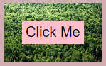
This property (border-image-slice: 40% 45% 20% 30%;) specifies how it should be sliced into regions for the top, right, bottom, and left sides of the button. The values represent the percentage of the width or height to be sliced from each side. Here’s what each value does:
40%: Specifies that 40% of the height will be sliced from the top side.45%: Specifies that 45% of the width will be sliced from the right side.20%: Specifies that 20% of the height will be sliced from the bottom side.30%: Specifies that 30% of the width will be sliced from the left side.
Different slicing values will result in different border appearances around the button. Adjusting these values allows you to control the size and shape of the slices, which can significantly impact the visual effect of the button’s border.
For example, increasing the slicing values may result in larger slices, creating a more pronounced border effect, while decreasing the values may produce finer details or thinner borders. Experimenting with these values allows you to achieve the desired appearance for your button border.
- The fill value: The’ fill’ keyword is a handy option among the
border-image-sliceproperty values. When using it with theborder-image-sliceproperty, the image slices are stretched or repeated to fill the entire border area of the element. This is beneficial for achieving a consistent border appearance, especially when dealing with irregularly shaped elements or complex images.
However, it’s essential to be careful when using fill, as it can potentially obscure the content within the element if the slices are not correctly sized or lack transparent areas. Finding the right balance between border visibility and content clarity is crucial when employing this value.
For example, applying the fill value below to the previous example will give the button a different look:
border-image-slice: 66 fill;Here, the fill value explicitly removes the slice property’s default performance and retains the whole image border.
Controlling Width with the border-image-width Property
The border-image-width property in CSS allows you to control the width of the image applied to an element’s border. It specifies the width of the slices along each edge of the element’s border. This property provides precise control over the visual thickness of the border.
The syntax:
border-image-width: value;Here, the value specifies the width of the slices. You can set a single value for all edges or provide individual values for each. When a single value is provided, it sets the same width for all edges. When two values are provided, the first value specifies the width for the top and bottom edges, while the second value specifies the width for the right and left edges.
Increasing the width values results in thicker slices, making the border more prominent. Decreasing the width values produces thinner image slices, creating a more delicate border effect.
Let’s look at an example demonstrating the use of the border-image-width property applied to a card:
<div class="fancy-card">
  <h2>Card Title</h2>
  <p>This card demonstrates a border image using width property.</p>
</div>
body {
background-color: rgb(207, 176, 176);
}
.fancy-card {
padding: 20px;
width: 300px;
border: 20px solid transparent;
border-image-source: url(https://tse2.mm.bing.net/th?id=OIP.qV38qxlYzfi5qvSZAisS_QHaEs&pid=Api&P=0&h=220); /* Image source */
border-image-width: 25px; /* The Width*/
border-image-slice: 60% 30% 35% 55%; /* Slicing for each side */
margin: 20px;
background-color: pink;
font-size: 24px;
text-align: center;
}The outcome:
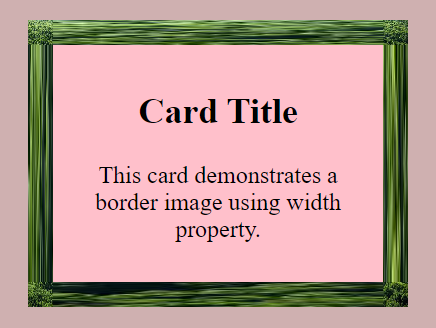
The example showcases applying the border-image-width property to a card element, resulting in a visually appealing border effect. Setting border-image-width: 25px; ensures that the image displayed around the card will have a consistent thickness of 25 pixels. This width is separate from the transparent border defined earlier, providing only space for the image while remaining invisible. This combination adds a decorative border of a specific width to the card element.
Adjusting the Spacing with the border-image-outset Property
A border image sits snugly within an element’s border box by default. The border-image-outset property provides control over the spacing around them, allowing you to adjust how far they extend beyond the border box of an element. By adjusting this property, you can achieve desired spacing effects and enhance the visual appearance of your website’s elements. This property is particularly valuable for creating decorative borders, frames, and other design elements where spacing is needed to achieve the desired aesthetic.
The syntax:
border-image-outset: [top/right/bottom/left amount] | number;The Length values (e.g., 15px, 1em) extend it outward in the specified direction by the given distance—the Number (N) is a multiple of the element’s border width. For instance, 2 would mean an outward extension twice the normal border width.
The values for border-image-outset can be specified in lengths, percentages, or the keyword auto:
- Positive values extend it outward, increasing the space around the border.
- Negative values contract it inward, reducing the space around the border.
- The keyword auto allows the browser to determine the outset automatically based on the intrinsic dimensions.
Here’s an example demonstrating the use of the border-image-outset property with a banner element:
<div class="banner">
  <h1>Welcome to Our Website</h1>
  <h2>Explore Our World of Possibilities</h2>
  <p>
    We're dedicated to unlocking limitless possibilities for you. Dive into our
    world and discover an array of services, products, and experiences tailored
    to elevate your journey.
  </p>
</div>
body {
background-color: #c79999;
}
.banner {
padding: 20px;
width: 70%;
height: 300px;
border: 10px solid transparent;
border-image-source: url(https://tse2.mm.bing.net/th?id=OIP.qV38qxlYzfi5qvSZAisS_QHaEs&pid=Api&P=0&h=220);
border-image-slice: 20; /* Assuming you meant 20% for all sides */
border-image-width: 25px;
border-image-outset: 20px; /* Outward spacing*/
margin: 0 auto; /* Center align horizontally */
text-align: center;
background-color: #e68181;
}
.banner p {
font-size: 25px;
}The outcome:
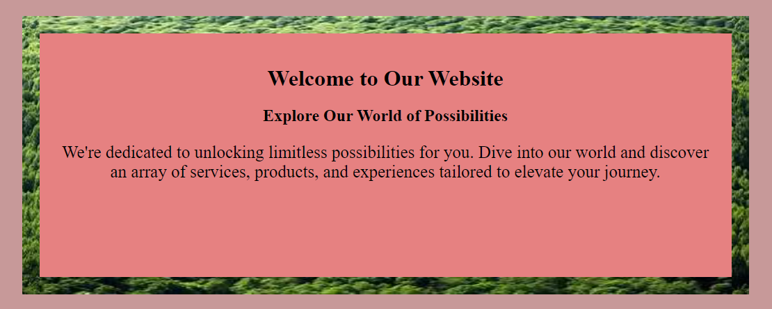
Here, the border-image-outset property is set to 20px, creating an outward spacing 20px around it. This outward spacing adds extra space around it, extending it beyond the border box of the .banner element. It adds depth and dimension to the banner, contributing to its overall aesthetic appeal and drawing attention to its content.
You can customize the extension independently on each side by providing multiple values (top right bottom left). For example: border-image-outset: 10px 5px 20px 15px;
The extended part of the image doesn’t expand the banner itself; it can visually overlap other page elements without affecting them.
By carefully adjusting this property, you can optimize the banner’s appearance and create engaging and visually appealing website layouts.
Repetition Options with the border-image-repeat Property
The border-image-repeat property dictates how the border image should behave if it doesn’t perfectly fit the dimensions of the element’s border. It offers multiple options for repetition or scaling of the image. The Syntax:
border-image-repeat: [horizontal-repeat] [vertical-repeat]Horizontal and vertical repeat values include:
stretch: This serves as the default value, wherein the image is stretched to encompass the entirety of the border. This stretching process may potentially distort the image’s original aspect ratio.repeat: The image is repeated (tiled) both horizontally and vertically to fill the border area. Images might be clipped if necessary.round: This is similar torepeat, but the last image tile is scaled down to fit if it doesn’t evenly cover the remaining space; images will not be stretched.space: Similar toround, but the space between image tiles is evenly distributed to fit the remaining space, maintaining the size of the tiles.
The different border-image-repeat values result in varied visual effects on the border, affecting its pattern, repetition, and overall appearance. The repetition option influences the coherence and aesthetic appeal of the border. The property is beneficial for creating decorative borders, frames, and backgrounds with intricate patterns or textures.
Below is an example demonstrating the use of the border-image-repeat property with a frame element:
<div class="frame">
  <h1>Welcome to Our Website</h1>
  <p>Explore our services and offerings</p>
</div>
body {
background-color: #b4a2a2;
}
.frame {
width: 400px;
height: 200px;
margin: 50px auto;
border: 40px solid transparent;
border-image-source: url(https://tse2.mm.bing.net/th?id=OIP.qV38qxlYzfi5qvSZAisS_QHaEs&pid=Api&P=0&h=220);
border-image-slice: 30;
border-image-width: 40px;
border-image-repeat: stretch; /* Repeat with rounding */
text-align: center;
padding: 20px;
background-color: pink;
}
h1 {
font-size: 24px;
}
p {
font-size: 22px;
}The outcome:
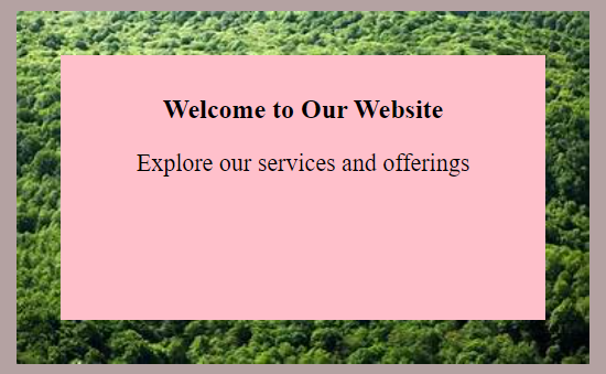
Here, border-image-repeat: stretch; is applied to the .frame class. This setting instructs the browser to stretch the image to cover the entire border area of the frame element. It ensures the image is stretched horizontally and vertically to fill the whole border area of the frame. The stretching ensures that the image covers the entirety of the frame’s border, regardless of its size or dimensions.
While stretch is used in this example, you can use values like repeat, round, or space to achieve different visual effects. Experimenting with these values allows for customization of the repetition pattern, offering versatility in design.
Best Practices
Having explored the functionalities of border images, let’s now delve into some best practices to elevate their usage. Adhering to best practices ensures optimal visual impact, performance, and accessibility when designing them in CSS. By following these guidelines, you can ensure that they not only enhance the aesthetics of your website but also perform well and cater to diverse user needs.
Here are some considerations:
-
Consider Design Goals: Choose an image that aligns with the overall design aesthetic and theme of your website. Ensure they complement other design elements harmoniously.
-
Transparency: Utilize transparent areas in them to allow background colors or patterns to show through, enhancing visual depth and flexibility in design.
-
Customization: Experiment with different slicing techniques, repetition options, and widths to achieve the desired visual effects while maintaining consistency with your design vision.
-
Image Optimization: Compress the images to reduce file size without compromising quality. Use image formats optimized for the web, such as JPEG, PNG, or SVG, depending on the complexity of the border design.
-
Performance Considerations: Limit the use of complex or large image files to avoid performance issues, particularly on low-bandwidth connections or resource-constrained devices.
-
Semantic Markup: Ensure that they enhance, rather than obscure, the content of your webpage. Use semantic HTML markup and CSS to maintain accessibility and ensure compatibility with assistive technologies.
-
Overly Complex Designs and images: Avoid overly intricate border designs that may overwhelm or distract users from the main content of your webpage. Also, avoid using those with excessive detail or high resolution, as they can significantly impact loading times.
-
Accessibility Oversights: Ensure that they do not hinder accessibility components like screen readers or keyboard navigation. Test for accessibility and provide alternative text or descriptions where necessary.
Conclusion
With careful consideration and attention to detail, border images can become powerful assets in your web design toolkit. By incorporating these techniques, you can add unique visual elements to your web pages, enhance the overall design, and potentially improve user engagement. However, it’s crucial to remember the best practices and potential pitfalls we discussed to ensure optimal performance, accessibility, and a positive user experience. Let your creativity shine through your borders!
Truly understand users experience
See every user interaction, feel every frustration and track all hesitations with OpenReplay — the open-source digital experience platform. It can be self-hosted in minutes, giving you complete control over your customer data.
Star on GitHub12k