Mastering CSS Transitions with React 18


Animations have always been a part of the web experience. The smooth transitions of a web page’s elements have always brought aesthetic appeal to websites.
Cascading Style Sheets (CSS) is the language used to design websites and make animations possible. The easiest way to implement animations with CSS is using the transition property.
We will be taking an in-depth look at CSS transitions and how to use them to create animations with React 18.
Let’s get started!
What are CSS Transitions?
CSS transitions are basic animations generated with the CSS property transition. Though easy to use, this property can perform a lot of amazing animations in a web page. CSS Transitions are not the only way animations can be implemented with CSS but happen to nonetheless be effective for most animation tasks.
React 18 introduced a new hook called
useTransition(). According to the documentation,useTransition()returns a stateful value for the pending state of the transition, and a function to start it. These transitions are user interface (UI) updates, but are not animations. They have nothing to do with CSS transitions, our topic here.
Exploring the Transition properties
When making animations using CSS transitions, we use some properties to specify what we want. These include:
transition-propertytransition-durationtransition-timing-functiontransition-delaytransition
transition-property
The transition property specifies to the browser the property of the element whose styling would change, and should therefore perform a transition.
Let’s see an example: suppose we alter the width property of a particular element. Then that element should have the value width in its transition-property.
.element {
    transition-property: width;
}
Now, it is not only the width property that a transition can be performed on. There are more properties a transition can be performed on. Find a complete list of the properties in this article.
Once a transition-property is selected, the browser checks for changes on that element’s property and performs the transition on it.
Note: When there are a lot of properties to be selected, one can use all as a value.
.element {
    transition-property: all;
}
transition-duration
The transition-duration property specifies the time interval in which the property must complete the change.
Now, suppose we want to perform a transition shrinking the width of a div from 500px to 50px in 2 seconds after hovering on the element. The value of the transition-duration (the time it would take the animation to complete) is 2s.
div {
    height: 100px;
    width: 500px;
    background-color: #768fc5;
    margin: 0 auto; /* So as to center the box */
    transition-property: width;
    transition-duration: 2s;
}

div:hover {
    width: 50px;
}
And we have this displayed:

It takes exactly 2 seconds for the box’s width shrink from 500px to 50px on hover.
We can achieve a fully working CSS transition with transition-property and transition-duration, as the rest of the properties are not compulsory and provide secondary features.
transition-timing-function
The transition-timing-function property helps control the acceleration of a transition. It specifies when the animation slows down and speeds up over the specified duration in transition-duration.
The values a transition-timing-function can accept are:
easeease-inease-outease-in-outlinearcubic-bezier()
ease
The ease timing function is the default of any transition in CSS. It starts with a slow movement, then fast, and ends slowly. Here is an animation made with ease:

ease-in
The ease-in timing function has a slow start. Here is an illustration:

ease-out
This timing function has a slow end. This function is used if that is the effect desired. Here is an illustration:

ease-in-out
This timing function has a slow start and end. If this is the behavior desired of an animation, then this is the value to be used. Here is an illustration:

linear
This specifies a transition effect with the same speed from start to finish. Here is an illustration:

cubic-bezier()
This cubic-bezier() is a function that accepts parameters used to create a custom transition-timing-function apart from the earlier specified ones. Using cubic-bezier is beyond the scope of this article; therefore, read this article to learn more.
transition-delay
The transition-delay property specifies the time interval the transition is delayed before it finally occurs. The value is in seconds: 2s, 1s, 1.5s, etc. Here is an illustration in which the transition is delayed for 1.5s before it works.

transition
The transition property is a short form for all the earlier mentioned transition properties. The syntax is
element {
    transition: <property> <duration> <timing-function> <delay>;
}
An example: suppose we wanted to perform a transition with property height changing, in 2s, with a linear timing function and a delay of 0.5s, then it would be written this way:
element {
    transition: height 2s linear 0.5s;
}
Another example: suppose an element has more than one transition-property. In that case, the transition contains the value of the first transition, then a comma ,, and finally the second transition value.
element {
    transition: height 2s linear 0.5s, width 1s ease-in 0s;
}
Open Source Session Replay
OpenReplay is an open-source, session replay suite that lets you see what users do on your web app, helping you troubleshoot issues faster. OpenReplay is self-hosted for full control over your data.

Start enjoying your debugging experience - start using OpenReplay for free.
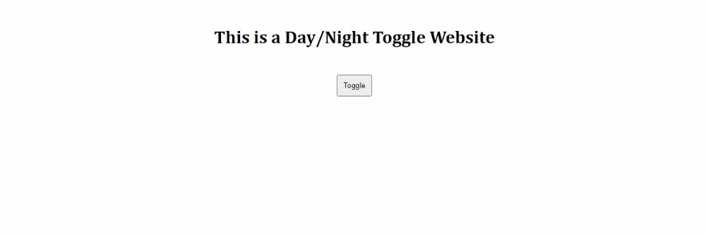
Creating a Day and Night Mode Toggle
Step 1: Set up a React JS Project
npx create-react-app toggleStep 2: Edit the index.js
import React from 'react';
import { createRoot } from 'react-dom/client';
import App from './App'
const container = document.getElementById('root');
const root = createRoot(container);

root.render(<App />);
Step 3: Edit the App.js
import React, {useState} from "react";
import "./style.css";

export default function App() {
  let [mode, setMode] = useState("light");
  function handleClick(){
    setMode(mode == "light" ? "dark" : "light");
  }
  return (
    <div className={'app ' + mode}>
      <h1>This is a Day/Night Toggle Website</h1>
      <div className="btn-box">
        <button onClick={handleClick}>Toggle</button>
      </div>
    </div>
  );
}*Step 4: Add some styling to style.css
* {
  margin: 0;
  padding: 0;
}

.app {
  height: 100vh;
  transition-property: background-color;
  transition-duration: 1s;
  transition-timing-function: linear;
  /* No transition delay */
}

.light {
  background-color: white;
  color: black;
}

.dark {
  background-color: #05040f;
  color: white;
}

h1 {
  font-family: Cambria;
  text-align: center;
  padding: 50px;
}

.btn-box {
  text-align: center;
}

button {
  padding: 10px;
}
And we have this beautiful transition:
Link to live project: https://stackblitz.com/edit/react-dc58ms
Creating A Modal Animation
Let’s see a different example, and create a modal animation.
Step 1: Set up a React JS Project
npx create-react-app modal-transitionStep 2: Edit the index.js
import React from 'react';
import { createRoot } from 'react-dom/client';
import App from './App'
const container = document.getElementById('root');
const root = createRoot(container);

root.render(<App />);
Step 3: Edit the app.js
import React, {useState} from "react";
import "./style.css";

export default function App() {
  let [view, setView] = useState(false);
  function show() {
    setView(true);
  }
  function close() {
    setView(false);
  }
  return (
    <div>
      <div className="modal" style={{top: view && "5px"}}>
        <p className="modal-header">This is a Modal Header</p>
        <p>Lorem ipsum dolor sit amet, consectetur adipiscing elit. Quisque nisl eros, pulvinar facilisis justo mollis, auctor consequat urna. Morbi a bibendum metus. </p>
        <div className="btn-box">
          <button onClick={close}>Close</button>
        </div>
      </div>
      <div className="btn-box">
        <button onClick={show}>Show Modal</button>
      </div>
    </div>
  );
}
Step 4: Add some styling to the style.css
body {
  font-family: 'Segoe UI', Tahoma, Geneva, Verdana, sans-serif;
}

.modal {
  max-width: 400px;
  min-height: 200px;
  padding: 10px;
  background-color: whitesmoke;
  position: fixed;
  left: 0;
  right: 0;
  margin: 0 auto;
  top: -250px;
  transition: top 0.5s ease-out;
  z-index: 1;
}

.modal-header {
  font-size: 20px;
  text-align: center;
  padding-bottom: 20px;
  font-weight: bold;
}

.btn-box {
  text-align: center;
}

button {
  padding: 10px;
}
And now we have this animation:

Link to live Project: https://stackblitz.com/edit/react-blgxpk
Creating a progress bar
For our final example, let’s build a progress bar, a common feature.
Step 1: Set up a React JS Project
npx create-react-app progress-barStep 2: Edit the index.js
import React from 'react';
import { createRoot } from 'react-dom/client';
import App from './App'
const container = document.getElementById('root');
const root = createRoot(container);

root.render(<App />);
Step 3: Edit the App.js
import React, {useState} from "react";
import "./style.css";

export default function App() {
  let [distance, setDistance] = useState('0');
  function move(){
    setDistance('100%');
  }
  return (
    <div>
      <h1>Progress Bar</h1>
      <div className="progress-box">
        <div className="mover" style={{width: distance}}></div>
      </div>
      <div className="btn-box">
        <button onClick={move}>Load Progress Bar</button>
      </div>
    </div>
  );
}
Step 4: Add some styling
body {
  font-family: 'Trebuchet MS', 'Lucida Sans Unicode', 'Lucida Grande', 'Lucida Sans', Arial, sans-serif;
  text-align: center;
}

.progress-box {
  height: 50px;
  width: 500px;
  background-color: #8f8fa3;
  margin: 10px auto;
}

.mover {
  background-color: #222274;
  width: 0;
  height: inherit;
  transition: width 1s linear 1s;
}

button {
  padding: 20px;
}
And we have this:

Link to live project: https://stackblitz.com/edit/react-swfomx
Conclusion
With these exercises, we have explored several uses of CSS transitions. CSS transitions serve front-end developers in making simple animations and can be combined with any Javascript framework to bring out the best in websites.