Mastering Tailwind CSS: Overcoming Common Challenges and Doing Debugging
Learn about this styling library


Discover how at OpenReplay.com.
Tailwind CSS is a popular utility-first CSS framework that web developers use to streamline their CSS workflow and efficiently build modern, responsive websites. However, like any tool or framework, Tailwind CSS has its share of challenges. To excel in harnessing its power, you need to not only understand its core principles but also be adept at overcoming common hurdles and applying advanced debugging techniques. This article dives into the world of Tailwind CSS, providing a comprehensive guide to help you enhance your proficiency with this popular utility-first CSS framework. Whether you’re a beginner looking to master the basics or an experienced developer aiming to level up your Tailwind CSS game, this article offers valuable insights and practical solutions to empower your web development journey.
Common challenges
There are many challenges most developers face when using Tailwind CSS. In this article, I will focus on handling complex forms, stateful components, and dynamic classes, as well as handling z-index and layering.
Handling complex forms
Handling complex forms in Tailwind CSS can be a difficult task. Still, with the right approach and understanding of Tailwind utility classes, you can create functional forms using grid layout and the Tailwind CSS form plugin.
Using the grid layout
From my experience using Tailwind CSS, I have observed that using the grid layout to create forms is easier to style and arrange than using Flexbox when creating a form.
Let’s take a simple project to see how this is done.
Setting up a Tailwind CSS project
We need to install Tailwind CSS into our project before we can work with it.
-
Create a folder and cd into that folder.
-
Run the following command:
npm init -yThis will create a package.json for us.
- Next, we install Tailwind CSS with the following command:
npm install tailwindcss- We create a config file with the following command:
npx tailwindcss initThis will help us to customize our Tailwind CSS to our taste.
- Add the directives to your
index.cssin the src folder:
@tailwind base;
@tailwind components;
@tailwind utilities;
These are directives used in the configuration file to include the base styles, component styles, and utility styles, respectively.
Where:
- Base styles: Define default styles for
HTMLelements. - Components: Define styles for reusable components.
- Utilities: Provide low-level utility classes for styling individual properties.
- We run the
CSSbuild command that we want to include in ourHTML:
npx tailwindcss -i ./src/input.css -o ./dist/output.css --watchThis command initiates the Tailwind CSS build process, taking the styles from ./src/input.css, processing them, and saving the result in ./dist/output.css. The --watch flag ensures that any changes made to the input file trigger an automatic update of the output file, which is reflected in our output.
Now, we’ve Tailwind CSS installed.
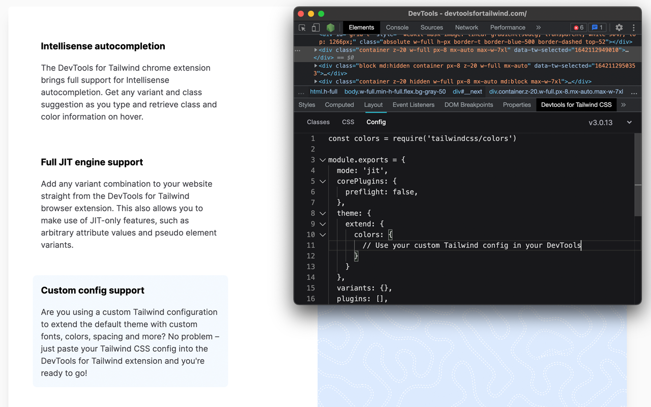
Note: We will be installing a VS Code extension called Tailwind CSS IntelliSense.
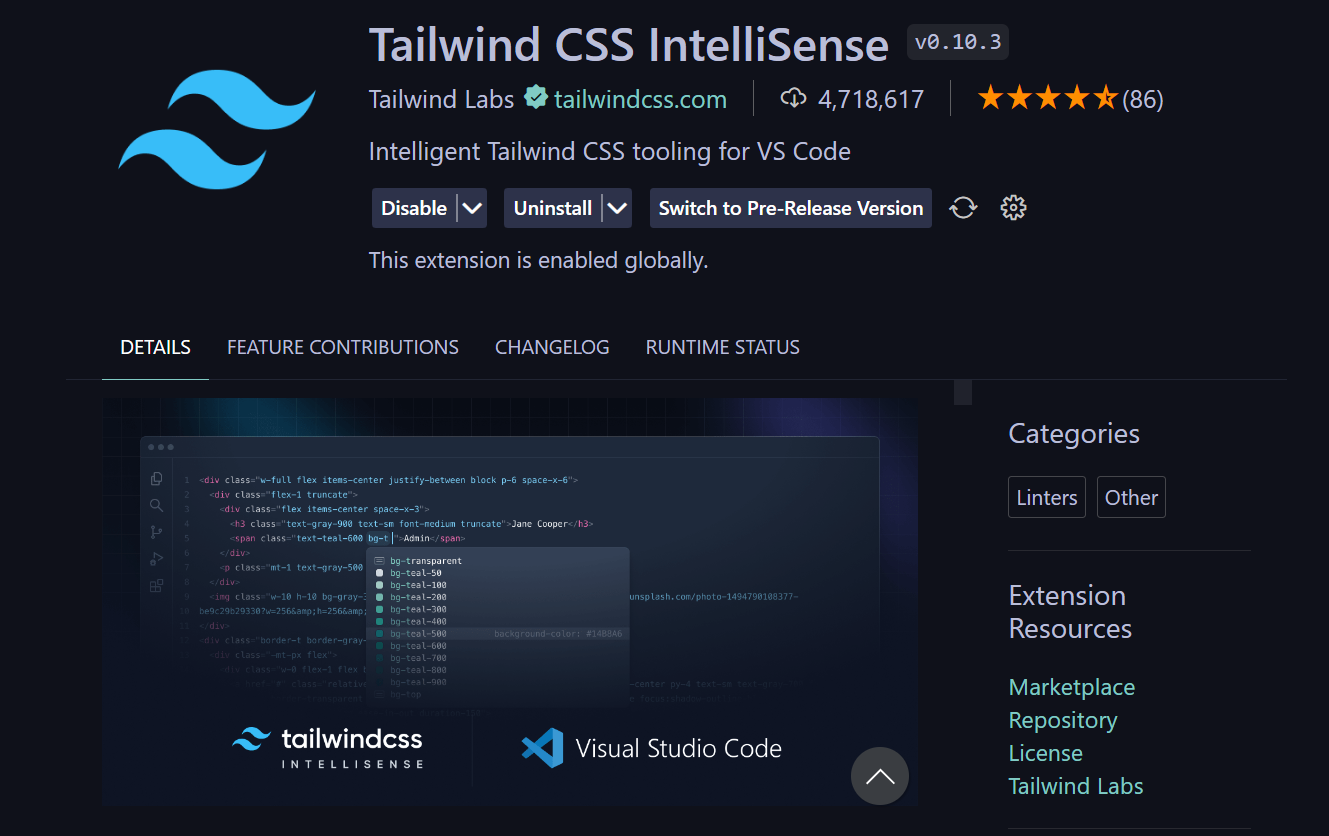
The above image is a sample of the extension.
According to its documentation:
Tailwind CSS IntelliSense enhances the Tailwind development experience by providing Visual Studio Code users with advanced features such as autocomplete, syntax highlighting, and linting.
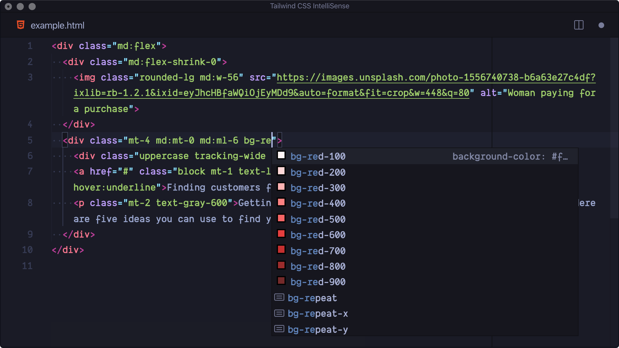
Image source.
The above image shows some of the features that the extension provides.
Utilize this sample as a model for a generic form element that has input fields such as (text, email, password, text area, URL), and you can add more columns and rows using the grid layout:
<section id="form" class="w-full max-w-md mx-auto md:mt-10 p-7 md:p-0">
  <form
    name="Message"
    method="POST"
    class="p-4 border border-red-500 rounded-lg md:p-8 md:mb-24"
  >
    <div class="grid gap-6 mb-6 md:grid-cols-1">
      <div>
        <label for="full_name" class="block mb-2 font-bold">
          Full Name
        </label>
        <input
          type="text"
          id="full_name"
          class="border border-indigo-500 text-sm rounded-full focus:border-indigo-950 block w-full p-2.5"
          placeholder="Full Name"
          required
        />
      </div>

      <div>
        <label for="email" class="block mb-2 text-sm font-bold">
          Email address
        </label>
        <input
          type="email"
          id="email"
          class="border border-indigo-500 text-sm rounded-full focus:border-indigo-950 block w-full p-2.5"
          placeholder="Email address"
          required
        />
      </div>

      <div>
        <label for="location" class="block mb-2 font-bold">
          Location
        </label>
        <input
          type="text"
          id="location"
          class="border border-indigo-500 text-sm rounded-full focus:border-indigo-950 block w-full p-2.5"
          placeholder="Enter your address"
          required
        />
      </div>

      <div>
        <label for="password" class="block mb-2 font-bold">
          Password
        </label>
        <input
          type="password"
          id="password"
          class="border border-indigo-500 text-sm rounded-full focus:border-indigo-950 block w-full p-2.5"
          placeholder="******"
          required
        />
      </div>

      <div>
        <label for="password" class="block mb-2 font-bold">
          Confirm password
        </label>
        <input
          type="password"
          id="password"
          class="border border-indigo-500 text-sm rounded-full focus:border-indigo-950 block w-full p-2.5"
          placeholder="******"
          required
        />
      </div>

      <div>
        <label for="website" class="block mb-2 font-bold">
          Website link
        </label>
        <input
          type="url"
          id="website"
          class="border border-indigo-500 text-sm rounded-full focus:border-indigo-950 block w-full p-2.5"
          placeholder="openreplay.com"
          required
        />
      </div>
      <div>
        <label for="visitors" class="block mb-2 font-bold">
          No of visitors
        </label>
        <input
          type="number"
          id="visitors"
          class="border border-indigo-500 text-sm rounded-full focus:border-indigo-950 block w-full p-2.5"
          placeholder=""
          required
        />
      </div>

      <div>
        <label for="location" class="block mb-2 font-bold">
          {" "}
          Message{" "}
        </label>
        <textarea
          name="message"
          id="message"
          placeholder="What do you want to tell us?"
          cols="10"
          rows="5"
          class="border border-indigo-500 text-sm rounded-lg focus:border-indigo-950 block w-full p-2.5"
        ></textarea>
      </div>
    </div>
    <div class="flex items-center justify-center">
      <button
        type="submit"
        class="font-bold rounded-full text-sm w-full sm:w-auto px-5 py-2.5 text-center shadow-md text-white bg-indigo-950"
      >
        Send Message
      </button>
    </div>
  </form>
</section>;
The code above represents a styled form section using Tailwind CSS, with specific attention to responsive design. It collects user information and provides a visually appealing and responsive layout for a form submission interface.
The output will be:
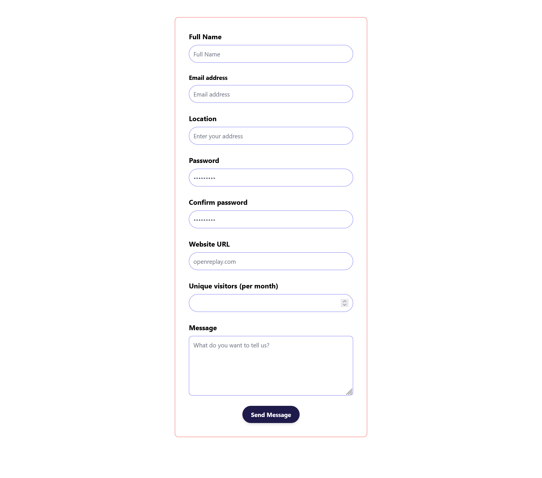
The image above shows a responsive form that collects user information.
Using the Tailwind CSS Forms plugin
The Tailwind CSS forms plugin is a provided plugin that adds a basic reset layer for form styles, making it easier to style form elements using Tailwind utility classes. This plugin helps to ensure consistent styling of form elements across different browsers and provides a foundation for further customization.
To use the Tailwind CSS form plugin, you will have to install it and set it up. So, let’s go to our terminal in our VS Code and run the following command.
- Install the form plugin using npm:
npm install @tailwindcss/forms- require it in our tailwind config file:
/** @type {import('tailwindcss').Config} */
module.exports = {
 content: ["./*.html"],
 theme: {
  extend: {},
 },
 plugins: [require("@tailwindcss/forms")],
};
The form plugin creates some default styles for our form, but it is done in a way that allows you to simply control how this element looks. Below is the image of the default styling our Tailwind CSS form gives us after removing the classes in the input tag in our HTML.
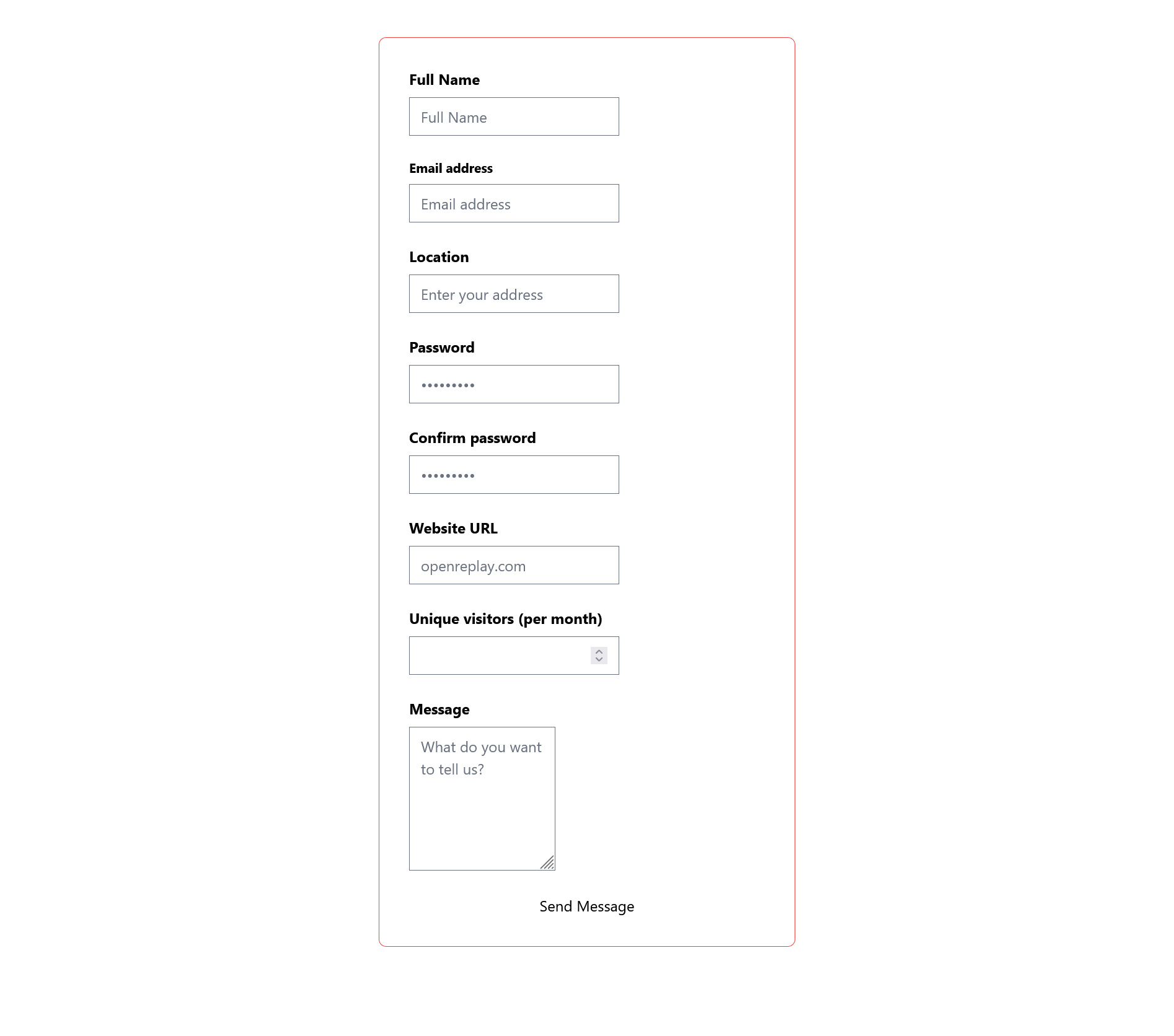
The image above is the default styling of the form plugin.
From the official documentation for the Tailwind CSS form plugin, here are all the supported form elements that the Tailwind form plugin provides for us:
input[type='text']input[type='password']input[type='email']input[type='number']input[type='url']input[type='date']input[type='datetime-local']input[type='month']input[type='week']input[type='time']input[type='search']input[type='tel']input[type='checkbox']input[type='radio']selectselect[multiple]textarea
The Tailwind CSS form plugin simply adds CSS to the base layer, so if you want to override it, i.e, customize it to your taste, you simply add CSS to the base layer in your input.css under your src folder using:
@layer base{
// Your customization goes here, and whatever you put in the base layer goes to the Tailwind base.
}
So, our Tailwind CSS code becomes:
<section id="form" class="w-full max-w-md mx-auto md:mt-10 p-7 md:p-0">
  <form
    name="Message"
    method="POST"
    class="p-4 border border-red-500 rounded-lg md:p-8 md:mb-24"
  >
    <div class="grid gap-6 mb-6 md:grid-cols-1">
      <div>
        <label for="full_name" class="block mb-2 font-bold">
          Full Name
        </label>
        <input
          type="text"
          id="full_name"
          class=""
          placeholder="Full Name"
          required
        />
      </div>

      <div>
        <label for="email" class="block mb-2 text-sm font-bold">
          Email address
        </label>
        <input
          type="email"
          id="email"
          class=""
          placeholder="Email address"
          required
        />
      </div>

      <div>
        <label for="location" class="block mb-2 font-bold">
          Location
        </label>
        <input
          type="text"
          id="location"
          class=""
          placeholder="Enter your address"
          required
        />
      </div>

      <div>
        <label for="password" class="block mb-2 font-bold">
          Password
        </label>
        <input
          type="password"
          id="password"
          class=""
          placeholder="******"
          required
        />
      </div>

      <div>
        <label for="password" class="block mb-2 font-bold">
          Confirm password
        </label>
        <input
          type="password"
          id="password"
          class=""
          placeholder="******"
          required
        />
      </div>

      <div>
        <label for="website" class="block mb-2 font-bold">
          Website link
        </label>
        <input
          type="url"
          id="website"
          class=""
          placeholder="openreplay.com"
          required
        />
      </div>
      <div>
        <label for="visitors" class="block mb-2 font-bold">
          No of visitors
        </label>
        <input type="number" id="visitors" class="" placeholder="" required />
      </div>

      <div>
        <label for="location" class="block mb-2 font-bold">
          {" "}
          Message{" "}
        </label>
        <textarea
          name="message"
          id="message"
          placeholder="What do you want to tell us?"
          cols="10"
          rows="5"
          class=""
        ></textarea>
      </div>
    </div>
    <div class="flex items-center justify-center">
      <button type="submit" class="">
        Send Message
      </button>
    </div>
  </form>
</section>;
While our input.css:
@tailwind base;
@tailwind components;
@tailwind utilities;

@layer base {
  /* using the selector for the forms plugin  */
  [type="text"],
  [type="email"],
  [type="url"],
  [type="password"],
  [type="number"],
  [type="date"],
  [type="datetime-local"],
  [type="month"],
  [type="search"],
  [type="tel"],
  [type="time"],
  [type="week"],
  select,
  select[multiple],
  [type="checkbox"],
  [type="radio"] {
    @apply border border-indigo-500 text-sm rounded-full focus:border-indigo-950 block w-full p-2.5;
  }

  textarea {
    @apply border border-indigo-500 text-sm rounded-lg focus:border-indigo-950 block w-full p-2.5;
  }

  [type="submit"] {
    @apply font-bold rounded-full text-sm w-full sm:w-auto px-5 py-2.5 text-center shadow-md text-white bg-indigo-950;
  }
}
The apply is used to add custom styles to the selected element. The Tailwind CSS form plugin helps you style any form element easily and quickly, and you can override or work with the default styling that comes with the plugin.
Output:

The image above shows a responsive form that collects user information using our form plugin.
Stateful Components and Dynamic Classes
Stateful components are components that maintain their internal state. This state can track the component’s current state, such as whether it is active or disabled. Stateful components can create interactive UI elements, such as buttons and dropdowns.
Some common challenges when working with Tailwind CSS stateful components are:
-
Managing Class Names and State Changes: When using Tailwind CSS, class names are applied directly to
HTMLelements to define their styling. In stateful components, the component’s state can change dynamically, potentially requiring the addition or removal of class names. This can lead to complex and error-prone code, especially when dealing with multiple state changes. -
Handling Conditional Styling: Tailwind CSS provides a vast collection of utility classes for various styling needs. However, styling often needs to be applied conditionally based on the component’s state in stateful components. This can make it challenging to manage the conditional application of Tailwind CSS classes and ensure consistent styling across different states.
-
Maintaining Reusability and Consistency: Stateful components often involve complex logic and state management, making it difficult to reuse components and maintain consistent styling across the application. Tailwind CSS promotes reusability through utility classes, but it can be challenging to integrate these classes into stateful components in a maintainable and reusable way.
-
Testing and Debugging: Tailwind CSS code can be more difficult than regular CSS code. This is because Tailwind CSS generates CSS based on the class names applied to the component, and it can be difficult to track down which class names are causing the issue.
Despite these challenges, Tailwind CSS can still be a powerful tool for styling stateful components, but it is important to be aware of these challenges and to take steps to mitigate them.
Dynamic classes are classes generated at runtime based on the current state of the component. This allows for a more dynamic and responsive design, as the component’s styling can change based on user interaction or other factors. To use dynamic classes in Tailwind CSS, you can use conditional statements to apply different classes based on the component’s state. For example, you could use an if statement to apply a different color class to a button, depending on whether it is disabled.
Here is an example of how to use a stateful component with dynamic classes in Tailwind CSS:
Setting up a React project with Tailwind CSS
Let’s start with installing React using create React app, then we will install Tailwind CSS.
- Open your terminal and run the following command:
npx create-react-app openreplay- Then cd into the folder openreplay that we created and run
npm start:
Now, we have React successfully running, we install Tailwind CSS. But before we install Tailwind CSS, we have our application running, and we need to stop it, so to stop it, we type “ctrl + c” on our terminal, and we get a pop message saying ^C^CTerminate batch job (Y/N), then press “y” and enter. Now, let’s install Tailwind CSS.
- Go to your terminal in that same directory and run the following command:
npm install -D tailwindcssThis will install Tailwind CSS, and you can see that Tailwind CSS has been installed when you check your devDependencies at package.json.
- Generate your
tailwind.config.jsfile by running the following command:
npx tailwindcss initAnd add this path to your template files.
  content: [
    "./src/**/*.{js,jsx,ts,tsx}",
]- Add the directives to your
index.css:
@tailwind base;
@tailwind components;
@tailwind utilities;- Start the build process with the
npm run startcommand.
Now, we are good to start working; go to your src folder where your index.css file is located, and create another file named index.js where we will be writing our React code.
import React, { useState } from "react";
import ReactDOM from "react-dom/client";
import "./index.css";

const Button = ({ disabled, children }) => {
  const [active, setActive] = useState(false);

  const handleClick = () => {
    if (!disabled) {
      setActive(!active);
    }
  };

  const classes = {
    normal: "bg-blue-500 m-10 px-10 py-8 rounded",
    disabled:"bg-gray-300 m-10 px-10 py-8 rounded cursor-not-allowed",
    active: "bg-blue-900 m-10 px-10 py-8 rounded",
  };

  const className = active
    ? classes.active
    : disabled
      ? classes.disabled
      : classes.normal;

  return (
    <button className={className} onClick={handleClick} disabled={disabled}>
      {children}
    </button>
  );
};

const root = ReactDOM.createRoot(document.getElementById("root"));
root.render(<Button />);
The Button component maintains its state using the useState hook (the useState hook is a hook that allows functional components to manage state), the active state determines whether the button is in its active state, the handleClick function toggles the active state when the button is clicked.
handleClick is a function that gets called when the button is clicked. It toggles the active state only if the button is not disabled (disabled prop is false).
The classes object defines the CSS classes for the button in its normal, disabled, and active states. The className variable is used to conditionally apply the appropriate CSS class to the button based on the component’s state.
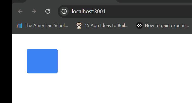
The output will create a button that initially has a background of bg-blue-500; when clicked, it will change to a background of bg-blue-900.
Handling Z-Index and Layering
The z-index property can be used to change the order of stacking elements on the page. It specifies the z-order of an element relative to its siblings. By default, all elements are stacked in the same order as in the DOM (Dynamic Object Model). To change this, you can assign a higher z-index value to an element to make it appear on top of other elements or a lower value to make it appear behind them.
The z-index utilities are named using the z-{index} pattern, where {index} is a number representing the z-index value. For example, the z-50 class sets the z-index of an element to 50.
While Tailwind CSS provides a convenient way to manage z-index and layering using utility classes, there are still some potential issues to consider:
-
Specificity Conflicts: Similar to CSS, specificity conflicts can arise when multiple z-index utility classes apply to the same element. Tailwind’s cascade rules will determine which class takes precedence, but managing these conflicts in complex layouts can be challenging.
-
Contextual z-index: z-index only applies within the context of its containing element. This can lead to unexpected layering behavior when elements with different z-index values are nested within different containers.
-
z-index and Click Events: Elements with higher z-index values can block click events for elements behind them. This can cause usability issues, especially when dealing with overlapping interactive elements.
-
Overuse of High z-index Values: Assigning excessively high z-index values can make it challenging to manage layering and lead to performance issues. It’s generally recommended to use a range of z-index values appropriate for the project’s complexity.
Tailwind CSS provides utility classes to easily manage z-index and layering in your web projects.
Here’s how you can handle z-index and layering in Tailwind CSS:
Z-index Utilities
You can directly apply z-index classes to HTML elements to control their stacking order.
- z-index scale: Tailwind CSS provides a default scale for z-index values that you can use directly in your HTML. The default scale ranges from 0 to 50, providing a good range of options.
<div class="z-10">This element has a z-index of 10</div>;<div class="m-10">
<div class="relative z-10 bg-red-400 right-5 w-36 h-36"></div>
<div class="relative z-20 bg-red-800 bottom-16 w-36 h-36"></div>
</div>The code above creates a representation of two overlapping red squares. The first square is a lighter shade of red and positioned slightly to the right, while the second square is a darker red shade and slightly below the first square.
Note: Only positioned elements can use the z-index property.

In the above image, the stacking orders of the div elements ensure that the darker red square is displayed on top of the lighter red square.
- Customizing z-index Values: If you need a specific z-index value not covered by the default scale, you can customize it to your taste. But, before using a customized z-index value, you must configure it in your tailwind config file.
/** @type {import('tailwindcss').Config} */
module.exports = {
  content: ["./*.html"],
  theme: {
    extend: {
      zIndex: {
        200: "200",
        500: "500",
        1000: "1000",
      },
    },
  },
};<div class="z-1000">This element has a customized z-index value of 1000.</div>- Arbitrary values: you might need to use specific, arbitrary z-index values for fine-grained control over the stacking order of elements. Instead of relying on predefined values or customizing the theme, you can directly apply these values to your classes using the
z-{value}utility classes provided by Tailwind CSS. This approach is useful when you have unique requirements for individual elements and don’t want to create customized theme values for every case.
<div class="z-[999]">This element has an arbitrary Z-index of 999</div>Using arbitrary values can be quicker for one-off cases, but it will lead to less consistency and clarity in your design system than customizing your theme.
Advanced Debugging Techniques
Debugging involves identifying and fixing errors in code.
Common Error Messages and troubleshooting steps
Here are some common errors you might encounter when working with Tailwind CSS, along with their potential causes and possible solutions:
-
Class not found or applied: Cause: There is an error in the styles, or the expected class is not applied. Solution: Proofread your HTML code for mistakes. Ensure that the classes are defined in the Tailwind CSS config and PurgeCSS hasn’t removed them.
-
Invalid Configuration: Cause: Invalid configurations result from problems with the tailwind.config.js file. Solution: Carefully review your tailwind.config.js file for syntax errors, missing or misconfigured plugins, and incorrect settings.
-
JITMode Issues: Cause: Just-in-Time (JIT) mode may have issues during development. Solution: Verify that JIT mode is properly enabled in your tailwind.config.js file if you’re using it. To implement modifications, restart your development server. -
Variant classes Not Working: Cause: Responsive or variant classes are not generating styles. Solution: Confirm that your configuration includes the necessary variants. Make sure your HTML structure is accurate and your class names are correct. Also, you can use browser developer tools to inspect whether the styles are correctly applied.
Debugging Tailwind CSS in Dev Tools
Debugging Tailwind CSS in your browser’s developer tools can be a helpful skill to ensure that your styles are applied as expected and to troubleshoot any issues that may arise during development. Here are some tips for debugging Tailwind CSS using browser developer tools.
- The DevTools for Tailwind CSS extension can be used to debug Tailwind CSS in browser developer tools. This extension gives your browser access to the full capabilities of the JIT engine, enabling you to work with Tailwind CSS classes on your web pages, but it is a paid extension that requires you to get a license key before you can make use of it. You can get it here!
And:
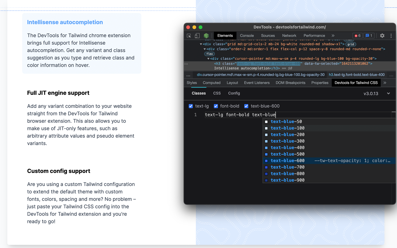
Image source.
The image above shows the features of the DevTools extension.
-
Check for configuration and usage issues: Ensure that the global CSS file in your styles directory contains all the necessary Tailwind directives, such as
@tailwind base; @tailwind utilities; @tailwind components. -
Tailwind CSS Debug screens: Tailwind CSS Debug Screens is a component that helps developers visualize the currently active responsive breakpoints (screens) in a Tailwind CSS project. When implemented, it displays information about the active screen based on the window size. This is particularly useful for debugging and understanding how the layout responds to different screen sizes.
Conclusion
In this article, we’ve explored Tailwind CSS; we look out using Tailwind CSS grid layout and the Tailwind CSS form plugin for styling our forms, stateful components, and dynamic classes when using Tailwind CSS with React; we also look at common error messages and their solutions to them, tools for debugging and how they can be of great to help Tailwind developers.
Tailwind CSS is broad, and we learn every day by practice; you can use this knowledge in your coding project with Tailwind as you explore more.
Truly understand users experience
See every user interaction, feel every frustration and track all hesitations with OpenReplay — the open-source digital experience platform. It can be self-hosted in minutes, giving you complete control over your customer data.
Star on GitHub12k

