Mastering the Art of Background Styling
CSS background properties play a pivotal role in shaping a website’s visual narrative. From setting the tone with colors to adding depth with images, backgrounds are more than just aesthetic elements—they’re powerful storytelling tools. This article delves into the art and functionality of CSS background properties, exploring their importance in web design and their effect on user experience.

Discover how at OpenReplay.com.
The CSS background property is a versatile toolkit that empowers you to unleash your creativity. It allows you to define background aspects like color, image, positioning, and more for individual elements. This property offers a range of sub-properties, including background-color, background-image, and more, that can be used independently or combined to achieve stunning design effects, giving you complete control over the visual narrative of your website.
Importance of background styling in web design
Backgrounds are not just a visual backdrop in web design; they are a crucial element that shapes user experience and brand identity. Here’s how:
-
They are fundamental to a website’s visual appeal. They set the tone by influencing the user’s mood, whether light and playful with bright colors or serious and professional with muted tones. They can also create ambiance by evoking specific environments, like a calming beach scene or a bustling city street.
-
They can influence how easily users can navigate and understand the content on your website. Clear and well-chosen background styles can improve readability and focus, while cluttered or distracting ones can make it difficult for users to find what they’re looking for.
-
They are a vital element in establishing your brand identity. They can set the tone of your website, reflecting your brand’s personality and values. For example, a playful and colorful background might suit a children’s clothing store, while a sleek and minimalist one might be better for a law firm’s website.
-
They have a profound ability to evoke emotions and convey messages. Whether using vibrant colors to convey energy or subtle textures to evoke tranquility, they contribute to the overall user experience, making it a powerful tool in your design arsenal.
-
They can be used to create a visual hierarchy on a webpage. By using contrasting colors for different sections or elements, you can guide users’ attention and prioritize important content.
-
They can also evoke emotions in users. Images and colors can create a sense of trust, excitement, relaxation, or any other emotion you want your audience to feel. Ideally, you can create a more engaging and memorable user experience by using them.
-
Websites with memorable backgrounds can significantly boost user engagement and brand recall. Striking visuals leave a lasting impression, making users more likely to revisit the site.
Understanding CSS Background Basics
Foundational properties such as background-color, background-image, and background-repeat form the core elements of CSS background styling. They allow you to set colors, add images, and control image repetition for your webpage backgrounds.
Let’s look at these foundational properties:
The background-color Property
The background-color property sets a solid color for the background and is a great way to establish a base tone for your website or to highlight specific sections. It uses various color value formats such as named colors, hex codes, RGB, or HSL values. For instance, a light blue background can create a sense of calmness, while a vibrant green one might convey energy and growth.
Let’s create a navigation bar with a blue background:
<nav class="main-nav">
  <ul>
    <li><a href="#">Home</a></li>
    <li><a href="#">About Us</a></li>
    <li><a href="#">Contact</a></li>
  </ul>
</nav>
.main-nav {
background-color: #0000ff;
color: white;
padding: 50px;
margin: 60px;
}
a {
color: white;
font-size: 28px;
}Here is the outcome:

The example above creates a navigation bar with a blue background using Hex code for the element with class main-nav. You can replace “#0000ff” with any valid color name, hex codes, RGB, or HSL values.
The background-image Property
The background-image property lets you incorporate an image as the background of an element on your website. You can use this property to showcase your products or services, create a specific mood or theme, or simply enhance the overall aesthetics of your design. This can be a URL pointing to an image file or a gradient created using CSS gradient functions.
Let’s set a background image of a nature scene:
<div class="container">
  <h1>Welcome to Our Website</h1>
  <p>Discover amazing products and services.</p>
</div>
.container {
width: 100%;
height: 600px;
background-image: url("http://wallpapercave.com/wp/soSaTJM.jpg");
color: white;
text-align: center;
padding: 20px;
font-size: 25px;
}The above example sets a background image for the .container <div> element using the background-image property in CSS.
Here is the outcome:

The background-repeat Property
The background-repeat property controls how a background image repeats itself within the element’s area. It offers options like repeat (tiling the image), no-repeat (displaying the image only once), or repeat-x and repeat-y (repeating the image horizontally or vertically, respectively). Understanding this property is essential for creating seamless patterns or avoiding unwanted image distortion. In simpler terms, it’s like choosing how wallpaper is applied, whether it’s tiled, displayed once, or stretched.
Let’s demonstrate each value of this property; the examples will use the same image so you can appreciate the effect of the different values.
repeat(default value): This value tiles the image repeatedly across the entire element’s area horizontally and vertically. This can be useful for creating subtle patterns using small background textures. Here is how you can use it:
<div class="container"></div>.container {
width: 95%;
height: 430px;
background-image: url("https://tse3.mm.bing.net/th?id=OIP.iBvR7avPLAtj8pnU537ARQHaE8&pid=Api&P=0&h=220");
background-repeat: repeat;
margin: 50px;
}Here is the outcome:

In this example, the repeat property value creates a repeating pattern of the background image throughout the entire element’s area, both horizontally and vertically.
Note: If the image is large enough to cover the entire element, then repeating it won’t be visually noticeable. You’ll only see a single instance of the image.
no-repeatvalue: This value displays the image only once at its initial position within the element. It’s ideal for large hero images or background elements that you want to appear only once. Here is how you can use it:
<div class="container"></div>.container {
width: 95%;
height: 430px;
background-image: url("https://tse3.mm.bing.net/th?id=OIP.iBvR7avPLAtj8pnU537ARQHaE8&pid=Api&P=0&h=220");
background-repeat: no-repeat;
margin: 50px;
}In this example, the background image is displayed only once within the .container element because of the no-repeat property value.
Here is the outcome:

repeat-xvalue: This value repeats the image horizontally across the element’s width, tiling it from left to right. It can be used for horizontal stripes or borders. Here is how you can use it:
<div class="container"></div>.container {
width: 95%;
height: 300px;
background-image: url("https://tse3.mm.bing.net/th?id=OIP.iBvR7avPLAtj8pnU537ARQHaE8&pid=Api&P=0&h=220");
background-repeat: repeat-x;
}In this example, the image is repeated horizontally (along the x-axis) within the .container element due to the repeat-x property value.
Here is the outcome:

repeat-y: This value repeats the image vertically across the element’s height, tiling it from top to bottom. It’s applicable for creating vertical stripes or columnar patterns. Here is how you can use it:
<div class="container"></div>.container {
width: 100%;
height: 600px;
background-image: url("https://tse3.mm.bing.net/th?id=OIP.iBvR7avPLAtj8pnU537ARQHaE8&pid=Api&P=0&h=220");
background-repeat: repeat-y;
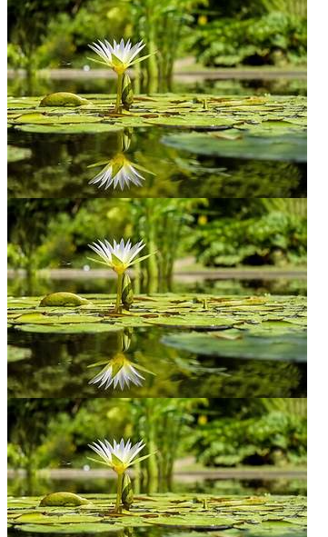
}In this example, the image is repeated vertically (along the y-axis) within the .container element because of the repeat-y property value.
Here is the outcome:
Enhancing Background Appearance with Advanced Properties
Beyond the foundational properties, CSS offers a powerful toolkit for enhancing background appearance.
Let’s explore three essential properties that unlock more control over background images:
The background-size Property
The background-size property determines how the images are scaled to fit within the element’s dimensions. It allows you to control their size to fit the container or cover it without distortion.
Here are some commonly used values:
auto(default) value: Attempts to fit the image within the element while preserving the aspect ratio. This might result in the image being smaller than the element or having space. The syntax:
.container {
    background-size: auto;
}containvalue: Scales the image to fit entirely within the element, maintaining its aspect ratio. If the image is smaller than the element, it won’t be stretched, and space might appear around it. The syntax:
.container {
    background-size: contain;
}covervalue: Scales the image to cover the entire element area, maintaining the aspect ratio. In some cases, parts of the image might be cropped to ensure they fill the space. The syntax:
.container {
    background-size: cover;
}- Length values: This value sets the width and height of the image using length values such as pixels (px), percentages (%), or other units. The syntax:
.container {
    background-size: 350px 250px;
}
This example sets the image’s width to 350 pixels and the height to 250 pixels.
inheritvalue: This value allows you to inherit the image size from the parent element The syntax:
.container {
    background-size: inherit;
}initial: Sets the size of the image to its default value. The syntax:
.container {
    background-size: initial;
}
Let’s see a practical example of how we can resize a hero image using this property:
<header class="hero">
    <h1>Welcome to our wesite</h1>
    <p>Where we give you the best.</p>
  </header>
.hero {
height: 500px;
background-image: url("https://tse3.mm.bing.net/th?id=OIP.iBvR7avPLAtj8pnU537ARQHaE8&pid=Api&P=0&h=220");
background-size: cover; /* Scales the image to cover the entire header area */
text-align: center;
color: white;
font-size: 28px;
}This example ensures the hero image fills the entire height of the header element while maintaining its aspect ratio using the cover value.
Here is the outcome:

This property can accept multiple values, allowing you to combine them. However, some combinations may not make sense or have a meaningful effect. You can experiment with the different values to see how they appear.
The background-position Property
The background-position property controls the initial placement of a background image within the element’s content area. It accepts various values like keywords (top, left, center, right, and bottom) or coordinates (pixels or percentages). If you provide only one value, the horizontal position is set, and the vertical position defaults to center. Specifying two values defines both the horizontal and vertical positions.
Let’s demonstrate how you can use a combination of the values. In this demonstration, you will see various ways you can use them and how they will display.
<h1>top-left</h1>
<div class="container position-top-left"></div>
<h1>bottom-right</h1>
<div class="container position-bottom-right"></div>
body {
background-color: pink;
}
.container {
width: 400px; /* Reduced width */
height: 200px; /* Reduced height */
background-image: url("https://tse3.mm.bing.net/th?id=OIP.iBvR7avPLAtj8pnU537ARQHaE8&pid=Api&P=0&h=220");
background-repeat: no-repeat; /* Ensure image is displayed only once */
}
.position-top-left {
background-position: top left; /* Positions image at top-left corner */
}
.position-bottom-right {
background-position: bottom right; /* Positions image at bottom-right corner */
}Here is the outcome:
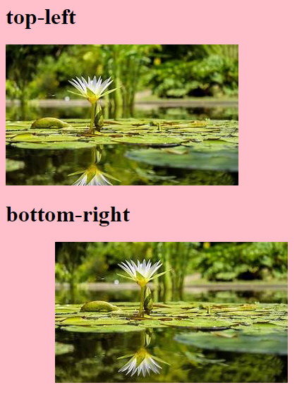
This example demonstrates how this property allows you to place the image in various positions within the container element. It displays two containers with images positioned (position-top-left) at the top-left corner and the second container (position-bottom-right) placed at the bottom-right corner.
By effectively using this property, you can achieve precise control over how background images appear within your web pages. This allows for more creative layouts and visual effects.
We’ve explored background-position for primary background image placement. Now, let’s delve deeper into using background-position-x and background-position-y for more granular control over background image positioning within an element. They provide control over the horizontal and vertical positioning of the images compared to using just background-position with keywords like left, right, center, top, and bottom.
When you use the property with those keywords, you set the image’s horizontal and vertical positions simultaneously. On the other hand, using background-position-x and background-position-y allows you to set the horizontal and vertical positions independently. This means you can specify the exact horizontal and vertical positions separately, providing more precise control over how the image is positioned within the element.
Let’s demonstrate how you can use this property:
<div class="banner"></div>body {
background-color: rgb(168, 159, 159);
}
.banner {
width: 430px;
height: 300px;
background-image: url("https://tse3.mm.bing.net/th?id=OIP.eacKUj-PMdmywks6GWoclAHaE7&pid=Api&P=0&h=220");
background-position-x: 100px; /* 100px from the left edge */
background-position-y: calc(100% - 300px); /* Align to bottom edge */
}Here is the outcome:
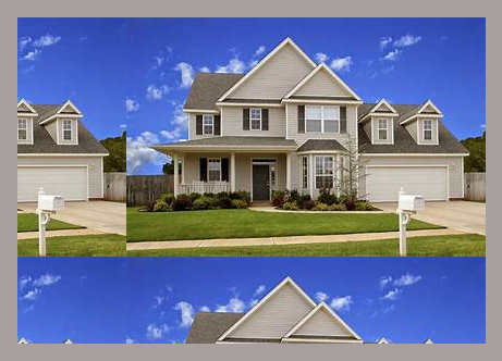
In the example above, background-position-x: 100px; positions the image 100 pixels from the left edge of the container, and background-position-y: calc(100% - 300px); positions it 300 pixels from the bottom edge of the container using a calculated value. The calc() function allows mathematical calculations in CSS.
You can experiment with several values to achieve the desired visual layout for your webpage.
The background-attachment Property
The background-attachment property controls how a background image behaves when a webpage is scrolled. It specifies whether the image scrolls with the rest of the page’s content or remains fixed in place as the page is scrolled. This can create outstanding visual effects and enhance a website’s overall design.
Here is the syntax using various values of this property:
background-attachment: scroll | fixed | local | initial | inherit;The scroll(default) value enables the image to scroll along with the content when the page is scrolled. The fixed value makes the image remain fixed relative to the viewport. It does not move when the page is scrolled. The local value allows the image to scroll along with its containing element’s content. However, this option is not widely supported. The initial value ensures the property’s default value is set. The inherit value ensures the parent element property is inherited.
Let’s demonstrate how you can use the fixed value for backgrounds that should remain static on your web page, such as hero images:
<div class="hero">
  <h1>Welcome to Our Website</h1>
</div>
<div class="content">
  <h2>About Us</h2>
  <p>
    Lorem ipsum diolor sit, amet consaectetur adipisicing elit. Est
    exercitationem, rem delectus sit eligendi, placeat repellendus error
    molestiae amet commodi nesciunt dignissimos distinctio numquam. Non
    quibusdam nihil perferendis omnis animi!
  </p>
</div>
.hero {
height: 100vh; /* Full viewport height */
background-image: url("https://photoshopcafe.com/wp-content/uploads/2019/02/oceanscape.jpg");
background-size: cover;
background-position: center;
background-attachment: fixed; /* Remains fixed */
text-align: center;
color: #ffffff;
display: grid;
place-items: center; /* Center content vertically and horizontally */
font-size: 28px;
}
.content {
padding: 50px;
text-align: center;
background-color: rgb(198, 198, 200);
font-size: 24px;
}In this example, the web page’s background image is set to cover the entire .hero section and remains fixed as the user scrolls the page.
Here is the outcome:

You can experiment with other values to see how they will display.
Fine-tuning Background Behavior
We’ve explored essential properties for background styling in the previous sections. Now, let’s delve into some advanced properties that offer even more control over how they appear and interact with other elements on your webpage:
The background-origin Property
The backgound-origin property determines the positioning origin of a background within its container. It specifies where the image or color starts from.
The syntax of this property using the values:
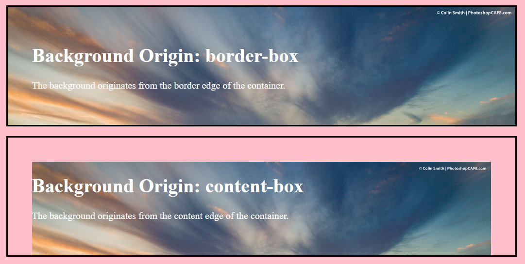
background-origin: border-box | padding-box | content-box;The border-box (default) specifies the image’s origin from the container’s border edge. It includes the padding and border areas. The padding-box defines the origin from the padding edge of the container and excludes the border area. The content-box specifies the background originates from the content edge of the container and excludes padding and border areas.
Let’s look at an example:
<div class="container border-box">
    <h1>Background Origin: border-box</h1>
    <p>The background originates from the border edge of the container.</p>
  </div>

  <div class="container content-box">
    <h1>Background Origin: content-box</h1>
    <p>The background originates from the content edge of the container.</p>
</div>
body {
background-color: pink;
}
.container {
width: 70%;
margin: 20px auto;
padding: 50px;
background-image: url("https://photoshopcafe.com/wp-content/uploads/2019/02/oceanscape.jpg");
background-size: cover;
color: #ffffff;
border: 3px solid #000000;
background-repeat: no-repeat;
font-size: 20px;
}
.border-box {
background-origin: border-box;
}
.content-box {
background-origin: content-box;
}In this example, the border-box value causes the background to start from the container’s border edge, while the content-box value causes it to start from the content edge.
Here is the outcome
The background-clip Property
The background-clip property determines which parts of the element’s content box the background image is clipped to. It essentially defines the visible area of the background.
The syntax of this property using the values:
background-origin: border-box | padding-box | content-box | text | no-clip;Here, the border-box (default) value clips the background to the edge of the border box, the padding-box value clips it to the outer edge of the padding box, and the content-box value clips it to the outer edge of the content box. The text value ensures it is only visible behind the element’s text content (applicable for text highlights). The no-clip value does not clip it (it can potentially bleed outside the element).
Let’s demonstrate how to use this property in a navigation bar to clip the background of the navigation links:
<div class="navbar">
  <a href="#" class="background-clip-content">Home</a>
  <a href="#">About</a>
  <a href="#" class="background-clip-text">Services</a>
  <a href="#" class="background-clip-padding">Portfolio</a>
  <a href="#" class="background-clip-no-clip">Contact</a>
</div>
/* Navigation Bar Styles */
.navbar {
background-color: #b55353; /* color for the navigation bar */
display: flex;
padding: 20px;
margin: 50px;
}
.navbar a {
display: block;
color: white;
text-align: center;
padding: 50px;
float: left;
text-decoration: none;
background-color: #423d3d; /* color for the navigation links */
border: 2px solid rgb(181, 181, 203);
flex-grow: 1;
font-size: 24px;
}
.navbar a.background-clip-content {
background-clip: content-box;
}
.navbar a.background-clip-text {
background-clip: text; /* Clip to the text */
}
.navbar a.background-clip-padding {
background-clip: padding-box; /* Clip to the padding box */
}
.navbar a.background-clip-no-clip {
background-clip: no-clip; /* Extend beyond padding and border */
}Here, these properties affect the navigation links as follows: “Home” with the content-box value has its background clipped to the content box, showing a little dark color due to the text content. The “Services” with text value clips it to the text, thereby not retaining the dark background color of the navigation bar instead of the link. “Portfolio” with a padding-box value clips it to the padding box, and “Contact” with a no-clip value extends the background beyond padding and border.
Look at the outcome:

The background-blend-mode Property
The background-blend-mode property defines how the background image interacts with the element’s background color or any underlying content. It offers various blending modes similar to those used in image editing software like Photoshop, enabling creative effects and interactions between different layers of content on a webpage.
Here are some common values and practical examples of applying blending effects for artistic backgrounds:
-
normal(default) value: The background image/color is displayed as is without any blending with the content below. -
multiplyvalue: Multiplies the colors of the background image/color with the content below, resulting in a darker overall appearance. -
screenvalue: Inverts the colors of the background image/color and then multiplies it with the content below, creating a lighter appearance (opposite of multiply). -
overlayvalue: Creates a darkening or lightening effect based on the background image’s average brightness. -
darken: This value selects the darker of the background image/color and the content below for each pixel. -
lightenvalue: Replaces areas of the background with a lighter color from the background image/color. -
differencevalue: Subtracts the content color from the background color or vice versa, creating an inverted effect.
Let’s demonstrate the effects of different values of this property:
<div class="container normal">Normal (Default)</div>
<div class="container multiply">Multiply</div>
<div class="container screen">Screen</div>
<div class="container overlay">Overlay</div>
<div class="container darken">Darken</div>
<div class="container lighten">Lighten</div>
<div class="container difference">Difference</div>
body {
display: flex;
flex-wrap: wrap; /* Allow items to wrap to the next line */
justify-content: center;
align-items: center;
background-color: #f5c7c7;
}
.container {
width: 350px;
height: 190px;
margin: 3px;
background-image: url("https://tse3.mm.bing.net/th?id=OIP.eacKUj-PMdmywks6GWoclAHaE7&pid=Api&P=0&h=220");
background-color: #dc0303;
color: rgb(237, 244, 245);
display: flex;
justify-content: center;
font-size: 26px;
border-radius: 8px;
box-sizing: border-box;
}
.normal {
background-blend-mode: normal;
}
.multiply {
background-blend-mode: multiply;
}
.screen {
background-blend-mode: screen;
}
.overlay {
background-blend-mode: overlay;
}
.darken {
background-blend-mode: darken;
}
.lighten {
background-blend-mode: lighten;
}
.difference {
background-blend-mode: difference;
}Here is the outcome:
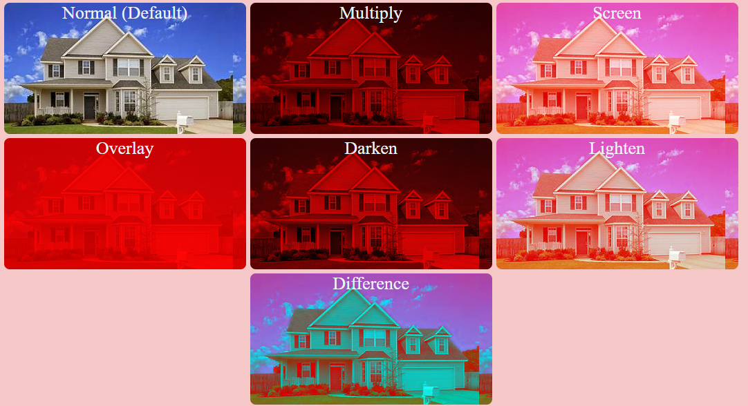
In this example, each div with the class .container has a different background-blend-mode property value applied to it. This provides a visual demonstration of how this property can significantly alter the appearance of background images when combined with a background color. By observing the visual effects produced by each blending mode, you can differentiate and understand which blending mode to use based on your design requirements.
You can experiment using various images to see how they interact with the different property values. Check out more on the CSS background-blend-mode property.
Best Practices for Optimizing Background Images:
Optimizing background performance and ensuring it is accessible are crucial aspects of web design. Here are some best practices and guidelines for achieving both:
-
Image Compression: Use compressed image formats (like JPEG or WebP) to reduce file size while maintaining quality.
-
Image Size: Resize images to the exact dimensions needed, avoiding oversized images that increase load times.
-
Contrast Ratio: Ensure sufficient contrast between the background image and text or content overlaid on it for readability, following WCAG guidelines.
-
Alternative Text: Provide descriptive alternative text (alt text) for background images used for decorative purposes or when the image conveys essential information.
-
Responsive Design: Optimize backgrounds for responsive design so they adapt well to different screen sizes and orientations.
Conclusion
Mastering CSS background properties opens up a world of creative possibilities in web design. With foundational elements like background color and image to advanced elements like blending effects, dynamic positioning, and other advanced techniques, you can create dynamic and visually appealing backgrounds that enhance the overall aesthetics and functionality of your website. Experimenting with these properties and exploring their diverse effects empowers you to craft unique and memorable web experiences for your audience.
Truly understand users experience
See every user interaction, feel every frustration and track all hesitations with OpenReplay — the open-source digital experience platform. It can be self-hosted in minutes, giving you complete control over your customer data. . Check our GitHub repo and join the thousands of developers in our community..


