Material UI vs. ShadCN UI - Which Should You be using in 2024?

In this ever-changing world of UI frameworks, deciding between ShadCN and Material UI (MUI) can be a make-or-break choice for your project to succeed. However, the best choice depends on your specific project needs. This article compares these two libraries and also highlights the pros, cons, and use cases that can make you pick one over the other.

Discover how at OpenReplay.com.
Overview of Material UI and ShadCN UI
MUI is influenced by Google Material Design Guidelines and developed to give the best look and feel of material design in a React framework. It comes with powerful builder libraries primarily based on single UI Pattern System, which is ruling insane and quite common among developers searching for well-crafted tools to build beautiful, easy-to-use UI. The ShadCN UI library, however, is relatively recent and has minimalist and flexible parts. ShadCN is way lighter than MUI; most components are quite adjustable and capable of implementing many designs you come across, making it bliss when your project revolves around one particular design that wants to be achieved.
Importance of Choosing the Right UI Library in 2024
In 2024, efficient and beautiful UI will be key to winning the war of getting into a user’s hands. A good library gives you templates of ready-to-use components, styles, and tools to build out your application faster and with more consistency. With a little bit of research and by asking the right questions about community support, documentation quality, performance, and compatibility with your use case or project requirements, you will be set to make an informed decision that could ultimately have tremendous implications for your application.
Key Differences
Here are some key differences between the two interfaces.
Design Philosophy
When MUI was created, Material designing principles was the foundation of developing MUI. The component is positioned according to material design specifications, which includes consistency, reasonable prominence shifting, and clear reveal. This design principle will help bring the applications created with MUI tools and techniques to professional designing standards.
ShadCN UI focuses on using fewer capacity blocks and adopting minimalism, aligning with the flexibility principle. It does give several components that, while less comprehensive, are extendable and adaptable to specific environments. You can use it if you are a developer ready to put in more leg work on your design process.
Component Library
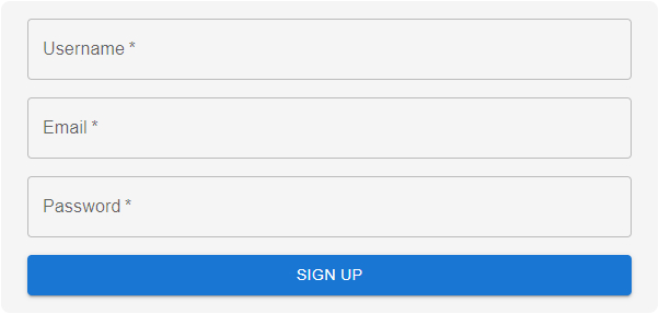
MUI offers a wide range of components, such as buttons & forms, data grids, and charts. Thus, every single element of it is elaborately constructed. Let’s use a signup form example to show this:
// Signup form example
import React from 'react';
import { Button, TextField, Grid, Container } from '@mui/material';

function SignUpForm() {
  return (
    <Container
      maxWidth="sm"
      sx={{
        backgroundColor: '#f5f5f5',  // Light gray background color
        padding: 2,
        borderRadius: 2
 }}
    >
      <form>
        <Grid container spacing={2}>
          <Grid item xs={12}>
            <TextField
              variant="outlined"
              fullWidth
              label="Username"
              required
            />
          </Grid>
          <Grid item xs={12}>
            <TextField
              variant="outlined"
              fullWidth
              label="Email"
              type="email"
              required
            />
          </Grid>
          <Grid item xs={12}>
            <TextField
              variant="outlined"
              fullWidth
              label="Password"
              type="password"
              required
            />
          </Grid>
          <Grid item xs={12}>
            <Button variant="contained" color="primary" fullWidth>
 Sign Up
            </Button>
          </Grid>
        </Grid>
      </form>
    </Container>
 );
}
export default SignUpForm;
The SignUpForm component utilizes the Container, Grid, TextField, and Button components from MUI to style up the signup form. The Container confines the width of the form to small and gives inline styling using the sx prop. The three fields of the form are username, email, and password, all implemented with MUI’s styled component. The button takes up the full width and a primary color (color= "primary"). With this approach, we get a very nice-looking and flexible form using MUI components.

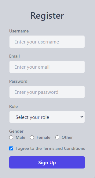
ShadCN UI components are minimal and flexible; their simplicity provides a great experience, especially for any Tailwind CSS developer. You can easily drop in a design system that is easy to tune and scale, but it takes more manual styles compared to out-of-the-box advanced theming libraries like MUI. It has a sparse component library, but its components are ripe for tweaking. Using the same signup form example as the above:
import React, { useState } from 'react';
import './App.css'

// Hypothetical ShadCN UI components using Tailwind classes
const Button = ({ children, className, ...props }) => (
  <button
    className={`px-4 py-2 bg-indigo-600 hover:bg-indigo-700 text-white font-semibold rounded-md ${className}`}
    {...props}
  >
    {children}
  </button>
);

const Input = ({ className, ...props }) => (
  <input
    className={`w-full px-4 py-2 mt-1 bg-gray-100 border border-gray-300 rounded-md focus:ring-2 focus:ring-indigo-500 ${className}`}
    {...props}
  />
);

const Select = ({ className, children, ...props }) => (
  <select
    className={`w-full px-4 py-2 mt-1 bg-gray-100 border border-gray-300 rounded-md focus:ring-2 focus:ring-indigo-500 ${className}`}
    {...props}
  >
    {children}
  </select>
);

const Label = ({ children, className, ...props }) => (
  <label className={`block text-sm font-medium text-gray-500 ${className}`} {...props}>
    {children}
  </label>
);

const Checkbox = ({ className, ...props }) => (
  <input
    type="checkbox"
    className={`mr-2 leading-tight ${className}`}
    {...props}
  />
);

const RadioButton = ({ label, value, checked, onChange }) => (
  <div className="flex items-center">
    <input
      type="radio"
      className="mr-2"
      value={value}
      checked={checked}
      onChange={onChange}
    />
    <Label>{label}</Label>
  </div>
);

function CustomForm() {
  const [formData, setFormData] = useState({
    username: '',
    email: '',
    password: '',
    role: '',
 agree to terms: false,
    gender: '',
 });

  const handleChange = (e) => {
    const { name, type, value, checked } = e.target;
    setFormData({
 ...formData,
      [name]: type === 'checkbox' ? checked : value,
 });
 };

  const handleSubmit = (e) => {
    e.preventDefault();
    console.log('Form submitted:', formData);
 };

  return (
    <div className="flex items-center justify-center min-h-screen bg-gray-300">
      <div className="max-w-md mx-auto bg-gray-300 p-8 rounded-lg shadow-lg text-gray-700">
        <h2 className="text-3xl font-semibold text-center mb-6">Register</h2>
        <form onSubmit={handleSubmit}>
          {/* Username Input */}
          <div className="mb-4">
            <Label htmlFor="username">Username</Label>
            <Input
              id="username"
              name="username"
              type="text"
              placeholder="Enter your username"
              value={formData.username}
              onChange={handleChange}
              required
            />
          </div>

          {/* Email Input */}
          <div className="mb-4">
            <Label htmlFor="email">Email</Label>
            <Input
              id="email"
              name="email"
              type="email"
              placeholder="Enter your email"
              value={formData.email}
              onChange={handleChange}
              required
            />
          </div>

          {/* Password Input */}
          <div className="mb-4">
            <Label htmlFor="password">Password</Label>
            <Input
              id="password"
              name="password"
              type="password"
              placeholder="Enter your password"
              value={formData.password}
              onChange={handleChange}
              required
            />
          </div>

          {/* Role Selection */}
          <div className="mb-4">
            <Label htmlFor="role">Role</Label>
            <Select
              id="role"
              name="role"
              value={formData.role}
              onChange={handleChange}
              required
            >
              <option value="">Select your role</option>
              <option value="admin">Admin</option>
              <option value="user">User</option>
              <option value="editor">Editor</option>
            </Select>
          </div>

          {/* Gender Radio Buttons */}
          <div className="mb-4">
            <Label>Gender</Label>
            <div className="flex space-x-4">
              <RadioButton
                label="Male"
                value="male"
                checked={formData.gender === 'male'}
                onChange={(e) => handleChange(e)}
              />
              <RadioButton
                label="Female"
                value="female"
                checked={formData.gender === 'female'}
                onChange={(e) => handleChange(e)}
              />
              <RadioButton
                label="Other"
                value="other"
                checked={formData.gender === 'other'}
                onChange={(e) => handleChange(e)}
              />
            </div>
          </div>

          {/* Terms and Conditions Checkbox */}
          <div className="mb-4 flex items-center">
            <Checkbox
              id="agreeToTerms"
              name="agreeToTerms"
              checked={formData.agreeToTerms}
              onChange={handleChange}
              required
            />
            <Label htmlFor="agreeToTerms">I agree to the Terms and Conditions</Label>
          </div>

          {/* Submit Button */}
          <Button type="submit" className="w-full">
 Sign Up
          </Button>
        </form>
      </div>
    </div>
 );
}

export default CustomForm;
This code defines a customizable registration form in React that utilizes Tailwind CSS for styling. The form consists of various input fields, including a username, email, password, and a role selection dropdown, as well as radio buttons for gender and a checkbox for agreeing to terms and conditions. Each input field is managed by React's state management using the useState hook, which allows the form to track user input dynamically. When the form is submitted, the handleSubmit function prevents the default form behavior and logs the collected data to the console. The overall layout is centered and features a visually appealing design.

Theming and Customization
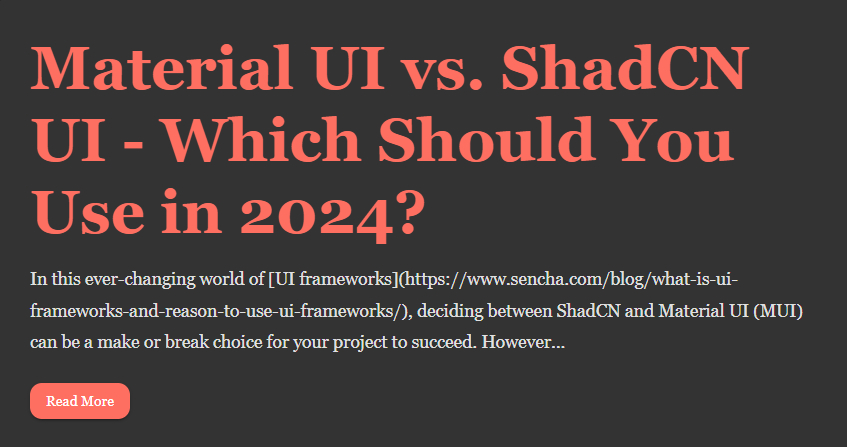
Theming enables brands to customize a library to meet their specific requirements. Theming saves product teams considerable time and resources because it allows them to make many changes with minimal effort. This is where libraries like MUI and ShadCN UI come into play, although they approach theming differently. MUI ships with a great theming system that allows you to create your own themes. Let’s show this with the dark-themed blog article page below.
// MUI Theme Example for Blog Article
import { createTheme, ThemeProvider } from '@mui/material/styles';
import { CssBaseline, Button, Typography, Container, Paper } from '@mui/material';

// Create a custom theme
const theme = createTheme({
  palette: {
    primary: {
      main: '#ff6f61',   // Primary color
 },
    secondary: {
      main: '#6a1b9a',   // Secondary color
 },
    error: {
      main: '#f44336',   // Error color
 },
    warning: {
      main: '#ff9800',   // Warning color
 },
    info: {
      main: '#2196f3',   // Info color
 },
    success: {
      main: '#4caf50',   // Success color
 },
    background: {
      default: '#1e1e1e',  // Page background
      paper: '#333333',    // Paper background
 },
    text: {
      primary: '#e0e0e0',  // Primary text color
      secondary: '#bdbdbd', // Secondary text color
 },
 },
  typography: {
    fontFamily: 'Georgia, serif',  // Global font family
    h2: {
      fontWeight: 'bold',  // Bold font for headings
      marginBottom: '16px',  // Margin for headings
      color: '#ff6f61',  // Primary color for headings
 },
    body1: {
      lineHeight: 1.8,  // Line height for body text
      fontSize: '1.1rem',  // Font size for body text
      color: '#e0e0e0',  // Primary text color
 },
 },
  components: {
    MuiButton: {
      styleOverrides: {
        root: {
          textTransform: 'none',  // Disable uppercase transformation
          borderRadius: 12,       // Rounded corners
          backgroundColor: '#ff6f61',  // Primary button color
          color: '#fff',  // Button text color
          '&:hover': {
            backgroundColor: '#e65100',  // Hover state color
 },
 },
 },
 },
    MuiPaper: {
      styleOverrides: {
        root: {
          padding: '32px',  // Padding inside paper
          backgroundColor: '#333333',  // Paper background color
          boxShadow: '0 2px 8px rgba(0,0,0,0.5)',  // Paper shadow
          marginBottom: '24px',  // Margin below paper
 },
 },
 },
    MuiTypography: {
      styleOverrides: {
        h2: {
          color: '#ff6f61',  // Heading color override
 },
        body1: {
          color: '#e0e0e0',  // Body text color override
 },
 },
 },
 },
});

export default function BlogPage() {
  return (
    <ThemeProvider theme={theme}>
      <CssBaseline />
      <Container maxWidth="md">
        <Paper>
          <Typography variant="h2">
 Material UI vs. ShadCN UI - Which Should You Use in 2024?
          </Typography>
          <Typography variant="body1">
 In this ever-changing world of [UI frameworks](https://www.sencha.com/blog/what-is-ui-frameworks-and-reason-to-use-ui-frameworks/), deciding between ShadCN and Material UI (MUI) can be a make or break choice for your project to succeed. However...
          </Typography>
          <Button variant="contained" style={{ marginTop: '24px' }}>
 Read More
          </Button>
        </Paper>
      </Container>
    </ThemeProvider>
 );
}
The code above defines a custom MUI theme tailored for a blog article page. The theme customization focuses on creating a cohesive dark-themed design with vibrant color contrasts. The primary color is set to a coral shade (#ff6f61), while the secondary color is a deep purple (#6a1b9a). These colors are prominently used for important actions, such as buttons and headers, creating a striking contrast against the dark background (#1e1e1e) and the dark paper components (#333333). The text colors are also customized, with primary text in light gray (#e0e0e0) and secondary text in a softer gray (#bdbdbd), ensuring readability while maintaining a sleek, modern look. The theme also includes special colors for error, warning, info, and success messages, reflecting a comprehensive and versatile design for a content-rich webpage.
In terms of typography, the theme uses “Georgia,” a serif font, to give the blog page a more elegant and readable feel, especially for long-form content. Heading styles (h2) are bold and carry the primary coral color for emphasis, while the body text has a larger font size and increased line spacing for better readability. Customizations are also applied to MUI components like MuiButton and MuiPaper, where buttons have rounded corners, use the primary color, and have distinct hover effects for interactivity. The MuiPaper component, used to display the blog content, has padding and a shadow effect to make the article sections stand out. This theme ensures a well-structured, visually engaging blog layout that enhances the user experience.

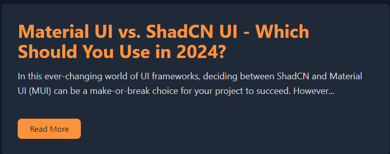
In contrast, ShadCN UI doesn’t have themes; however, you will tweak them here using a more tiresome method.
// ShadCN UI Theme Example with Tailwind CSS for Blog Article
import './App.css'
import React from 'react';

// Tailwind CSS setup in a React component
export default function BlogPage() {
  return (
    <div className="bg-gray-900 text-gray-300 min-h-screen p-8">
      <div className="max-w-3xl mx-auto">
        {/* Paper-like component */}
        <div className="bg-gray-800 shadow-lg p-8 rounded-lg mb-8">
          {/* Typography Heading */}
          <h2 className="text-4xl font-bold text-orange-400 mb-4">
 Material UI vs. ShadCN UI - Which Should You Use in 2024?
          </h2>
          {/* Body Text */}
          <p className="text-lg leading-relaxed mb-6">
 In this ever-changing world of UI frameworks, deciding between ShadCN and Material UI (MUI) can be a crucial decision for your project's success. However...
          </p>
          {/* Button */}
          <button className="bg-orange-400 text-gray-900 py-2 px-6 rounded-lg hover:bg-orange-500 transition duration-300 mt-4">
 Read More
          </button>
        </div>
      </div>
    </div>
 );
}
The code demonstrates how to style a simple blog article page using ShadCN UI in combination with Tailwind CSS. Since it doesn’t offer a theming system like MUI, styles are applied manually using Tailwind’s utility classes. The page features a dark background (bg-gray-900) with light gray text (text-gray-300) for readability. A paper-like component is styled with a background of bg-gray-800, shadow, and padding to mimic a card. The heading is styled with a bold, orange color (text-orange-400), while the button is customized with hover effects and rounded corners. This approach requires explicit styling for each element, providing flexibility but without the convenience of centralized theme management.

Performance
Performance is another key factor when choosing a UI library. However, MUI offers a bundle of components and necessary tools like a list that can be included in your project. Example:
npm run build — — analyzeDissecting the bundle size, this command discovers which area needs to be optimized in MUI projects.
In Short, ShadCN UI is designed to be as fast as possible without questionable interventions. For example, the build sizes of a simple project with both libraries, given the bundle size, let us make comparisons just for PhotoCount.
Building the ShadCN UI itself: 150 KB
Material UI build size: 300kb
You can clearly see the ShadCN UI is a very small library compared to MUI.
Advantages
Here are some of the advantages of both libraries.
Material UI
-
MUI Community and Ecosystem Support: MUI is also a widely used library supported by an extensive community over the globe, so there are many resources out there (like docs, tutorials) that can help you work faster with third-party solutions. As a result, developers can easily find solutions to their common problems and use MUI with other tools/libraries.
-
Simple with High-Level Docs and Tutorials: MUI comes bundled with comprehensive high-level documentation that allows developers to start using the components effortlessly.
-
Business side, Common Codebase: MUI provides a common set of UI widgets designed using Google Material design standards, giving a professional look across the applications. This is particularly valuable in projects requiring a clean, cohesive public façade.
ShadCN UI
-
Lightweight and Minimalistic, Leading to Faster Load Times: This UI has a sleek, minimal design with a smaller bundle size for faster load times, which is an ideal solution if you care about the speed of your project.
-
More support for custom design implementations: Designed with great flexibility, it enables developers to create their designs without the shackles of predetermined styles or themes. This is perfect when you need something unusual or completely custom-made.
-
Best For Projects That Require a Special or Non-Standard Design: If you expect to do some customization and are tasked with making the most unique experience, then check out ShadCN UI.
Disadvantages
Here are also some disadvantages of both libraries.
Material UI
-
Bigger Bundle in Size: Another consequence of using MUI is ending up having many components packaged (and built-in features), and that could lead to an increase in the size of our bundle, which is definitely something you don’t want when building a more decorated project or with very big complexity.
-
For Projects That Want a Truly Unique Design, it May Feel Constrictive: While MUI does offer plenty of customization options, the developers are still subject to sticking closely with principles of Material design which makes the liberty on extraordinary or rare designs quite challenging.
ShadCN UI
-
Smaller community/less pre-built components, a smaller component library means developers are often left to build them from scratch.
-
More Manual Work: While it offers more flexibility, complex designs may require additional manual work to achieve similar effectiveness, which can further extend development time and complexity.
Use Cases
If you are looking for a well-designed, enterprise-level project and love the ecosystem, go with MUI. It is a great fit for projects that need to comply with Material Design specifications, accompanied by extensive, well-supported documentation. On the other hand, ShadCN UI is well-suited for use cases where a unique design is required or when high performance and extensive customization are needed. It is ideal for developers who are comfortable with a framework that may lack the excitement and glamour that more modern frameworks provide.
Conclusion
Well, choosing the wrong UI library in the year 2024 itself is out for your project; thus, it becomes imperative to make the right choice. MUI is a full range of FAAS GUI, making it an indispensable tool for frequently used services. It offers a well-documented system, an active community, and strong support. In contrast, ShadCN UI is minimalistic, making it appealing for full-stack developers working on unique or exotic projects where complexity and performance meet the beauty of custom design. However, its support is more limited, focusing on specific keys and functions. Understanding the key features of both libraries will allow developers to choose the best option based on their project’s needs.
Truly understand users experience
See every user interaction, feel every frustration and track all hesitations with OpenReplay — the open-source digital experience platform. It can be self-hosted in minutes, giving you complete control over your customer data. . Check our GitHub repo and join the thousands of developers in our community..

