

A CSS (Cascading Style Sheet) framework is a pre-prepared library containing CSS code blocks, a collection of files containing CSS styles for easy design implementation. These styles could cover site layouts (flex, grids, margins, paddings, containers, etc.), typography (font weights, font size, text color, etc.), animations, and other design elements. It is designed to make it easier and faster for web developers to create responsive and visually appealing web applications without having to write CSS codes from scratch.
CSS frameworks were built to simplify the act of front-end development. The web development process is significantly sped up, as the developer can simply add pre-defined classes from the framework to achieve an intended visual effect, as opposed to writing pure CSS, thereby getting desired results faster.
Over the years, there have been a lot of frameworks released by different organizations. In this article, we will cover Material UI and Tailwind CSS frameworks and how they can be set up and used in web applications. We will also discuss their differences and similarities.
Introduction to Material UI and Tailwind CSS Frameworks
In this section, we will discuss the differences and similarities between the Material UI and Tailwind CSS frameworks.
Similarities
- Customizable: Both frameworks can be customized and provide options to modify and create custom styles.
- Open-source: Material and Tailwind CSS are open-sourced CSS frameworks, freely available, and have large developer communities.
- Responsive web designs: Material UI and Tailwind CSS frameworks are suitable for creating responsive user interfaces for different screen sizes.
Differences
Although similarities exist between both frameworks, here are some differences that exist between them:
- Theming: Material UI provides powerful theming features to allow for easy customization of the visual styles and colors used in components, while Tailwind CSS provides a set of default properties and allows us to define ours by editing the classes upon usage.
- Presence of a component library: Material UI provides a comprehensive set of pre-built and customizable components, while Tailwind CSS allows users to build their site components using its provided utility classes.
- Availability of utility classes: Tailwind CSS provides more utility classes and customization options than Material UI. Tailwind CSS is a utility-first CSS framework, while Material UI uses a component UI design approach.
- Learning curve: Material UI is considered to have a slightly steeper learning curve due to its extensive component library and theming system than Tailwind CSS, which focuses on utility classes.
For this tutorial, we will use Material UI and Tailwind CSS frameworks, along with React.js, a popular JavaScript front-end framework.
Getting started with Material UI
Material UI is a popular front-end CSS framework that provides utility classes (typography, colors, margins, etc.) and customizable components to quickly build responsive user interfaces. Components such as forms, buttons, sliders, navigation, cards, etc., can be easily added and customized to produce desired results. Material UI is flexible and can be used with various front-end frameworks. It is well documented and has a vast amount of tools and resources.
Material UI CSS Characteristics
Below are key characteristics of the Material UI CSS framework:
- Easy to Learn: Material UI has an easy learning curve and has a supportive developer community. It is extensively documented, making it easy for developers of all skill levels to learn and use.
- Modular and Reusable: Material UI is modular-based, so its components and UI elements can be re-used as desired.
- Theming and Customization: Material UI is highly customizable and provides a theming feature to easily customize components’ styles by selecting from various options.
- Pre-built components: Material UI has a lot of components for building interactive web interfaces. With Material UI components tasks such as creating forms, navigation components, etc., can be performed easier and faster.
- Responsiveness: Material UI is highly responsive and can be used to develop web applications for different devices and screen sizes.
Advantages of Material UI
The following are reasons why Material UI stands out among CSS frameworks:
- Material UI is a simple, intuitive CSS framework that is easy to learn, set up, and implement. Its simple design approach makes using the framework easier for developers of all levels.
- Comprehensive documentation containing code, examples, and features of Material UI classes and components provided by its extensive documentation makes learning and using the framework easy.
- Material UI is highly customizable, making it easy for users to edit components to fit their design needs or use cases.
- Material UI provides a range of components and utilities for building responsive designs that work well across different screen sizes.
Installing Dependencies
To install the Material UI dependency, create a new React application, or open an existing project in the CLI and enter the following command:
npm install @mui/material @emotion/react @emotion/styled @mui/icons-materialThis command installs the Material UI dependency in the chosen project folder, and we can proceed to show it in action.
Setup, Syntax, and Component Examples
To make use of Material UI within the application, we just need to add the import for the desired components from the framework, e.g:
src/App.js
import { Typography, TextField, Button } from "@mui/material";The above command adds an import for Typography, TextField, and the Button components into the App.js file. Typography deals with text of any kind, TextField can be used to create input fields, while the Button component can quickly add buttons to your application.
To make use of these components, make the following changes to App.js:
src/App.js
import "./App.css";
import { Typography, TextField, Button } from "@mui/material";
function App() {
return (
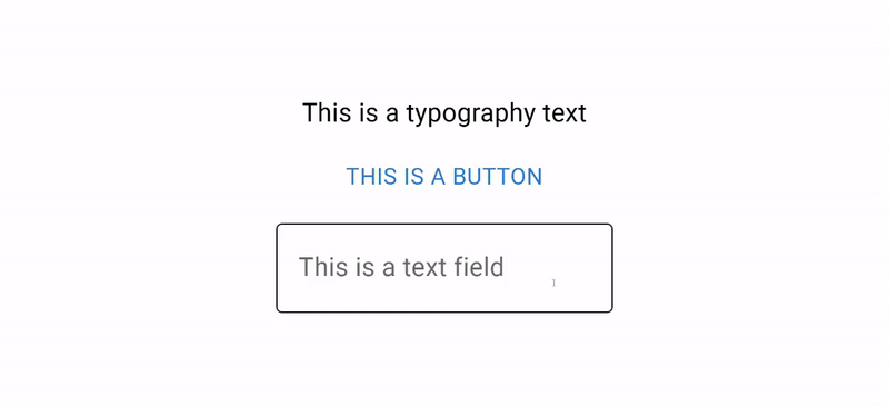
<div className="App">
<Typography>This is a typography text</Typography>
<Button>This is a button</Button>
<TextField label="This is a text field" />
</div>
);
}
export default App;If we run our code with the npm start command, we will get the following results:
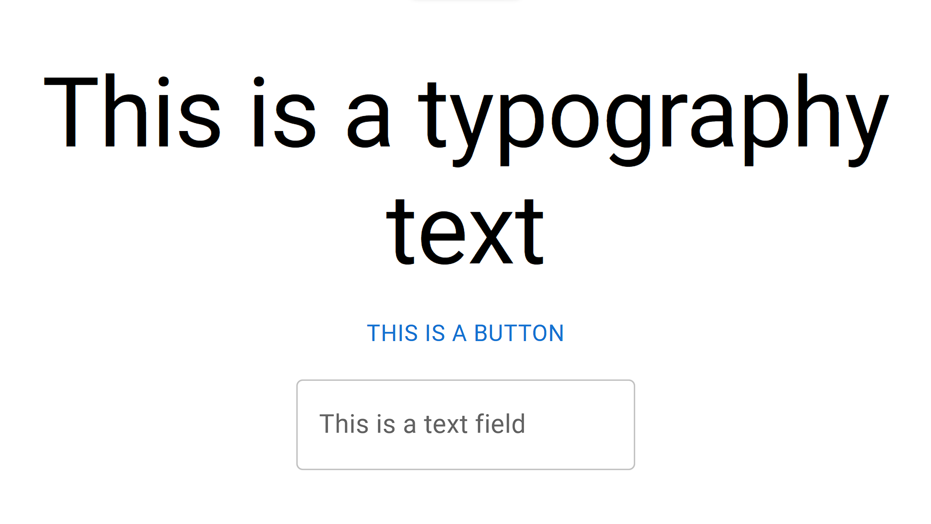
Apart from the basic styles offered by the component, Material UI also provides us a list of variations we can pick from using their theming feature. For example, we can change the Typography to act as a heading element using the variant prop as shown below:
<Typography variant="h2" >This is a typography text</Typography>This will produce the following result:
Variations are available for virtually every component. The button style can be changed by using the following variants: outlined and contained. Apart from variants, we can also further customize the appearances of components using the following:
- color: We can use this property to set the color our components will take.
- classes: With the classes prop, we can replace the Material UI provided styles or add to it by adding custom classes.
- disabled: If this prop is set to true, the component will be displayed but unable to perform any action as it is disabled. This can be applied to buttons, input fields, etc.
- fullWidth: This prop enables components to inherit the full width of their parent element.
- size: This prop indicates the size of the component it is applied to.
- sx: This class lets us customize the styles of the component directly in the form of inline CSS.
To learn more about Material UI and its applications, check out the framework’s official documentation.
Material UI Example
We will build a simple form using React and Material UI to demonstrate Material UI in action.
src/App.js
import "./App.css";
import { Typography, TextField, Button, Container, Stack } from "@mui/material";
function App() {
  return (
    <Container maxWidth="sm" sx={{ marginTop: "80px" }}>
      {/* A simple form with Material UI */}
      <Typography variant="h4" component="h1" gutterBottom>
        A simple Material Ui form
      </Typography>
      <Stack spacing={2}>
        <TextField
          id="outlined-basic"
          label="An outlined field"
          variant="outlined"
          margin="normal"
        />
        <TextField
          id="filled-basic"
          label="Filled"
          variant="filled"
          margin="normal"
        />
        <TextField
          id="standard-basic"
          label="Standard"
          variant="standard"
          margin="normal"
        />
        <Button variant="contained" color="secondary" fullWidth>
          Submit
        </Button>
      </Stack>
    </Container>
  );
}

export default App;
With the form added, we can proceed to run the application and view the results in the browser:
Session Replay for Developers
Uncover frustrations, understand bugs and fix slowdowns like never before with OpenReplay — an open-source session replay tool for developers. Self-host it in minutes, and have complete control over your customer data. Check our GitHub repo and join the thousands of developers in our community.
Getting started with Tailwind CSS
Tailwind CSS is an open-source utility-first CSS framework designed to help developers effortlessly build user interfaces. Unlike most other frameworks, Tailwind CSS does not feature pre-built components such as buttons, navigation menus, carousels, etc.. Rather, it provides the user with classes and utilities to apply different CSS styles and build their web applications as they see fit.
Characteristics of the Tailwind Framework
As mentioned, Tailwind CSS is a utility-first CSS framework designed to help developers build responsive and customizable user interfaces. Below are the main characteristics of the Tailwind CSS framework:
- Utility-first CSS framework: Tailwind CSS is classified as a utility-first CSS framework it provides users with utility classes that apply different styles to the web application. Examples of such utility classes include classes for spacing, margin, padding, flex properties, backgrounds, and grids. With this, developers can easily build user interfaces by adding classes to the HTML elements.
- Customizable: Tailwind CSS provides customizability features for its provided utility classes. Developers can use the Tailwind configuration file to tailor the framework to fit specific needs. Alterations can be made to the default values of the classes and animations, and even user-defined ones can be added for use.
- Responsive: Tailwind CSS is highly responsive, providing the user with screen sizes and responsive systems to make the web application fit into whatever device used to access it.
- Component-driven: Apart from its utility-provided classes, Tailwind CSS also provides pre-built web components such as headers, hero and testimonial sections, CTA, newsletter, and stats sections, etc.
Advantages of Tailwind CSS
- Tailwind CSS is a lightweight performance-focused CSS framework with an easy learning curve. Tailwind CSS performs tree-shaking on the CSS for dead-code elimination. This process removes unused CSS files from the final build, thereby reducing the amount of CSS to be loaded and speeding up the web application.
- Tailwind CSS speeds up the rate of web development, as lesser time is spent on writing custom CSS and styles can easily be applied using its utility classes.
- It is designed to be easily customizable, making it easier for the developer to modify default provided styles or add custom styles using the Tailwind configuration file.
- It is a popular CSS framework and is characterized by a large active developer community. This makes finding solutions to issues easier and getting tutorials, support, and resources for the framework.
- Tailwind CSS has comprehensive documentation on its installation, components, utilities, customizations, and usage.
Installation and Setup
To set up Tailwind CSS in a React application, follow the steps below:
- Create a new React application or open an existing project, and enter the following in the CLI of the directory:
npm install -D tailwindcss
npx tailwindcss init
The command above installs the tailwind dependency via the command line and sets up a configuration file. Open up the project directory in your code editor after installation.
- Next, we will add the file extension support to the configuration file
tailwind.config.js:
/** @type {import('tailwindcss').Config} */
module.exports = {
  content: ["./src/**/*.{js,jsx,ts,tsx}"],
  theme: {
    extend: {},
  },
  plugins: [],
};- Finally, we will add style directives for Tailwind CSS, to the
./src/index.cssfile.
@tailwind base;
@tailwind components;
@tailwind utilities;
Congratulations, you’ve successfully set up Tailwind CSS in your React application and now have access to the extensive styles provided by it.
Tailwind classes, Utilities, and Customizations
Tailwind CSS provides us with a truckload of styles, available with the use of its pre-defined classes. Below are some of the provided classes and the styles they apply:
- Flex and grid properties: Tailwind provides us with utility classes to easily assign and manage the flex properties of an element. A style of display flex can be assigned using the
flexclass. The element can then be assigned positions of flex start/end and be justified to the desired position simply by adding a class to it. Similarly, a property ofgridcan be applied to an object, and the number of rows and columns can easily be assigned to the element. - height and width: With Tailwind, we can easily specify a height of 100% with the
h-fullclass, or add classes for heights of valuevh. Numerous classes are available for different height sizes or percentage sizes that can be used as desired. The same goes for the width classes. - Background, colors, and border: The
bgprefix indicates classes that affect an element’s background property. This could be a background color, size, position, repeat, opacity, etc. Tailwind provides colors with different levels of opacity, denoted by 100-900, with 100 being the most opaque and vice versa. For example, a background color of orange and an opacity value of 500 can be denoted bybg-orange-500. - Text formatting: Classes for text formatting, such as color, size, orientation, shadow, font family, opacity, text wrap, etc., are covered by the extensive Tailwind CSS framework.
- Responsiveness: To handle responsivity on different screen sizes, Tailwind provides four major classes:
- Container: This class arranges items within the element it’s applied to, using a flex layout pattern to easily position items.
sm,md, andlgsignify small, medium, and large screen sizes. Prefixing a class by a screen size will make that class be applied only when the size of the screen in context is of that size below. e.g.,sm:hiddenwill apply a class of hidden to the element it is assigned to if the screen size is equal to or below the value specified by thesmclass.
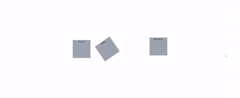
- Animation: Tailwind provides the following CSS animations:
.animate-bounce,.animate-none,.animate-ping,.animate-pulse,.animate-spin. The bounce animation adds a bouncing effect to whatever element it is added to while spin rotates the object on its axis. Ping and pulse animations modify the object’s opacity, scale, and opacity, respectively. Below is a code example of the following animation types:
src/app.js
import './App.css';
function App() {
  return (
    <div className="App flex h-screen justify-center items-center gap-14">
      {/* animate-pulse */}
      <div className="animate-pulse bg-gray-400 h-32 w-32">
        PULSE
      </div>
      {/* animate-spin */}
      <div className="animate-spin bg-gray-400 h-32 w-32">
        SPIN
      </div>
      {/* animate-ping */}
      <div className="animate-ping bg-gray-400 h-32 w-32">
        PING
      </div>
      {/* animate-bounce */}
      <div className="animate-bounce bg-gray-400 h-32 w-32">
        BOUNCE
      </div>
    </div>
  );
}
export default App;
In the code above, we have four squares with specified background, height, and width parameters. We also added the different animation classes to them. Below is the result of the code above:
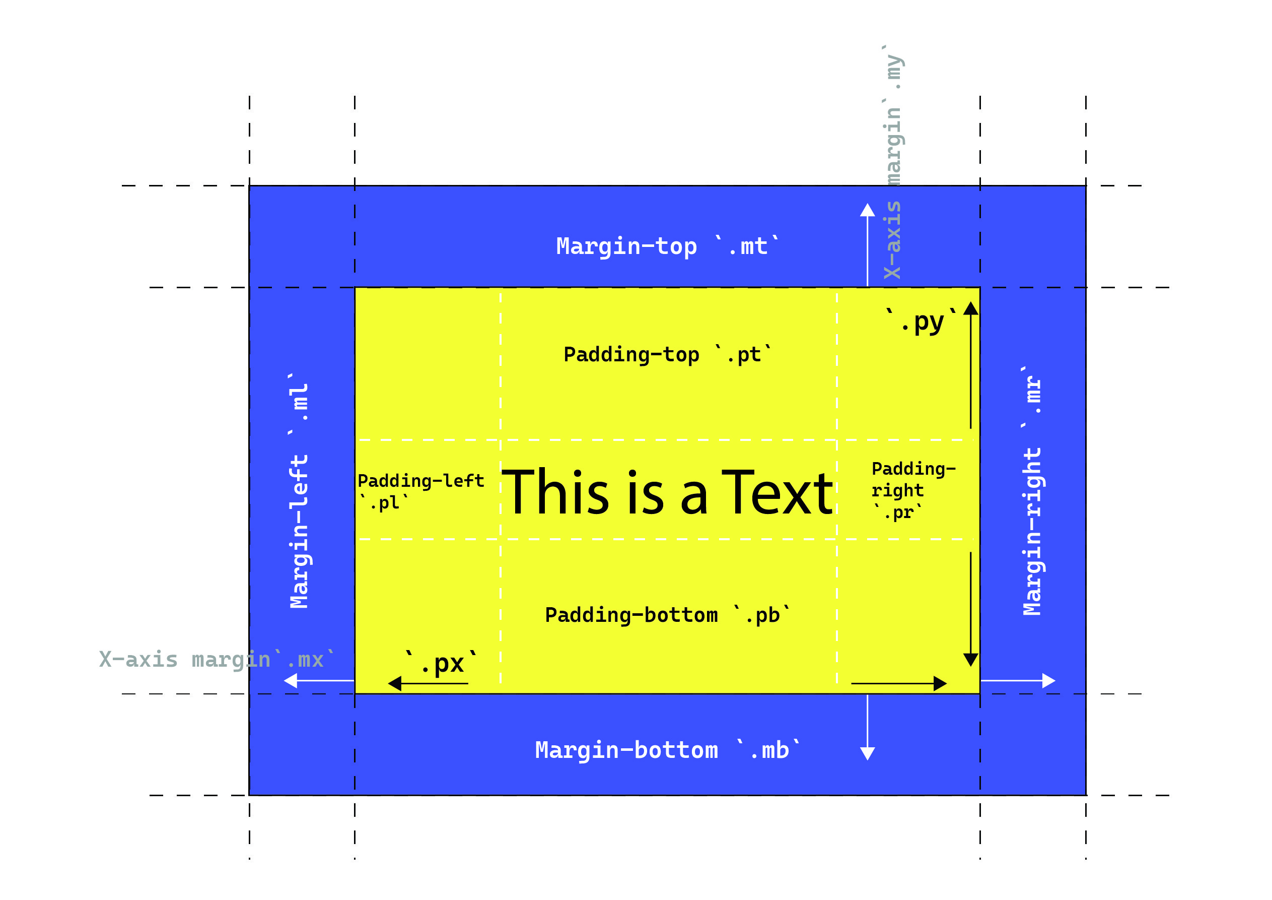
- Paddings and Margins: With Tailwind styles, margins and paddings can easily be added to HTML elements of choice. Both paddings and margins follow the following conventional patterns:
- Margin and padding top/bottom are prefixed by
mtandptfor top andmbandpbfor bottom respectively e.g.,mt-2andpb-4. - when a margin or padding is prefixed by simply
morp, e.g.,m-2andp-3. The property is applied to both the positive and negative x and y axes. - Finally, a margin or padding can be constrained to the x and y axis as follows:
mxandmywill constrain the margin to the x and y axis, respectively, e.g.,mx-2. - Paddings/margins can be added to the left or right side of an element. e.g.,
mlfor margin-left andprfor margin-right. Where “L” denotes left and “R” denotes right.
- Margin and padding top/bottom are prefixed by
The margin and padding properties are further illustrated in the image below:
- Utilities: Tailwind-provided utilities include placeholders, overflow, cursor, and pointer events, scroll events, resize select, etc.
- Customization: Custom values can be assigned to any of the Tailwind classes using a hyphen “-”, and an opening and closing square bracket “[ ]”. E.g., a custom height of 500px can be assigned using as follows
h-[500px], and a custom color for a text/background can also be assigned in the same way, e.g.,text-[#fff].
A curated list of all classes and utilities offered by the Tailwind framework can be found here.
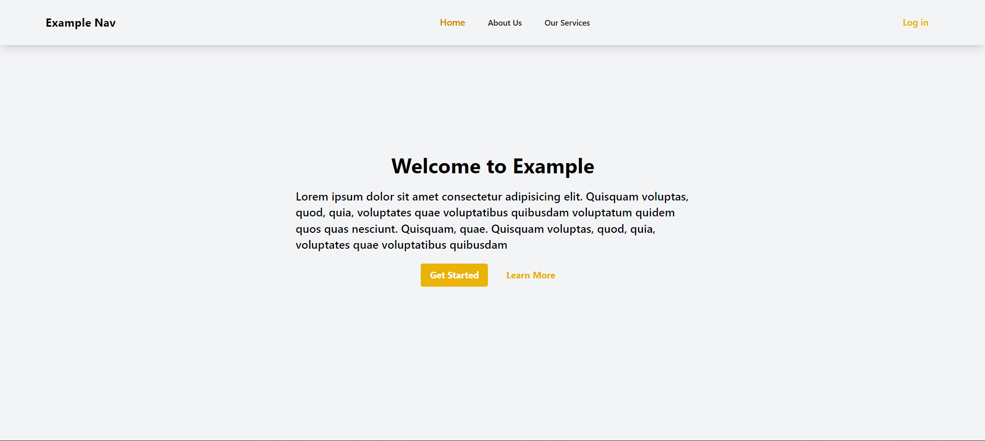
Tailwind CSS Example
In this section, we will create a simple landing site section using Tailwind CSS.
src/App.js
import "./App.css";
function App() {
  return (
    <div>
      <div>
        {/* navigation section */}
        <nav className=" shadow-lg fixed w-full">
          {/* shadow is applied to the element */}
          <span className="w-full">
            <div className="flex items-center h-20 w-full">
              <div className="flex items-center items mx-20 justify-between w-full flex-row">
                {/* items are position flex and placed at the center of the container. It follows a row arrangement(horizontal) */}
                <span className="flex items-center justify-center flex-shrink-0">
                  <h1 className=" font-bold cursor-pointer text-xl">
                    Example Nav
                  </h1>
                </span>
                <span className="block">
                  <div className=" ml-10 flex items-baseline space-x-4">
                    <a
                      href="#Home"
                      className="cursor-pointer text-yellow-600 font-semibold px-3 py-2 text-md hover:font-bold"
                    >
                      Home
                    </a>
                    <a
                      href="#About"
                      className="cursor-pointer hover:bg-yellow-600 text-black hover:text-white px-3 py-2 rounded-md text-sm font-medium"
                    >
                      About Us
                    </a>
                    <a
                      href="#Services"
                      className="cursor-pointer hover:bg-yellow-600 text-black hover:text-white px-3 py-2 rounded-md text-sm font-medium"
                    >
                      Our Services
                    </a>
                  </div>
                </span>
                <div className="flex gap-5">
                  <div className=" text-yellow-500 font-medium px-5 py-2 rounded-md hover:cursor-pointer ">
                    Log in
                  </div>
                </div>
              </div>
            </div>
          </span>
        </nav>
      </div>
      {/* landing Area */}
      <div className="flex flex-col items-center justify-center h-screen bg-gray-100">
        {/* items are position flex and placed at the center of the container. It follows a column arrangement(vertical) */}
        <div className="flex flex-col items-center justify-center h-1/2 w-1/2">
          {/* height and width are half the parent element */}
          <h1 className="text-4xl font-bold">Welcome to Example</h1>
          {/* text is 4 extra large and bold */}
          <p className="text-xl font-medium w-4/5 my-5">
            {/* margin on y-axis is 5 units */}
            Lorem ipsum dolor sit amet consectetur adipisicing elit. Quisquam
            voluptas, quod, quia, voluptates quae voluptatibus quibusdam
            voluptatum quidem quos quas nesciunt. Quisquam, quae. Quisquam
            voluptas, quod, quia, voluptates quae voluptatibus quibusdam
          </p>
          <div className="flex gap-4">
            <button className="bg-yellow-500 hover:bg-yellow-600 text-white font-bold py-2 px-4 rounded">
              Get Started
            </button>
            <button className=" text-yellow-500 font-bold py-2 px-4 rounded">
              Learn More
            </button>
          </div>
        </div>
      </div>
    </div>
  );
}
export default App;
Here we have a simple navigation bar and landing section. Running the code will produce the following result:
Conclusion
We have come to the end of this tutorial. In this tutorial, we covered the Material UI and Tailwind CSS frameworks, their characteristics, similarities, and differences,
Gain Debugging Superpowers
Unleash the power of session replay to reproduce bugs and track user frustrations. Get complete visibility into your frontend with OpenReplay, the most advanced open-source session replay tool for developers.