Multi-step forms with Transition Effects in React


A multi-step form is a long form that is broken into multiple steps to make it look less intimidating to site visitors, allowing them to complete their information in chunks. It helps to provide a user-friendly and well-organized layout. In this article, we will learn how to create a multi-step form with a transition animation. To follow up with this tutorial, you should be familiar with React and React hooks.
File Architecture
Before diving into the codes, let’s have a look at how our folders and files will be structured.
src
  ┣ components
  ┃ ┣ 0therInfo.jsx
  ┃ ┣ LocationInfo.jsx
  ┃ ┣ PersonalInfo.jsx
  ┃ ┗ SignUp.jsx
  ┣ App.css
  ┣ App.js
  ┣ index.css
  ┗ index.js
We have a components folder that contains the OtherInfo.jsx, LocationInfo.jsx, PersonalInfo.jsx and SignUp.jsx. These files contain inputs for different form sections in our app.
Creating Multi-Step Form App
Let’s start by setting up a new React app using the npx or yarn command below.
npx create-react-app multi-step-form-app
npm start
// OR
yarn create react-app multi-step-form-app
yarn start
Here is a GIF showing what we will be building in the following sections:

Create the Form components
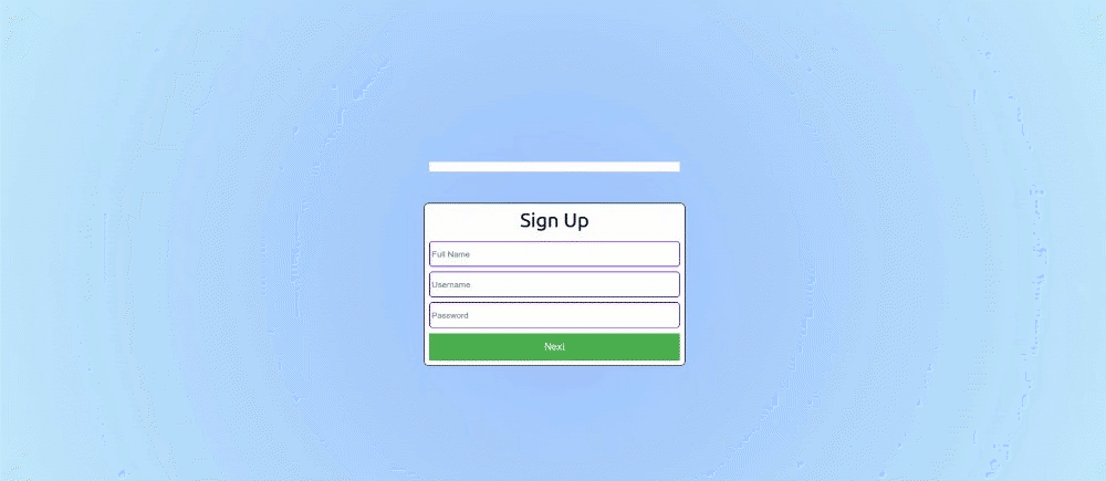
We’ll be splitting our codes into smaller form components for each form to be displayed. Let’s start by creating a components folder in the src directory. Afterward, create a SignUp.jsx file in the src/component folder and paste the code snippet into it.
const SignUp = () => {
  return (
    <div className="card">
      <div className="step-title">Sign Up</div>
      <input
        type="text"
        placeholder="Full Name"
        className="form-group"
      />
      <input
        type="text"
        className="form-group"
        placeholder="Username"
      />
      <input
        type="text"
        className="form-group"
        placeholder="Password"
      />
      <button>
        Next
      </button>
    </div>
  );
};

export default SignUp;
In the above code, we create a form using the input tag and setting the placeholder to the input description. We’ll be doing the same for the next three (3) Form components( PersonalInfo.jsx, LocationInfo.jsx, OtherInfo.jsx). Create a PersonalInfo.jsx file in the src/components folder and paste the code snippet into it.
const PersonalInfo = () => {
  return (
    <div className="card">
      <div className="step-title">Personal Info</div>
      <input
        type="text"
        placeholder="Nickname"
      />
      <input
        type="text"
        placeholder="Email"
      />
      <button>
        Next
      </button>
      <br/>
      <button>
        Previous
      </button>
    </div>
  );
};

export default PersonalInfo
Create a LocationInfo.jsx file in the src/components folder and paste the code snippet into it.
const LocationInfo = () => {
  return (
    <div className="card">
      <div className="step-title">Location Info</div>
      <input
        type="text"
        placeholder="Address"
      />
      <input
        type="text"
        placeholder="Nationality"
      />
      <input
        type="text"
        placeholder="Zipcode"
      />

      <button>
        Next
      </button>
      <br />
      <button>
        Previous
      </button>
    </div>
  );
};

export default LocationInfo;
Finally, create an OtherInfo.jsx file in the src/components folder and paste the code snippet into it.
const OtherInfo = () => {
  return (
    <div className="card">
      <div className="step-title">Other Info</div>
      <input
        type="text"
        placeholder="Highest Qualification"
      />
      <input
        type="text"
        placeholder="Occupation"
      />
      <textarea
        type="text"
        placeholder="About"
      />
      <br />
      <button>
        Submit
      </button>
      <br />
      <button>
        Previous
      </button>
    </div>
  );
};

export default OtherInfo;
With this, we have created the layout of the forms we will use to create the functionality of the multi-step form. To finish, replace the entire code in the App.js file with the code block below.
function App() {
  return (
    <div className="App">
      <div className="progress-bar"></div>
      <div>Forms</div>
    </div>
  );
}
The code block above is the template for our app. We have the progress-bar, and the div that will contain our forms later on.
Styling our Forms
Let’s add some nice colors and displays to our form. Head over to the App.css file and replace everything with the code below.
.App {
  overflow: hidden;
  display: flex;
  justify-content: center;
  flex-direction: column;
  align-items: center;
  position: relative;
  height: 100vh;
  background: rgba(194, 233, 251, 1);
  background: radial-gradient(
    circle,
    rgba(161, 196, 253, 1) 10%,
    rgba(194, 233, 251, 1) 100%
  );
}
.progress-bar {
  width: 400px;
  height: 15px;
  background-color: white;
  margin-bottom: 50px;
}
.progress-bar div {
  width: 25%;
  height: 100%;
  background-color: rgb(98, 0, 255);
}
.card {
  width: 400px;
  background-color: white;
  border: 1px solid #333;
  border-radius: 0.5rem;
  padding: 0.5rem;
  max-width: 500px;
  margin: 0 auto;
  display: flex;
  flex-direction: column;
}
.form-group {
  display: flex;
  flex-direction: column;
  margin-bottom: 0.5rem;
  gap: 0.25em;
}
.form-group:last-child {
  margin: 0;
}
.form-group > label {
  font-weight: bold;
  font-size: 0.8em;
  color: #333;
}
.form-group > input {
  border: 1px solid #333;
  border-radius: 0.25em;
  font-size: 1rem;
  padding: 0.25em;
}
.step-title {
  margin: 0;
  margin-bottom: 1rem;
  font-size: 2rem;
  text-align: center;
}
input {
  border: 2px solid rgb(98, 0, 255);
  border-radius: 5px;
  height: 35px;
  display: block;
  margin-bottom: 1rem;
}
.button-area {
  display: flex;
  align-content: space-between;
}
button {
  background-color: #4caf50;
  border: none;
  color: white;
  padding: 0.8rem;
  text-align: center;
  text-decoration: none;
  display: inline-block;
  font-size: 16px;
}
textarea {
  height: 5rem;
}
The styles above will add a nice aesthetic feel to our form, making it more appealing to our users.
Open Source Session Replay
OpenReplay is an open-source, session replay suite that lets you see what users do on your web app, helping you troubleshoot issues faster. OpenReplay is self-hosted for full control over your data.

Start enjoying your debugging experience - start using OpenReplay for free.
Creating dynamic pages
In this section, we’ll display our forms dynamically upon clicking the Next and Previous buttons. By doing this, we will be manipulating the a state property. Import the useState hook from the react library into the App.js file.
import { useState } from "react";Instantiate the useState hook in the App() component.
function App() {
  const [page, setPage] = useState(0);

  ...
}
In the code block above, we created a page hook and the setPage for updating the page hook while setting the initial state to zero (first form) in the useState() function. Import the components created earlier into the App.js file.
import SignUp from "./components/SignUp";
import PersonalInfo from "./components/PersonalInfo";
import LocationInfo from "./components/LocationInfo";
import OtherInfo from "./components/OtherInfo";
Then, paste the code below into the App() component.
function App() {
  const [page, setPage] = useState(0);

  const componentList = [
    <SignUp />,
    <LocationInfo />,
    <PersonalInfo />,
    <OtherInfo />,
  ];

  ...
}
In the above code, we created two arrays, the componentList array that contains the list of all our forms in the order we want them to display. Next, let’s update our User Interface with our dynamic form. Update the return() in the App.js with the code below.
return (
    <div className="App">
    <div className="progress-bar"></div>
    <div>{componentList[page]}</div>
  </div>
);
In the above code, we display our componentList using the page value as our index.
Switching Between Pages
In the previous section, we’ve made the pages dynamic, but so far, just a single form page still displays. Let’s change our form pages by clicking the Next and Previous buttons. To achieve this, update the componentList array.
const componentList = [
  <SignUp
    page={page}
    setPage={setPage}
  />,
  <PersonalInfo
    page={page}
    setPage={setPage}
  />,
  <LocationInfo
    page={page}
    setPage={setPage}
  />,
  <OtherInfo
    page={page}
    setPage={setPage}
  />,
];
In the code block above, we’re passing the page and the setPage into all components as props, enabling us to control the state of each component. Next, Let’s accept the props and manipulate the state in each component. Head over to the src/components/SignUp.jsx file and update the code.
const SignUp = ({page, setPage}) => {
  return (
      ...

      <button
          onClick={() => {
            setPage(page + 1);
          }}>
          Next
        </button>
    </div>
  );
};
In the code block above, we’re retrieving the page and setPage props, incrementing by 1 the page prop upon clicking the Next button. We’ll be doing the same to all the other components. Head over to src/components/PersonalInfo.jsx file and update the code.
const PersonalInfo = ({page, setPage}) => {
  return (
      ...

      <button
        onClick={() => {
          setPage(page + 1);
        }}>
        Next
      </button>
      <br/>
      <button
        onClick={() => {
          setPage(page - 1);
        }}>
        Previous
      </button>
    </div>
  );
};

export default PersonalInfo
In the code block above, we’re updating the state by incrementing by 1 in the Next and decrementing it by 1 in the Previous button.
Head over to the src/components/LocationInfo.jsx file and update the code.
const LocationInfo = ({page, setPage}) => {
  return (
      ...

      <button
        onClick={() => {
          setPage(page + 1);
        }}>
        Next
      </button>
      <br />
      <button
        onClick={() => {
          setPage(page - 1);
        }}>
        Previous
        </button>
    </div>
  );
};
Like we did in the previous code block, we’re updating the state by incrementing by 1 in the Next and decrementing it by 1 in the Previous button. Finally, head over to the src/components/OtherInfo.jsx file and update the code.
const OtherInfo = ({ page, setPage }) => {
  return (
      ...

      <button
        onClick={() => {
          alert("You've successfully submitted this form");
        }}>
        Submit
      </button>
      <br />
      <button
        onClick={() => {
          setPage(page - 1);
        }}>
        Previous
      </button>
    </div>
  );
};
In the code block above, we’re displaying an alert dialog signifying the end of the form pages. We’re also decreasing the state by 1 to return to the previous form in the Previous button. Upon checking our process, you should have the results below.
Preserving entered data across steps
In this section, we’ll be saving our values in our text field when switching pages to allow users to modify their previous data. Head to the App.js and paste the code below into the App() component.
function App() {
  const [formData, setFormData] = useState({
    fullname: "",
    username: "",
    password: "",
    nickname: "",
    email: "",
    address: "",
    nationality: "",
    zipcode: "",
    highestQualification: "",
    occupation: "",
    about: "",
  });

...
}
In the above code, we created a formData hook and set its initial value to the object we want to update from our text field. Let’s update each component in the componentList.
const componentList = [
  <SignUp
    formData={formData}
    setFormData={setFormData}
    page={page}
    setPage={setPage}
  />,
  <PersonalInfo
    formData={formData}
    setFormData={setFormData}
    page={page}
    setPage={setPage}
  />,
  <LocationInfo
    formData={formData}
    setFormData={setFormData}
    page={page}
    setPage={setPage}
  />,
  <OtherInfo
    formData={formData}
    setFormData={setFormData}
    page={page}
    setPage={setPage}
  />,
];
In the above code, we are passing the formData and the setFormData as props into each component in the componentList.
Let’s grab the formData value and update the setFormData with our form input. Head over src/components/SignUp.jsx file and update the component.
const SignUp = ({ page, setPage, formData, setFormData }) => {  // grabbing the props
  return (
      <div>
        <input
          type="text"
          placeholder="Full Name"
          value={formData.fullName} //setting the value of the form to the props value
          onChange={(e) =>
            setFormData({ ...formData, fullName: e.target.value })  //setting the formData to the value input of the textfield
          }
        />
        <input
          type="text"
          placeholder="Username"
          value={formData.username}
          onChange={(e) =>
            setFormData({ ...formData, username: e.target.value })
          }
        />
        <input
          type="text"
          placeholder="Password"
          value={formData.password}
          onChange={(e) =>
            setFormData({ ...formData, password: e.target.value })
          }
        />

      ...
      </div>
  );
};
In the above code, we’re grabbing the formData and the setFormData function as props, updating the text field’s value to the formData value and updating the object in the formData to our typed value. We’ll do the same for all the other components. Head over src/components/PersonalInfo.jsx file and update the component.
const PersonalInfo = ({ page, setPage, formData, setFormData }) => {
  return (
      <div>
        <input
          type="text"
          placeholder="Nickname"
          value={formData.nickname}
          onChange={(e) => setFormData({ ...formData, nickname: e.target.value })}
        />
        <input
          type="text"
          placeholder="Email"
          value={formData.email}
          onChange={(e) => setFormData({ ...formData, email: e.target.value })}
        />

      ...
      </div>
  );
};
Head over src/components/LocationInfo.jsx file and update the component.
const LocationInfo = ({ page, setPage, formData, setFormData }) => {
  return (
      <div>
        <input
          type="text"
          placeholder="Address"
          value={formData.address}
          onChange={(e) => setFormData({ ...formData, address: e.target.value })}
        />
        <input
          type="text"
          placeholder="Nationality"
          value={formData.nationality}
          onChange={(e) => setFormData({ ...formData, nationality: e.target.value })}
        />
        <input
          type="text"
          placeholder="Zipcode"
          value={formData.zipcode}
          onChange={(e) => setFormData({ ...formData, zipcode: e.target.value })}
        />

      ...
      </div>
  );
};
In the code above, we’re updating the value and the onchanged of the address, nationality, and zipcode. Finally, Head over src/components/OtherInfo.jsx file and update the component.
const OtherInfo = ({ page, setPage, formData, setFormData }) => {
  return (
      <div>
        <input
          type="text"
          placeholder="Occupation"
          value={formData.occupation}
          onChange={(e) =>
            setFormData({ ...formData, occupation: e.target.value })
          }
        />
        <textarea
          type="text"
          placeholder="About"
          value={formData.about}
          onChange={(e) => setFormData({ ...formData, about: e.target.value })}
        />

      ...
      </div>
  );
};
Here, we’re also updating the value and setting the formData to our typed input. With these done, we’ll have a form looking like this.

Create a progress display header
Using a progress bar, let’s show users the current page they’re on. Head to the App.js file and update the progress-bar div.
return (
  <div className="App">
    <div className="progress-bar">
      <div style={{width: page === 0? "25%": page === 1? "50%": page === 2? "75%" : "100%"}}></div>
    </div>

  ...
  </div>
);
In the code block above, we’re styling the progress bar by increasing the indicator’s width in the div tag according to the page index. Thus, the width will change whenever there is an update to the page state.

Adding a transition effect to the form
Let’s give our form some swift animation when navigating to and fro. This section will cover how to add nice animations when navigating to and from the different forms. For this, we will be installing the Framer motion package. Run the command below to install it
npm install framer-motion
// OR
yarn add framer-motion
We’ll be adding a transition effect to all our form components, so make sure to import it into the various form components (SignUp, PersonalInfo, LocationInfo, and OtherInfo).
import { motion } from "framer-motion";Now add the x prop and update the div tag to all the components listed above.
const SignUp = ({ formData, setFormData, x}) => { //added x
  return (
      <motion.div                            //updated the div tag
          initial={{ x: x }}
          transition={{ duration: 1 }}
          animate={{ x: 0 }}
        >

      ...
      </motion.div>
    );
}
In the above code, we have added an x parameter to our prop and updated our div tag to motion.div. Then we set our animation to the values from our prop. Note: Ensure to make the above update to the PersonalInfo, LocationInfo, and OtherInfo Component.
Finally, head to the App.js file and add the hook below.
const [x, setX] = useState(0);The hook above is added to the App() function. We’ll be using this to control our transition flow. Next, pass the hook into every component in the componentList.
const componentList = [
  <SignUp
    formData={formData}
    setFormData={setFormData}
    page={page}
    setPage={setPage}
    x={x}
    setX={setX}
  />,
  <PersonalInfo
    formData={formData}
    setFormData={setFormData}
    page={page}
    setPage={setPage}
    x={x}
    setX={setX}
  />,
  <LocationInfo
    formData={formData}
    setFormData={setFormData}
    page={page}
    setPage={setPage}
    x={x}
    setX={setX}
  />,
  <OtherInfo
    formData={formData}
    setFormData={setFormData}
    page={page}
    setPage={setPage}
    x={x}
    setX={setX}
  />,
];
Then, control the animation flow on navigation between pages. In the Previous buttons, add the update to the x state. Head over to the PersonalInfo, LocationInfo, and OtherInfo and update the Previous button to the code below.
<button
  onClick={() => {
    setPage(page - 1);
    setX(-1000); //here, we're manipulating the xstate
  }}
>
  Previous
</button>
In the code block above, we’re setting the value of our x state to -1000, making the animation start from left to right.
Update the code in the Next button by updating the x state in the SignUp, PersonalInfo, and LocationInfo.
<button onClick={() => {setPage(page + 1); setX(1000);}}>
  Next
</button>
In the above code, we’re updating the x state to 1000 to give the form a right-to-left transition. With all this done, we should be able to achieve a dynamic form with cool transitions.

Conclusion
In this tutorial, we’ve been able to create dynamic forms, preserve form states, form progress bar and add transitions to our form.
The entire source code can be found on GitHub.