Achieving the Scroll Aware UI State for better UI Control
Get a better handle of scroll workings


Forget about using JavaScript; this tutorial will show you how to create dynamic, responsive UIs with pure CSS, looking at creative tactics like
sticky-components,animation-timeline, andscroll-poweredtransitions to help you create websites that feel alive and captivate visitors with every click.

Discover how at OpenReplay.com.
Scroll-aware state, also sometimes called position-aware state or viewport-aware state, refers to a UI design pattern where the state of a component changes dynamically based on the user’s scroll position within the viewport. This means that the content or behavior of the component adapts as the user scrolls up or down the page. Here are some of the key characteristics of a scroll-aware state:
- Reactivity: The component’s state updates automatically in response to changes in the scroll position. This can be achieved through various techniques, like event listeners, Intersection Observer API, or custom scroll detection mechanisms.
- Conditional rendering: Different content or UI elements may be displayed based on the scroll position. For example, a navigation bar might become fixed at the top of the screen when the user scrolls past a certain point, or an infinite scroll might dynamically load new content as the user approaches the bottom of the page.
- Smooth transitions: Ideally, the state changes should occur smoothly and seamlessly, providing a natural and intuitive user experience. Animations and other visual cues can be used to enhance the transition effect.
Benefits of Using a Scroll-Aware State
There are several benefits to using the scroll-aware state in your UI:
- Improved user engagement: By dynamically adapting to the user’s interaction,
scroll-awarecomponents can keep users engaged and interested in the content. - Enhanced navigation and discovery:
Scroll-awarestate can reveal additional information or functionalities as the user scrolls, promoting exploration and discovery within the UI. - Efficient resource utilization: With techniques like infinite scrolling, a
scroll-awarestate can help optimize resource usage by only loading content that is visible to the user.
CSS vs. JavaScript
Prioritize CSS-only solutions for simple, performant scroll-aware effects that enhance visual appeal and user experience without compromising performance. You choose JavaScript for more intricate animations, advanced features, fine-grained control over timing, and complex interactions that require extensive JavaScript logic. But don’t forget to carefully weigh the trade-offs between performance, complexity, and control to select the most suitable approach for your specific use case. Here’s a comparison of CSS-only and JavaScript solutions for implementing a scroll-aware state, highlighting their advantages.
CSS-Only Solutions Advantages
Below are the main advantages of using CSS-only solutions for scroll-aware:
- Performance: CSS-only solutions often outperform JavaScript alternatives for simple scroll-sensitive effects. They leverage browser optimizations for rendering and animations, reducing the workload on the main thread, which leads to smoother interactions and less potential for performance bottlenecks.
- Declarative: CSS is inherently declarative, making the code more readable, maintainable, and easier to reason about. You define the visual states and transitions directly within the stylesheet, separating presentation from behavior.
- No JavaScript overhead: CSS-only solutions don’t require any JavaScript execution, which can benefit initial page load times and reduce overall JavaScript code complexity.
CSS-Only Solution Disadvantages
Below are the disadvantages of using CSS-only solutions for scroll-aware:
- Limited complexity: CSS-only solutions are often constrained to simpler
scroll-awareeffects. They might not be suitable for intricate animations or advanced interactions that require greater control over timing and logic. - Browser compatibility: some CSS features for
scroll-awareeffects, likescroll-behavior: smoothoroverscroll-behavior, have limited browser support. You might need to consider polyfills or fallbacks for older browsers.
JavaScript Solutions Advantages
Below are the advantages of implementing JavaScript solutions for scroll-aware:
- Flexibility: JavaScript offers unparalleled flexibility and control over scroll-aware interactions. You can create highly complex animations, fine-tune timing, and coordinate multiple elements precisely.
- Advanced features: JavaScript allows for features like lazy loading content, tracking scroll progress, triggering actions based on scroll position, implementing parallax effects, creating custom scrollers, and cross-browser compatibility where libraries and frameworks often handle browser inconsistencies to provide consistent experiences across different browsers.
JavaScript Solutions Disadvantages
Below are the disadvantages of implementing JavaScript solutions for scroll-aware:
- Performance overhead: JavaScript execution can impact performance, especially if not optimized carefully, and it is crucial to consider code optimization and avoid excessive
DOMmanipulation to maintain smooth scrolling. - Code complexity: JavaScript code for
scroll-awareinteractions can become complex and harder to maintain, especially for intricate animations or interactions.
Implementing Scroll-Aware UI With CSS
The scroll-aware user interface may vary from a simple scroll-snap effect to an element that becomes animated when a user scrolls into view of it or when a user scrapes ahead or backward in direct reaction. There are various approaches to implementing this type of Design structure.
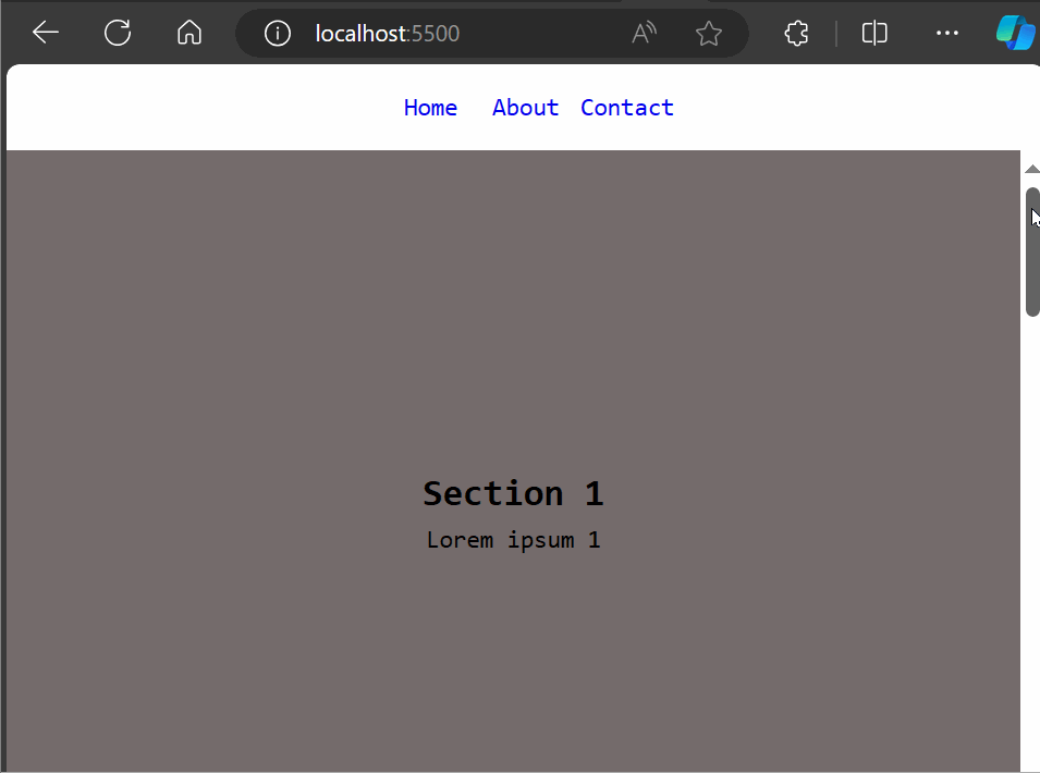
The most frequent sort of scroll-aware UI is a basic scroll-snap. It is as simple as adding a scroll-snap-type to get this effect: y or position: fixed one-liner property to a container to get this result copy the Html codes below.
  <nav>
    <a href="page1">Home</a>
    <a href="page2">About</a>
    <a href="page3">Contact</a>
  </nav>
  <main>
    <section>
      <div>
        <h1>Section 1</h1>
        <p>Lorem ipsum 1</p>
      </div>
    </section>
    <section id="section-2">
      <div>
        <h2>Section 2</h2>
        <p>Lorem ipsum 2</p>
      </div>
    </section>
    <section>
      <div>
        <h2>Section 3</h2>
        <p>Lorem ipsum 3</p>
      </div>
    </section>
    <section>
      <div>
        <h2>Section 4</h2>
        <p>Lorem ipsum 4</p>
      </div>
    </section>
    <section>
      <div>
        <h2>Section 5</h2>
        <p>Lorem ipsum 5</p>
      </div>
    </section>
  </main>
The code above creates a basic web page with a navigation bar linking to three pages, and a main content area divided into five sections with headings and paragraphs, and the CSS codes below will be used to style the above HTML code.
a {
  display: inline-block;
  width: 50px;
  text-decoration: none;
}

nav,
.scroll-container {
  display: block;
  margin: 0 auto;
  text-align: center;
}
nav {
  width: 200px;
  padding: 15px;
  border: none;
}

* {
  margin: 0;
  line-height: 1.5;
  box-sizing: border-box;
  font-family: sans-serif;
}

main {
  height: 100vh;
  overflow-y: scroll;
  scroll-snap-type: y mandatory;
}

main > section {
  height: 100vh;
  display: flex;
  background: #658686;
  scroll-snap-align: start;
  scroll-snap-stop: always;
}

main > section:nth-child(odd) {
  background: #756c6c;
}

main > section > div {
  margin: auto;
  text-align: center;
}

html,
body {
  overflow: hidden;
}
The code above creates a full-screen vertically scrolling website with fixed height sections that snap into place as the user scrolls. The code output can be found in the GIF below:
 This kind of
 scroll-aware UI can be easy to develop, but you can do a lot more.
Implementing Scroll-Aware With Animation-Timeline
The animation-timeline is a CSS property that specifies the timeline used to control the progress of a CSS animation. Please remember that animation-timeline is included in the animation simple terms as a reset-only value. This means that including animation resets a previously declared animation-timeline value to auto, but animation cannot set a specific value. For CSS scroll-driven animations to work, you must declare animation-timeline after declaring any animation shorthand. Below is an example to show how animation-timeline works.
<!DOCTYPE html>
<html lang="en">
  <head>
    <meta charset="UTF-8" />
    <meta name="viewport" content="width=device-width, initial-scale=1.0" />
    <title>Animation Timeline</title>
    <link rel="stylesheet" href="timeline.css" />
  </head>
  <body>
    <h1>ANIMATION TIMELINE</h1>
    <div id="container">
      <div id="square"></div>
      <div id="stretcher"></div>
    </div>
  </body>
</html>
This code establishes the basic structure of a web page, including a title, heading, and placeholders for visual elements related to an animation timeline, while linking to an external stylesheet for styling.
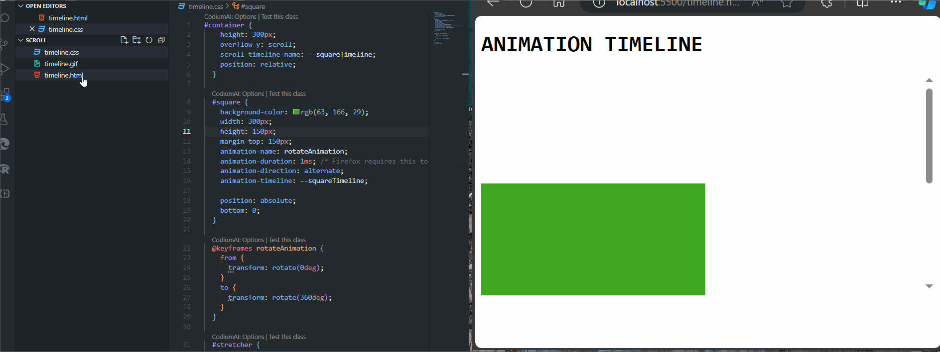
Using the scroll-timeline-name property, the CSS for the container makes it the source of a scroll progress timeline named --squareTimeline (we could explicitly set which scrollbar axis to use with scroll-timeline-axis, but there is only a block direction scrollbar here, and it will be used by default).
#container {
    height: 300px;
    overflow-y: scroll;
    scroll-timeline-name: --squareTimeline;
    position: relative;
  }

  #square {
    background-color: rgb(63, 166, 29);
    width: 300px;
    height: 150px;
    margin-top: 150px;
    animation-name: rotateAnimation;
    animation-duration: 1ms; /* Firefox requires this to apply the animation */
    animation-direction: alternate;
    animation-timeline: --squareTimeline;

    position: absolute;
    bottom: 0;
  }

  @keyframes rotateAnimation {
    from {
      transform: rotate(0deg);
    }
    to {
      transform: rotate(360deg);
    }
  }

  #stretcher {
    height: 600px;
  }
The CSS code above creates a scrollable container with a green square that rotates 360 degrees whenever the user scrolls. The result of the above code implementation can be found in the gif as you scroll down to see the square element being animated.
Examples of Scroll-Aware Designs
Below are a series of examples to showcase scroll-aware designs with only HTML and CSS:
Overlapping Horizontal Slideshow Using Position: Strictly
This scroll-aware feature is very responsive and supports virtually all known browsers, which includes Chrome, Edge, Firefox, Opera, and Safari. Here is an HTML code to implement scroll-aware with only HTML and CSS.
<!doctype html>
<html lang="en">
<head>
<meta charset="UTF-8" />
<meta name="viewport" content="width=device-width, initial-scale=1.0" />
<title>Scrolling</title>
</head>
<body>
<h1>Scrolling left and right</h1>
<ul>
<li>
<img
src="https://source.unsplash.com/ezSFnAFi9hY/500x500"
alt="cut citrus fruits. "
/>Lorem Ipsum
</li>
<li>
<img
src="https://source.unsplash.com/TIGDsyy0TK4/500x500"
alt="sliced mango. "
/>Dolor Sit
</li>
<li>
<img
src="https://source.unsplash.com/TdDtTu2rv4s/500x500"
alt="a bunch of blueberries. "
/>Amet Consectetur
</li>
<li>
<img
src="https://source.unsplash.com/eudGUrDdBB0/500x500"
alt="a pineapple sitting on a table. "
/>Adipiscing Elit
</li>
<li>
<img
src="https://source.unsplash.com/eJH4f1rlG7g/500x500"
alt="frozen raspberries. "
/>
Nunc Tortor
</li>
<li>
<img
src="https://source.unsplash.com/24RUrLSW1HI/500x500"
alt="a sliced strawberry. "
/>Metus Mollis
</li>
<li>
<img
src="https://source.unsplash.com/h5yMpgOI5nI/500x500"
alt="an arrangement of assorted sliced fruits. "
/>Congue Sagittis
</li>
<li>
<img
src="https://source.unsplash.com/2TYrR2IB72s/500x500"
alt="sliced watermelons. "
/>Vestibulum Et
</li>
</ul>
</body>
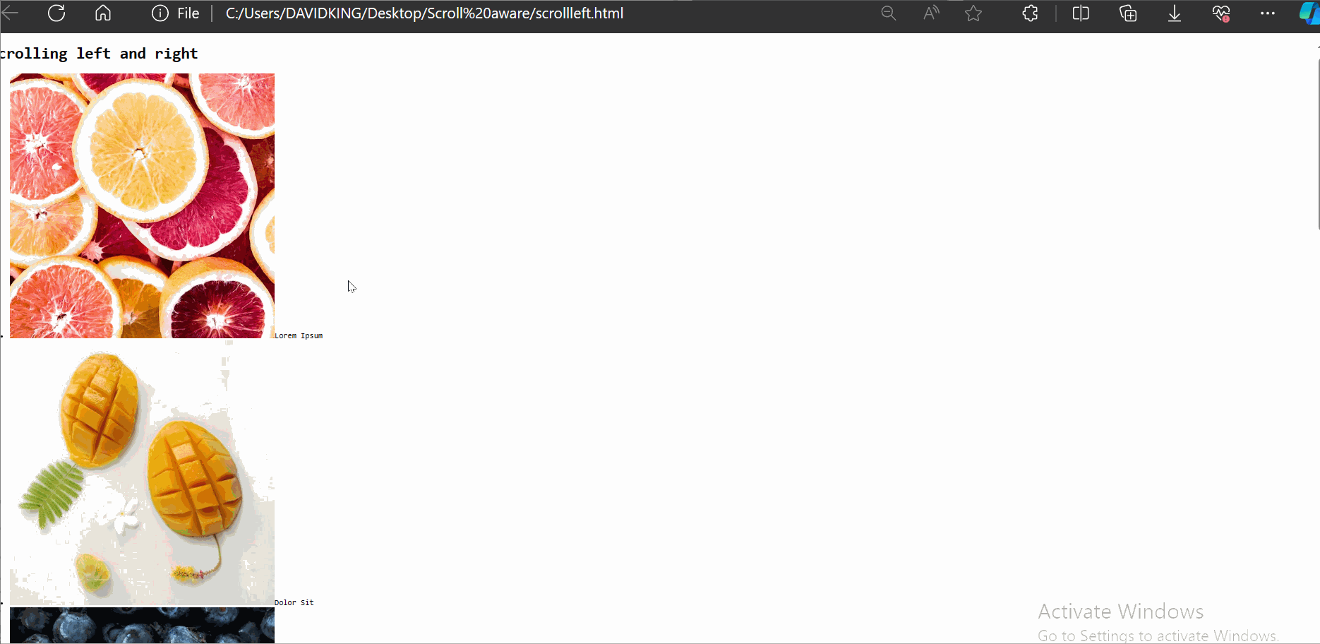
</html>This HTML code above creates a webpage with a heading and a horizontal list of images and text, designed to scroll left and right within the browser window. It establishes the basic structure and content but will rely on an external CSS for styling and controlling the scrolling behavior. Below is an output of the code without adding an external CSS.
 Now, let us include the external CSS and see what has changed.
*,
*:before,
*:after {
box-sizing: border-box;
}
*,
body,
html {
&::-webkit-scrollbar {
background-color: #6871b6;
height: 20px;
width: 20px;
}
&::-webkit-scrollbar-thumb {
background: #383d4d;
border-radius: 99em;
border: 6px solid #399882;
}
}
html,
body {
margin: 0;
padding: 0;
}
h1 {
font-size: clamp(40px, 2.5vw, 36px);
color: rgba(#fff, 0.8);
font-weight: 600;
text-align: center;
}
img {
display: block;
width: 100%;
max-width: 100%;
margin-bottom: 1.5rem;
}
ul {
padding: 0;
margin: 0;
display: block;
width: 100%;
overflow-y: hidden;
overflow-x: auto;
white-space: nowrap;
text-align: center;
scroll-behavior: smooth;
}
li {
position: -webkit-sticky;
position: sticky;
left: 0;
width: min(50vw, 350px);
display: inline-block;
text-align: center;
background-color: #132bdd;
color: #9b9dad;
padding-bottom: 1.5rem;
font-size: clamp(18px, 2.5vw, 22px);
box-shadow: -10px 0 30px 0 rgba(#000, 0.25);
margin-left: -4px;
}
body {
font-family: "Inter", sans-serif;
background-color: #4dce30;
display: flex;
flex-direction: column;
justify-content: center;
align-items: center;
min-height: 100vh;
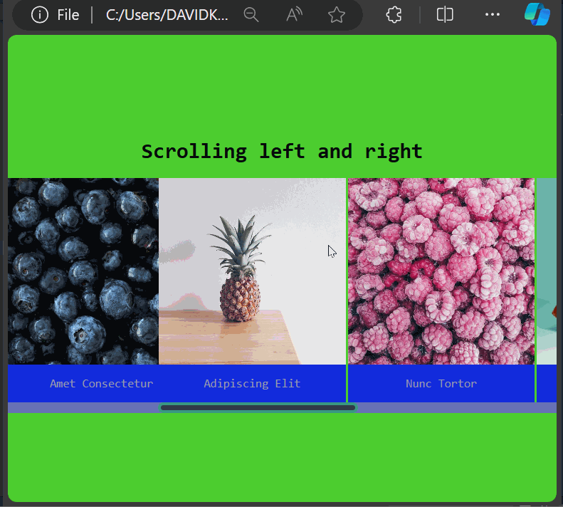
}This CSS code establishes a webpage with a vibrant green background, smoothly scrolling horizontal list items that stick to the left side of the screen, and customized scrollbars, all while ensuring consistent element sizing and spacing. The output of the HTML and the CSS can be found in the gif below.
CSS Fixed Conic Fill
Scroll through the contextual conic gradient text. The “fixed to viewport” background-gradient is revealed by the text mask. Below is an HTML code to implement the CSS fixed conic fill.
<!DOCTYPE html>
<html lang="en">
<head>
<meta charset="UTF-8" />
<meta name="viewport" content="width=device-width, initial-scale=1.0" />
<title>Animation Timeline</title>
<link rel="stylesheet" href="timeline.css" />
</head>
<body>
<h1>CSS Fixed Conic Fill</h1>
<h1>Achieving the scroll-aware UI state using CSS</h1>
<div id="container">
<div id="square"></div>
<div id="stretcher"></div>
</div>
<openreplay>
<h1>Scroll Contextual Conic Gradient Text</h1>
<p>text mask revealing "fixed to viewport" background gradient</p>
<p>
Scroll through the contextual conic gradient text. The "fixed to
viewport" background gradient is revealed by the text mask.
</p>
</openreplay>
</body>
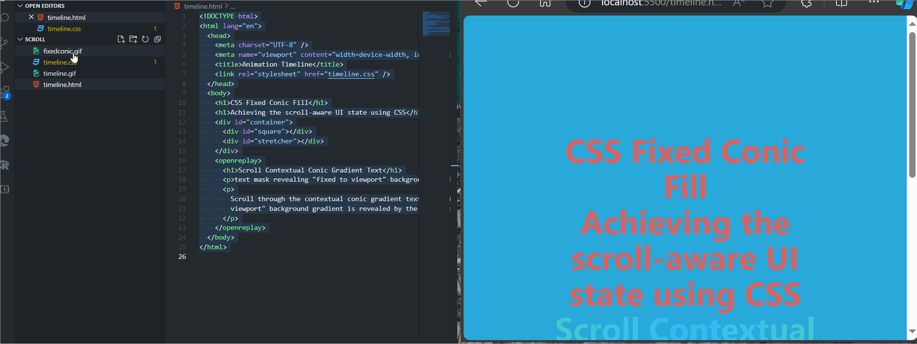
</html>The code above creates a webpage titled animation-timeline, which demonstrates a fixed conic fill effect and a scroll-aware UI state using CSS, likely involving a masked conic gradient effect that reacts to scrolling. The specific styling and behavior are defined in an external stylesheet, and the external CSS code can be seen below.
openreplay {
    /*  leverage cascade for cross-browser gradients  */
    background: radial-gradient(
      hsl(100 100% 60%),
      hsl(200 100% 60%)
    ) fixed;
    background: conic-gradient(
      hsl(100 100% 60%),
      hsl(200 100% 60%),
      hsl(100 100% 60%)
    ) fixed;
    -webkit-background-clip: text;
    -webkit-text-fill-color: transparent;
    text-align: center;
  }

  body {
    background: hsl(197, 71%, 51%);
  /*   background: conic-gradient(
      hsl(100 100% 60%),
      hsl(200 100% 60%),
      hsl(100 100% 60%)
    ) fixed; */
    color: rgb(213, 99, 99);
    min-block-size: 200vh;
    min-inline-size: 100%;
    padding: 5vmin;
    box-sizing: border-box;
    display: grid;
    place-content: center;
    font-family: system-ui;
    font-size: min(200%, 5vmin);
  }

  h1, p, body {
    margin: 0;
  }

  h1 {
    font-size: 10vmin;
    line-height: 1.1;
    max-inline-size: 15ch;
    margin: auto;
  }

  p {
    font-family: "Dank Mono", ui-monospace, monospace;
    margin-top: 1ch;
    line-height: 1.35;
    max-inline-size: 40ch;
    margin: auto;
  }

  html {
    block-size: 100%;
    inline-size: 100%;
    text-align: center;
  }
This CSS code creates a webpage with a gradient background and bold centered text. It adapts across browsers and applies unique visual effects to text within the openreplay class, all structured using familiar HTML elements. Below is a GIF showing the output of the above codes.
Advanced CSS Scroll-Driven Animations
Here, we will introduce a cutting-edge way to create captivating web experiences that come alive as users scroll.
With advanced CSS scroll-driven animations, you can effortlessly create dynamic visual effects without relying on JavaScript. This results in smoother performance and greater control within CSS, crafting captivating user experiences that feel natural and intuitive, keeping visitors engaged and eager to discover more. It also adds a touch of sophistication and interactivity to your web pages, setting your designs apart from the rest.
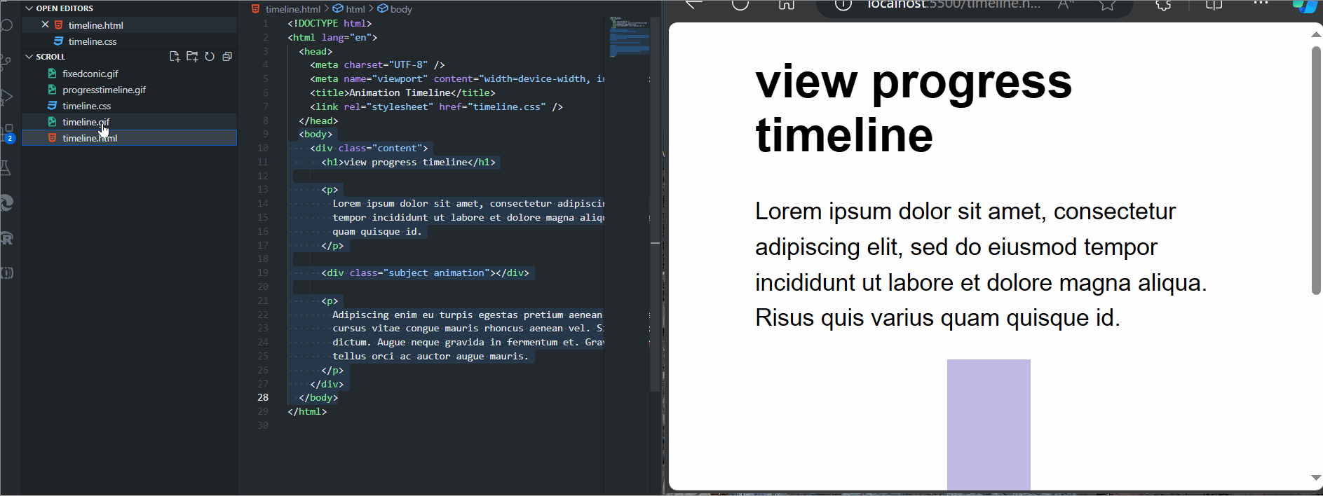
Implementing View Progress Timeline
The view-timeline-name property on a subject element with the animation class defines a view progress timeline named --subjectReveal. The timeline for the same element is then set using animation-timeline: --subjectReveal;. As a result, the subject element animates as it moves up the document as it is scrolled. The HTML for the example can be seen below.
<body>
    <div class="content">
      <h1>Content</h1>

      <p>
        Lorem ipsum dolor sit amet, consectetur adipiscing elit, sed do eiusmod
        tempor incididunt ut labore et dolore magna aliqua. Risus quis varius
        quam quisque id. Et ligula ullamcorper malesuada proin libero nunc
        consequat interdum varius. Elit ullamcorper dignissim cras tincidunt
        lobortis feugiat vivamus at augue.
      </p>

      <p>
        Dolor sed viverra ipsum nunc aliquet. Sed sed risus pretium quam
        vulputate dignissim. Tortor aliquam nulla facilisi cras.
      </p>

      <div class="subject animation"></div>

      <p>
        Adipiscing enim eu turpis egestas pretium aenean pharetra magna ac. Arcu
        cursus vitae congue mauris rhoncus aenean vel. Sit amet cursus sit amet
        dictum. Augue neque gravida in fermentum et.
      </p>
    </div>
  </body>
This code above creates the basic structure of a web page, containing a heading, paragraphs of text, and an animated element, all arranged within the main content area. The subject-element and its containing content-element are styled minimally, and the text-content is given some basic font settings; the CSS code can be seen below.
.subject {
  width: 250px;
  height: 150px;
  margin: 0 auto;
  background-color: rgb(58, 32, 173);
}

.content {
  width: 75%;
  max-width: 700px;
  margin: 0 auto;
}

p,
h1 {
  font-family: Arial, Helvetica, sans-serif;
}

h1 {
  font-size: 3rem;
}

p {
  font-size: 1.5rem;
  line-height: 1.5;
}
.animation {
  view-timeline-name: --subjectReveal;
  animation-timeline: --subjectReveal;

  animation-name: appear;
  animation-fill-mode: both;
  animation-duration: 1ms; /* Firefox requires this to apply the animation */
}

@keyframes appear {
  from {
    opacity: 0;
    transform: scaleX(0);
  }

  to {
    opacity: 1;
    transform: scaleX(1);
  }
}
The above CSS code, when linked to the HTML code, styles a purple subject box, a content area with text in Arial font, and an animation that reveals elements by scaling them in from the left to show how to view the progress timeline, the output is displayed in the gif below.
Adding Functionality With JavaScript
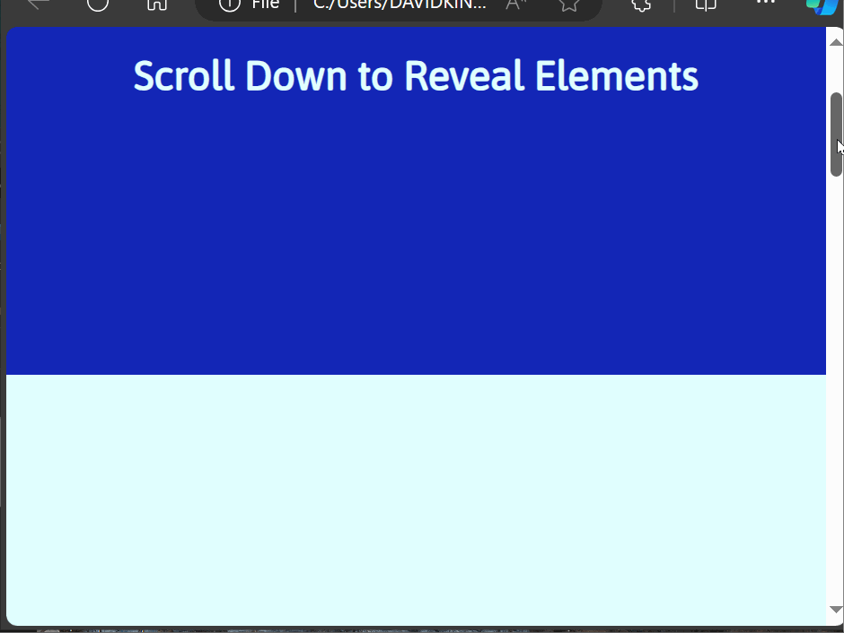
The recent CSS features for animations are powerful, but not all browsers support them yet. But for guaranteed cross-browser compatibility and accessibility, you can improve the scroll-driven animations using JavaScript. We use the new animation-timeline CSS property and have it refer to the timeline’s name to associate the scroll-timeline with CSS animation; the HTML Code can be found below.
<section>
  <h1>Scroll Down to Reveal Elements</h1>
</section>

<section>
  <div class="container reveal">
    <h2>Caption</h2>
    <div class="text-container">
      <div class="text-box">
        <h3>Section Text</h3>
        <p>
          Your session replay, analytics, and co-browsing tools. Together. A
          full-featured session replay suite you can self-host, so your
          customer data never leaves your infrastructure.
        </p>
      </div>
      <div class="text-box">
        <h3>Section Text</h3>
        <p>
          Session Replay See everything users do on your web app, down to
          the smallest detail. Understand all frustrations and visually get
          to the "why" of every issue.
        </p>
      </div>
      <div class="text-box">
        <h3>Section Text</h3>
        <p>
          DevTools provides you with the full context so you can understand
          the state of your web application at any point in time. It's like
          reproducing bugs in your browser
        </p>
      </div>
    </div>
  </div>
</section>
The code above creates a web page with a heading and a hidden section that reveals itself when the user scrolls down. The hidden section contains text boxes with information about session replay tools and developer tools; the CSS code can be seen below
@import url('https://fonts.googleapis.com/css2?family=Asap&display=swap');
*{
  margin: 0;
  padding: 0;
  box-sizing: border-box;
  font-family: "Asap", sans-serif;
}
body{
  background: #1326b6;
}
section{
  min-height: 100vh;
  display: flex;
  justify-content: center;
  align-items: center;
}
section:nth-child(1){
  color: #e0ffff;
  }
section:nth-child(2){
  color: #121c65;
  background: #e0ffff;
}
section:nth-child(3){
  color: #e0ffff;
}
.reveal{
  position: relative;
  transform: translateY(150px);
  opacity: 0;
  transition: 1s all ease;
}

.reveal.active{
  transform: translateY(0);
  opacity: 1;
}
This CSS code above sets up a webpage with a blue background, centered content, and animated text elements that gracefully slide into view. It achieves this by importing a font, styling the body and sections, and defining a class for content reveal animations; the JavaScript code for implementation can be seen below.
function reveal() {
  const reveals = document.querySelectorAll(".reveal");

  for (let i = 0; i < reveals.length; i++) {
    const windowHeight = window.innerHeight;
    const elementTop = reveals[i].getBoundingClientRect().top;
    const elementVisible = 150;

    if (elementTop < windowHeight - elementVisible) {
      reveals[i].classList.add("active");
    } else {
      reveals[i].classList.remove("active");
    }
  }
}

window.addEventListener("scroll", reveal);
The JavaScript code above checks for elements with a reveal class as the user scrolls and reveals them by adding an active class when they come into view within a 150-pixel threshold from the top of the viewport. The output of the above codes can be seen in the gif below.
The Limitations to Scroll-Aware
While CSS offers powerful tools for creating scroll-aware UI elements, it does have some inherent limitations which are listed below:
- Limited Event Handling: CSS lacks direct scroll event listeners, as you can’t trigger actions precisely when a user scrolls to a specific element or position.
- Indirect State Management: CSS can’t directly change element states based on scroll position; it relies on
pseudo-classeslike:hoveror:activecan be limiting for complex interactions. - Performance Considerations: Complex CSS
scroll-awareeffects, especially those involving multiple transitions or animations, can impact performance on resource-constrained devices. - Browser Compatibility: Not all CSS
scroll-awareproperties have consistent support across all browsers. It’s essential to consider browser compatibility and provide polyfills or fallbacks when necessary. - Limited Interaction Scope: CSS alone can’t handle more complex scroll-based interactions like dynamic content loading, infinite scrolling, and real-time updates based on scroll position
Conclusion
CSS offers promising capabilities for achieving scroll-aware UI states, adding a layer of visual interest and interactivity to web pages. By understanding scroll timelines, scroll-linked animations, browser compatibility, and potential JavaScript integration, developers can create dynamic and engaging user experiences that respond seamlessly to user actions.