Navigating Compatibility: the impact of Browser Wars on development

In the dynamic realm of web development, where compatibility is the compass guiding user experiences, navigating the treacherous terrain of a browser war becomes an art of its own. As rival multiple browsers battle for supremacy, developers are entrusted with the task of harmonizing their creations across diverse digital landscapes. This article unravels the profound impact of browser wars on web development, offering invaluable insights into the art of navigating compatibility and ensuring your digital masterpieces thrive amidst the ever-changing tides of the web.
Among the software applications present in today’s world, the web browser is one of the most used. Web browsers serve as a gateway to the internet, which has approximately 4 billion daily users. When it comes to web development, the competition among browsers has shaped the very foundation of the online landscape and has had a huge effect on the way web applications are built.
Compatibility is not a feature, it is the absence of an error — Sir Tim Berners-Lee, inventor of the World Wide Web.
The first major browser war was between Netscape (remember Netscape Navigator?) and Internet Explorer. Back then, web developers faced the daunting challenge of designing websites that functioned flawlessly across these two major browsers. But as the web gained more traction, the battle for dominance intensified, resulting in rapid innovation and the emergence of new features and standards.
In early 2000, Firefox came along, and it championed open web standards, offering developers a viable alternative and rekindling competition in the browser arena.
Meanwhile, Apple’s Safari browser, introduced in 2003, catered specifically to Mac users, providing a seamless and integrated browsing experience. As the popularity of Apple products surged, Safari gained traction and further diversified the browser landscape.
In recent years, the rise of Google Chrome has reshaped the browser wars landscape.
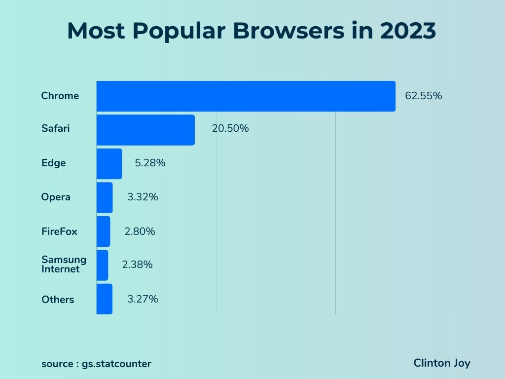
Here is a chart showing the most popular browsers in 2023.
Browser Engine Differences
The rendering engines of browsers are what control how web browsers interact with and display web content. Different browsers differ in their rendering engines, and each of these browsers has different capabilities. In this section, I will be discussing the differences between the rendering engines, as understanding these differences is important to ensure compatibility and consistent user experiences across various browsers. Here are the different rendering engines of the top browsers:
- Blink : This is the rendering engine of the most used browser (Google Chrome) and other Chromium-based browsers such as Microsoft Edge, Opera, Vivaldi, e.t.c. Blink’s main feature, which makes it stand out from other rendering engines, is its fast rendering speed. Making it the most popular choice among developers. Unlike other rendering engines, you should bear in mind that Blink’s web standard rules are slightly different, which may lead to some inconsistencies.
- Gecko: It’s the rendering engine that powers the Mozilla Firefox web browser. Unlike Blink, Gecko is known for its adherence to web standards, but in turn, it is comparatively slower than Blink in certain scenarios.
- WebKit: WebKit was developed by Apple and is the rendering engine of Safari and some other web browsers. WebKit prioritizes rendering accuracy over speed and has made some significant contributions to web standards. While historically dominant in the mobile space, WebKit’s influence has extended to desktop browsers as well.
However, developers must be cautious of subtle differences in rendering behavior, particularly when dealing with complex CSS and JavaScript interactions.
Implications for Web Designers and Developers
We have discussed different rendering engines and their differences; bear in mind that those differences present both opportunities and challenges for web developers.
With the goal of a developer being to create applications that function seemlessly across different browsers, the rendering engine’s behavior requires careful consideration. Here are a few key implications for web developers:
- Testing and Debugging: We need to thoroughly test our websites on different browsers with distinct rendering engines to identify and resolve any compatibility issues. Cross-browser testing tools such as LambdaTest, BrowserStack, e.t.c. can aid in this process, helping detect discrepancies and ensuring consistent rendering.
- Vendor Prefixes: Some rendering engines may require the use of vendor-specific CSS prefixes to enable experimental or non-standard features. Developers must be aware of the appropriate prefixes for each rendering engine and implement fallbacks when necessary. Later in this article, I will be discussing Vendor Prefixes in depth.
- CSS and JavaScript Compatibility: Rendering engine differences also have an impact on the interpretation of CSS styles and JavaScript code. Developers are therefore advised to consult browser compatibility resources and consider using feature detection techniques or polyfills to ensure consistent behavior across browsers.
By staying informed about the rendering engine differences, we can navigate compatibility challenges more effectively and deliver websites that perform well across a range of browsers.
Polyfills and Feature Detection: Making Websites Work on Older Browsers
Polyfills and feature detection are handy tools that allow developers to bridge the gap and ensure their web projects function smoothly across different browsers.
Think of polyfills as clever snippets of code or libraries that mimic modern browser features on older browsers. They fill in the missing pieces, hence the name Polyfill, making things work as if the browser supported the latest fancy stuff. By selectively including polyfills, developers can ensure that their websites or web apps run smoothly, even on outdated browsers.
How Feature Detection Helps
Feature detection lets developers determine whether a specific feature or functionality is supported by a user’s browser. By using feature detection, developers can adapt their code based on what the browser can handle.
Many modern JavaScript libraries and frameworks come with built-in feature detection capabilities. These tools make it easier for developers to handle differences between browsers. They provide handy functions or methods to check if a feature is supported. If it’s not, they offer graceful alternatives. One popular library called Modernizr helps developers detect HTML5 and CSS3 support. It even lets them load polyfills only if they’re needed.
Things to Consider When Working with Polyfills
Polyfills and feature detection bring several benefits to web developers. However, keep these points in mind when working with polyfills and feature detection:
-
Choose Wisely: Be selective with the polyfills you use. Consider their size, their impact on performance, and which specific browser versions they target. Look for lightweight and well-maintained polyfills to avoid adding unnecessary bulk to your codebase.
-
Graceful Degradation: While polyfills can add missing functionality to older browsers, make sure your website or app still works without them. Prioritize essential features and handle unsupported functionality gracefully. That way, users with older browsers can still enjoy the core experience.
-
Stay up-to-date: Keep an eye on browser updates and new web standards. Reassess the need for specific polyfills over time. Regularly update and maintain your code to ensure compatibility with changing browser landscapes.
Session Replay for Developers
Uncover frustrations, understand bugs and fix slowdowns like never before with OpenReplay — an open-source session replay tool for developers. Self-host it in minutes, and have complete control over your customer data. Check our GitHub repo and join the thousands of developers in our community.
Vendor prefixes and standards: challenges and best practices
Vendor prefixes are specific CSS properties or values used by particular browsers. They were introduced to allow browser vendors to experiment with and implement new CSS features before they became standardized. For example, -webkit- is used by Safari and Chrome, -moz- by Firefox, and -ms- by Microsoft Edge and Internet Explorer.
Challenges Faced
When working with Vendor prefixes, here are some of the challenges we developers face.
- Compatibility and Maintenance Burden: Dealing with vendor prefixes means writing and maintaining multiple versions of CSS rules for different browsers. This adds complexity and increases the size of the codebase, making it more challenging to manage and troubleshoot.
- Lack of Standardization: Vendor prefixes are not standardized and can lead to inconsistencies in how CSS is interpreted and rendered by different browsers. These inconsistencies can result in unexpected layout issues or broken functionality, especially when using cutting-edge CSS features.
Best Practices
Here are some of the best practices to follow when working with Vendor prefixes:
- Feature Detection and Progressive Enhancement: Instead of relying solely on vendor prefixes, developers should adopt feature detection techniques to determine browser capabilities. By using JavaScript libraries like Modernizr or checking for the existence of specific CSS properties, developers can apply targeted styles or fallbacks based on support, ensuring a more reliable and future-proof approach.
- Limiting Vendor Prefix Usage:It’s advisable to use vendor prefixes only for experimental or bleeding-edge CSS properties that aren’t yet standardized. As browser support for these features improves, the need for vendor prefixes can be gradually reduced or eliminated.
- Autoprefixer Tools:To streamline the management of vendor prefixes, developers can take advantage of autoprefixer tools. These tools automatically add or remove vendor prefixes based on predefined rules and browser compatibility data. They allow developers to write clean and standardized CSS without the hassle of manually adding prefixes.
     /* Experimental CSS property with vendor prefixes */
     .container {
       -webkit-box-shadow: 2px 2px 5px rgba(0, 0, 0, 0.3);
       -moz-box-shadow: 2px 2px 5px rgba(0, 0, 0, 0.3);
       box-shadow: 2px 2px 5px rgba(0, 0, 0, 0.3);
     }

     /* Standardized CSS property without vendor prefixes */
     .box {
       display: flex;
       justify-content: center;
       align-items: center;
     }
In this example, the .container class demonstrates the usage of vendor prefixes for the box-shadow property. The -webkit-, -moz-, and non-prefixed versions are provided to ensure compatibility across different browsers.
On the other hand, the .box class showcases a standardized CSS property (display: flex) that doesn’t require any vendor prefixes. This is an example of how web developers can transition from using vendor prefixes to relying on standardized CSS features.
The web development community recognizes the challenges posed by vendor prefixes and is gradually shifting towards standardized web technologies. CSS working groups and browser vendors now strive to implement and support CSS features based on specifications set by organizations like the World Wide Web Consortium (W3C).
Developers are encouraged to embrace standardized CSS features once they gain widespread support across major browsers. This reduces the reliance on vendor prefixes and simplifies the development process. CSS features like Flexbox and Grid Layout have successfully transitioned from vendor-specific implementations to standardized, widely supported specifications.
Progressive Enhancement and Graceful Degradation: Accommodating Different Browsers and Their Capabilities
Progressive enhancement is like building a strong foundation. We start by creating a simple, accessible version of a website that works across all browsers, regardless of their capabilities. The idea is to provide a baseline experience where essential content and functionality are accessible to everyone.
Once the foundation is set, we can add extra features and visual enhancements for browsers that can handle them. This can be done using modern CSS styles, JavaScript interactions, and advanced functionality. By checking the capabilities of the user’s browser, developers can selectively apply enhancements where supported while still ensuring that the website functions for all users.
Graceful degradation, on the other hand, takes a different approach to browser compatibility. It starts with a feature-rich version of a website that assumes modern browsers can handle all the fancy stuff. However, it also prepares for older or less capable browsers that cannot fully support those features.
In this case, we build websites with cutting-edge features, leveraging the latest web technologies. But they also implement fallback mechanisms and alternative solutions for older browsers. This means that if a particular feature is not supported, there’s a backup plan in place.
Benefits and Considerations:
Both progressive enhancement and graceful degradation strategies offer benefits and considerations for web developers.
- Enhanced User Experience: These strategies contribute to a better user experience by accommodating a wide range of browsers. Users with older or less capable browsers can still access the core content and functionality, while users with modern browsers can enjoy enhanced features and visual enhancements.
- Flexibility and Adaptability: Progressive enhancement and graceful degradation provide flexibility in adapting to different browser capabilities. As new browsers and features emerge, these strategies allow developers to easily incorporate them while ensuring backward compatibility.
- Development Efficiency: By using feature detection and layering techniques, developers can streamline their development process. They can focus on creating a solid baseline experience first and then progressively enhance or gracefully degrade features, reducing the complexity of building separate versions for different browsers.
While progressive enhancement and graceful degradation are powerful strategies for handling browser compatibility, it’s essential to strike a balance. Developers should consider factors like the target audience, browser usage statistics, and the specific requirements of the website to determine the most appropriate approach.
Emerging Web Standards and Compatibility
When it comes to web development, the introduction of new web standards like HTML5, CSS3, and ECMAScript has had a profound impact on cross-browser compatibility. These standards bring exciting new features, improved performance, and enhanced user experiences. However, they also present challenges, as different browsers may not fully support them right away.
But just like we discussed in the last section, Progressing Enchancement and Graceful Degradation, we need to fix this and account for whatever new standards are being formed.
The Future of Cross-Browser Compatibility
The future of cross-browser compatibility and development practices is shaped by ongoing trends and innovations. Here are some areas to keep an eye on:
- Progressive Web Apps (PWAs): Progressive Web Apps combine the best of web and native app experiences, providing offline functionality, push notifications, and app-like experiences. As PWAs gain popularity, ensuring cross-browser compatibility becomes increasingly important to deliver consistent experiences across various platforms and devices.
- Standardization Efforts: Web standards organizations, such as the World Wide Web Consortium (W3C) and Ecma International, continue to work on advancing and refining web standards. These standardization efforts aim to establish clear guidelines and specifications for browser vendors to follow, improving cross-browser compatibility.
- Browser Vendor Collaboration: Browser vendors are increasingly collaborating to improve cross-browser compatibility. Initiatives like the Web Platform Tests project, where browser vendors contribute and share test suites, help identify and resolve compatibility issues across different browsers.
Conclusion
In conclusion, the browser wars have had a significant impact on web development and cross-browser compatibility and have shaped the way we build websites and apps. And it has left Web developers facing challenges due to rendering engine differences, which impact compatibility and the user experience. But with the help of Techniques such as polyfills and feature detection, developers can tackle some of the challenges.
Looking ahead, cross-browser compatibility will continue to evolve. Staying proactive, embracing new technologies, and staying informed about industry developments are crucial for delivering exceptional user experiences. And By navigating these challenges, developers can create inclusive and accessible web experiences for all users.
Gain Debugging Superpowers
Unleash the power of session replay to reproduce bugs and track user frustrations. Get complete visibility into your frontend with OpenReplay, the most advanced open-source session replay tool for developers.