When You Don't Need a Component Library
Why utility CSS and headless primitives often beat full component libraries in 2026, with a checklist for when to use one.

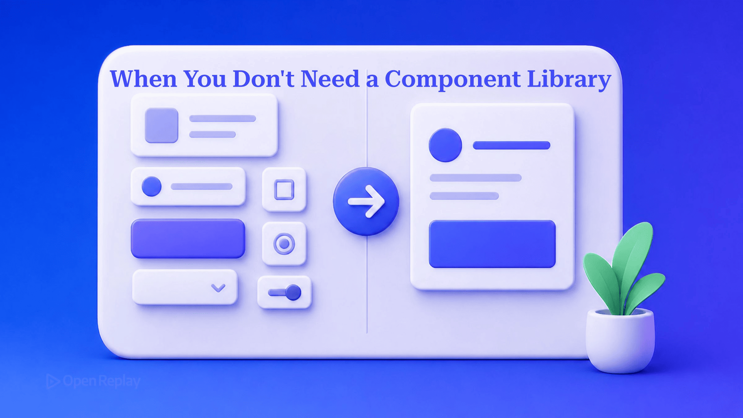
For most small, highly branded, or performance-sensitive projects in 2026, you don’t need a component library — you need utility CSS for layout and headless primitives for the three or four genuinely hard interactive behaviors. A full styled library like MUI, Ant Design, or Chakra earns its weight only under specific conditions: consistency across many teams, internal tools where shipping speed beats brand, or no dedicated design resource. Outside those, the bundle, customization, and generic-look costs usually outweigh the benefit. This article gives you the decision framework — the real costs of defaulting to a library, the cases where you genuinely don’t need one, the cases where you do, and a concrete ladder from “nothing” to “full library” so you pick the lowest rung that solves your actual problem.
The key reframing up front: “don’t use a component library” has never meant “hand-roll your own dropdowns.” It means utility CSS plus battle-tested headless primitives for the behaviors that are hard to get right.
Key Takeaways
- The modern default for most projects is utility CSS for styling plus headless primitives — not a full styled component library and not hand-rolled interactive widgets.
- Reach for a full styled library only when you need consistency across many teams, you’re shipping internal tools where speed beats brand, or you have no dedicated design resource.
- Reach UI is currently not maintained, so any 2026 advice to use it is wrong — the accessible-primitive role now belongs to Radix Primitives and Adobe’s React Aria.
- The most expensive part of a hand-built dropdown is not the markup; it’s the keyboard navigation, focus trapping, outside-click dismissal, and screen-reader announcements that a headless primitive provides by default.
- Tailwind CSS v4.0 is a major release of the utility-first CSS framework, published on January 22, 2025, which makes utility-first CSS a realistic default for the styling layer.
The real costs of defaulting to a component library
A full component library carries three costs that compound over a project’s life: bundle weight, customization friction, and visual sameness. None of them are deal-breakers in isolation, but together they explain why pulling in MUI for a marketing site or a five-screen app is usually a bad trade.
Bundle weight. A monolithic styled library ships a baseline of CSS and JavaScript — theming runtime, component registry, design tokens — that arrives whether you render three components or thirty. Tree-shaking helps, but only where the library is genuinely modular. Per-component packages tree-shake well; the radix-ui package is tree-shakeable, so you should only ship the components you use. Monolithic theme and styling payloads do not shed weight the same way, because the runtime is a shared dependency every component pulls in. The honest version of the “tree-shaking fixes it” claim: it works for modular primitives, not for a library whose styling engine is a single runtime.
Customization friction. If a project’s design is generic and short-lived, a ready-made library wins outright. If the design is distinctive and long-lived, every styled component you import becomes a specificity battle you’ll fight for the life of the project — overriding nested selectors, fighting theme defaults, and wrapping components to bend them to your brand.
Generic look. Library defaults are neutral by design. Distinctive branding means heavy overrides, which loops back into the customization cost. The further your design is from the library’s opinions, the more of the library you end up fighting rather than using.
When you don’t need a component library

Discover how at OpenReplay.com.
You don’t need a component library when the UI is mostly static, the design is distinctive, or performance is a hard constraint. These are the projects where a library is pure overhead.
- Landing pages, blogs, and portfolios. Mostly typography, layout, and a few interactive flourishes. Utility CSS covers the styling; you rarely need more than a handful of interactive components.
- Highly branded apps. When the design is the product’s identity, library defaults work against you. Building from utility classes and a small set of your own components gives full control without fighting someone else’s opinions.
- Performance-critical apps. When every kilobyte and every millisecond of interaction latency counts, shipping a styled-library runtime for a few buttons is the wrong default.
- Tailwind shops. If your team already styles with utility classes, a styled library duplicates the styling layer and creates two competing sources of truth for how things look.
A useful distinction here: a component library is a collection of ready-made UI elements; a design system is the broader framework of principles, tokens, and usage rules around them. You can need the second without buying the first — a set of design tokens in CSS custom properties plus utility classes gives you consistency without importing anyone’s components.
When you do need one
Reach for a full styled library when speed and consistency at scale matter more than brand distinctiveness or bundle size. Four situations justify it:
- Internal tools and admin dashboards. Nobody is judging a back-office CRUD panel on visual identity. A library that gives you tables, forms, modals, and date pickers out of the box is the fastest path to shipping.
- MVPs and prototypes. When the goal is to validate an idea before investing in design, ready-made components let you move fast and throw away cheaply.
- Multi-team enterprise consistency. When many teams ship into one product, a shared library enforces a single look and a single update path — fix a component once, and every consumer inherits it.
- No dedicated design resource. If there’s no designer and no design system, a library’s sensible defaults are better than what most teams will produce ad hoc.
The common thread: in each case the library’s opinionated defaults are a feature, not a constraint you’ll fight.
The decision ladder: from nothing to a full component library
Instead of a binary “library or no library,” think in rungs. Each rung adds capability and cost; climb only as high as your actual needs require. This modernizes the classic build-vs-buy spectrum.
| Rung | What you reach for | Use it when |
|---|---|---|
| 1. Nothing extra | Raw HTML + CSS, small reusable components | Static or near-static UI, full design control |
| 2. Utility CSS | Tailwind CSS v4 + design tokens | You want speed on styling without leaving CSS |
| 3. Headless primitives | Radix, React Aria, Headless UI, Ark UI | You need accessible dropdowns, dialogs, comboboxes |
| 4. Single-purpose components | react-select, a date picker, a rich-text editor | One genuinely hard widget, not a whole UI kit |
| 5. Full styled library | MUI, Ant Design, Chakra UI | Internal tools, enterprise consistency, no designer |
Rung 2 — utility CSS. Tailwind is the realistic default for the styling-and-layout layer. Tailwind CSS v4.0 is an all-new version of the framework optimized for performance and flexibility, with a reimagined configuration and customization experience. The headline architectural change: Tailwind CSS v4 is an all-in-one tool for processing your CSS, with Lightning CSS integrated directly into the framework so you don’t have to configure anything about your CSS pipeline. Configuration moved from tailwind.config.js into CSS via the @theme directive. Patch releases move fast, so pin a version in your project rather than memorizing one; v4 is current as of June 2026.
Rung 3 — headless primitives. This is the rung the older “don’t use a library” advice underweights, and it’s the one that matters most. Headless primitives give you the accessible behavior of an interactive component — keyboard handling, focus management, ARIA wiring — with zero styling, so you bring your own utility classes.
Radix Primitives is the reference choice: a low-level UI component library with a focus on accessibility, customization and developer experience, an open-source UI component library for building high-quality, accessible design systems and web apps, maintained by WorkOS. It offers primitives for common UI patterns like dialogs, dropdowns, popovers, and tooltips, all built with WAI-ARIA compliance to ensure screen reader support and keyboard navigation. For multi-framework teams, Ark UI (built on Zag.js state machines, with React/Vue/Solid/Svelte parity) covers the same ground across frameworks. If you’re on React, Adobe’s React Aria and Tailwind Labs’ Headless UI (which supports React and Vue) are equivalent options.
One correction worth stating plainly: avoid Reach UI in 2026. Reach UI is currently not maintained. Its maintainer filed for “OSS bankruptcy” back in 2022, and since Reach was introduced, others have built low-level, composable, and accessible components, with several well-maintained libraries to consider instead — Radix and React Aria chief among them. Any article still recommending Reach UI for “the hard ones” is pointing you at an abandoned dependency.
Rung 4 — single-purpose components. When one widget is genuinely hard — a searchable multi-select, a date-range picker, a rich-text editor — pull in a dedicated, battle-tested package for that one thing rather than adopting a whole UI kit to get it.
It’s also worth noting that the platform has absorbed problems that used to require a library. In React 19, support for using async functions in transitions handles pending states, errors, forms, and optimistic updates automatically, and the new form actions plus the useActionState, useFormStatus, useOptimistic, and use() API reduce the “you need a form library for this” argument for a class of forms. Fewer reasons to reach up the ladder is a feature.
The hidden cost of hand-rolling interactive components
The reason “don’t use a library” must not collapse into “build everything yourself” is accessibility and edge-case behavior. The most expensive part of a hand-built dropdown isn’t the markup — it’s the keyboard navigation, focus trapping, outside-click dismissal, and screen-reader announcements that a headless primitive gives you for free.
This is precisely the gap Radix’s authors describe: the implementations the web platform provides for these patterns are inadequate — non-existent, lacking in functionality, or not customizable enough — so developers are forced to build custom components, an incredibly difficult task, and as a result most components on the web are inaccessible, non-performant, and lacking important features.
Accessibility failures in hand-rolled interactives are the class of bug that session replay surfaces in production. Watching replays of custom-built controls is where the true cost of “just build it yourself” becomes visible: a keyboard user whose focus escapes a custom modal and lands on the page behind it; a mobile user tapping repeatedly on a dropdown that won’t dismiss because there’s no outside-click or Escape handling; a combobox that never announces its options to a screen reader, so the user gives up. These are the exact behaviors a headless primitive handles by default — and the exact behaviors a hand-rolled component silently gets wrong until someone watches a real user fight it.
The takeaway isn’t “always use a primitive.” It’s that the cost of DIY interactives is paid later, in accessibility bugs and abandoned interactions, not up front in markup. Price that in before you decide to hand-roll.
A decision checklist
Run a project through these five questions before choosing a rung:
- Lifespan. Throwaway prototype or multi-year product? Short-lived favors ready-made; long-lived favors owning your styling layer.
- Brand distinctiveness. Generic and templated, or a distinctive identity? Distinctive design makes a styled library a liability.
- Team size. One team or many shipping into one product? Multi-team consistency is the strongest case for a shared library.
- Performance budget. Is bundle size or interaction latency a hard constraint? If so, prefer utility CSS plus per-component primitives over a monolithic runtime.
- Who maintains it. Do you have a designer and the capacity to maintain a custom layer? No design resource pushes you toward a library’s sensible defaults.
If most answers point to “short-lived, generic, multi-team, no designer,” climb to rung 5. If they point to “long-lived, distinctive, one team, tight perf budget,” stay on rungs 2 and 3.
Conclusion
The default for new frontend work in 2026 is utility CSS for styling and headless primitives for the handful of interactions that are hard to get right — climbing to a full styled library only when consistency at scale, raw shipping speed, or a missing design resource makes its opinionated defaults an asset. Before you npm install a UI kit out of habit, walk the five-question checklist and pick the lowest rung that solves the problem in front of you. Build with intention, not by habit — and let the project, not reflex, decide how much library you actually need.
FAQs
What is the difference between a headless component library and a styled component library?
A headless library such as Radix Primitives, React Aria, or Headless UI provides the behavior and accessibility of an interactive component — keyboard navigation, focus management, ARIA wiring — with no styling, so you supply your own CSS or utility classes. A styled library like MUI, Ant Design, or Chakra UI ships both the behavior and an opinionated visual design plus a theming runtime. Headless trades convenience for full visual control and a smaller styling footprint.
Can you use Tailwind CSS and a component library together in the same project?
Yes, but it usually duplicates the styling layer and creates two competing sources of truth for how things look. A styled library ships its own theming runtime, so pairing it with Tailwind means maintaining both. The cleaner combination is Tailwind for styling plus a headless primitive like Radix, React Aria, or Ark UI, which ships no styles of its own and is designed to be styled with utility classes.
Why is Reach UI no longer recommended for accessible React components?
Reach UI is currently not maintained, per its official GitHub repository. The maintainer declared OSS bankruptcy in 2022, and the project has not received active development since. Any 2026 guidance recommending Reach UI for dropdowns, tooltips, or other hard interactive patterns is pointing at an abandoned dependency. The accessible-primitive role it once filled now belongs to Radix Primitives and Adobe's React Aria, both actively maintained with full WAI-ARIA keyboard and focus support.
Which headless component library works across React, Vue, Solid, and Svelte?
Ark UI is the framework-agnostic option, built on Zag.js state machines with parity across React, Solid, Vue, and Svelte. Most headless primitives are framework-specific: Radix Primitives and Adobe's React Aria target React, while Tailwind Labs' Headless UI supports React and Vue. If you need shared component logic across multiple frameworks in one organization, Ark UI is designed for that case, since the underlying behavior lives in Zag.js rather than a single framework binding.
Truly understand users experience
See every user interaction, feel every frustration and track all hesitations with OpenReplay — the open-source digital experience platform. It can be self-hosted in minutes, giving you complete control over your customer data.
Star on GitHub12k