The Power of HTMLSlotElement: A Key Element in Web Components
Use this Shadow DOM technique


Utilizing modern techniques and features is paramount to crafting engaging and maintainable user interfaces. One such cornerstone in web components is the
HTMLSlotElement, a key player in facilitating dynamic content composition within the Shadow DOM. It empowers developers to create flexible and reusable components that elevate the user experience with advanced content styling techniques. This article will explore it and delve into the intricacies of advanced content styling, so readers can harness the full potential of web components and unlock a new level of modularity and customization in their projects.

Discover how at OpenReplay.com.
The HTMLSlotElement is an interface representing a <slot> element within an HTML document’s Document Object Model (DOM). It is part of the broader Web Components specification, which enables the creation of reusable and encapsulated components in web development.
Here’s what HTMLSlotElement does:
-
It’s an interface in the Web Components specification representing the
<slot>element. -
It acts as a placeholder within a web component’s template where content can be dynamically injected from the outside.
-
It enables flexible content distribution, reusability, and conditional rendering.
Significance of Content Distribution in Modern Web Development
Content distribution is a crucial concept in modern web development, especially in the context of Web Components and the Shadow DOM. It allows developers to create more modular, encapsulated, and reusable components, improving web applications’ maintainability, flexibility, and scalability.
Here are some critical significance of content distribution:
-
Component Encapsulation: Content distribution, often facilitated by the
<slot>element and the Shadow DOM, enables the creation of encapsulated components. You can hide the internal structure of a component from the outside, preventing unintended styling and scripting interference. -
Reusability and Composition: Components can be designed to be more reusable by exposing specific insertion points (slots) where external content can be added. This promotes a composition-based approach to building interfaces, allowing developers to combine and reuse components easily.
-
Flexibility and Customization: Content distribution allows for greater flexibility in component usage. Users of a component can customize its behavior and appearance by providing their content to designated slots. This customization can include anything from text and images to complex HTML structures.
-
Dynamic Content Injection: Web developers can dynamically inject content into a component at runtime. This dynamic nature is powerful for scenarios where the content or structure of a component needs to change based on user interactions, data, or application state.
-
Consistent UI Patterns: Content distribution encourages the adoption of consistent UI patterns across an application or a website. By defining slots for specific types of content (e.g., headers, footers, main content), developers can ensure a consistent look and feel while allowing for variations in content.
-
Improved Maintainability: Encapsulating content and functionality within components, each with its specific slots, makes it easier to maintain and update code. Changes to one component are less likely to have unintended consequences on other application parts.
Exploring Shadow DOM
The Shadow DOM is a web standard that enables you to encapsulate DOM and CSS in a web component. It is a scoped DOM subtree within an HTML element, hidden from the main document’s DOM. It also allows you to encapsulate a component’s internal structure, styles, and behavior, preventing them from affecting the rest of the document. The Shadow DOM is beneficial when building reusable and modular components.
Here are critical concepts related to the Shadow DOM:
- Shadow Host: The shadow host is the element to which the Shadow DOM is attached. It is a container for encapsulating and isolating the component’s internal structure, styles, and behavior. Example:
<div id="myComponent"></div>Here, the <div id="myComponent"> element is the shadow host to which the Shadow DOM will be attached.
- Shadow Tree: The shadow tree is a hidden DOM tree inside the shadow host, encapsulating a component’s internal structure, styles, and behavior. Example:
const shadowHost = document.getElementById("myComponent");
const shadowRoot = shadowHost.attachShadow({ mode: "open" });
Here, the shadowHost element will be the shadow DOM’s host. It’s where the shadow tree will be attached. The ShadowRoot object represents the root of the shadow tree. The attachShadow method is called on the selected element (shadowHost). This method creates and attaches a shadow tree to the specified element. The { mode: 'open' } is an options object configuring the shadow DOM’s behavior. In this case, it sets the mode to ‘open,’ allowing external access to the shadow DOM.
- Shadow Root: The shadow root is the root of the shadow tree created within the Shadow DOM. It serves as a container for encapsulated content, styles, and behavior, providing a separate scope isolated from the global document. Example:
const shadowRoot = element.attachShadow({ mode: 'open' });This line of code attaches a shadow root to the specified HTML element (element). The { mode: 'open' } option sets the mode of the shadow DOM to ‘open,’ allowing external access to the encapsulated content.
Let us demonstrate a use case example of shadow host, tree, and root:
<!doctype html>
<html>
  <head>
    <title>Demonstrating Shadow Host, Tree, and Root</title>
  </head>
  <style>
    /* Styles for the content outside the shadow DOM */
    #myElement {
      border: 2px solid black;
      padding: 80px;
      background-color: purple;
      color: white;
    }

    /* Styles specific to the shadow DOM */
    #myElement::before {
      content: "Content outside the shadow DOM: ";
      font-weight: bold;
      font-size: 22px;
    }
  </style>

  <body>
    <div id="myElement">
      <!-- Content outside the shadow DOM -->
    </div>
  </body>
</html>
// Select the host element
const element = document.getElementById("myElement");
// Attach a shadow root to the host element
const shadowRoot = element.attachShadow({ mode: "open" });
// JavaScript code for creating and styling elements inside the shadow root
const button = document.createElement("button");
button.textContent = "Click me";
// Apply styling to the button inside the shadow root
button.style.fontSize = "20px";
button.style.padding = "15px 20px";
// Append the button to the shadow root
shadowRoot.appendChild(button);The output:
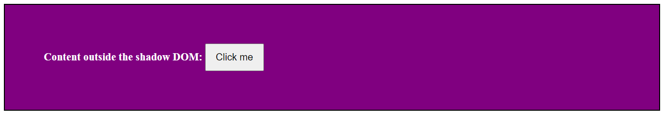
The example demonstrates the use of a shadow tree within the Shadow DOM. It attaches a shadow root to a host element, creates elements (in this case, a button) within the shadow root, and showcases the shadow tree’s encapsulation and isolation properties. The shadow tree, represented by the shadow root, is the hidden and encapsulated DOM structure associated with the host element.
- Scoped Selectors: Styles within the shadow DOM can use scoped selectors to target only the elements within the shadow tree, providing encapsulation. Here’s an example demonstrating the use of scoped selectors:
<!doctype html>
<html>
  <head>
    <title>Using Scoped Selectors in Shadow DOM</title>
  </head>

  <body>
    <div id="myElement">
      <!-- Content outside the shadow DOM -->
    </div>
  </body>
</html>
const element = document.getElementById("myElement");
const shadowRoot = element.attachShadow({ mode: "open" });
// Scoped styles for the shadow DOM
const styles = `
:host {
display: block;
background-color: purple;
padding: 30px;
font-size: 22px;
color: white;
}
`;
// Create a style element and set its content to the scoped styles
const styleElement = document.createElement("style");
styleElement.textContent = styles;
// Append the style element to the shadow root
shadowRoot.appendChild(styleElement);
// JavaScript code for creating and styling elements inside the shadow root
const paragraph = document.createElement("p");
paragraph.textContent = "This text is styled within the shadow DOM.";
// Append the paragraph to the shadow root
shadowRoot.appendChild(paragraph);The output:
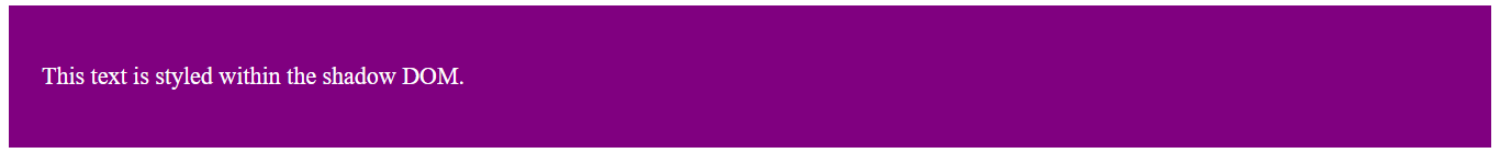
The :host selector targets the host element in the example above, while the p selector targets the p element within the shadow tree. This way, styles applied using scoped selectors are confined to the specific elements within the shadow tree, ensuring encapsulation and preventing style leakage to the global scope.
HTMLSlotElement and Content Distribution
At the heart of dynamic content distribution lies the HTMLSlotElement. It is part of the Web Components standard and is crucial in facilitating content distribution within a custom element shadow tree. Web Components can enable you to create reusable components with encapsulated functionality and styling. The shadow DOM is a vital feature of Web Components, allowing for the encapsulation of styles and DOM structure. Combining Shadow DOM and HTMLSlotElement is a powerful approach in web development, particularly when building encapsulated and reusable components. This combination allows for enhanced encapsulation by isolating internal structures, styles, and behavior while providing flexibility for dynamic content insertion.
Mechanism of Content Distribution
When you project content into a slot, it will be distributed to the corresponding <slot> element within the shadow DOM of a custom element. Multiple slots within the shadow DOM allow you to segment and receive different types of content in a more structured manner. Each slot can act as a placeholder for specific content, providing flexibility in organizing and displaying information.
Understanding the mechanics of content distribution involves grasping how slots act as placeholders within the Shadow DOM, allowing for seamless integration of external content from the light DOM.
Let’s delve into the intricacies of this process:
- Declaring Slots in the Shadow DOM: [The
<slot>element] (https://www.w3schools.com/tags/tag_slot.asp) serves as a placeholder within the shadow DOM of a custom element. It acts as a receptacle or insertion point where content from the light DOM (the main DOM outside the shadow DOM) can be projected or distributed. It allows dynamically inserting external content into specific locations within the shadow DOM. Slots are declared using the<slot>element within the Shadow DOM. Example:
<div id="shadow-root">
  <!-- Other Shadow DOM content -->
  <slot></slot>
</div>
In the above example, the <div> with the ID “shadow-root” is the root of the Shadow DOM. The <slot> element is the key feature here and is an insertion point that allows content from the light DOM to be projected into the Shadow DOM.
- When you use an element with this Shadow DOM structure on a web page, the content between that element’s opening and closing tags will be dynamically inserted into the
<slot>in the Shadow DOM. Example:
<custom-element>
  <p>This content goes into the slot.</p>
</custom-element>
Here, the paragraph (<p>) element will be inserted into the <slot> within the Shadow DOM of the custom-element.
- Let’s see how it works:
<!doctype html>
<html>
  <head>
    <title>Slot Example</title>
  </head>
  <body>
    <custom-element>
      <p>This content goes into the slot.</p>
    </custom-element>
  </body>
</html>
class CustomElement extends HTMLElement {
constructor() {
super();
const shadowRoot = this.attachShadow({ mode: "open" });
shadowRoot.innerHTML = `
<style>
/* Styles specific to the Shadow DOM */
:host {
display: block;
border: 1px solid #ddd;
padding: 10px;
}
</style>
<div id="shadow-root">
<!-- Other Shadow DOM content -->
<slot></slot>
</div>
`;
}
}
customElements.define("custom-element", CustomElement);The output:
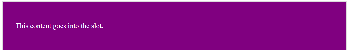
Here, the HTML contains the usage of the custom element <custom-element> with its content, and the Javascript code defines the custom element’s behavior, including creating the Shadow DOM and the internal structure.
The <div id="shadow-root"> is part of the internal structure defined within the Shadow DOM. It encapsulates the content and includes the <slot> element for dynamic content insertion. So, when you use <custom-element> in your HTML, the Shadow DOM will dynamically generate the <div id="shadow-root"> internally, and the content you provide (in this case, <p>This content goes into the slot.</p>) will be inserted into the <slot> within the Shadow DOM. The <div id="shadow-root"> is not directly specified in the HTML where you use the custom element; it’s part of the Shadow DOM’s encapsulated structure.
- Content Projection: Content projection refers to the process of projecting or inserting content from the light DOM into specific locations within the Shadow DOM of a web component. It allows for the creation of versatile, reusable components with customizable content.
This process can be explained further below:
- Distributing Content from Light DOM to Shadow DOM: The light DOM is the context where the web page’s main content resides. It includes all the HTML elements and content defined directly in your HTML document. Components within the light DOM can be encapsulated using Shadow DOM. When utilizing a component with slots, content within the light DOM can be inserted into the slots within the Shadow DOM.
When you use a custom component (e.g., <custom-component>) in your HTML, you can include content within its opening and closing tags. This content will be part of the light DOM. If the custom component uses slots within its Shadow DOM, the content from the light DOM can be dynamically inserted into those slots.
Example:
<!doctype html>
<html>
  <head>
    <title>Light DOM to Shadow DOM Example</title>
  </head>
  <body>
    <custom-component>
      <!-- Content to be distributed to the slot -->
      <h1>This content is from the light DOM.</h1>
    </custom-component>
  </body>
</html>
// Define the custom element and its behavior
class CustomComponent extends HTMLElement {
constructor() {
super();
// Create a Shadow DOM and attach it to the custom element
const shadowRoot = this.attachShadow({ mode: "open" });
// Define the Shadow DOM content with a slot
shadowRoot.innerHTML = `
<style>
/* Styles specific to the Shadow DOM */
:host {
display: block;
border: 3px solid #ddd;
padding: 50px;
background-color: purple;
color: white;
font-size: 28px;
}
</style>
<div id="shadow-root">
<slot></slot> <!-- Slot for dynamic content insertion -->
</div>
`;
}
}
// Define the custom element tag
customElements.define("custom-component", CustomComponent);The output:
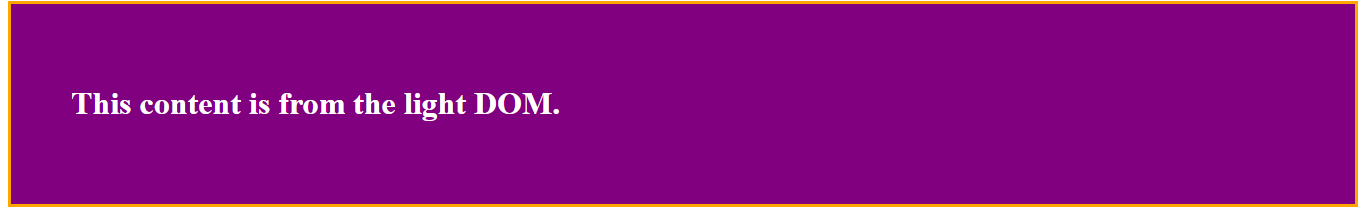
Here, the <custom-component> instance utilizes Shadow DOM and slots. The paragraph (<p>) element inside the custom component tags is the content you want to distribute into the Shadow DOM using slots.
- Default and Named slots:
The default slot is an unnamed
<slot>element within the shadow DOM. This default slot acts as a placeholder for content from the light DOM that doesn’t match any explicitly named slots. It serves as a fallback, ensuring that content not intended for a specific named slot has a designated place to be distributed. However, named slots can be utilized for more specific content distribution. This approach provides a way to organize and specify where content should be placed within the Shadow DOM. They offer more control over content placement, especially when you have specific areas or regions in your custom element where certain content should be inserted. Example:
<div id="shadow-root">
  <slot name="header"></slot>
  <slot></slot>
  <!-- Default slot for unspecified content -->
</div>
In this shadow DOM structure, <slot name="header"></slot> is a named slot with the name “header.” It serves as a designated location for content with the attribute slot=“header” in the light DOM. The <slot></slot> is a default slot without a specified name. It acts as a placeholder for content that doesn’t have a specific slot name. If the content in the light DOM doesn’t have a slot attribute, it will be distributed to this default slot.
Now, let’s look at the example usage:
<!doctype html>
<html lang="en">
  <head>
    <title>Default and Named Slot Example</title>
  </head>
  <body>
    <custom-component>
      <h1 slot="header">Custom Header for Named Slot</h1>
      <p>This content goes into the default slot.</p>
    </custom-component>
  </body>
</html>
class CustomComponent extends HTMLElement {
constructor() {
super();
const shadowRoot = this.attachShadow({ mode: "open" });
shadowRoot.innerHTML = `
<style>
/* Styles specific to the Shadow DOM */
:host {
display: block;
border: 3px solid #ddd;
padding: 30px;
background-color: purple;
color: white;
font-size: 24px;
}
</style>
<div id="shadow-root">
<slot name="header"></slot>
<slot></slot> <!-- Default slot for unspecified content -->
</div>
`;
}
}
customElements.define("custom-component", CustomComponent);The output:
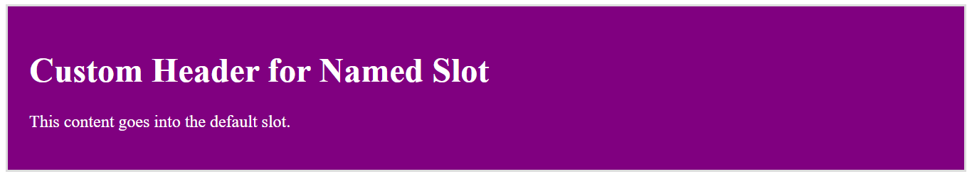
Here, <custom-component> is an instance of the custom element, and it has two pieces of content:
<h1 slot="header">Custom Header</h1>: This <h1> element has a slot attribute with the value “header.” It will be distributed to the named slot with the name “header” in the Shadow DOM.
<p>This content goes into the default slot.</p>: This <p> element doesn’t have a slot attribute, so it will be distributed to the default slot in the Shadow DOM.
Creating a Simple Web Component
Creating a simple web component involves defining a custom element and specifying its behavior, structure, and styles.
Let’s create an example where you can insert several components into slots. We’ll create a card-container web component that allows users to insert different types of cards. Each card will have its own custom content and style. The card-container will provide a flexible layout to showcase these cards.
<!doctype html>
<html>
  <head>
    <title>Creating Simple Web Component</title>
  </head>
  <body>
    <template id="card-container-template">
      <style>
        :host {
          display: block;
          padding: 60px;
          background-color: gray;
          color: white;
          font-size: 24px;
        }

        .cards {
          display: flex;
          gap: 20px;
          justify-content: center;
        }
      </style>
      <div class="cards">
        <slot></slot>
      </div>
    </template>

    <template id="text-card-template">
      <style>
        .text-card {
          background-color: purple;
          border: 2px solid #ccc;
          padding: 30px;
          text-align: center;
        }
      </style>
      <div class="text-card">
        <slot></slot>
      </div>
    </template>

    <card-container>
      <text-card>This is a simple text card.</text-card>
      <text-card>This is another text card.</text-card>
    </card-container>
  </body>
</html>
class CardContainer extends HTMLElement {
constructor() {
super();
this.attachShadow({ mode: "open" });
const template = document.getElementById("card-container-template");
const instance = template.content.cloneNode(true);
this.shadowRoot.appendChild(instance);
}
}
class TextCard extends HTMLElement {
constructor() {
super();
this.attachShadow({ mode: "open" });
const template = document.getElementById("text-card-template");
const instance = template.content.cloneNode(true);
this.shadowRoot.appendChild(instance);
}
}
customElements.define("card-container", CardContainer);
customElements.define("text-card", TextCard);The output:

In the example, we define a card-container web component using the <template> tag. It includes internal styles (scoped to the shadow DOM) that define the component’s appearance. The component has a div with a class of cards where the <slot> element is used to insert content dynamically. The example then includes two instances of the text-card component inside the card-container.
Similarly, the text-card web component is defined with its template. It also includes internal styles for its appearance. The component has a div with a class of text-card where the <slot> element is used to insert content dynamically.
The JavaScript section defines two classes (CardContainer and TextCard). Each class represents a custom element. The classes extend HTMLElement and define the behavior for creating shadow DOMs and appending the corresponding templates. Finally, the customElements.define method registers these custom elements.
Advanced Content Styling for HTMLSlotElement
When working with HTMLSlotElement in web components, apply advanced content styling to enhance the appearance and behavior of your component.
Let’s explore a more advanced example with custom styling for the slotted content. In this example, we’ll use the ::slotted() pseudo-element selector to style the slotted content.
<!doctype html>
<html>
  <head>
    <title>Advanced Content Styling for HTMLSlotElement</title>
  </head>
  <body>
    <!-- Custom Button Component -->
    <template id="custom-button-template">
      <style>
        :host {
          display: inline-block;
          border: 2px solid white;
          background-color: purple;
          cursor: pointer;
          padding: 100px;
        }

        /* Styling for slotted content within the Shadow DOM */
        ::slotted(p) {
          margin: 0;
          color: white;
          font-size: 22px;
        }
      </style>
      <slot></slot>
    </template>

    <!-- Usage of the Custom Button Component -->
    <custom-button>
      <p>This is a slotted paragraph.</p>
      <p class="highlight">This paragraph has a special highlight.</p>
      <p>Another slotted paragraph.</p>
    </custom-button>
  </body>
</html>
// Create the Custom Button component using Shadow DOM
class CustomButton extends HTMLElement {
constructor() {
super();
const shadowRoot = this.attachShadow({ mode: "open" });
const template = document.getElementById("custom-button-template");
const instance = template.content.cloneNode(true);
shadowRoot.appendChild(instance);
}
}
// Define the custom element
customElements.define("custom-button", CustomButton);The output:
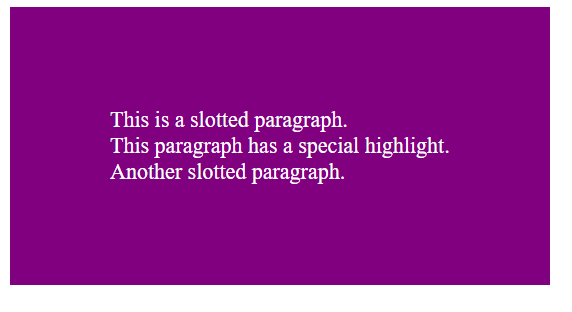
This example demonstrates the creation of a custom button web component with a Shadow DOM and advanced styling for the slotted content using the ::slotted() pseudo-element selector. The slotted paragraphs inherit styles specified within the Shadow DOM.
The :host pseudo-class styles the custom button while the ::slotted pseudo-class styles slotted paragraphs. The template (custom-button-template) defines styles for the custom button and slotted paragraphs. Slotted paragraphs inherit styles through ::slotted(p). The <custom-button> is used with three slotted paragraphs. The CustomButton class creates a custom element with a Shadow DOM and clones content from the template to the Shadow DOM.
Dynamic Content Injection with Slots
Dynamic content injection with slots in web components allows you to change the content of the component dynamically, providing flexibility and reusability. Let us demonstrate how to use slots for dynamic content injection:
<!doctype html>
<html>
  <head>
    <title>Dynamic Content Injection with Slots</title>
  </head>
  <body>
    <template id="dynamic-component-template">
      <style>
        :host {
          display: block;
          padding: 20px;
          background-color: purple;
          color: white;
          margin-bottom: 5px;
          font-size: 22px;
        }

        h2 {
          color: white;
        }
      </style>
      <div>
        <h2><slot name="header"></slot></h2>
        <div class="content">
          <slot></slot>
        </div>
      </div>
    </template>

    <dynamic-component id="component1">
      <h2 slot="header">Component 1 Header</h2>
      <p>This is the content for Component 1.</p>
    </dynamic-component>

    <dynamic-component id="component2">
      <h2 slot="header">Component 2 Header</h2>
      <ul>
        <li>Item 1</li>
        <li>Item 2</li>
        <li>Item 3</li>
      </ul>
    </dynamic-component>
  </body>
</html>
class DynamicComponent extends HTMLElement {
constructor() {
super();
this.attachShadow({ mode: "open" });
const template = document.getElementById("dynamic-component-template");
const instance = template.content.cloneNode(true);
this.shadowRoot.appendChild(instance);
}
}
customElements.define("dynamic-component", DynamicComponent);The output:
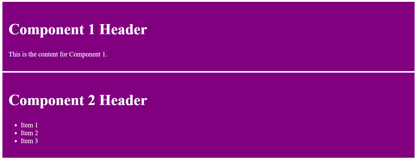
The above example demonstrates the use of web components to create dynamic and flexible components with slots. The dynamic-component allows dynamic injection of content into specific slots, allowing customization and reuse of components with different content. The DynamicComponent class defines the behavior of the custom element, attaching a Shadow DOM and appending the cloned content to it. The HTML instances showcase the flexibility of dynamic content injection through slots.
Conditional Rendering Using Slots
Conditional rendering using slots in web components enables you to control the visibility of content based on certain conditions. You can achieve this by dynamically manipulating the content in the light DOM and having the web component distribute that content to specific slots in the shadow DOM. Here’s an example of conditional rendering using slots:
<!doctype html>
<html>
  <head>
    <title>Conditional Rendering with Slots</title>
    <style>
      my-conditional-element {
        display: block;
        padding: 50px;
        font-size: 26px;
        background-color: purple;
        color: white;
      }
    </style>
  </head>

  <body>
    <my-conditional-element>
      <div slot="header" data-condition="true">
        Header Content (Condition is true)
      </div>

      <div slot="header" data-condition="false">
        Header Content (Condition is false)
      </div>

      <!-- Default content -->
      <p>This is the default content.</p>
    </my-conditional-element>
  </body>
</html>customElements.define(
"my-conditional-element",
class extends HTMLElement {
constructor() {
super();
const shadowRoot = this.attachShadow({ mode: "open" });
const headerSlot = document.createElement("slot");
headerSlot.name = "header";
shadowRoot.appendChild(headerSlot);
const defaultSlot = document.createElement("slot");
shadowRoot.appendChild(defaultSlot);
this.querySelectorAll('[slot="header"]').forEach((headerContent) => {
const condition = headerContent.getAttribute("data-condition");
const clonedHeaderContent = headerContent.cloneNode(true);
if (condition === "true") {
headerSlot.appendChild(clonedHeaderContent);
} else {
defaultSlot.appendChild(clonedHeaderContent);
}
headerContent.remove();
});
}
},
);Here is the output:
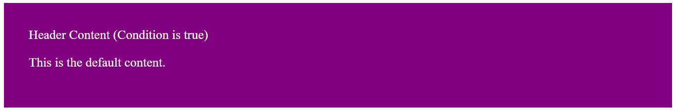
The example demonstrates conditional rendering using slots within a custom element (my-conditional-element). The custom element dynamically distributes slotted content based on the condition specified by the data-condition attribute. This provides flexibility in rendering different content based on conditions within the custom element’s shadow DOM.
The script queries all elements with the attribute [slot="header"] within the custom element. For each slotted header content, it checks the value of the data-condition attribute. If the condition is ‘true’, the cloned header content is appended to the header slot. Otherwise, it is appended to the default slot. The original header content is removed from the DOM.
Best Practices for HTMLSlotElement
Using HTMLSlotElement effectively in web development involves following best practices to provide clean and maintainable code. Here are some of them:
-
Understand how the Shadow DOM works and its relationship with the light DOM. This knowledge is crucial for the effective use of
HTMLSlotElement. -
Leverage the Shadow DOM to encapsulate styles and structure. This helps prevent styles and scripts from bleeding into or out of the component.
-
Consider using a default slot to provide default content within the shadow DOM. This ensures the component is still usable even without external content.
-
Utilize named slots for specific content insertion points. This clarifies how the component should be composed and allows for more flexible customization.
-
Ensure that your custom element and the use of slots do not compromise accessibility. Test your components with screen readers and other accessibility tools to guarantee a good user experience.
-
Utilize attributes like
slot=" "for default slot assignment and slot change event for detecting slot content changes. This enables dynamic content management. -
Use CSS variables and custom properties for styling within the Shadow DOM. This allows external styles to be applied to the component, making it customizable while maintaining encapsulation.
Conclusion
In exploring the HTMLSlotElement, we’ve delved into its remarkable capabilities for advanced content styling within web components. The HTMLSlotElement stands as a cornerstone in modern web component development. Its ability to handle dynamic content, provide advanced styling options, and support conditional rendering makes it an indispensable tool for crafting sophisticated and maintainable web applications. As we continue to push the boundaries of web development, it remains a key player in building the next generation of interactive and user-friendly experiences.
Truly understand users experience
See every user interaction, feel every frustration and track all hesitations with OpenReplay — the open-source digital experience platform. It can be self-hosted in minutes, giving you complete control over your customer data.
Star on GitHub12k