
Previewing Markdown code with React


Markdown, created by John Gruber in 2004, is one of the most popular markup languages. The Markdown format converts plain text into HTML and is easy to write and read. Markdown is popular because the syntax used is simple to grasp. In addition, people who do not know HTML can use Markdown and convert their documents automatically into HTML pages.
We aim to create a Markdown previewer with Next.js and customize the components using Styled-Components. By the end of this article, you will be able to implement the previewer on a blog project.
Development Environment Setup
The most important thing is ensuring that we have a Node.js environment setup in our Operating System. We can first check the version of Node.js installed.
node -vIf you are not yet a Node.js user, follow the instructions in this link. The process may differ depending on the operating system. After successfully installing Node.js, we can begin by initializing our project. In this phase, we will create a Next.js app using create-next-app. Next.js community has made the installation process easier by implementing program prompts that guide developers. Open the terminal by typing “cmd” in the program search area, then use the command below to create a Next.js app.
npx create-next-app@latestIf the command doesn’t work for you, you can try these two alternatives.
yarn create-next-appor
pnpm create-next-appIn our case, we will name our project markdownpreviewer, and since we only need JavaScript, we will not include the Typescript template; select “no” when prompted.
We now have a new directory called markdownpreviewer. Let’s navigate into it:
cd markdownpreviewerThen, run the project using the command:
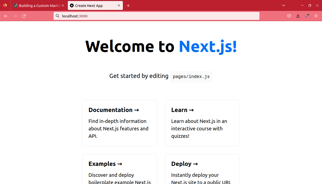
npm run devThe web app is now visible in our browser.
Installing Required Packages
The next step is installing the packages needed for our project. The first package will be Styled-Components. This is our choice for styling our application, and it will also help us when customizing our markdown output.
npm i styled-componentsWe will use react-markdown for our markdown rendering logic. Let’s install the package.
npm i react-markdownNow we are ready for the fun part. Let’s ensure that the room has no distractions before starting our hacking endeavor.
Building the Markdown previewer
Since we have already installed the dependencies, we can open the editor. With Visual Studio Code installed, we can open it from our command prompt using the command below.
cd markdownpreviewer
code .
The editor will open with the project as the current workspace when we press enter.
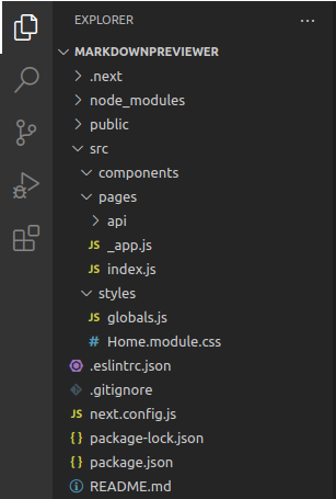
The first thing that we should do is re-create our project structure. Mostly, it’s recommended that we create a source folder, src, and get every project file from that folder. The following is the produced structure.
If you are having trouble setting up Styled-Components, I have you covered. Let’s clear the files in our styles folder and paste this code into a new Globals.js file.
// Globals.js

import { createGlobalStyle } from "styled-components";

const GlobalStyle = createGlobalStyle`
body{
background:white;
margin:0;
padding:0;
}
`;

export default GlobalStyle;
The second step is importing and using our styles in our root page, which is _app.js in our pages folder.
// _app.js
import { Fragment } from "react";
import GlobalStyle from "../styles/Globals";

function MyApp({ Component, pageProps }) {
  return (
    <Fragment>
      <GlobalStyle />
      <Component {...pageProps} />
    </Fragment>
  );
}

export default MyApp;
After setting the global styled-components, let’s create a Previewer.js file in our components folder. Here we will create a functional component that will hold the logic needed for both our editor and previewer. We will start by importing our modules at the top of our file.
// Previewer.js
import React from "react";
import { useState } from "react";
import styled from "styled-components";
import ReactMarkdown from "react-markdown";
After the imports, create an Editortool functional component in that file by adding the code below.
export function Editortool() {
  const [form, setForm] = useState({ markdown: "" });

  const handleChange = (e) => {
    setForm({
      ...form,
      [e.target.name]: e.target.value,
    });
  };

  return (
    <div>
      <h1>Markdown Previewer</h1>
      <div>
        <textarea
          id="textarea_id"
          name= "markdown"
          type= "text"
          onChange={handleChange}
        />
        <ReactMarkdown>{form.markdown}</ReactMarkdown>
      </div>
    </div>
  );
}
We must define the method we want to use when handling our state. Since we have a functional component, we will use the useState hook. Define the variable form as our current state, and update it through the setForm function. We then set our current state to an empty string with useState({markdown:"}).
The handleChange arrow function is reserved for handling the change effect when typing in our textarea. The change of an input element is then detected through the onChange event. After creating the component, we import it into our index.js page, which serves as our home page.
// index.js
import Editortool from "../components/Editor"

export default function Home() {
  return (
    <>
      <Editortool />
    </>
  );
}
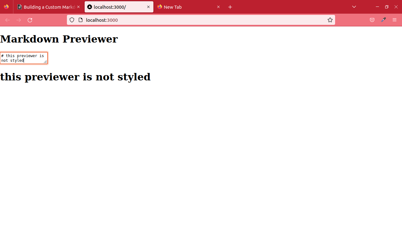
If we run our code, we get that the editor and previewer are working, but it still needs to be styled. Let’s execute the code using the command below.
npm run devClicking on the link provided opens the browser.
Let’s create our styling components. The styled-components syntax involves creating a variable and assigning the styled function to it. We use the CSS inside backticks as Styled-Components.
const Styledexample = styled.div`
  position: absolute;
  top: 60px;
  min-height: 90%;
  width: 90vw;
  left: 5%;
`;
We will need three Styled-Components for our styling; Markdowncontainer, Editor, and Reviewarea components. Let’s add them to the code.
import React from "react";
import { useState } from "react";
import styled from "styled-components";
import ReactMarkdown from "react-markdown";

const H1 = styled.h1`
  position: absolute;
  left: 35%;
`;

const MarkdownContainer = styled.div`
  position: absolute;
  top: 60px;
  min-height: 90%;
  width: 90vw;
  left: 5%;
  display: grid;
  grid-template-columns: 1fr 1fr;
  grid-gap: 8px;
  border: 1px solid black;
  box-sizing: border-box;
`;

const Editor = styled.textarea`
  top: 0;
  font-size: 18px;
  background: #1e2126;
  color: white;
  border: 1px solid #c4c4c4;
  box-sizing: border-box;
  max-width: 45vw;
`;

const Reviewarea = styled(ReactMarkdown)`
  top: 0;
  padding: 20px;
  font-size: 18px;
  background: white;
  border: 1px solid blue;
  box-sizing: border-box;
  max-width: 45vw;
`;

export function Editortool() {
  const [form, setForm] = useState({ markdown: "" });

  const handleChange = (e) => {
    setForm({
      ...form,
      [e.target.name]: e.target.value,
    });
  };
  return (
    <div>
      <H1>Markdown Previewer</H1>
      <MarkdownContainer>
        <Editor
          id="textarea_id"
          name= "markdown"
          type= "text"
          onChange={handleChange}
        />
        <Reviewarea components={CodeBlock} remarkPlugins={[remarkGfm]}>
          {form.markdown}
        </Reviewarea>
      </MarkdownContainer>
    </div>
  );
}
The CSS in our styled component uses the grid system to arrange the elements. Using Styled-Components is just like using CSS in JavaScript directly. The final output is created after running the code.
With fewer lines of code, we have our editor and previewer running. In the next step, we will customize the different components rendered by our previewer; fonts, font family, image size, tables, and code snippets. If you are new to Styled-Components and wonder how, this is the easiest part of this tutorial.
Session Replay for Developers
Uncover frustrations, understand bugs and fix slowdowns like never before with OpenReplay — an open-source session replay tool for developers. Self-host it in minutes, and have complete control over your customer data. Check our GitHub repo and join the thousands of developers in our community.
Customize Components with Styled Components
Let’s now work on styling our components.
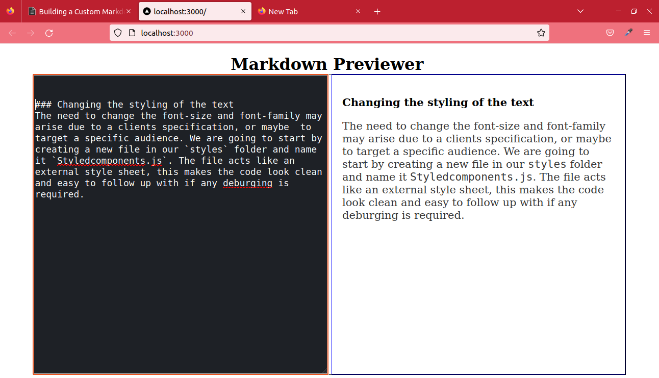
Changing the styling of the text
The need to change the font size and family may arise because of a client’s specification or the target of a specific audience. Let’s see how we go about it.
We will start by creating a new file in our styles folder and naming it Styledcomponents.js. The file acts like an external style sheet, making the code look clean and easy to follow up with if any debugging is required.
Let’s copy the recently created styled components from our Previewer.js file into our newly created file, adding an export declaration at the beginning.
import styled from "styled-components";
import ReactMarkdown from "react-markdown";

export const MarkdownContainer = styled.div`
  position: absolute;
  top: 60px;
  min-height: 90%;
  width: 90vw;
  left: 5%;
  display: grid;
  grid-template-columns: 1fr 1fr;
  grid-gap: 8px;
  border: 1px solid black;
  box-sizing: border-box;
`;

export const Editor = styled.textarea`
  top: 0;
  font-size: 18px;
  background: #1e2126;
  color: white;
  border: 1px solid #c4c4c4;
  box-sizing: border-box;
  max-width: 45vw;
`;

export const Reviewarea = styled(ReactMarkdown)`
  top: 0;
  padding: 20px;
  font-size: 18px;
  background: white;
  border: 1px solid blue;
  box-sizing: border-box;
  max-width: 45vw;
`;

export const H1 = styled.h1`
  position: absolute;
  left: 35%;
`;
When we use the components, we must import them in our Previewer.js file.
import { Editor, H1, MarkdownContainer, Reviewarea } from “../styles/Styledcomponents”The most common font sizes used in blog post range between 16-20 pixels. Let’s see how we can change our font sizes and aim at an older audience by changing the font size to 19 pixels and the font family to Monoscope. Add these lines of code in the Reviewarea component. This should change the styling of both the heading and paragraph elements.
  h1 {
    color: brown;
    font-family: “Lucida Console”, “Courier New”, monoscope;
  }
  p {
    color: #333333;
    font-size: 21px;
  }
This is how our code will look when the styles are added.
export const Reviewarea = styled(ReactMarkdown)`
  position: relative;
  top: 0;
  padding: 20px;
  font-size: 18px;
  background: white;
  border: 1px solid blue;
  box-sizing: border-box;
  max-width: 45vw;

  h1 {
    color: brown;
    font-family: "Lucida Console", "Courier New", monoscope;
  }
  p {
    color: #333333;
    font-size: 21px;
  }
`;
This is what we produce:
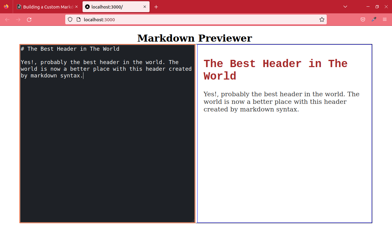
The previewer is now customized, the header has a custom color, and the paragraph font size larger than the default.
Positioning and Sizing Images
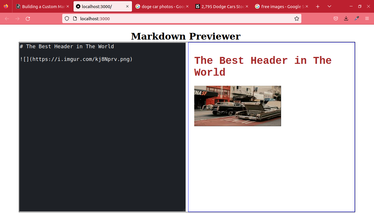
We may also need to reduce the size of images, either to reduce the size of web pages or to create a custom hero image for a blog header section. If we try adding an image, we notice it’s added with its default size. This makes the previewer break since it’s larger than the previewer.
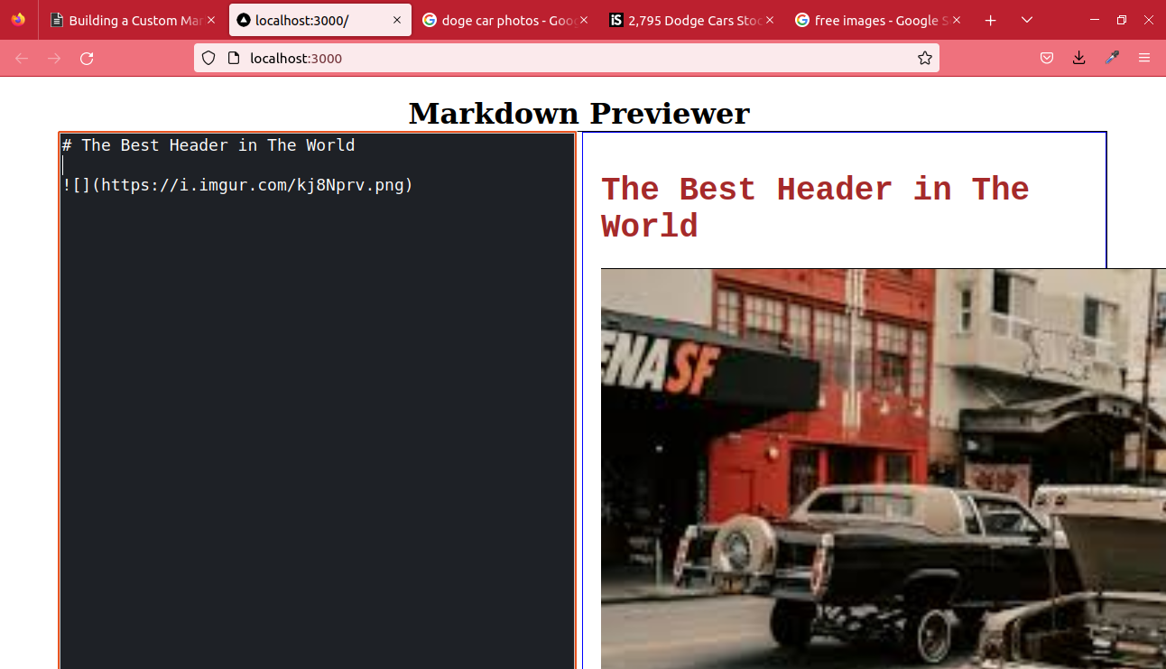
We don’t want our editor breaking each time, so let’s make our image maximum size 500px by 400px in dimension. This only takes two to three lines. The property for width and height is width:szpx; and height:szpx;.
In the same Reviewarea component, add an img tag with these properties and check the output once again.
export const Reviewarea = styled(ReactMarkdown)`
  top: 0;
  padding: 20px;
  font-size: 18px;
  background: white;
  border: 1px solid blue;
  box-sizing: border-box;
  max-width: 45vw;

  img {
    width: 500px;
    height: 400px;
  }
`;
This is the output:
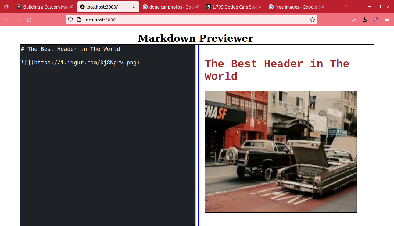
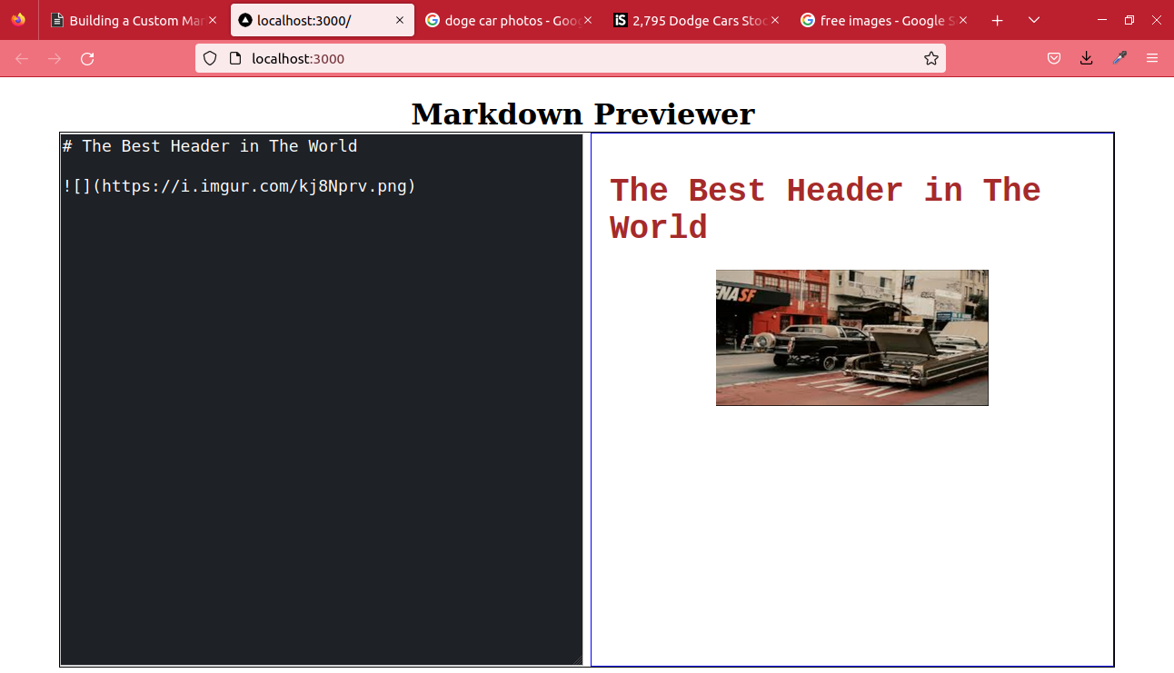
As we can see, sizing images is very easy. In cases of smaller images, they tend to lie on one side. The image in the previewer below is 300px by 150px.
Let’s center the image using the margin CSS property in styled components.
export const Reviewarea = styled(ReactMarkdown)`
  top: 0;
  padding: 20px;
  font-size: 18px;
  background: white;
  border: 1px solid blue;
  box-sizing: border-box;
  max-width: 45vw;
  img {
    width: 300px;
    height: 150px;
    display: block;
    margin-left: auto;
    margin-right: auto;
  }
`;
When the margin property is set to auto on the right and left sides, the image gets centered like the one below.
Customizing and Including Support for Tables
Since table syntax in markdown isn’t considered standard, react-markdown does not support them by default. For tables to work, we need to use a plugin called remark-gfm, the most suitable plugin for table functionality.
Quick, let’s install the plugin using the command below.
npm i remark-gfmWe only need to import the remarkGfm module from the plugin and use it in our ReactMarkdown component. Below is the syntax used in a plain react-markdown component.
return (
  <ReactMarkdown remarkPlugins={[remarkGfm]}>{form.markdown}</ReactMarkdown>
);
Since we are using Styled-Components, the code looks different compared with the names given to our styling components.
import React from "react";
import { useState } from "react";
import ReactMarkdown from "react-markdown";
import remarkGfm from "remark-gfm";
export default function Editortool() {
const [form, setForm] = useState({ markdown: "" });
const handleChange = (e) => {
setForm({
...form,
[e.target.name]: e.target.value,
});
};
return (
<div>
<MarkdownContainer>
<Editor
id="textarea_id"
name= "markdown"
type= "text"
onChange={handleChange}
/>
<Reviewarea remarkPlugins={[remarkGfm]}>{form.markdown}</Reviewarea>
</MarkdownContainer>
</div>
);
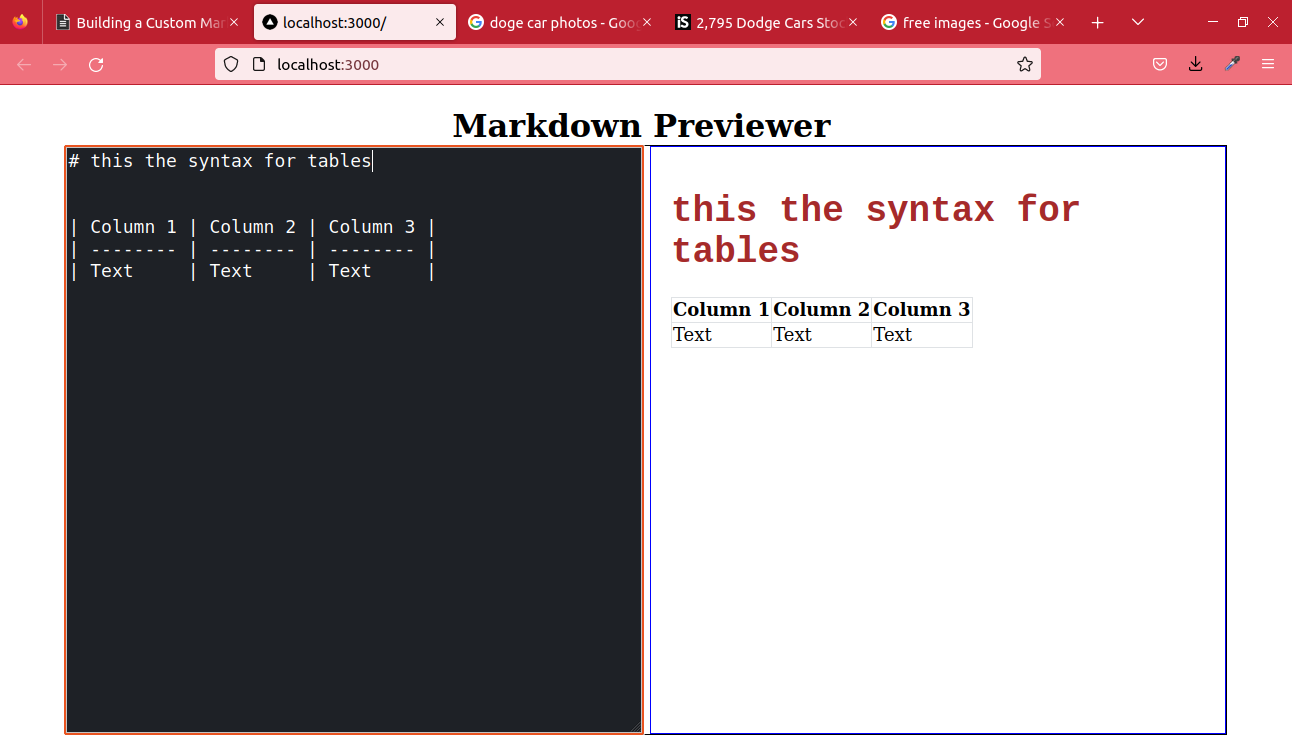
}Our previewer now supports markdown table syntax; we can try it out.
| Column 1 | Column 2 | Column 3 |
| -------- | -------- | -------- |
| Text | Text | Text |
We can now view the output in our previewer.

The table is generated successfully, but there is a minor problem: no borders. We can add them using the CSS border property. Let’s add a table property in our Reviewarea styled component.
export const Reviewarea = styled(ReactMarkdown)`
  top: 0;
  padding: 20px;
  font-size: 18px;
  background: white;
  border: 1px solid blue;
  box-sizing: border-box;
  max-width: 45vw;
  table {
    border-collapse: collapse;
    th,
    td {
      border: 0.5px solid #dfe2e5;
    }
  }
`;
In the code above, notice that we have added a border-collapse property? This is to remove the extra space in the cells. Below is the outstanding-looking table.
With Styled Components, you have unlimited capabilities that you can implement on your own; try adding different colors to the table background and text.
Custom Code block highlighter
In the case of a technical blog, we regard a code block as an essential component. In our previewer, we will need a code block syntax highlighter; the best library for this would be react-syntax-highlighter.
npm i react-syntax-highlighterAfter a successful installation, navigate to the styles folder and create a new Highlighter.js file. The required module imports are going to be our first lines of code.
import React from "react";
import styled from "styled-components";
import { Prism as SyntaxHighlighter } from "react-syntax-highlighter";
import { dracula } from "react-syntax-highlighter/dist/cjs/styles/prism";
We will need the SyntaxHighlighter element the most, but we will still need a theme called dracula. Create a Styled-Component and call it CodeContainer, then assign it the SyntaxHighlighter element just like in the code below.
import React from "react";
import { Prism as SyntaxHighlighter } from "react-syntax-highlighter";
import styled from "styled-components";
import { dracula } from "react-syntax-highlighter/dist/cjs/styles/prism";

const Codecontainer = styled(SyntaxHighlighter)`
  width: 98%;
  position: relative;
  left: 10px;
`;

const CodeBlock = {
  code({ node, inline, className, children, ...props }) {
    const match = /language-(\w+)/.exec(className || "");
    return !inline && match ? (
      <Codecontainer
        style={dracula}
        language={match[1]}
        PreTag= "div"
        {...props}
      >
        {String(children).replace(/\n$/, "")}
      </Codecontainer>
    ) : (
      <code className={className} {...props}>
        {children}
      </code>
    );
  },
};

export default CodeBlock;
The functional component above overwrites the normal handling of a code element by passing a component into it. Since we have a prop called code, we can now change the code element by rendering custom code elements.
We also use a ternary operator in the return statement. If the typed string matches with a coding language, then the Codecontainer will be returned, and a normal code block will be returned if false.
This is how our final code will look after importing the CodeBlock container to use it in our Reviewarea component.
// Previewer.js
import React from "react";
import { useState, useEffect } from "react";
import ReactMarkdown from "react-markdown";
import remarkGfm from "remark-gfm";
import CodeBlock from "../styles/Highlighter";
export default function Editortool() {
const [form, setForm] = useState({ markdown: "" });
const handleChange = (e) => {
setForm({
...form,
[e.target.name]: e.target.value,
});
};
return (
<div>
<MarkdownContainer>
<Editor
id="textarea_id"
name= "markdown"
type= "text"
onChange={handleChange}
/>
<Reviewarea components={CodeBlock} remarkPlugins={[remarkGfm]}>
{form.markdown}
</Reviewarea>
</MarkdownContainer>
</div>
);
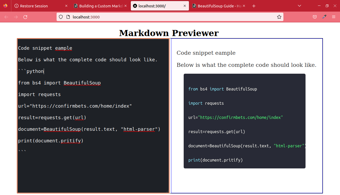
}Let’s test our syntax highlighter and try using backticks or tildes syntax.
Congrats on getting this far. We now have our customized Next.js Markdown Previewer.
Conclusion
When we contemplate the infinite possibilities of customizing a react markdown previewer, what we have covered is only a foundation for more ideas. You may add support for flowcharts, including a display for math expressions, or play with distinct color patterns. It’s all about your imagination.
Let’s meet in our following tutorial. I hope you had fun.
References
A TIP FROM THE EDITOR: For more on Markdown and React, don’t miss How To Safely Render Markdown From A React Component.
Gain Debugging Superpowers
Unleash the power of session replay to reproduce bugs and track user frustrations. Get complete visibility into your frontend with OpenReplay, the most advanced open-source session replay tool for developers.
